In this article:
- Colors That Trigger Purchases
- Practical Applications of Color in Marketing
- Understanding Color Psychology
- Cultural Variations in Color Meaning
- Case Studies
- Conclusion
In the world of marketing, colors are more than just a visual element—they’re a powerful tool that can shape consumer behavior. Did you know that certain colors can influence us to make purchasing decisions? Red, for example, is a standout color often associated with urgency and excitement, making it a favorite for sales and impulse buys. But it’s not the only one that captures attention; each hue has its own psychological impact.
Understanding how colors influence emotions and decisions is crucial for businesses aiming to connect with customers on a deeper level. Whether it’s the calm trustworthiness of blue or the cheerful invite of yellow, choosing the right color can enhance branding and drive sales. Uncover the secrets of color psychology and wield it to boost your marketing strategy, making your brand unforgettable.
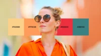
Colors That Trigger Purchases
Have you ever wondered why certain brands always use the same colors in their logos and marketing materials? The colors you see aren’t just picked at random. There’s actually a science behind it. Marketers understand that colors can affect our emotions and decisions. Let’s explore how different colors can make us feel and how they can even encourage us to make a purchase.
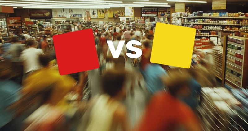
Red: The Urgency Creator
Red is like an alarm bell. It gets your attention right away. When you see red, it’s common to feel a sense of urgency. Think of clearance sales or the “last chance” notices you often see online. Red is exciting and intense, making it a perfect choice for creating urgency in marketing. It can stimulate quick decisions — that’s why you often see it on sale signs or clearance racks. It’s as if the color is shouting, “Buy now!”

Blue: The Trust Builder
Blue is the color of trust. Have you noticed how many banks and companies use blue in their logos? It’s not a coincidence. Blue gives off a sense of reliability and security. It’s calming, yet powerful, which is why it often leads people to feel more comfortable making purchases. If you’re aiming to build long-term relationships with customers, blue might just be the color to help foster those feelings of trust and dependability.
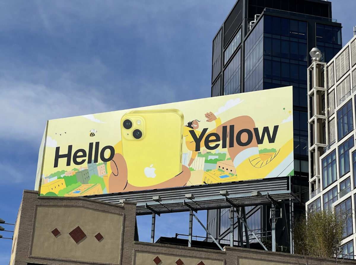
Yellow: The Optimism Color
Yellow is like sunshine in a bottle. It represents joy and energy, making people feel upbeat and cheerful. This bright and refreshing color can definitely put a smile on your face. Think about how a splash of yellow can bring out the positivity and playfulness in a product. Brands looking to spread joy and happiness often choose yellow to make their products feel more fun and enjoyable.

Get 300+ Fonts for FREE
Enter your email to download our 100% free "Font Lover's Bundle". For commercial & personal use. No royalties. No fees. No attribution. 100% free to use anywhere.
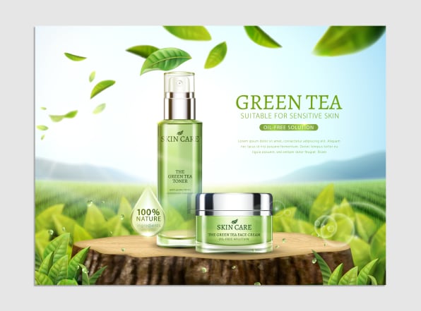
Green: The Calming Influence
Green is all about nature and freshness. When you see green, you might think of peaceful forests or fresh vegetables. It’s a color that can evoke calmness and relaxation, often used to symbolize health, balance, and nature. If a brand wants to promote eco-friendly products or a healthy lifestyle, green is the go-to. It tells the customer, “We’re natural, and we’re safe.”
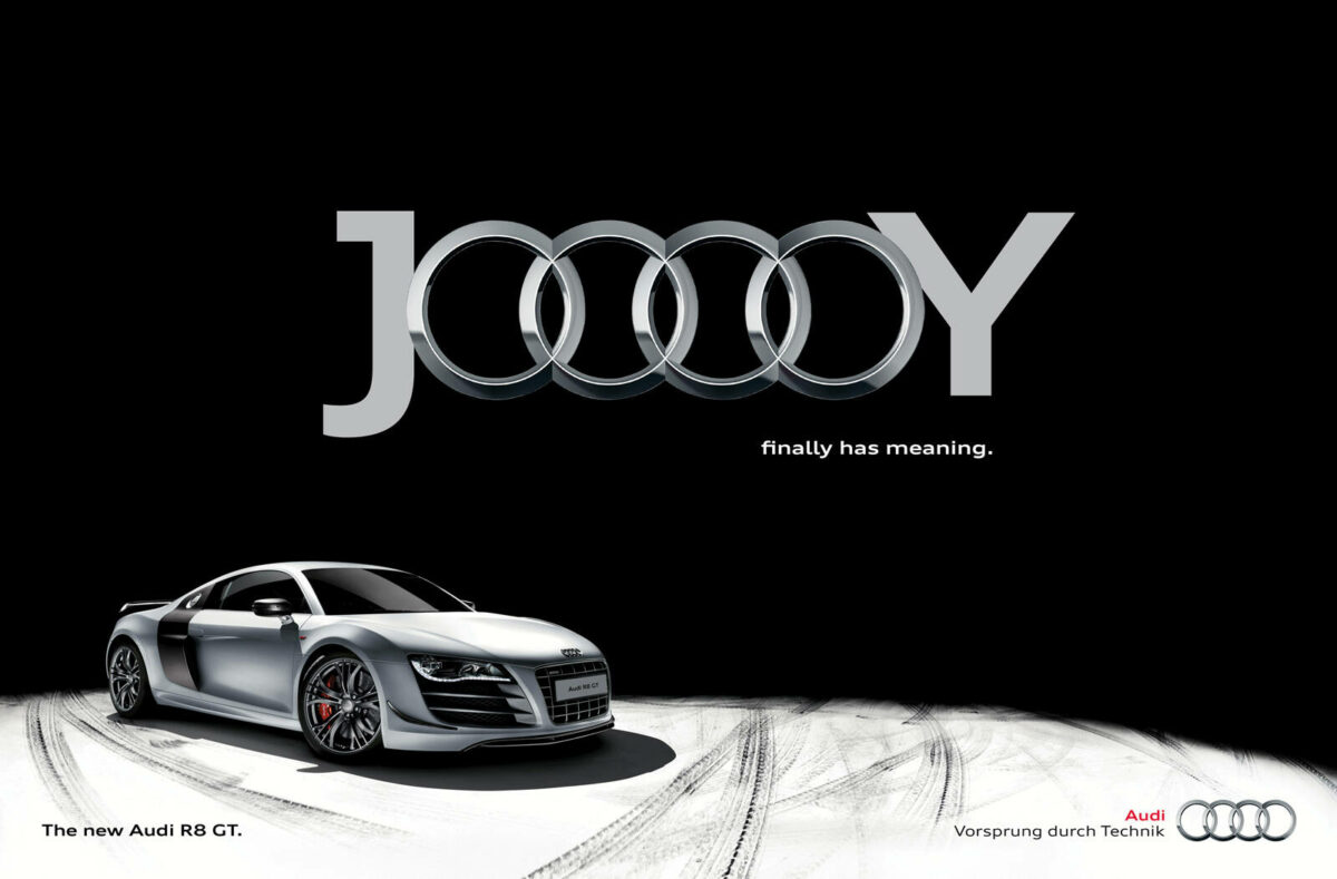
Black: The Luxury Appeal
Black is the epitome of sophistication and elegance. It’s classy, timeless, and often associated with luxury. Many high-end brands use black in their designs to signal exclusivity and status. When combined with simple, sleek design, black communicates a sense of mystery and power. It’s the perfect color for brands wanting to convey luxury and premium quality.
Each color has its own story to tell, impacting how we perceive products and ultimately, our decision to make a purchase. Understanding how these colors affect emotions can be your secret weapon in attracting the right customers and boosting sales. So next time you’re about to choose a product, take a moment to consider how its color might be influencing you!
Practical Applications of Color in Marketing
Color is more than just a visual treat. It’s a crucial tool in marketing, shaping the way we perceive brands and products. Whether you’re designing a logo or crafting an ad, the color choices you make can have a massive impact. Let’s explore how color is practically applied across different marketing areas.
Branding and Color Choice
Brands meticulously choose colors to create a strong identity. Think about Coca-Cola’s vibrant red or the calming blue of Facebook. These aren’t just favorite colors; they’re strategic choices to evoke certain emotions and brand connections.
- Consistency: Brands often use the same colors across all platforms to enhance brand recognition.
- Emotion: Colors like blue can convey trust and dependability, which is why many finance companies use it.
- Cultural Relevance: Understanding cultural differences is vital. While white symbolizes purity in many Western cultures, it’s associated with mourning in some Eastern cultures.
Choosing the right color palette is like choosing the right outfit. It tells people who you are without saying a word.
Color in Advertising
Advertising relies heavily on color to grab attention and drive action. Ever wonder why sale signs are often red? It’s no accident. Red evokes urgency and can push people to make quick decisions.
Here’s how colors drive action in ads:
- Attention-Grabbing: Bright colors like yellow can draw the eye more quickly than duller shades.
- Call to Action: Buttons often use contrasting colors to stand out and invite clicks.
- Emotional Response: Green suggests calmness and growth, making it ideal for eco-friendly products.
Think of color in ads like a spotlight, directing where you want your audience to look and what you want them to feel.
Color and Website Design
In website design, color is just as important. It not only enhances the look but also affects usability and user experience.
- Navigation Aid: Different colors can help distinguish between sections and guide users smoothly through content.
- Mood Setting: Earthy tones can create a warm, inviting feel, while cool colors bring a modern, sleek touch.
- Accessibility: High contrast combinations improve readability and ensure that content is accessible to all users, including those with visual impairments.
Website color schemes are like road signs on a journey. They show users where to go and how to feel along the way.
By thinking like a painter with a purpose and using the right colors, marketers can tell powerful stories that connect with customers at a glance.
Understanding Color Psychology
Color isn’t just for decoration—it’s a silent language that speaks to our deepest instincts and emotions. When you’re shopping, have you ever wondered why certain products catch your eye more than others? That’s the magic of color at work, subtly guiding our feelings and decisions.
Definition of Color Psychology
Color psychology is the study of how colors influence human emotions and behavior. This field reveals that different hues can evoke specific responses. For instance, red can make us feel more energetic or even raise our heart rate, while blue often provides a sense of calm and trust. In the world of marketing, businesses harness the power of colors to sway consumer choices. Did you know that a color can be the reason you pick up a product or engage with a brand? It can all boil down to how a color makes you feel at that moment.
- Red: This color often symbolizes passion and urgency, making it popular in clearance sales.
- Blue: Known for its calming effect, it’s widely used by banks and businesses to convey trust and reliability.
- Green: Associated with health, tranquility, and nature, frequently used in stores to relax customers.
- Yellow: Evokes happiness and warmth, but should be used sparingly as it can also trigger anxiety.
Historical Context
The roots of color psychology in marketing stretch back to the early 20th century when marketers began studying the effect of colors on consumer choices. During this era, businesses started noticing patterns—red encouraged impulse buying, while blue built trust. These early insights led brands to fine-tune their advertising and product design strategies.
Think of iconic brands like Coca-Cola; they’ve used their signature red for decades to grab attention and make their brand feel lively and exciting. Marlboro’s red packaging may not only stand for boldness but also aims to leave an unforgettable imprint on the consumer’s mind. These choices weren’t just about aesthetics—they were tactical maneuvers designed to connect emotionally with consumers.
The understanding of color effects has evolved, yet the core principles remain. Today, with an array of research tools at marketers’ disposal, we better appreciate how nuanced and powerful color can be. Have you noticed a brand that uses colors in ways that really resonate with you? That’s color psychology in action, enticing you to explore, engage, and eventually, purchase.
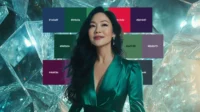
Cultural Variations in Color Meaning
When we think about colors, we often associate them with certain feelings or ideas. But what if I told you that these meanings aren’t the same everywhere? Across the globe, colors can speak different languages, reflecting various cultural histories and traditions. Understanding these variations is crucial, especially if you’re planning to market your product internationally.
Color Perception in Different Cultures
Colors can convey multiple meanings depending on where you are. Let’s take the color red as an example. In Western cultures, red is often seen as the color of passion, excitement, and sometimes, danger. But hop over to China, and red symbolizes good fortune and joy—a color that’s prominently featured in weddings and New Year celebrations.
Here’s a snapshot of how colors can be perceived differently:
- Black:
- Western cultures see black as a color of mourning and elegance.
- In Africa, it can symbolize maturity and masculinity.
- White:
- Associated with purity and peace in Western cultures.
- In Eastern cultures like China and Korea, white is often linked to death and mourning.
- Green:
- Represents nature and harmony widely, but in Indonesia, it can signify forbidden territory.
Such variations highlight how ingrained cultural symbols can be, influencing interpretations beyond just aesthetics.
Implications for Global Marketing
Understanding these cultural nuances can be the difference between a marketing hit or a miss. As brands reach beyond borders, being color-conscious is more vital than ever. Here are some actionable strategies:
- Research Before Launch: Don’t assume that a color popular in your home country will resonate abroad. Dig into color preferences and avoid misunderstandings.
- Test Locally: Whether you’re introducing a new product or an advertisement, conduct local tests. This way, you gather real feedback on color reactions.
- Be Flexible: Adapt your brand’s color schemes to suit local preferences. It might mean tweaking a logo color in certain markets or customizing packaging.
- Educate Your Team: Make sure your marketing team understands the importance of cultural variations in color perception. Workshops or training can be beneficial.
Imagine colors as the silent language of marketing—one that doesn’t need words but speaks volumes through shades and hues. By tuning into these cultural conversations, businesses won’t just sell products; they’ll craft connections that transcend borders.
Case Studies
Colors can significantly influence consumer behavior and purchase decisions. From vibrant reds that stir excitement to calming blues that build trust, brands strategically use colors to their advantage. Let’s explore a few successful campaigns and some not-so-successful ones to understand how color choices can make or break a marketing strategy.
Successful Color Strategies
Some brands have mastered the art of choosing the right colors, enhancing their identity, and boosting sales. Here are a few examples:
- Coca-Cola’s Iconic Red: Coca-Cola’s choice of bold red evokes excitement and energy. This color aligns perfectly with the brand’s image of being refreshing and lively. Over the years, the red has become synonymous with Coca-Cola, creating a powerful brand recall.
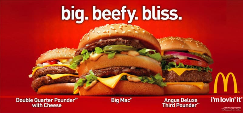
- McDonald’s Golden Arches: The familiar golden arches of McDonald’s are not just about architectural design. The yellow color is associated with happiness and optimism. Combined with red, these colors stimulate appetite, making them a perfect choice for a fast-food giant.
- Tiffany & Co. – The Tiffany Blue: Tiffany’s signature blue color represents luxury and exclusivity. The distinctiveness of this hue has been a significant factor in building a prestigious brand image. This specific blue is so unique that it has been trademarked by the company.
These brands show how strategic color choices do more than adorn packaging—they weave into the brand’s identity and can be pivotal in marketing efforts.
Lessons Learned from Failure
While some brands thrive with their color palettes, others have learned the hard way. Poor color choices can send the wrong message or fail to connect with the audience, leading to disappointing results.
- Tropicana’s Packaging Redesign: In 2009, Tropicana decided to revamp its packaging. The aim was modernization, but the redesign led to a massive sales drop. The new packaging, which featured a more muted color scheme, confused customers, eroding brand recognition. Tropicana quickly reverted to its older design to regain lost ground.
- Cultural Missteps in Color Choice: In another case, a company used green packaging for a product in China, unaware that green holds cultural significance and isn’t associated with their product type. Sales were poor until they switched to a more culturally appropriate color.
These examples serve as reminders that understanding both your brand and your audience’s cultural background is essential. A misstep in color selection can disrupt brand recognition and alienate consumers, illustrating how crucial it is to get colors right in any marketing strategy.
As you can see, color is not just a visual tool; it is a powerful force in marketing. It can evoke feelings, provoke actions, and even sometimes—if misused—deter potential customers.
Conclusion
Choosing the right color can significantly influence buying behavior. Research consistently shows that colors like red and blue can trigger impulse purchases and convey trust, respectively. Red captures attention, creating urgency, while blue fosters a sense of reliability and calm. Implementing these insights in your marketing strategy can enhance engagement and drive sales.
Consider how these colors align with your brand message and audience preferences. Whether you’re crafting an ad or designing a storefront, mindful color selection can set the stage for success.
What colors do you associate with your favorite brands? Share your thoughts and watch your marketing efforts flourish!