In this article:
- What Is Microtypography?
- Why Microtypography Is Important in Web Design
- Tips for Implementing Microtypography
- Common Microtypography Mistakes to Avoid
- The Power of Microtypography in Design
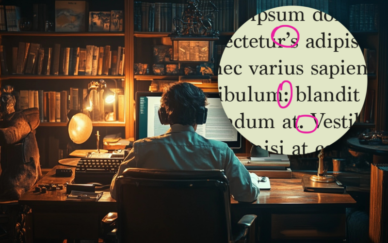
Microtypography is the art of perfecting the smaller details in brand design. Many people might think it’s a waste of time since most designers would rather focus on making eye-catching graphics. However, professional typographers and typeface designers will tell you the importance of paying attention to the often-overlooked details.
I have always believed that emphasizing marks improves typographic communication. With microtypography, you can take your designs to the next level and provide an exceptional reading experience.
What Is Microtypography?
When I first started learning about typography, I thought it was all about font choices, text size and layout. However, I quickly realized that typography is more than the big picture — it is also about the finer details. This is where microtypography comes into the picture. It focuses on the smaller adjustments that enhance text readability and visual harmony, such as:
- Kerning and tracking
- Word spacing
- Line height
- Punctuation placement
I essentially think of it as the behind-the-scenes part of the design. Although these tweaks are small, they can turn any ordinary text block into something that feels effortless to read.
Microtypography handles the granular details, ensuring everything aligns perfectly and flows naturally. For example, if you are designing a blog, the right choice of kerning can make your text appear more balanced and professional. Pair that with carefully chosen line heights and word spacing, and suddenly, your page invites readers to linger.
Microtypography works to remove friction, making the reading experience seamless without calling attention to itself. Approximately 96% of adults in the U.S. use the internet to find information, and making small changes in typography can make all the difference in a site’s usability. Even if they cannot articulate why, microtypography is what improves how your audience consumes a website’s content.
Why Microtypography Is Important in Web Design
Microtypography might focus on the minor details, but its impact on design is anything but small.

Get 300+ Fonts for FREE
Enter your email to download our 100% free "Font Lover's Bundle". For commercial & personal use. No royalties. No fees. No attribution. 100% free to use anywhere.
Enhances Readability and Accessibility
Microtypography can enhance everyone’s reading experience. Slightly changing the line height or word spacing can mean the difference between inviting text and what feels like a chore to read. This attention to detail becomes even more critical when you consider how diverse your audience is — what works for one reader may not work for another.
A study found that reading speed can increase readability by up to 35% with different fonts. By fine-tuning typography to suit the context and audience, you ensure the text performs well. Whether designing for people with visual impairments or making your content accessible across devices, microtypography can make your design engaging to everyone.
Makes Design Visually Pleasing
Microtypography brings balance to your designs. Every element of text — from the letter spacing to punctuation alignment — contributes to the overall aesthetic of a design. Refining these details allows you to build a seamless look that pulls your entire product together.
When I encounter a website with uneven kerning or inconsistent leading, I see how much it disrupts my page experience and creates visual tension. Carefully calibrated typography guides the eye effortlessly, ensuring your audience focuses on the message. As a result, you can improve the functionality of your design while giving it a professional look.
Supports Branding
Your typography choices directly reflect your brand’s identity. Microtypography can reinforce that by ensuring every detail of your text feels intentional and cohesive. For instance, a slight increase in the letter spacing of a logo can communicate professionalism and trustworthiness.
I like to think of microtypography as the voice of a brand. A design with meticulous attention to detail sends a message of care and precision, aligning with the values a company wants to convey. Adjusting these elements lets you build trust and recognition through a visually appealing design.
Increases a Business’s Value
A well-designed website is an intangible asset that can increase your business’s tangible assets and overall worth. Since microtypography elevates your site’s design and functionality, it can make it more appealing to users and more valuable to your company. A site that’s easier to read enhances the overall user experience, eventually increasing conversions and customer loyalty.
A polished website reflects positively on your business, boosting its marketability and perceived value. This is especially important in a competitive online marketplace since small improvements can greatly impact a company’s bottom line.
Improves Site Usability
Users can navigate your content effortlessly when text is easy to read and visually well-structured. Proper kerning, line spacing and word alignment work together to ensure users focus on the information they seek without unnecessary distractions.
Microtypography becomes even more critical in responsive design. Text that looks great on a desktop could look cramped or awkward on a smaller mobile screen.
Over 54% of the world’s website traffic comes from mobile devices, so attention to detail becomes even more critical when considering screen sizes. Incorporating microtypography that adapts to different devices ensures your site remains user-friendly.
Tips for Implementing Microtypography
Perfecting microtypography requires a mix of technical skill and creativity, but the results are worth the effort.
1. Use Proper Spacing
Spacing is one of the more critical factors, as it directly influences readability and aesthetics. Start by fine-tuning the space between individual letters to ensure a balanced look. Visualize making each letter look equal.
When trying to achieve an equal amount of space, I think of sand filling those empty areas between the letters. After kerning, I ask myself whether the volumes of sand would look equal.
You may need tighter kerning for larger headlines, while body text often benefits from a looser approach for readability. Inconsistent spacing can be distracting. However, paying attention to these details will make the text layout natural for your audience.
2. Consider Leading Carefully
Leading is the vertical space between lines of text. Too little makes words feel cramped, while too much can create large enough gaps to disrupt the reader’s flow. The key is finding a balance that matches the typeface, font size and the design’s context.
For example, smaller text generally requires slightly looser leading, especially for longer paragraphs. In contrast, headings or callouts often use tighter leading to create a bold, impactful look.
As you adjust leading, consider how it interacts with other elements on the page, like images or white space. Testing different settings will help you create a pleasing composition layout.
3. Mind Punctuation and Alignment
Proper punctuation spacing ensures your text results in better communication. For instance, overly tight spacing around commas and periods could cause readers to skip over them and read into the next sentence. This scenario disrupts the flow of reading and may cause a misunderstanding of the message you are sending.
Alignment is equally important in maintaining a clean design. Whether you are justifying text or using a ragged-right alignment, make sure your lines break naturally and avoid gap or hyphenation issues.
Paying attention to these subtleties will make the typography feel intuitive to the reader. Precision in these areas may seem tedious, but this level of care makes great work.
4. Leverage Tools and Plugins
Incorporating microtypography into your designs can be easy when you decide to use tools and plugins to help. Various products can fine-tune components, saving you time while guaranteeing high-quality results. For example, typographic-specific plugins for design software allow you to experiment with letter spacing or alignment.
Beyond improving your workflow, they also help you cater to user preferences. A survey on digital reading habits revealed that 47% of readers prefer personalized typography.
With plugins that enable font resizing, line spacing adjustments or even dark mode compatibility, you can provide more options for your target audience. Technology helps create user-centric design, so using them can give people control over their reading experience.
5. Test on Multiple Devices
Regardless of how perfect your typography looks on a desktop screen, testing your design across different devices is still essential. For example, larger text can be harder to read on smartphones. Therefore, typography should adjust automatically according to the user’s device.
Start by previewing your design on different screen sizes and resolutions to catch issues. For example, you could look for inconsistencies in line heights or poorly adjusted kerning. Tools like browser simulators or device testing platforms will identify and resolve these discrepancies for you.
Common Microtypography Mistakes to Avoid
Even with the best intentions, small microtypography errors can detract from your design’s quality.
Overtightened Kerning or Tracking
While tightening the letter or word spacing can make text appear clean and modern, going too far can compromise readability. Overtightened kerning creates crowded letters that make things difficult to distinguish. Always balance aesthetics with functionality by testing different spacing settings and considering how the words will look at various sizes.
Ignoring Responsive Typography
Typography that looks great on a desktop can fall apart on mobile devices if improperly adjusted. Neglecting to make text responsive can result in cramped layouts, illegible fonts or misaligned elements. Avoid this by using scalable units like ems or rems and testing your design to ensure balance everywhere.
Improper Line Heights
Setting the wrong line height or leading can disrupt the flow of content. Text with insufficient leading increases reading difficulty, while excessive leading distracts the eye. Avoid this by adjusting line heights to match the font size and purpose of the text so the flow is more natural.
Overusing All Caps or Small Caps
While all caps or small caps can create emphasis, overusing them can make your text feel aggressive or hard to read. These styles are more effective for short headlines or callouts but can quickly become overwhelming in body text. Use them sparingly and always prioritize readability over visual impact.
The Power of Microtypography in Design
Microtypography seems like a minor design aspect, but it can be highly effective at improving the user experience. Paying attention to the finer details lets you create designs that are visually stunning and pleasing to the user. However, it is all about the details. When you prioritize these micro-adjustments, your audience will thank you.


