In this article:
- Here are the best, most legible fonts for signs right now:
- Key Factors in Choosing Sign Fonts
- Font Selection by Sign Type
- Design Best Practices
- Common Mistakes to Avoid
- Making It Work
- The Bottom Line
When it comes to designing signs, there’s one decision that can make or break your entire project: choosing the best fonts for signs.
Think about it – you could have the most eye-catching design, the perfect color scheme, and premium materials, but if people can’t read your sign from a distance, none of that matters. And with hundreds of thousands of fonts available today, picking the right one can feel completely overwhelming.
Here’s the truth: while creativity is important in design, choosing fonts for signs isn’t the time to get wildly experimental. The most successful signs almost always rely on tried-and-true fonts that prioritize readability over novelty. After all, a sign has one primary job – to be read.
Here are the best, most legible fonts for signs right now:
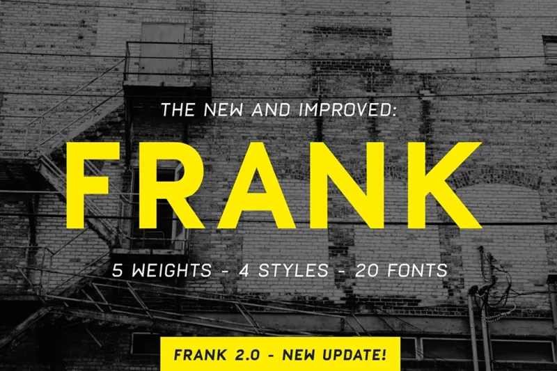
Frank
Frank is a modern sans-serif typeface with a squarish appearance. Its clean lines and geometric shapes make it ideal for contemporary designs, particularly in digital interfaces and branding projects.
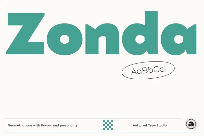
Zonda
Zonda is a geometric sans-serif font with a strong display character. Its clean, modern aesthetics make it perfect for headlines, logos, and branding projects that require a bold, contemporary look.

Get 300+ Fonts for FREE
Enter your email to download our 100% free "Font Lover's Bundle". For commercial & personal use. No royalties. No fees. No attribution. 100% free to use anywhere.
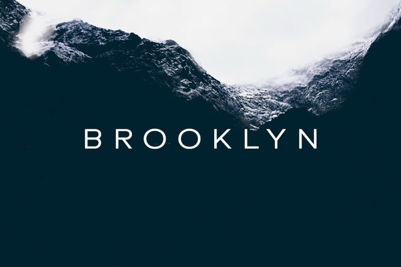
BROOKLYN
BROOKLYN is a minimal geometric sans-serif typeface designed for headings and decorative use. Its clean lines and balanced proportions make it an excellent choice for modern, minimalist designs in both print and digital media.
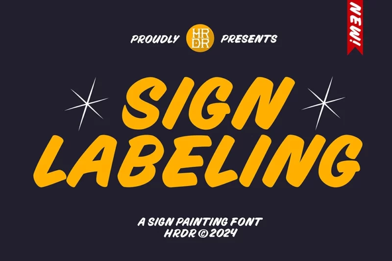
Sign Labeling
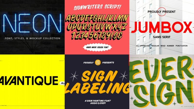
Sign Labeling is an elegant script font that mimics hand-painted signage. Its fluid strokes and vintage charm make it perfect for creating designs with a handcrafted, artisanal feel, ideal for branding, packaging, and editorial projects.
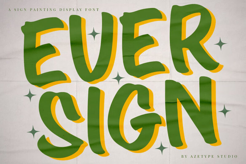
Ever Sign
Ever Sign is a handwritten script font designed to emulate sign painting. Its authentic, hand-crafted appearance makes it ideal for projects requiring a personal touch, such as branding, packaging, and vintage-inspired designs.
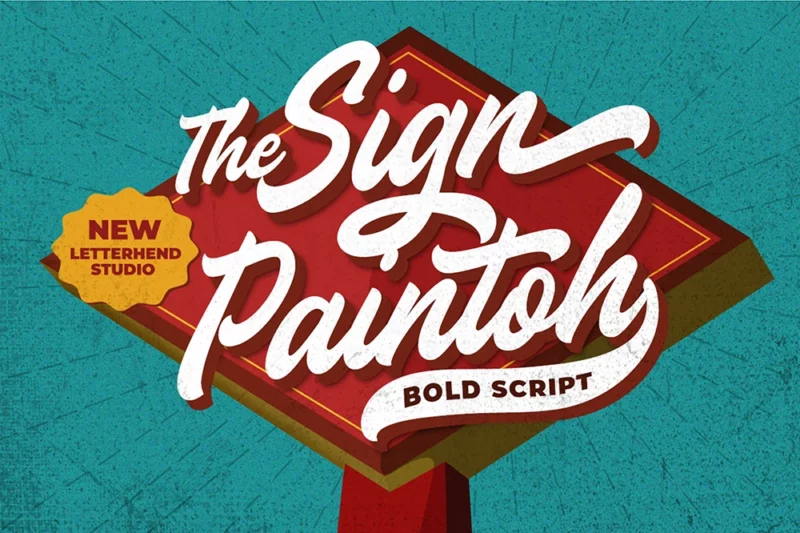
The Sign Paintoh
The Sign Paintoh is a retro-inspired script font that captures the essence of vintage sign painting. Its nostalgic charm and handcrafted feel make it perfect for creating designs with a classic, timeless appeal.
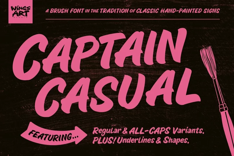
Captain Casual
Captain Casual is a sans-serif font with a hand-painted quality. Its relaxed, approachable style makes it suitable for casual branding, signage, and designs that require a friendly, personable touch.
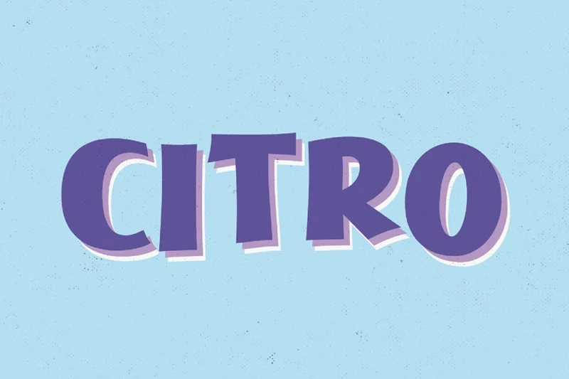
Citro
Citro is a playful, vintage-inspired sign painter typeface. Its decorative nature and whimsical character make it ideal for creating eye-catching headlines, logos, and designs that require a touch of nostalgia and fun.
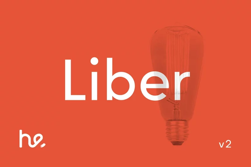
Liber v2
Liber v2 is a geometric sans-serif font inspired by classic typefaces like Futura. Its clean lines and balanced proportions make it versatile for both body text and headlines, suitable for modern and minimalist design projects.
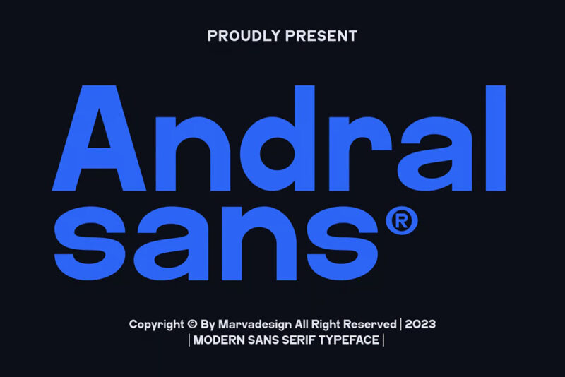
Andral
Andral is a modern sans-serif font with a clean and professional appearance. Its versatile design makes it suitable for a wide range of applications, from corporate branding to digital interfaces and editorial layouts.
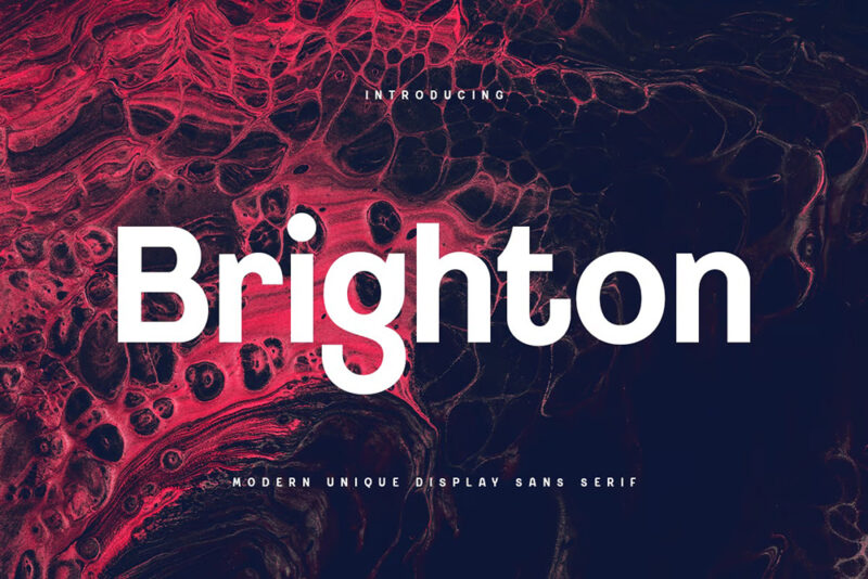
Brighton
Brighton is a unique display sans-serif font with a modern edge. Its distinctive character and strong presence make it ideal for creating impactful logos, headlines, and branding materials that demand attention.
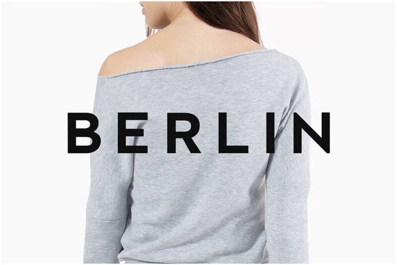
BERLIN
BERLIN is a minimal, geometric sans-serif typeface designed for both print and web use. Its clean lines and modern aesthetics make it perfect for contemporary designs, particularly in digital interfaces and minimalist branding projects.
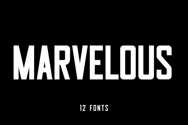
Marvelous
Marvelous is a condensed sans-serif font that offers a bold, space-efficient design. Its narrow proportions make it ideal for headlines, posters, and designs where space is at a premium while maintaining strong legibility.
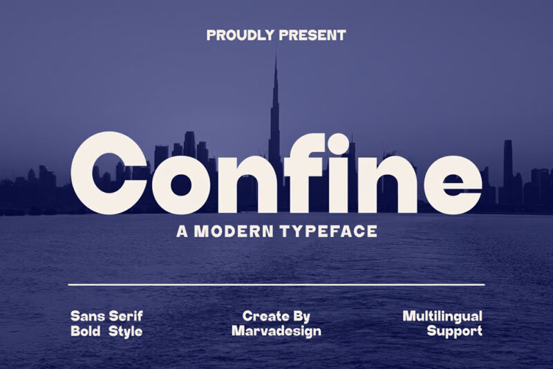
Confine
Confine is a modern sans-serif font with a sleek and refined appearance. Its clean lines and balanced proportions make it suitable for a wide range of design applications, from branding to editorial layouts.
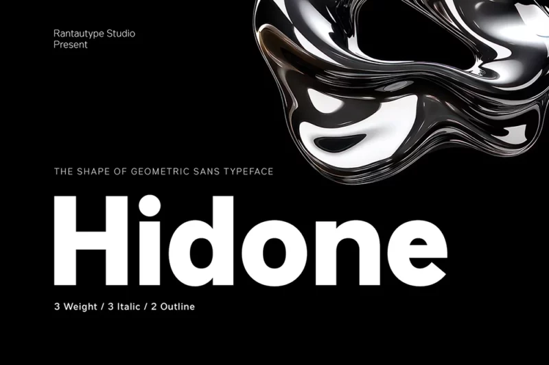
Hidone
Hidone is a versatile sans-serif font family designed for branding and corporate use. Its clean, professional appearance and range of weights make it suitable for both body text and headlines across various media.
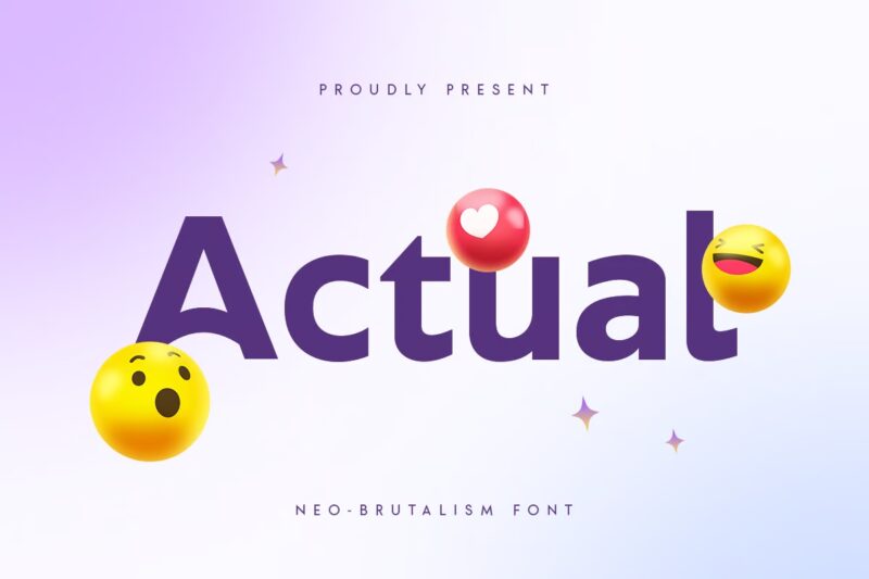
Actual
Actual is a neo-brutalist font inspired by Helvetica. Its bold, no-nonsense design makes it perfect for creating impactful headlines and designs that embrace the raw, honest aesthetic of brutalism.
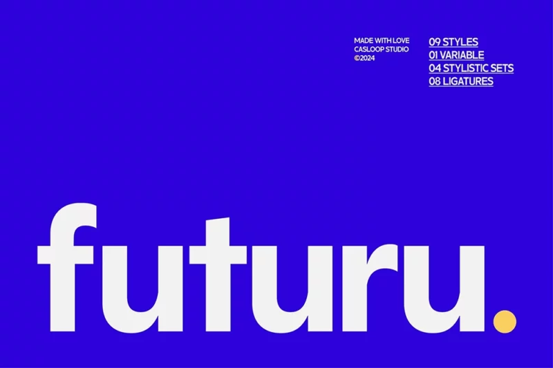
Futuru
Futuru is a neo-grotesque variable font designed with a futuristic, tech-oriented aesthetic. Its modern appearance and variable capabilities make it ideal for cutting-edge designs and digital interfaces targeting younger audiences.
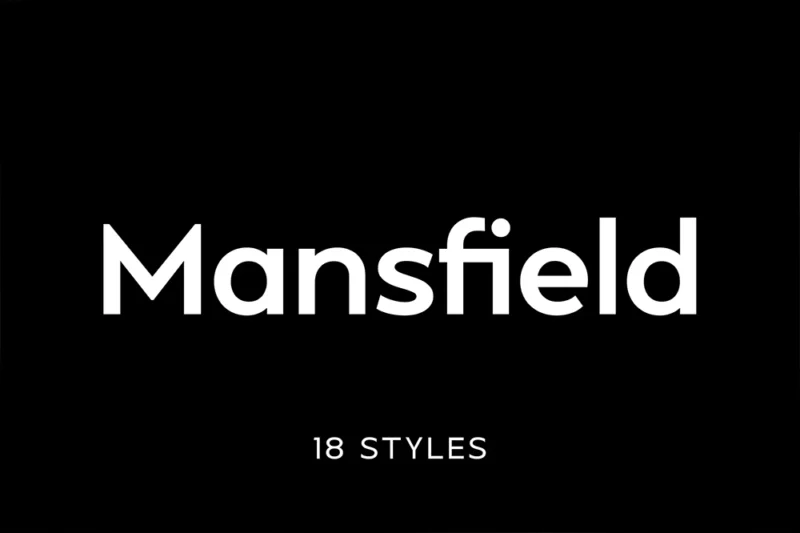
Mansfield
Mansfield is an elegant geometric sans-serif font with subtle serif-like details. Its refined design makes it suitable for high-end branding, editorial layouts, and designs that require a touch of sophistication.
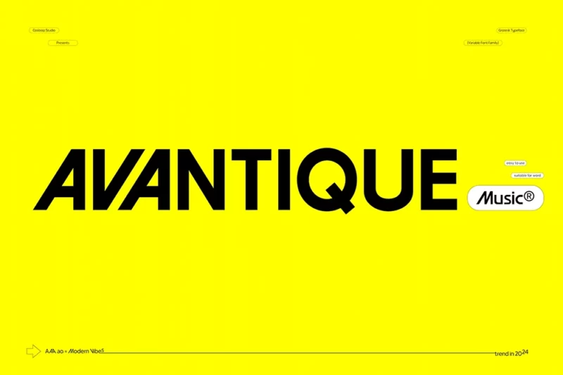
Avantique
Avantique is a youthful geometric grotesk font inspired by 60s and 70s design. Its retro charm and playful character make it perfect for creating designs with a vintage feel, particularly for fashion, music, and lifestyle brands.
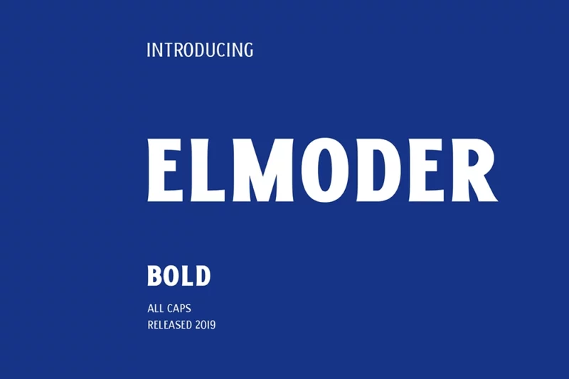
ELMODER BOLD
ELMODER BOLD is a striking display font that combines sans-serif and serif elements. Its bold presence and unique character make it ideal for creating impactful headlines and logos that demand attention.
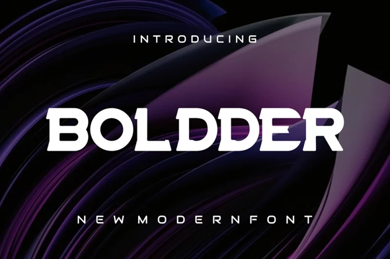
Boldder
Boldder is a powerful serif font with a strong display character. Its bold letterforms and distinctive serifs make it perfect for creating eye-catching headlines and designs that require a confident, assertive presence.
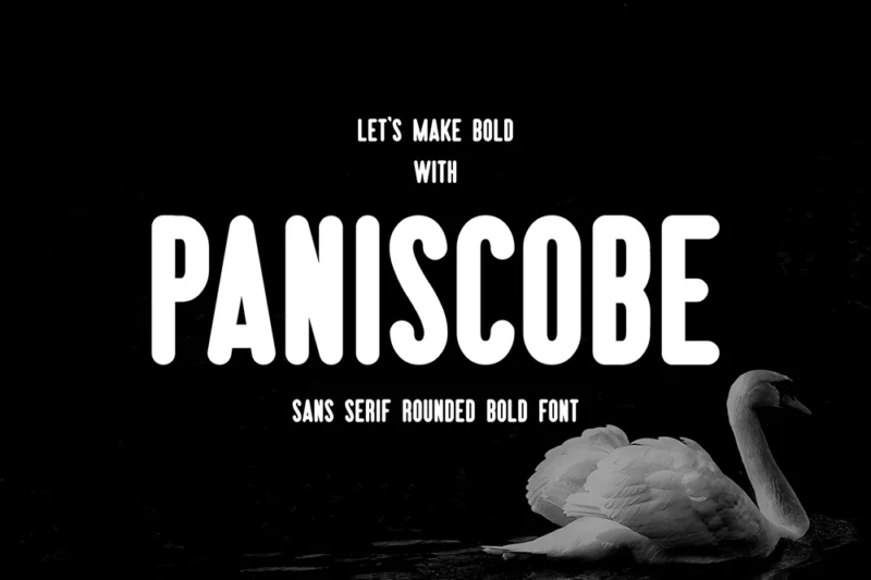
Paniscobe Bold
Paniscobe Bold is a robust sans-serif font with a strong, confident presence. Its bold weight and clean design make it ideal for creating impactful headlines, logos, and designs that need to make a bold statement.
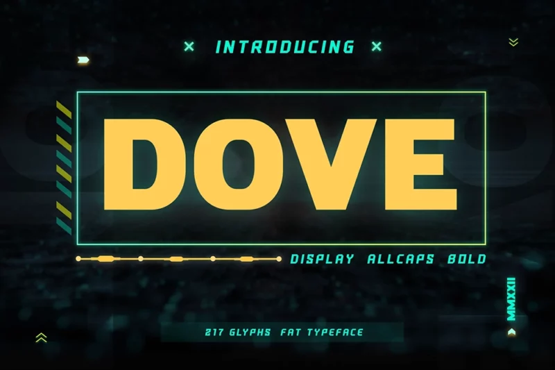
Dove
Dove is a bold display sans-serif font with a modern, clean aesthetic. Its strong presence and balanced proportions make it perfect for creating eye-catching headlines and logos across various media.
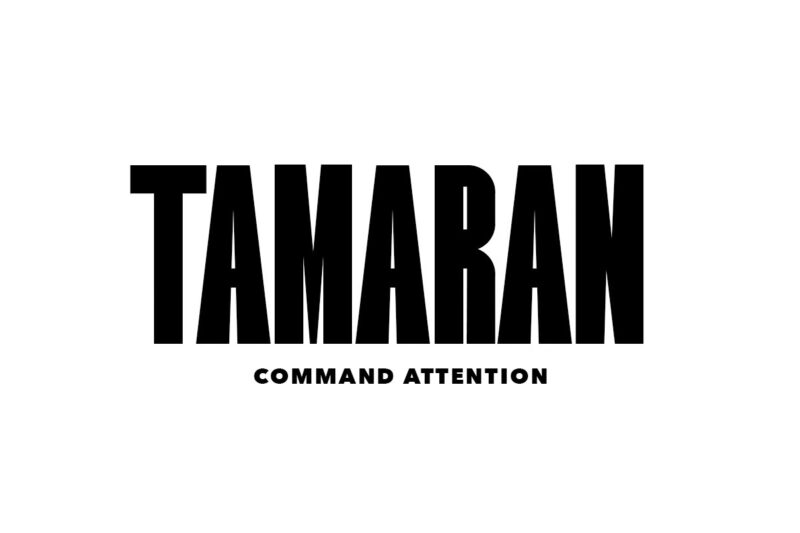
Tamaran
Tamaran is a super-bold display sans-serif font designed to make a strong impact. Its hefty weight and confident character make it ideal for creating powerful headlines, posters, and designs that demand immediate attention.
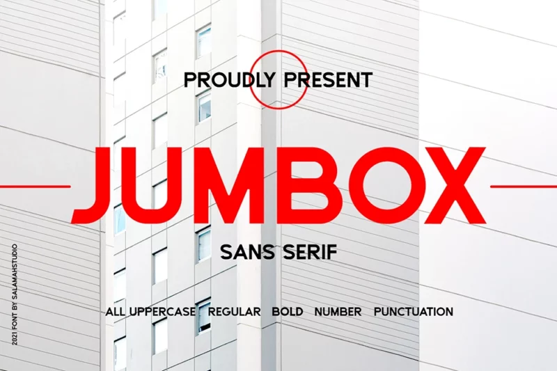
Jumbox
Jumbox is a bold sans-serif font with a strong, modern character. Its clean lines and robust design make it perfect for creating impactful logos, headlines, and designs that require a confident, contemporary presence.
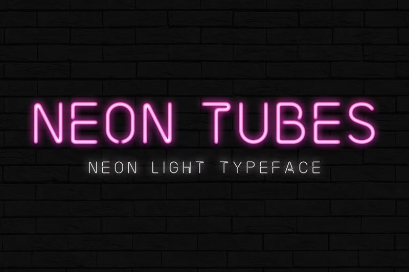
Neon Tubes – Neon Light Font
This font mimics the look of neon tube lighting, perfect for creating eye-catching displays and signage. Its glowing appearance adds a vibrant, retro-futuristic feel to designs, making it ideal for nightlife-themed projects or anything requiring a bold, luminous aesthetic.
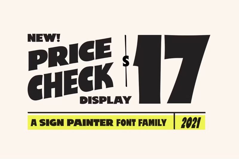
Price Check – Sign Painter Display
Price Check is a handcrafted display font that emulates the style of traditional sign painting. Its bold, confident strokes and slight irregularities give designs an authentic, vintage feel, making it perfect for creating eye-catching headlines or rustic branding materials.
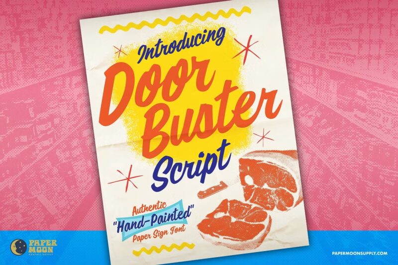
Doorbuster Script-Sign Painter Font
This script font captures the fluid, energetic style of hand-painted signage. Its bold strokes and dynamic flow make it ideal for creating attention-grabbing headers or promotional materials. The font’s vintage charm adds a touch of nostalgia to any design project.
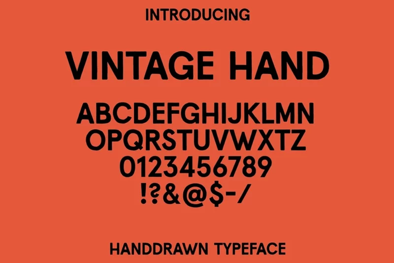
Vintage Hand typeface
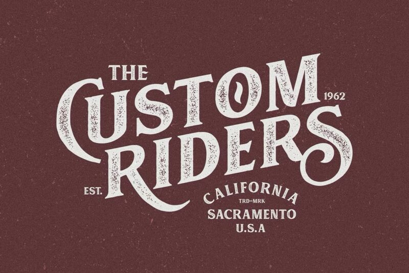
Vintage Hand is a typeface that emulates the look of hand-drawn lettering from bygone eras. Its imperfect, slightly rough edges give designs an authentic, artisanal feel. This font is perfect for creating a nostalgic atmosphere in branding, packaging, or editorial designs.
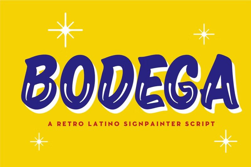
Bodega
Bodega is a script font that exudes a casual, friendly vibe with its smooth, flowing lines. Its relaxed style makes it perfect for branding projects, particularly in the food and beverage industry. The font’s approachable character can add a touch of warmth and personality to any design.
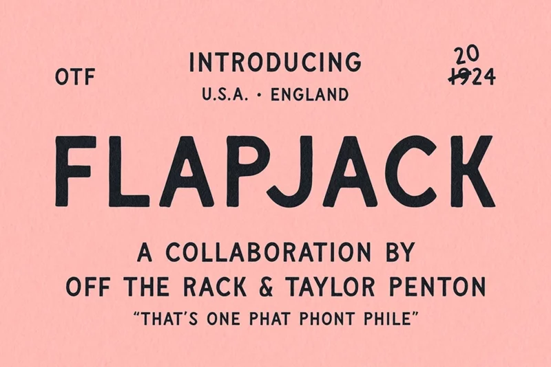
Flapjack | Vintage Hand Drawn Font
Flapjack is a sans serif font with a hand-drawn, vintage aesthetic. Its slightly uneven lines and rounded edges give it a charming, approachable feel. This font is ideal for creating designs with a rustic or retro vibe, perfect for packaging, logos, or headings in editorial layouts.
Muara Rough
MUARA ROUGH is a font that embraces imperfection with its textured, weathered appearance. Its rough edges and uneven strokes add character and depth to designs. This font is excellent for creating an aged, distressed look in logos, posters, or any project requiring a rugged, authentic feel.
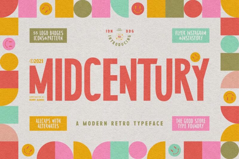
MidCentury Typeface + Extras
This serif font captures the essence of mid-20th century design with its clean lines and subtle vintage touches. Its versatile character makes it suitable for both body text and headlines. The included extras allow for more creative freedom in crafting authentic mid-century inspired designs.
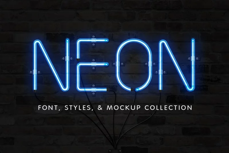
Neon Font & Sign Collection
This collection offers a variety of neon-inspired fonts and sign elements. The glowing, vibrant aesthetic of these fonts makes them perfect for creating eye-catching designs with a retro or nightlife theme. The additional sign elements provide extra versatility for creating complete neon-style compositions.
NeonBlitz – Retro Neon Font
NEONBLITZ is a sans serif font that captures the bold, electrifying essence of neon signage. Its sharp angles and glowing effects create a dynamic, retro-futuristic look. This font is ideal for designs that need to stand out, such as posters, album covers, or any project requiring a vibrant, nostalgic feel.
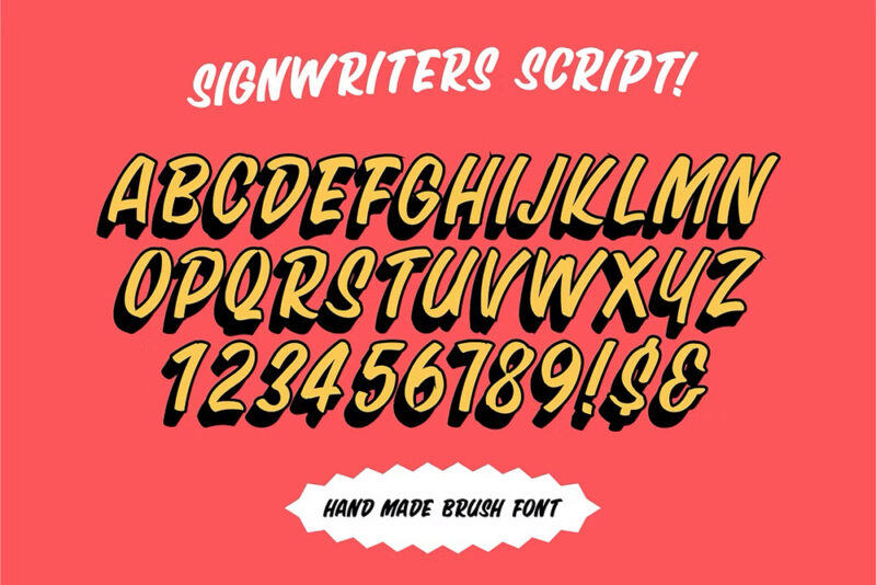
Sign Writers Script
Sign Writers Script emulates the fluid, graceful style of traditional sign painting. Its smooth curves and varying stroke weights give it an authentic, hand-crafted feel. This font is perfect for creating vintage-inspired logos, headlines, or any design that requires a touch of classic elegance.
Key Factors in Choosing Sign Fonts
Before we dive into specific recommendations, let’s talk about what actually matters when choosing a font for your sign.
Readability from a Distance
The 10-foot rule of signage tells us that every inch of letter height gets you about 10 feet of readable viewing distance. But here’s what most people don’t realize: it’s not just about size. The actual design of the font can make or break readability at any scale. Those fancy decorative swirls that look amazing up close? They turn into a blurry mess from across the street.
Brand Consistency Considerations
You probably spent good money on your brand guidelines. And while those guidelines matter, sometimes they need to flex a bit when it comes to signage. If your brand font is a delicate script that looks amazing on business cards, you might need to make some adjustments for your storefront sign. The key is finding a balance between staying true to your brand and ensuring your sign actually does its job.
Usage and Location
Where is your sign going to live? A sign mounted 20 feet high on a building needs different treatment than one sitting at eye level in your lobby. Exterior signs face weather, changing light conditions, and distance challenges. Indoor signs can often get away with more delicate or detailed fonts since people will be viewing them up close in controlled lighting.
Legal Requirements and Standards
Here’s something a lot of people forget until it’s too late: there are actual rules about this stuff. ADA requirements for signage are no joke, and if you’re creating any kind of wayfinding or informational signage, you need to make sure your font choices comply with accessibility standards. Breaking these rules isn’t just bad practice – it can cost you real money in fines and required replacements.
Font Selection by Sign Type
Let’s break this down by the most common types of signs you might be creating:
Outdoor Signs
For outdoor signage, contrast and simplicity are your best friends. Sans-serif fonts usually win here because they maintain their readability even in poor weather or lighting conditions. Think about how your sign will look:
- In bright sunlight
- On cloudy days
- At dusk or dawn
- During rain or snow
- When viewed from moving vehicles
You want letterforms that stay clear and distinct under all these conditions.
Retail Store Signs
Your store sign is often your first impression on potential customers. Sure, you want it to look good, but more importantly, you want it to work. A good retail sign font should:
- Be visible from both pedestrian and vehicle traffic
- Maintain readability when illuminated (if you’re using lighting)
- Stay consistent with your brand while being practical
- Stand out from neighboring businesses without looking out of place
Digital Signs
Digital displays come with their own set of challenges. Screen resolution, viewing distance, and display time all factor into font selection. You need fonts that:
- Render clearly on LED and LCD displays
- Maintain legibility even on lower-resolution screens
- Work well with dynamic content
- Stay readable during brief exposure times
Design Best Practices
Let’s get practical about implementation. Here are some real-world tips that will help your sign succeed:
Color Contrast
The relationship between your font and background colors can make or break your sign’s effectiveness. The basic rule? Aim for at least a 70% contrast ratio between text and background. But remember – some color combinations that look great on your computer screen might not work as well in real-world conditions.
Spacing and Layout
Good typography isn’t just about the letters – it’s about the space between them. Pay attention to:
- Letter spacing (tracking)
- Word spacing
- Line height (leading)
- Overall composition and balance
When in doubt, give your text a little more breathing room than you think it needs. Cramped text is hard text to read.
Size Calculations
Remember that visibility rule we talked about earlier? Here’s how to actually use it:
- Measure the primary viewing distance to your sign
- Divide that distance by 10
- That’s your minimum letter height in inches
But don’t just hit the minimum – consider going larger if space and budget allow. Nobody ever complained that a sign was too easy to read.
Common Mistakes to Avoid
Let’s talk about what not to do. These are the mistakes I see people make over and over:
Overcomplicating Things
Just because you can use an elaborate font doesn’t mean you should. The best signs often use the simplest fonts. Save the creative typography for your brochures and business cards.
Poor Contrast Choices
Dark gray text on a black background might look sleek in your design software, but it’s practically invisible from 20 feet away. Don’t sacrifice readability for style.
Inappropriate Sizing
That font size that looks perfect on your computer screen? It’s probably too small for your actual sign. Always mock up your design at actual size if possible, or at least view it from the intended viewing distance.
Making It Work
Here are your next steps to make sure your sign actually accomplishes what you need it to:
Testing Before Production
Before you commit to production:
- Print your design at actual size if possible
- View it from the intended distance
- Check it in different lighting conditions
- Get feedback from people who haven’t seen it before
Distance Checks
Step back – way back – from your design. If you can’t read it easily from where your audience will be, neither will they. Test your sign design from multiple angles and distances.
Professional Consultation
If you’re investing serious money in signage, consider working with a sign professional. They deal with these challenges every day and can help you avoid expensive mistakes.
The Bottom Line
Creating effective signage isn’t about following trends or picking the coolest new font. It’s about understanding the basic principles of readability and visibility, then applying them to your specific situation. Start with clarity and functionality, then add style within those constraints.
Remember: the best sign font is one that does its job so well, people don’t even think about the font – they just read the message and take action. That’s what we’re really after here.
Ready to create your sign? Start with these principles, test thoroughly before you commit, and don’t be afraid to keep things simpler than you initially planned. Your future customers (and their eyes) will thank you for it.

