In this article:
- The Most Authentic Old English Fonts for 2026
- What Makes a Font Feel "Old English"?
- Where to Use Old English Fonts (And Where Not To)
- Choosing the Right Old English Font
- Common Old English Font Mistakes
- Frequently Asked Questions
- Wrapping Up
Ah, Old English fonts. They’ve been catching designers’ eyes since long before computers came around. Whether you’re working on a medieval-themed project, creating a traditional beer label, or designing a church bulletin, the right Old English font can transport your audience back centuries.
But here’s the thing: not all Old English fonts are created equal. Some nail that authentic medieval vibe while others… well, let’s just say they look about as authentic as a plastic sword at a renaissance fair.
In this post, we’ll explore:
- The best Old English fonts for authentic medieval designs
- What makes a font truly “Old English”
- How to use these fonts effectively (and where to avoid them)
- Common mistakes to watch out for
- Expert answers to Old English font questions
Let’s dive in!
The Most Authentic Old English Fonts for 2026
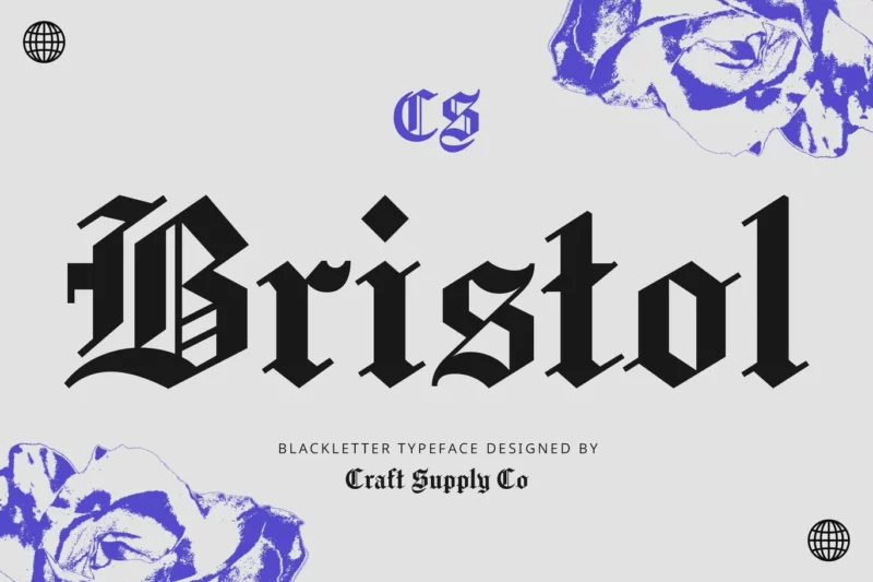
CS Bristol
CS Bristol is a decorative blackletter font that combines classic Gothic styles with modern sophistication. Its intricate letterforms and sharp contrasts make it ideal for creating striking headlines or logos with a touch of historical elegance.
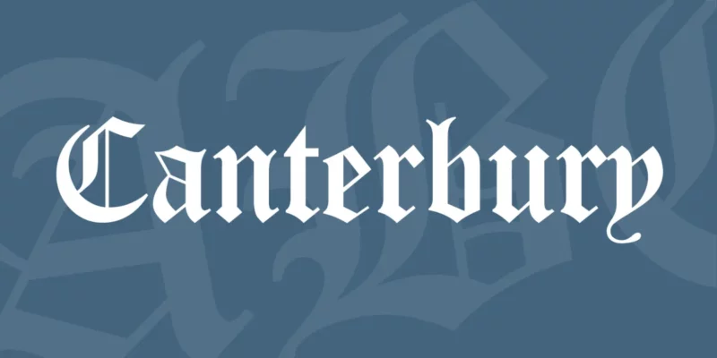
Canterbury

Get 300+ Fonts for FREE
Enter your email to download our 100% free "Font Lover's Bundle". For commercial & personal use. No royalties. No fees. No attribution. 100% free to use anywhere.
Canterbury is a traditional blackletter font that evokes a sense of medieval charm. Its ornate characters and flowing lines make it perfect for historical-themed designs or adding a touch of old-world elegance to contemporary projects.
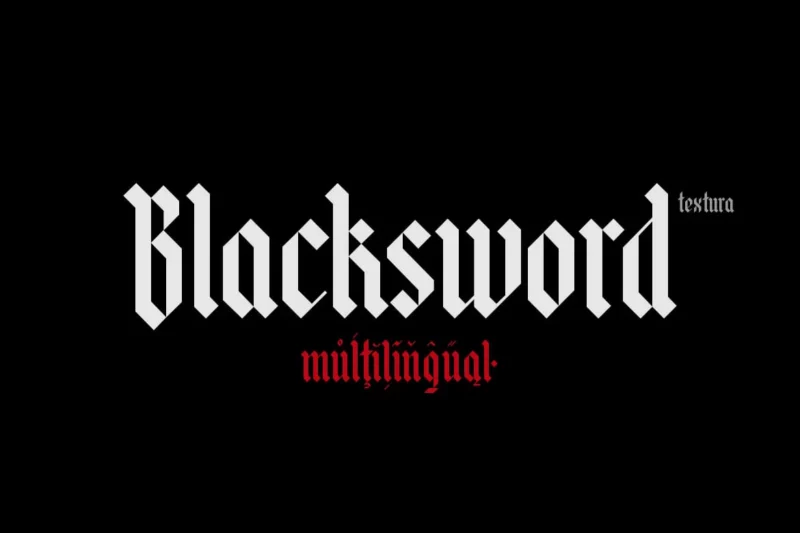
Blacksword
Blacksword is a bold and dramatic Gothic-inspired font that blends blackletter elements with a modern twist. Its strong, sweeping strokes and sharp edges make it an excellent choice for impactful titles or branding that demands attention.
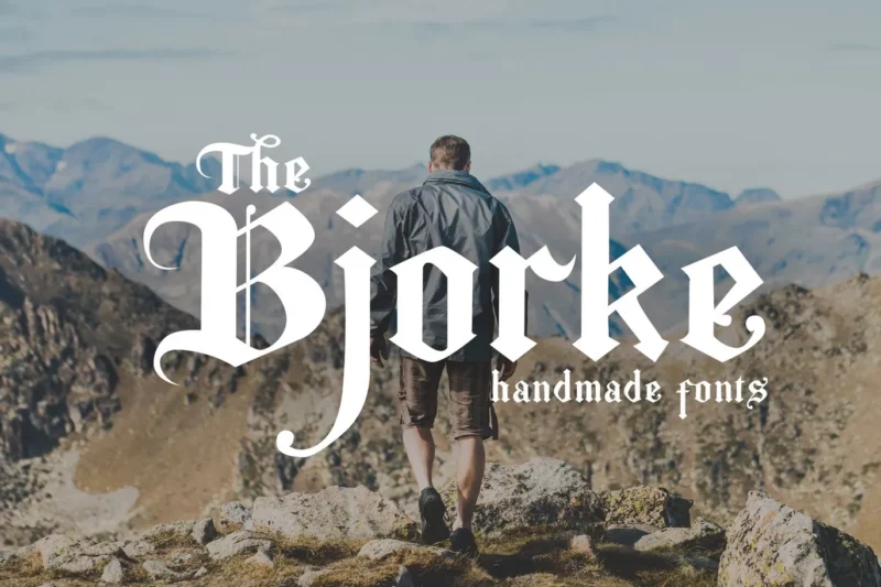
The Bjorke
The Bjorke is a handmade serif font that combines old-world charm with a touch of New York sophistication. Its slightly irregular characters give it a unique, artisanal feel, making it perfect for designs that require a blend of vintage and contemporary aesthetics.
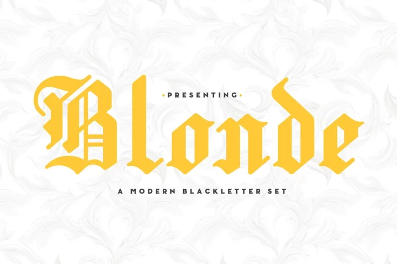
Blonde
Blonde is a modern take on the blackletter style, offering a more refined and elegant approach. Its delicate strokes and balanced proportions make it versatile for both traditional and contemporary design applications, especially in branding and editorial contexts.
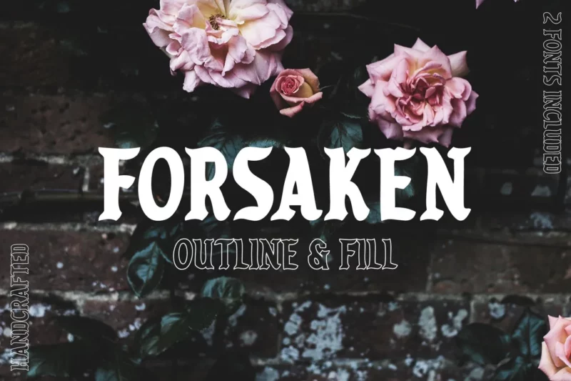
Forsaken
Forsaken is a Gothic-inspired decorative font that exudes a sense of mystery and intrigue. Its intricate details and sharp angles make it ideal for creating atmospheric designs, particularly in the realms of fantasy, horror, or vintage-inspired projects.
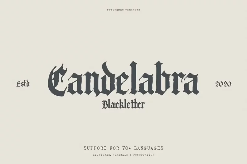
Candelabra
Candelabra is an ornate blackletter font that comes with additional decorative elements. Its elaborate characters and flourishes make it perfect for creating luxurious, high-end designs or adding a touch of grandeur to logos and headlines.
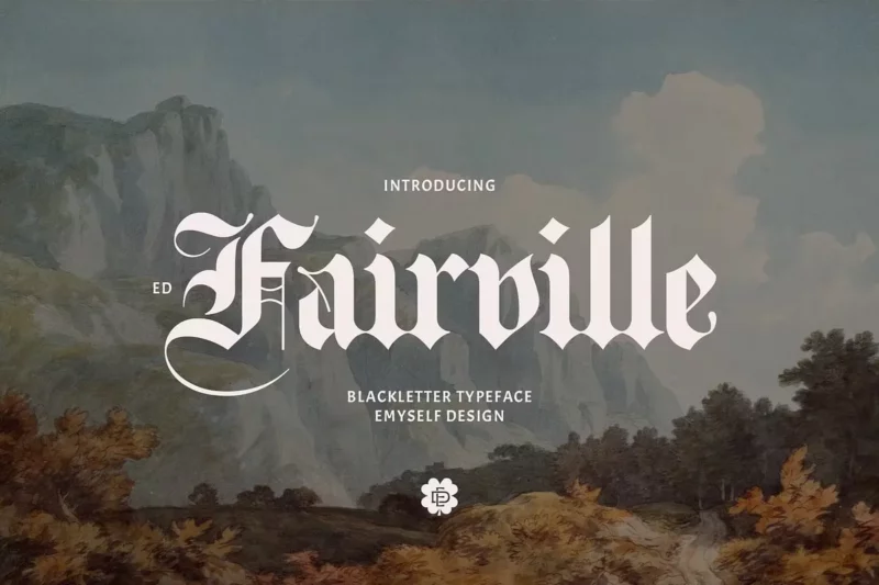
ED Fairville
ED Fairville is a sophisticated blackletter font with a modern twist. Its clean lines and balanced proportions offer a fresh take on the traditional Gothic style, making it suitable for contemporary branding and editorial designs that require a touch of elegance.
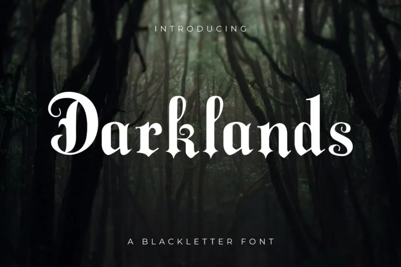
Darklands
Darklands is a bold and dramatic blackletter font that combines Gothic elements with a vintage flair. Its strong character shapes and high contrast make it ideal for creating impactful titles or logos, particularly in designs with a dark or edgy theme.
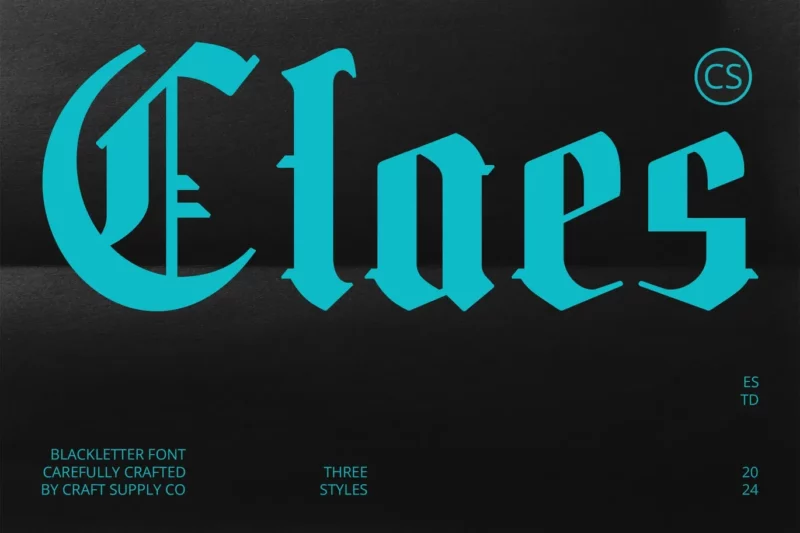
Claes
Claes is an Old English-style font that brings a touch of historical elegance to designs. Its intricate letterforms and balanced proportions make it perfect for formal invitations, certificates, or any project requiring a classic, refined aesthetic.
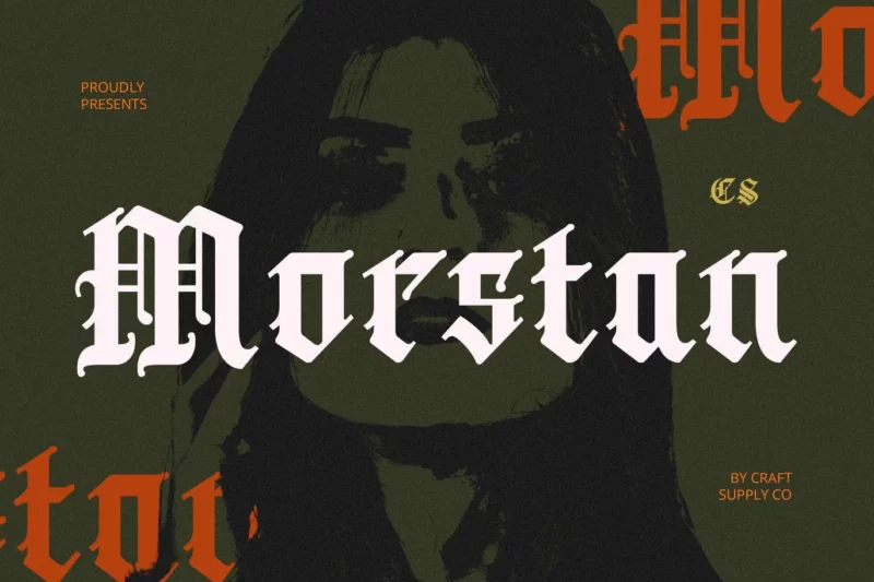
Morstan
Morstan is a modern interpretation of the Old English font style, designed for contemporary headlines. Its crisp edges and refined details offer a fresh take on traditional blackletter, making it suitable for both classic and avant-garde design projects.
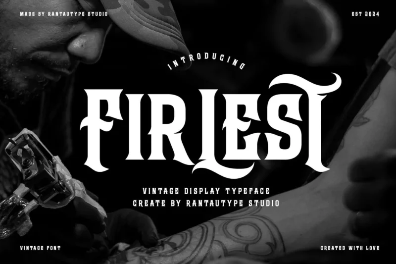
Firlest
Firlest is an old vintage font that captures the essence of bygone eras. Its weathered appearance and classic letterforms make it ideal for creating designs with a nostalgic or retro feel, perfect for vintage-inspired branding or packaging.
English Towne
English Towne is a traditional blackletter font that evokes the charm of old English typography. Its ornate characters and flowing lines make it excellent for creating designs with a historical or formal theme, such as certificates or traditional branding.
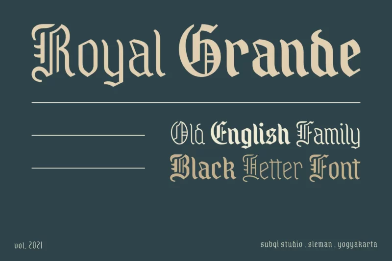
AMR Royal Grande
AMR Royal Grande is a decorative display font with a vintage royal flair. Its elegant letterforms and ornate details make it perfect for creating luxurious, high-end designs or adding a touch of sophistication to logos and headlines.
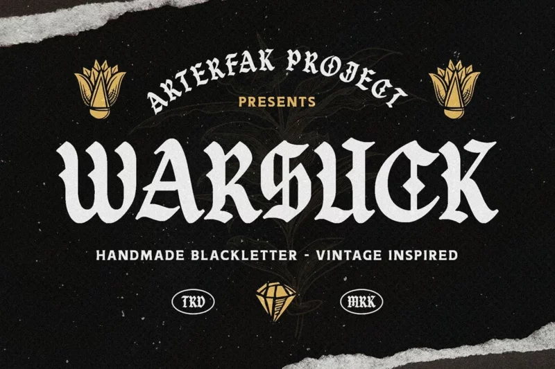
Warsuck
Warsuck is a bold, edgy font that combines Gothic elements with an underground aesthetic. Its sharp angles and aggressive style make it ideal for creating impactful designs in music, fashion, or alternative culture contexts.
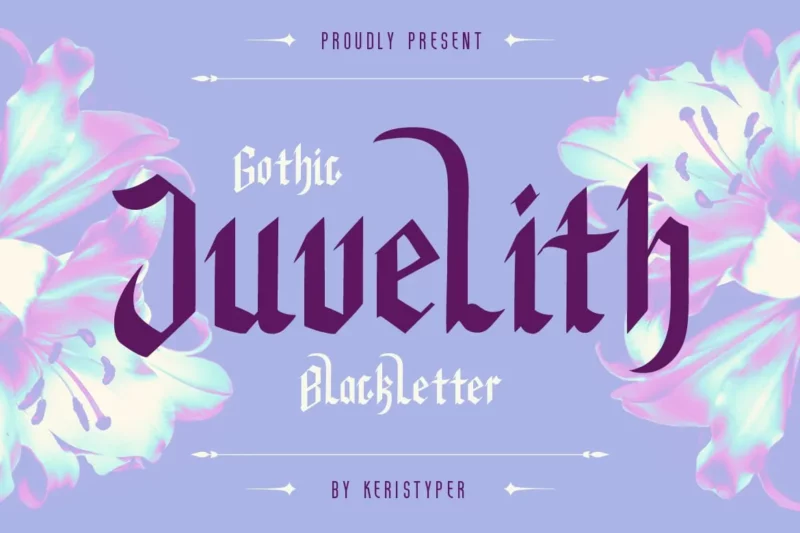
Juvelith
Juvelith is a vintage-inspired serif font with a distinctive slanted style. Its unique character shapes and slight irregularities give it a handcrafted feel, making it perfect for designs that require a blend of elegance and artisanal charm.
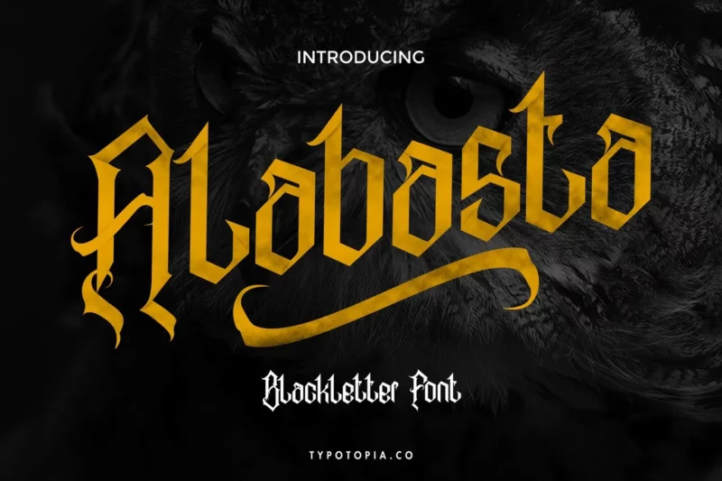
Alabasta
Alabasta is a modern blackletter font that offers a fresh take on the traditional Gothic style. Its clean lines and balanced proportions make it versatile for contemporary design applications, from branding to editorial layouts.
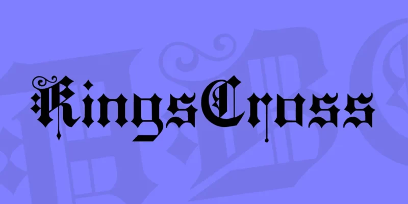
KingsCross
KingsCross is a regal blackletter font that exudes a sense of majesty and tradition. Its ornate characters and flowing lines make it ideal for creating designs with a royal or historical theme, perfect for luxury branding or formal invitations.
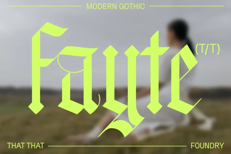
Fayte Blackletter gothic
Fayte is a condensed blackletter Gothic font that offers a bold, dramatic presence. Its narrow letterforms and strong vertical emphasis make it excellent for creating impactful headlines or logos, especially in designs requiring a dark or edgy aesthetic.
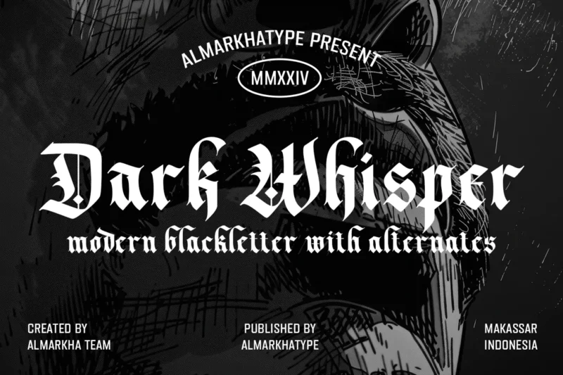
Dark Whisper
Dark Whisper is a fierce blackletter font that combines classic Gothic elements with a modern edge. Its sharp contrasts and dynamic letterforms make it perfect for creating designs with a mysterious or dramatic flair, ideal for book covers or album art.
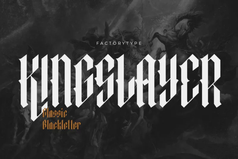
Kingslayer
Kingslayer is a modern take on the blackletter style, offering a sleek and refined approach to Gothic typography. Its clean lines and balanced proportions make it versatile for contemporary designs that require a touch of historical elegance.
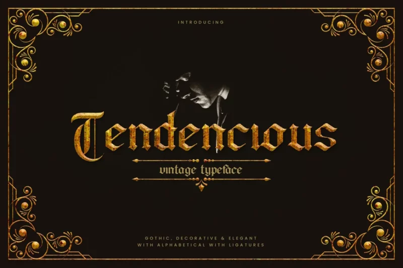
Tendencious
Tendencious is a vintage Gothic display typeface that combines blackletter elements with a distinctive retro feel. Its unique character shapes and decorative details make it ideal for creating eye-catching headlines or logos with a nostalgic twist.
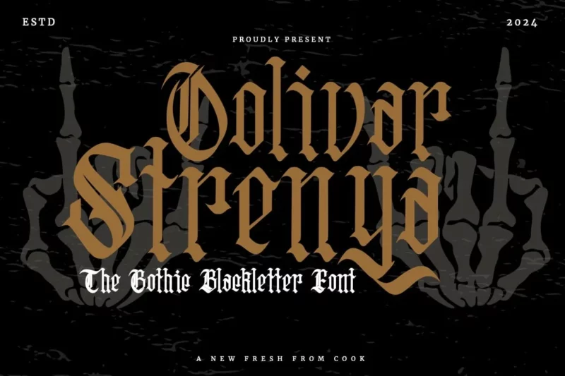
Oolivar Strenya
Oolivar Strenya is a Gothic blackletter font with a bold, tattoo-inspired aesthetic. Its intricate details and strong character shapes make it perfect for creating designs with an edgy, alternative vibe, suitable for fashion, music, or street art projects.
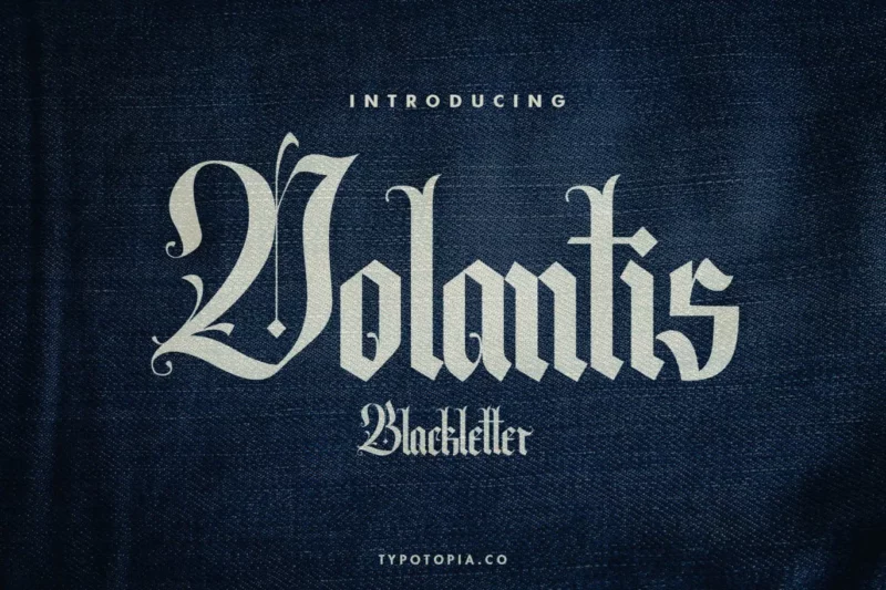
Volantis
Volantis is a vintage blackletter font that offers a refined take on traditional Gothic typography. Its elegant letterforms and subtle details make it suitable for creating sophisticated designs with a historical flair, perfect for branding or editorial use.
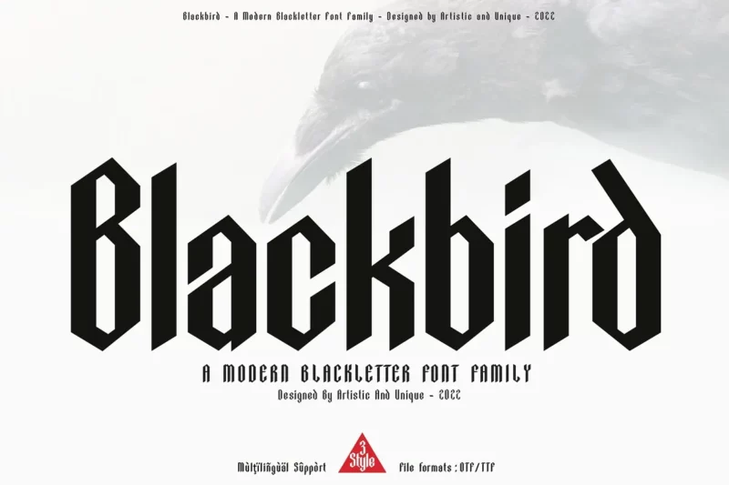
Blackbird
Blackbird is a versatile blackletter font family that offers various weights and styles. Its modern interpretation of Gothic letterforms allows for flexibility in design, making it suitable for a wide range of applications from traditional to contemporary contexts.
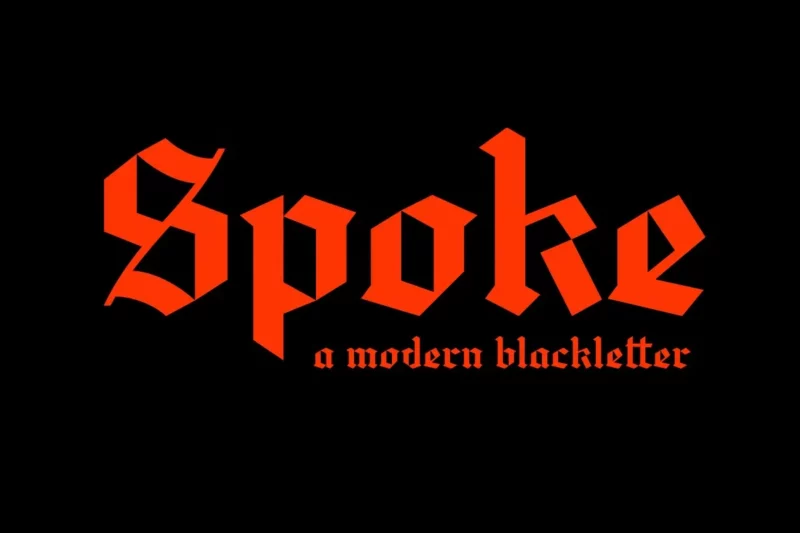
Spoke
Spoke is a unique blackletter typeface that combines Gothic elements with a contemporary twist. Its distinctive character shapes and balanced proportions make it ideal for creating standout designs in branding, packaging, or editorial projects.
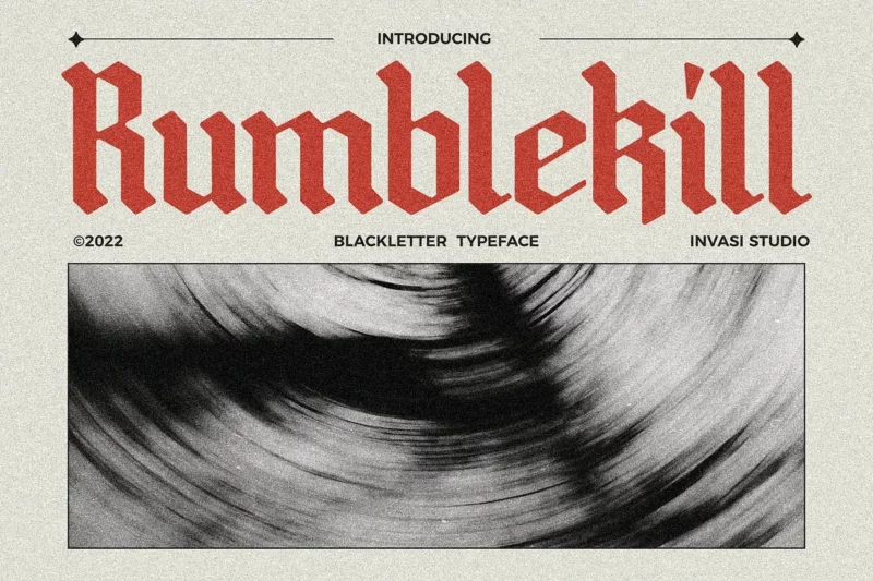
Rumblekill
Rumblekill is a rounded blackletter font that offers a softer, more approachable take on Gothic typography. Its smooth edges and balanced design make it versatile for creating friendly yet impactful designs across various media.
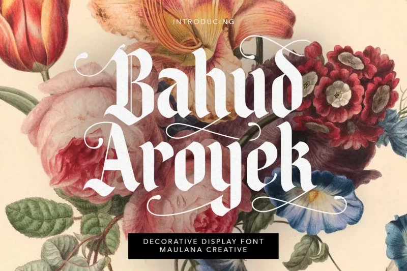
Bahud Aroyek
Bahud Aroyek is a decorative display font with blackletter influences. Its ornate characters and unique design elements make it perfect for creating eye-catching headlines or logos, especially in projects that require a blend of elegance and creativity.
Landsknecht
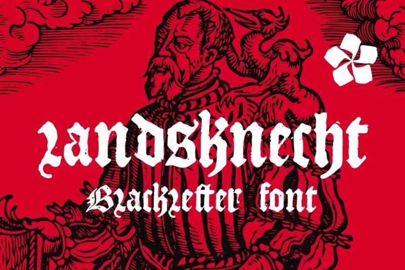
Landsknecht is a blackletter-style font that captures the essence of medieval German typography. Its authentic character shapes and historical accuracy make it ideal for designs requiring a genuine old-world feel, such as historical recreations or themed branding.
Old English Five
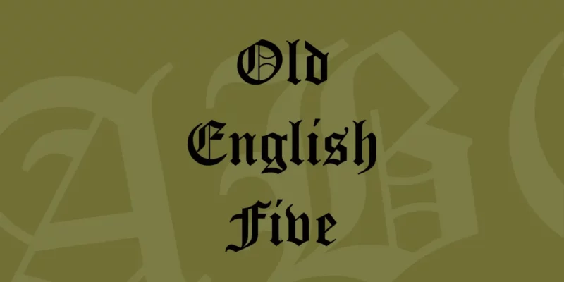
Old English Five is a classic blackletter font that embodies traditional Gothic typography. Its ornate letterforms and historical authenticity make it perfect for creating designs with a formal, traditional, or medieval theme, such as certificates or historical documents.
Hold Money
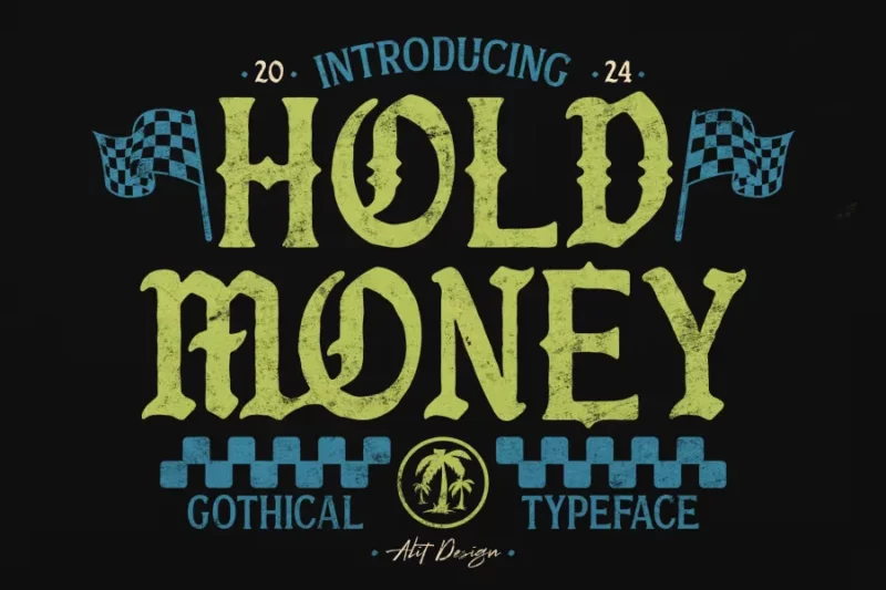
Hold Money is a unique blackletter-inspired font with a modern twist. Its bold character shapes and distinctive style make it suitable for creating impactful designs in contemporary contexts, particularly for branding or editorial projects that require a strong visual presence.
What Makes a Font Feel “Old English”?
Ever wonder why some fonts just scream “medieval” while others fall flat? It’s all in the details. Let’s break down what gives Old English fonts their unmistakable character:
Blackletter Base
First, true Old English fonts are built on blackletter typography. This means thick, bold strokes contrasted with delicate hairlines. Think of medieval manuscripts – those monks weren’t messing around with their quills.
Ornate Details
Look for those fancy decorative elements. Authentic Old English fonts feature elaborate swashes, flourishes, and ornamental touches. But here’s the key: these details should feel purposeful, not slapped on as afterthoughts.
Historical Accuracy
The best Old English fonts actually reference historical documents and manuscripts. They’re not just making things up – they’re drawing from centuries of calligraphic tradition.
Consistent Weight
Despite all those fancy flourishes, good Old English fonts maintain consistent stroke weights where it counts. This creates that cohesive, professional look that separates the pros from the amateurs.
Where to Use Old English Fonts (And Where Not To)
Look, I get it. When you find a gorgeous Old English font, you want to use it everywhere. But trust me – restraint is your friend here. Let’s talk about where these fonts shine (and where they definitely don’t).
Perfect Uses:
- Historical projects (think museum exhibits or educational materials)
- Traditional branding (especially for establishments like pubs, breweries, or antique shops)
- Heritage designs (family crests, certificates, commemorative pieces)
- Religious/church materials
- Special occasions (wedding invitations, formal announcements)
Places to Avoid:
- Digital interfaces (please, no Old English fonts in your mobile app)
- Body text (your readers will thank you)
- Modern tech brands (unless you’re going for ironic – and even then, think twice)
- When readability is crucial (like signage or important instructions)
- Small text sizes (those beautiful details become muddy real quick)
Choosing the Right Old English Font
Selecting the perfect Old English font isn’t just about picking the prettiest option. Here’s what you need to consider:
Context is King
Think about where and how your font will be used. A font that looks amazing on a wedding invitation might be completely wrong for a restaurant menu.
Readability Requirements
Yes, Old English fonts can be challenging to read. But some are definitely more legible than others. If your audience needs to actually read the text (wild concept, I know), pick a more simplified version.
Technical Considerations
Check if the font has all the characters you need. Nothing worse than realizing halfway through a project that your font is missing crucial glyphs or special characters.
Size Matters
Test your font at different sizes. Some Old English fonts look fantastic in large display sizes but fall apart when scaled down. Know your usage requirements before committing.
Common Old English Font Mistakes
Let’s be real – we’ve all made these mistakes. But knowledge is power, so here are some pitfalls to avoid:
Mixing Period Styles
Just because two fonts look “old” doesn’t mean they belong together. Mixing a 15th-century Old English with an 18th-century script is like wearing a medieval costume with sneakers.
Overdoing It
Using Old English for everything in your design is like putting a crown on every letter – it gets old fast. Use it sparingly for maximum impact.
Ignoring Spacing
Old English fonts often need extra attention to spacing. Don’t just set it and forget it – take time to adjust that kerning and leading.
Frequently Asked Questions
Let’s wrap up with some common questions about Old English fonts:
What’s the difference between Old English and Gothic fonts?
While related, they’re not exactly the same. Old English is a specific style of blackletter, while Gothic is a broader category. Think of it like this: all Old English fonts are Gothic, but not all Gothic fonts are Old English.
Are Old English fonts hard to read?
Generally, yes. That’s why we save them for display purposes rather than body text. But some modern interpretations strike a nice balance between style and legibility.
Which Old English font is most authentic?
The most authentic ones are based on actual historical manuscripts. But remember – authenticity isn’t always the most important factor. Sometimes readability and practicality should take priority.
Can I use Old English fonts for logos?
Absolutely! Just make sure it fits your brand’s personality and values. A tech startup probably shouldn’t use Old English in their logo (unless they’re going for some serious irony).
Wrapping Up
Old English fonts carry centuries of history in their strokes. When used thoughtfully, they can add gravitas, tradition, and authentic medieval flair to your designs. Just remember: like a powerful spice, a little goes a long way.
Have a favorite Old English font that didn’t make our list? Or maybe a creative way you’ve used these fonts in your work? Share in the comments below!

