In this article:
- The Most Eye-Catching Spray Paint Fonts
- What Makes Spray Paint Fonts Feel So Authentic?
- Where Can You Use Spray Paint Fonts?
- Where to Avoid Spray Paint Fonts
- How to Pick the Perfect Spray Paint Font
- Perfect Pairings for Spray Paint Fonts
- Common Spray Paint Font Questions
- The Evolution of Spray Paint Typography
- Expert Opinions: Typography Designers on Spray Paint Fonts
- Conclusion: Adding Urban Energy to Your Designs
As designers, we’re constantly searching for fonts that can capture that raw, urban energy that only street art delivers. And in 2026, spray paint fonts are making their mark across everything from album covers to fashion brands to social media graphics.
Spray paint fonts embody that unmistakable street aesthetic – letterforms with drips, splatters, and uneven edges that look like they were created with a can of paint and a whole lot of attitude. They bring an authentic, gritty vibe that feels rebellious and unapologetically real.
In this deep dive, I’ll be exploring the best spray paint fonts to try in 2026. We’ll cover:
- What makes a great spray paint font
- How to choose the perfect spray paint typeface for your project
- The most eye-catching spray paint fonts available right now
- Perfect pairings to complement your spray paint font
- Common questions about using spray paint typography
Let’s shake things up and dive into the world of spray paint typography!
The Most Eye-Catching Spray Paint Fonts
Not all spray paint fonts can capture that authentic street vibe. I’ve compiled a list of my absolute favorite spray paint fonts that truly deliver that raw, urban aesthetic. Here they are:
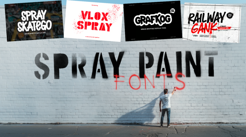
Spray Skatego
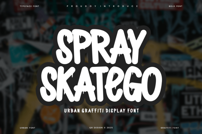
Spray Skatego is an edgy, urban graffiti-inspired font that captures the essence of street art and skate culture. Its distressed appearance and bold lines make it perfect for designs that require a raw, authentic feel. This font is ideal for creating eye-catching headlines, logos, or street-wear branding.
Rough Spray SVG
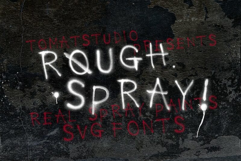
Rough Spray SVG is a versatile decorative typeface that mimics the look of spray paint. Its SVG format allows for easy scaling and customization, making it suitable for both digital and print projects. This font is perfect for creating urban-inspired designs, posters, or adding a gritty touch to branding materials.

Get 300+ Fonts for FREE
Enter your email to download our 100% free "Font Lover's Bundle". For commercial & personal use. No royalties. No fees. No attribution. 100% free to use anywhere.
Mind the Gap
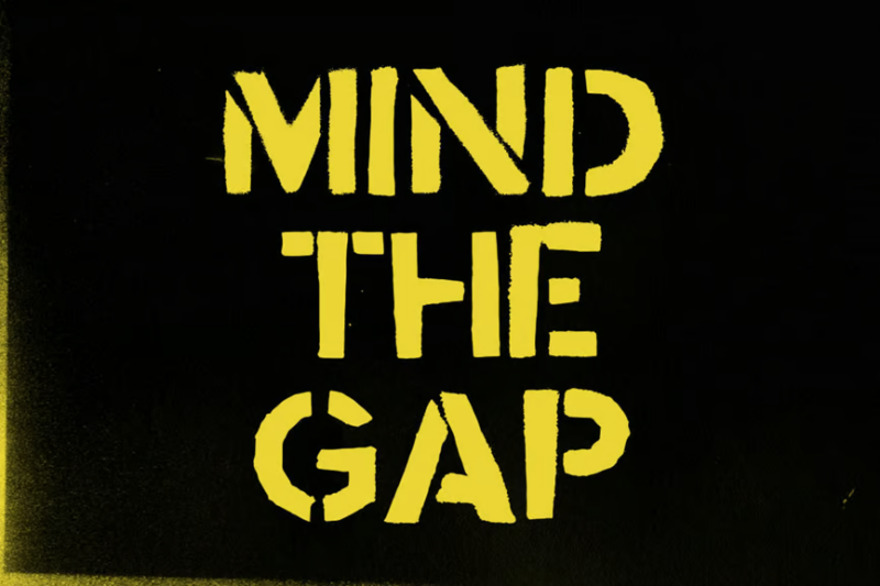
Mind the Gap is a bold stencil font that evokes the urban underground. Its clean, geometric shapes are reminiscent of subway signage and industrial design. This font is excellent for creating impactful headlines, wayfinding systems, or adding an edgy, metropolitan feel to your designs.
Morsey
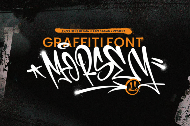
Morsey is a unique decorative font that combines elements of typography and illustration. Its playful, hand-drawn style gives it a whimsical character that stands out in various design contexts. This font is perfect for creating eye-catching titles, logos, or adding a touch of personality to packaging designs.
Dripping Drops
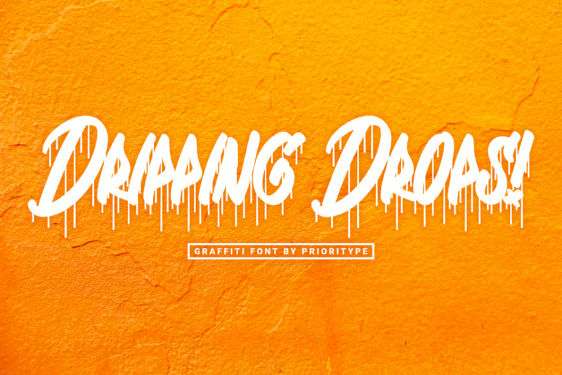
Dripping Drops is a dynamic graffiti font that features a distinctive dripping effect. Its liquid-like letterforms create a sense of movement and energy, making it ideal for designs that need to convey a bold, urban vibe. This font works well for album covers, event posters, or street-style branding.
Grafkog
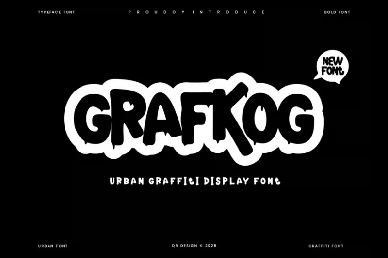
Grafkog is a grungy, splash-style font that embodies the spirit of urban skate culture. Its distressed appearance and irregular shapes give it an authentic, handmade feel. This font is perfect for creating edgy logos, t-shirt designs, or any project that requires a raw, street-inspired aesthetic.
Stencil Autobahn SVG
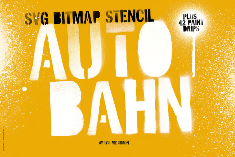
Stencil Autobahn SVG is a versatile font that combines the look of stencil art with modern SVG technology. Its clean, industrial style makes it highly legible while maintaining an urban edge. This font is ideal for creating signage, packaging designs, or adding a contemporary touch to branding projects.
Recall Hipe
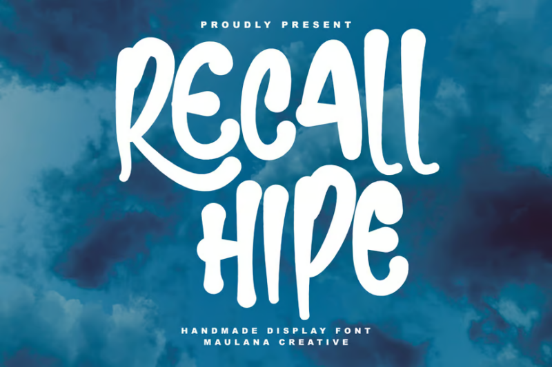
Recall Hipe is a handmade display font with a unique urban flair. Its irregular, hand-drawn style gives designs an authentic and personal touch. This font is perfect for creating attention-grabbing headlines, logo designs, or adding character to social media graphics and promotional materials.
Graffiti Fonts Street Tag Vol2
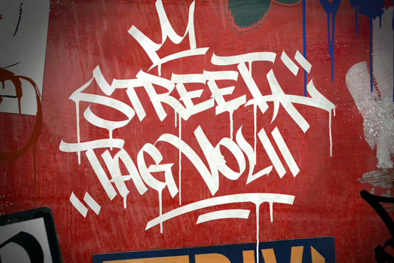
Graffiti Fonts Street Tag Vol2 is a collection of authentic graffiti-inspired typefaces. These fonts capture the essence of street tagging with their bold, expressive strokes. They are ideal for creating urban-themed designs, album artwork, or adding a rebellious touch to branding projects.
Vlox Spray
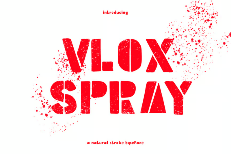
Vlox Spray is a hand-drawn typeface that mimics the look of quick spray paint strokes. Its spontaneous, energetic style adds a sense of urgency and rawness to designs. This font is excellent for creating graffiti-inspired artwork, poster designs, or adding an urban edge to digital content.
Streetlight
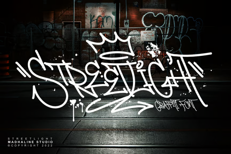
Streetlight is a bold graffiti font that captures the essence of urban street art. Its thick, stylized letterforms make a strong visual impact, perfect for headlines and logo designs. This font is ideal for creating designs that need to convey a strong, street-wise attitude.
Urban Graffiti Font
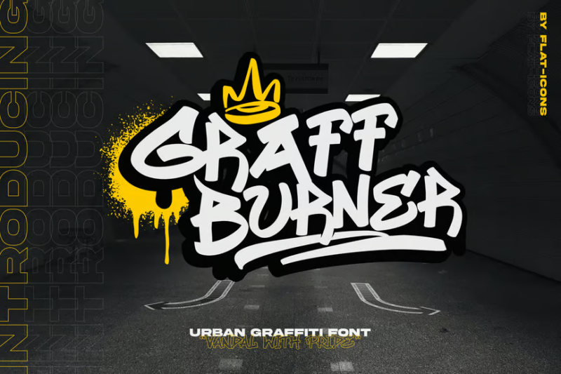
Urban Graffiti Font is a versatile typeface that brings the raw energy of street art to your designs. Its bold, expressive strokes and slight irregularities give it an authentic graffiti feel. This font is perfect for creating urban-themed illustrations, poster designs, or adding an edgy touch to branding projects.
Bomb Da Gone
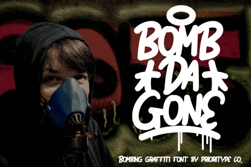
Bomb Da Gone is a dynamic graffiti-inspired font featuring a distinctive dripping effect. Its bold, liquid-like letterforms create a sense of movement and energy in designs. This font is ideal for creating impactful headlines, urban-themed graphics, or adding a rebellious touch to branding materials.
Railway Gank
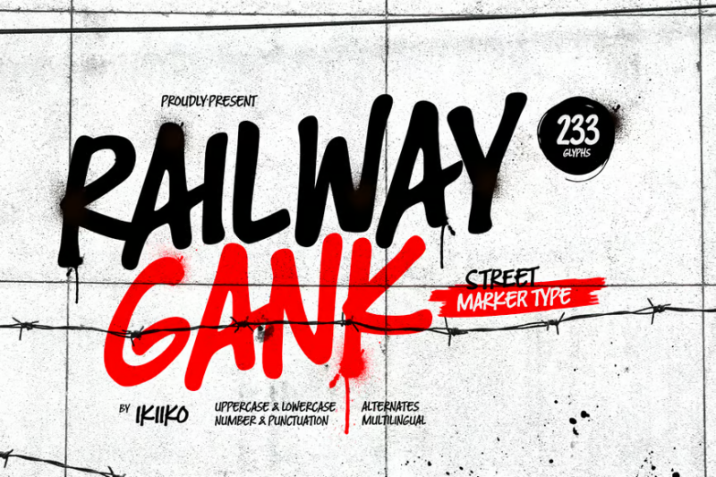
Railway Gank is a street marker font that captures the quick, spontaneous nature of graffiti tags. Its rough, hand-drawn style gives designs an authentic urban feel. This font is perfect for creating graffiti-inspired artwork, adding character to packaging designs, or creating edgy social media graphics.
Roeshio
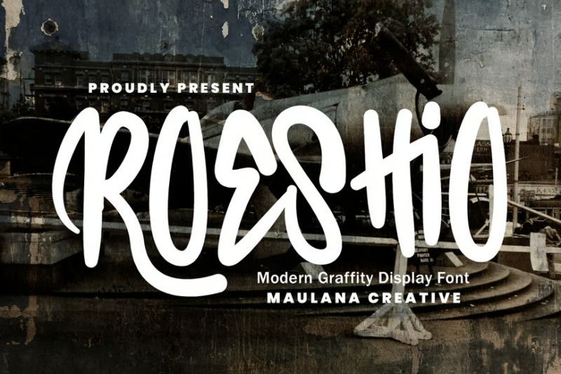
Roeshio is a bold graffiti display font that commands attention with its thick, stylized letterforms. Its urban aesthetic makes it perfect for creating impactful headlines or logo designs. This font is ideal for projects that need to convey a strong, street-wise attitude, such as music album covers or event posters.
Street Stoke
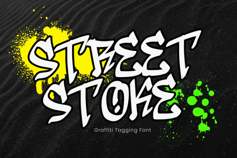
Street Stoke is a handwritten script font that captures the fluid, expressive nature of graffiti tags. Its spontaneous style adds an authentic urban touch to designs. This font is excellent for creating logo designs, adding personality to packaging, or creating graffiti-inspired digital content.
Grofil
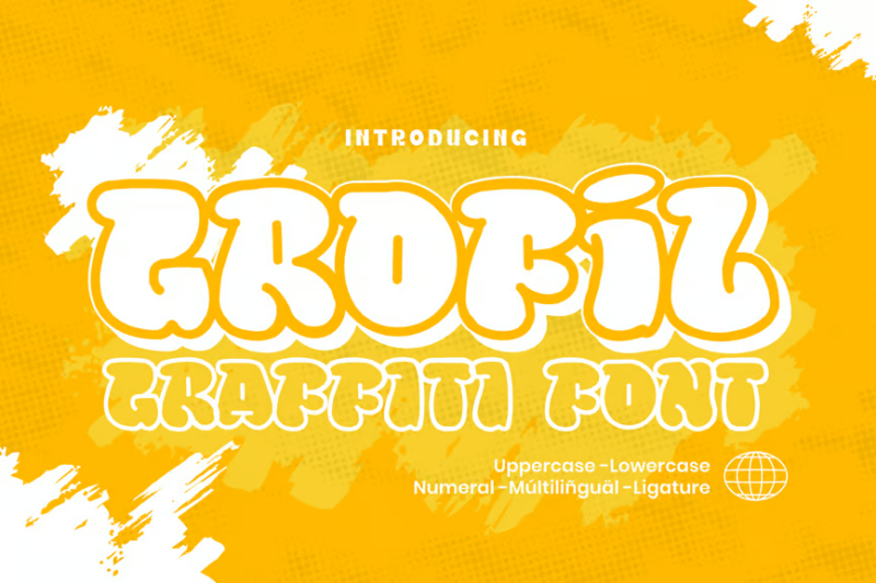
Grofil is a bold graffiti font that brings the energy of street art to your designs. Its thick, stylized letterforms create a strong visual impact, perfect for headlines and branding. This font is ideal for projects that need to convey an urban, rebellious attitude, such as streetwear designs or event promotions.
What Makes Spray Paint Fonts Feel So Authentic?
Spray paint fonts get their distinctive, rebellious character from several key elements:
Drips and Splatters
The hallmark of any great spray paint font is the presence of drips, splatters, and overspray. These imperfections mimic what happens when actual spray paint hits a surface – it doesn’t always behave! These “mistakes” are actually what gives spray paint fonts their authentic street cred.
The best spray paint typefaces incorporate drips that look natural, not forced. They follow gravity, getting thinner as they trail down, just like real paint would behave on a vertical surface.
Inconsistent Edges
Look closely at genuine street art and you’ll notice the edges aren’t perfectly clean. Great spray paint fonts replicate this with slightly fuzzy, imperfect outlines that mimic the way aerosol paint disperses.
These rough edges create that unmistakable look of letters sprayed through a stencil or freehand, rather than the precise lines of digital design.
Bold, Chunky Proportions
Street art is meant to be seen from a distance, which explains why spray paint fonts typically feature bold, chunky proportions. They command attention and make a statement – just like the art form they emulate.
The thickness and weight distribution mimics the difficulty of creating delicate lines with spray paint, resulting in letterforms that feel powerful and unapologetic.
Urban Attitude
Beyond the technical characteristics, the best spray paint fonts capture that intangible urban energy. They feel rebellious, raw, and authentic – channeling the cultural roots of street art as a form of expression for those whose voices weren’t represented in mainstream channels.
Where Can You Use Spray Paint Fonts?
The urban, edgy nature of spray paint fonts makes them perfect for specific design contexts:
Music Branding
Spray paint fonts are a natural fit for hip-hop, punk, and alternative music branding. Album covers, concert posters, merchandise, and promotional materials benefit from their raw, authentic energy.
The rebellious attitude inherent in these fonts aligns perfectly with genres that push boundaries and challenge conventions.
Urban Fashion
Streetwear and urban fashion brands frequently leverage spray paint typography to connect with their audience. T-shirts, hoodies, hats, and other apparel items benefit from that authentic street aesthetic.
The DIY, counter-culture vibe of spray paint fonts helps fashion brands establish credibility in the urban market.
Sports & Action Branding
Skate, BMX, snowboarding, and other action sports brands often incorporate spray paint fonts into their visual identity. The dynamic, high-energy feel of these fonts matches the adrenaline-fueled nature of these activities.
Social Activism
Given graffiti’s historical connection to social commentary, spray paint fonts work effectively for activism campaigns, protest materials, and social justice messaging.
They capture attention while communicating an authentic, grassroots message that feels genuine rather than corporate.
Digital Content
Online, spray paint fonts grab attention on social media graphics, YouTube thumbnails, gaming content, and anywhere that needs to stand out in a crowded digital landscape.
Where to Avoid Spray Paint Fonts
While spray paint fonts pack a punch in many contexts, there are situations where their rebellious nature might send the wrong message:
Corporate/Traditional Business
For conservative industries like banking, law, healthcare, or traditional B2B services, spray paint fonts likely feel too informal and could undermine professionalism.
In these contexts, opt for clean serif or sans-serif fonts that convey stability, reliability, and trustworthiness.
Luxury Branding
High-end luxury products typically aim for refinement and sophistication. The rough, street aesthetic of spray paint fonts generally clashes with luxury brand positioning.
Elegant serifs or minimalist sans-serifs better communicate exclusivity and premium quality.
Academic/Educational Materials
For educational content where readability and clarity are paramount, spray paint fonts can be difficult to read and distracting. They may also send inappropriate signals about the seriousness of the content.
Long-form Text
Spray paint fonts are display fonts, not text fonts. Their distinctive features make them unsuitable for body copy, where their stylistic elements would quickly become tiring to read and could compromise comprehension.
How to Pick the Perfect Spray Paint Font
To select the ideal spray paint font for your project, consider these factors:
Authenticity Level
How “street” do you want to go? Some spray paint fonts offer subtle urban influences, while others go all-in with extreme drips, splatters, and distressing.
For mainstream brands dipping their toes into urban aesthetics, a more restrained spray paint font might be appropriate. For projects deeply embedded in street culture, embrace the more authentic, gritty options.
Legibility Needs
Consider where and how your text will be viewed. Will it be seen quickly from a distance? Does it need to be immediately readable, or is the overall vibe more important than perfect legibility?
Some spray paint fonts prioritize style over readability, which might be fine for a one-word logo but problematic for longer phrases.
Cultural Authenticity
Remember that graffiti and street art have deep cultural roots. The most effective use of spray paint fonts respects and honors this heritage rather than appropriating it without understanding.
If your brand has no genuine connection to street culture, consider whether a spray paint font is the right choice or if it might come across as inauthentic.
Technical Requirements
Many spray paint fonts look best at larger sizes where their details can shine. Consider whether the font will work across all your needed applications, from large posters to smaller digital uses.
Also check for complete character sets if you need special characters, multilingual support, or alternate glyphs.
Perfect Pairings for Spray Paint Fonts
Spray paint fonts make a strong statement, so they need thoughtful partners. Here are some excellent font pairings that complement without competing:
Clean Sans-Serifs
The contrast between a gritty spray paint font and a clean, minimal sans-serif creates a powerful balance. Try pairing with fonts like Helvetica Neue, Inter, or Montserrat for body text.
This combination lets the spray paint font handle the attention-grabbing headlines while the sans-serif delivers content with clarity.
Industrial Slab Serifs
For a consistent urban vibe that’s still readable, pair spray paint display fonts with industrial-feeling slab serifs like Roboto Slab or Courier.
This combination maintains the edgy aesthetic throughout your design while improving readability for longer text.
Hand-drawn Companions
For a fully authentic street art look, pair spray paint fonts with hand-drawn marker-style fonts. This combination feels like it came straight from a street artist’s toolkit.
Just be careful not to combine too many highly stylized fonts, which can create visual chaos rather than intentional design.
Common Spray Paint Font Questions
Let’s address some frequently asked questions about spray paint typography:
What font looks like spray paint?
Fonts like Bombing, Tagster, and Graffiti Classic effectively capture the spray paint aesthetic with their irregular edges, drips, and authentic street vibe. The best spray paint fonts incorporate natural-looking drips and texture variations that mimic real aerosol application.
How can I make my text look like spray paint?
Beyond using dedicated spray paint fonts, you can add spray paint effects to regular text in graphic design software. Try adding drips, spatters, and slightly rough edges. Experiment with layer blend modes and texture overlays to achieve an authentic spray paint look.
Are there free spray paint fonts available?
Yes! While many premium spray paint fonts offer more complete character sets and alternate glyphs, there are excellent free options like Urban Decay, Sprite Graffiti, and Ruthless Dripping available for personal use.
What’s the difference between graffiti fonts and spray paint fonts?
While there’s significant overlap, graffiti fonts often focus on stylized letterforms common in graffiti writing (bubble letters, wild style, etc.), while spray paint fonts specifically emulate the medium itself, with drips, splatters, and texture being the defining features.
The Evolution of Spray Paint Typography
The typography of street art has a rich history worth understanding:
In the early days of modern graffiti culture in 1970s New York, simple tags evolved into increasingly complex styles. As artists pushed boundaries, distinctive typographic approaches emerged – bubble letters, block letters, and the highly complex “wildstyle.”
Digital spray paint fonts began appearing in the 1990s, but many early attempts lacked the authentic characteristics of actual spray paint. Today’s best digital spray paint fonts benefit from decades of refinement and often involve direct collaboration with actual street artists.
What’s fascinating is seeing how this once-underground aesthetic has influenced mainstream design. Major brands now regularly incorporate spray paint typography into campaigns, showing how this style has evolved from rebellious origins to recognized design language.
Expert Opinions: Typography Designers on Spray Paint Fonts
I reached out to typography experts to get their take on spray paint fonts and their place in modern design:
Marcus Rivera, type designer and former street artist, says: “The challenge with spray paint fonts is capturing the spontaneity of the medium. Real spray paint behaves differently every time, depending on pressure, distance, surface, and even temperature. The best digital versions incorporate subtle randomization to mimic this natural variation.”
Emma Chen, creative director at UrbanType, notes: “What makes spray paint fonts powerful is their cultural context. They visually reference a specific artistic tradition and community. Designers should approach them with respect for that heritage, not just as a shortcut to looking ‘edgy’ or ‘urban’.”
James Wilson, typography professor, observes: “The most successful spray paint fonts find the sweet spot between authenticity and usability. Too clean, and they lose their character. Too raw, and they become illegible. It’s that balance that separates the great from the merely good.”
Conclusion: Adding Urban Energy to Your Designs
Spray paint fonts offer designers a direct line to urban culture’s raw energy and authenticity. When chosen thoughtfully and used in appropriate contexts, they inject attitude, rebellion, and street credibility into designs that might otherwise feel too polished or corporate.
Remember that these fonts carry cultural significance beyond their aesthetic appeal. The best uses of spray paint typography honor and respect the art form’s origins while bringing its unique visual language to new audiences and applications.
Whether you’re designing for a hip-hop artist, a skateboard brand, or an urban fashion line, the right spray paint font can transform your project from mainstream to memorably authentic.
So which spray paint font will you try first? Drop a comment below with your favorite, or share how you’ve incorporated spray paint typography into your own designs!