In this article:
- Most Famous Red Logos
- Bold, Energetic Red Logos
- Food & Beverage Red Logos
- Retail & Service Red Logos
- Luxury and Sophisticated Red Logos
- Why Red Works for Logos
- When to Avoid Red Logos
- Choosing the Right Shade of Red
- Design Tips for Red Logos
- Is Red Right for Your Logo?
- All set
Red is one of the most powerful colors in logo design. It’s bold, passionate, and impossible to ignore. I’ve spent years analyzing how brands use this color to create memorable identities, and I’m excited to share what I’ve learned.
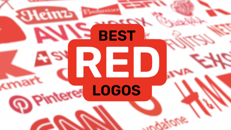
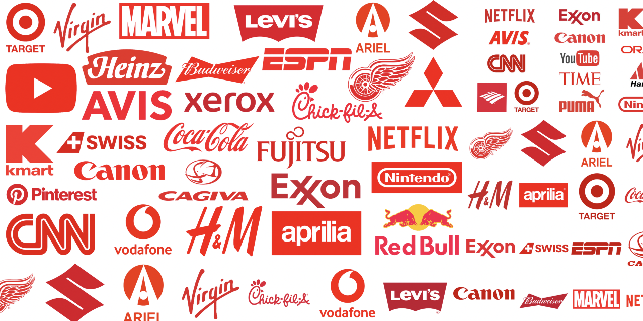
In this article, I’ll walk you through 18 of the best red logos that have made their mark on the world. From the iconic Coca-Cola script to the simple power of Netflix, these examples will show you why red might be the perfect choice for your next design project.
I’ll also explore:
- What makes red so effective for brand identities
- Different ways to incorporate red into your logo designs
- When red might NOT be the right choice
- How to determine if red aligns with your brand personality
Let’s dive into these inspiring examples and discover what makes red such a compelling choice for logos!
Most Famous Red Logos
These iconic red logos are recognized worldwide and have become cultural touchstones:
1. Coca-Cola
![]()
Coca-Cola’s flowing script in bright red has become one of the most recognizable logos in history. The vibrant red conveys energy, passion, and excitement—perfect for a refreshing beverage.
2. Netflix
![]()
Netflix’s simple red “N” against a black background is instantly recognizable. The bold red represents entertainment, passion, and the excitement of streaming content.

Get 300+ Fonts for FREE
Enter your email to download our 100% free "Font Lover's Bundle". For commercial & personal use. No royalties. No fees. No attribution. 100% free to use anywhere.
3. YouTube
![]()
YouTube’s red play button is the universal symbol for video content. The red creates urgency and excitement around watching videos.
4. Target
![]()
Target’s simple red bullseye is genius in its simplicity. It’s easy to spot from a distance and communicates the brand’s promise of hitting the mark for value and quality.
5. Marvel
![]()
Marvel’s bold red logo represents the dynamic energy and excitement of their superhero universe. It’s as powerful as the characters within their comics.
6. Levi’s
![]()
The red tab on Levi’s jeans has become an iconic brand marker. Simple but instantly recognizable, it stands out against blue denim.
7. Nintendo
![]()
Nintendo’s bold red wordmark exudes playfulness and excitement, perfectly capturing the fun of gaming.
8. CNN
![]()
CNN’s bold red letters convey urgency and importance, perfect for a 24-hour news network that needs to grab attention.
9. Heinz
![]()
Heinz’s red logo has become synonymous with ketchup itself, creating an immediate association with their signature product on every product packaging design.
10. Xerox
![]()
Xerox’s red emblem stands out in the corporate world, making a bold statement in an often blue-dominated industry.
Now let’s explore what makes these logos so effective, starting with…
Bold, Energetic Red Logos
These logos use red to communicate energy, excitement, and boldness:
11. Kellogg’s
![]()
Kellogg’s red signature font exudes warmth and triggers morning appetite appeal. It feels both nostalgic and energizing.
12. Adobe
![]()
Adobe’s distinctive red square with “Aa” creates an immediately recognizable brand mark. The red represents creativity and passion for design.
13. ESPN
![]()
ESPN’s bold red letters communicate the passion and energy of sports, perfect for their brand position.
14. H&M
![]()
H&M’s bright red logo is simple yet effective, making it easy to spot their stores in crowded shopping centers.
15. Toyota
![]()
Toyota’s overlapping ovals in red create a distinctive and memorable symbol that stands out on vehicles worldwide.
Food & Beverage Red Logos
Red’s appetite-stimulating properties make it perfect for food brands:
16. Chick-fil-A
![]()
Chick-fil-A’s red script creates an inviting, homestyle feeling while stimulating appetite for their chicken sandwiches.
17. Pizza Hut
![]()
Pizza Hut’s iconic red roof is instantly recognizable and creates appetite appeal for their pizzas.
18. KFC
![]()
KFC’s red and white color scheme makes Colonel Sanders pop while building hunger for their fried chicken.
19. Wendy’s
![]()
Wendy’s friendly red logo with the girl’s face creates a warm, homey feeling while stimulating appetite.
20. Budweiser
![]()
Budweiser’s bold red label conveys heritage, tradition, and the bold flavor of their beer.
Retail & Service Red Logos
These brands use red to stand out in competitive retail environments:
21. CVS
![]()
CVS Pharmacy’s heart-shaped red logo connects health with caring while creating a highly visible retail presence.
22. Ace Hardware
![]()
Ace Hardware’s red triangle creates a strong visual identifier that’s easy to spot from a distance.
23. Pinterest
![]()
Pinterest’s bold red “P” stands out on digital devices and represents the passion of their users’ interests and collections.
Luxury and Sophisticated Red Logos
When used strategically, red can also convey luxury, sophistication, and exclusivity:
Christian Louboutin
![]()
The red sole of Louboutin shoes has become a status symbol. This clever use of red signals luxury and exclusivity.
Cartier
![]()
Cartier’s elegant red box is perhaps more recognizable than their logo itself. The deep red exudes luxury and special occasions.
(RED)
![]()
No, this is not Taylor Swift’s Red album font (although it’s strikingly similar). The (RED) organization uses a bold red parenthesis to fight AIDS. Simple, powerful, and memorable.
Virgin
![]()
Virgin’s simple red script communicates Richard Branson’s rebellious spirit and the brand’s disruptive nature.
Formula 1
![]()
The Formula 1 logo uses bold, dynamic red lettering in a sleek, racing-inspired font, conveying the high-speed, competitive nature of the sport. The use of red signifies energy, excitement, and the thrill of racing.
Why Red Works for Logos
Before we dive deeper into examples, it’s helpful to understand why red is such a powerful choice for logos:
Attention-Grabbing
Red has the longest wavelength of any color in the visible spectrum, making it the most attention-grabbing color. It literally jumps forward in our vision compared to other colors.
Emotion and Passion
Red is associated with strong emotions – love, passion, excitement. It can trigger physiological responses like increased heart rate.
Appetite Stimulation
Red has been shown to stimulate appetite, which explains why so many food brands incorporate it into their logos.
Urgency and Importance
Red signals urgency and importance – think stop signs, fire engines, and emergency exits. This makes viewers pay attention.
Cultural Significance
In many cultures, red symbolizes luck, prosperity, and celebration, giving it positive associations.
With these powers in mind, let’s explore more brilliant examples of red logos and what makes them so effective.
When to Avoid Red Logos
While red offers powerful benefits, it isn’t always the right choice. Here are a few scenarios where you might want to avoid red:
- Health and wellness brands that want to convey calm and tranquility. Blue logos may be better here. (Although, CVS and Walgreens both challenge this trend.)
- Financial institutions seeking to communicate stability and trust
- Environmental organizations where green would better represent their mission
- Luxury spa brands where relaxation is the primary value proposition
The bottom line: consider your industry, audience expectations, and the emotions you want to evoke.
Choosing the Right Shade of Red
If you do opt for a red logo, selecting the ideal shade makes all the difference:
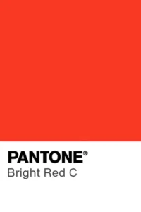
Bright red – Energetic, youthful, exciting

Crimson – Sophisticated, rich, premium
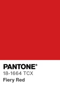
Fire engine red – Urgent, attention-grabbing, bold
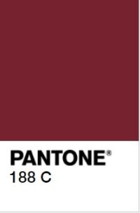
Burgundy – Luxurious, established, mature
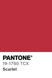
Scarlet – Passionate, dramatic, intense
Ruby – Precious, valuable, rare
The shade choice should align with your brand personality and the feelings you want to evoke in your audience.
Design Tips for Red Logos
To make your red logo truly effective, consider these design strategies:
- Use red sparingly for maximum impact – maybe just for one element
- Pair red with complementary colors like white, black, or dark blue for contrast
- Consider negative space to create interesting red shapes
- Test how your red logo looks in different contexts – digital, print, merchandise
- Ensure your red stands out from competitors in your industry
- Choose fonts that complement red’s boldness – either matching its energy or balancing it
With thoughtful design, your red logo can become a powerful brand asset.
Is Red Right for Your Logo?
Before committing to a red logo, ask yourself:
- Does red reflect my brand personality and values?
- Will my target audience respond positively to red?
- How do my competitors use color, and will red help me stand out?
- Does red communicate the right emotions for my industry?
- Will red work across all applications of my logo?
If the answers align with your brand strategy, red could be a fantastic choice that helps your brand make a bold impression.
All set
I hope these red logo examples have sparked some inspiration for your own branding projects. The power of red is undeniable – it grabs attention, evokes emotion, and creates memorable brand experiences.
Whether you’re designing a new logo or refreshing an existing one, red offers incredible versatility and impact. Use it wisely, and your brand could join these iconic examples in making a lasting impression.