In this article:
- 21 Best Digital Fonts in 2026
- What Makes a Font "Digital" in Appearance?
- The Fascinating History of Digital Display Fonts
- How to Effectively Use Digital Fonts in Your Designs
- Perfect Pairings for Digital Fonts
- Digital Font Design Trends in 2026
- When to Avoid Digital Fonts
- Common Digital Font Questions
- Conclusion: The Timeless Appeal of Digital Fonts
Digital fonts transport us back to the early days of digital technology while paradoxically still feeling cutting-edge in the right context. Their distinctive, technical appearance has made them enduringly popular for tech companies, sci-fi projects, retro-futuristic designs, and any brand wanting to communicate innovation and technological prowess.
Whether you’re designing for a tech startup, creating a nostalgic 80s arcade vibe, or simply want to add some electronic flair to your next project, these digital fonts will have your designs looking tech-ready in no time. Let’s dive in!
21 Best Digital Fonts in 2026
I’ve curated this collection of the absolute best digital fonts available right now. From classic 7-segment displays to more elaborate 16-segment options, these fonts capture that distinctive electronic vibe that designers are loving in 2026.
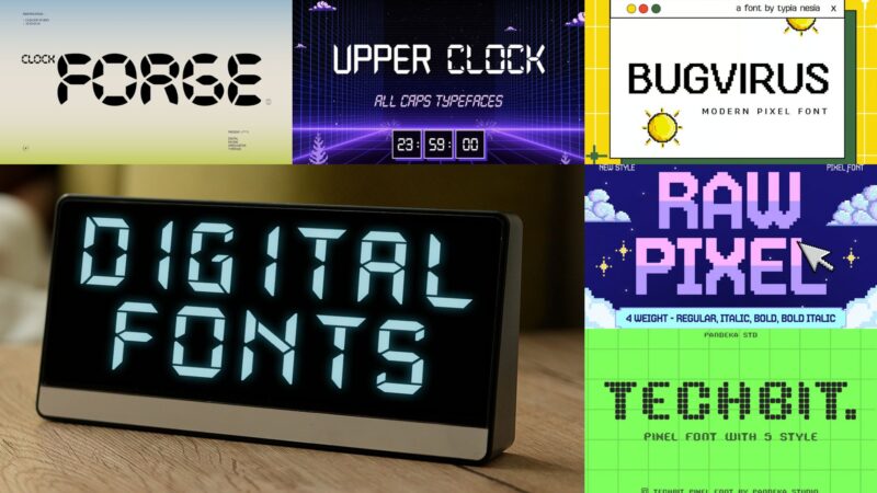
Clock Forge
![]()
Clock Forge is a dynamic digital font inspired by racing speed meters and pixel aesthetics. It combines a Y2K-inspired look with watch-like elements, making it perfect for designs that need a retro-futuristic edge.
Upper Clock
![]()
Upper Clock is a monospace pixel font that embodies the Y2K digital aesthetic. Its design is reminiscent of time and temperature displays, making it ideal for projects that require a nostalgic yet futuristic feel.
Digitalize
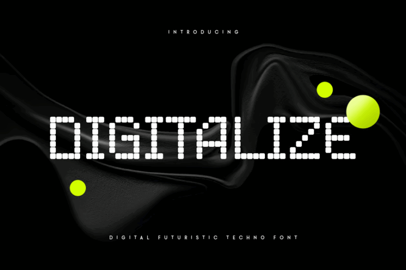
Digitalize is a pixel font that exudes a futuristic and techno vibe. Its modern, pixelated design makes it perfect for tech-related projects or any design that aims to convey a cutting-edge, digital feel.
Bugvirus
![]()
Bugvirus is a sans-serif pixel font designed to mimic the look of classic video game and software interfaces. Its digital, retro aesthetic makes it ideal for gaming-related designs or projects aiming for a nostalgic tech feel.

Get 300+ Fonts for FREE
Enter your email to download our 100% free "Font Lover's Bundle". For commercial & personal use. No royalties. No fees. No attribution. 100% free to use anywhere.
Digital Moneter
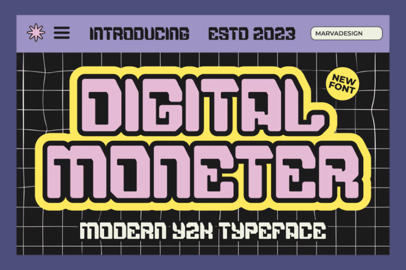
Digital Moneter is a decorative font that captures the essence of Y2K techno aesthetics. Its modern yet retro design makes it perfect for projects that want to evoke a turn-of-the-millennium digital vibe.
Digital Dreamer
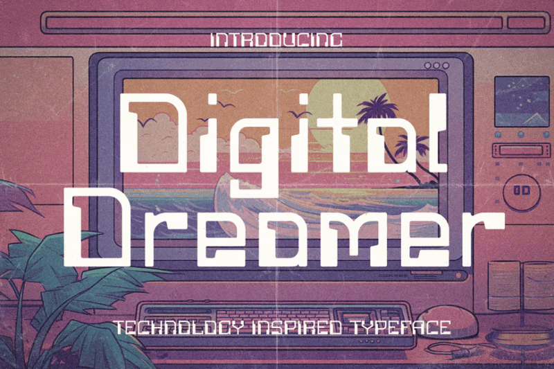
Digital Dreamer is a decorative typeface that pays homage to 1980s computer aesthetics. Its design evokes early internet and digital technology, making it ideal for retro-themed projects or designs aiming for a nostalgic tech feel.
Cyberpunk Style Font
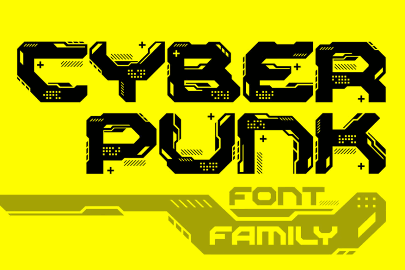
This decorative font embodies the essence of cyberpunk aesthetics with its futuristic and technological design. It’s perfect for projects related to sci-fi, tech, or any design that aims to convey a edgy, future-forward feel.
Cyber Bresero
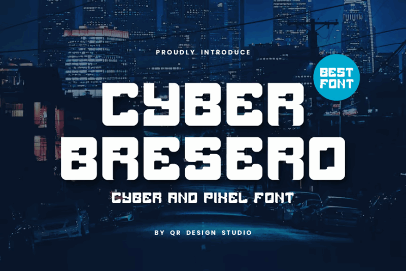
Cyber Bresero is a decorative digital font with a sporty, tech-inspired design. Its condensed style makes it ideal for headlines or logos in projects related to technology, sports, or futuristic themes.
Digibra
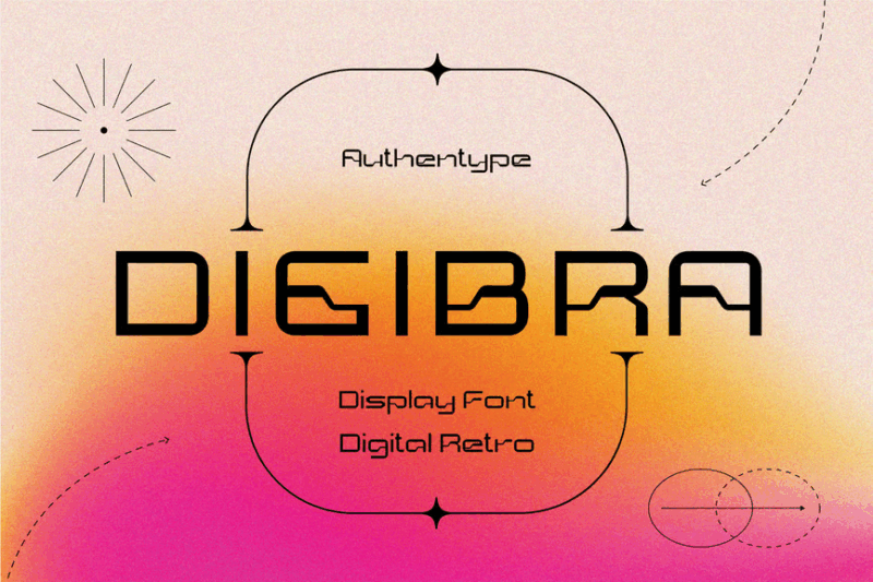
Digibra is a decorative font that combines digital aesthetics with retro display elements. Its pixel art-inspired design makes it perfect for projects aiming for a nostalgic digital look or retro-futuristic themes.
Techbit
![]()
Techbit is a sans-serif font featuring a soft pixel design, perfect for modern logos. Its blend of pixel aesthetics with smooth edges makes it ideal for tech-related branding or any project requiring a contemporary digital look.
Degita
![]()
Degita is a decorative pixel font that captures the essence of retro gaming aesthetics. Its blocky, pixelated design makes it perfect for game-related projects or any design aiming to evoke a nostalgic digital feel.
Pixemaze
![]()
Pixemaze is a unique decorative font that combines serif elements with pixelated aesthetics. Its retro-inspired design makes it ideal for projects that want to blend classic typography with digital art styles.
Glitchen
![]()
Glitchen is a sans-serif display font featuring a modern, pixelated design. Its futuristic look makes it perfect for tech-related projects, digital art, or any design that aims to convey a cutting-edge, computerized feel. It also looks a little like the original Minecraft font, doesn’t it?
Vorcas Glitch Font
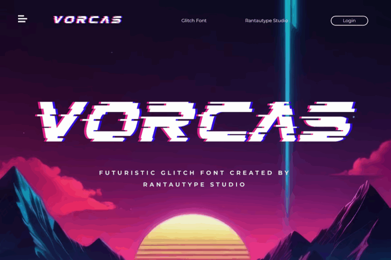
Vorcas is a decorative font that incorporates glitch aesthetics into its design. Its distorted, edgy look makes it ideal for magazine layouts, album covers, or any project aiming for a contemporary, digitally-disrupted feel.
Cybernex
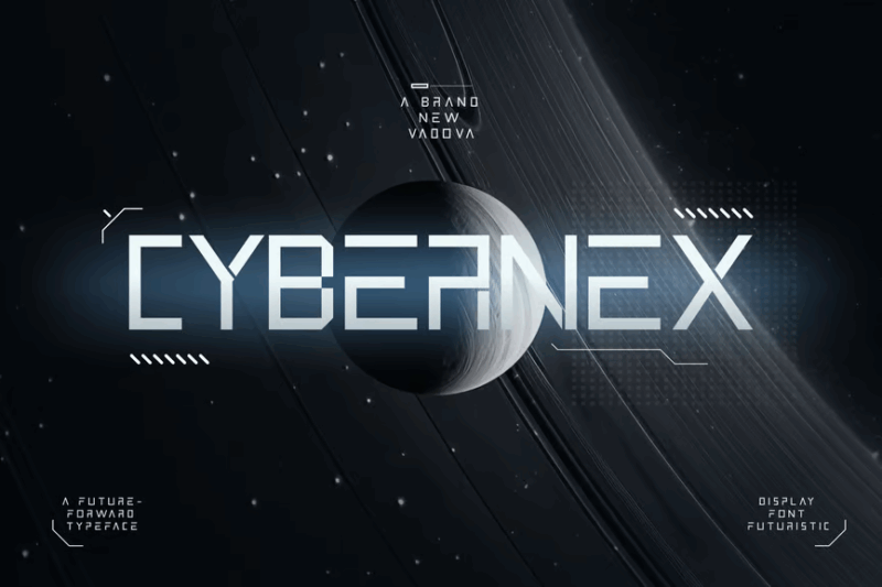
Cybernex is a sans-serif font with a strong futuristic and digital aesthetic. Its sleek, tech-inspired design makes it perfect for sci-fi related projects, tech branding, or any design that needs to convey a sense of future-forward thinking.
Psygen
![]()
Psygen is a modern sans-serif font that incorporates pixel aesthetics. Its contemporary take on pixelated design makes it ideal for tech startups, digital art projects, or any design that wants to blend retro and modern elements.
Robert
![]()
Robert is a sans-serif pixel font that evokes 90s digital aesthetics. Its nostalgic design makes it perfect for retro-themed projects, vintage tech branding, or any design aiming to capture the essence of early digital era.
Raw Pixel
![]()
Raw Pixel is a decorative bitmap font that embodies classic 8-bit aesthetics. Its chunky, pixelated design makes it ideal for retro gaming projects, pixel art, or any design aiming for an authentic old-school digital look.
Pixel Impact
![]()
Pixel Impact is a decorative 8-bit style font that captures the essence of classic video game typography. Its bold, pixelated design makes it perfect for gaming-related projects or any design aiming to evoke nostalgia for early digital graphics. It’s also on our list of fonts like Impact, but better.
Caleb Mono
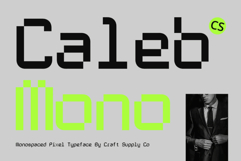
Caleb Mono is a clean, readable monospaced sans-serif font. Its crisp design and consistent character width make it ideal for coding, technical documentation, or any project requiring a modern, efficient typeface.
UT Defghio Nixav
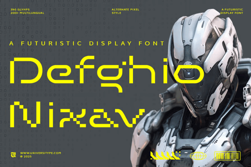
UT Defghio Nixav is a futuristic sans-serif display font with a strong gaming aesthetic. Its bold, tech-inspired design makes it perfect for video game titles, sci-fi themed projects, or any design that aims to convey a sense of digital adventure.
What Makes a Font “Digital” in Appearance?
Before we jump into our font recommendations, let’s clarify what we mean by “digital fonts.” We’re specifically talking about typefaces that visually reference segmented electronic displays. These fonts have a distinctive appearance defined by several key characteristics:
Segmented Construction – The hallmark of a true digital font is its segmented construction, where each character is formed by combining distinct rectangular or occasionally rounded segments. These mimic the physical LCD or LED elements in electronic displays where specific segments illuminate to create different characters.
Limited Geometry – Digital display fonts are constrained by their structure, typically using 7 segments for numbers (the classic “7-segment display”) or 14-16 segments for full alphanumeric characters. This limitation creates their distinctive, sometimes quirky appearance.
Uniform Thickness – Unlike many traditional typefaces, digital fonts typically maintain the same thickness throughout all strokes, reflecting the consistent illumination of electronic displays.
Angular Shapes – Most classic digital fonts feature sharp, angular shapes with pronounced corners, though some newer variations incorporate rounded corners to mimic more modern displays.
Negative Space Gaps – Authentic digital fonts feature small gaps between segments, just as you’d see on a real electronic display, giving them their instantly recognizable “broken” appearance.
Now that we understand what makes these fonts so special, let’s look at the best digital fonts that will give your designs that distinctive tech-ready look in 2026.
The Fascinating History of Digital Display Fonts
Digital fonts have a rich history that parallels the evolution of electronic displays themselves. Understanding this history helps us appreciate why these fonts continue to resonate with audiences today.
The story begins in the early 20th century with the development of the first electronic numerical displays for equipment like voltmeters. However, it wasn’t until the 1970s, with the proliferation of affordable LED and LCD displays in consumer electronics, that these segmented fonts truly entered public consciousness.
The classic 7-segment display became ubiquitous in digital watches, calculators, alarm clocks, and microwave timers. This simple arrangement of seven rectangular elements could form all ten digits and a limited set of alphabetic characters (though some, like ‘K’ and ‘M’, were awkwardly represented).
For more complex alphanumeric displays, the 14-segment and 16-segment displays were developed, adding diagonal and horizontal elements that allowed for better representation of the entire alphabet. These appeared in early digital signage, vehicle dashboards, and more sophisticated electronic equipment.
By the 1980s, these digital displays were everywhere, creating a strong visual association with technology and the future. When personal computers became mainstream, digital fonts were among the first decorative typefaces created to evoke that high-tech feeling.
Today, while many actual displays have moved to pixel-based screens that can show any typeface, the distinct aesthetic of segmented digital fonts remains powerfully evocative of technology, precision, and innovation. They’ve transcended their functional origins to become design elements in their own right, carrying nostalgic charm while still feeling decidedly tech-forward.
How to Effectively Use Digital Fonts in Your Designs
Digital fonts have a strong personality, so knowing when and how to use them is crucial for successful designs. Here are some best practices for incorporating these distinctive typefaces:
Perfect for Headlines, Challenging for Body Text – Digital fonts shine as attention-grabbing headlines, logos, or short phrases. Their distinctive appearance makes them less suited for lengthy body text, where legibility might suffer.
Size Matters – Many digital fonts retain their visual impact best at larger sizes where their segmented construction is clearly visible. At very small sizes, some segmented details may become muddy.
Embrace the Tech Connection – These fonts naturally evoke technology, electronics, gaming, and science fiction themes. Lean into these associations rather than fighting them.
Consider Contextual Appropriateness – While perfect for tech companies, gaming applications, and future-forward brands, digital fonts might feel jarring for traditional businesses like law firms or luxury brands (unless going for intentional contrast).
Use Color Strategically – Many digital fonts look their best in colors that reference electronic displays: acid green, bright red, electric blue, or glowing white against dark backgrounds. Some even come with multi-colored or gradient options to enhance the digital display effect.
Respect the Nostalgia Factor – Digital fonts can trigger strong nostalgic feelings for the 70s, 80s, and early computing. This can be leveraged for retro-themed designs or deliberately contrasted for interesting juxtapositions.
Consider Animation Potential – In digital environments, these fonts are perfect candidates for animations that mimic electronic displays, like flickering, illumination changes, or segment-by-segment reveals.
Perfect Pairings for Digital Fonts
Digital fonts have such a distinctive personality that pairing them effectively requires some thought. Here are some excellent companion fonts that complement digital typefaces:
Clean Sans Serifs – Fonts like Helvetica, Roboto, or Open Sans provide a neutral, legible counterpoint that doesn’t compete with the technical character of digital fonts.
Monospaced Fonts – Typefaces like Courier, Roboto Mono, or Source Code Pro share a technical feel while offering better readability for longer text passages.
Geometric Sans Serifs – Fonts with clean, geometric construction like Futura or Montserrat complement the mathematical precision of digital fonts.
Industrial Slab Serifs – For a complementary yet contrasting pairing, industrial-feeling slab serifs like Courier Slab or Roboto Slab work well while maintaining a technical aesthetic.
Remember, contrast in style but consistency in mood usually creates the most successful pairings. Let your digital font take center stage while its companion handles the heavy lifting of readability.
Digital Font Design Trends in 2026
As we progress through 2026, we’re seeing some fascinating evolutions in digital font design:
Rounded Variants – Modern interpretations are introducing rounded corners to traditional segmented forms, giving a softer, more contemporary feel while maintaining the digital display aesthetic.
Variable Thickness – Some newer digital fonts experiment with varying the thickness of different segments, adding visual interest while still honoring the segmented construction.
Expanded Character Sets – Today’s digital fonts often come with extensive character sets that solve the traditional limitations of segmented displays, offering better solutions for traditionally problematic letters.
Textured and 3D Variations – Digital fonts are increasingly available with textured effects that mimic LED pixels, screen glitches, or dimensional properties that add depth and visual interest.
Hybrid Approaches – Some cutting-edge designs are blending segmented construction with other typographic styles, creating innovative hybrids that reference digital displays while pushing into new aesthetic territory.
Creative Animations – For web and motion graphics, animated digital fonts that mimic the illumination patterns of real displays are becoming increasingly popular, with segments lighting up sequentially or flickering like real electronic components.
When to Avoid Digital Fonts
While digital fonts are fantastic in many contexts, there are situations where they may not be the best choice:
Readability-Critical Applications – Forms, contracts, lengthy articles, or any text where quick, effortless reading is essential should avoid digital fonts, which can slow comprehension.
Traditional or Luxury Branding – Businesses wanting to convey tradition, craftsmanship, or luxury might find digital fonts undermine these values (unless using the contrast intentionally).
Very Small Sizes – Many digital fonts lose clarity at very small sizes where the gaps between segments become indistinct.
Formal Documents – Legal, academic, or business formal documents are rarely appropriate places for digital fonts, which may undermine the seriousness of the content.
Overexposure – Using digital fonts for too many elements in a single design can quickly become overwhelming and reduce their impact.
Common Digital Font Questions
Let’s wrap up by answering some frequently asked questions about digital fonts:
What font is used in digital clocks?
Most digital clocks use a standard 7-segment display font, where each numeral is formed by illuminating some combination of seven straight-line segments. There’s no single “official” font, as this is a display technology rather than a specific typeface, but fonts like “Digital-7” closely replicate this appearance.
What is the name of the digital number font?
The most common digital number font is generically called “7-segment display.” Popular digital font implementations include “Digital-7,” “LCD,” “DS-Digital,” and “Advanced LED Board-7.” Each offers slight variations on the classic segmented appearance.
How do I get the digital clock font?
Many digital clock fonts are available through font marketplaces like MyFonts, Creative Market, or font foundry websites. There are also free options available through sites like DaFont or Google Fonts, though commercial use rights vary.
Are digital fonts still relevant in modern design?
Absolutely! While actual segmented displays are less common in modern technology, digital fonts remain relevant for their strong tech associations, nostalgic appeal, and distinctive visual character. They’re particularly effective in tech branding, gaming interfaces, and designs that want to evoke technological themes.
Conclusion: The Timeless Appeal of Digital Fonts
Digital fonts occupy a unique space in typography. Born from the functional constraints of early electronic displays, they’ve evolved into powerful design elements that instantly communicate technology, precision, and innovation.
What makes these fonts so enduring is their ability to simultaneously evoke nostalgia for early digital technology while still feeling appropriate for cutting-edge applications. Few other typographic styles can claim such versatility across time.
Whether you’re designing a retro-arcade game interface, branding a tech startup, or simply adding a technical flavor to your next project, the right digital font can instantly establish the desired associations.
As we move further into 2026, digital fonts continue to evolve, with designers pushing the boundaries of what’s possible while honoring the distinctive segmented construction that gives these typefaces their unmistakable character.
So next time you’re looking to add some technological flair to your designs, consider reaching for one of these digital fonts. Their distinctive appearance might be just what you need to make your project truly “light up!”
Which digital font is your favorite? Are you team 7-segment or do you prefer the full alphanumeric flexibility of 16-segment designs? Let me know in the comments!