In this article:
- The 8 Most Breathtaking Sunset Color Palettes
- Why Sunset Colors Never Go Out of Style
- How to Master Sunset Palettes in Contemporary Design
- The Science Behind Our Sunset Obsession
- Applying Sunset Palettes Across Design Disciplines
- Seasonal Considerations and Trending Applications
- Conclusion: Bringing Natural Beauty Into Modern Design
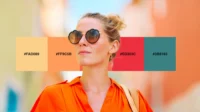
There’s something absolutely magical about watching the sun dip below the horizon, painting the sky in breathtaking hues that seem almost too beautiful to be real. As a designer, I find myself constantly inspired by these natural masterpieces that unfold before us every evening. The way warm oranges melt into soft pinks, how deep purples blend seamlessly with golden yellows – it’s like nature’s own masterclass in color theory.
If you’re looking to infuse your next project with the warmth, romance, and natural beauty of a perfect sunset, you’ve come to the right place. I’ve curated eight of the most captivating sunset color palettes that will bring that golden hour magic directly into your designs.
The 8 Most Breathtaking Sunset Color Palettes
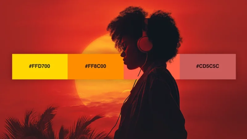
1. Golden Hour Glow
-
 #FFD700


-
#FF8C00
-
#FF6347
-
#CD5C5C
Download this color palette
 735×1102
Pinterest image

 2160×3840
Vertical wallpaper

 900×900
Square

 3840×2160
4K Wallpaper

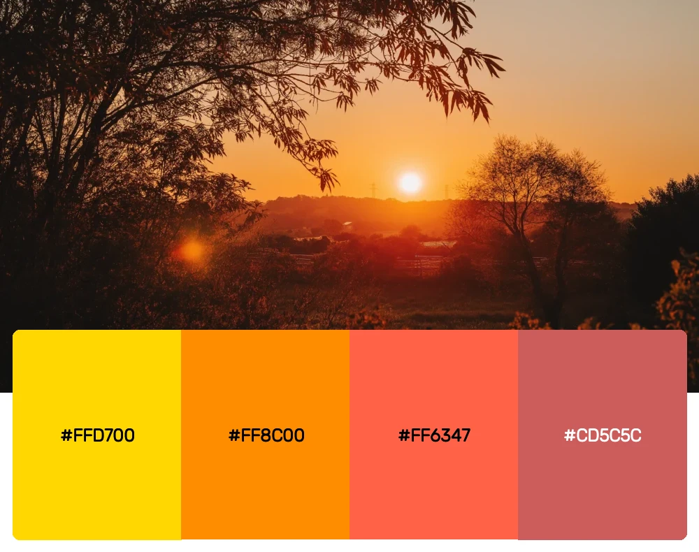
This palette captures that perfect moment when everything seems to be touched by liquid gold. The warm yellows transition beautifully into rich oranges and soft coral reds, creating a sense of warmth and optimism that’s impossible to ignore. I find this combination works wonderfully for brands that want to evoke feelings of happiness, energy, and positivity.
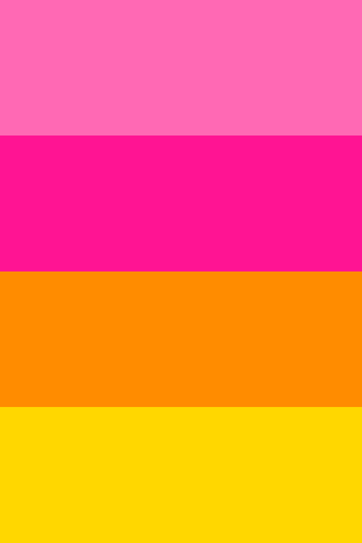
2. Tropical Paradise
-
#FF69B4
-
#FF1493
-
#FF8C00
-
#FFD700
Download this color palette
 735×1102
Pinterest image
 2160×3840
Vertical wallpaper

 900×900
Square

 3840×2160
4K Wallpaper

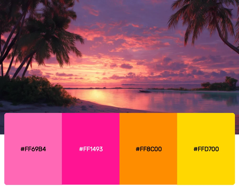
Inspired by those incredible sunsets you see in tropical destinations, this vibrant palette combines hot pinks with brilliant oranges and golden yellows. It’s bold, it’s energetic, and it’s perfect for projects that need to make a statement. I love using these colors for summer campaigns or anything that needs to capture that vacation feeling.
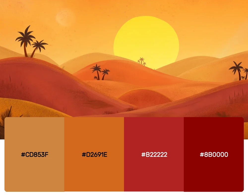
3. Desert Dreams
-
#CD853F
-
#D2691E
-
#B22222
-
#8B0000
Download this color palette
 735×1102
Pinterest image
 2160×3840
Vertical wallpaper

 900×900
Square

 3840×2160
4K Wallpaper


Get 300+ Fonts for FREE
Enter your email to download our 100% free "Font Lover's Bundle". For commercial & personal use. No royalties. No fees. No attribution. 100% free to use anywhere.
The American Southwest produces some of the most spectacular sunsets on earth, and this palette pays homage to those incredible desert skies. The earthy browns blend into warm oranges before deepening into rich reds and burgundies. This combination brings a sense of grounding and authenticity that works beautifully for rustic or heritage brands.
4. Pastel Evening
-
#FFE4E1
-
#FFA07A
-
#F0E68C
-
#DDA0DD
Download this color palette
 735×1102
Pinterest image
 2160×3840
Vertical wallpaper

 900×900
Square

 3840×2160
4K Wallpaper

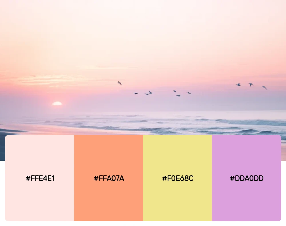
Not every sunset needs to be bold and dramatic. This softer palette captures those gentle, dreamy evenings when the sky looks like it’s been painted with watercolors. The delicate pinks, peaches, and lavenders create a romantic, ethereal feeling that’s perfect for wedding designs, beauty brands, or any project that needs a touch of feminine elegance.
5. Coastal Sunset
-
#fae991
-
#FF7F50
-
#FF6347
-
#4169E1
-
#1E90FF
Download this color palette
 735×1102
Pinterest image

 2160×3840
Vertical wallpaper

 900×900
Square

 3840×2160
4K Wallpaper

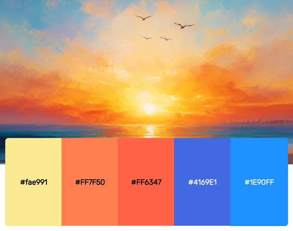
There’s something special about watching the sun set over the ocean, where warm oranges and corals meet the deep blues of the sea and sky. This palette captures that perfect contrast between warm and cool tones. I find it creates a sense of adventure and wanderlust that’s ideal for travel brands or outdoor companies.
6. Urban Twilight
-
#ffeda3
-
#fdad52
-
#fc8a6e
-
#575475
-
#111f2a
Download this color palette
 735×1102
Pinterest image

 2160×3840
Vertical wallpaper

 900×900
Square

 3840×2160
4K Wallpaper

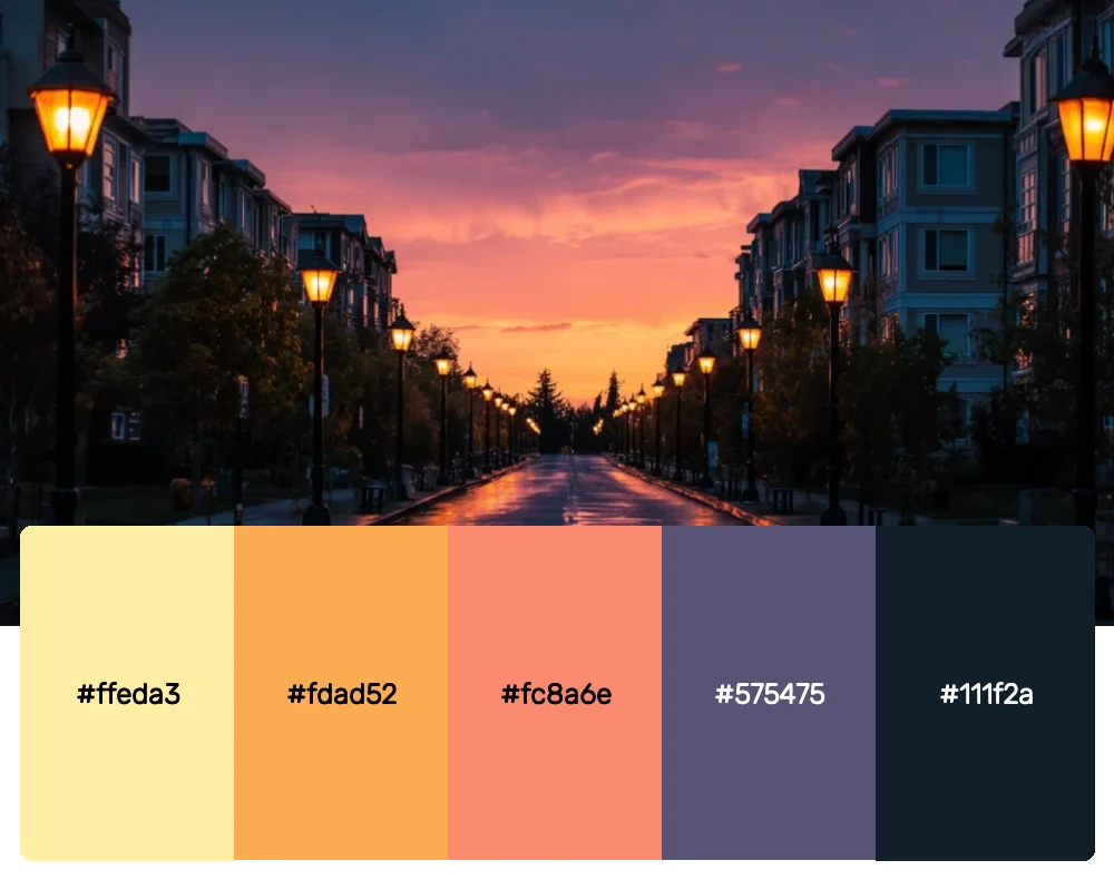
As the sun sets behind city skylines, you get these incredible contrasts between deep purples and vibrant oranges. This sophisticated palette brings together the mystery of twilight with the warmth of the setting sun. It’s perfect for creating designs that feel both modern and dramatic.
7. Autumn Harvest
-
#FF4500
-
#FF8C00
-
#DAA520
-
#8B4513
Download this color palette
 735×1102
Pinterest image

 2160×3840
Vertical wallpaper

 900×900
Square

 3840×2160
4K Wallpaper

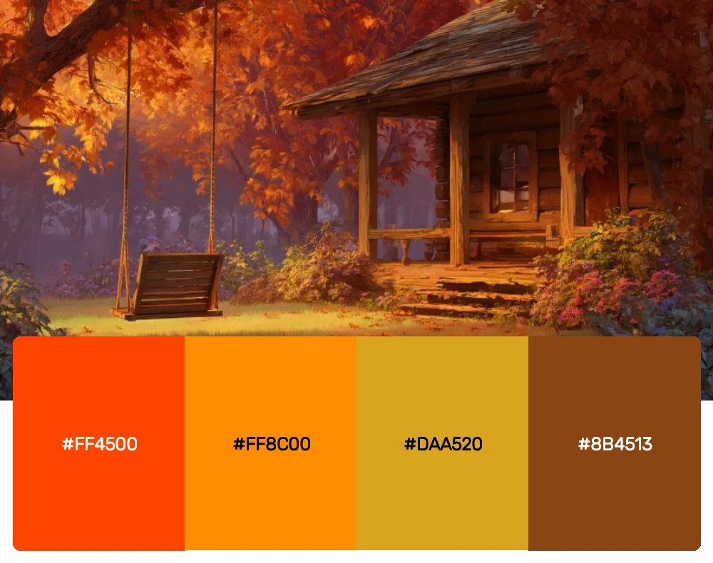
This palette captures those perfect fall evenings when the sunset seems to echo the changing leaves. The deep oranges and golden yellows create a cozy, inviting feeling that’s perfect for seasonal campaigns or brands that want to evoke comfort and tradition.
8. Fire Sky
-
#652220
-
#DC143C
-
#FF0000
-
#FF4500
-
#FF8C00
Download this color palette
 735×1102
Pinterest image

 2160×3840
Vertical wallpaper

 900×900
Square

 3840×2160
4K Wallpaper

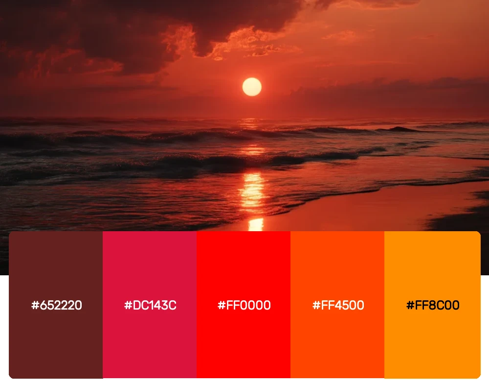
Sometimes nature puts on a show that’s so intense it takes your breath away. This bold, fiery palette captures those dramatic sunsets that look like the sky is literally on fire. It’s not for the faint of heart, but when you need maximum impact and energy, these colors deliver in spades.
Why Sunset Colors Never Go Out of Style
Before we explore how to use these palettes effectively, let’s talk about why sunset colors have such enduring appeal in design. There’s something deeply ingrained in human psychology that responds to these warm, glowing hues. They remind us of endings and beginnings, of peaceful moments and natural beauty.
From a design perspective, sunset colors offer incredible versatility. They can be bold and energetic or soft and romantic. They work equally well for corporate branding and personal projects. And perhaps most importantly, they’re inherently optimistic – they make people feel good.
I’ve found that incorporating sunset-inspired colors into modern projects adds an instant sense of warmth and approachability that resonates with audiences across all demographics. Whether you’re working on packaging design, web interfaces, or environmental graphics, these palettes can help create an emotional connection that goes beyond mere aesthetics.
How to Master Sunset Palettes in Contemporary Design
Using sunset colors effectively requires more than just picking pretty hues and hoping for the best. Here are some strategies I’ve developed for incorporating these palettes into modern design work:
Start with Temperature Balance
One of the most important aspects of working with sunset palettes is understanding color temperature. Most sunset combinations naturally include both warm and cool elements – the warm oranges and yellows of the sun itself, balanced by the cooler purples and blues of the surrounding sky. Maintaining this temperature balance keeps your designs from feeling flat or monotonous.
Layer for Depth
Real sunsets have incredible depth and dimension, with colors layering and blending into each other. Try to recreate this in your designs by using gradients, overlays, or layered elements rather than flat blocks of color. This approach creates visual interest and mimics the natural way these colors appear in nature.
Consider Context and Contrast
While sunset colors are beautiful, they need to work within the context of your overall design. Pay attention to readability – text needs sufficient contrast against sunset backgrounds. Consider using neutrals like deep charcoal or cream to provide breathing room and ensure your message remains clear.
Embrace Gradual Transitions
The magic of a sunset lies in how colors flow seamlessly from one to another. Incorporate this principle into your designs through smooth gradients, subtle color shifts, or elements that bridge between different hues in your palette.
The Science Behind Our Sunset Obsession
As someone who’s spent years studying color psychology, I’m fascinated by why sunset colors have such universal appeal. Research suggests that warm colors like those found in sunsets trigger positive emotional responses and can even increase feelings of comfort and security.
There’s also the association factor – sunsets are linked in our minds with relaxation, beauty, and positive experiences. When we see these colors in design, we unconsciously associate them with those same positive feelings. This makes sunset palettes particularly effective for brands that want to create emotional connections with their audiences.
The cyclical nature of sunsets also plays a role. They happen every day, marking the transition from activity to rest, from work to leisure. This gives sunset colors a sense of familiarity and comfort that few other color combinations can match.
Applying Sunset Palettes Across Design Disciplines
One of the things I love most about sunset color palettes is how adaptable they are across different types of design work:
Brand Identity Design
Sunset colors can help brands convey warmth, optimism, and approachability. I’ve used variations of these palettes for everything from artisanal food companies to wellness brands. The key is choosing the right intensity level for your brand’s personality – softer palettes for more refined brands, bolder combinations for companies that want to make a statement.
Digital Design
In web and app design, sunset colors can create interfaces that feel warm and inviting rather than cold and clinical. I often use these palettes for backgrounds, accent elements, or call-to-action buttons. The natural flow between colors makes them perfect for creating smooth user experiences that guide the eye naturally through content.
Print and Packaging
Sunset palettes really shine in print applications where you can take advantage of rich, saturated colors. They work beautifully for packaging design, particularly for products associated with warmth, comfort, or natural ingredients. The key is ensuring your color reproduction is accurate – sunset colors can look muddy if not handled properly in print.
Environmental Design
In spaces, sunset colors can create incredibly welcoming environments. I’ve seen these palettes used effectively in restaurants, retail spaces, and even corporate offices where the goal is to create a sense of warmth and community.
Seasonal Considerations and Trending Applications
While sunset colors are timeless, they do have natural seasonal associations that smart designers can leverage. The warmer, more intense sunset palettes work beautifully for fall and winter campaigns, while the softer, more pastel variations are perfect for spring and summer applications.
I’ve noticed a growing trend toward using sunset palettes in unexpected contexts – tech companies embracing warm gradients, financial services using sunset colors to appear more approachable, and healthcare brands incorporating these hues to create more comforting environments.
Conclusion: Bringing Natural Beauty Into Modern Design
As we’ve explored these eight stunning sunset color palettes, I hope you’ve gained new appreciation for the incredible design potential that nature provides us every single day. These colors aren’t just beautiful – they’re powerful tools for creating emotional connections, conveying brand values, and making designs that truly resonate with people.
The secret to successfully using sunset palettes lies in understanding both their emotional impact and their technical requirements. Don’t be afraid to experiment with different combinations and intensities, but always keep your audience and context in mind.
Remember, the best sunset colors aren’t just about picking the prettiest hues – they’re about capturing the feeling of those magical moments when day transitions to night. Whether you’re creating a logo that needs to convey warmth and trust, designing a website that should feel welcoming and approachable, or developing packaging that needs to stand out on crowded shelves, these sunset-inspired palettes offer endless possibilities.
So the next time you catch yourself stopped in your tracks by a particularly stunning sunset, take a moment to really study those colors. Notice how they blend and flow, how they make you feel, and how they change as the light shifts. Then bring that natural magic into your next design project.
After all, if nature can create such breathtaking color combinations every single day, imagine what we can achieve when we learn from the master. Happy designing!