In this article:
- 28 Newsworthy Newspaper Fonts of 2026
- The Anatomy of Newspaper Typography
- Classic Newspaper Fonts That Defined an Era
- Headlines vs. Body Text: Choosing the Right Newspaper Font
- What Makes a Font Feel "Newsy"?
- Using Newspaper Fonts in Your Own Designs
- The Psychology Behind Newspaper Font Choices
- Common Mistakes When Using Newspaper Fonts
- Digital vs. Print: How Newspaper Fonts Adapt
- Expert Opinions: Typography Designers on Newspaper Fonts
- The Future of Newspaper Typography
- Newspaper Font Pairing: Building Hierarchies That Work
- Conclusion: The Enduring Power of Newspaper Typography
Remember when tiny black marks on paper delivered the world’s most important stories? Those marks were newspaper fonts – and they represent some of the most brilliant problem-solving in typography history, even as physical newspapers fade into memory.
Think about it: these typefaces needed to whisper “credible journalism” while shouting “read me first!” They had to squeeze maximum information into minimal space, remain crystal clear at microscopic sizes, and work flawlessly whether printed on high-end presses or basement operations. It was typographic genius disguised as everyday utility – back when “everyday” meant something entirely different.
From the iconic Times New Roman that graced countless front pages to the final gasps of print journalism, newspaper fonts carry the DNA of a publishing era that’s largely passed us by. As someone who’s dissected everything from vintage broadsheet headers to forgotten classified ad text, I’m fascinated by how these information workhorses achieved the impossible balance of efficiency and elegance. Ready to explore the fonts that once literally made headlines? Let’s uncover the typographic legacy of an analog world!
28 Newsworthy Newspaper Fonts of 2026
Typrighter
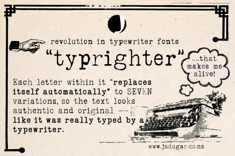
Typrighter is a serif typeface that emulates the look of old typewriter text. It offers a nostalgic and authentic feel, perfect for projects requiring a vintage or retro aesthetic.
Analog Typewriter
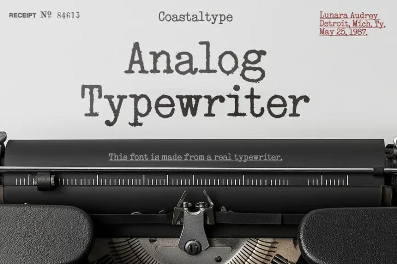
Analog Typewriter is a serif font that mimics the imperfections of typewritten documents. It’s ideal for creating realistic, vintage-inspired designs or adding a touch of authenticity to digital projects.
Not my type typewriter font
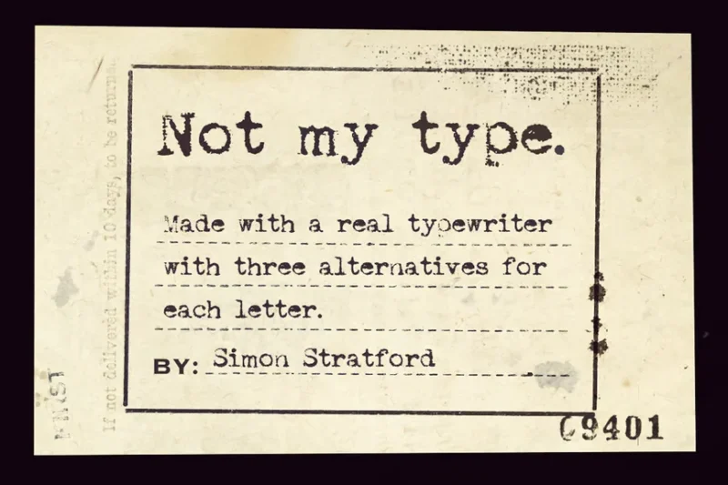
This serif typeface captures the essence of a realistic typewriter font. It’s perfect for designers looking to add a genuine, old-school typewritten feel to their work, with all the charm and imperfections of actual typewritten text.
Scripter – Classic Typewriter Font
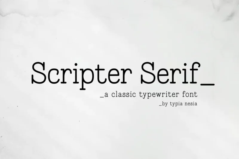
Scripter is a classic typewriter-inspired serif font. It offers a timeless, traditional look that’s ideal for creating vintage-style designs or adding a touch of nostalgia to modern projects.

Get 300+ Fonts for FREE
Enter your email to download our 100% free "Font Lover's Bundle". For commercial & personal use. No royalties. No fees. No attribution. 100% free to use anywhere.
Chronicles Secret – Display Typewriter
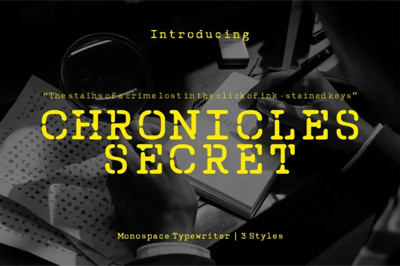
Chronicles Secret is a decorative serif typewriter font with rounded edges. This unique display font combines vintage charm with a modern twist, making it perfect for eye-catching headlines or branding projects.
Autors Story – Typewriter Font
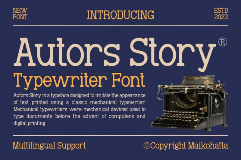
Autors Story is a serif typewriter font that captures the essence of a writer’s tale. It’s ideal for creating a nostalgic, literary atmosphere in design projects, particularly those related to storytelling or publishing.
Untold History – Typewriter Font
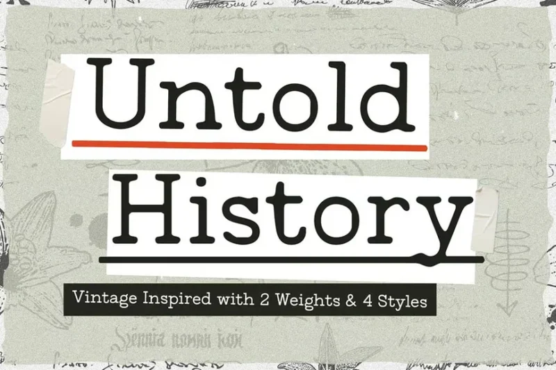
Untold History is a classic typewriter-inspired serif font. It evokes a sense of forgotten stories and hidden narratives, making it perfect for historical or vintage-themed designs.
Amateur Hand – Handwritten Typewriter Font
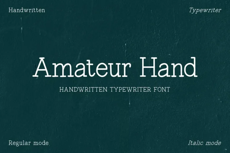
Amateur Hand is a clean, handwritten-style typewriter font. This serif typeface combines the charm of handwriting with the structure of typewritten text, ideal for designs that require a personal touch with a hint of nostalgia.
Keyclack Font
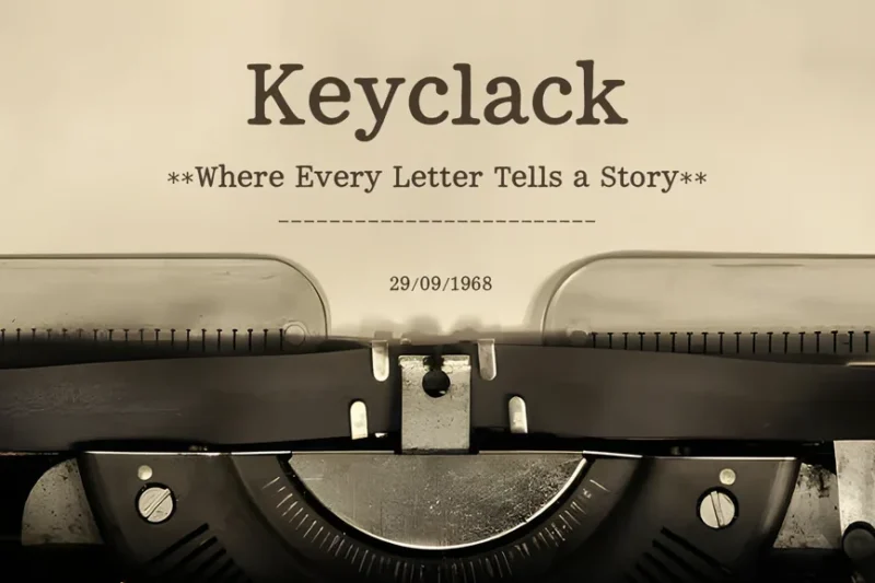
Keyclack is a retro-inspired serif typewriter font. It captures the essence of old-school typing, complete with the imagined sound of keys clacking, perfect for vintage-themed designs or projects requiring a touch of nostalgia.
Inktype
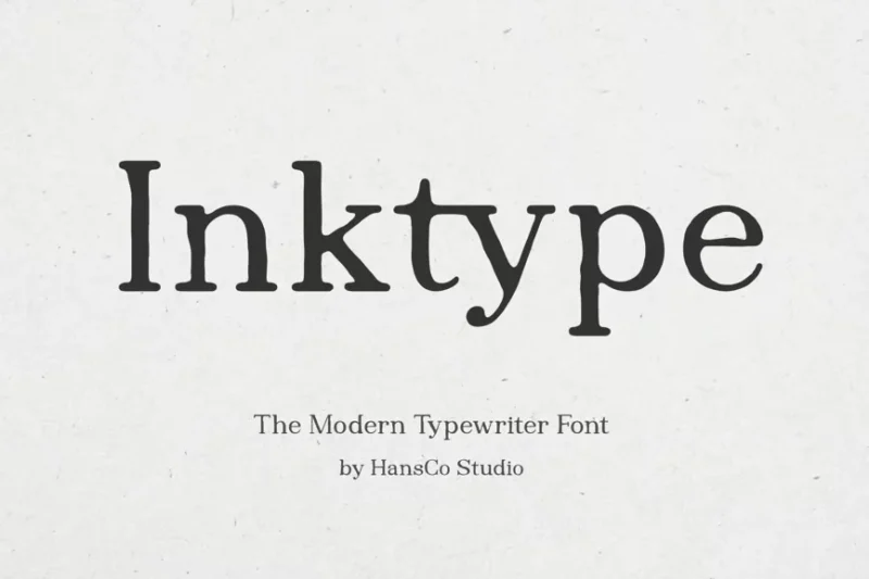
Inktype is a serif typewriter font that mimics the look of inked text. It offers a unique blend of typewriter precision and the organic quality of ink, ideal for designs that require a handcrafted, vintage feel.
Manuscript – Vintage Typewriter Font
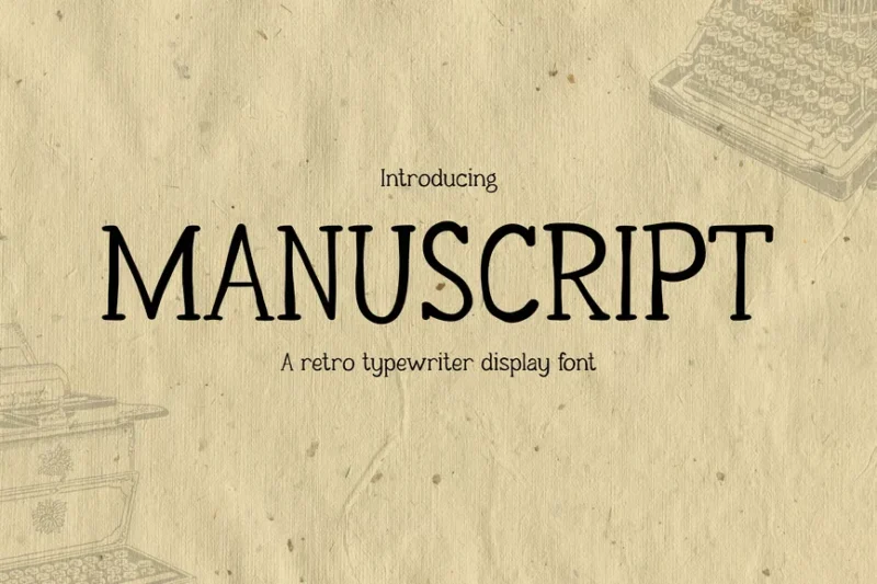
Manuscript is a vintage-style serif typewriter font. It’s particularly well-suited for headlines and retro-inspired designs, offering a classic typewritten look that evokes nostalgia and authenticity.
Rattle Ink — Vintage Typewriter Font
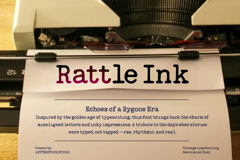
Rattle Ink is a vintage-inspired serif typewriter font. It combines the charm of old typewriters with a slightly distressed look, perfect for creating authentic retro designs or adding a touch of nostalgia to modern projects.
Merchant Ledger
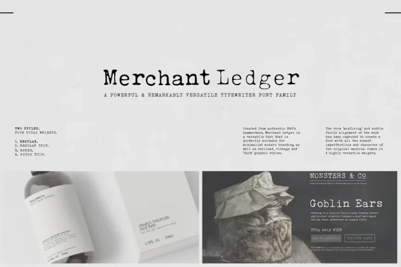
Merchant Ledger is a decorative serif font with a typewriter-inspired design. It evokes the feel of old business ledgers and accounting books, making it ideal for vintage-themed designs or projects related to finance and commerce.
Tranfer – A Typewriter Font
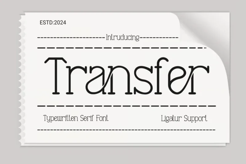
Tranfer is a serif typewriter font that captures the essence of traditional typewritten text. It’s perfect for designers looking to add an authentic, vintage touch to their projects, particularly those aiming for a classic, nostalgic feel.
Authoring – Typewriter Typeface
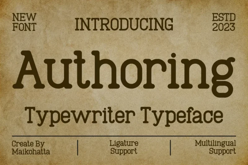
Authoring is a serif typewriter font that embodies the spirit of writing and storytelling. It’s ideal for literary-themed designs or projects that aim to evoke the feeling of classic authorship and creativity.
Typehunter – Handwritten Typewritter Font
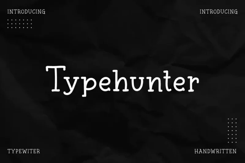
Typehunter is a minimalist, handwritten-style typewriter font. This serif typeface combines the charm of handwriting with the structure of typewritten text, perfect for designs that require a personal touch with a clean, organized look.
Inkfolk Rough Typewriter Serif
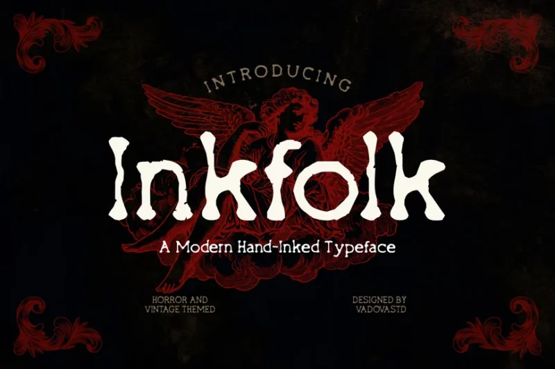
Inkfolk Rough is a decorative serif typewriter font with a gothic, vintage flair. Its rough edges and ink-like texture make it perfect for creating designs with a grungy, old-world charm or a touch of mystery.
Vintage Machine – Typewritter Typeface Logo Font
![]()
Vintage Machine is a handwritten-style serif typewriter font. It’s designed to mimic the look of old typewriter text with a personal touch, making it ideal for logo designs or projects that require a blend of vintage charm and individuality.
Silk Remington
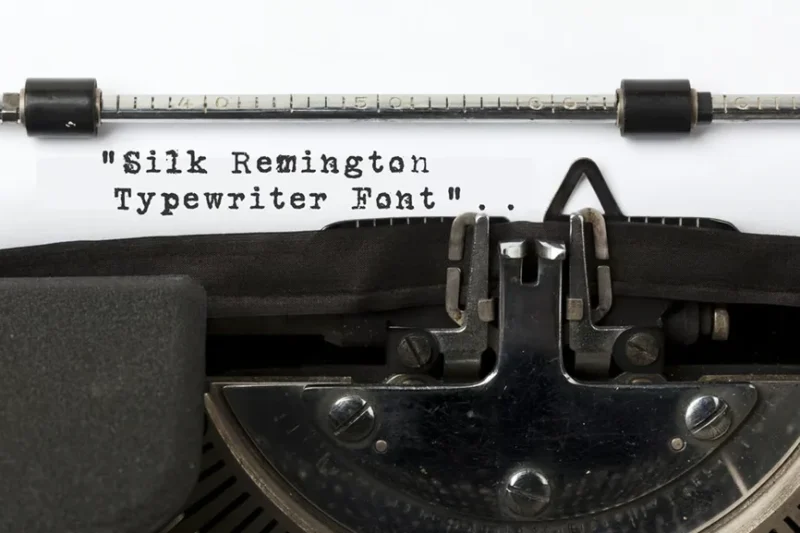
Silk Remington is a unique font that combines sans-serif, script, and handwritten styles with a typewriter aesthetic. This versatile typeface offers a blend of elegance and vintage charm, perfect for a wide range of design projects.
Marking First – Monoline Typewriter Font
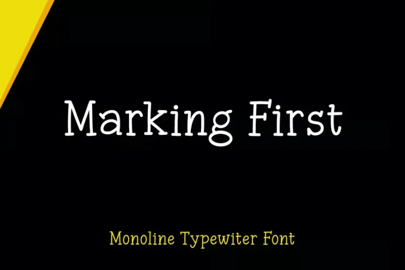
Marking First is a monoline typewriter font with a script and handwritten style. Its clean, consistent lines make it ideal for logo designs and projects that require a blend of typewriter aesthetics and modern simplicity.
Manly Beard – Handmade Typewriter Font
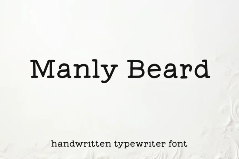
Manly Beard is a handmade serif typewriter font with a display-style flair. It offers a rugged, masculine aesthetic that’s perfect for designs targeting a male audience or projects requiring a bold, vintage-inspired look.
Trioskay – Typewriter Font
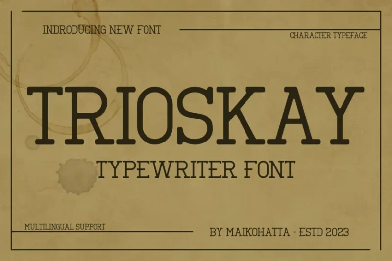
Trioskay is a serif typewriter font that captures the essence of classic typewritten text. It’s ideal for creating authentic vintage-inspired designs or adding a touch of nostalgia to modern projects.
Frontype – Typewriter Typeface
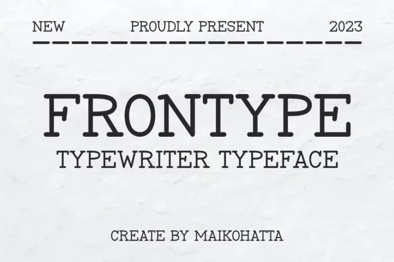
Frontype is a serif typewriter font that embodies the charm of traditional typewritten text. It’s perfect for designers looking to add an authentic, vintage touch to their projects, particularly those aiming for a classic, nostalgic feel.
Hestoria – Typewriter Font
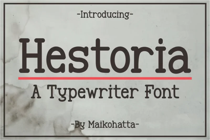
Hestoria is a serif typewriter font that evokes a sense of history and storytelling. It’s ideal for projects that aim to capture the essence of classic literature or vintage documentation, offering a timeless, authentic look.
Nobula Hubiont – Modern Monospaced Font
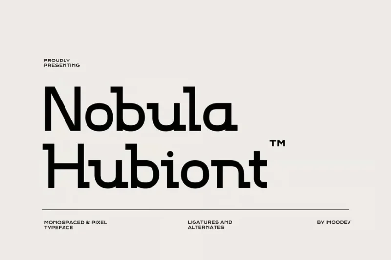
Nobula Hubiont is a modern, sans-serif monospaced font with a futuristic flair. Its clean lines and uniform character width make it perfect for tech-related designs, coding projects, or game interfaces that require a sleek, contemporary look.
Thomas Craft A Modern Serif Typeface
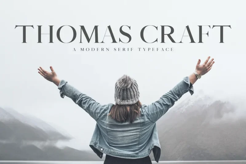
Thomas Craft is a modern serif typeface that combines elegance with contemporary design. Its refined look makes it suitable for a wide range of projects, from branding to editorial design, where a touch of sophistication is desired.
Thinkerbery – Modern Clean and Elegant Serif Font
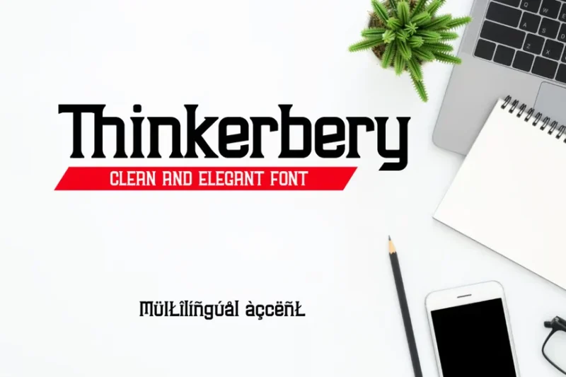
Thinkerbery is a modern, clean serif font with an elegant touch. Its refined design makes it perfect for office-related projects, professional branding, or any design that requires a sophisticated yet contemporary look.
Unblocker – Headline Font
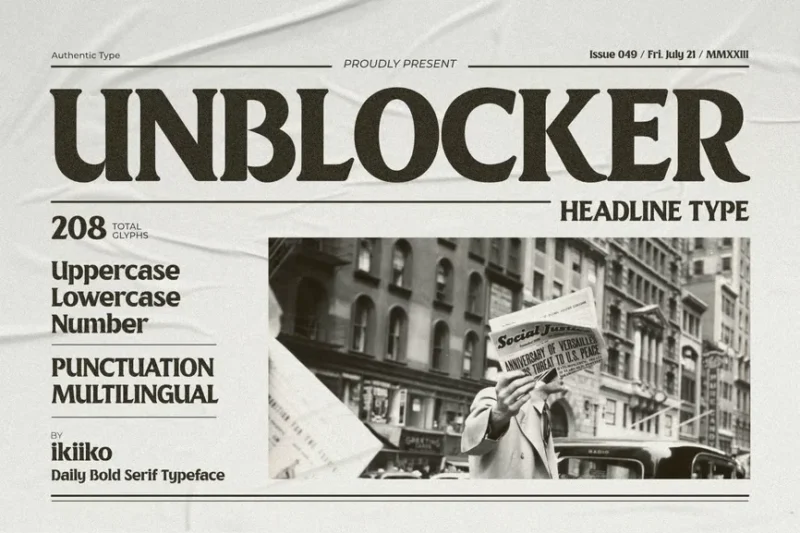
Unblocker is a bold serif font designed specifically for headlines and newspaper-style typography. Its strong presence and clear legibility make it ideal for creating impactful titles and grabbing readers’ attention in print or digital media.
The Anatomy of Newspaper Typography
Before we jump into specific fonts, let’s understand what makes newspaper typography so distinctive. Newspaper fonts aren’t chosen randomly – they’re the result of careful consideration of several key factors.
Space Efficiency Newspapers operate under extreme space constraints. Every inch of paper costs money, so fonts need to be highly legible while taking up minimal horizontal space. This is why you’ll often see condensed letterforms and tight spacing in newspaper design.
High-Speed Readability Unlike a novel that you might read leisurely, newspapers are consumed quickly. Readers scan headlines, skim articles, and jump between sections rapidly. The typography must facilitate this behavior with clear hierarchy and instant recognition.
Print Quality Considerations Traditional newspaper printing uses lower-quality paper and high-speed presses, which can cause ink to bleed or blur. Newspaper fonts are designed with slightly thicker strokes and more open counters to maintain clarity even when printing conditions aren’t perfect.
Authority and Trust Perhaps most importantly, newspaper fonts must convey credibility. When delivering breaking news or investigating complex stories, the typography itself becomes part of building reader trust. This is why many newspapers stick with time-tested serif fonts that feel established and authoritative.
Classic Newspaper Fonts That Defined an Era
Let’s start with the legends – the fonts that have shaped newspaper design for generations and continue to influence editorial typography today.
Times New Roman The granddaddy of newspaper fonts, Times New Roman was commissioned by The Times of London in 1931. Designed by Stanley Morison and Victor Lardent, this serif masterpiece was created specifically to maximize readability in narrow newspaper columns while saving space. Its slightly condensed letterforms and strong contrast between thick and thin strokes make it instantly recognizable as “newspaper typography.”
Georgia Created by Matthew Carter for Microsoft in the 1990s, Georgia was designed specifically for screen reading but has found its way into many print applications. Its large x-height and robust serifs make it incredibly readable at small sizes, making it a favorite for both digital and print editorial work.
Minion Pro Adobe’s Minion Pro has become a staple in newspaper design for its exceptional readability and elegant proportions. Designed by Robert Slimbach, this font family offers extensive weights and styles while maintaining that classic newspaper feel.
Imperial Used by The Wall Street Journal and many other prestigious publications, Imperial strikes the perfect balance between traditional authority and modern clarity. Its tall x-height and clean letterforms work beautifully in both headlines and body text.
Headlines vs. Body Text: Choosing the Right Newspaper Font
One of the biggest decisions in newspaper design is selecting fonts for different hierarchical levels. Let’s break down the considerations for each use case.
Headline Fonts Headlines need to grab attention while conveying the story’s importance. Traditionally, newspapers used bold or black weights of their body text font, but modern publications often pair serif body text with sans-serif headlines for improved contrast and readability.
Subheadings and Bylines These elements need to create clear hierarchy without competing with headlines. Often, newspapers use medium weights or small caps versions of their primary typeface family.
Body Text Considerations Body text is where readability becomes paramount. The font needs to be comfortable for extended reading while efficient enough to fit substantial content in limited space. Traditional serif fonts still dominate this space for good reason.
Caption and Fine Print The smallest text in newspapers requires fonts with excellent legibility at tiny sizes. This often means choosing fonts with larger x-heights and more open letterforms.
What Makes a Font Feel “Newsy”?
There’s something indefinable about fonts that immediately scream “newspaper,” but it’s actually a combination of very specific design characteristics.
Serif Structure Most traditional newspaper fonts are serifs, and specifically old-style or transitional serifs. These styles reference historical typography while providing the small details that aid in reading flow.
Moderate Contrast Newspaper fonts typically have moderate contrast between thick and thin strokes. Too little contrast feels bland; too much can cause printing problems and reduce readability at small sizes.
Condensed Proportions Space efficiency demands slightly condensed letterforms. True newspaper fonts are designed to fit more characters per line without sacrificing readability.
Robust Construction Letters need strong, well-defined shapes that hold up under less-than-perfect printing conditions. Delicate fonts simply don’t work in the newspaper environment.
Using Newspaper Fonts in Your Own Designs
Newspaper fonts aren’t just for newspapers! Their combination of authority, readability, and efficiency makes them excellent choices for many design applications.
Editorial Design Obviously, these fonts shine in magazines, newsletters, and any publication that needs to convey credibility and encourage reading.
Corporate Communications Annual reports, white papers, and other serious business documents benefit from the authoritative feel of newspaper typography.
Academic Publications Research papers, journals, and educational materials gain credibility from fonts associated with serious journalism.
Digital Applications Many newspaper fonts have been optimized for screen reading, making them excellent choices for websites, apps, and digital publications.
Branding Applications Brands that want to convey trustworthiness, tradition, or authority often incorporate newspaper-style fonts into their identity systems.
The Psychology Behind Newspaper Font Choices
Typography is psychology, and nowhere is this more evident than in newspaper design. The fonts chosen by major publications aren’t arbitrary – they’re carefully selected to influence how readers perceive and interact with content.
Trust and Authority Serif fonts, particularly those with historical associations, trigger subconscious associations with establishment, tradition, and reliability. This is why conservative publications almost universally stick with serif typefaces.
Reading Behavior The design of newspaper fonts influences how we consume information. Highly legible fonts encourage deeper reading, while poorly chosen fonts can cause readers to abandon articles.
Cultural Associations Different font styles carry cultural weight. A font that feels authoritative in one culture might feel foreign or inappropriate in another.
Common Mistakes When Using Newspaper Fonts
Even with the best intentions, it’s easy to misuse newspaper fonts. Here are the pitfalls to avoid:
Mixing Too Many Styles Newspapers typically use one primary font family with maybe one contrasting font for headlines. Resist the urge to add more – it destroys the clean, professional aesthetic.
Ignoring Hierarchy Newspaper design is all about clear information hierarchy. If your font choices don’t create obvious levels of importance, you’ve missed the point.
Poor Spacing Newspaper fonts are designed for specific spacing relationships. Too tight, and readability suffers; too loose, and you lose that efficient, packed feeling that makes newspapers work.
Wrong Context Not every project benefits from newspaper fonts. Using Times New Roman for a playful children’s book or trendy startup might send the wrong message entirely.
Digital vs. Print: How Newspaper Fonts Adapt
The transition from print to digital has forced newspaper fonts to evolve. Many traditional newspaper fonts have been redesigned or supplemented with screen-optimized versions.
Screen Optimization Digital versions of newspaper fonts often feature larger x-heights, more open spacing, and simplified details that might get lost on screens.
Responsive Typography Modern newspaper websites need fonts that work across all device sizes, from phones to large monitors. This has led to more flexible font families with extensive weight and width options.
Loading Performance Web fonts need to balance visual quality with loading speed. Many publications now use font subsetting and loading strategies to maintain performance while preserving their typographic identity.
Expert Opinions: Typography Designers on Newspaper Fonts
I reached out to some leading typography experts to get their take on what makes newspaper fonts so effective.
Sarah Chen, Senior Type Designer at Monotype, observes: “Newspaper fonts represent some of the most refined typography in existence. They’ve been tested by millions of readers under real-world conditions for decades. There’s a reason these fonts have stayed relatively unchanged – they simply work.”
Marcus Rodriguez, Creative Director at Editorial Design Studio, notes: “The constraint of newspaper design – limited space, fast reading, cheap paper – has produced some of the most efficient and beautiful typography ever created. Modern designers can learn a lot from studying how newspapers solve complex typographic problems.”
Dr. Elena Kowalski, Typography Professor at Design Institute, adds: “What’s fascinating about newspaper fonts is how they balance individual character recognition with overall reading flow. They’re optimized for rapid information consumption in a way that few other typeface categories achieve.”
The Future of Newspaper Typography
As the media landscape continues to evolve, so does newspaper typography. We’re seeing exciting developments that respect tradition while embracing new possibilities.
Variable Fonts The emergence of variable font technology allows newspapers to fine-tune their typography for different contexts without loading multiple font files. This could revolutionize how news organizations approach responsive design.
AI-Assisted Design Some forward-thinking publications are experimenting with AI tools to optimize typography for different reading contexts, automatically adjusting spacing and sizing based on content and platform.
Accessibility Focus There’s growing awareness of how font choices affect readers with dyslexia, visual impairments, and other accessibility needs. Future newspaper fonts will likely incorporate more accessibility considerations from the ground up.
Personalization Digital platforms might eventually allow readers to customize typography to their preferences while maintaining the publication’s overall design integrity.
Newspaper Font Pairing: Building Hierarchies That Work
Creating effective typographic hierarchies with newspaper fonts requires understanding how different weights and styles work together.
Primary Combinations The most successful newspaper designs typically pair a serif font for body text with either a bold weight of the same font for headlines, or a complementary sans-serif for contrast.
Supporting Fonts For elements like captions, bylines, and secondary information, newspapers often use lighter weights, italics, or small caps versions of their primary fonts.
Display Typography Special sections or feature stories might incorporate additional display fonts, but these should be used sparingly and always in service of the content hierarchy.
Conclusion: The Enduring Power of Newspaper Typography
As we’ve explored in this deep dive, newspaper fonts represent some of the most thoughtfully designed typography in existence. These aren’t just fonts – they’re information delivery systems refined over decades of real-world use.
From the timeless authority of Times New Roman to the contemporary clarity of Guardian Egyptian, newspaper fonts continue to shape how we consume information. They’ve proven their worth not just in traditional publishing, but across digital platforms, corporate communications, and anywhere clear, credible communication is essential.
Whether you’re designing the next great publication or simply want to bring some editorial credibility to your project, understanding newspaper fonts gives you access to typography that’s been tested by millions of readers every day. These fonts have literally shaped public discourse for generations – and they continue to influence how we process information in our increasingly digital world.
So next time you’re choosing fonts for a serious project, consider the lessons learned from newspaper design. Sometimes the most powerful typography is the kind that gets out of the way and lets the content shine – just like a great newspaper font should.
The beauty of newspaper typography lies not in flashy effects or trendy styling, but in its quiet efficiency and enduring reliability. In a world of constant change, these fonts remind us that some design principles are truly timeless.