In this article:
- The Most "Towering" Tall Fonts of 2026
- What Makes Tall Fonts So Visually Powerful?
- Where Tall Fonts Truly Shine
- When to Avoid Tall Fonts
- How to Choose the Perfect Tall Font
- Expert Pairing Strategies for Tall Fonts
- The Psychology Behind Tall Typography
- Technical Considerations for Tall Fonts
- Current Trends in Tall Typography
- Common Tall Font Mistakes to Avoid
- The Future of Tall Typography
- Conclusion: Reaching New Heights with Tall Typography
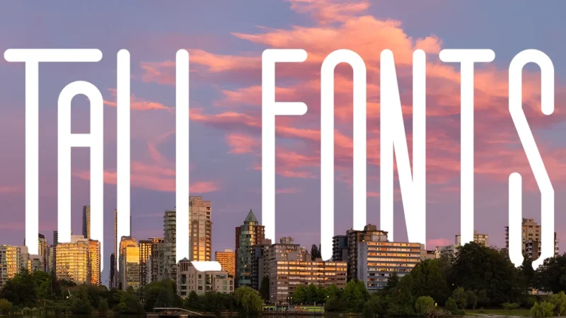
Tall fonts are becoming increasingly popular in design, and it’s easy to see why. These vertically-stretched typefaces—whether you call them condensed, narrow, or extended—pack serious visual punch while solving real design challenges.
What makes them so appealing? Tall fonts help you fit more text into tight spaces, create strong visual hierarchy, and give designs an instantly modern feel. They’re showing up everywhere from magazine headlines to brand identities, and they’re surprisingly versatile once you know how to use them.
This guide covers the best tall fonts available in 2026 and the practical know-how for using them effectively in your projects. Whether you’re designing for print or digital, these typefaces can add impact and sophistication to your work.
The Most “Towering” Tall Fonts of 2026
Let’s dive straight into the good stuff – the tall fonts that are absolutely crushing it right now. I’ve curated this list based on versatility, visual impact, and that special something that makes a font truly memorable.
Super Tall
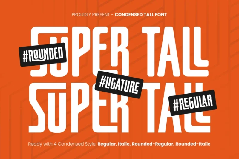
Super Tall is an ultra-condensed sans-serif font that pushes the boundaries of vertical typography. Its extreme height-to-width ratio makes it perfect for creating striking headlines and logos with a modern, urban feel.
Garry Tall Font
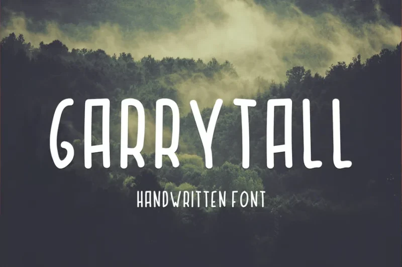
Garry Tall Font is a unique blend of handdrawn and sans-serif styles, featuring elongated letterforms. This versatile typeface is ideal for creating distinctive logos and branding materials that demand attention.
Wild Thorn Font
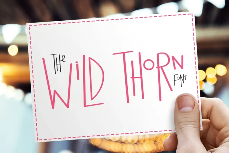
Wild Thorn is a sans-serif font with an edgy, uneven character. Its combination of straight lines and irregular shapes gives it a raw, organic feel, perfect for designs that require a touch of rebellious energy.

Get 300+ Fonts for FREE
Enter your email to download our 100% free "Font Lover's Bundle". For commercial & personal use. No royalties. No fees. No attribution. 100% free to use anywhere.
BARSTRIP
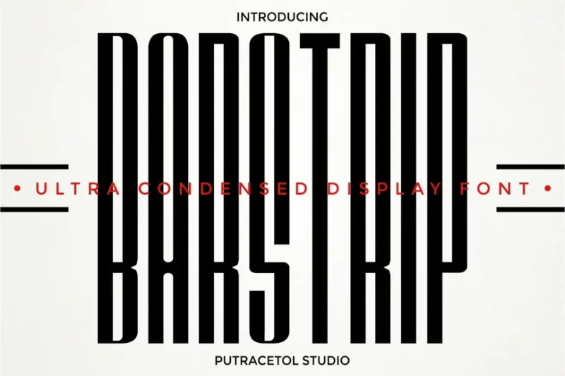
BARSTRIP is an ultra-condensed font that pushes the limits of legibility. Its extreme narrowness and inclusion of unique symbols make it an excellent choice for creating visually striking headlines and experimental typographic designs.
Tallios Font
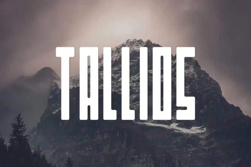
Tallios is a decorative blocky font with a tall, elegant structure. Its unique letterforms combine simplicity with flair, making it an excellent choice for logo design and high-end branding projects.
Ultra Tall
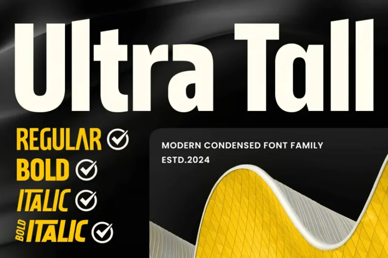
Ultra Tall is a modern, condensed font family that pushes vertical limits. This versatile typeface family offers various weights, making it suitable for a wide range of design applications, from sleek corporate branding to bold editorial layouts.
Highest
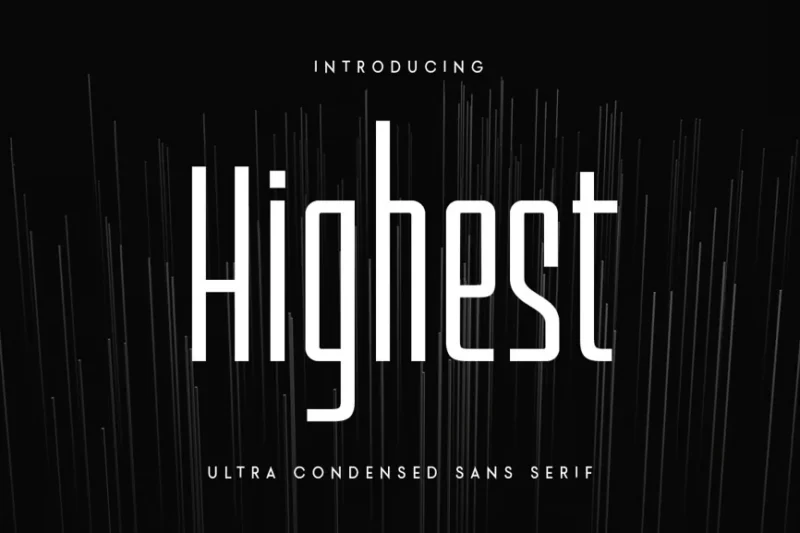
Highest is an ultra-condensed sans-serif font designed for maximum impact in headlines and titles. Its extreme vertical emphasis creates a powerful visual presence, perfect for designs that need to command attention in limited space.
Honkenia

Honkenia is an ultra-condensed font that combines sleekness with a touch of quirkiness. Its narrow letterforms and subtle character variations make it an excellent choice for modern, space-efficient designs that still retain personality.
Ranyoka
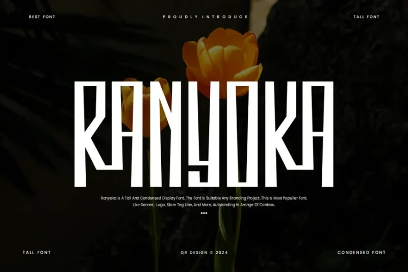
Ranyoka is a tall, condensed font that blends futuristic elements with a collegiate feel. Its unique character set makes it versatile for various applications, from sports team branding to tech startup logos.
TF Local Scotch
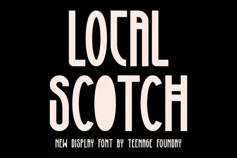
TF Local Scotch is a tall sans-serif font with a touch of classic charm. Its elongated letterforms and subtle details make it an excellent choice for creating sophisticated, modern designs with a hint of traditional elegance.
Hanging
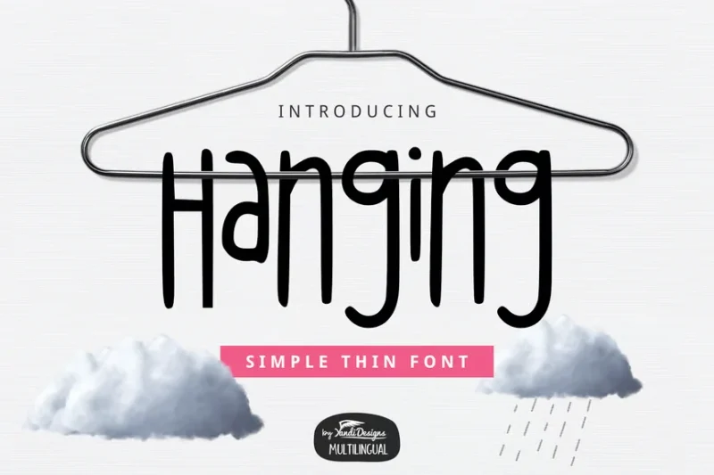
Hanging is a unique script-style font with a sans-serif twist. Its elongated, vertical design creates a striking visual effect, perfect for creating eye-catching titles, logos, and artistic typographic compositions.
Robinson Outline
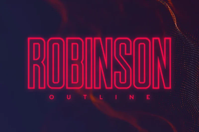
Robinson Outline is a decorative sans-serif font with a neon-inspired aesthetic. Its outlined characters create a luminous effect, making it ideal for designs that aim to capture the vibrancy of city nightlife or retro-futuristic themes.
Lash Typeface
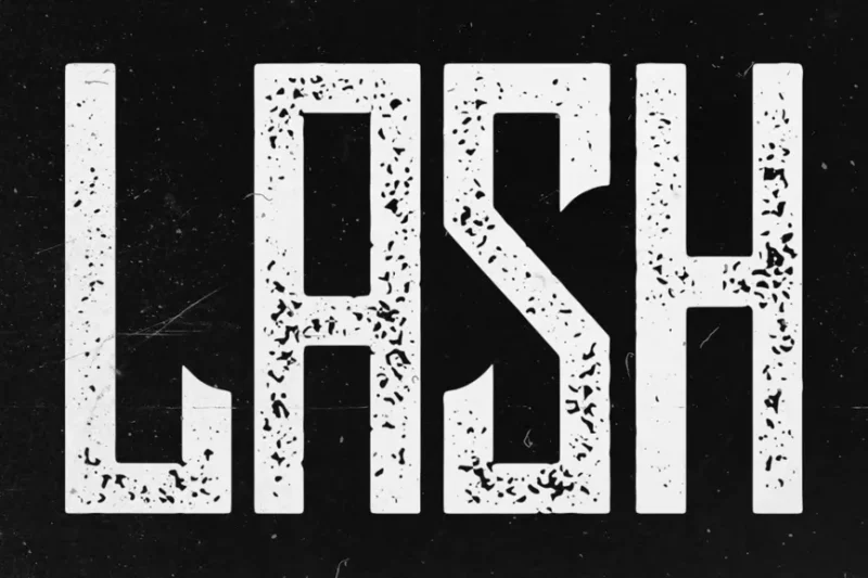
Lash Typeface is a tall, distressed font with a retro flair. Its elongated forms and subtle curves make it perfect for creating vintage-inspired designs with a modern twist, especially in fashion and lifestyle branding.
Vintasca
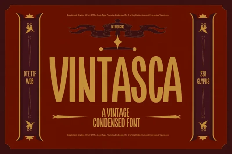
Vintasca is a trendy display sans-serif font that combines vintage elements with contemporary design. Its unique character set and balanced proportions make it versatile for various applications, from editorial design to branding projects.
Talking
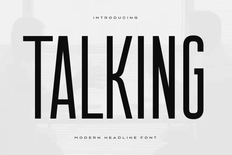
Talking is a modern, condensed headline font designed to make a statement. Its clean lines and balanced proportions make it highly legible even at small sizes, perfect for creating impactful headlines in magazines, posters, and digital media.
Thoboleh
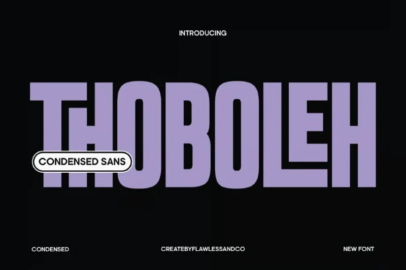
Thoboleh is a condensed sans-serif font similar to Impact with a unique style that stands out. Its narrow letterforms and subtle character variations make it an excellent choice for creating distinctive headlines and logos that demand attention.
Therlalu
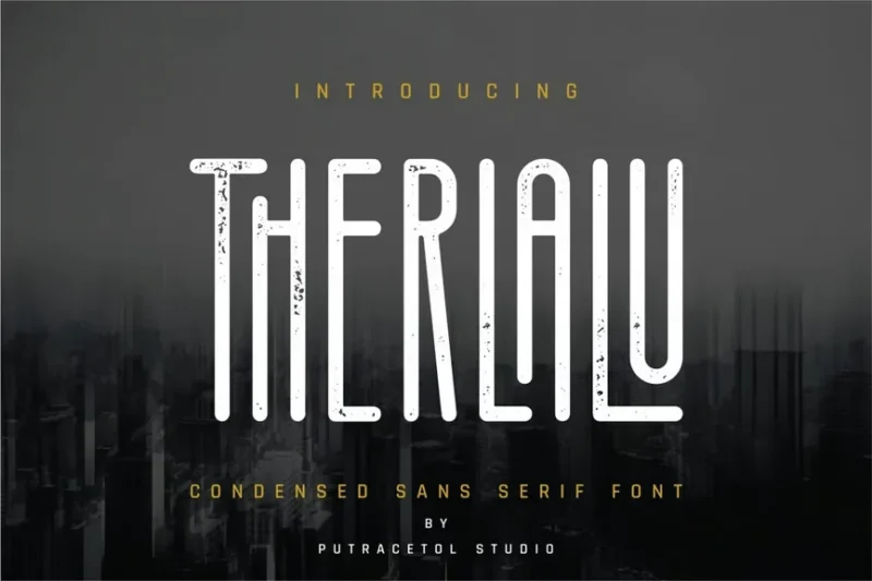
Therlalu is a condensed sans-serif font that balances readability with style. Its clean lines and well-proportioned characters make it versatile for various design applications, from body text to headlines in both print and digital media.
HS Monsnow
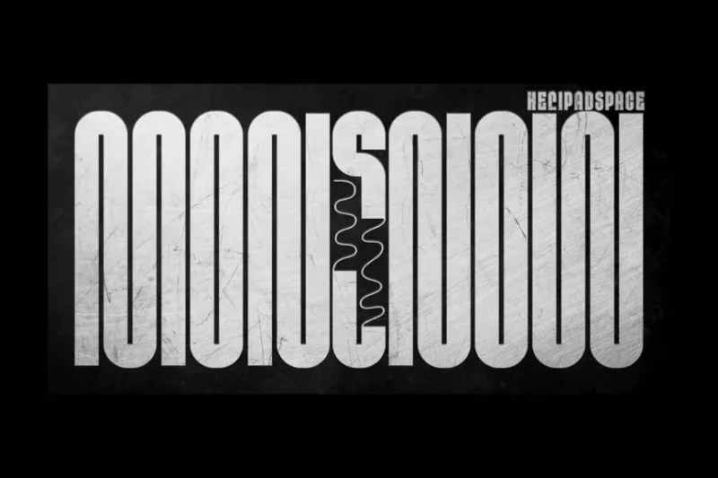
HS Monsnow is an experimental condensed font that pushes the boundaries of traditional typography. Its unique letterforms and unconventional design elements make it perfect for creating avant-garde designs and eye-catching visual statements.
Rothefight
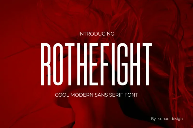
Rothefight is a branding-oriented sans-serif font with a strong, confident character. Its well-balanced letterforms and subtle uniqueness make it an excellent choice for creating cohesive brand identities across various media.
Gomedievar
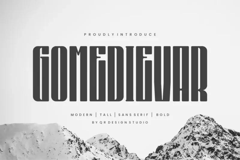
Gomedievar is a tall font that combines collegiate and sports-inspired elements. Its elongated letterforms and bold character make it perfect for creating dynamic designs for sports teams, universities, and youth-oriented brands.
Tallze
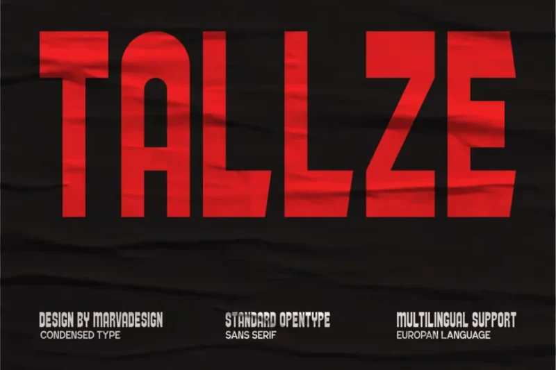
Tallze is a modern, condensed sans-serif font that combines sleekness with readability. Its well-proportioned characters and clean lines make it versatile for various design applications, from branding to editorial layouts.
High Mount
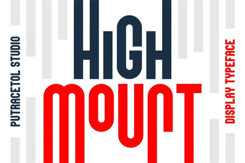
High Mount is a heights-inspired display font with a condensed, vertical emphasis. Its unique design evokes a sense of elevation and grandeur, making it ideal for outdoor-themed brands, adventure companies, and projects that aim to convey a sense of scale.
Lumilance
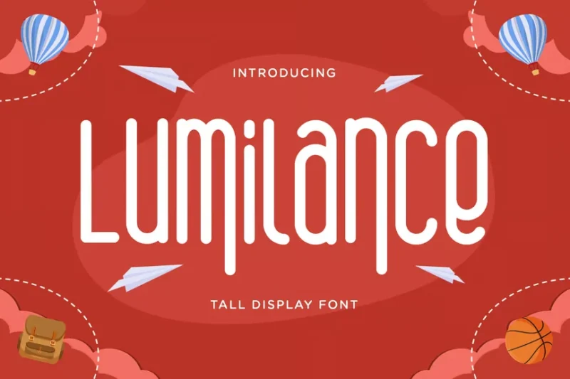
Lumilance is a tall, rounded font with a creative and futuristic edge. Its elongated forms and unique character set make it perfect for creating striking headlines, logos, and designs that require a touch of avant-garde flair.
Glorynight Tall Version
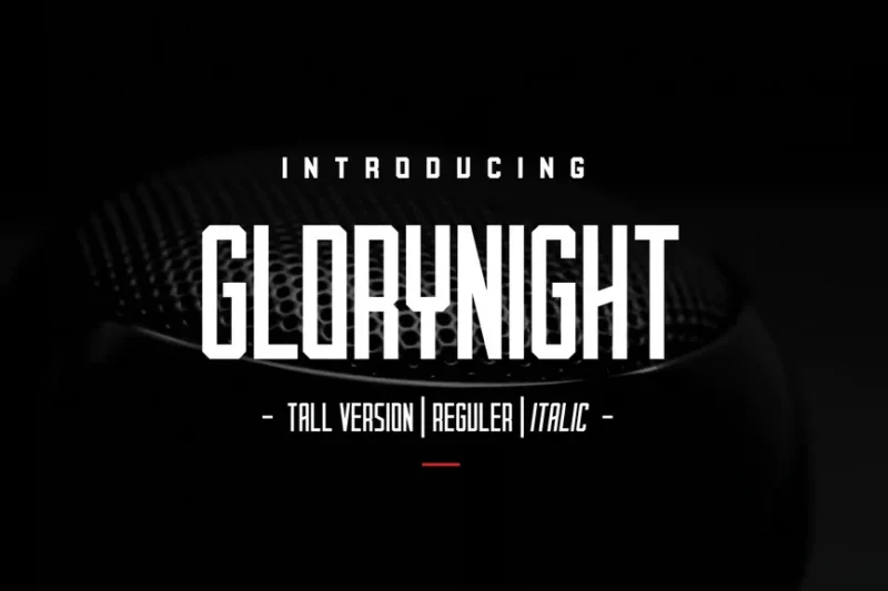
Glorynight Tall Version is a display sans-serif font with a vintage-inspired twist. Its elongated characters and subtle imperfections give it a unique charm, ideal for creating nostalgic designs with a modern edge.
Thuman
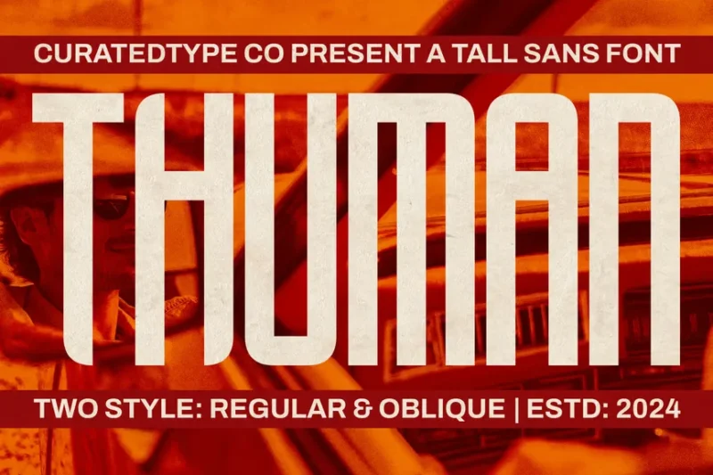
Thuman is a tall, decorative display font that combines elegance with a touch of quirkiness. Its elongated forms and unique character variations make it perfect for creating eye-catching headlines and logos that demand attention.
Tallpod
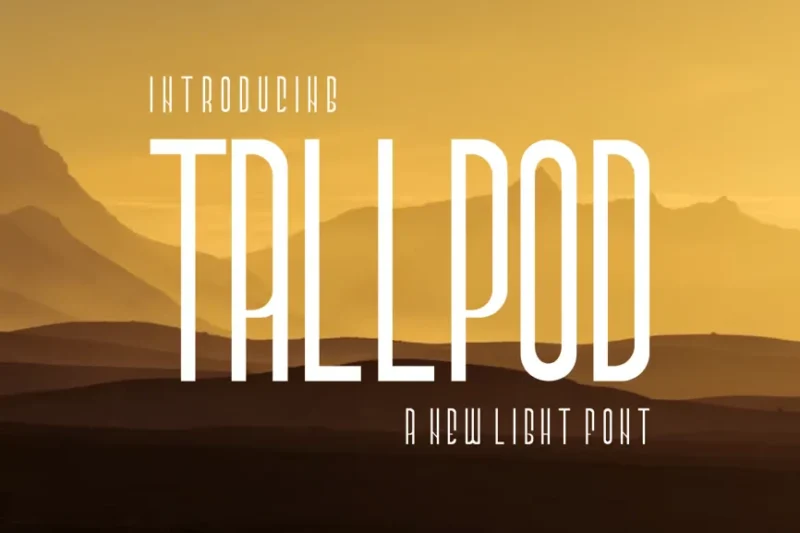
Tallpod is a versatile sans-serif font designed with vector compatibility in mind. Its clean lines and balanced proportions make it excellent for creating scalable logos and designs that maintain clarity across various sizes and applications.
Karope SX
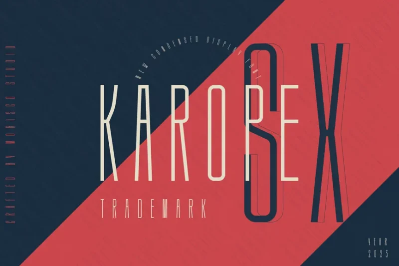
Karope SX is a slim, condensed sans-serif font that exudes elegance and modernity. Its narrow letterforms and clean design make it ideal for creating sophisticated layouts in limited spaces, perfect for editorial design and minimalist branding.
Bradome
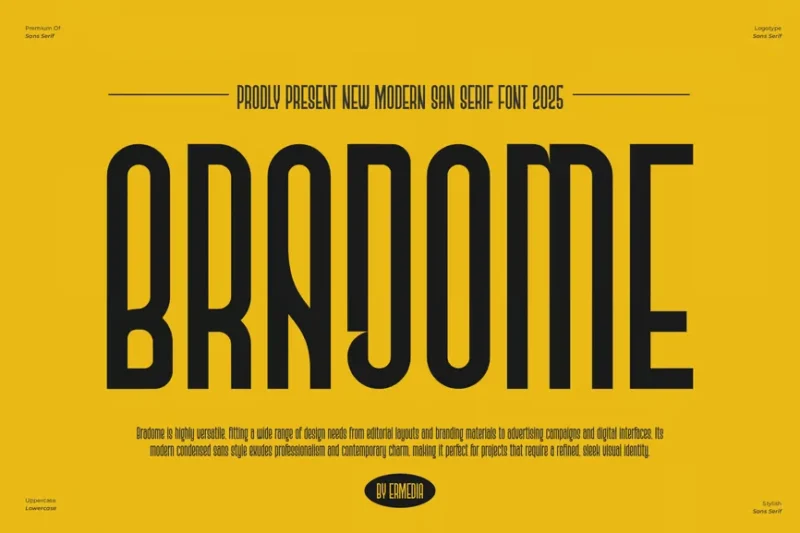
Bradome is a modern, tall sans-serif font that offers a fresh take on traditional typography. Its well-designed alphabet and unique character set make it perfect for creating distinctive branding and designs that stand out from the crowd.
Blonden Rounded
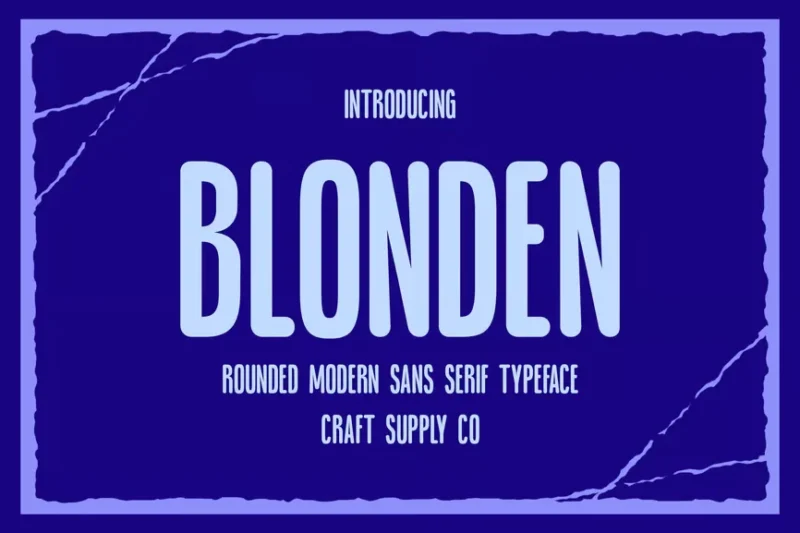
Blonden Rounded is a tall sans-serif font with soft, rounded edges that give it a friendly yet sophisticated appearance. Its unique blend of height and softness makes it ideal for creating welcoming, modern designs across various media.
Wakatobi
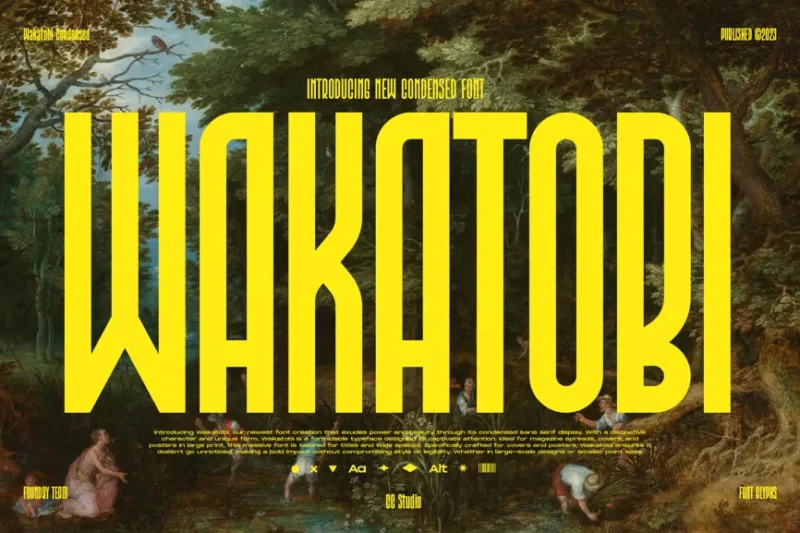
Wakatobi is an ultra-condensed display font that combines boldness with elegance. Its extremely narrow letterforms and strong vertical emphasis make it perfect for creating impactful headlines and designs that need to make a statement in limited space.
What Makes Tall Fonts So Visually Powerful?
Understanding what gives tall fonts their unique appeal is key to using them effectively. These typography titans derive their impact from several distinctive characteristics:
Vertical Emphasis
The most obvious trait of tall fonts is their dramatic height-to-width ratio. This vertical emphasis naturally draws the eye upward, creating a sense of grandeur and importance. It’s like the typographic equivalent of a cathedral ceiling – instantly commanding respect and attention.
Space Efficiency
Here’s where tall fonts really shine: they pack a lot of visual punch into relatively narrow spaces. This makes them perfect for fitting longer words or phrases into tight layouts without sacrificing readability or impact.
Modern Sophistication
Tall fonts often convey a sense of contemporary elegance and refinement. Their sleek, streamlined appearance aligns perfectly with modern design sensibilities, making brands and designs feel current and sophisticated.
Architectural Qualities
The structural nature of tall fonts creates an almost architectural feel in designs. They can make layouts feel more organized, structured, and intentionally designed – qualities that resonate strongly with audiences.
Where Tall Fonts Truly Shine
Now that we understand what makes tall fonts tick, let’s explore where they can work their magic most effectively:
Headlines and Titles
This is where tall fonts are absolute superstars. Their commanding presence makes them perfect for grabbing attention and establishing hierarchy. Whether it’s a magazine cover, website header, or poster title, tall fonts ensure your message gets noticed.
Logo Design
Many of the world’s most recognizable brands use tall fonts in their logos. The vertical emphasis creates memorability while the space efficiency allows for clean, uncluttered wordmarks that work across all applications.
Editorial Design
In magazines, newspapers, and digital publications, tall fonts excel at creating dramatic headlines that break up text blocks and guide readers through content. They’re particularly effective for fashion, architecture, and lifestyle publications.
Packaging Design
Product packaging benefits enormously from tall fonts, especially when shelf space is limited. The vertical emphasis helps products stand out on crowded shelves while maintaining elegant, premium appeal.
Digital Interfaces
In web and app design, tall fonts can help create clean, modern interfaces that feel spacious despite information density. They’re particularly effective for navigation elements and call-to-action buttons.
Event Materials
Concert posters, festival graphics, and event signage often rely on tall fonts to create that essential “wow factor.” The dramatic vertical lines suggest energy and excitement.
When to Avoid Tall Fonts
While tall fonts are incredibly versatile, there are certain situations where they might not be the best choice:
Body Text
Extended reading in tall fonts can be challenging. The compressed letterforms can reduce legibility when used for paragraphs or long blocks of text. Stick to more traditional proportions for body copy.
Small Sizes
Tall fonts lose their impact and can become difficult to read when scaled down significantly. The narrow letterforms may become too thin or details may disappear entirely.
Traditional Contexts
For brands or designs that need to convey heritage, tradition, or timelessness, tall fonts might feel too modern or contemporary. Classic serif fonts often serve these contexts better.
Children’s Materials
Young readers typically benefit from more standard letter proportions. The compressed nature of tall fonts can make learning to read more challenging.
How to Choose the Perfect Tall Font
Selecting the ideal tall font for your project requires considering several key factors:
Project Personality
Consider the mood and personality you want to convey. Sleek and modern? Bold and dramatic? Elegant and refined? Different tall fonts excel at different emotional tones.
Brand Alignment
Ensure the font aligns with your brand values and target audience. A tech startup might choose a geometric sans-serif tall font, while a luxury fashion brand might opt for something more refined and elegant.
Technical Requirements
Consider where and how the font will be used. Does it need to work well at small sizes? Will it be used digitally or in print? Does it need multiple weights or styles?
Pairing Potential
Think about what other fonts you’ll pair with your tall font. The supporting typography should complement, not compete with, your tall font choice.
Expert Pairing Strategies for Tall Fonts
The key to successful tall font implementation often lies in smart pairing. Here are some proven strategies:
Contrast is King
Pair your tall font with something that has opposite characteristics. A condensed sans-serif headline might pair beautifully with a wide, friendly serif for body text.
Stay in the Same Family
Many font families include both tall and standard proportions. Using fonts from the same family ensures harmony while providing the contrast you need.
Consider Weight Variations
Sometimes the perfect pairing is simply different weights of the same tall font. A light tall font for headlines paired with a bold version for emphasis can create sophisticated hierarchy.
Balance Personality
If your tall font has a lot of personality, pair it with something more neutral. Conversely, if your tall font is quite minimal, you can afford to be more expressive with supporting fonts.
The Psychology Behind Tall Typography
Understanding the psychological impact of tall fonts can help you use them more strategically:
Authority and Power
Tall fonts naturally convey authority and strength. The vertical emphasis suggests stability and power, making them excellent choices for brands that want to project confidence and leadership.
Modernity and Innovation
The sleek, streamlined nature of most tall fonts signals innovation and forward-thinking. Tech companies, startups, and brands positioning themselves as industry leaders often gravitate toward tall fonts for this reason.
Elegance and Sophistication
When executed well, tall fonts can feel incredibly refined and elegant. This makes them popular choices for luxury brands, high-end services, and premium products.
Energy and Movement
The vertical lines of tall fonts can suggest upward movement and growth, making them effective for brands focused on progress, achievement, and aspiration.
Technical Considerations for Tall Fonts
Working with tall fonts requires some technical awareness:
Kerning and Spacing
Tall fonts often require careful attention to kerning and letter spacing. The compressed letterforms can create awkward gaps or crowding if not properly adjusted.
Line Height
When using tall fonts for multiple lines of text, pay special attention to line height. The vertical emphasis can make lines feel too close together if not properly spaced.
Scale and Proportion
Tall fonts often work best at larger sizes where their proportions can be fully appreciated. Consider how your chosen font will scale across different applications.
Web Font Performance
If using tall fonts on the web, consider loading times and fallback options. Some tall fonts can be quite heavy files, which may impact site performance.
Current Trends in Tall Typography
The tall font landscape is constantly evolving. Here are some trends shaping 2026:
Variable Fonts
The rise of variable fonts is giving designers unprecedented control over tall font proportions. You can now adjust the condensation level in real-time to perfectly fit your design needs.
Organic Tall Fonts
While geometric tall fonts have dominated, we’re seeing more organic, humanist tall fonts that maintain personality while providing vertical emphasis.
Ultra-Condensed Styles
Designers are pushing the boundaries with extremely condensed fonts that create almost abstract, artistic effects while maintaining legibility.
Mixed Proportions
Some innovative designers are mixing tall and standard proportions within the same wordmark or headline for dynamic, attention-grabbing effects.
Common Tall Font Mistakes to Avoid
Even experienced designers can stumble with tall fonts. Here are the most common pitfalls:
Overuse
Tall fonts are powerful, but using them everywhere can diminish their impact. Reserve them for key moments where you really need that vertical drama.
Poor Spacing
Failing to adjust spacing and kerning can make tall fonts feel cramped or awkward. Take time to fine-tune these details.
Ignoring Context
Not all tall fonts work in all contexts. A font that looks great on a poster might not work for a business card or mobile interface.
Forgetting Accessibility
Ensure your tall font choices don’t sacrifice readability for style. Test with real users and consider accessibility guidelines.
The Future of Tall Typography
Looking ahead, tall fonts show no signs of losing their appeal. If anything, they’re becoming more sophisticated and versatile:
AI-Assisted Design
Artificial intelligence is beginning to help optimize tall font spacing and proportions automatically, making them easier to use effectively.
Responsive Typography
New technologies are enabling tall fonts to adapt automatically to different screen sizes and contexts, maintaining their impact across all platforms.
Sustainability Considerations
As digital sustainability becomes more important, the space-efficient nature of tall fonts may make them increasingly attractive for reducing screen real estate and energy consumption.
Conclusion: Reaching New Heights with Tall Typography
Tall fonts represent one of typography’s most powerful tools for creating visual impact and emotional connection. From their space-efficient practicality to their inherent sophistication, these vertical virtuosos offer designers a unique way to make their messages stand tall in an increasingly crowded visual landscape.
The key to mastering tall fonts lies in understanding their strengths and limitations. Use them strategically for maximum impact, pair them thoughtfully with complementary typefaces, and always prioritize readability alongside visual drama.
As we move through 2026 and beyond, tall fonts will continue evolving, offering even more possibilities for creative expression and effective communication. Whether you’re designing a bold poster, an elegant logo, or a cutting-edge website, there’s likely a tall font that can help your design reach new heights.
Remember, in the world of typography, sometimes the best way to stand out is to stand tall. Choose your tall fonts wisely, use them strategically, and watch as your designs command the attention and respect they deserve.
So, fellow designers, which tall font will you reach for in your next project? The sky’s the limit!