In this article:
- The Hottest Flame Fonts Burning Up 2026
- What Makes Flame Fonts So Hot?
- Where Flame Fonts Ignite Success
- When to Cool Down on Flame Fonts
- How to Use Flame Fonts Without Getting Burned
- Pairing Flame Fonts Like a Pro
- Expert Opinions: What Typography Pros Think About Flame Fonts
- The Evolution of Flame Typography
- Digital vs. Print Considerations
- Common Flame Font Mistakes to Avoid
- Flame Font Alternatives for Different Moods
- Frequently Asked Questions About Flame Fonts
- Conclusion: Keeping Your Designs Burning Bright
There’s something absolutely mesmerizing about flame fonts. These fiery typefaces don’t just sit on a page – they leap, dance, and practically sizzle with energy.
Flame fonts feature flickering edges, blazing textures, and that unmistakable heat that can transform any ordinary design into something that truly burns bright. Whether you’re working on band merchandise, gaming graphics, or restaurant branding, flame fonts are your secret weapon for creating designs that demand attention. You might also like this list of smoky fonts.
In this blazing guide, we’ll explore:
- The hottest flame fonts trending in 2026
- What makes flame fonts so captivating and effective
- Best practices for using flame fonts in your designs
- Where flame fonts work best (and where to avoid them)
- Expert tips for pairing flame fonts with other typefaces
- And much more. Let’s turn up the heat!
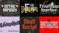
The Hottest Flame Fonts Burning Up 2026
Not all flame fonts are created equal – some barely smolder while others are absolute infernos. I’ve curated this collection of the most scorching flame fonts that are setting the design world ablaze right now:
Fireboys
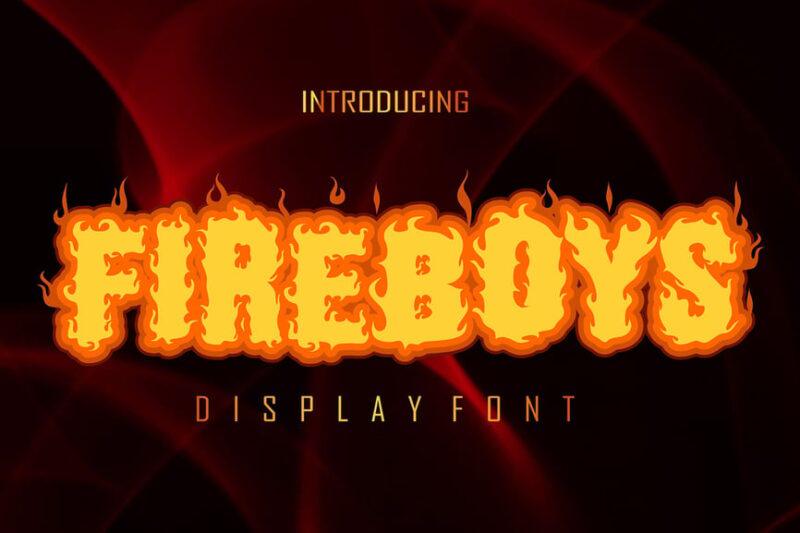
Fireboys is a decorative font that embodies the essence of heat and flames. Its bold, fiery design makes it perfect for projects requiring a strong, energetic visual impact, particularly suited for themes related to fire and intensity.
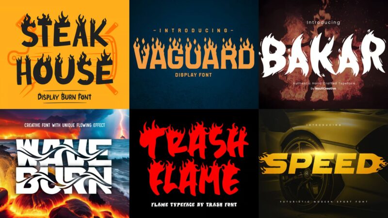
Steak House
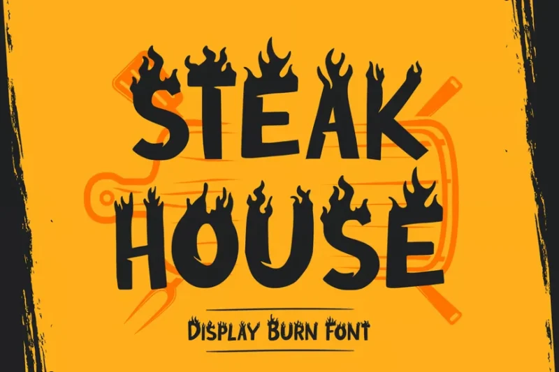
Steak House is a display burn font that exudes a rustic, charred aesthetic. Its unique design makes it ideal for branding projects, especially in the food industry, where a bold and creative typographic approach is desired.
Burning Hammer
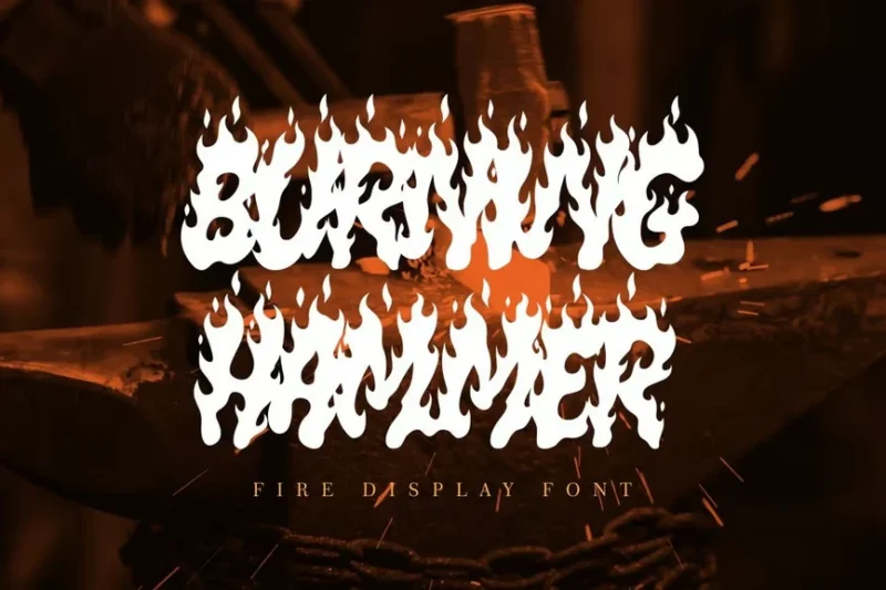
Burning Hammer is a decorative display font that conveys strength and intensity. Its bold, fiery design makes it perfect for headlines or logos that need to make a powerful, scorching impact.

Get 300+ Fonts for FREE
Enter your email to download our 100% free "Font Lover's Bundle". For commercial & personal use. No royalties. No fees. No attribution. 100% free to use anywhere.
Fire Ball
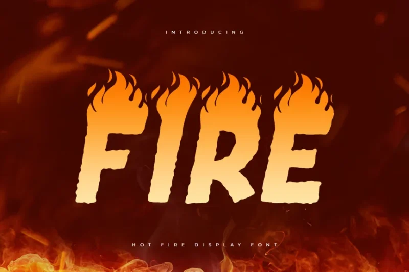
Fire Ball is a hot fire display font that captures the essence of intense heat. Its dynamic, flame-like characters make it ideal for promotional materials or designs that need to convey energy and passion.
VAGUARD
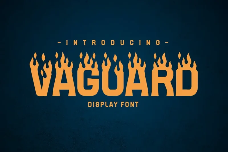
VAGUARD is a sans-serif font with decorative elements that give it a unique, crafted feel. Its blend of modern and artisanal qualities makes it versatile for various design projects requiring a touch of distinctiveness.
Bakar
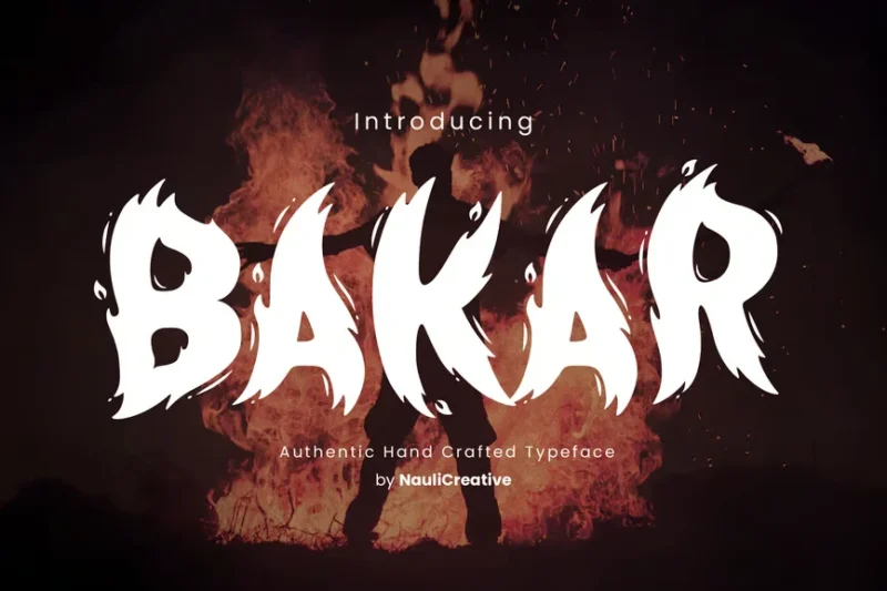
Bakar is a flaming unique font that combines sans-serif structure with decorative flame elements. Its distinctive style makes it particularly suitable for music-related designs or invitations that require a fiery, eye-catching typography.
Flamegeist
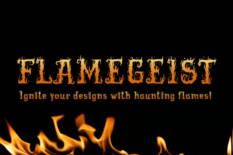
Flamegeist is a decorative font that merges flame aesthetics with a spooky vibe. Its unique design makes it perfect for Halloween-themed projects or any design that requires a blend of fire and eerie elements.
Blazeberg
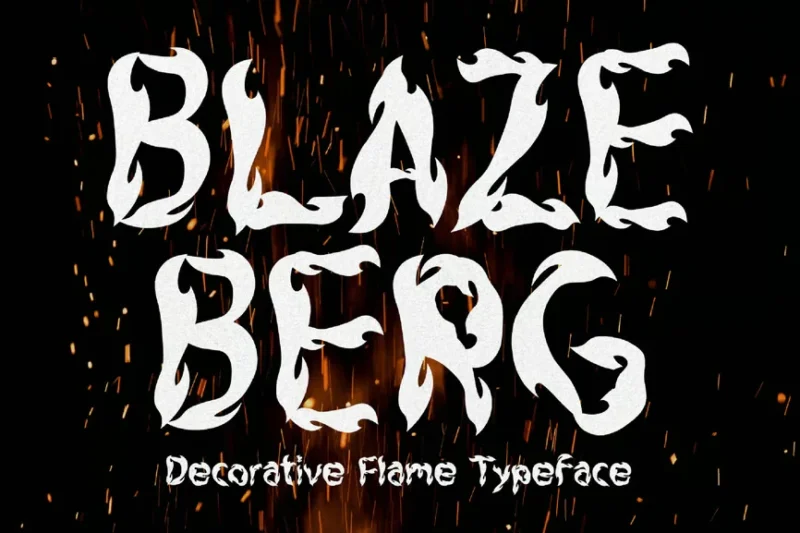
Blazeberg is a flame typeface that embodies the essence of fire and burning. Its bold, scorching design makes it ideal for projects that need to convey intense heat or passion, perfect for fiery themes or burning-hot promotions.
Combust
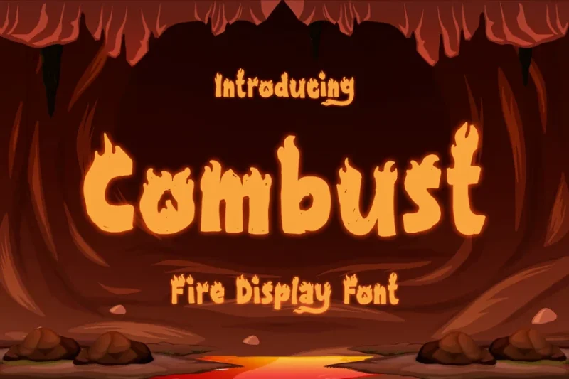
Combust is a playful fire display font that brings a lighthearted touch to flame-inspired typography. Its whimsical design makes it perfect for projects related to bonfires or any design that needs a fun, fiery aesthetic.
Falo
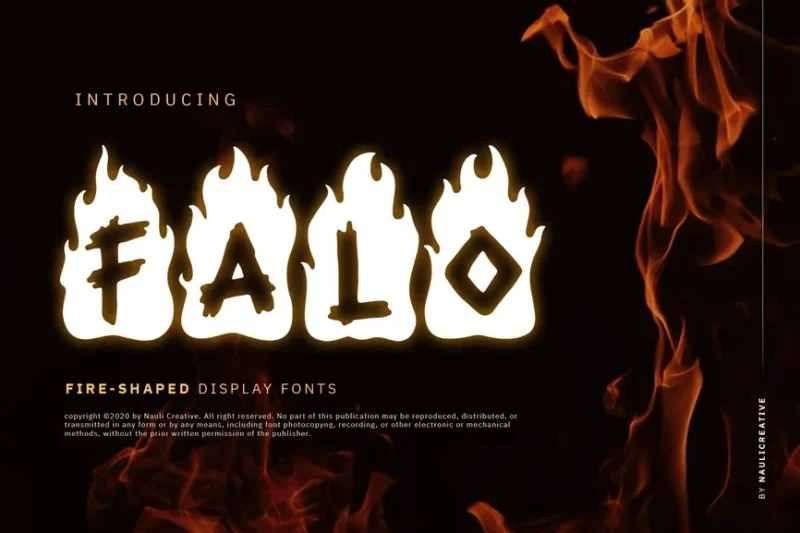
Falo is a flaming decorative font that combines sans-serif elements with fiery accents. Its unique style makes it particularly suitable for music-related designs or invitations that require a bold, flame-inspired typography.
Firehead
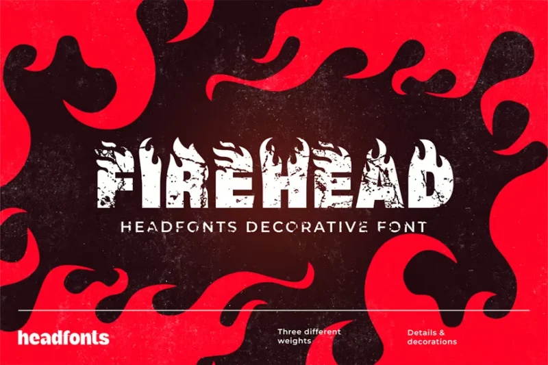
Firehead is the ultimate flame font, designed to capture the essence of fire in typography. Its intricate flame details and spark effects make it perfect for projects that require a high-impact, fiery visual statement.
Wave Burn
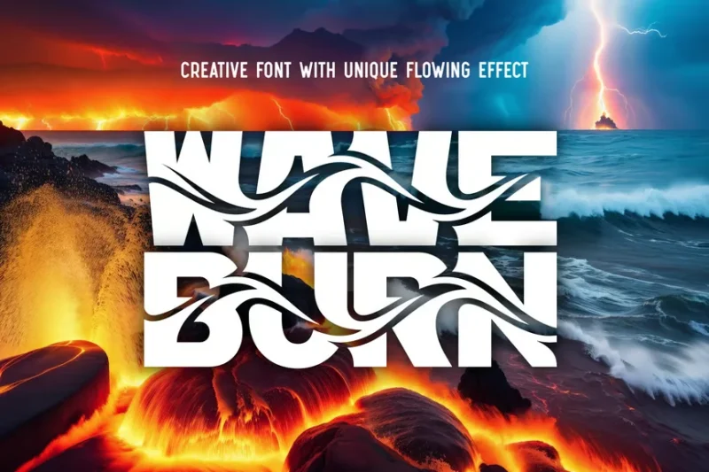
Wave Burn is a creative font that combines wave-like elements with a burnt aesthetic. Its unique design makes it ideal for projects that require a blend of fluid movement and fiery intensity in their typography. Depending on how you look at it, this could also be used as a water font.
Trash Flame
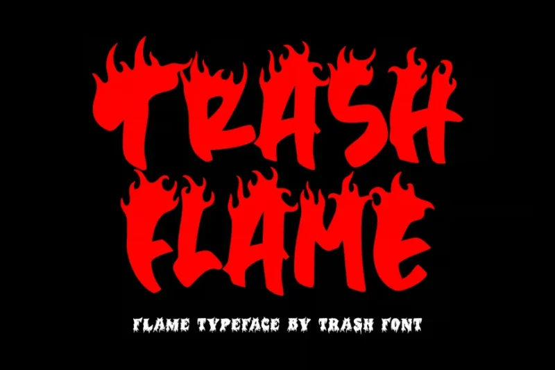
Trash Flame is a decorative font that merges a grungy, trashy aesthetic with flame elements. Its edgy design makes it perfect for Halloween-themed projects or death metal band logos that require a fierce, fiery typography.
Heatware
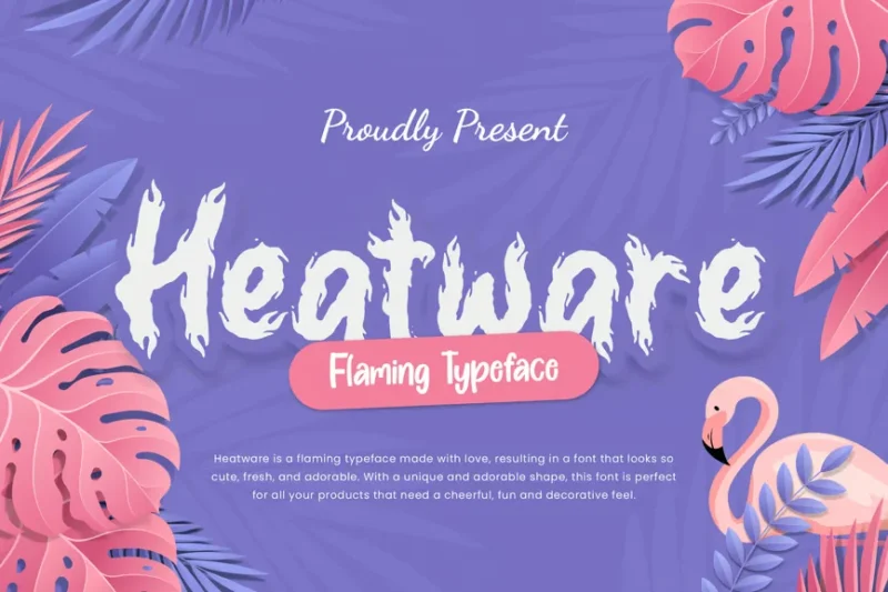
Heatware is a flaming advertisement font that combines brush-like strokes with fiery elements. Its bold design makes it ideal for eye-catching advertisements or any project that needs to convey heat and energy through typography.
Firestor
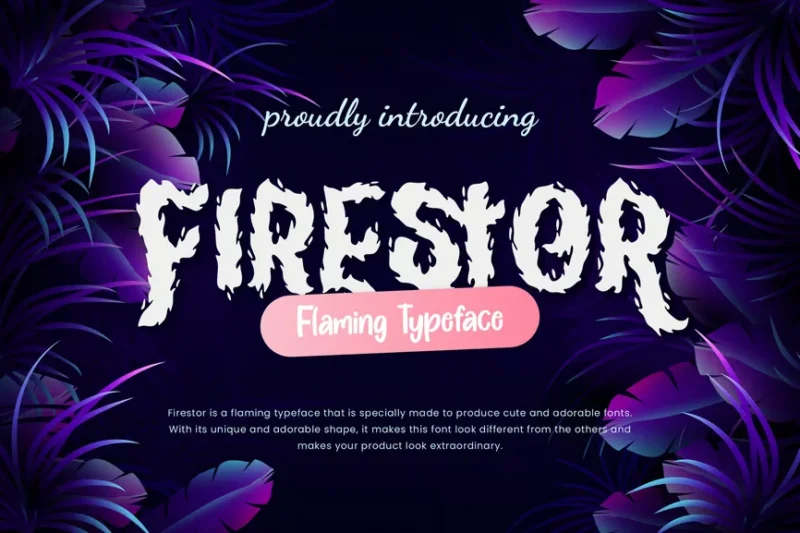
Firestor is a flaming business font that blends professional aesthetics with fiery accents. Its unique brush-like strokes and flame elements make it perfect for business advertisements or projects that require a bold, energetic typographic approach.
Wildfire
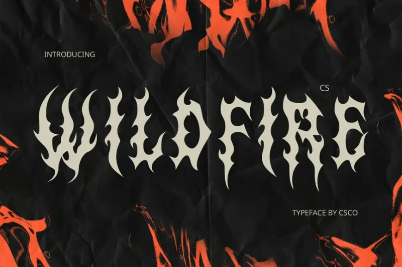
Wildfire is a black metal font that captures the intense, uncontrollable nature of its namesake. Its sharp, flame-like design makes it ideal for metal band logos or any headline that needs to convey raw, fierce energy.
Fire Ace
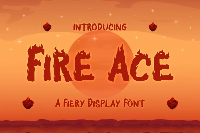
Fire Ace is a fiery display font that embodies the heat and intensity of flames. Its bold, blazing design makes it perfect for branding projects or any typography that needs to make a scorching impact.
Dragon Flames
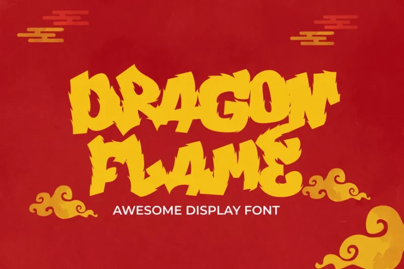
Dragon Flames is an onfire display font that combines dragon-inspired elements with fiery aesthetics. Its unique design makes it ideal for fantasy-themed projects or any typography that needs to convey both mystical and intense burning qualities.
Ember
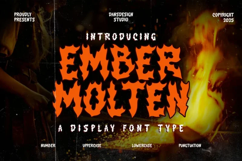
Ember is a molten fire graffiti metal font that merges blackletter style with fiery, rock-inspired elements. Its intense design makes it perfect for metal band logos or any project requiring a bold, burning graffiti aesthetic.
Hot Ground
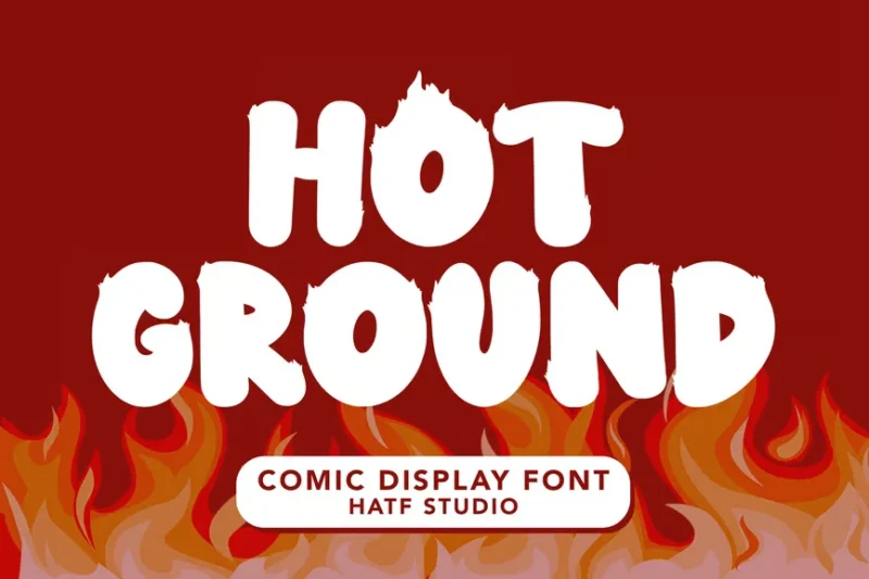
Hot Ground is a decorative font that brings a playful, heated touch to typography. Its unique design, suitable for calendars and comics, makes it versatile for projects that require a fun, warm aesthetic.
Wendor Misra
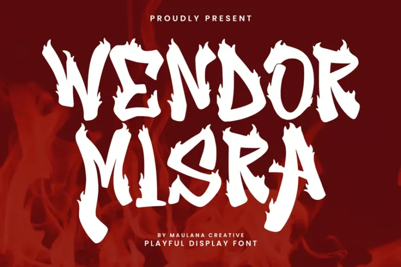
Wendor Misra is a fire display font that combines graffiti style with flame-like features. Its distinctive design makes it perfect for Halloween-themed projects or any typography that needs to blend spooky and fiery aesthetics.
Speed
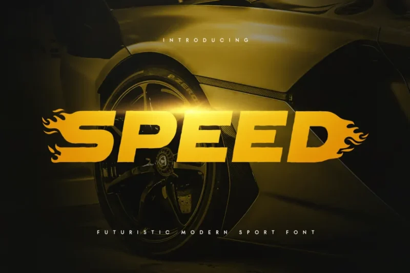
Speed is a futuristic modern racing font that conveys a sense of rapid movement and energy. Its sleek design makes it ideal for sports-related projects or racing themes that require a dynamic, cutting-edge typographic approach.
What Makes Flame Fonts So Hot?
Flame fonts get their blazing personality from several key design elements that work together to create that unmistakable fiery effect:
Dynamic, Flickering Edges
The most defining characteristic of flame fonts is their irregular, dancing edges that mimic the unpredictable movement of real flames. These jagged, flowing contours create visual movement even when the text is completely static.
Unlike clean, geometric fonts with perfect edges, flame fonts embrace chaos and organic movement. The result? Letters that look like they’re literally on fire.
Dramatic Texture and Gradients
Many flame fonts incorporate rich textures that simulate the play of light and shadow you’d see in actual flames. Color gradients from deep reds and oranges to bright yellows and whites add depth and realism.
Some flame fonts even include particle effects or ember-like details that enhance the burning sensation. These textural elements transform simple letterforms into visual experiences.
Upward Energy and Movement
Notice how flames always reach upward? The best flame fonts capture this ascending energy through letterforms that seem to stretch and flow skyward. Ascenders might flicker higher, and even baseline letters often feature upward-trending flourishes.
This vertical energy creates a sense of power and excitement that’s perfect for designs needing high impact and drama.
Bold, Attention-Grabbing Presence
Flame fonts are inherently bold and commanding. They’re designed to be seen, not whispered. The combination of dramatic shapes, vibrant colors, and dynamic textures ensures these fonts grab attention from across a room.
Where Flame Fonts Ignite Success
Flame fonts aren’t subtle – and that’s exactly the point. Their fiery nature makes them perfect for specific design contexts where you want maximum visual impact:
Music and Entertainment
Flame fonts are absolute gold for rock bands, metal acts, gaming content, and any entertainment brand that wants to project power and intensity. They’re perfect for album covers, concert posters, merchandise, and promotional materials.
The rebellious, high-energy vibe of flame fonts perfectly matches the attitude of these industries.
Food and Beverage
Hot sauce brands, barbecue restaurants, spicy food products, and any culinary business emphasizing heat can benefit from flame fonts. They instantly communicate “hot” and “spicy” in a way that’s both literal and exciting.
Think hot wing challenges, chili cook-offs, or that new ghost pepper sauce that needs packaging with serious attitude.
Automotive and Sports
Racing teams, motorcycle brands, extreme sports companies, and automotive businesses often use flame fonts to convey speed, power, and adrenaline. The dynamic energy of flames parallels the excitement of high-performance vehicles and athletic competition.
Gaming and Digital Media
Video games, especially action games, fighting games, and fantasy titles, frequently employ flame fonts for logos, titles, and interface elements. The dramatic flair perfectly matches the intense, immersive worlds these games create.
Event Promotion
Concerts, festivals, competitions, and any high-energy event can benefit from flame fonts in their promotional materials. The fonts help communicate excitement and urgency that gets people fired up to attend.
When to Cool Down on Flame Fonts
While flame fonts can add incredible impact to the right projects, there are definitely situations where their intensity works against you:
Corporate and Professional Contexts
Financial institutions, law firms, medical practices, and most traditional corporate environments typically need fonts that convey trust, stability, and professionalism. Flame fonts might undermine credibility in these contexts.
Children’s Products (Usually)
Unless you’re designing for older kids interested in action themes, flame fonts can feel too intense or even scary for young children’s products. Stick to friendlier, softer typefaces for most youth-oriented designs.
Luxury and Elegance
High-end fashion, jewelry, fine dining, and luxury goods typically call for sophisticated, refined typography. Flame fonts might feel too aggressive or crude for these premium contexts.
Information-Heavy Designs
Technical manuals, educational materials, reports, and other text-heavy documents need maximum legibility. Flame fonts, with their decorative elements and dramatic styling, can impair readability when used extensively.
How to Use Flame Fonts Without Getting Burned
Working with flame fonts requires some finesse to avoid designs that feel overwhelming or amateurish. Here are my top tips:
Keep It Short and Sweet
Flame fonts work best for headlines, logos, and short phrases. The more text you set in a flame font, the harder it becomes to read and the more chaotic your design feels.
Use flame fonts for impact moments – your brand name, a key tagline, or a dramatic headline – then pair with cleaner fonts for body text.
Mind Your Colors
While red and orange are obvious choices for flame fonts, don’t feel limited to literal fire colors. Sometimes unexpected color choices can be even more striking.
Consider your brand colors and overall design palette. A blue flame font might be perfect for a brand that wants to feel “cool hot” – intense but sophisticated.
Balance with Simple Elements
When your typography is doing all the talking, let other design elements take a back seat. Pair flame fonts with clean, simple graphics and plenty of white space to avoid visual overload.
Think of flame fonts as the star of the show – everything else should support, not compete with, their dramatic presence.
Test Readability
Always test your flame font choices at the sizes they’ll actually be used. What looks awesome at 72pt might become illegible at 16pt. Make sure your message can still be clearly read, especially for important information.
Pairing Flame Fonts Like a Pro
The key to successful flame font usage often lies in what you pair them with. Here’s how to create harmonious type combinations:
Complement with Clean Sans Serifs
Pair your blazing headline font with crisp, clean sans serifs like Helvetica, Open Sans, or Montserrat for body text. This creates a perfect balance between excitement and readability.
Add Structure with Strong Serifs
Bold serifs like Times New Roman Bold or Georgia can provide a solid foundation that grounds your flame font’s energy. This combination works especially well for more traditional or established brands that want to add some fire.
Layer Different Weights
If your flame font family includes multiple weights or styles, use them strategically. A lighter flame font for subheadings can bridge the gap between your bold flame headline and clean body text.
Expert Opinions: What Typography Pros Think About Flame Fonts
I reached out to several typography experts to get their take on using flame fonts effectively. Their insights are pretty enlightening!
Maria Rodriguez, Senior Designer at BrandFire Studios, notes: “Flame fonts are like hot sauce – a little goes a long way. When used strategically, they can add incredible personality and energy to a brand. The key is knowing when to dial up the heat and when to keep things cool.”
James Chen, Creative Director at TypeForge, observes: “The best flame fonts balance drama with legibility. Anyone can make letters look like they’re on fire, but it takes real skill to create a flame font that’s both visually exciting and functionally readable.”
Sarah Thompson, Typography Instructor at Design Academy, adds: “I always tell my students that flame fonts are like special effects in movies – they should enhance the story, not distract from it. Use them to amplify your message, not replace it.”
These experts agree: flame fonts are powerful tools that require thoughtful application. They’re not just decorative elements – they’re communicative devices that can dramatically impact how your audience perceives your message.
The Evolution of Flame Typography
Flame fonts have come a long way since their early days in metal band logos and hot rod graphics. Today’s flame fonts are more sophisticated, offering better readability and more nuanced design options.
Modern flame fonts often incorporate:
- Subtle gradient effects instead of harsh color transitions
- More refined edge treatments that suggest flames without screaming them
- Multiple style variations within font families
- Better hinting and optimization for digital displays
- Advanced OpenType features for enhanced customization
This evolution has made flame fonts more versatile and accessible to a broader range of design applications.
Digital vs. Print Considerations
When working with flame fonts, always consider where your design will be seen:
Digital Applications
Screen resolution and viewing distance affect how flame font details render. Test your choices on actual devices at realistic viewing sizes. Some intricate flame effects might get lost on smaller screens or lower resolution displays.
Print Applications
High-resolution printing can showcase the full detail of complex flame fonts, but consider your printing method. Spot colors might not capture gradient effects as effectively as full-color printing.
Common Flame Font Mistakes to Avoid
Having worked with flame fonts for years, I’ve seen some common pitfalls that can kill even the hottest design:
Overdoing the Effect
More isn’t always better. Resist the urge to make everything flame-themed. One strong flame font element is usually more effective than multiple flame fonts competing for attention.
Ignoring Context
A flame font that works perfectly for a motorcycle rally poster might feel completely wrong for a yoga studio. Always consider your audience and brand personality.
Sacrificing Readability
No matter how cool your flame font looks, if people can’t read your message, you’ve failed. Always prioritize clear communication over visual effects.
Using Poor Quality Fonts
Cheap or poorly designed flame fonts often look amateurish. Invest in quality typefaces that maintain their impact across different sizes and applications.
Flame Font Alternatives for Different Moods
If flame fonts feel too intense but you still want dynamic energy, consider these alternatives:
Grunge and Distressed Fonts
For edgy attitude without literal flames, grunge fonts offer worn, rebellious character.
Brush Script Fonts
Hand-painted brush fonts can provide organic energy and movement with a more artistic feel.
Speed and Motion Fonts
Fonts with horizontal motion blur or racing stripes can suggest speed and excitement without the heat.
Neon and Glow Effects
Electric-inspired fonts can provide high energy with a different kind of intensity.
Frequently Asked Questions About Flame Fonts
Let’s address some common questions about using flame fonts effectively:
What’s the best flame font for beginners?
Start with flame fonts that maintain good readability while still providing visual interest. Look for options with cleaner edges and less complex textures.
Can flame fonts work for feminine brands?
Absolutely! Consider flame fonts in unexpected colors like pink, purple, or teal. The energy and confidence of flame typography can work beautifully for bold, empowered feminine brands.
How do I make flame fonts look professional?
Focus on quality fonts, thoughtful color choices, and strategic application. Use flame fonts as accent elements rather than primary text, and always pair with clean, professional supporting typography.
Are flame fonts good for logos?
Flame fonts can work excellently for logos in the right contexts. Ensure the logo remains legible at small sizes and consider creating simplified versions for different applications.
Conclusion: Keeping Your Designs Burning Bright
Flame fonts are powerful typography tools that can transform ordinary designs into extraordinary visual experiences. When used thoughtfully and strategically, they add energy, personality, and unforgettable impact to your work.
The key to success with flame fonts lies in understanding their strengths and limitations. They’re perfect for grabbing attention, conveying intensity, and creating memorable brand moments. But they require careful handling to avoid overwhelming your message or alienating your audience.
Remember, great design is about more than just making things look cool – it’s about effective communication. Flame fonts should enhance your message, not replace it. Use them to amplify the energy and attitude you want to convey, but always keep readability and appropriateness in mind.
As you experiment with flame fonts in your own work, start small and build confidence. Try them for headlines and accent text before committing to larger applications. Test different colors, sizes, and pairings to find combinations that work for your specific projects.
Most importantly, have fun with them! Flame fonts are meant to be exciting and energetic. Let that energy inspire your creativity and push your designs to new levels of impact.
Whether you’re designing for a rock band, a hot sauce company, or just want to add some serious heat to your next project, the right flame font can be the spark that sets your design ablaze. So go ahead – light up those designs and watch them burn bright!
What flame font will you try first? The fire starts now!