In this article:
- The 10 Most Electric 80s Color Palettes
- Why 80s Colors Are Dominating Design Again
- Making 80s Colors Work in Contemporary Design
- The Cultural Forces Behind 80s Color Trends
- Adapting 80s Palettes Across Design Disciplines
- The Psychology of 80s Color Combinations
- Looking Forward: 80s Colors in 2025 and Beyond
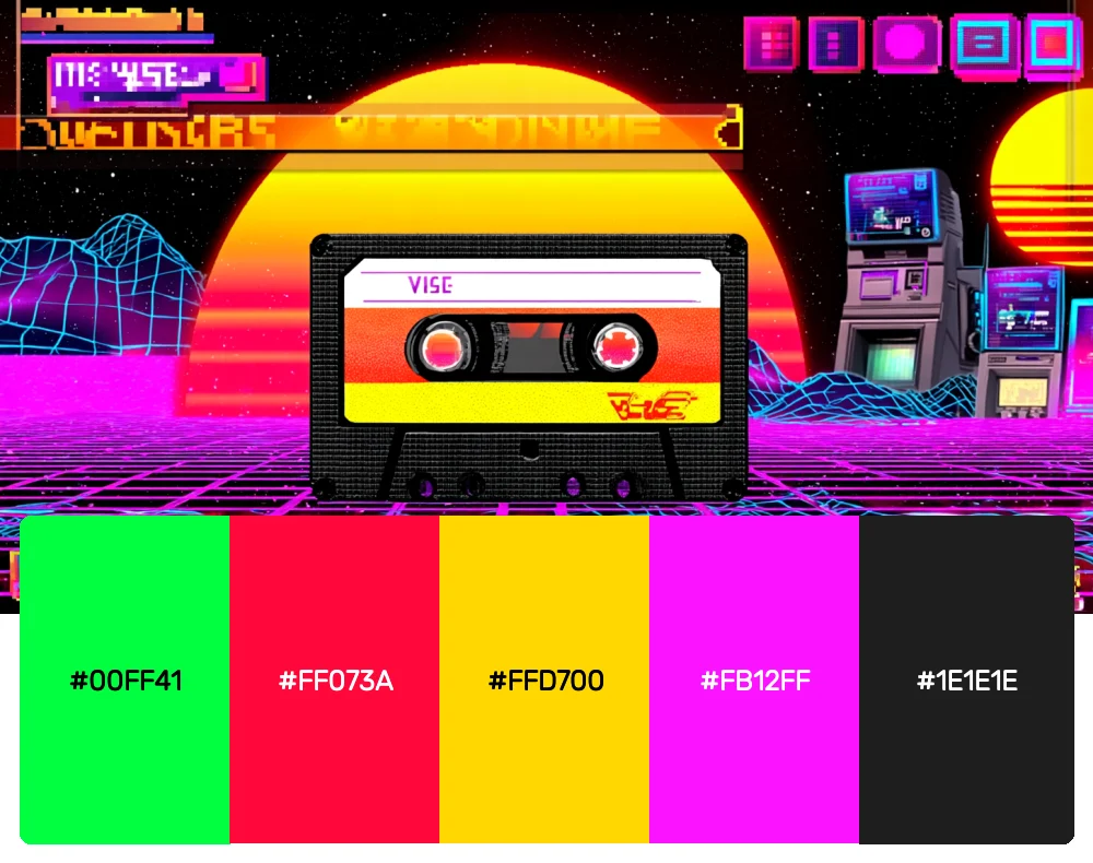
There’s something absolutely magnetic about the electric energy of 1980s color schemes. The decade was unapologetically bold, mixing neon brights with high-contrast combinations that practically pulsed with synth-wave energy. If you’re ready to inject some serious retro-futuristic flair into your designs, these 80s-inspired palettes will transport you straight back to the era of Miami Vice and arcade games.
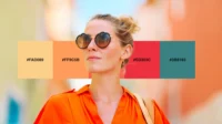
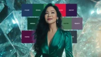
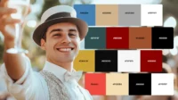
The 10 Most Electric 80s Color Palettes
1. Miami Vice Nights
-
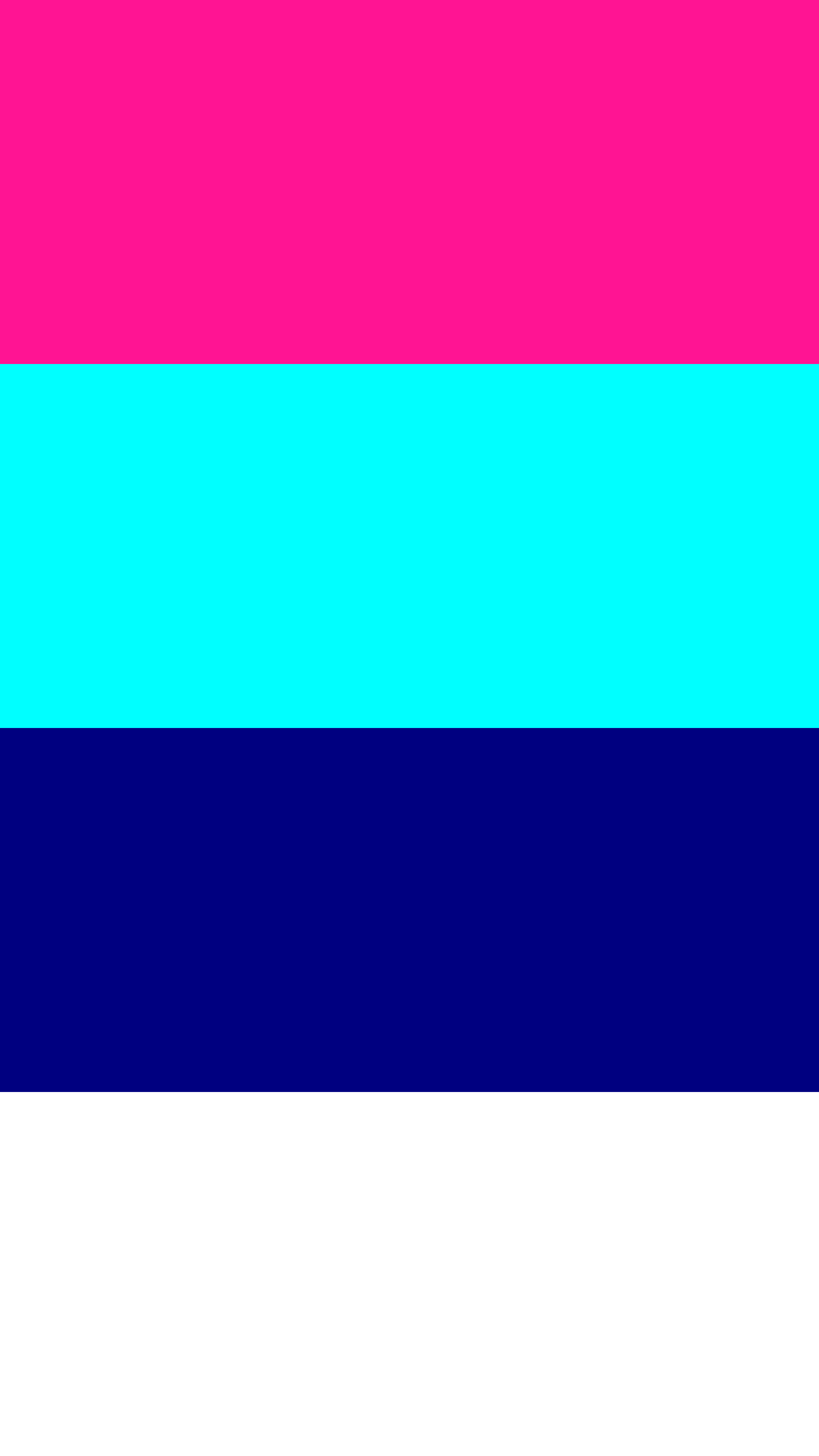
 #FF1493


-
#00FFFF
-
#000080
-
#FFFFFF
Download this color palette
 735×1102
Pinterest image

 2160×3840
Vertical wallpaper
 900×900
Square

 3840×2160
4K Wallpaper
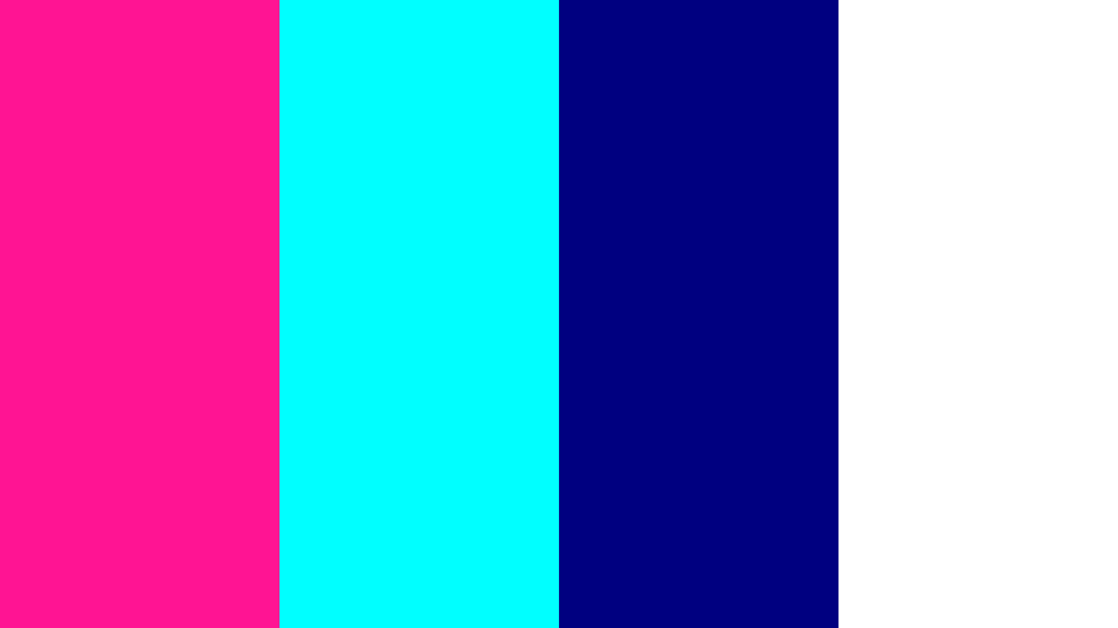
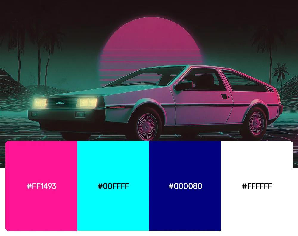
This palette screams pure 80s sophistication with its hot pink and electric cyan combo. The deep navy adds that mysterious nighttime vibe, while crisp white keeps everything sharp and clean. I absolutely love using this combination for tech startups or any brand that wants to channel that sleek, dangerous coolness of the decade.
2. Neon Arcade
-
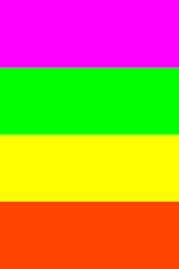
#FF00FF
-
#00FF00
-
#FFFF00
-
#FF4500
Download this color palette
 735×1102
Pinterest image
 2160×3840
Vertical wallpaper

 900×900
Square

 3840×2160
4K Wallpaper

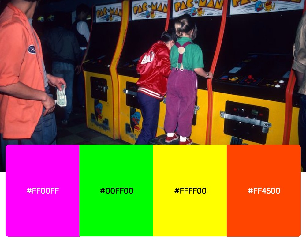
Step into any arcade from 1985 and you’d be hit with these exact colors. Magenta, lime green, electric yellow, and orange-red create an explosive combination that’s perfect for gaming brands or any project that needs that high-energy, competitive edge.
3. Synthwave Sunset
-
#FF006E
-
#8338EC
-
#3A86FF
-
#06FFA5
Download this color palette
 735×1102
Pinterest image

 2160×3840
Vertical wallpaper

 900×900
Square

 3840×2160
4K Wallpaper

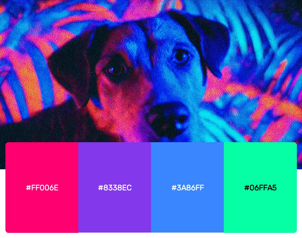
This gradient-inspired palette captures the essence of those iconic 80s sunset graphics. The transition from hot pink through purple to blue and mint green creates a dreamy, ethereal quality that’s absolutely perfect for music projects or tech interfaces with a retro twist.

Get 300+ Fonts for FREE
Enter your email to download our 100% free "Font Lover's Bundle". For commercial & personal use. No royalties. No fees. No attribution. 100% free to use anywhere.
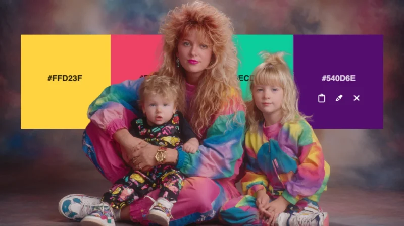
4. Memphis Design Pop
-
#FFD23F
-
#EE4266
-
#0ECD9D
-
#540D6E
Download this color palette
 735×1102
Pinterest image
 2160×3840
Vertical wallpaper

 900×900
Square

 3840×2160
4K Wallpaper

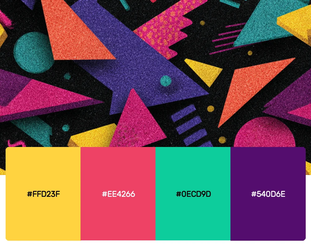
Inspired by the Memphis design movement that dominated the 80s, this palette combines sunshine yellow with coral red, turquoise, and deep purple. It’s playful yet sophisticated – exactly what you need for creative agencies or lifestyle brands that aren’t afraid to stand out.
5. Corporate Rebellion
-
#FF6B35
-
#004E89
-
#1A8FE3
-
#A4A4A4
Download this color palette
 735×1102
Pinterest image

 2160×3840
Vertical wallpaper

 900×900
Square

 3840×2160
4K Wallpaper

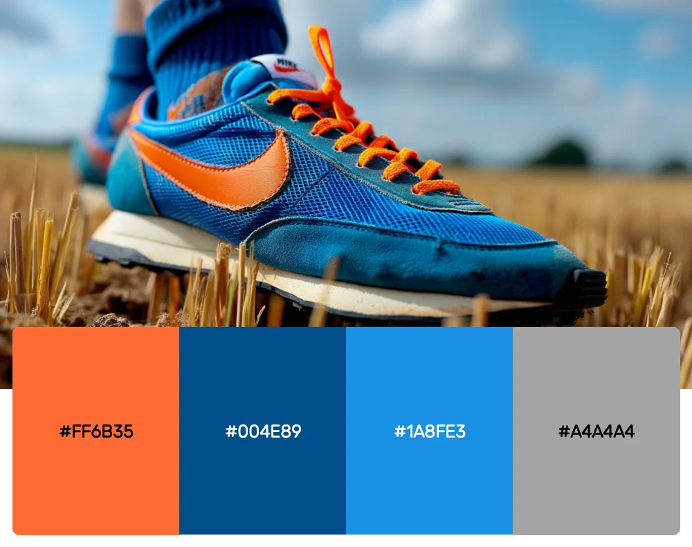
The 80s saw a fascinating clash between corporate culture and rebellious spirit, and this palette captures that tension perfectly. Bright orange rebels against navy corporate blue, while sky blue and gray keep things professional enough for the boardroom.
6. Pastel Power
-
#FFB3E6
-
#B3E5FC
-
#DCEDC1
-
#FFFACD
Download this color palette
 735×1102
Pinterest image

 2160×3840
Vertical wallpaper

 900×900
Square

 3840×2160
4K Wallpaper

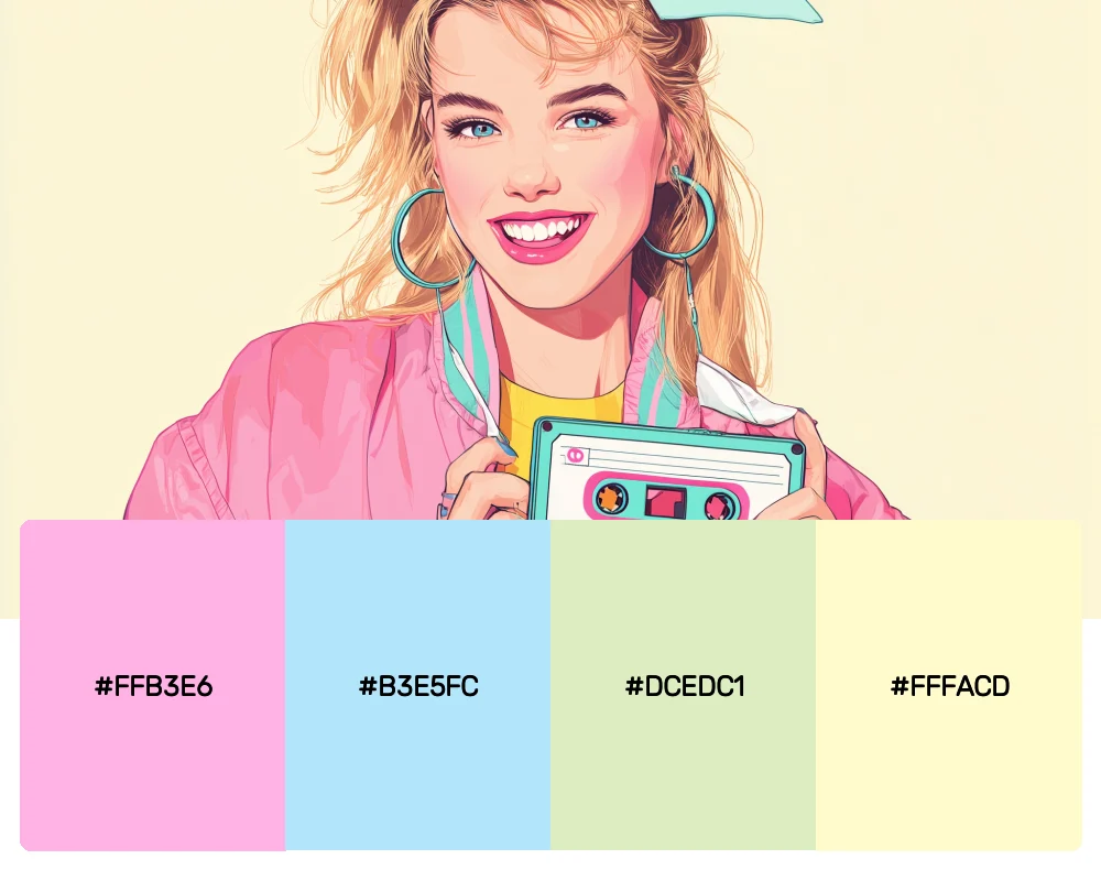
Not every 80s palette was about neon intensity. This softer combination of pastel pink, baby blue, mint, and cream shows the gentler side of the decade. It’s perfect for wellness brands or any project that needs a touch of 80s nostalgia without the visual assault.
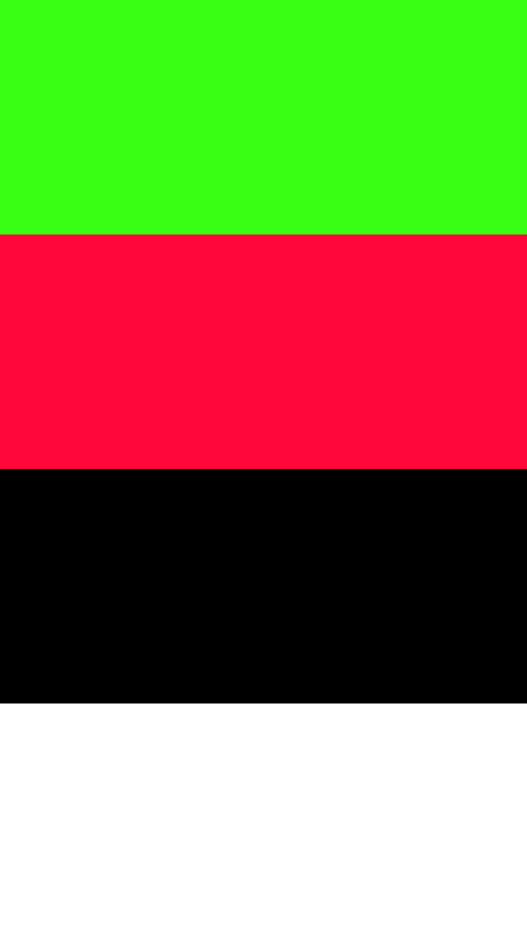
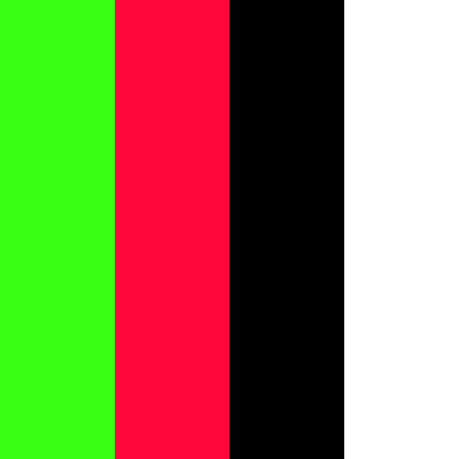
7. Cyberpunk Dreams
-
#39FF14
-
#FF073A
-
#000000
-
#FFFFFF
Download this color palette
 735×1102
Pinterest image

 2160×3840
Vertical wallpaper
 900×900
Square
 3840×2160
4K Wallpaper

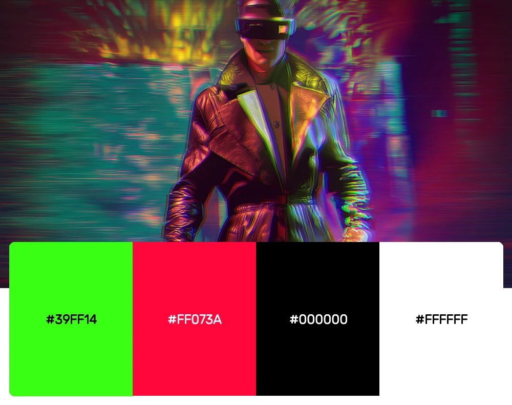
This high-contrast palette channels the cyberpunk aesthetic that emerged in the 80s. Electric green and hot red against stark black and white create that edgy, futuristic feel that’s perfect for tech companies or brands targeting the gaming community.
8. Tropical Paradise
-
#FF5F1F
-
#FCDE70
-
#40E0D0
-
#FF1493
Download this color palette
 735×1102
Pinterest image
 2160×3840
Vertical wallpaper

 900×900
Square

 3840×2160
4K Wallpaper

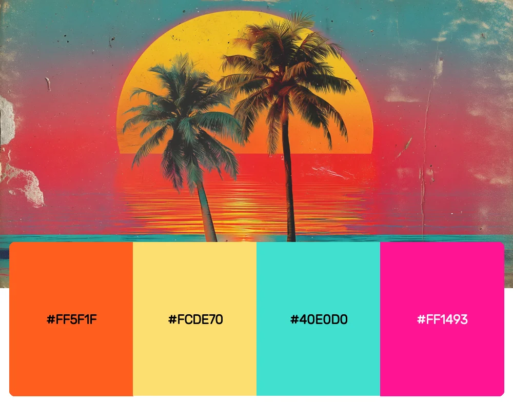
The 80s had a serious obsession with tropical themes, and this palette brings all that sunny, vacation energy. Coral orange, golden yellow, turquoise, and hot pink create an instant mood boost that’s ideal for travel brands or summer campaigns.
9. New Wave Cool
-
#9D4EDD
-
#00F5FF
-
#FFE66D
-
#FF006E
Download this color palette
 735×1102
Pinterest image
 2160×3840
Vertical wallpaper

 900×900
Square

 3840×2160
4K Wallpaper

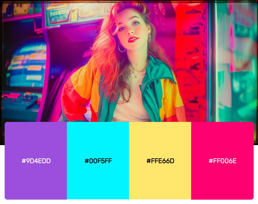
Inspired by the new wave music scene, this palette combines purple, cyan, yellow, and magenta in a way that feels both edgy and sophisticated. It’s perfect for music-related projects or brands that want to tap into that alternative 80s vibe.
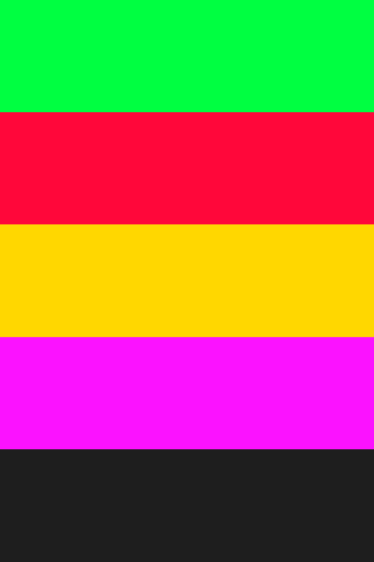
10. Retro Tech
-
#00FF41
-
#FF073A
-
#FFD700
-
#FB12FF
-
#1E1E1E
Download this color palette
 735×1102
Pinterest image
 2160×3840
Vertical wallpaper

 900×900
Square

 3840×2160
4K Wallpaper

This palette screams classic computer terminals and early video games. Matrix green, alarm red, golden yellow, and charcoal create that authentic retro-tech feeling that’s absolutely perfect for software companies or any brand with a nostalgic tech angle.
Why 80s Colors Are Dominating Design Again
The 1980s weren’t just about bold fashion and synthesized music – they represented a complete cultural shift toward embracing technology, individualism, and unapologetic self-expression. The color palettes of this era reflected society’s fascination with the future while maintaining a rebellious edge against traditional design rules.
What makes these palettes so compelling for modern designers is their emotional impact. The high-contrast combinations and saturated hues create an immediate psychological response – they demand attention and evoke strong feelings. In our current digital landscape, where brands are fighting for every second of attention, these bold 80s-inspired palettes can cut through the noise like nothing else.
The decade’s aesthetic also perfectly captures our current cultural moment. As we navigate rapid technological change and seek authentic self-expression, these colors offer a way to be both nostalgic and forward-thinking simultaneously.
Making 80s Colors Work in Contemporary Design
The biggest challenge with 80s palettes isn’t their boldness – it’s knowing how to use them without creating designs that feel like costume parties. Here’s what I’ve learned about incorporating these electric hues into modern work:
Start with Digital Applications
80s colors were literally born for screens. RGB displays could finally show these saturated hues properly, so they naturally work well in digital environments. Use them for app interfaces, website accents, or social media graphics where their vibrancy can really shine.
Master the Art of Contrast
The 80s were all about maximum contrast – light against dark, warm against cool, saturated against neutral. Don’t be afraid to push these contrasts to their limits. That tension is what makes the palettes so visually striking.
Embrace Geometric Patterns
Pair these colors with bold geometric shapes, angular layouts, and structured grids. The 80s aesthetic was heavily influenced by architectural and technological forms, so clean lines and geometric patterns feel completely natural with these palettes.
Use Gradients Strategically
The 80s popularized gradient backgrounds, but modern applications call for more sophisticated approaches. Try subtle gradients within individual elements rather than overwhelming background washes.
Balance with Sophisticated Typography
While you could go full retro with chunky, stylized fonts, pairing 80s colors with clean, modern typography creates a fresh tension that feels current while honoring the decade’s boldness.
The Cultural Forces Behind 80s Color Trends
Understanding why these colors dominated the 80s helps explain their current resurgence. Several factors converged to create this distinctive aesthetic:
The rise of MTV and music videos created a new visual language that needed to pop on television screens. Bright, saturated colors translated well to the video medium and helped create the decade’s distinctive look.
Advances in synthetic materials and manufacturing made it possible to produce these intense hues in everything from clothing to home goods. For the first time, designers could access colors that were previously impossible to create.
The personal computer revolution introduced people to RGB color spaces, where these electric combinations looked natural and appealing. The limitations and possibilities of early computer graphics heavily influenced the decade’s aesthetic choices.
The economic boom of the mid-80s encouraged conspicuous consumption and bold statements. Colors became a way to signal success, confidence, and forward-thinking attitudes.
Adapting 80s Palettes Across Design Disciplines
Brand Identity Design
These palettes work exceptionally well for brands that want to communicate innovation, energy, or nostalgia. Tech startups, gaming companies, and creative agencies can use 80s colors to differentiate themselves in crowded markets while tapping into positive associations with the decade.
Digital Product Design
App interfaces and websites can benefit from the high contrast and attention-grabbing nature of 80s palettes. Use them for call-to-action buttons, navigation elements, or interactive features where you need users to take specific actions.
Event and Marketing Design
The emotional impact of 80s colors makes them perfect for creating memorable experiences. Whether you’re designing a music festival poster or a product launch campaign, these palettes can create instant excitement and buzz.
Packaging Design
In retail environments where products need to stand out on crowded shelves, 80s-inspired palettes can be incredibly effective. The bold contrasts and saturated hues naturally draw the eye and create strong brand recognition.
Interior Design
While it might seem risky, 80s colors can create incredibly dynamic interior spaces when used thoughtfully. Try using them as accent colors against neutral backgrounds, or go bold with a single statement wall in a vibrant hue.
The Psychology of 80s Color Combinations
What makes 80s palettes so psychologically powerful is their deliberate use of complementary and triadic color relationships pushed to maximum saturation. These aren’t subtle, harmonious combinations – they’re designed to create visual tension and emotional response.
The high contrast between colors creates what psychologists call “visual excitement” – our brains are literally stimulated by the dramatic differences between adjacent hues. This makes 80s palettes perfect for designs that need to grab attention or create emotional engagement.
The saturated nature of these colors also taps into our associations with energy, youth, and optimism. In an era where many design trends favor muted, sophisticated palettes, 80s colors offer a refreshing blast of pure visual joy.
Looking Forward: 80s Colors in 2025 and Beyond
As we move deeper into the 2020s, I’m seeing 80s-inspired palettes evolve in fascinating ways. Designers are taking the core principles – high contrast, bold saturation, geometric relationships – and applying them with more sophisticated color theory and modern production techniques.
The key to success with these palettes is understanding that they’re not just about nostalgia. They represent a design philosophy that values boldness, optimism, and authentic self-expression. In our current moment of uncertainty and rapid change, these colors offer a way to inject confidence and energy into our visual communications.
Whether you’re designing the next breakthrough app, creating a memorable brand identity, or just want to add some serious visual impact to your next project, these 80s palettes offer a proven formula for creating designs that people actually notice and remember.
The 80s taught us that design doesn’t always have to be subtle to be sophisticated. Sometimes, the most powerful statement you can make is to embrace the bold, the bright, and the absolutely electric. So go ahead – turn up the neon and let your creativity run wild.