In this article:
- What Is Inclusive Design?
- The Case for Inclusive Design
- How to Implement Inclusive Design in Your Work
- Designing for Inclusion Makes Everything Easier
Inclusive design is often discussed when ethics pops up in conversation, but there is so much more to it than that. While it is the responsible thing to do, it can be easy to cut corners because it adds another step to your process. The thing is that inclusiveness pushes us to become better designers, and it leads to work that is easier for everyone to use.
So, while you may previously have put inclusive design on the back burner, consider the ways it helps you. Knowing how it makes you a better designer will inspire you to implement it into every project.
What Is Inclusive Design?
Inclusive design is about creating work that considers the widest range of people possible. This means thinking about different abilities, experiences, backgrounds, ages, viewpoints and the ways people interact with the world.
It is about more than checking off the accessibility box. Instead, it starts by asking who could be left out and how you can bring them in.
To be clear, inclusive design is not so much about creating a solution for everyone as it is about ensuring your design can flex to meet different needs so everyone feels like they belong. That could mean adding alt text or avoiding certain color combinations.
For example, using only color to convey information can exclude users with color vision deficiency. Adding icons, labels or patterns makes that same creation usable for more people without losing clarity.
Nearly 70 million U.S. citizens live with some form of disability. When you create with inclusion, you build smarter solutions that work better for everyone.

Get 300+ Fonts for FREE
Enter your email to download our 100% free "Font Lover's Bundle". For commercial & personal use. No royalties. No fees. No attribution. 100% free to use anywhere.
The Case for Inclusive Design
Inclusive design challenges you in the following ways.
It Expands Your Creative Problem-Solving Skills
Designing with inclusiveness naturally pushes us to think beyond the first choice. Instead of going for what has always worked for you, it challenges you to create something in new ways. This transition stretches your creative mind because you step outside the box of familiarity and assumptions.
For example, say you are drafting a navigation menu. If you think only about sighted users on desktops, you might choose a minimal hover-based drop-down menu.
Yet, when you consider screen reader users and keyboard navigation, your solution has to adapt. You must think of different layouts and labeling systems that make the experience clearer and more usable.
The more you do this, the more natural it becomes. Inclusive design turns constraints into opportunities, and that often leads to more refined solutions.
It Builds Empathy-Driven Thinking
When I focus on inclusive design, I step into users’ shoes. This perspective trains you to understand people deeply and create with compassion and clarity.
Anne Peterson, the Experience Design Lead of CoDesign Collaborative, pointed out that inclusive design begins with understanding lived experiences. When you hear about your audience’s frustrations, you have a more profound realization of what matters most to them.
That mindset leads to creative, more human-focused end products. Simultaneously, it reflects the values we want to see in the workplace.
Recent research shows that 80% of the workforce would rather work for companies prioritizing diversity, equity and inclusion. When you lead with empathy in your process, you are also helping shape a culture where more people feel seen and supported, including your team.
It Makes Your Work More Flexible and Future-Proof
Inclusive design benefits more users and opens the door to your growth as a creative. Slack’s Vivian Urata has stated that inclusive design broadens your world view and illuminates opportunities to grow, both as a designer and an individual. As you evolve, your perspective and how you approach every project change.
This lets you build systems that can adapt to different contexts and users in the following ways:
- Naturally create interfaces that accommodate screen readers, flexible content layouts and keyboard navigation.
- Prioritize things like semantic HTML and responsive type scales.
- Think about edge cases and alternate experiences upfront.
Overall, inclusive design helps you stop creating for one user and start building for many. As a result, your work becomes more reusable and better suited to evolve over time.
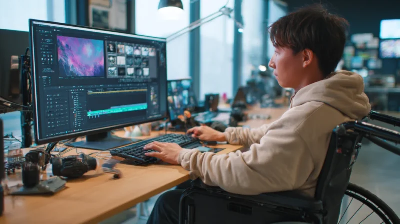
How to Implement Inclusive Design in Your Work
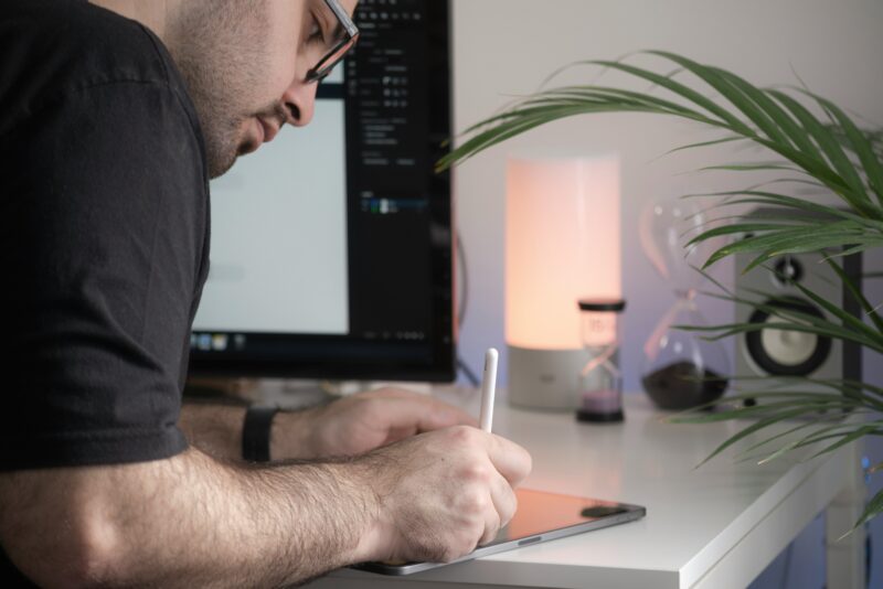
Source: https://unsplash.com/photos/man-in-black-t-shirt-writing-on-white-paper-XxSohbzD6E8
Building inclusivity into your day-to-day work may seem challenging at first. Yet, if you start with a few ways to implement it, you can grow and make it part of your process permanently.
1. Make Inclusivity a Mindset — Not a Checkbox
Inclusive design works best when you have baked it into the process rather than adding it at the end as a quick fix. If you wait until a project is nearly done to start thinking about accessibility, you are more likely to miss important details or create barriers.
I ask myself questions early on, like “Who might have trouble using this?” or “Am I assuming every user interacts with this the same way I do?” These check-ins help me catch things sooner, whether it is a layout with too much color or a font that is harder to read for some.
2. Use Accessible Typography
Typography plays a large part in whether a design is easy to understand or hard to navigate. Fonts that look great in a mock-up can quickly become a barrier if they are too decorative, small or poorly spaced.
Thinking mobile-first is a helpful way to stress-test my typography choices. With over 6.38 billion people using smartphones globally, most people will likely interact with your design on a small screen.
Stick to clean fonts, and avoid overly light weights or compressed styles. Use heading levels in logical order, and make sure line height and contrast support easy reading.
3. Rethink Color Usage and Contrast

Source: https://unsplash.com/photos/red-flower-in-tilt-shift-lens-HSO9dQLTdkE / https://www.color-blind-test.com/images/simulator/
Good color contrast is essential to making your designs readable and usable. Yet, many of us overlook it, even when working with attractive color palettes.
Studies show that 79.1% of websites fail the minimum WCAG 2 contrast standards on text alone. That means most users are experiencing web content that is harder to read than it needs to be.
When I think about color with inclusivity in mind, I:
- Ensure text is always legible.
- Support users with low vision, color blindness or aging eyesight.
- Create designs that work equally well when printed, projected or viewed on older screens.
To ensure contrast works beautifully, use contrast checkers to hit the WCAG minimum of 4.5:1 for body text and 3:1 for larger text. It also helps to test in black and white or color-blind modes to ensure your creation still reads clearly.
4. Design for Multiple Input Methods
People tap, scroll and click in different ways. Some use a keyboard while others use voice commands. If your design only works for a mouse or touchscreen, you could be shutting out many users.
I look at every interaction and consider whether a person can navigate without a mouse. I also think about what happens if they are navigating with a keyboard or assistive tech. This helps me catch things that I have missed, such as buttons or carousels that you cannot swipe with a screen reader.
You can ensure this type of inclusivity by:
- Ensuring keyboard accessibility: Every interactive element should be reachable and usable by keyboard.
- Providing visible focus indicators: Users need to see where they are when tabbing through content.
- Supporting gesture alternatives: Offer clear buttons or links as backup for swipe-based actions.
5. Use Inclusive Imagery
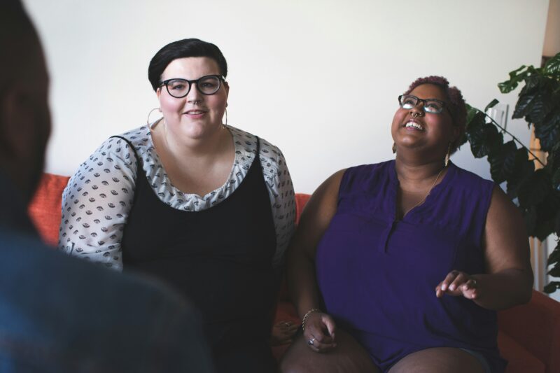
Source: https://unsplash.com/photos/two-women-sitting-on-sofa-qjHtxArSBT8
The visuals we choose carry weight. Even if our design is functionally accessible, it can still feel unsettling if the imagery represents a narrow group of people.
Look for assumptions in your imagery. If your product only shows a young, able-bodied or Western type of person, this sends a message about who your work is for. Choosing diverse, authentic visuals incorporates the full spectrum of your audience.
So, choose visuals that represent every race, age, ability, gender and more. Make sure representation is meaningful so your designs feel human-centered.
6. Structure Content for Clarity
Research shows that processing speed, attention and short-term memory begin to decline by your 30s or earlier. Therefore, visual clutter can feel overwhelming to many users.
To create with clarity, keep these practices in mind:
- Use strong visual hierarchy: Make sure it is clear what users should look at first, second and third. Use size, weight, color and placement intentionally.
- Keep layouts clean and consistent: Avoid overcrowding elements too closely together. Generous spacing improves readability and reduces mental effort.
- Limit the number of focal points: Too many competing visuals can be overwhelming. Guide the eye with purposeful contrast and alignment.
7. Test With a Wide Range of Users
One of the easiest ways to spot accessibility issues is to invite more people into your feedback loop. It is easy to assume a design works well when you only consider it from your perspective, but that is also how gaps occur.
Testing with only a few people who interact differently can uncover things that are hard to catch. This could be something as simple as a button that is not reachable without scrolling or a color choice that makes content unreadable for someone with low vision. Improving these small details can make a big difference.
Designing for Inclusion Makes Everything Easier
Some check off inclusive design at the end of their process and move on, but we have to be more serious than that if we want to grow. Rather than checking it off your to-do list, consider understanding people’s different needs. Digging deeper makes your work clearer and more connected to your audience.