In this article:
- The Most Majestic Royal Fonts of 2026
- What Makes a Font Feel Royal?
- Where to Use Royal Fonts in Your Designs
- Where to Avoid Royal Fonts
- How to Choose the Perfect Royal Font
- Royal Font Alternatives to Consider
- Common Royal Font Questions
- The Lasting Impact of Royal Typography
I’ve been obsessing over royal fonts for years, and here’s what I’ve discovered: they’re basically the typographic equivalent of a perfectly tailored tuxedo. Instant class, undeniable presence, and that mysterious quality that makes everything look more expensive.
Whether you’re designing for a luxury hotel, crafting wedding invitations that need to scream “elegance,” or building a brand that demands respect, royal fonts are your secret weapon. They whisper authority instead of shouting for attention.
Ready to discover which royal fonts are ruling the design world in 2026? Let’s dive into the typography that makes kings and queens jealous!
The Most Majestic Royal Fonts of 2026
Not all fonts are born equal, and when it comes to royal typography, some truly reign supreme. I’ve curated a collection of the most regal typefaces that will add instant nobility to your designs:
Royalite Script Family
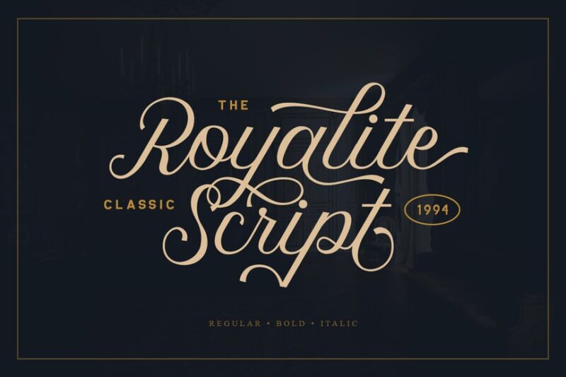
Royalite Script Family is an elegant and royal-inspired cursive font. It features flowing curves and ornate details, perfect for creating luxurious and sophisticated designs with a regal touch.
The Royal Consort
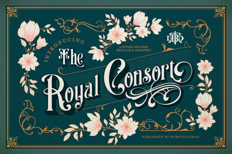
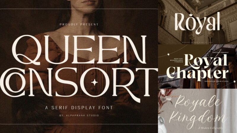
The Royal Consort is a decorative serif font with a royal and queenly aesthetic. Its majestic letterforms and refined details make it ideal for projects requiring a noble and dignified appearance.
Queen Consort
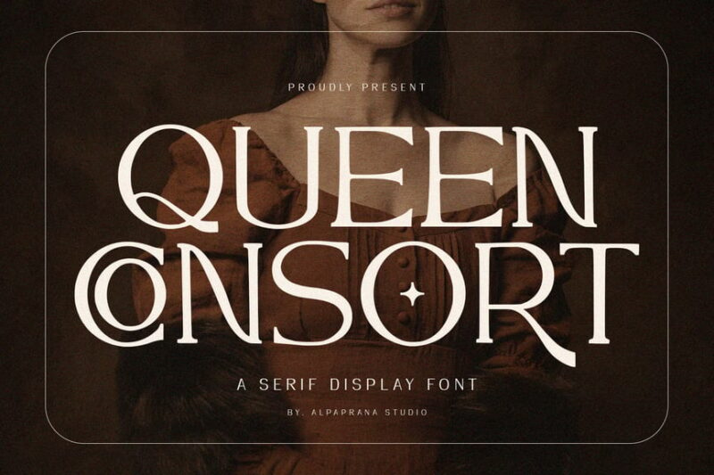
Queen Consort is a serif font with a princess and fairy-tale inspired modern design. Its delicate and whimsical characteristics make it perfect for creating enchanting and magical designs with narratives.

Get 300+ Fonts for FREE
Enter your email to download our 100% free "Font Lover's Bundle". For commercial & personal use. No royalties. No fees. No attribution. 100% free to use anywhere.
Lord Story
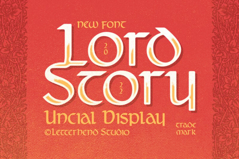
Lord Story is a decorative sans-serif font with medieval influences. Its bold and dramatic letterforms evoke a sense of ancient nobility and dark romance, ideal for historical or fantasy-themed designs.
NCL Jurgen Farbache – Medieval Rounded Blackletter
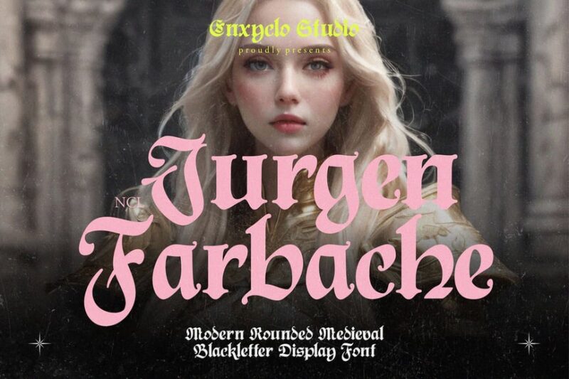
NCL Jurgen Farbache is a decorative Irish-inspired font with a medieval twist. Its rounded edges soften the traditional sharp angles, creating a unique blend of historical authenticity and modern readability.
Royale Kingdom – Modern Calligraphy Logo Font
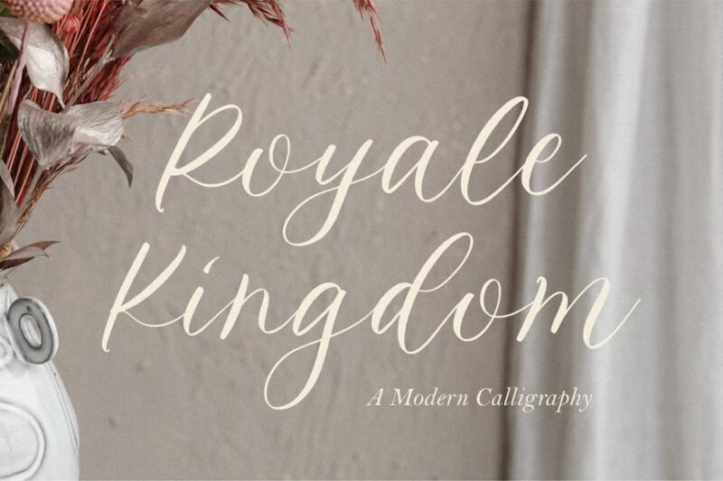
Royale Kingdom is a modern calligraphy font with a royal and ornate flair. Its fluid strokes and decorative elements make it perfect for creating elegant logos and branding materials with a contemporary regal touch.
Royale Luxurious Typeface
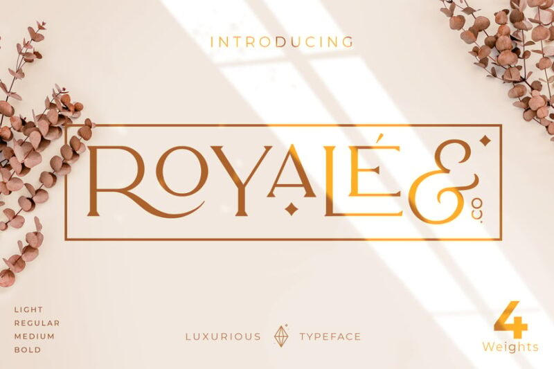
Royale Luxurious Typeface is a versatile gold font family encompassing serif, sans-serif, decorative, and script styles. Its opulent design and varied options make it ideal for luxury branding and high-end logo creation.
Royal Kingdom – Cartoon Game Font
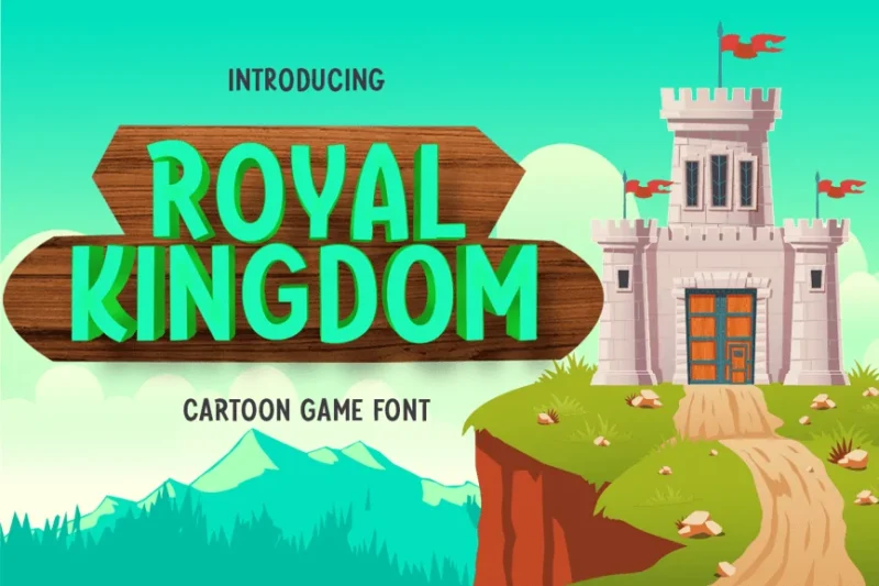
Royal Kingdom is a playful sans-serif and script font designed for cartoon games. Its funky and energetic character makes it perfect for creating lively, game interfaces and children’s content.
Royal Kingdom – Modern Display Typeface
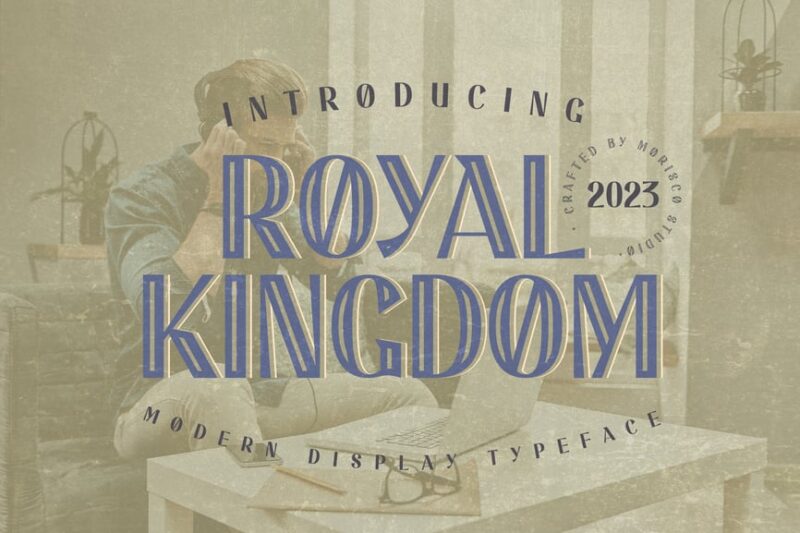
Royal Kingdom is a modern sans-serif display font with a royal theme. Its inline design adds depth and interest, making it ideal for creating eye-catching headlines and titles with a contemporary regal feel.
Queen Temoz – Modern Display Font
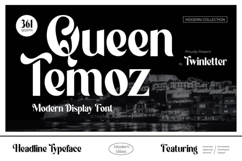
Queen Temoz is a modern sans-serif display font with a princess-inspired twist. Its sleek and stylish design combines royal elegance with contemporary aesthetics, perfect for fashion and lifestyle branding.
Queen Emirates
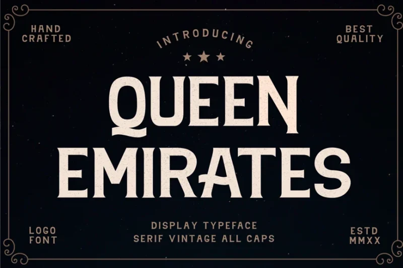
Queen Emirates is a serif font with a royal and badge-like quality. Its strong, authoritative letterforms make it excellent for creating emblems, crests, and official-looking designs with a regal touch.
Royal Chapter
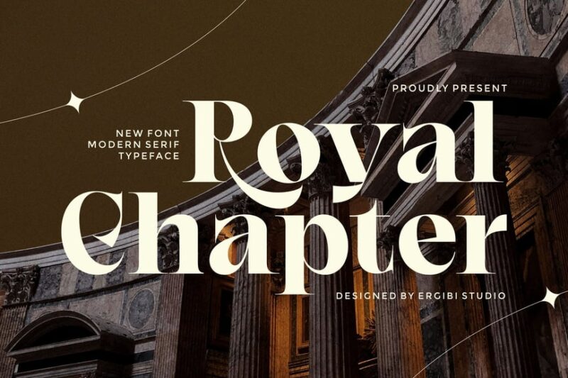
Royal Chapter is a luxurious serif font with a royal flair. Its refined and elegant design makes itforms are perfect for high-end branding, editorial design, and projects requiring a sophisticated, noble appearance.
Queen
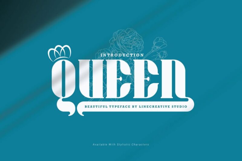
Queen is a decorative serif font with a royal and crown-inspired design. Its majestic and ornate characters make it ideal for creating regal logos, titles, and designs that require a strong, monarchical presence.
Crimson Queen – Modern Serif
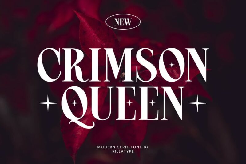
Crimson Queen is a modern serif font with royal and kingly attributes. Its magical take on classic serif design makes it versatile for both traditional and modern projects requiring a touch of regality.
Kensington Palace Elegant Serif Font
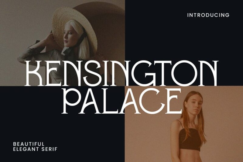
Kensington Palace is an elegant serif font inspired by luxury and high fashion. Its refined letterforms and subtle details make it perfect for creating sophisticated designs for upscale brands and editorial content.
Brittney Queen
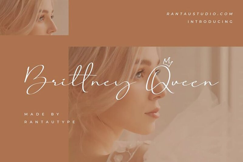
Brittney Queen is a script font that embodies luxury and high fashion. Its flowing, graceful lines and elegant curves make it ideal for creating chic, upscale designs for fashion brands and luxury products.
Queen Rogette – A Stylish Serif
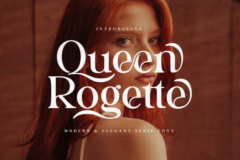
Queen Rogette is a stylish serif font with a royal and queenly aesthetic. Its elegant and refined design makes it perfect for creating sophisticated logos, headlines, and branding materials with a regal touch.
Gavelin – Luxury Modern Serif Font
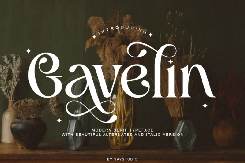
Gavelin is a luxury modern serif font designed for high-end fantasy type projects. Its sleek and contemporary interpretation of classic sermakes it ideal for creating upscale, sophisticated visual identities.
Last Royal – Elegant Luxury Font
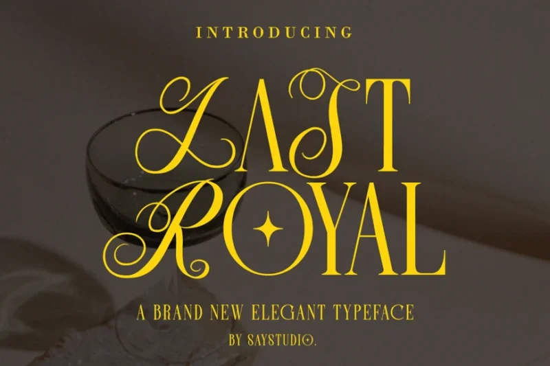
Last Royal is an elegant luxury serif font. Its refined and graceful letterforms are perfect for creating high-end branding materials, editorial designs, and projects that require a touch of opulence.
Royale Milanor – Elegant Serif
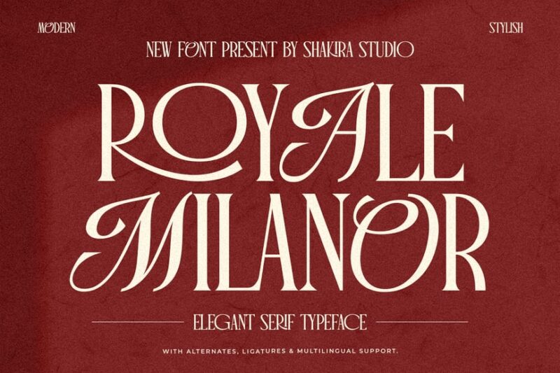
Royale Milanor is an elegant serif font designed for luxury branding. Its refined and sophisticated character letterforms and subtle details make it excellent for creating high-end logos and upscale visual identities.
Royal Treasure – Royal Vintage Font
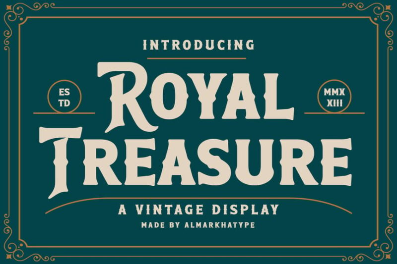
Royal Treasure is a vintage-inspired serif font with a royal and money-like design. Its elaborate letterforms and decorative elements make it perfect for creating designs with a nostalgic, regal aesthetic.
Royal Wonder
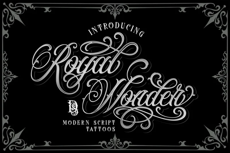
Royal Wonder is a decorative Chicano-style font that combines royal elegance with heavy metal aesthetics. Its bold. Its unique blend of ornate calligraphy and bold, dramatic strokes makes it ideal for creating striking, unconventional designs.
Kingfesh Quaker
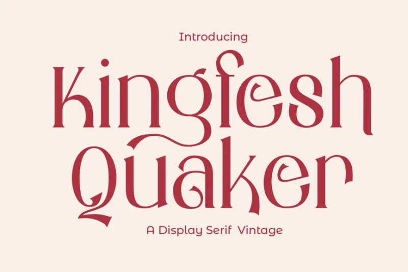
Kingfesh Quaker is a traditional serif font with a royal touch. Its classic design and subtle regal attributes for creating timeless, authoritative designs with a hint of nobility.
Estarossa – Classic Script
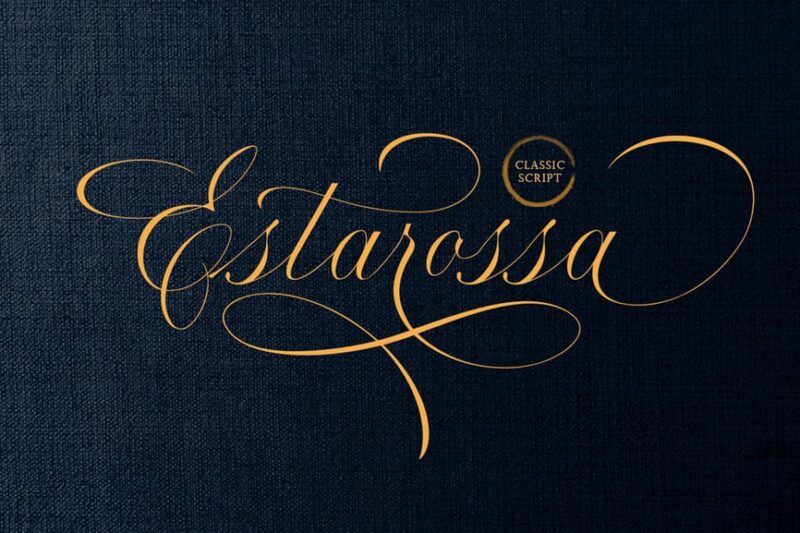
Estarossa is a classic script font that and opulent feel. Its flowing, elegant letterforms and refined details make it perfect for creating high-end branding materials and designs that exude sophistication and glamour.
Royal Fleur – Elegant Luxury Logo Modern
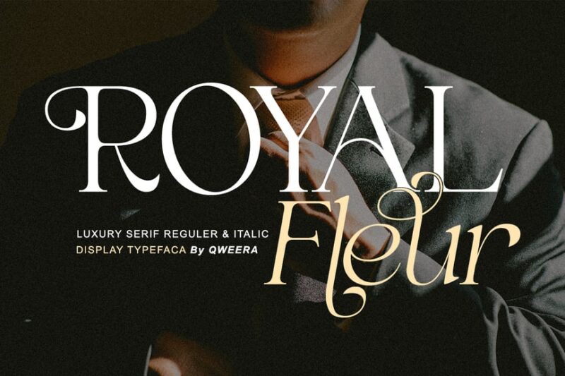
Royal Fleur is an elegant, modern serif font designed for luxury logos. Its refined letterforms and contemporary interpretation of classic elements make it ideal for creating sophisticated, high-end brand identities.
Regalia Monarch Luxury Serif Font
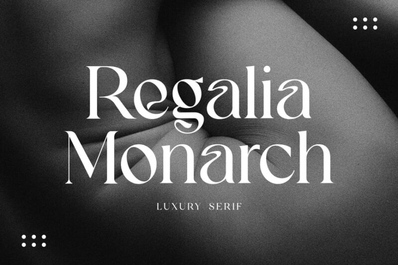
Regalia Monarch is a luxury serif font designed for upscale branding. Its majestic letterforms and refined details make it perfect for creating elegant logos and visual identities for high-end products and services.
Ranzene – Elegant Script
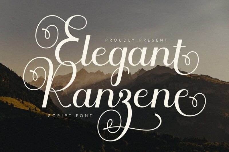
Ranzene is an elegant script font with a French-inspired luxury feel. Its graceful curves and refined strokes make it ideal for creating sophisticated designs with a touch of European elegance.
Kingdom – Elegant Stylish Serif
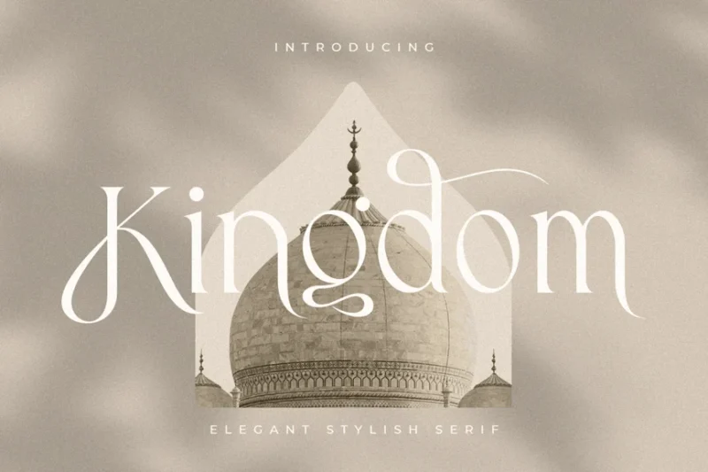
Kingdom is an elegant and stylish serif font with a luxurious, royal aesthetic. Its refined letterforms and subtle details make it perfect for creating sophisticated designs for high-end brands and regal-themed projects.
Monarch – Elegant Ligature Serif
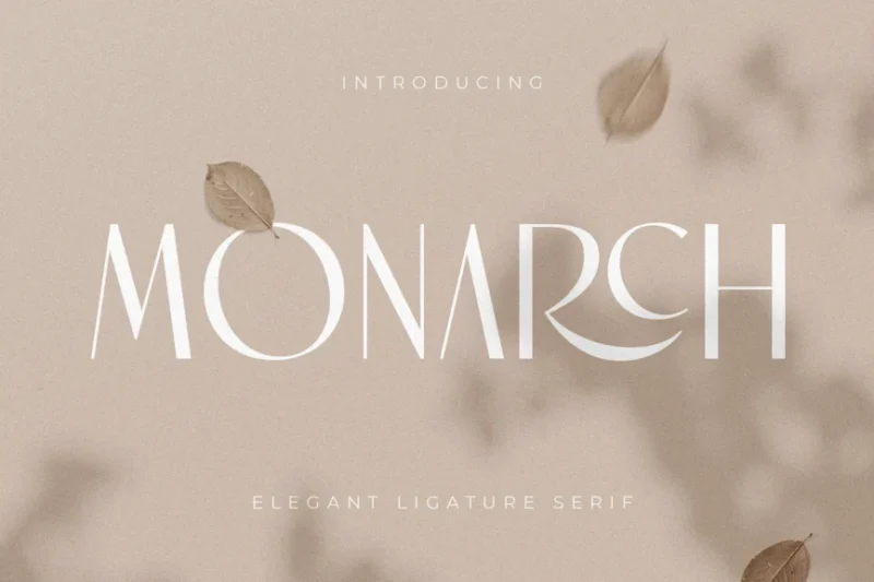
Monarch is an elegant tall serif font with a luxury feel. Its sophisticated design and unique ligatures make it ideal for creating refined, high-end branding materials and designs that require a touch of exclusivity.
Royal – Modern Unique Display Font
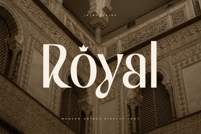
Royal is a modern, unique display serif font with a luxurious aesthetic. Its distinctive letterforms and contemporary interpretation of classic elements make it perfect for creating eye-catching headlines and logos with a touch of op.
The Royal Chambers
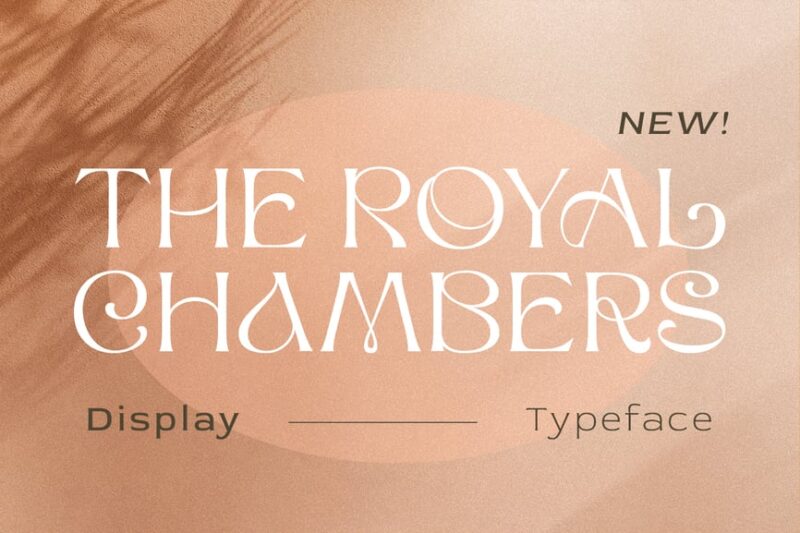
The Royal Chambers is a decorative font with a royal and princess-inspired design. Its ornate and majestic letterforms make it ideal for creating fairy-tale-like titles, logos, and designs that require a regal, enchanting quality.
Forthsmith Classic Script
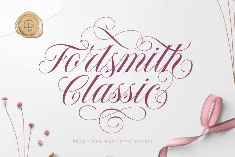
Forthsmith is a classic script font with royal and vintage serif influences. Its elegant, flowing lines combined with subtle traditional serif elements make it perfect for creating designs with a timeless, noble quality.
What Makes a Font Feel Royal?
Understanding the anatomy of royal typography is crucial for any designer looking to harness this powerful aesthetic. Royal fonts don’t achieve their majestic presence by accident – they’re carefully crafted with specific characteristics that trigger our psychological associations with nobility and prestige.
Classical Proportions and Heritage
First and foremost, royal fonts often draw from classical Roman inscriptions and medieval manuscripts. These historical connections immediately lend gravitas and legitimacy to any design. When we see letterforms inspired by ancient stone carvings or illuminated manuscripts, our minds instinctively connect them with power, tradition, and permanence.
The proportions themselves matter enormously. Royal fonts typically feature balanced, harmonious letterforms that follow classical rules of proportion. Nothing feels rushed or casual – every curve and angle is deliberate and refined.
Elegant Serifs and Ornate Details
Most royal fonts are serif typefaces, and for good reason. Serifs add sophistication and formality, while also improving readability in longer texts. But royal serifs go beyond mere functionality – they often feature subtle flourishes, elegant brackets, and refined terminals that whisper rather than shout their luxury.
You’ll notice that many royal fonts incorporate subtle ornamental details. These might be delicate swashes, refined ligatures, or carefully crafted alternate characters. These details never feel overwhelming, but they add that extra layer of sophistication that separates royal fonts from everyday typography.
Commanding Presence and Authority
Royal fonts command attention through their presence rather than their volume. They don’t need to be bold or loud to make a statement. Instead, they rely on perfect proportions, refined details, and that indefinable quality we call “gravitas.”
The best royal fonts feel confident without being aggressive, elegant without being precious, and authoritative without being intimidating. They’re the typographic equivalent of a perfectly tailored suit – immediately recognizable as high-quality, even to those who can’t articulate why.
Where to Use Royal Fonts in Your Designs
Royal fonts are incredibly versatile, but they work best when their inherent dignity aligns with your design goals. Here are the most effective applications:
Luxury Branding and High-End Products
Royal fonts are natural choices for luxury brands that want to convey exclusivity, heritage, and premium quality. Whether you’re designing for jewelry, high-end fashion, luxury automobiles, or premium spirits, royal typography immediately signals that this is a product for discerning customers.
The key is matching the font’s personality to your brand’s story. A centuries-old whiskey distillery might choose a font with strong historical connections, while a modern luxury tech company might opt for a royal font with cleaner, more contemporary lines.
Wedding and Event Design
Few occasions call for royal treatment like weddings and special celebrations. Royal fonts excel at creating that perfect balance between elegance and readability that wedding invitations require. They make every couple feel like royalty on their special day.
From save-the-dates to menu cards, royal fonts bring sophistication to every piece of wedding stationery. They work beautifully for both traditional church weddings and modern luxury celebrations.
Editorial and Publishing
Magazines, books, and publications targeting sophisticated audiences often rely on royal fonts for their timeless appeal and excellent readability. These fonts work particularly well for lifestyle magazines, literary publications, and luxury travel content.
Royal fonts can elevate everything from magazine mastheads to book covers, adding instant credibility and appeal to editorial designs.
Corporate and Professional Applications
Law firms, financial institutions, consulting companies, and other professional services often choose royal fonts to convey stability, trustworthiness, and expertise. These fonts suggest that the organization has been around for generations and will be around for generations to come.
The key is using royal fonts judiciously in professional contexts – they should enhance credibility without appearing pretentious.
Where to Avoid Royal Fonts
While royal fonts are magnificent in the right context, they can feel completely out of place in others. Understanding when not to use them is just as important as knowing when they shine.
Casual and Youth-Oriented Brands
Royal fonts can feel stuffy and disconnected when targeting younger audiences or promoting casual, laid-back brands. A skateboard company or trendy coffee shop would likely benefit more from contemporary, approachable typography than regal formality.
The inherent formality of royal fonts can create distance between your brand and audiences looking for authenticity and relatability.
Technology and Innovation
While some luxury tech brands successfully use royal fonts, most technology companies benefit from cleaner, more forward-looking typography. Royal fonts can make innovative companies appear backwards-looking or out of touch with modern sensibilities.
Budget-Conscious Markets
Royal fonts naturally suggest premium pricing and exclusive access. If you’re marketing to budget-conscious consumers or promoting value-oriented products, royal typography might send the wrong message about your pricing and accessibility.
How to Choose the Perfect Royal Font
Selecting the ideal royal font requires careful consideration of several factors that will determine whether your typography enhances or undermines your design goals.
Consider Your Brand’s Personality
Start by defining your brand’s character. Are you traditional or modern? Approachable or exclusive? International or distinctly regional? The answers will guide you toward royal fonts that align with your brand’s core identity.
A centuries-old European luxury house might choose a font with strong historical connections, while a modern luxury hotel chain might prefer something more contemporary but still undeniably elegant.
Evaluate Readability Requirements
Royal fonts vary significantly in their readability across different applications. While ornate display fonts work beautifully for headlines and logos, they may become illegible at small sizes or in body text applications.
Always test your chosen royal font at the actual sizes and contexts where it will be used. What looks magnificent at 72 points might become unreadable at 12 points.
Assess Cultural Appropriateness
Different royal fonts carry different cultural associations. Some evoke British aristocracy, others suggest French elegance, and still others reference classical Roman authority. Make sure your choice aligns with your brand’s geographic and cultural context.
Plan for Font Pairing
Royal fonts work best when paired thoughtfully with complementary typefaces. Consider how your royal display font will work alongside more utilitarian fonts for body text, captions, and supporting information.
The goal is creating a typographic hierarchy that feels cohesive and intentional, with your royal font serving as the elegant anchor for the entire system.
Royal Font Alternatives to Consider
While dedicated royal fonts offer the most authentic regal aesthetic, several alternative approaches can achieve similar results:
Classical Serif Fonts
Time-tested serifs like Garamond, Caslon, and Minion Pro carry centuries of typographic heritage. While not explicitly “royal,” they possess the dignity and refinement that royal designs require.
Engraved and Inscriptional Fonts
Fonts inspired by stone carving and metal engraving naturally convey permanence and authority. These typefaces feel substantial and enduring – perfect for brands that want to suggest longevity.
Luxury Script Fonts
Elegant script fonts can provide royal sophistication in more flowing, organic forms. These work particularly well for brands that want to feel personal yet prestigious.
Common Royal Font Questions
Let’s address some frequently asked questions about royal typography:
What makes a font look royal?
Royal fonts typically combine classical proportions, refined serifs, elegant details, and historical inspiration. They achieve dignity through subtlety rather than ostentation, creating an immediate impression of quality and tradition.
Can royal fonts work for modern brands?
Absolutely! Many contemporary luxury brands successfully use royal fonts by choosing typefaces that balance historical inspiration with modern sensibilities. The key is finding fonts that feel timeless rather than dated.
Are royal fonts always serif fonts?
While most royal fonts are serifs, some sans-serif fonts can achieve regal effects through proportion, refinement, and subtle details. The defining characteristic is elegance and authority, not necessarily the presence of serifs.
How do I know if a royal font is right for my project?
Consider your audience, brand personality, and design goals. Royal fonts work best when your project benefits from associations with tradition, quality, exclusivity, and sophistication.
The Lasting Impact of Royal Typography
Royal fonts represent more than just aesthetic choices – they’re connections to centuries of typographic tradition and human civilization’s highest aspirations for beauty and dignity.
When we choose a royal font, we’re not just selecting letterforms; we’re invoking the power of history, the authority of tradition, and the timeless appeal of refined craftsmanship. These fonts remind us that some things – like quality, elegance, and attention to detail – never go out of style.
In our fast-paced digital world, royal fonts offer something increasingly rare: a sense of permanence and gravitas that cuts through the noise. They speak to our desire for authenticity, quality, and connections to something larger than ourselves.
Whether you’re designing a luxury brand identity, crafting an elegant invitation, or creating editorial layouts that demand respect, royal fonts provide the typographic foundation for designs that truly command attention.
So the next time you’re looking to add some regal sophistication to your designs, remember that the perfect royal font is out there waiting to transform your project from ordinary to extraordinary. After all, in the kingdom of typography, we all deserve to feel like royalty.
Choose wisely, design boldly, and let your royal fonts reign supreme in your creative kingdom!

