In this article:
- The 9 Most Luxurious Color Palettes for 2025
- The Psychology Behind Luxury Colors
- Modern Applications of Luxury Color Palettes
- Creating Authentic Luxury with Color
- The Future of Luxury Color
- Embracing Sophisticated Color Choices
As a designer who’s worked with premium brands for over a decade, I can tell you that nothing elevates a design quite like the right luxury color palette. There’s an undeniable sophistication that comes from those perfectly curated combinations of rich jewel tones, sumptuous neutrals, and metallic accents that whisper elegance rather than shout for attention.
Whether you’re crafting a high-end brand identity, designing an upscale interior, or creating marketing materials for luxury goods, the colors you choose can make or break that premium feel. I’ve curated 9 of the most stunning luxury color palettes that will instantly elevate your work and give it that coveted high-end aesthetic.
The 9 Most Luxurious Color Palettes for 2025
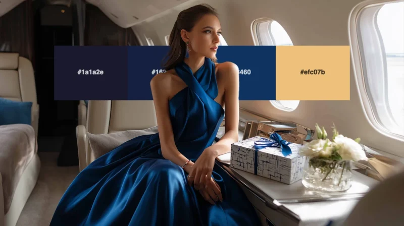
1. Midnight Opulence
-
 #1a1a2e


-
#16213e
-
#0f3460
-
#efc07b
Download this color palette
 735×1102
Pinterest image

 2160×3840
Vertical wallpaper

 900×900
Square

 3840×2160
4K Wallpaper

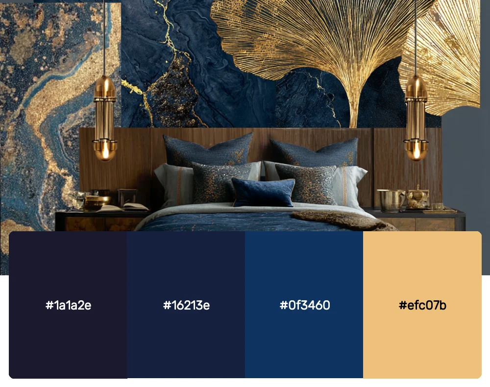
This sophisticated palette draws from the mystery of midnight skies and the richness of deep ocean waters. The dramatic navy tones paired with that stunning crimson accent create an atmosphere of exclusivity and power. I love using this combination for luxury tech brands or high-end financial services that want to convey trust and prestige.
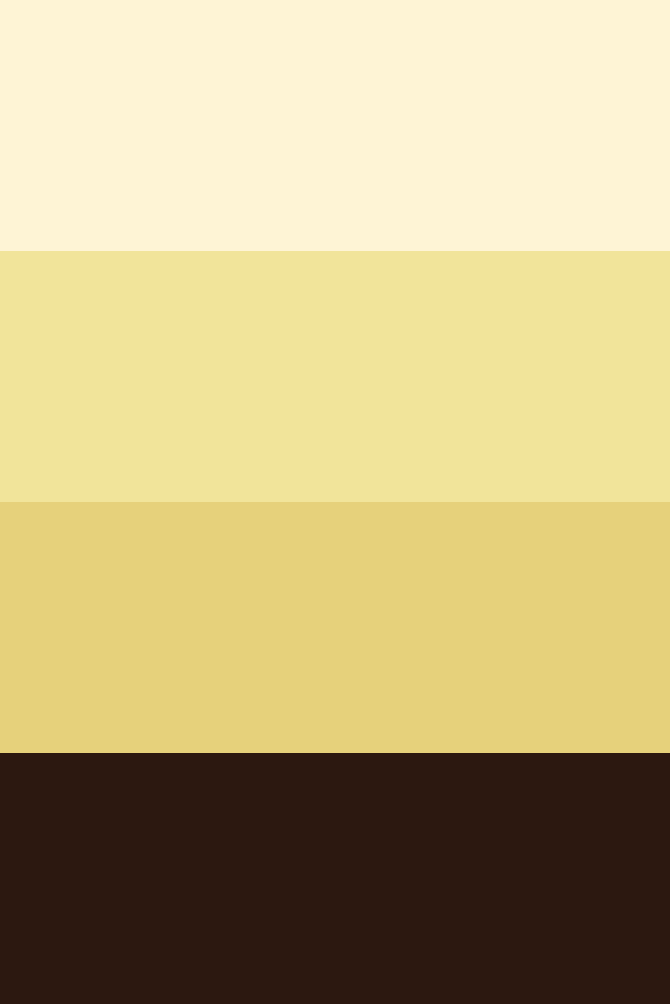
2. Golden Hour Elite
-
#FEF4D5
-
#F1E49A
-
#E6D17B
-
#2c1810
Download this color palette
 735×1102
Pinterest image
 2160×3840
Vertical wallpaper

 900×900
Square

 3840×2160
4K Wallpaper

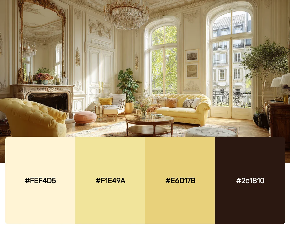
Inspired by those magical moments when everything is bathed in warm, golden light, this palette embodies pure luxury. The rich golds paired with that deep chocolate brown create an irresistible sense of warmth and opulence. It’s perfect for jewelry brands, premium spirits, or any project that needs to feel genuinely luxurious.
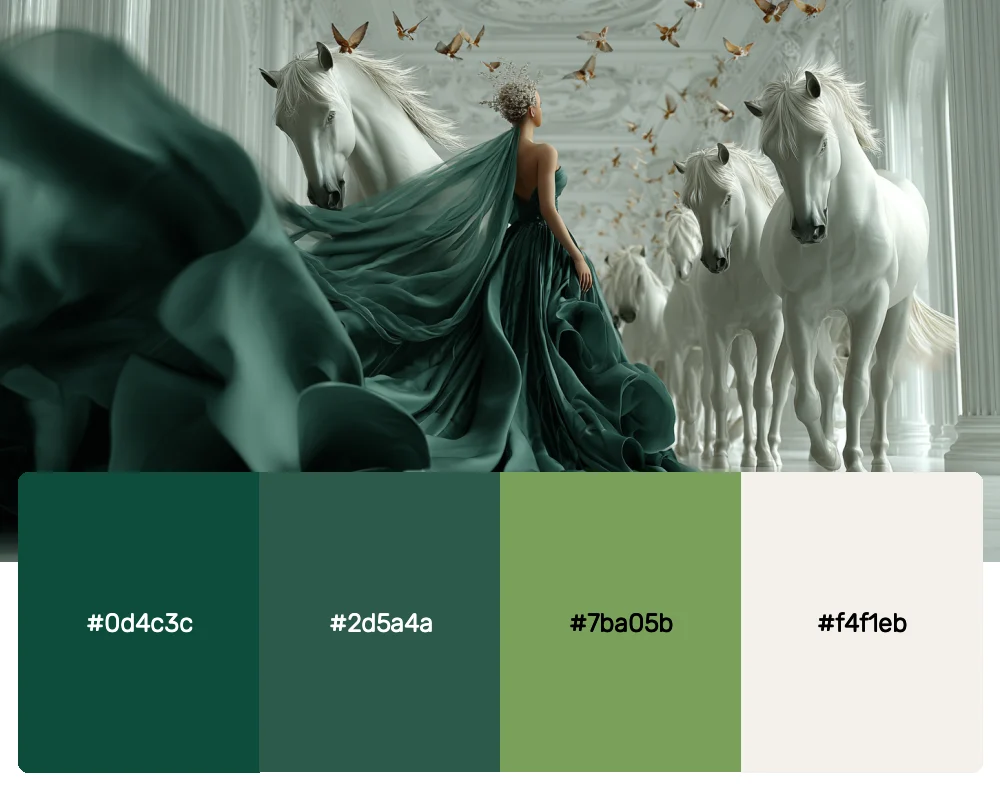
3. Emerald Sophistication
-
#0d4c3c
-
#2d5a4a
-
#7ba05b
-
#f4f1eb
Download this color palette
 735×1102
Pinterest image

 2160×3840
Vertical wallpaper

 900×900
Square

 3840×2160
4K Wallpaper


Get 300+ Fonts for FREE
Enter your email to download our 100% free "Font Lover's Bundle". For commercial & personal use. No royalties. No fees. No attribution. 100% free to use anywhere.
There’s something inherently regal about deep emerald greens. This palette captures that essence beautifully, balancing rich forest tones with a soft, creamy backdrop. I often reach for these colors when working on wellness brands or luxury resorts that want to evoke a sense of natural elegance.
4. Platinum Prestige
-
#2c3e50
-
#34495e
-
#bdc3c7
-
#ecf0f1
Download this color palette
 735×1102
Pinterest image

 2160×3840
Vertical wallpaper

 900×900
Square

 3840×2160
4K Wallpaper

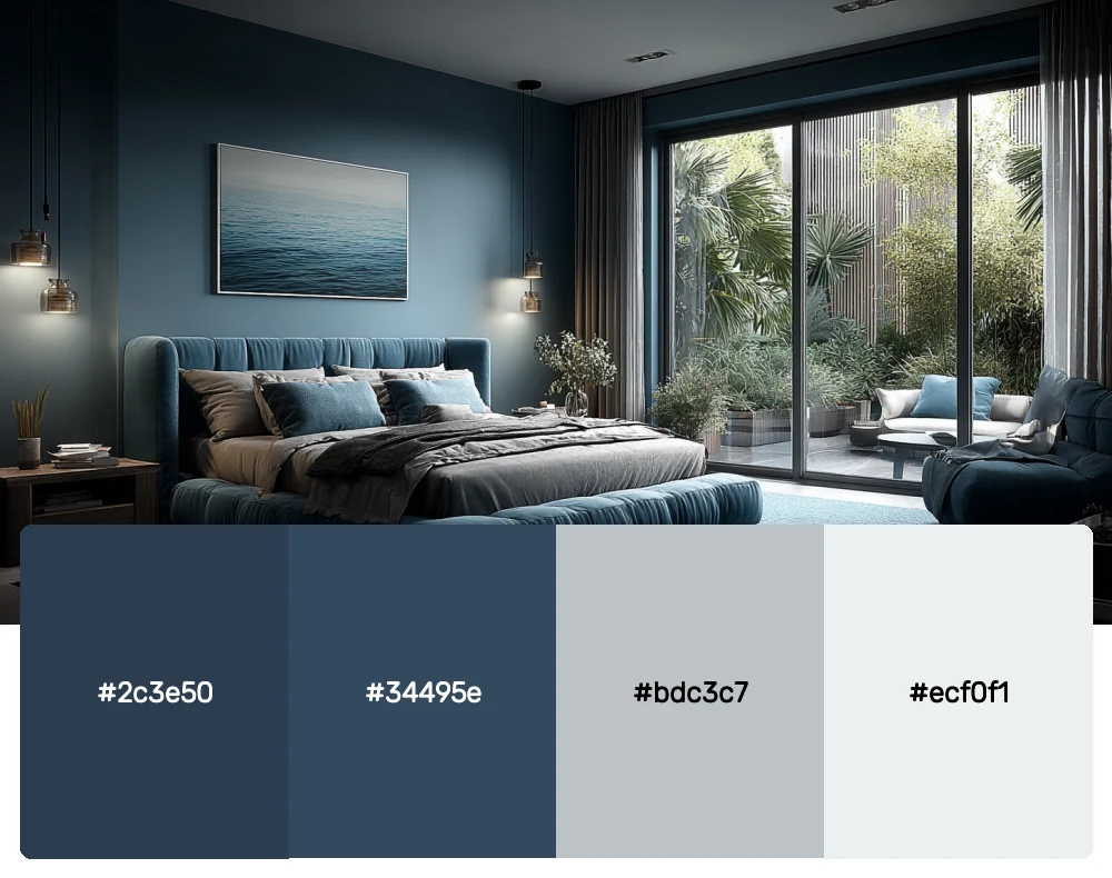
Sometimes luxury is about restraint and understated elegance. This monochromatic palette proves that point perfectly. The cool grays and silvers create a modern, minimalist luxury that feels fresh and contemporary. It’s ideal for high-end architecture firms or premium automotive brands.
5. Royal Burgundy
-
#722f37
-
#8b1538
-
#a0522d
-
#f5f5dc
Download this color palette
 735×1102
Pinterest image

 2160×3840
Vertical wallpaper

 900×900
Square

 3840×2160
4K Wallpaper

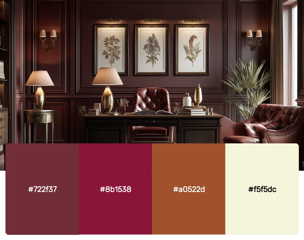
Deep, wine-inspired burgundy has always been associated with royalty and sophistication. This palette takes that classic luxury color and pairs it with warm undertones and a soft cream base. I love using it for luxury hospitality brands or premium wine labels that want to feel both traditional and refined.
6. Sapphire Dreams
-
#0f1419
-
#1e3a5f
-
#4a90a4
Download this color palette
 735×1102
Pinterest image

 2160×3840
Vertical wallpaper

 900×900
Square

 3840×2160
4K Wallpaper

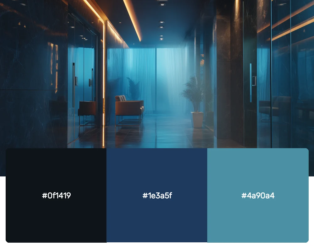
This palette captures the depth and brilliance of precious sapphires. Moving from the deepest midnight blue to lighter, more ethereal tones, it creates a sense of depth and mystery that’s absolutely captivating. It works beautifully for luxury cruise lines or high-end spa brands.
7. Rose Gold Romance
-
#b76e79
-
#e8b4b8
-
#f7e7ce
-
#ffffff
Download this color palette
 735×1102
Pinterest image

 2160×3840
Vertical wallpaper

 900×900
Square

 3840×2160
4K Wallpaper

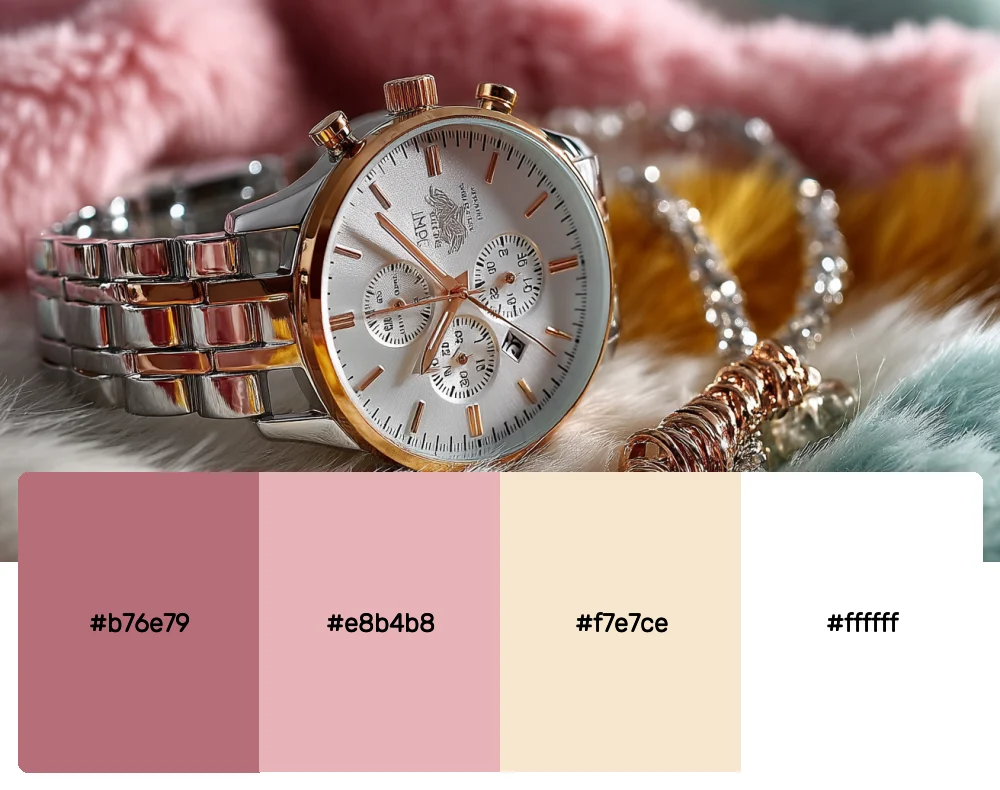
Rose gold has become synonymous with modern luxury, and this palette celebrates that beautifully. The soft, warm tones create an atmosphere of gentle sophistication that feels both luxurious and approachable. It’s perfect for beauty brands or boutique hotels that want to feel elegant yet welcoming.
8. Obsidian Elegance
-
#0c0c0c
-
#2c2c2c
-
#4a4a4a
-
#bea98e
Download this color palette
 735×1102
Pinterest image

 2160×3840
Vertical wallpaper

 900×900
Square

 3840×2160
4K Wallpaper

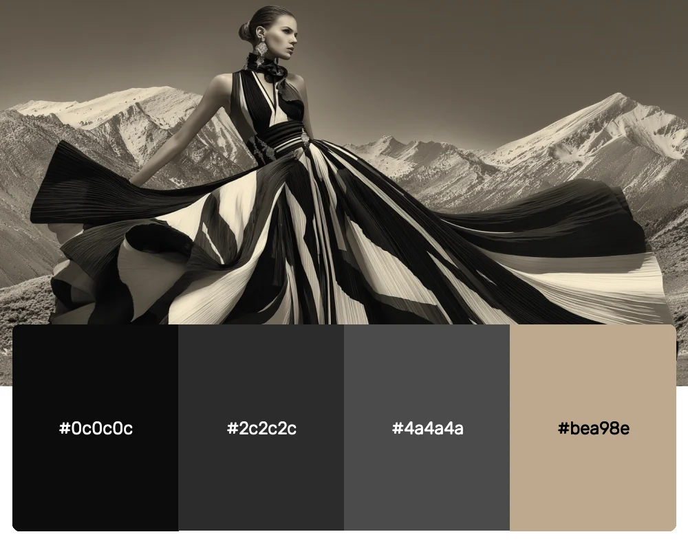
Sometimes the most powerful luxury statement is made in near-black. This dramatic palette uses deep charcoals and true black as a backdrop for that single, striking gold accent. It’s perfect for creating designs that feel exclusive and mysterious, ideal for luxury fashion or high-end spirits.
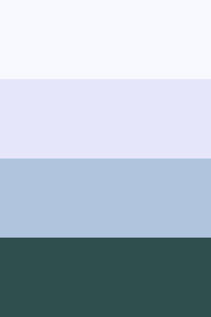
9. Arctic Luxury
-
#f8f8ff
-
#e6e6fa
-
#b0c4de
-
#2f4f4f
Download this color palette
 735×1102
Pinterest image
 2160×3840
Vertical wallpaper

 900×900
Square

 3840×2160
4K Wallpaper

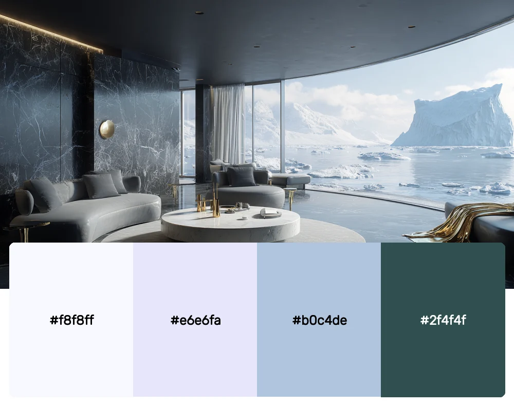
Inspired by pristine Arctic landscapes, this cool palette creates a sense of pure, untouched luxury. The icy blues and soft whites feel clean and exclusive, perfect for high-end skincare brands or luxury minimalist products that want to convey purity and sophistication.
The Psychology Behind Luxury Colors
Understanding why certain colors feel luxurious is crucial for any designer. Throughout my career, I’ve noticed that luxury colors often share specific characteristics that trigger psychological responses associated with wealth, quality, and exclusivity.
Deep, saturated colors like burgundy and navy suggest richness and depth, while metallics like gold and silver immediately evoke precious materials. Muted, complex colors often feel more sophisticated than bright, simple ones because they suggest refinement and subtlety rather than mass appeal.
The key is understanding that luxury isn’t always about being the loudest color in the room. Sometimes it’s about being the most perfectly balanced, the most thoughtfully chosen, or the most unexpectedly beautiful combination.
Modern Applications of Luxury Color Palettes
The beauty of luxury color palettes lies in their versatility across different design disciplines. Each field offers unique opportunities to showcase these sophisticated combinations.
Brand Identity Design
When creating luxury brand identities, these palettes help establish immediate credibility and premium positioning. I’ve found that using a restrained approach works best – perhaps choosing two colors as primaries with one metallic accent for special applications like foil stamping or embossing.
Interior Design
Luxury color palettes in interior spaces create environments that feel curated and exclusive. The key is layering these colors through different textures and finishes. A deep burgundy might appear in velvet upholstery, while gold accents shine through in hardware and lighting fixtures.
Digital Design
Applying luxury palettes to websites and apps requires careful consideration of accessibility and user experience. These rich colors work beautifully for hero sections and accent elements, but they need to be balanced with plenty of white space and highly legible typography to maintain that premium feel.
Packaging Design
Perhaps nowhere do luxury colors shine more than in premium packaging. These palettes help products stand out on shelves while communicating quality and value. Matte finishes in deep colors paired with metallic foil details create an irresistible sense of luxury.
Creating Authentic Luxury with Color
The secret to successfully using luxury color palettes isn’t just in the colors themselves – it’s in how you apply them. Over the years, I’ve developed several strategies that help ensure these sophisticated combinations feel authentic rather than forced.
First, less is always more when it comes to luxury design. Choose one or two colors as your foundation and use metallics or accent colors sparingly. The restraint itself becomes part of the luxury appeal.
Second, pay attention to color relationships and harmony. Luxury palettes work because the colors complement each other perfectly, creating visual balance that feels effortless and refined.
Finally, consider the cultural context of your colors. Different cultures associate different colors with luxury and prestige, so understanding your audience is crucial for creating designs that truly resonate.
The Future of Luxury Color
As we move through 2025, I’m seeing luxury color trends evolve in fascinating ways. There’s a growing appreciation for colors with depth and complexity – those that change subtly in different lighting conditions or reveal hidden undertones upon closer inspection.
Sustainability is also influencing luxury color choices, with more brands gravitating toward colors that feel connected to nature and environmental consciousness. This doesn’t mean sacrificing sophistication; instead, it’s about finding luxury in authenticity and responsibility.
Embracing Sophisticated Color Choices
These 12 luxury color palettes represent the pinnacle of sophisticated design thinking. Each combination has been carefully considered not just for its visual appeal, but for its ability to communicate quality, exclusivity, and refinement.
The magic happens when you understand that luxury design isn’t about using the most expensive colors or the flashiest combinations. It’s about making thoughtful choices that create emotional connections and communicate value through visual harmony.
Whether you’re working on a premium brand launch, designing an upscale interior, or creating marketing materials for luxury goods, these palettes provide the foundation for truly exceptional work. Remember to trust your instincts, embrace restraint, and always consider the emotional impact of your color choices.
True luxury lies in the details, and color is perhaps the most powerful detail of all. Use these palettes as your starting point, but don’t be afraid to adapt and refine them to perfectly match your project’s unique needs and vision.