In this article:
- The Best Dot Fonts to Try in 2026
- The History Behind Dot Fonts
- What Makes Dot Fonts So Appealing?
- Where to Use Dot Fonts (And Where to Avoid Them)
- How to Choose the Right Dot Font
- Pairing Dot Fonts With Other Typefaces
- Design Tips for Working With Dot Fonts
- Dot Fonts in Modern Design Trends
- Free vs. Premium Dot Fonts
- Common Dot Font Mistakes to Avoid
- Dot Fonts in Different Industries
- Creating Your Own Dot Font
- Common Questions About Dot Fonts
- The Future of Dot Fonts
- Conclusion: Making Your Mark With Dot Fonts
There’s something almost meditative about dot fonts. Each letter is carefully constructed from individual points, creating a texture that’s simultaneously retro and futuristic. They remind me of old-school scoreboards, vintage video games, and those satisfying lite-brite toys from childhood.
But here’s the thing – dot fonts aren’t just a nostalgia trip. They’re having a serious moment in contemporary design, popping up everywhere from tech startup logos to high-fashion editorial spreads. And trust me, when used correctly, they can transform an ordinary design into something truly memorable.
In this comprehensive guide, we’ll explore everything you need to know about dot fonts. Whether you’re hunting for the perfect dotted typeface for your next project or just curious about what makes these fonts tick, I’ve got you covered.
The Best Dot Fonts to Try in 2026
DotStudio
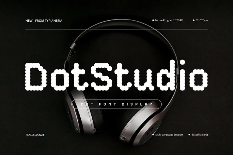
DotStudio is a cutting-edge Dot Font that embodies the essence of digital futurism. This sans-serif typeface features a unique blend of digital aesthetics and dotted elements, making it perfect for tech-savvy designers seeking a modern, forward-thinking look.
Flight
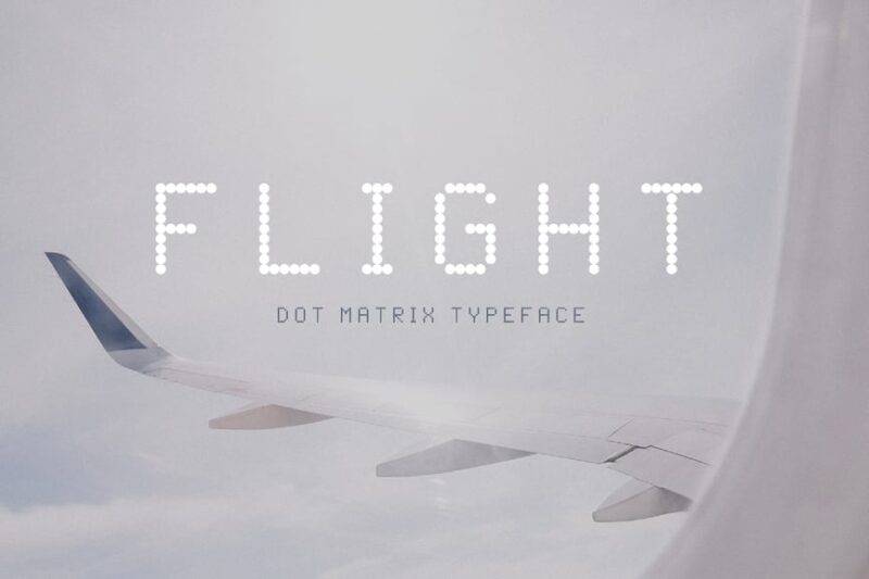
Flight is a versatile Dot Font that captures the essence of travel and movement. This dot matrix typeface offers a decorative touch with its dotted elements, making it ideal for projects that require a sense of journey or technological flair.
Belmein Disco
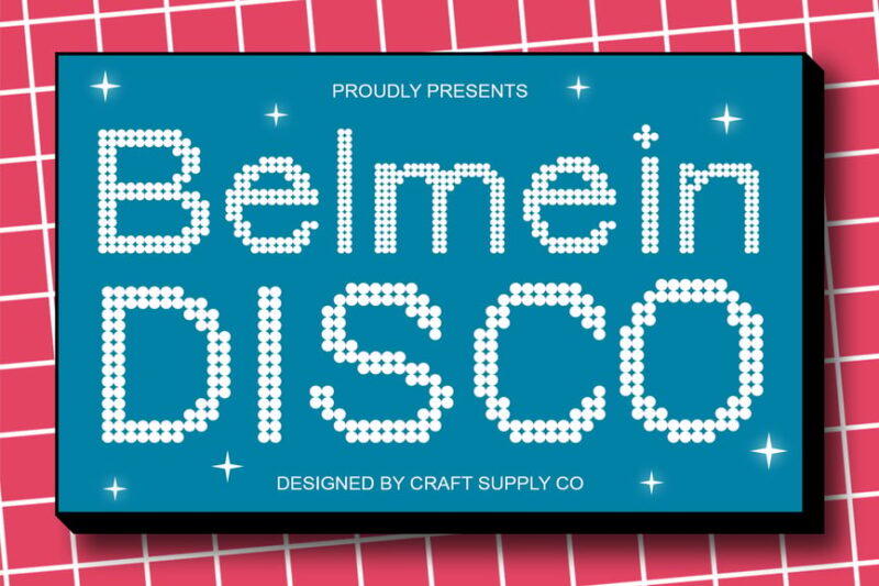
Belmein Disco is a lively Dot Font that brings the energy of the disco era to your designs. With its decorative dotted elements, this typeface is perfect for creating eye-catching headlines and retro-inspired graphics that demand attention.
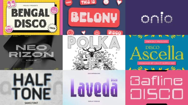
Visage Polka Dot
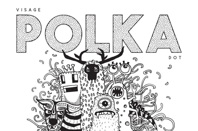
Visage Polka Dot is a playful sans-serif Dot Font that combines modern design with a touch of whimsy. This decorative typeface features polka dot elements, making it an excellent choice for designers looking to add a fun, approachable feel to their projects.

Get 300+ Fonts for FREE
Enter your email to download our 100% free "Font Lover's Bundle". For commercial & personal use. No royalties. No fees. No attribution. 100% free to use anywhere.
Alvera
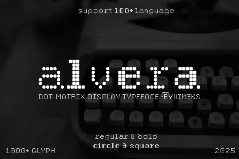
Alvera is a sophisticated Dot Font that brings a touch of elegance to the world of dot-matrix typography. This sans typeface offers a unique blend of pixelated and matrix-inspired elements, perfect for designers seeking a modern, tech-savvy aesthetic.
Ponkadought
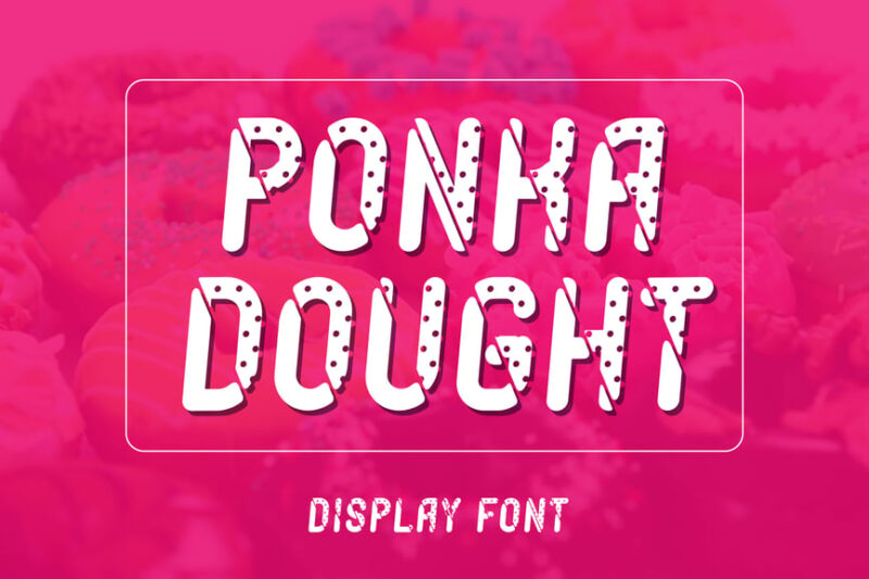
Ponkadought is a delightful Dot Font that adds a sweet touch to your designs. This sans-serif display typeface features playful dotted elements reminiscent of ice cream toppings, making it perfect for food-related projects or designs that require a fun, approachable feel.
BORSE
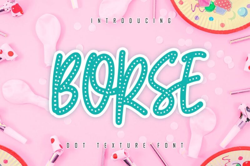
BORSE is a versatile Dot Font that combines display, script, and sans-serif styles. This decorative typeface features dotted elements that add a unique touch to branding projects, making it an excellent choice for designers looking to create memorable logos and headlines.
Halftone Sans
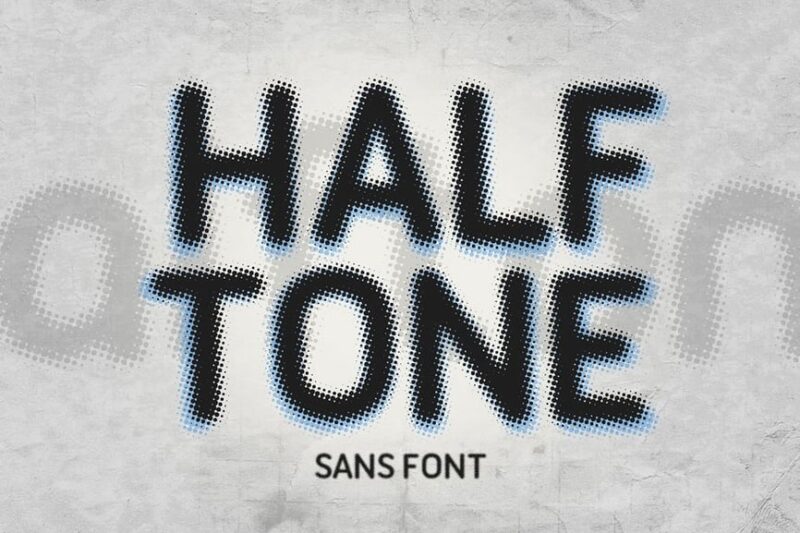
Halftone Sans is a striking Dot Font that brings the classic halftone effect to typography. This sans-serif typeface features dotted elements that create a unique visual texture, perfect for designers looking to add depth and intrigue to their projects.
Bengal Disco
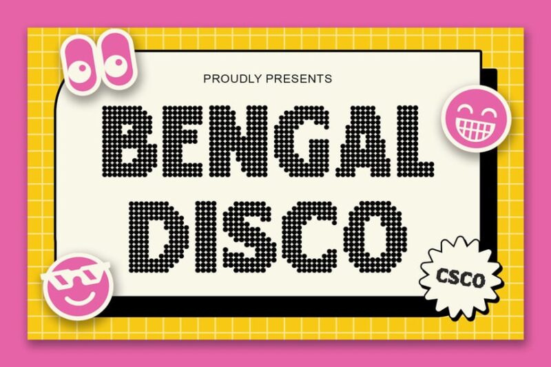
Bengal Disco is a vibrant Dot Font that captures the essence of disco culture. This decorative typeface features dotted elements that create a sense of movement and energy, making it ideal for projects that require a bold, retro-inspired look.
Dotrix
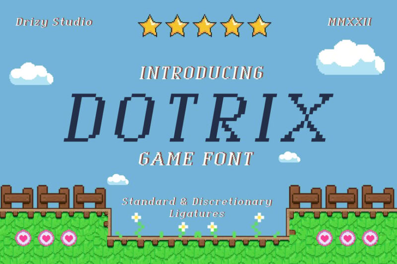
Dotrix is a unique Dot Font that brings a touch of retro gaming to modern design. This serif typeface features dotted elements inspired by 8-bit graphics, making it perfect for designers looking to add a nostalgic, tech-inspired feel to their projects.
Pixel Bit
![]()
Pixel Bit is a cutting-edge Dot Font that embodies the future of digital typography. This sans-serif display typeface features pixelated elements and geometric shapes, making it ideal for designers seeking a modern, tech-forward aesthetic in their projects.
Capsplay
![]()
Capsplay is a dynamic Dot Font that brings a futuristic flair to your designs. This sans-serif typeface combines pixelated elements with a neon-inspired look, perfect for creating eye-catching headlines and graphics with a modern, tech-savvy edge.
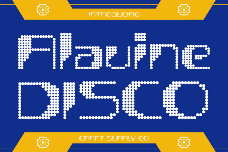
Bafline Disco
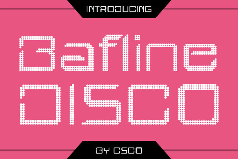
Bafline Disco is a striking Dot Font that combines the energy of disco with a modern neon aesthetic. This decorative typeface features dotted elements that create a unique visual texture, ideal for designers looking to add a touch of retro-futurism to their projects.
Briallen Disco
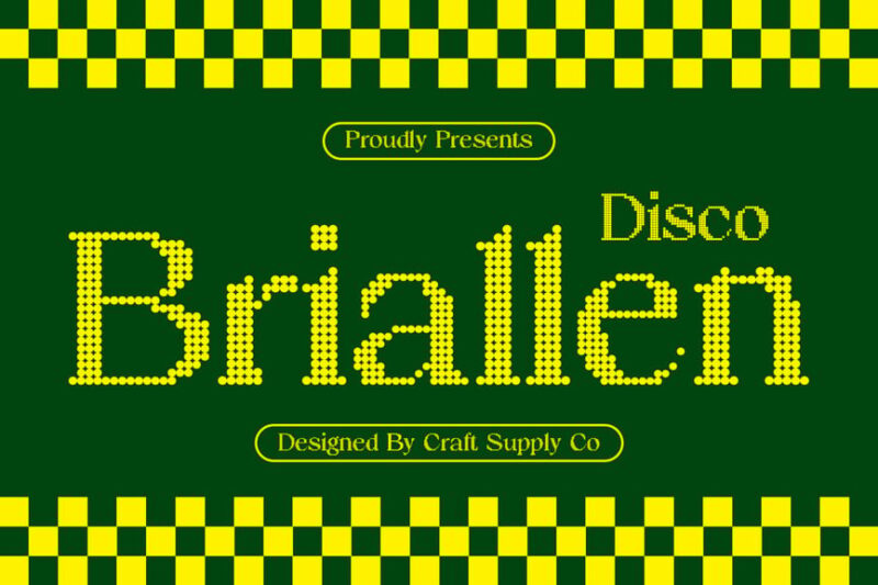
Briallen Disco is a dynamic Dot Font that brings the essence of digital timekeeping to typography. This decorative typeface features dotted elements inspired by digital clock displays, making it perfect for designs that require a modern, tech-inspired look.
Bartine Disco
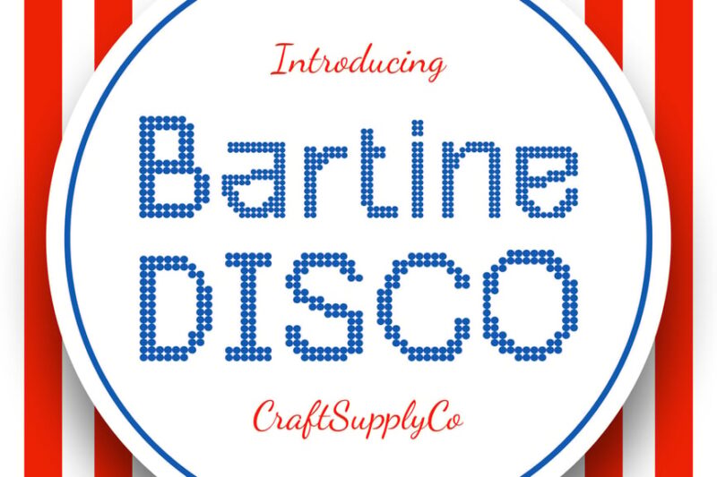
Bartine Disco is a nostalgic Dot Font that captures the spirit of retro disco culture. This decorative typeface features dotted elements that create a sense of movement and energy, ideal for designers looking to add a touch of vintage flair to their projects.
Neo Rizon
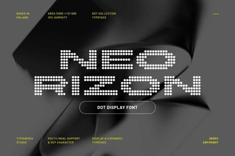
Neo Rizon is a bold Dot Font that combines 8-bit aesthetics with neon-inspired design. This modern display typeface features expanded characters and dotted elements, making it perfect for creating eye-catching headlines and graphics with a futuristic edge.
Alavine Disco
Alavine Disco is a vibrant Dot Font that brings a digital twist to disco-inspired typography. This decorative typeface features dotted elements that create a unique visual texture, ideal for designers looking to add a touch of retro-futurism to their projects.
Arbane Disco
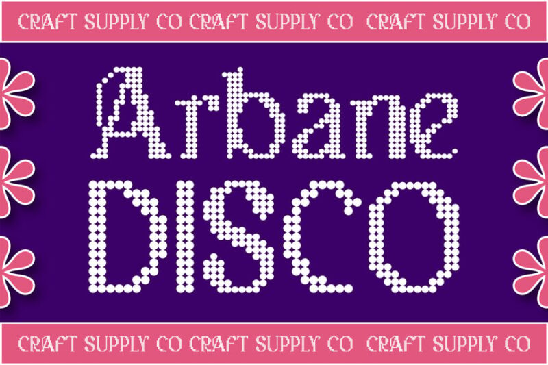
Arbane Disco is a striking Dot Font that combines marquee-style typography with 3D effects. This decorative typeface features dotted elements that create depth and dimension, perfect for designers looking to create eye-catching logos and headlines with a disco-inspired flair.
Arshine Disco
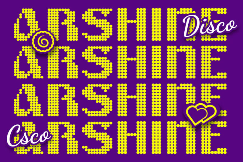
Arshine Disco is a bold Dot Font that brings a punk edge to disco-inspired typography. This decorative typeface features dotted elements and a modern take on the Neue Haas style, making it ideal for designers looking to create edgy, attention-grabbing designs.
Roinert
Roinert is a futuristic Dot Font that embodies the essence of industrial design. This decorative typeface features dotted elements that create a unique visual texture, perfect for designers looking to add a touch of sci-fi or tech-inspired aesthetics to their projects.
Ascella Disco
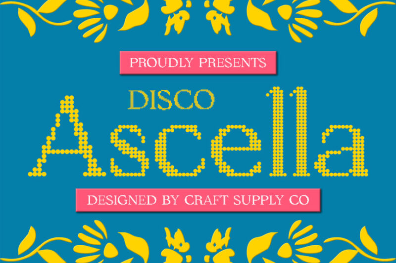
Ascella Disco is a lively Dot Font that captures the energy of party culture. This decorative typeface features dotted elements that create a sense of movement and excitement, making it ideal for designers working on logos and graphics for event-related projects.
Albercio Disco
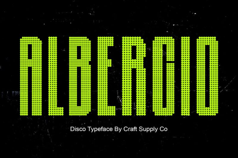
Albercio Disco is a vibrant Dot Font that brings the spirit of nightclub culture to typography. This decorative typeface features dotted elements that create a unique visual rhythm, perfect for designers looking to add a touch of disco flair to their projects.
Alvinus Disco
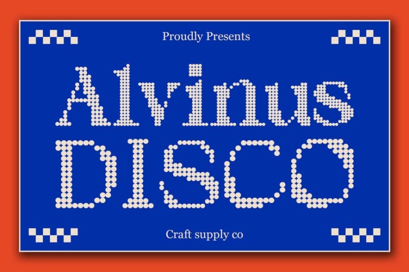
Alvinus Disco is a dynamic Dot Font that combines digital clock aesthetics with disco-inspired design. This decorative typeface features dotted elements that create a sense of technological precision, ideal for designers seeking a retro-futuristic look in their work.
Brendie Disco
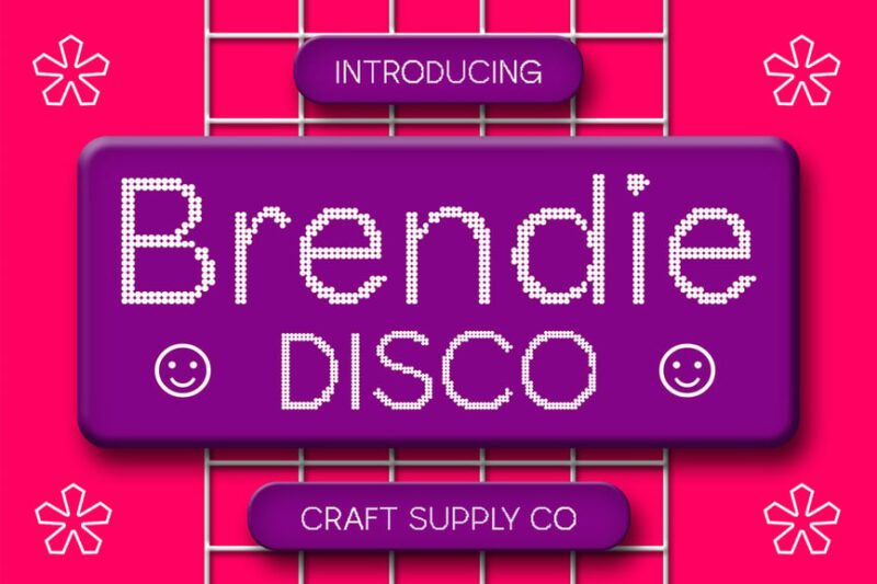
Brendie Disco is a whimsical Dot Font that adds a touch of fantasy to disco-inspired typography. This decorative typeface features playful dotted elements, making it perfect for designers looking to create eye-catching headlines and graphics with a fun, imaginative twist.
Balthis Disco
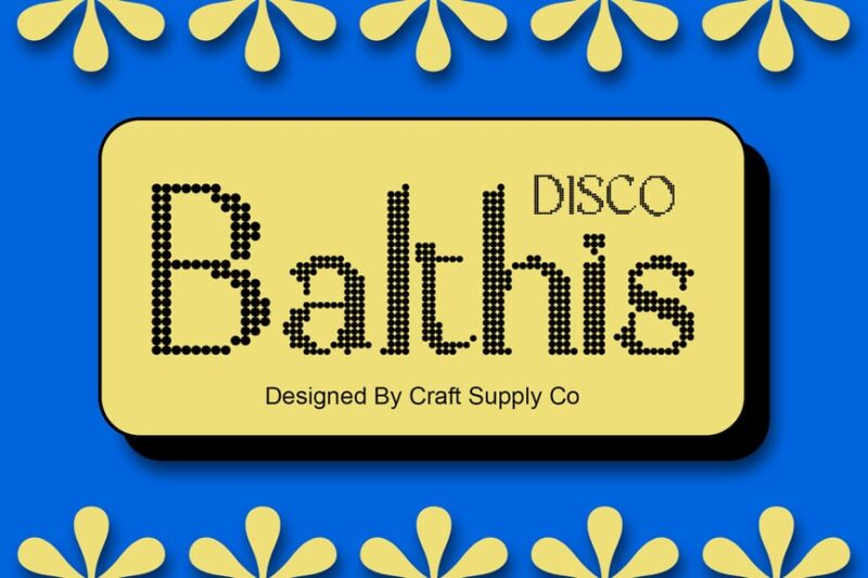
Balthis Disco is an eye-catching Dot Font that demands attention with its unique design. This decorative typeface features bold dotted elements that create a striking visual impact, ideal for designers looking to make a statement in their disco-inspired projects.
Calben Disco
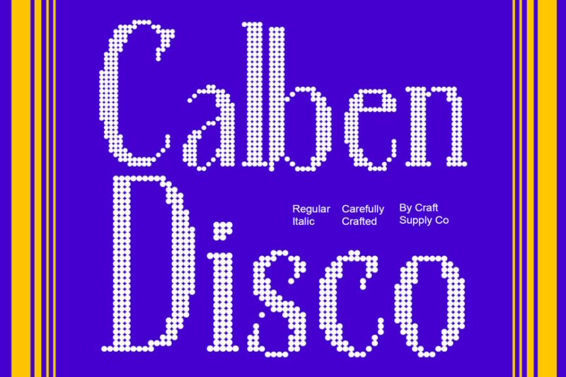
Calben Disco is a dynamic Dot Font that brings a glitch-inspired aesthetic to band typography. This decorative typeface features distorted dotted elements, making it perfect for designers working on music-related projects or seeking to add an edgy, digital feel to their designs.
Brivane Disco
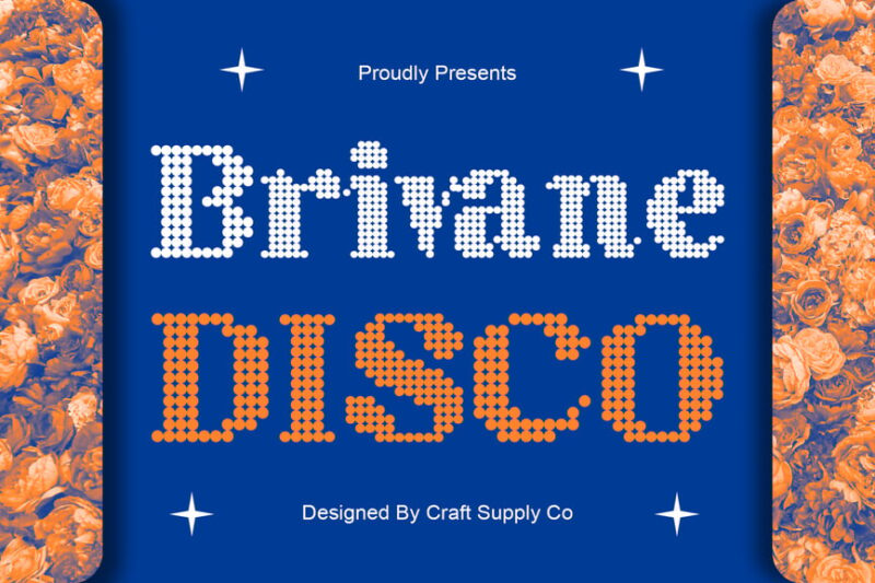
Brivane Disco is a sleek Dot Font that combines digital precision with disco flair. This decorative typeface features carefully crafted dotted elements, ideal for designers looking to create modern, tech-inspired graphics with a touch of retro charm.
Angeris Disco
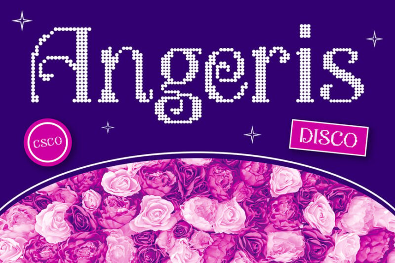
Angeris Disco is a playful Dot Font that brings a sense of fun to disco-inspired typography. This decorative typeface features lively dotted elements, perfect for designers looking to add a touch of whimsy and energy to their projects.
Catelyn Disco
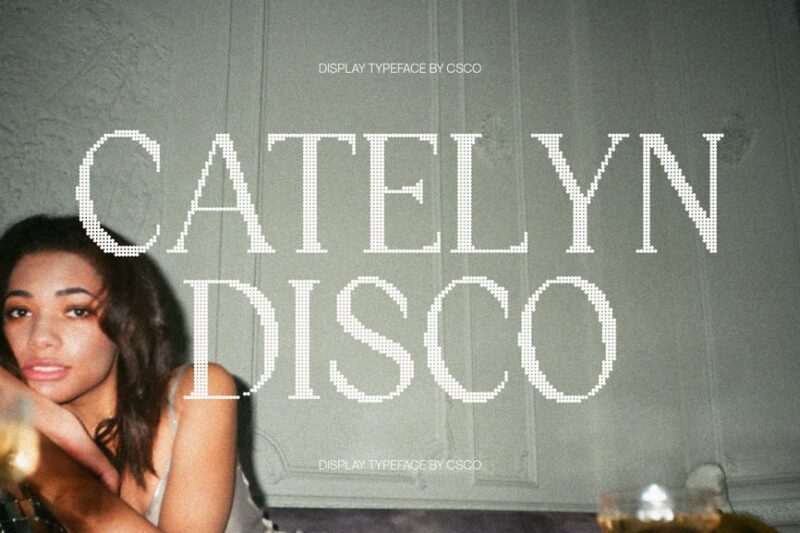
Catelyn Disco is a sophisticated Dot Font that adds a touch of elegance to digital-inspired serif typography. This decorative typeface features refined dotted elements, making it ideal for designers seeking to create a modern, tech-savvy look with a classic twist.
Bamboly Disco
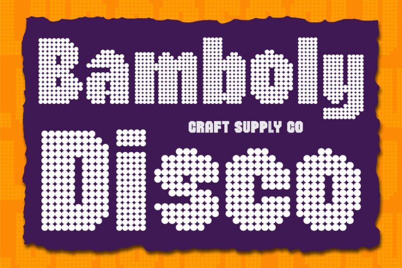
Bamboly Disco is a bold Dot Font that makes a strong statement in disco-inspired design. This decorative typeface features prominent dotted elements, perfect for designers looking to create eye-catching headlines and graphics with a powerful, retro-futuristic feel.
Badoney Disco
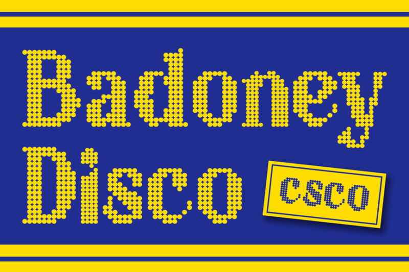
Badoney Disco is a stylish Dot Font that brings a touch of sophistication to disco-inspired typography. This decorative typeface features elegant dotted elements, making it ideal for designers looking to create refined, yet eye-catching designs with a retro flair.
Bordie Disco
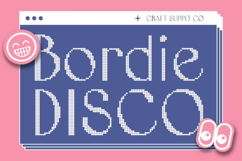
Bordie Disco is a nostalgic Dot Font that captures the essence of vintage retro design. This decorative typeface features dotted elements that evoke a sense of nostalgia, perfect for designers looking to create authentic, disco-inspired graphics with a timeless appeal.
Laveda Disco
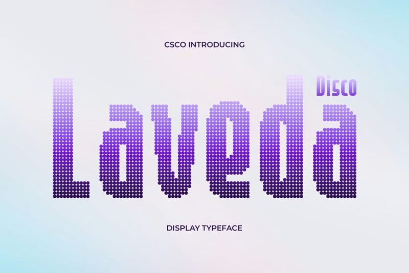
Laveda Disco is a melodic Dot Font that brings musical inspiration to logo design. This decorative typeface features rhythmic dotted elements, making it ideal for designers working on music-related projects or seeking to add a harmonious touch to their disco-inspired creations.
Ansela Disco
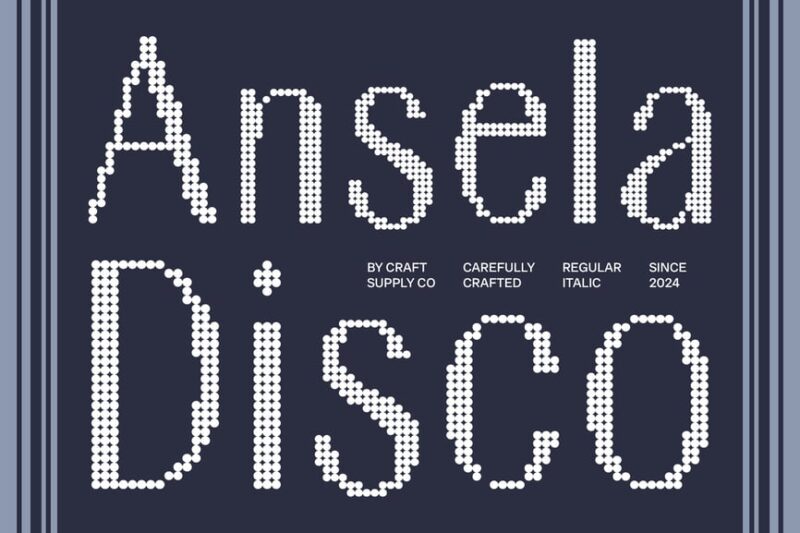
Ansela Disco is a vibrant sans-serif Dot Font that embodies the energy of disco culture. This typeface features lively dotted elements that create a sense of movement and excitement, perfect for designers looking to add a bold, dynamic touch to their projects.
Redika Disco
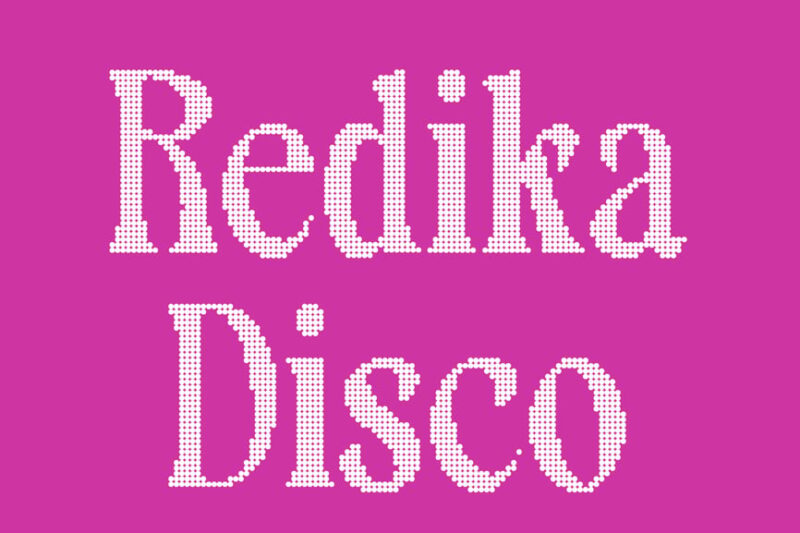
Redika Disco is a striking Dot Font that brings a 3D twist to logo design. This decorative typeface features dimensional dotted elements, making it ideal for designers looking to create eye-catching, disco-inspired logos and graphics with depth and visual impact.
Ravio Disco
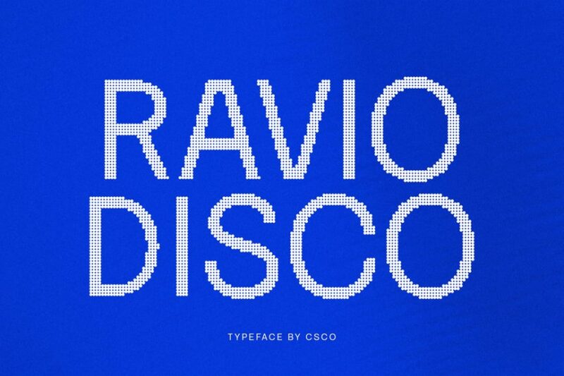
Ravio Disco is a dynamic Dot Font that captures the essence of DJ culture. This decorative typeface features energetic dotted elements and 3D-inspired effects, perfect for designers working on music-related projects or seeking to create bold, attention-grabbing logos.
Belony Disco
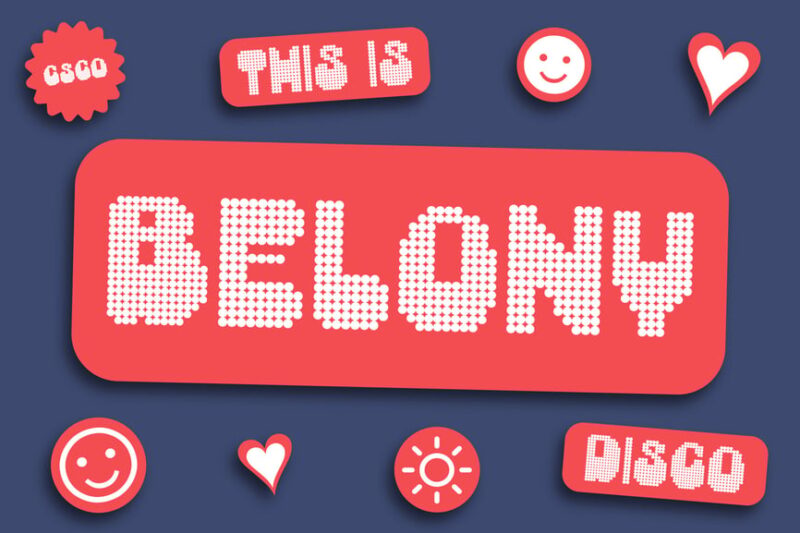
Belony Disco is a luminous Dot Font that brings the glow of neon lights to party-inspired typography. This decorative typeface features vibrant dotted elements, making it ideal for designers looking to create eye-catching graphics with a festive, disco-inspired atmosphere.
Calley Disco
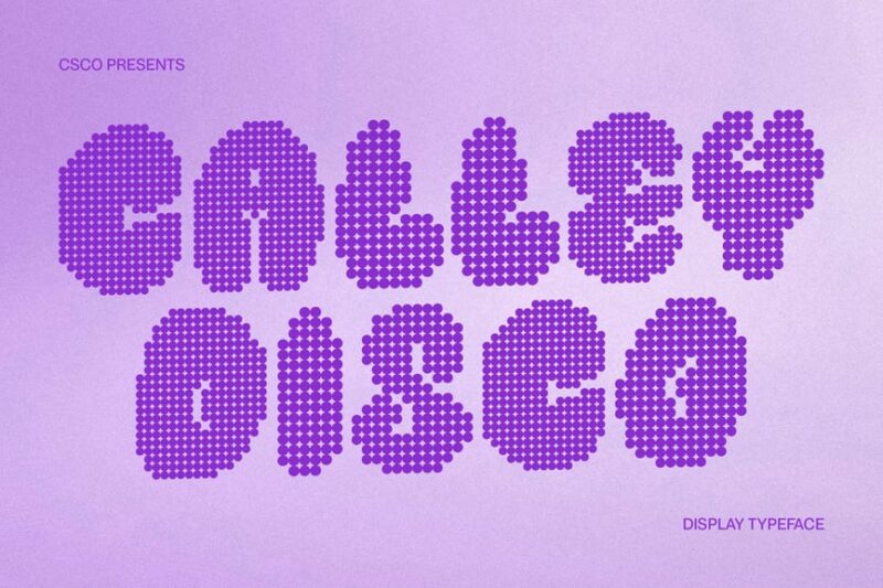
Calley Disco is a tech-savvy Dot Font that brings a modern edge to logo design. This decorative typeface features innovative dotted elements, perfect for designers working on technology-related projects or seeking to create cutting-edge, disco-inspired logos with a futuristic feel.
The History Behind Dot Fonts
Dot fonts have a fascinating origin story that spans multiple industries and technologies. Their roots trace back to several key developments:
Early Printing Technology: Before modern printing, halftone techniques used dots of varying sizes to create the illusion of continuous tone in printed images. This same principle influenced early typographic experimentation.
Digital Display Limitations: In the early days of digital displays – think LED scoreboards, airport flight information boards, and the first computer monitors – dots were literally all designers had to work with. These technological constraints birthed iconic dot matrix fonts that defined an era.
Video Game Culture: Remember the chunky, pixelated text in classic arcade games? Those weren’t just technical limitations – they became an aesthetic. Fonts like those used in Space Invaders or Pac-Man created a visual language that still resonates today.
Newspaper and Magazine Printing: The halftone printing process used by newspapers created a distinctive dotted appearance that became synonymous with journalism and credibility.
What started as technical necessity has evolved into intentional design choice. Modern dot fonts often pay homage to these origins while pushing the concept in new, creative directions.
What Makes Dot Fonts So Appealing?
So what is it about dot fonts that keeps designers coming back? Several factors contribute to their enduring appeal:
Visual Texture: Dot fonts add an immediate sense of texture to designs. Even at smaller sizes, the stippled quality creates visual interest that solid fonts simply can’t match. Your eye naturally wants to linger on them.
Nostalgia Factor: For anyone who grew up in the 80s, 90s, or early 2000s, dot fonts trigger instant nostalgia. They harken back to early video games, digital clocks, and the dawn of personal computing. That emotional connection is powerful in design.
Tech Credibility: Dot fonts have an inherent “tech-forward” quality. They feel digital, precise, and systematic – perfect for brands in tech, gaming, data, or innovation-focused industries.
Uniqueness: Let’s be honest – everyone and their mother is using the same handful of trendy sans serifs. Dot fonts offer a way to stand out while maintaining excellent readability.
Scalability: Interestingly, many dot fonts actually scale quite well. The dot pattern can create a sort of natural anti-aliasing effect that looks crisp at various sizes.
Where to Use Dot Fonts (And Where to Avoid Them)
Like any specialized typeface, dot fonts shine in certain contexts and fall flat in others. Here’s where they work best:
Perfect Uses for Dot Fonts:
Tech and Gaming Brands: Dot fonts are a natural fit for technology companies, esports organizations, gaming studios, and software brands. They communicate innovation and digital expertise.
Retro Designs: Creating something with a vintage 80s or 90s vibe? Dot fonts are your secret weapon. They instantly transport viewers to the era of neon, arcade games, and early computing.
Data Visualization: The technical quality of dot fonts makes them excellent for infographics, charts, and data-heavy designs where you want to emphasize precision and accuracy.
Display Headers: Dot fonts make fantastic headline fonts. Use them in large sizes where the dot pattern becomes a design element itself, creating maximum visual impact.
Sports Graphics: The scoreboard association makes dot fonts perfect for sports-related designs, from team logos to ticket designs to stadium signage.
Editorial Design: Fashion magazines and design publications love using dot fonts for their textural quality and visual intrigue.
Where to Avoid Dot Fonts:
Body Text: This is the big one. Dot fonts are almost always a poor choice for paragraph text. The pattern becomes exhausting to read over multiple sentences, causing eye strain and frustration.
Small Print: At very small sizes, the dots can blur together or become illegible. Save dot fonts for applications where they’ll be displayed at readable sizes.
Formal Corporate Communication: Legal documents, formal proposals, and traditional corporate materials usually require more conservative typography. A dot font might undermine the serious tone you’re trying to establish.
Accessibility-Critical Applications: For designs that need to meet strict accessibility standards or serve users with visual impairments, the reduced clarity of dot fonts can be problematic.
How to Choose the Right Dot Font
With so many dot fonts available, how do you pick the perfect one for your project? Consider these factors:
Dot Size and Spacing: Larger dots with more spacing between them create a bolder, more playful effect. Smaller, tightly-packed dots read as more refined and sophisticated. Choose based on your design’s personality.
Complete or Outline: Do you want dots filling the entire letter shape, or just outlining it? Filled dot fonts feel more solid and traditional, while outline versions feel more delicate and modern.
Regularity: Perfectly uniform dots arranged in a grid create a technical, systematic feel. Irregular or hand-placed dots add organic warmth and personality.
Weight Options: Just like traditional fonts, some dot fonts come in multiple weights. Having options from light to bold gives you more flexibility in your designs.
Character Set: Make sure your chosen dot font includes all the characters you need – numbers, punctuation, special characters, and any international letters required for your project.
Pairing Dot Fonts With Other Typefaces
Dot fonts rarely work alone. Here’s how to pair them effectively:
The Classic Combo: Use a dot font for headlines and a clean, simple sans serif (like Helvetica, Open Sans, or Inter) for body text. This creates hierarchy while maintaining readability.
Double Down on Tech: Pair a dot font with a monospace font for maximum tech credibility. This combination screams “digital” and works beautifully for coding-related content or tech brands.
Retro Remix: Combine a dot font with other vintage-inspired typefaces – think chunky slab serifs or groovy 70s scripts. This amplifies the nostalgic effect.
Elegant Contrast: Create tension by pairing a technical dot font with an elegant serif like Garamond or a sophisticated script. This unexpected combination can be stunning in editorial design.
Keep It Simple: When in doubt, let the dot font be the star. Choose understated, neutral supporting typefaces that won’t compete for attention.
Design Tips for Working With Dot Fonts
Ready to incorporate dot fonts into your work? Keep these pro tips in mind:
Size Matters: Dot fonts need room to breathe. Don’t be shy about going big – the larger the type, the more impressive the dot pattern becomes.
Color Choice: Dot fonts look fantastic in bold, saturated colors. They can also work beautifully in duotone or with gradient fills that play across the dot pattern.
Background Considerations: Make sure there’s enough contrast between your dot font and its background. The gaps between dots can create readability issues if the contrast is too low.
Spacing Adjustments: You may need to adjust letter spacing (tracking) more than you would with solid fonts. The dots can sometimes make letters feel cramped or too separated.
Test at Multiple Sizes: Always preview your dot font at the actual size it’ll be used. What looks perfect at poster size might be illegible at business card dimensions.
Animation Potential: Dot fonts are incredibly fun to animate. Each dot can move, pulse, or change color independently, creating mesmerizing motion graphics.
Dot Fonts in Modern Design Trends
Dot fonts aren’t stuck in the past – they’re evolving with contemporary design trends:
Variable Dot Density: Modern dot fonts are getting sophisticated, using varying dot sizes and densities to create depth, dimension, and even simulate 3D effects.
Color Dots: Some designers are creating dot fonts where each dot can be a different color, enabling rainbow effects or brand-specific color patterns.
Hybrid Styles: We’re seeing fonts that combine solid areas with dotted sections, or that use dots strategically to create unique visual effects.
Generative Design: Designers are using code to create custom dot fonts where the dot pattern is generated algorithmically, creating unique variations every time.
Free vs. Premium Dot Fonts
Should you invest in a premium dot font or stick with free options? Here’s the breakdown:
Free Dot Fonts: There are some excellent free dot fonts available, especially if you’re working on personal projects or have a limited budget. Sites like Google Fonts, Font Squirrel, and DaFont offer solid options.
However, free fonts often have limitations – fewer weights, incomplete character sets, or licensing restrictions for commercial use. Always read the license carefully.
Premium Dot Fonts: Investing in a premium dot font usually gets you better craftsmanship, more weight options, complete character sets, and clear commercial licensing. If you’re working on client projects or building a brand, premium fonts are worth the investment.
Premium dot fonts also tend to have better kerning, more refinement in the dot placement, and overall higher quality that shows in the final design.
Common Dot Font Mistakes to Avoid
Learn from others’ mistakes:
Using Them for Body Copy: I can’t stress this enough – dot fonts are for display use only. Your readers will thank you for not making them wade through paragraphs of dotted text.
Ignoring Readability: Just because a dot font looks cool doesn’t mean it’s readable. Always test legibility before committing to a design.
Overuse: Dot fonts are like hot sauce – a little goes a long way. Use them as accents and focal points, not on every element of your design.
Poor Size Choices: Using dot fonts too small makes them look muddy. Too large and they can feel overwhelming. Find the sweet spot through testing.
Clashing Aesthetics: Make sure your dot font matches your overall design direction. A retro 8-bit dot font won’t work in an elegant wedding invitation (unless you’re going for ironic, which is a whole different conversation).
Dot Fonts in Different Industries
Tech Startups: Dot fonts help tech companies look innovative and forward-thinking. They’re particularly popular in AI, data analytics, and cybersecurity branding.
Gaming: From mobile games to major esports organizations, dot fonts tap into gaming’s digital roots while looking contemporary and exciting.
Sports: The scoreboard connection makes dot fonts natural for sports teams, athletic brands, and sporting events.
Fashion: High-fashion brands use dot fonts to add an unexpected technical edge to editorial spreads and advertising campaigns.
Music: Electronic music artists and festivals frequently use dot fonts to convey their digital, futuristic sound.
Creating Your Own Dot Font
Feeling ambitious? Creating a custom dot font is actually more accessible than you might think:
Font creation software like FontForge (free) or Glyphs (premium) makes it possible to design your own dot fonts. Start by sketching your letterforms, then place dots strategically to form each character.
The key is consistency – maintain the same dot size, spacing pattern, and overall style across all letters. It’s painstaking work, but the result is a truly unique typeface that no one else has.
Alternatively, you can commission a type designer to create a custom dot font for your brand. This ensures professional quality while giving you exclusive rights to a distinctive typeface.
Common Questions About Dot Fonts
Are dot fonts readable?
At display sizes (headlines, titles, logos), yes! The human eye is remarkably good at connecting the dots (literally) to perceive complete letterforms. However, at small sizes or in body text, dot fonts become difficult to read and should be avoided.
Can I use dot fonts for my logo?
Absolutely, as long as your logo will primarily be used at sizes where the dots remain clear and recognizable. Consider how your logo will look at small sizes – like on a business card or mobile app icon – before committing to a dot font.
Do dot fonts work in print?
Yes! In fact, dot fonts can look fantastic in print, especially at larger sizes where the dot pattern creates interesting texture on paper. Just ensure your printer’s resolution is high enough to render the dots clearly.
Are dot fonts accessible?
Dot fonts can present accessibility challenges. The reduced clarity compared to solid fonts may be difficult for users with visual impairments. If accessibility is critical, use dot fonts sparingly and always provide alternative text or ensure sufficient contrast and size.
What’s the difference between dot fonts and pixelated fonts?
Pixelated fonts are made up of square pixels arranged in a grid, while dot fonts use circular dots. Pixelated fonts typically have a more angular, blocky appearance reminiscent of early computer graphics, while dot fonts can range from technical to organic depending on the dot arrangement.
The Future of Dot Fonts
Where are dot fonts headed? If current trends are any indication, we’re just scratching the surface:
AI-Generated Dot Patterns: Machine learning is enabling designers to create dot fonts with incredibly sophisticated patterns that would be impossible to place by hand.
Responsive Dot Density: Imagine fonts where the dot pattern adjusts based on viewing distance or screen size – tighter for small displays, more dramatic for large ones.
3D Dot Typography: We’re seeing experiments with dot fonts that exist in three-dimensional space, with dots placed at varying depths to create truly sculptural letterforms.
Interactive Dots: In web and app design, dots that respond to user interaction – pulsing, moving, or changing color on hover or click – are creating engaging typographic experiences.
The beauty of dot fonts is that they’re simultaneously retro and futuristic. They remind us where digital design came from while pointing toward where it’s going.
Conclusion: Making Your Mark With Dot Fonts
Dot fonts are more than just a stylistic choice – they’re a powerful design tool that can elevate your work from ordinary to extraordinary. Whether you’re channeling retro nostalgia, establishing tech credibility, or simply looking for something visually distinctive, the right dot font can make all the difference.
The key is using them thoughtfully. Reserve dot fonts for display purposes where they can shine – headlines, logos, posters, and other high-impact applications. Pair them with readable body fonts. Test them at actual size. And always, always prioritize your audience’s experience.
Remember, design trends come and go, but well-executed typography is timeless. Dot fonts have survived technological shifts from LED scoreboards to high-resolution displays because they offer something unique: a perfect marriage of technical precision and visual intrigue.
So go ahead, experiment with dot fonts in your next project. Whether you choose a subtle, sophisticated option or a bold, playful design, you’re working with a typographic tradition that spans decades while remaining thoroughly contemporary.
After all, sometimes the most impactful designs are made up of the smallest dots.
What’s your favorite way to use dot fonts? Drop a comment below and let me know!