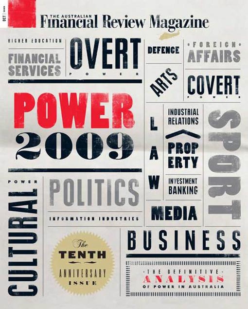
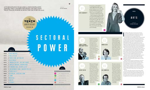
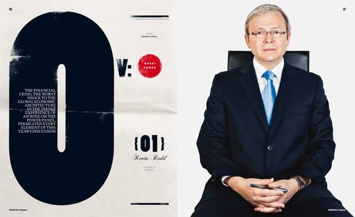
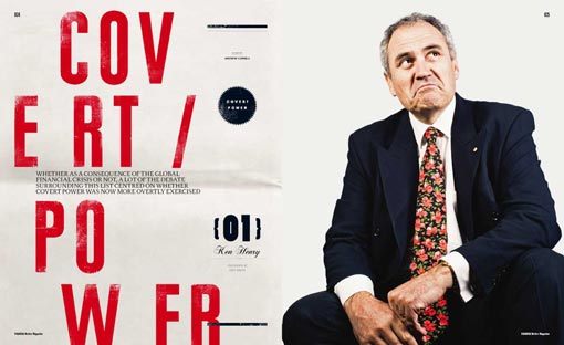
Tony Rice, Design Director for the Australian Financial Review, gives Grids an in-depth look behind the design of their most recent, 10th anniversary issue. I’m not at all familiar with this publication, so it’s really interesting to get a glimpse in their process. And the end result is an excellent example of how a limited color palette does not have to be boring. Take a look here for more spreads.
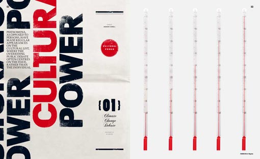
via Grids

Get 300+ Fonts for FREE
Enter your email to download our 100% free "Font Lover's Bundle". For commercial & personal use. No royalties. No fees. No attribution. 100% free to use anywhere.
