In this article:
- Physical Versus Implied Texture
- Why Humans Are Wired to Notice Texture
- The Psychology of Specific Textures
- How to Apply Texture in Your Designs
- When Texture Goes Too Far
- Design With Intention
Tactile experiences engage multiple senses and are more memorable than visual designs alone. You can close your eyes and imagine the feel of a book in your hands, the rough texture of a cloth cover and the crisp linen feel of the interior pages. The contrast between smooth, rough and bumpy surfaces keeps designers trying new things and seeing what works with a particular target audience.
In graphic design, texture can be either a material quality in printing and packaging or a visual illusion in web and digital design, both of which influence viewers’ perceptions, memories and trust. Layouts fall flat because they lack texture. One solution I’ve found helpful is creating concepts with a simple design that comes alive when texture is applied.
Physical Versus Implied Texture
Texture is multifaceted and can be physical or implied through a digital format. Each functions differently, and understanding the nuances can help you select the best approach for the medium and message.
Understanding Physical Texture
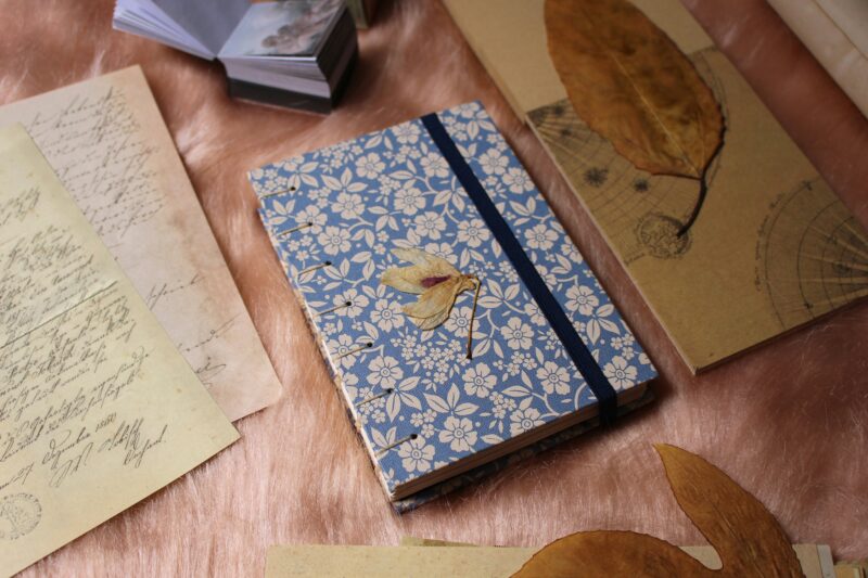
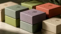
Several forms of physical texture exist in the real world, such as paper stock, embossing, debossing, foil stamping and letterpress. These encourage engagement and a tactile experience that screens often cannot reproduce.
People read differently when they are aware of the material’s physical texture, slowing down when feeling raised type or heavy cotton paper. It denotes high quality, care and credibility. Researchers find that haptic details enhance memory retention more than visuals alone. Use texture that improves your message.
The Power of Implied Texture


Get 300+ Fonts for FREE
Enter your email to download our 100% free "Font Lover's Bundle". For commercial & personal use. No royalties. No fees. No attribution. 100% free to use anywhere.
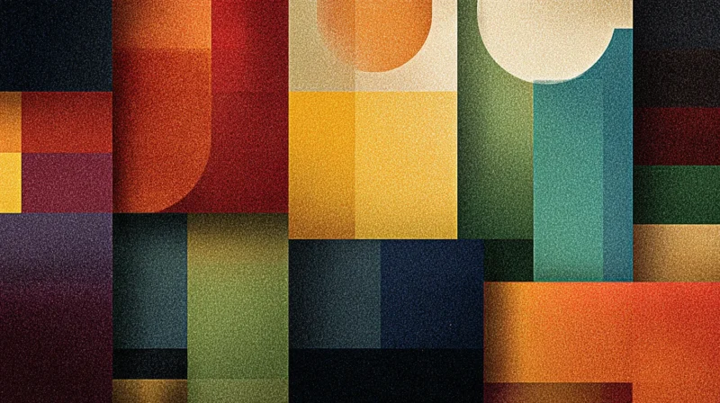
Texture can also be suggested with overlays of patterns, such as grain, noise or brush effects, to create a sense of depth on a two-dimensional surface. Other methods include using differential lighting to make images look more lifelike.
Digital designs utilize texture and gradients to avoid overly sterile or clinical appearances, creating a subtle, paper-like background that remains clear and crisp.
Subtlety is the key. The brain perceives texture as a cue for judging realism in visual images. Excessive design breaks the illusion, creating confusion about usability.
Creating a Cohesive Blended Experience
In a digital world, tactile experiences are increasingly rare, making them all the more powerful. As such, the presence of physical texture as well as implied texture has become a form of communication in and of itself. For many, engaging with that tactile sense still carries its own weight, as studies show more than half of people trust print advertising more than digital. The physical texture of a page becomes a calculated advantage.
This is why the need for printed design hasn’t disappeared but become far more intentional. While the digital space is now the main method for consuming content, it also means designers have opportunities to create something that will stay in someone’s mind as a mark of true credibility. It’s a deliberate statement. As the world gets flatter and flatter, more and more designers are looking for ways to make the visual arts come to life. What better way to do this than by both incorporating digital textures and printed textured designs?
Why Humans Are Wired to Notice Texture
Texture works because the human brain immediately recognizes and reads a surface. Physical composition predates typography and grids. Texture evokes a sense of safety, comfort and quality.
Smooth surfaces speak of precision and modern design. Rough or organic textures say authenticity. Soft gradients imbue a sense of calm, while sharp grain feels energetic.
You’ve likely encountered this issue frequently with branding projects, where what felt off about a design was that the texture choices didn’t align with the brand’s personality. Texture doesn’t decorate meaning – it creates it.
Brands that consistently use the correct surfaces may achieve greater familiarity, as the experience becomes part of their visual vocabulary. Natural brands focus on fibers, paper grain and irregular edges. Technology companies have fine, almost-finished textures to denote smooth, polished surfaces.
No single approach works universally, as every business and product has unique features. However, knowing the common standards helps determine what drives your design. Texture should always be integrated within a brand system, because when it aligns correctly with tone, the audience becomes more easily and consistently locked into expectations.
The Psychology of Specific Textures
Understanding that texture matters is only half the equation. You also need to know which textures convey which feelings.
I’ve found that surfaces awaken certain emotions before we have even had time to process the information at a conscious level. Texture thus becomes an integral part of a calculated decision-making process, rather than simply an aesthetic component.
Smooth and Glossy
Smooth, shiny surfaces connote modernity, efficiency, and precision and often feature prominently in technology and luxury designs. They are perceived to be orderly and deliberate.
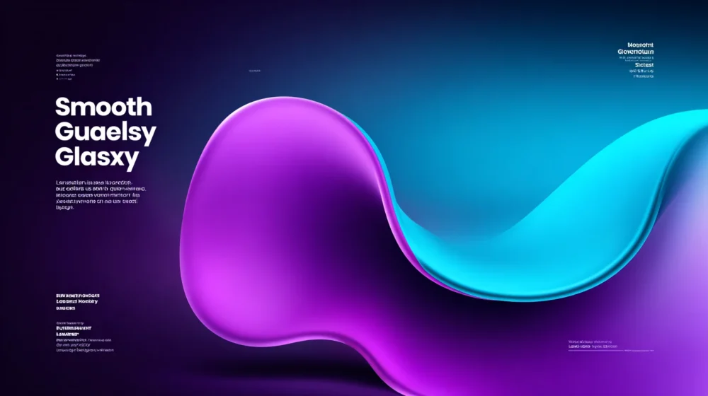
A high-gloss surface design conveys a sense of cleanliness and modernity. Smooth gradients and polished surfaces in digital design connote speed and simplicity. These textures work best when the desired outcome is confidence, clarity or performance.
However, if something is excessively smooth and feels cold, I often soften the gloss on these surfaces by adding subtle shadows or moderating the grain to maintain warmth.
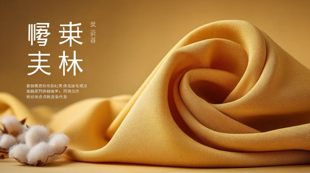
Rough and Coarse
Rough textures often convey realism and possess an earthy quality, like raw stone, wood or fabric. They emphasize a realistic aesthetic without polish, drawing inspiration from tradition.
Brands associated with craft, history or the outdoors may use coarse textures to add visual interest or convey a sense of durability.
You must find balance, as rough textures work best when combined with clean typography. The contrast prevents the design from feeling chaotic while allowing for organic forms to emerge.
Soft and Fine
Soft, fine-grained surfaces and edges, along with subtle gradients between spaces, create a calming and approachable atmosphere that supports longer browsing times.
In health and lifestyle design, you can utilize textures to visually relieve pressure and provide users with a sense of security. They can also humanize more rigid designs with a subtle softness.
Softness needs scaling, too. Overdoing it makes the design lose its meaning and effectiveness. Used with restraint, soft elements add warmth without obscuring meaning.
Metallic and Industrial
Texture can be metallic or industrial, suggesting strength, precision and durability. Materials like brushed metal, concrete and steel speak of engineering, reliability and high performance.
I often combine cool color tones, characterized by bright white highlights, subtle contrast and minimal gradations from light to dark, with strong typography. This conveys an air of authority and expertise online.
Because industrial textures can appear hard-edged, design often incorporates small organic details to give the eye breathing space.
Handmade and Irregular
Handmade and irregular textures convey personality and individuality. Imperfect edges, hand-drawn elements and uneven surfaces suggest human involvement.
These textures are used in portfolios, artisan-made products and personal branding to denote care, creativity and authenticity rather than mass production.
You can best use irregular textures with a specific intent to elicit an emotional response. Otherwise, they will appear random. Handmade textures convey an expressive quality in relation to their clearly defined graphic arrangement or layout.
How to Apply Texture in Your Designs
Texture earns its keep when it solves a problem. Here is how you can use it effectively.
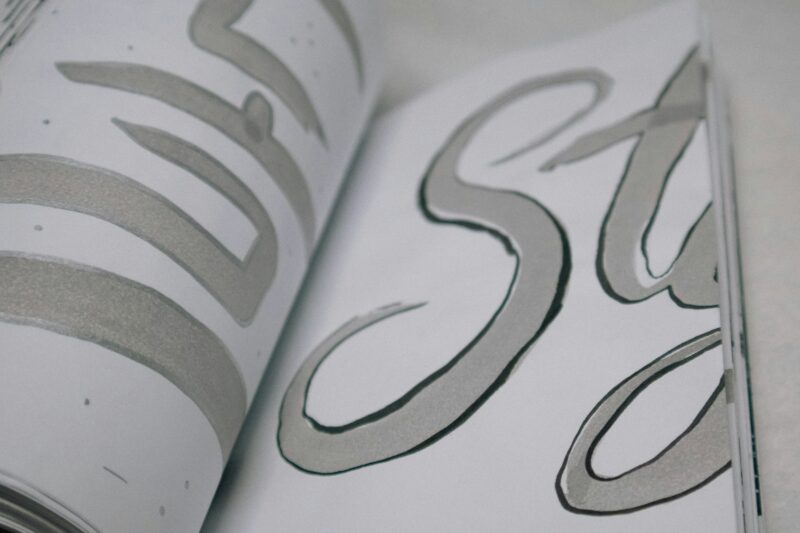
Fonts
Source: https://unsplash.com/photos/a-close-up-of-a-book-with-a-white-background-Z6zh9F0ljM8
Typography can set the tone for your readers. Each font has a personality and voice. For example, a display font in a heading can add character that a plain sans-serif sometimes lacks. Font families are effective for headlines, logos and short-form text when used carefully.
Prioritize ensuring that the type is legible. Then, turn your attention to textured type. Typically, fonts with a rougher appearance work best at larger sizes, where the texture is more noticeable. These designs are often paired with clean body text to strike a balance between expression and legibility.
Letters might take on the look of being made of wood, concrete, paper or fabric. When done well, they have a three-dimensional appearance that engages users from the minute they land on a page.
While it may be more challenging to achieve online than in print, adding shading around letters can enhance the tactile experience.
Backgrounds
A background texture can provide contrast that brings elements in the foreground into focus and creates hierarchy. The trick is to scale back. I use neutral tones and look for repetition that disappears into the background. Texture should not call attention to itself.
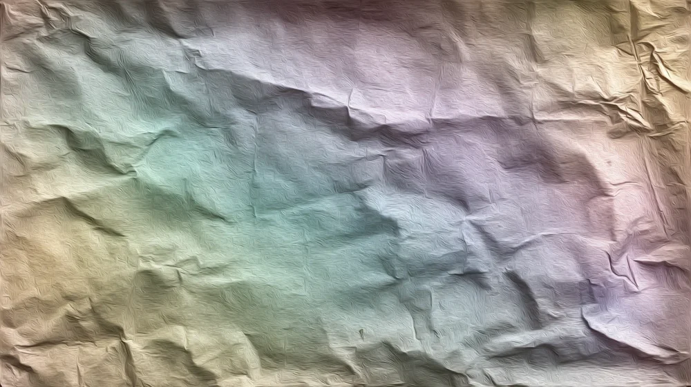
Focusing on subtle detail and texture enhances visual interest and gives your backgrounds a realistic appearance. Subtle textures can mitigate the harshness of solid fills and create a more natural, less structured feel, provided they are scaled correctly.
Test visuals on your target devices, as something subtle on the desktop can be overwhelming on a phone. The scale and opacity are constant across all formats.
When Texture Goes Too Far
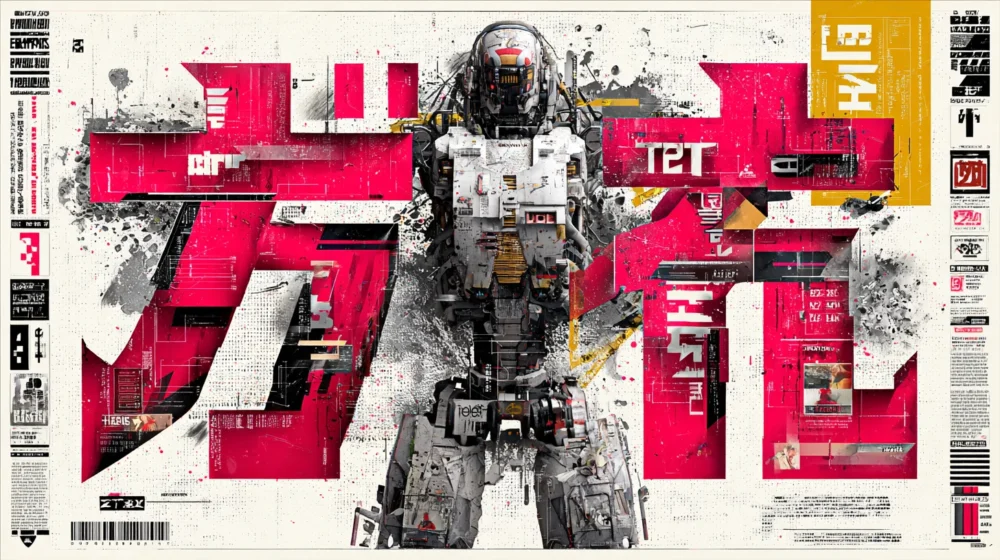
Texture is detrimental when it distracts from a message or when the underlying composition is confused by excess or conflicting patterns.
Common issues include small text, excessive clutter or visual competition that distracts from or diminishes the importance of the main message. Oftentimes, less is more. Sometimes pulling back on the texture restores balance and clarifies without losing personality.
Texture provides visual organization, differentiating elements within the image and highlighting essential details through variations in surface density. In many cases, I use heavy textures to create cleaner content areas, directing the viewer’s eye to them without relying on other visual devices. Used this way, texture becomes navigation instead of decoration.
Design With Intention
Used intentionally, texture can elicit an emotional response, bringing flat images to life and lending credibility and memorability to design. It should reinforce the message. When matched with user intent, it elevates good design into something memorable.