In this article:
- The Best Diploma Fonts to Use in 2026
- What Makes a Font Look Like a Diploma Font?
- Traditional Diploma Fonts: The Classics
- Modern Diploma Fonts: Fresh Takes on Formal
- How to Use Diploma Fonts in Your Own Designs
- Free vs. Premium Diploma Fonts: What You Need to Know
- Diploma Font Pairings That Work
- Common Diploma Font Questions
- The Bigger Picture: Why Diploma Typography Matters
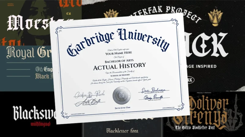
There’s a moment every graduate knows: the second that rolled-up paper hits your hands, the tassel swings to the left, and suddenly four (or more) years of hard work becomes something you can hold. But before the handshakes and the photographs, someone had to design that diploma — and the font they chose? It matters more than most people realize.
Diploma fonts are a fascinating corner of typography. They carry weight — literal and figurative. They’re asked to say “you did it” and “this is official” and “frame this and put it on your wall” all at once. And somehow, the best ones pull it off beautifully.
Whether you’re a designer creating certificates and academic documents, a school administrator updating your institution’s templates, or just a type nerd who wants to understand why diplomas look the way they do — this is for you. Let’s dig in.
The Best Diploma Fonts to Use in 2026
Here are some of the best diploma fonts available — whether you’re going for deeply traditional, elegantly modern, or somewhere beautifully in between.
The Bjorke – Handmade Fonts

The Bjorke offers a distinctive handmade aesthetic that combines craftsmanship with contemporary appeal. While not a traditional diploma font, its artisanal quality makes it suitable for creative certificates and alternative educational credentials. This typeface works exceptionally well for design schools, art programs, and modern institutions seeking to break away from conventional academic typography.
AMR Royal Grande
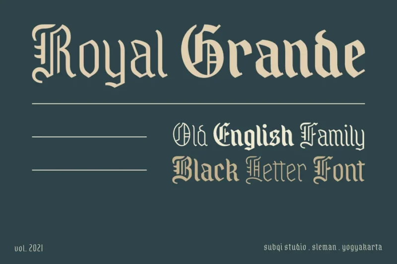
AMR Royal Grande exudes luxury and grandeur, making it an excellent choice for high-end diploma designs and prestigious award certificates. This regal typeface commands attention and respect, perfect for graduation documents and formal recognition materials. Its sophisticated character set ensures that diploma fonts maintain their ceremonial importance while delivering exceptional readability.
Vasavine – Old English Font
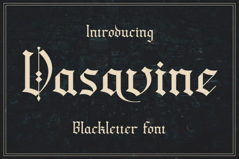
Vasavine delivers authentic Old English charm with refined elegance suitable for formal academic documents. This traditional diploma font captures the timeless appeal of classical education while maintaining excellent legibility for modern applications. Its historical character makes it perfect for universities, colleges, and institutions that value tradition in their certification materials.

Get 300+ Fonts for FREE
Enter your email to download our 100% free "Font Lover's Bundle". For commercial & personal use. No royalties. No fees. No attribution. 100% free to use anywhere.
Oolivar Strenya – Gothic Blackletter Font
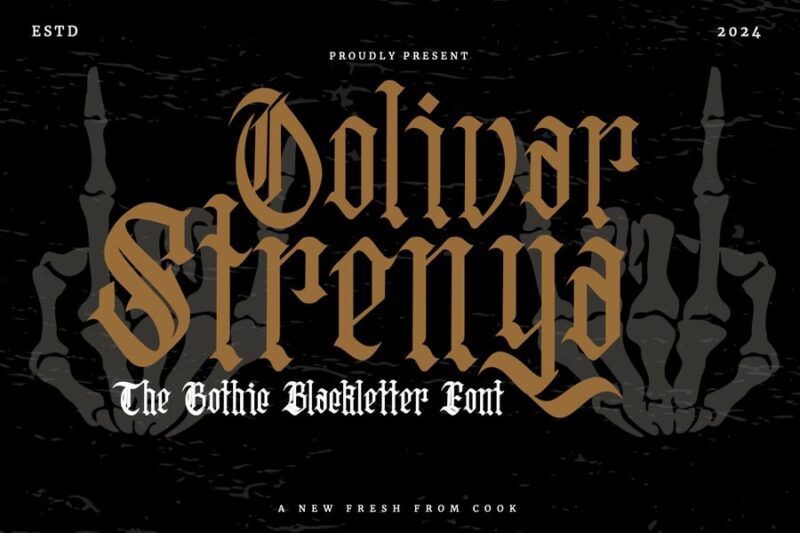
Oolivar Strenya showcases dramatic Gothic blackletter styling that brings medieval gravitas to contemporary design projects. This striking diploma font alternative is ideal for institutions seeking to convey heritage and academic excellence through bold typography. Its commanding presence makes it particularly effective for law schools, theological seminaries, and prestigious academic programs.
Claes – Old English Font
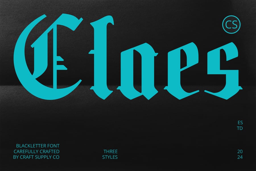
Claes offers a refined interpretation of classic Old English typography, perfectly balanced for modern diploma and certificate applications. This versatile diploma font maintains traditional academic authority while ensuring contemporary readability standards. Its elegant letterforms make it an excellent choice for graduation ceremonies, professional certifications, and formal educational documents.
Kingslayer – Modern Blackletter Font
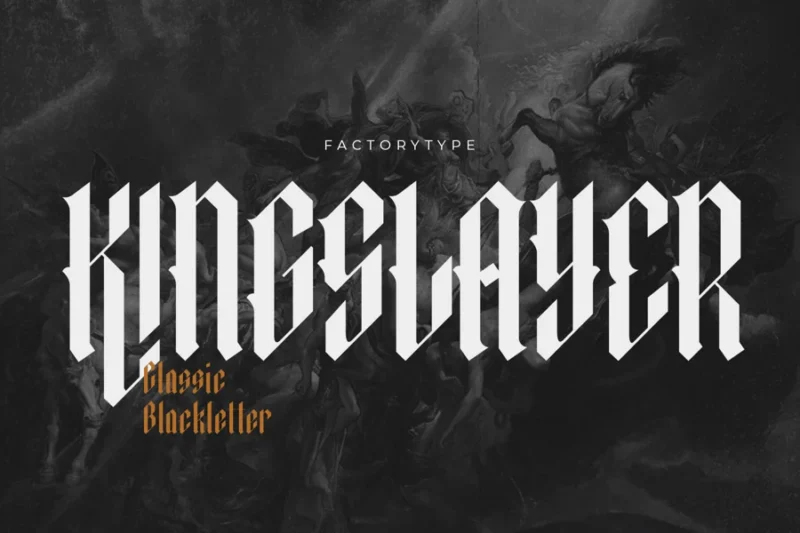
Kingslayer presents a contemporary take on blackletter design, combining medieval inspiration with modern functionality. While more dramatic than traditional diploma fonts, it’s perfect for creative institutions and alternative academic programs seeking distinctive certificate designs. This font bridges the gap between historical academic typography and cutting-edge design aesthetics.
Dark Whisper – Fierce Blackletter Font
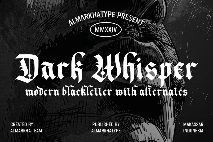
Dark Whisper delivers intense blackletter styling with bold character and commanding presence. Though more dramatic than conventional diploma fonts, it serves specialized educational markets like military academies or martial arts certifications. Its fierce aesthetic makes it suitable for institutions that want their credentials to convey strength and determination.
Modula – Old English Font
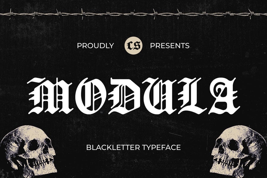
Modula combines classic Old English elegance with modular design principles for exceptional versatility. This sophisticated diploma font works beautifully across various academic applications, from undergraduate certificates to doctoral degrees. Its balanced proportions and traditional character set make it a reliable choice for institutions seeking timeless academic typography.
Saunter – Old English Font
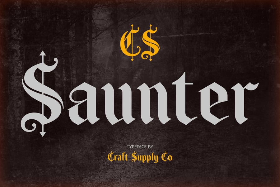
Saunter brings graceful Old English styling with a relaxed, approachable character to formal documents. This diploma font option balances traditional academic gravitas with contemporary accessibility, making it suitable for both formal certificates and modern educational materials. Its refined letterforms ensure that graduation documents maintain their ceremonial significance while remaining highly legible.
Blacksword
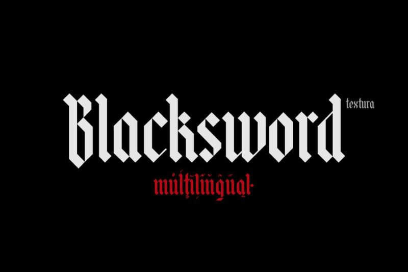
Blacksword delivers bold, medieval-inspired typography with strong character and historical authenticity. While more dramatic than standard diploma fonts, it’s perfect for specialized academic programs, historical societies, or institutions with medieval themes. This powerful typeface ensures that certificates and awards command immediate attention and respect.
Volantis Vintage Blackletter Font
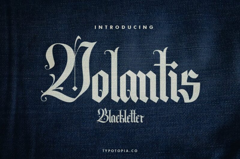
Volantis combines vintage blackletter charm with refined elegance suitable for prestigious academic applications. This distinguished diploma font captures the essence of traditional scholarly typography while maintaining excellent readability for modern use. Its vintage character makes it particularly effective for established universities and institutions with rich historical heritage.
CS Bristol – Blackletter Font
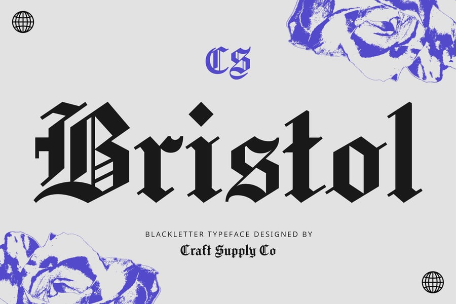
CS Bristol showcases sophisticated blackletter design with contemporary refinement perfect for academic credentials. This elegant diploma font alternative bridges traditional academic typography with modern design sensibilities. Its professional character set makes it ideal for universities, professional schools, and certification programs seeking to convey both heritage and innovation.
Morstan – Old English Font
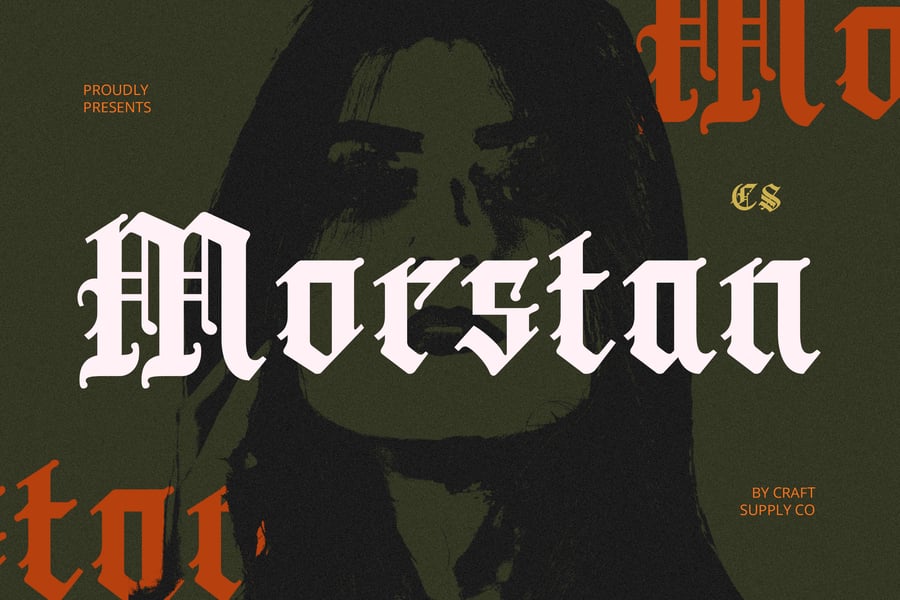
Morstan is an elegant Old English typeface that brings medieval sophistication to modern design projects. This diploma font style is perfect for creating formal certificates, academic credentials, and prestigious awards that require a traditional, authoritative appearance. Its classic letterforms make it an ideal choice for educational institutions and ceremonial documents.
Warsuck
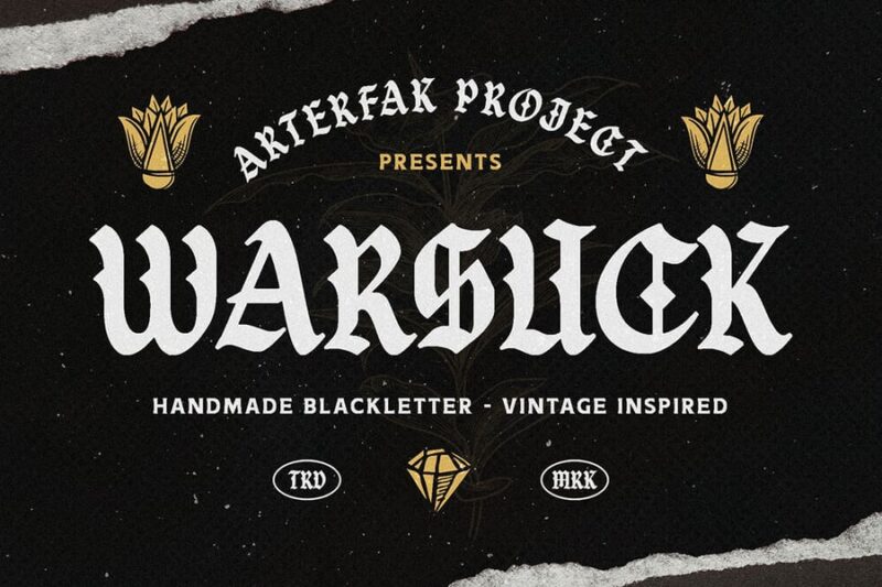
Warsuck presents bold, aggressive typography with strong visual impact for specialized applications. While unconventional for traditional diploma fonts, it serves niche markets like gaming academies, esports certifications, or alternative educational programs. This distinctive typeface ensures that certificates stand out and make a memorable impression on recipients.
What Makes a Font Look Like a Diploma Font?
Before we jump into specific fonts, it’s worth understanding what gives diploma fonts their unmistakable look and feel. You know it when you see it — that sense of gravitas, tradition, and earned achievement. But what’s actually creating that impression?
A few key characteristics define the diploma font aesthetic.
Old-World Roots
Most diploma fonts trace their DNA back to blackletter scripts, copperplate engravings, and the calligraphic traditions of medieval Europe. Universities in particular have deep ties to these historical letterforms — think of the Gothic scripts used by scribes long before moveable type existed. When a diploma uses these styles today, it’s consciously borrowing centuries of scholarly credibility.
Thick-and-Thin Contrast
Like money fonts, diploma fonts tend to feature dramatic variation between thick downstrokes and delicate hairlines. This contrast comes from the pointed quill and copperplate engraving traditions, and it signals craftsmanship. It says: someone took great care with this.
Ornamentation and Flourishes
Swashes, serifs, decorative caps, and elaborate ligatures are common in diploma typography. These aren’t just decorative — they signal exclusivity and occasion. A diploma is not an everyday document, and its typography should never feel like one either.
Serif Dominance
Sans-serif fonts rarely appear on traditional diplomas. Serifs — especially Roman-inspired ones — carry connotations of education, authority, and permanence. They feel like they belong etched in stone or pressed into parchment, which is exactly the right impression for a document meant to last a lifetime.
Traditional Diploma Fonts: The Classics
Some fonts have earned their place in the diploma canon for a reason. They’ve been used on official documents, certificates, and academic credentials for decades — and they still deliver.
Old English / Blackletter Fonts
Nothing says “diploma” quite like a bold blackletter typeface. Fonts in this category — think Old English Text MT or a variety of its modern interpretations — are rooted in the Gothic scripts that defined European universities for centuries. They’re dramatic, deeply traditional, and immediately recognizable as formal.
Used well, blackletter fonts give a diploma an air of unimpeachable authority. Used poorly, they can feel overwrought. The key is restraint: let the blackletter do the heavy lifting for a headline or institution name, and pair it with something cleaner for the body text.
Copperplate and Engraving-Inspired Fonts
Copperplate fonts are named after the copper engraving process used to print formal documents — including, historically, diplomas and certificates. They feature very small serifs, uniform stroke weights, and a pristine, formal character. They feel less ornate than blackletter, but no less serious.
If blackletter is the architectural Gothic spire of diploma typography, copperplate is the marble column: refined, classic, and built to last.
Spencerian and Script Fonts
For the recipient’s name — arguably the most important text on any diploma — a flowing Spencerian or formal script font adds a personalized, almost handwritten quality that feels special. These fonts suggest that someone penned your name in with care, even if the reality is a laser printer.
Modern Diploma Fonts: Fresh Takes on Formal
Not every institution wants to look like it was founded in 1642. Modern schools, professional certification programs, and contemporary design academies often want their credentials to feel current while still conveying quality. These fonts thread that needle.
Elegant Modern Serifs
Fonts like Cormorant Garamond or Playfair Display bring classical proportions into a contemporary sensibility. They have the thick-and-thin contrast and refined character of traditional diploma fonts, but with a freshness that doesn’t feel stuffy. They’re the typographic equivalent of a well-tailored suit — timeless, but clearly of this century.
Refined Sans-Serifs
Yes, sans-serifs can work on diplomas — but they have to be the right ones. Clean, geometric sans-serifs like Futura or humanist options like Gill Sans have appeared on modern certificates for institutions that want to project innovation alongside tradition. The trick is pairing them thoughtfully with a more formal element, like a serif for the institution name or a script for the graduate’s name.
How to Use Diploma Fonts in Your Own Designs
Understanding which fonts to use is only half the battle. Knowing how to deploy them effectively is what separates a certificate that feels meaningful from one that looks like it came out of a template generator.
Hierarchy Is Everything
A well-designed diploma has clear typographic hierarchy. The institution name commands the most presence — often set in your boldest, most formal typeface. The recipient’s name comes next, frequently in a flowing script that makes it feel personally awarded. Supporting text — the degree title, date, signatures — plays a quieter, supporting role.
When every element is competing for attention, nothing feels special. Let your type breathe and lead the eye deliberately through the document.
Limit Your Font Count
Two to three fonts is the sweet spot for diploma design. A blackletter or strong serif for the institution, a script for the name, and a clean Roman serif for body text covers everything you need without creating visual chaos. More than three fonts and you risk undermining the seriousness the document is supposed to project.
Think About the Paper
Diploma fonts don’t live on screens — they live on paper. Heavy parchment stock, foil embossing, and letterpress printing all interact with typography differently than digital display. Finer hairline details in ornate fonts can disappear on certain paper stocks or printing methods. Always test your fonts at actual print size before finalizing a diploma design.
Size and Spacing Matter
Generous letter-spacing on all-caps text, ample line-height, and careful centering all contribute to that official, considered look. Tight or awkward spacing will undercut even the most beautiful font choice. The space between letters on a diploma should feel deliberate — like every element was placed with intention.
Free vs. Premium Diploma Fonts: What You Need to Know
Here’s the honest truth: the best diploma fonts tend to be premium. The intricate detailing, extensive glyph sets, and multiple weights required to handle formal document design are time-consuming to create, and quality font designers price accordingly.
That said, there are excellent free options. Google Fonts hosts several strong contenders — Cormorant Garamond, IM Fell English (yes, the same family used for Taylor Swift’s “folklore” album), and Playfair Display can all work beautifully in diploma contexts at zero cost.
For commercial use — if you’re selling diploma or certificate templates, for instance — always verify your license. Many free fonts are available for personal projects only, and using them commercially without the right license is a legal risk not worth taking.
Diploma Font Pairings That Work
Finding the right font combination for a diploma is a bit like casting a film — each element needs to play its role without upstaging the others. Here are a few reliable pairings to consider.
Old English paired with Garamond is a time-honored classic. The blackletter institution name anchors the design in tradition, while Garamond’s elegant Roman serifs handle everything else with quiet authority.
Copperplate with a flowing Spencerian script gives you precision and warmth in equal measure. The copperplate body text feels official and refined; the script name feels personal and celebratory.
Playfair Display with Cormorant Garamond is a modern pairing that feels elevated without feeling stiff. Both fonts share classical proportions and dramatic contrast, so they speak the same design language — just in slightly different registers.
Common Diploma Font Questions
What font is used on real diplomas?
Most universities and institutions use custom or proprietary fonts designed specifically for their official documents. Harvard, for example, has deeply embedded typographic traditions tied to its visual identity. For commercially available lookalikes, Old English Text MT, Diploma (yes, there’s actually a font named that), and various Blackletter families come closest to that traditional diploma feel.
What is the most formal-looking font?
For diploma and certificate design, blackletter fonts like Old English or Wilhelm Klingspor Gotisch project the maximum level of formal authority. For a slightly more readable formality, copperplate-inspired serifs or classic Roman fonts like Trajan hit the mark.
Can I use a cursive font on a diploma?
Absolutely — in fact, it’s expected for the recipient’s name. A formal Spencerian script or copperplate-influenced cursive makes the name feel specially inscribed rather than typed. Just reserve the script to the name and perhaps a decorative line or two; don’t set entire paragraphs in cursive, as readability suffers quickly.
What’s the difference between a diploma font and a certificate font?
Functionally, not much — the same typographic principles apply. Diplomas tend to skew more traditional and ornate, especially for academic institutions. Certificates of completion or achievement can range from deeply formal to quite contemporary depending on the issuing organization. The font choice should always reflect the weight and occasion of what’s being recognized.
The Bigger Picture: Why Diploma Typography Matters
Here’s something worth sitting with: a diploma is often one of the most important documents a person will ever receive. It represents years of effort, sacrifice, and growth. It gets framed. It gets stored in fireproof boxes. It gets shown to grandchildren.
The typography on that document isn’t decoration — it’s part of the meaning. The right font communicates that the institution takes the achievement seriously. It tells the graduate: this is real, this is official, and this is yours.
That’s a remarkable amount of pressure to put on letterforms. And the best diploma fonts carry it without breaking a sweat.
So whether you’re designing credentials for a major university or a boutique professional certification, give the typography the attention it deserves. Because somewhere out there, someone is going to frame what you create — and they’re going to look at it for the rest of their life.
Choose your fonts accordingly.