In this article:
- The Best Industrial Fonts of 2026
- What Makes a Font Feel "Industrial"?
- Where to Use Industrial Fonts
- Where to Avoid Industrial Fonts
- How to Choose the Right Industrial Font for Your Project
- Industrial Fonts vs. Other "Tough" Typefaces
- Tips for Using Industrial Fonts Like a Pro
- Frequently Asked Questions About Industrial Fonts
- The Lasting Appeal of Industrial Typography
There’s a certain feeling that hits when you see the right font on a steel beam, a warehouse sign, or a bold product label. Something clicks. It feels earned — like the typography has actually worked a 12-hour shift to be there. That’s the power of industrial fonts, and once you start noticing them, you can’t stop.
Industrial fonts aren’t just a trend. They’re a typographic tradition rooted in factory floors, railroad signage, machinery stencils, and the no-nonsense visual language of manufacturing. Whether you’re branding a rugged outdoor gear company, designing packaging for a craft brewery, or creating a gritty editorial spread, the right industrial font does the heavy lifting your design needs.
In this deep dive, we’ll explore the best industrial fonts making noise in 2026, what gives them that raw, mechanical edge, where to use them (and where to leave them at the door), and how to pick the perfect one for your project. Let’s get to work.
The Best Industrial Fonts of 2026
Not all industrial fonts are forged equal. Some lean into vintage factory aesthetics. Others go full modern-mechanical. And some sit somewhere in the middle — worn, bold, and ready for anything. Here are the top picks worth adding to your type collection:
Under Construction – 3D Color SVG Font
This innovative 3D color SVG font combines the ruggedness of industrial fonts with modern technology, featuring dynamic dimensional effects perfect for construction and industrial-themed projects. The vibrant color capabilities and three-dimensional styling make it an excellent choice for designers working on manufacturing, construction, or heavy industry branding. Its built-in depth and industrial aesthetic deliver maximum visual impact for headlines and logos.
Bob
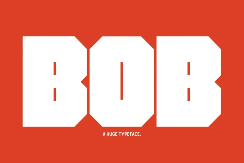
Bob is a bold, no-nonsense typeface that embodies the strength and reliability associated with industrial fonts and manufacturing design aesthetics. This straightforward font delivers clean, readable characters with a sturdy foundation that works exceptionally well for technical documentation and industrial signage. Its practical design makes it versatile for both digital and print applications where clarity and industrial strength are paramount.
Blockhead Typeface|Bold Geometric Font
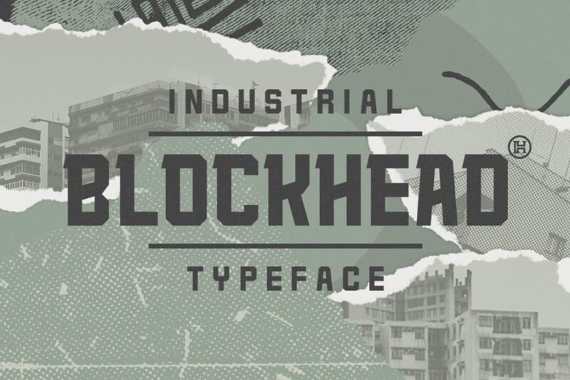
Blockhead represents the pinnacle of geometric industrial fonts, featuring bold, architectural letterforms that command attention in any design layout. This typeface draws inspiration from heavy machinery and structural engineering, making it perfect for industrial branding and mechanical design projects. The strong geometric foundation and bold weight create an unmistakable industrial presence that resonates with manufacturing and construction audiences.

Get 300+ Fonts for FREE
Enter your email to download our 100% free "Font Lover's Bundle". For commercial & personal use. No royalties. No fees. No attribution. 100% free to use anywhere.
ZW Stencil
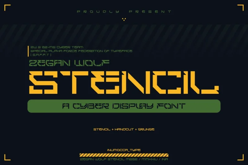
ZW Stencil captures the authentic essence of industrial stencil fonts used in warehouses, factories, and shipping facilities worldwide. This functional typeface brings military and industrial precision to modern design work, featuring clean cuts and practical letterforms optimized for spray painting and industrial marking applications. Its utilitarian design philosophy makes it an essential tool for designers creating authentic industrial-themed projects.
Industrial Sans
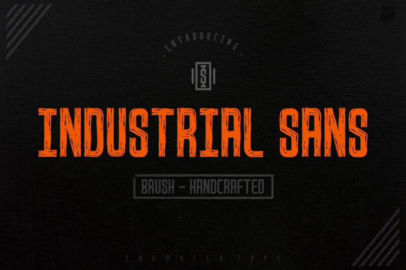
Industrial Sans is the definitive sans-serif choice among industrial fonts, combining contemporary typography principles with heavy industry aesthetics. This versatile typeface maintains excellent readability while delivering the robust, mechanical feel essential for manufacturing and engineering design projects. Its clean lines and industrial character make it perfect for corporate branding in the manufacturing, automotive, and construction sectors.
Steel Frame Modern Industrial Font
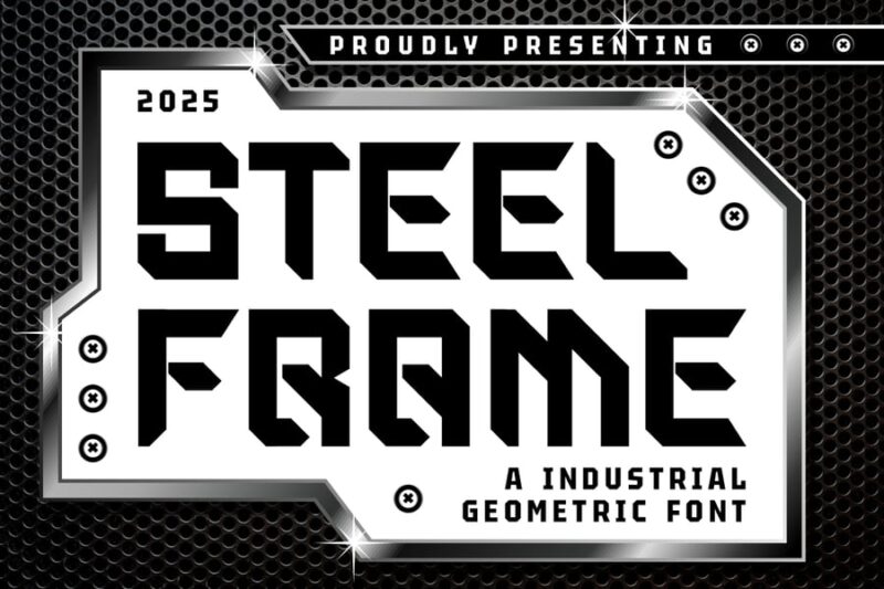
Steel Frame Modern Industrial Font embodies the strength and precision of structural engineering, representing the cutting edge of contemporary industrial fonts design. This typeface features sharp, angular characteristics reminiscent of steel construction and modern manufacturing processes. Its modern industrial aesthetic makes it ideal for tech companies, construction firms, and any brand seeking to convey strength, reliability, and innovation.
Dexvor Bold Industrial Display Font
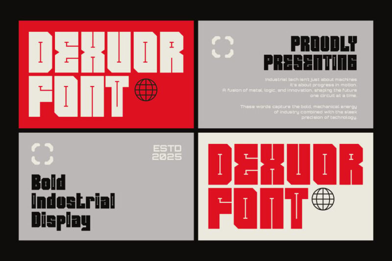
Dexvor Bold Industrial Display Font stands out among industrial fonts with its commanding presence and heavy-duty construction suitable for high-impact display applications. This bold typeface draws inspiration from heavy machinery and industrial equipment, featuring robust letterforms that maintain clarity even at large sizes. Its industrial strength and display-optimized design make it perfect for signage, headlines, and branding in manufacturing and construction industries.
Frankerd – Modern Industrial Font
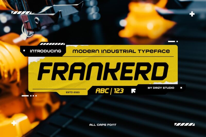
Frankerd represents the evolution of industrial fonts, blending traditional manufacturing aesthetics with contemporary design sensibilities for maximum versatility. This modern industrial font features refined letterforms that maintain the rugged character essential for industrial branding while offering improved readability for digital applications. Its balanced approach makes it suitable for both corporate communications and heavy industry marketing materials.
Rebar – Geometric Industrial Font
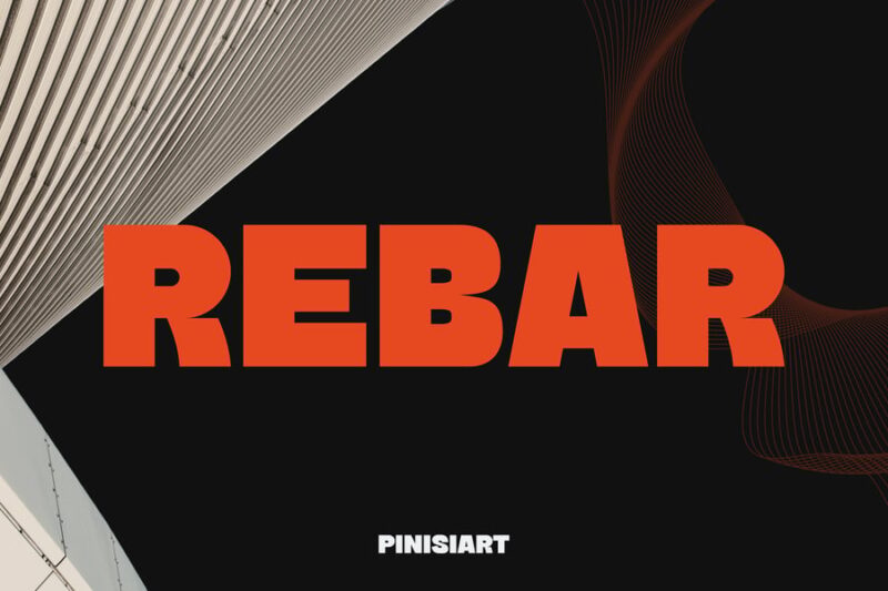
Rebar Geometric Industrial Font draws its name and inspiration from the steel reinforcement used in concrete construction, embodying the essential characteristics of structural industrial fonts. This geometric typeface features clean, mathematical precision combined with the robust strength associated with construction and manufacturing design. Its architectural foundation and industrial heritage make it an excellent choice for engineering firms, construction companies, and infrastructure-related branding projects.
Meksar | Industrial Display Font
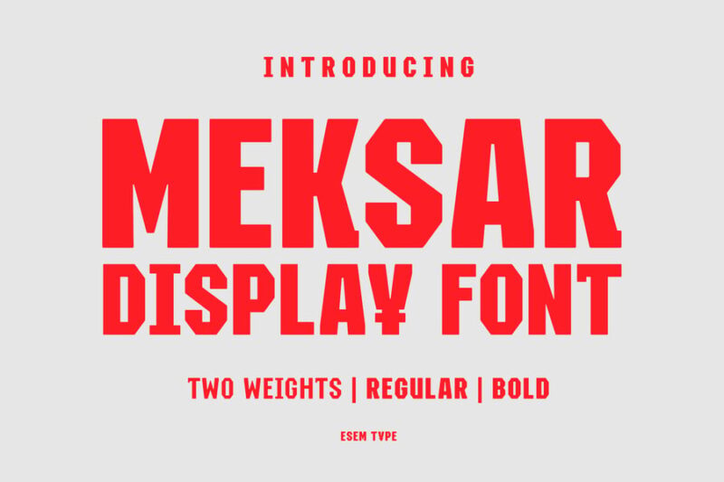
Meksar Industrial Display Font delivers powerful visual impact while maintaining the functional characteristics that define quality industrial fonts for professional applications. This display-optimized typeface features bold, mechanical letterforms designed to perform exceptionally well in large-scale applications such as billboards, signage, and industrial facility branding. Its robust construction and industrial aesthetic ensure maximum legibility and brand recognition across manufacturing and heavy industry sectors.
Gasterol – Industrial Steel Display Fonts
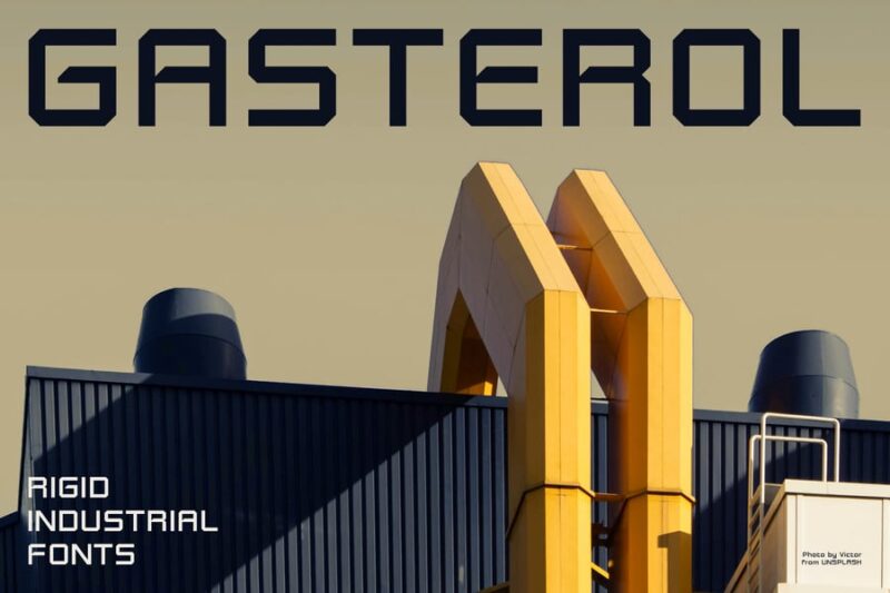
Gasterol Industrial Steel Display Fonts captures the raw power and durability of steel manufacturing, representing premium quality among industrial fonts collections. This display typeface features heavy-duty letterforms inspired by steel production and metalworking industries, delivering uncompromising strength in visual communications. Its steel-inspired design elements and industrial craftsmanship make it perfect for heavy industry branding, metal fabrication companies, and construction equipment manufacturers.
Modern Industrial Logo Font – Boilas
![]()
Boilas Modern Industrial Logo Font specializes in logo design applications, representing the pinnacle of custom industrial fonts created specifically for brand identity projects. This typeface combines contemporary design trends with classic industrial strength, featuring optimized letterforms that maintain clarity and impact at any size. Its logo-focused design and industrial character make it ideal for manufacturing companies, construction firms, and technology brands seeking a strong, memorable visual identity.
Industrial Box – 3D Color SVG Font
Industrial Box 3D Color SVG Font pushes the boundaries of traditional industrial fonts by incorporating cutting-edge 3D technology and vibrant color capabilities. This innovative typeface combines the rugged aesthetic of industrial design with modern digital effects, creating dimensional letterforms perfect for web applications and digital branding. Its advanced SVG technology and industrial styling make it ideal for tech companies, manufacturing startups, and modern industrial service providers.
Rugged Concrete Font
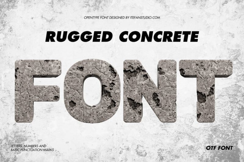
Rugged Concrete Font embodies the raw, unfinished aesthetic of construction materials, representing authentic industrial fonts inspired by concrete manufacturing and construction environments. This typeface features weathered, textured letterforms that capture the gritty reality of heavy industry and construction work. Its concrete-inspired design and rugged industrial character make it perfect for construction companies, architectural firms, and any brand seeking to convey durability and strength.
Hammerhead Typeface|Industrial Condensed Font
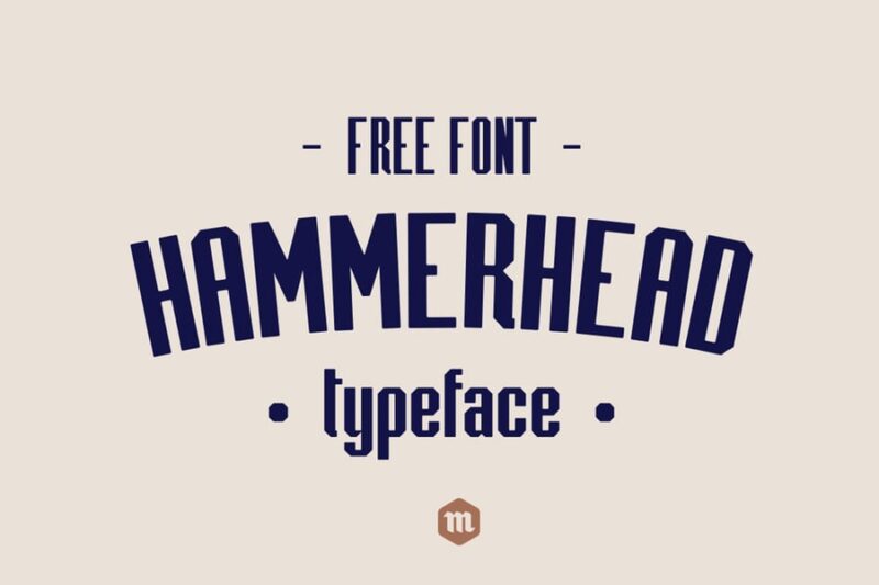
Hammerhead Industrial Condensed Font delivers maximum impact in minimal space, representing efficient design solutions among space-conscious industrial fonts. This condensed typeface features powerful, tool-inspired letterforms that maintain readability while maximizing character density for tight layouts and industrial signage applications. Its hammerhead-inspired strength and condensed efficiency make it ideal for equipment labeling, industrial documentation, and manufacturing facility signage.
Robofor_mechanical engineering font
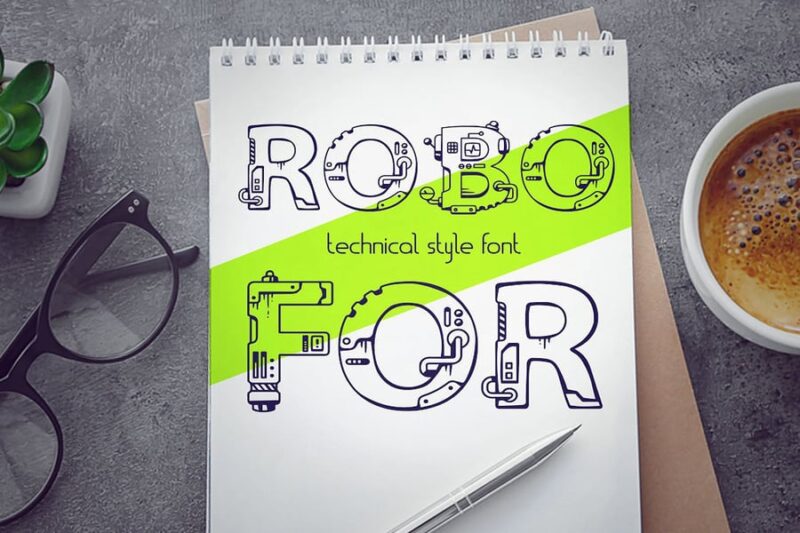
Robofor mechanical engineering font represents specialized industrial fonts designed specifically for technical documentation and engineering applications. This typeface features precise, mechanical letterforms that reflect the accuracy and attention to detail required in engineering and robotics industries. Its mechanical precision and industrial functionality make it essential for technical drawings, engineering specifications, and automation industry communications.
Typehead Typeface|Industrial Stencil Font
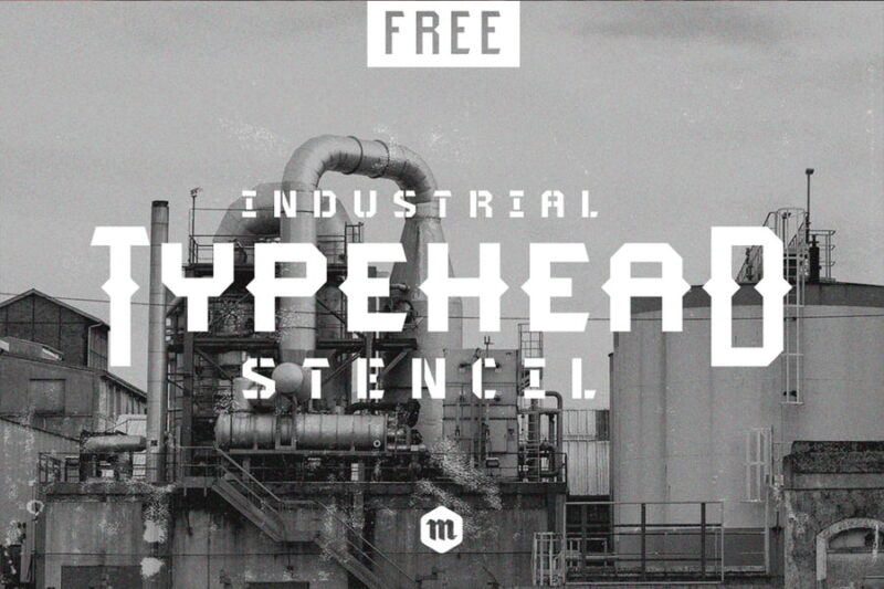
Typehead Industrial Stencil Font combines the practical functionality of stencil design with the robust character of industrial fonts for versatile marking applications. This stencil typeface features clean cuts and industrial precision, designed for spray painting, laser cutting, and industrial marking systems used in manufacturing environments. Its authentic stencil construction and industrial heritage make it perfect for warehouse signage, equipment labeling, and industrial facility identification.
Numhead Typeface
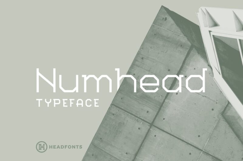
Numhead Typeface excels in numerical display applications, representing specialized industrial fonts optimized for data visualization and technical communications. This typeface features enhanced numerical characters with industrial strength construction, designed for dashboards, control panels, and industrial monitoring systems. Its focus on numerical clarity and industrial design principles makes it essential for manufacturing analytics, industrial IoT applications, and technical data presentation.
Caspian – Industrial Font
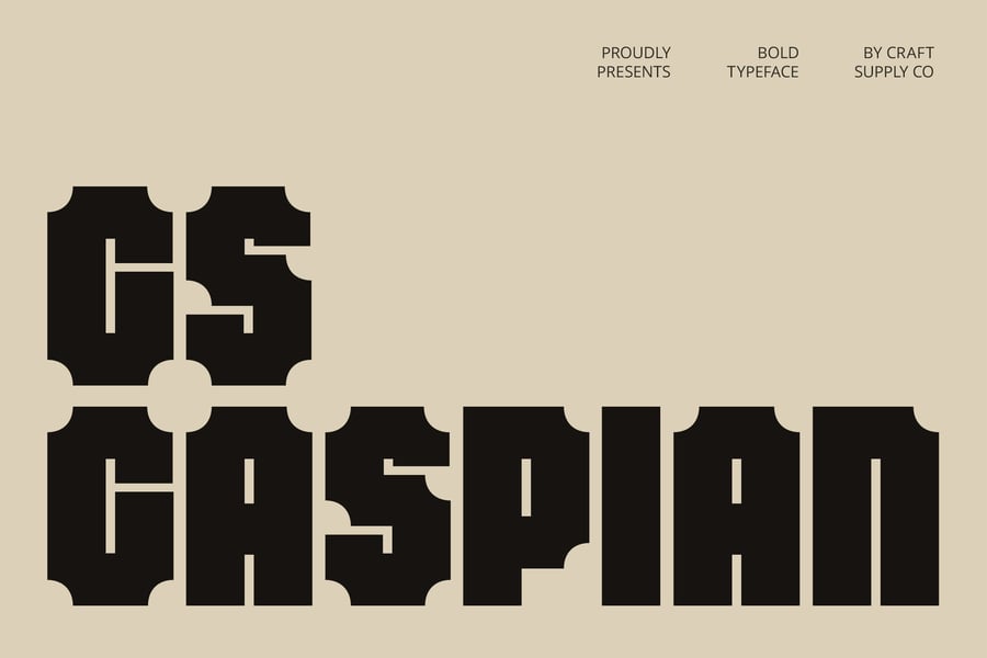
Caspian Industrial Font delivers refined industrial aesthetics suitable for premium branding applications, representing the sophisticated end of the industrial fonts spectrum. This typeface balances industrial strength with elegant letterforms, creating a professional appearance perfect for high-end manufacturing, engineering consultancies, and industrial services marketing. Its refined industrial character and premium construction make it ideal for companies seeking to elevate their industrial brand positioning.
What Makes a Font Feel “Industrial”?
Industrial fonts have a distinct personality — and it doesn’t come from nowhere. There are specific design decisions that give these typefaces their gritty, mechanical, hard-working soul.
Bold, Heavy Weight
First and most obviously: industrial fonts are built big. They tend to feature heavy strokes, thick letterforms, and a visual weight that demands attention. Think of the lettering stenciled on the side of a freight container. It needs to be readable from a distance, in any conditions, with zero ambiguity. That’s the DNA industrial fonts carry into your designs.
The boldness isn’t just aesthetic — it communicates strength, reliability, and permanence. When your brand needs to feel like it’s been around for a century and plans to stay another hundred years, heavy weight typography says it better than any tagline.
Condensed or Extended Letterforms
Industrial fonts often lean toward condensed widths — tall, narrow letterforms packed tightly together. This mirrors the efficiency of industrial design itself: no wasted space, maximum output. You’ll also find extended or wide-set variants that evoke large-format signage, machinery plates, and warehouse banners.
Either direction — condensed or extended — gives industrial fonts their unmistakable presence in headers, logos, and display applications.
Slab Serifs and Square Details
Many industrial fonts feature slab serifs — thick, blocky bracketed or unbracketed serifs that feel like they were cut from metal rather than drawn with a pen. These square, no-nonsense details are a huge part of what makes a font feel mechanical and grounded.
Compare a thin, flowing script to a slab serif industrial font and you’ll immediately feel the difference. One floats. The other plants its feet and doesn’t move.
Worn Textures and Distressed Details
A lot of the best industrial fonts come loaded with texture — ink traps, rough edges, subtle erosion effects that make letterforms look like they’ve been stamped, stenciled, or pressed into metal. This weathered quality adds authenticity and depth that clean, digital fonts simply can’t replicate.
It’s the typographic equivalent of a leather jacket with actual scuffs on it. The wear tells a story.
Geometric or Military Influence
Industrial fonts frequently borrow from military stencil lettering, engineering drawings, and early 20th century geometric modernism. Think sharp angles, precise construction, and a deliberate absence of anything decorative or unnecessary. Every stroke has a job to do.
Where to Use Industrial Fonts
Industrial fonts are versatile workhorses — but they thrive in specific contexts. Here’s where they really earn their keep:
Branding and Logos
Industrial fonts are a natural fit for brands that want to feel rugged, established, and authentic. Think outdoor apparel, craft beer, construction companies, automotive brands, fitness businesses, hardware stores, and anything else that trades on toughness and reliability.
A heavy slab serif or a distressed stencil font in a logo instantly communicates that a brand has substance. It says “we build real things” without saying a word.
Packaging Design
Product packaging is where industrial fonts really shine. Whether it’s hot sauce, coffee, whiskey, power tools, or protein supplements, an industrial typeface on a label commands shelf presence and communicates quality without trying too hard.
The key is contrast — pair a bold industrial display font with clean, minimal body copy and you’ve got packaging that feels both rugged and refined.
Posters and Print
Industrial fonts were practically made for large-format print. Concert posters, event announcements, editorial spreads, and promotional materials all benefit from that commanding, no-apologies presence that industrial typefaces bring to the table.
Scale them up. Let them breathe. They can handle it.
Apparel and Merchandise
T-shirts, hats, hoodies, patches — industrial fonts translate brilliantly to apparel. Their bold forms hold up when embroidered, screen printed, or heat-pressed. And their aesthetic taps directly into the workwear and heritage clothing revival that shows no sign of slowing down.
Web and Digital Design
Industrial fonts make powerful statements in digital interfaces too. Hero sections, navigation headers, call-to-action buttons, and landing pages for brands with a gritty or premium-rugged aesthetic all benefit from a well-chosen industrial typeface.
Just be mindful of rendering at small sizes — the details and textures that make industrial fonts so compelling at large scale can get muddy in body copy or fine print.
Where to Avoid Industrial Fonts
As strong as they are in the right context, industrial fonts can work against you if you reach for them in the wrong situation.
Luxury and High-End Brands
Industrial fonts communicate craft and durability — but not exclusivity in the traditional luxury sense. If you’re designing for a high-fashion label, a fine jewelry brand, or an upscale spa, a distressed stencil font is going to clash hard with the elegance you’re trying to project. Reach for refined serifs or sleek geometric sans-serifs instead.
Children’s Products
Industrial fonts carry a grown-up, serious weight that feels out of place in the playful, colorful world of kids’ brands. Heavy slab serifs and weathered stencil lettering don’t exactly say “fun for ages 3 and up.” Bubble fonts and rounded display types are a much better fit here.
Healthcare and Wellness
Trust is critical in health-related design — and industrial fonts, while they do communicate strength, can also feel cold, impersonal, or intimidating in medical or wellness contexts. Clean sans-serifs or friendly humanist typefaces tend to do a better job of communicating care and reassurance.
Long-Form Body Copy
Industrial display fonts are built for impact at large sizes, not readability across paragraphs of text. Using them for body copy is like using a sledgehammer to hang a picture frame. Technically it works, but it’s the wrong tool for the job. Reserve industrial fonts for headlines, subheads, and display applications — then let a clean, legible serif or sans-serif carry the body text.
How to Choose the Right Industrial Font for Your Project
With so many industrial fonts available in 2026, how do you narrow it down? A few things to consider before you commit:
Define the Mood
Industrial is a broad category. A distressed, weathered stencil font communicates something very different from a crisp geometric slab serif — even though both technically qualify as “industrial.” Get specific about the mood you’re after. Vintage and nostalgic? Modern and precision-engineered? Gritty and urban? Rugged and outdoorsy? The answer narrows your options fast.
Think About Your Audience
Who’s this design for, and what do they respond to visually? A craft whiskey brand targeting 30-something enthusiasts has different typographic needs than a power tools company speaking to contractors. Industrial fonts have range — but the right one for your project depends on the people you’re trying to reach.
Test at Real Sizes
Always preview industrial fonts at the actual sizes they’ll be used. A distressed font that looks incredible at 200pt on your screen can turn into an unreadable mess on a business card or a small product label. Test early. Test often.
Consider Pairing
Industrial fonts rarely work in isolation. Think about what you’ll pair them with. A heavy industrial slab serif headline pairs beautifully with a clean, lightweight grotesque for body copy. A stencil-style display font can be grounded by a neutral monospace for supporting text. The contrast between rough and refined is where the magic usually lives.
Check Licensing
This one’s easy to overlook but critically important. Many premium industrial fonts require commercial licenses for branding, packaging, or merchandise use. Before you fall in love with a typeface, check what you can actually do with it. Some fantastic industrial fonts are free for personal use but require a paid license for anything commercial — so plan accordingly.
Industrial Fonts vs. Other “Tough” Typefaces
Industrial fonts often get grouped with other bold, masculine typefaces — but there are real distinctions worth knowing.
Industrial vs. Gothic: Gothic and blackletter fonts carry a medieval or ecclesiastical weight that industrial fonts don’t. Where blackletter feels ancient and ornate, industrial fonts feel like they rolled off a factory floor in 1940. Both are bold, but the cultural references are completely different.
Industrial vs. Military: Military stencil fonts are close cousins to industrial types and often overlap. The key difference is that military fonts tend to be more standardized and utilitarian — think stencil lettering on ammunition crates — while industrial fonts have more visual range and personality.
Industrial vs. Grunge: Grunge fonts are distressed and textured like industrial fonts, but they tend to lean chaotic and DIY rather than structured and purposeful. Industrial fonts, even when weathered, retain a sense of order and legibility. They feel constructed. Grunge fonts feel torn apart.
Tips for Using Industrial Fonts Like a Pro
Getting the most out of industrial typography is equal parts font selection and thoughtful execution. Here are a few principles to keep in mind:
- Embrace contrast. Pair heavy industrial display fonts with lightweight body copy for maximum visual impact. The tension between the two makes both work harder.
- Use color intentionally. Industrial fonts feel at home in earthy, muted palettes — blacks, deep browns, rust oranges, army greens, aged creams. Push the palette and the typography works together as a system.
- Don’t over-texture. If your font is already distressed and worn, your design doesn’t need additional grunge overlays or texture layers. Let the font do the work. Adding more texture on top can quickly tip into noise.
- Go big. Industrial fonts are display types at heart. Give them room. Large, confident headlines are where they shine — not squeezed into small spaces.
- Mix eras thoughtfully. Vintage industrial and modern industrial fonts can coexist beautifully in one design — but make sure the combination feels intentional, not accidental. A 1920s railway serif and a sleek contemporary geometric slab can work together if the rest of the design bridges the two.
Frequently Asked Questions About Industrial Fonts
What makes a font look industrial?
Industrial fonts typically feature bold or heavy weight letterforms, condensed widths, slab or square serifs, and often include distressed textures or stencil-style details that evoke factory signage, machinery, and manufacturing. The overall impression is of something built to work, not to charm.
Are industrial fonts good for logos?
Absolutely — for the right brands. Industrial fonts work exceptionally well in logos for rugged, heritage-driven, or authenticity-focused brands. They communicate strength, durability, and craftsmanship. That said, they’re not the right tool for every brand identity, so always match the font to the brand’s character first.
What industries use industrial fonts most?
Craft beverages (beer, whiskey, coffee), outdoor and workwear apparel, construction and contracting, automotive, fitness, manufacturing, hardware and tools, and editorial design for magazines with a gritty or heritage editorial direction all reach for industrial typography regularly.
Can I use industrial fonts for body copy?
Generally, no — or at least not heavily textured or distressed variants. Industrial fonts are display typefaces built for large-scale use. For body copy, pair them with a clean, readable sans-serif or humanist serif that complements the industrial look without sacrificing legibility.
Are there free industrial fonts worth using?
Yes! Several high-quality industrial fonts are available for free or at low cost through Google Fonts, DaFont, and other font libraries. Options like Oswald, Roboto Condensed, and Arvo have industrial-adjacent qualities and are free for commercial use. That said, for premium branding work, investing in a paid industrial typeface almost always pays off in distinctiveness and quality.
The Lasting Appeal of Industrial Typography
Industrial fonts have been around since the printing presses and steel mills of the 19th century — and they’re not going anywhere. There’s a reason brands keep coming back to them: they communicate something true. They feel like they’ve earned their place on the page.
In a design landscape flooded with smooth gradients, soft rounded corners, and airy minimalism, a well-chosen industrial font cuts through the noise. It plants a flag. It says this is real, this is built, this matters.
Whether you’re building a brand identity from scratch, refreshing a logo, designing packaging, or just hunting for that perfect headline font, industrial typefaces offer a depth of character that’s hard to match. The wear isn’t a flaw — it’s the whole point.
So dig through the list, test a few options at size, and find the industrial font that works as hard as your design deserves. Have a favorite industrial font that didn’t make the list? Drop it in the comments — we’d love to hear about it.