In this article:
- The Best Clock Fonts in 2026
- What Makes a Font Look Like a Clock?
- Where to Use Clock Fonts in Your Designs
- Where to Be Careful With Clock Fonts
- How to Pick the Right Clock Font
- Tips for Using Clock Fonts Like a Pro
- Frequently Asked Questions About Clock Fonts
- The Bigger Picture: Why Clock Fonts Matter More Than You Think
Time is funny that way. We spend so much energy obsessing over what the clock says, yet almost never stop to think about how it says it. Whether it’s the glowing digits on a bedside alarm, the ornate numerals on a grandfather clock, or the bold countdown on a sports broadcast, clock fonts are quietly doing some of the most emotionally loaded typographic work in the world of design.
Think about it: a font on a clock doesn’t just display information — it sets a mood, triggers a memory, and tells you everything about the world that clock belongs to. Sleek and digital? You’re in a sci-fi thriller. Vintage and serif? You’re in a Victorian drawing room. Chunky and distorted? Welcome to a retro arcade.
In this post, we’re diving deep into the best clock fonts to use in 2026 — from timeless classics to bold modern statements. We’ll cover:
- What makes a font feel “clock-like”
- The best clock fonts available right now
- Where and how to use clock fonts in your designs
- Tips for pairing clock fonts with other typefaces
- Common questions about clock fonts
So set your stopwatch. Let’s get into it.
The Best Clock Fonts in 2026
Not all clock fonts are created equal. Some nail the digital LED look. Others go full gothic grandfather clock. And a handful manage to feel genuinely timeless — no pun intended. Here are our top picks:
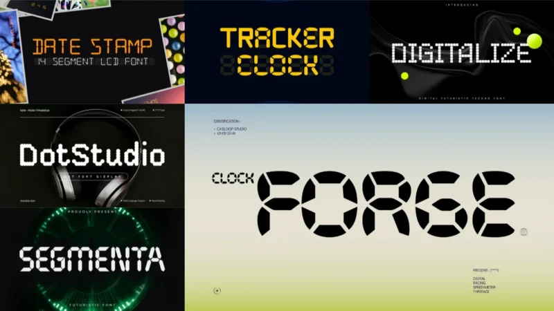
Tracker Clock – Precise Quartz Stopwatch Y2k Pixel
![]()
This Y2K-inspired pixel font perfectly captures the essence of digital timepieces and stopwatch displays. Tracker Clock delivers precise, geometric letterforms that evoke the nostalgic charm of early 2000s technology. It’s an ideal choice for projects requiring authentic clock fonts that blend retro digital aesthetics with modern design sensibilities.
Speed Px Watch

Speed Px Watch delivers the crisp, pixelated appearance of digital watch displays with remarkable accuracy. This clock font specializes in creating that distinctive electronic timepiece aesthetic that’s perfect for gaming interfaces and tech-themed designs. The font’s clean pixel construction ensures excellent legibility across various digital applications.

Get 300+ Fonts for FREE
Enter your email to download our 100% free "Font Lover's Bundle". For commercial & personal use. No royalties. No fees. No attribution. 100% free to use anywhere.
Digitron Font
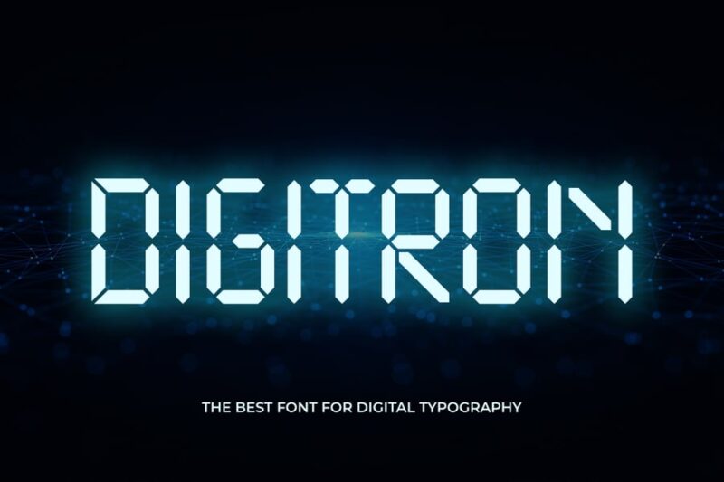
Digitron Font embodies the classic seven-segment LED display style commonly found in digital clocks and electronic devices. This versatile clock font brings authentic digital display characteristics to your designs with its bold, segmented letterforms. Perfect for projects that need to convey precision, technology, or time-related themes.
Date Stamp
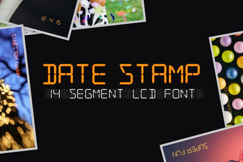
Date Stamp captures the utilitarian aesthetic of time-stamping devices and administrative marking systems. While not exclusively designed as clock fonts, its structured letterforms work excellently for time-related applications and document dating. The font’s industrial character makes it perfect for designs requiring an official, timestamp-like appearance.
Clock Forge – Digital Racing Speed Meter Pixel
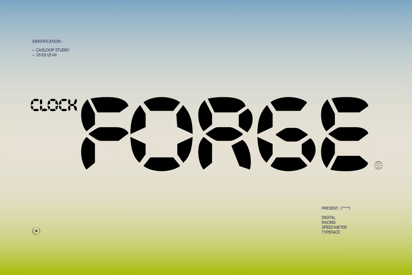
Clock Forge combines the precision of digital timepieces with high-speed racing aesthetics in a dynamic pixel format. This specialized font among clock fonts excels in automotive and gaming applications where speed and time measurement are crucial. The racing-inspired design elements make it perfect for dashboard displays, speedometers, and performance-oriented interfaces.
Segmenta – Futuristic Seven Segment Font + Webfont
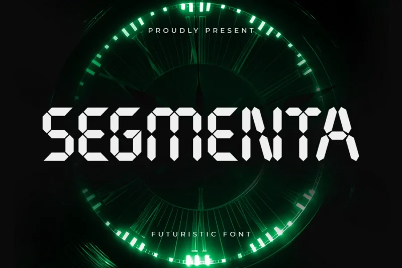
Segmenta offers a futuristic take on the classic seven-segment display format traditionally used in digital clocks and electronic devices. This modern interpretation of clock fonts brings enhanced readability and contemporary styling to the timeless LED aesthetic. The included webfont version ensures seamless integration across digital platforms and responsive designs.
Tiny Timmy

Tiny Timmy delivers compact, pixel-perfect letterforms that excel in space-constrained digital environments like watch faces and small displays. This efficient clock font maintains excellent legibility even at minimal sizes, making it ideal for wearable technology and compact interface design. Its playful name belies its professional utility in time-sensitive applications.
Cyber Digital LED-Inspired Font
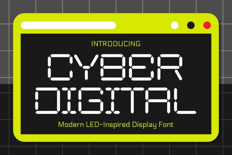
This LED-inspired font brings authentic digital display aesthetics to cyberpunk and futuristic design projects. While primarily a digital typeface, it works exceptionally well as part of clock fonts collections for sci-fi themed timepieces and electronic interfaces. The cyber aesthetic makes it perfect for gaming, technology, and futuristic branding applications.
Digitalize – Digital Futuristic Techno Font
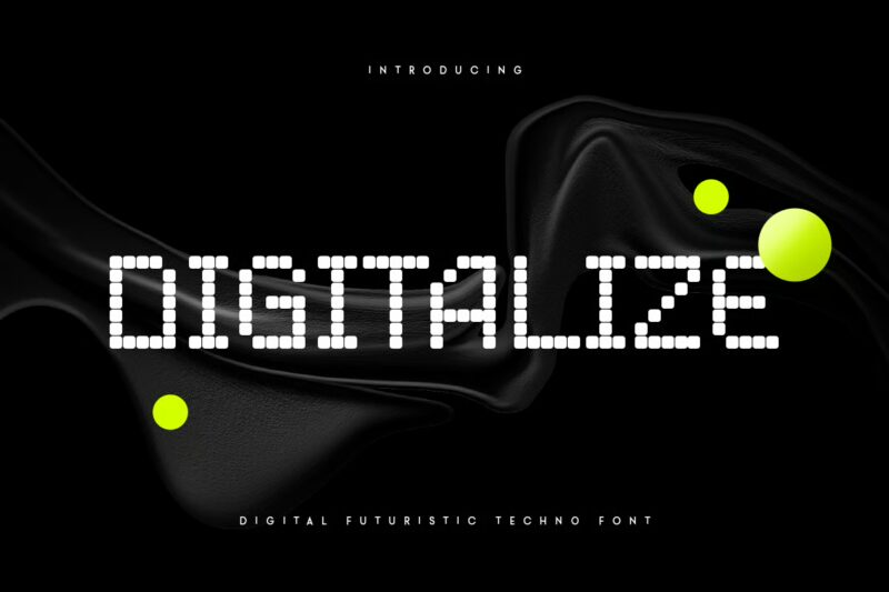
Digitalize merges cutting-edge digital aesthetics with techno-inspired design elements for a truly futuristic appearance. This font complements clock fonts beautifully in tech-forward projects requiring time display functionality. Its sleek, technological character makes it ideal for digital interfaces, electronic music branding, and modern timepiece designs.
DotStudio – Digital Futuristic Dot Font Display
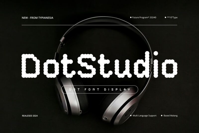
DotStudio creates letterforms using a sophisticated dot matrix system that recalls both vintage computer displays and modern LED panels. This innovative approach to digital typography works excellently alongside traditional clock fonts for projects requiring dot-matrix aesthetics. The font’s modular dot construction offers unique visual texture while maintaining excellent readability.
Bitcloid – Modern Futuristic Digital Dot Font
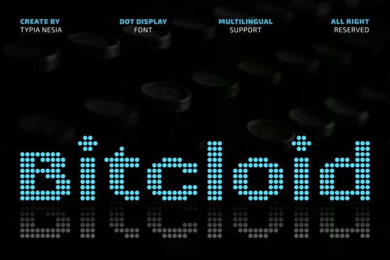
Bitcloid represents the evolution of dot-matrix typography with its modern, futuristic approach to digital letterforms. This font pairs exceptionally well with clock fonts in contemporary digital projects requiring pixel-precise time displays. The sophisticated dot pattern creates visual interest while maintaining the clean, technical aesthetic essential for professional time-keeping interfaces.
Digital Dreamer – 1980s Computer Typeface
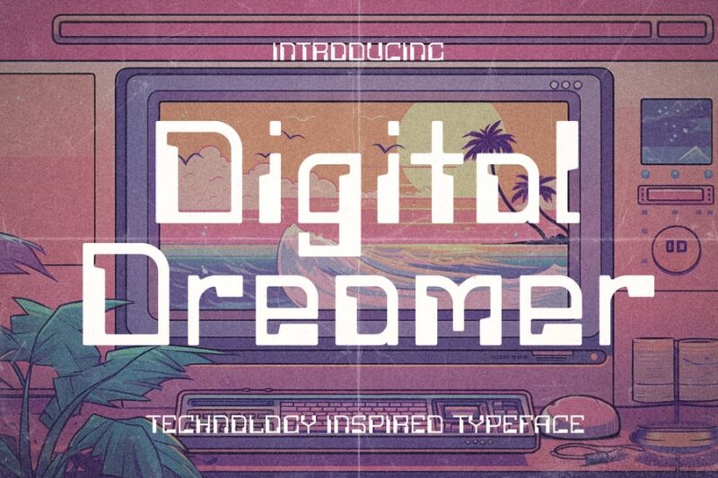
Digital Dreamer transports viewers back to the golden age of 1980s computer technology with authentic period styling. This retro digital font works beautifully in vintage-inspired clock fonts applications, especially for projects celebrating early computing history. The nostalgic character design captures the distinctive bitmap aesthetic of classic computer terminals and early digital displays.
Foster Drawn
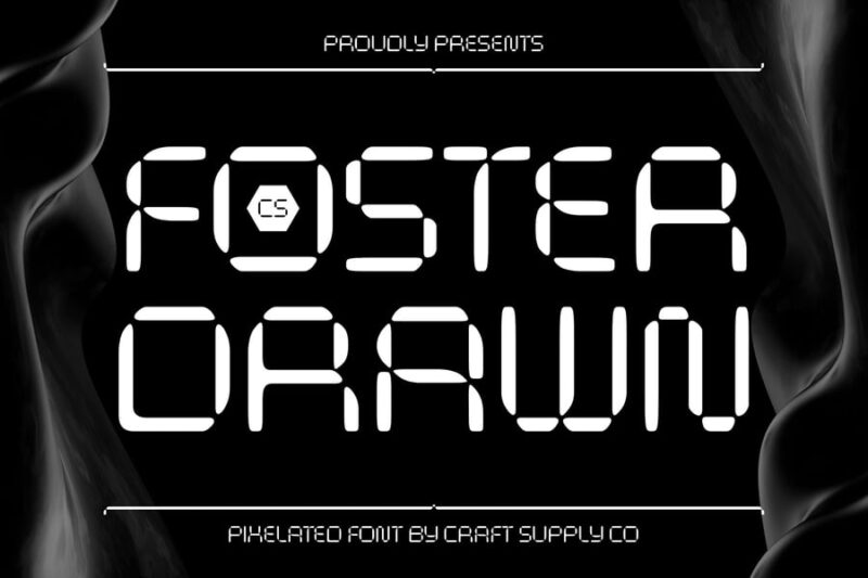
Foster Drawn offers a unique hand-drawn interpretation of digital typography, blending organic artistic elements with technological precision. While not traditionally categorized among clock fonts, its digital-inspired character makes it suitable for creative timepiece designs and artistic clock applications. The hand-drawn quality adds human warmth to digital aesthetics, perfect for boutique tech brands.
What Makes a Font Look Like a Clock?
It’s a surprisingly deep question. After all, clocks have been around for centuries, and in that time they’ve borrowed from practically every typographic tradition imaginable. But when you look at fonts that immediately read as “clock-like,” a few consistent traits emerge.
The Digital DNA: Segment Display Style
When most people picture a clock font, they picture this: the segmented, boxy numerals of a digital alarm clock. You know the ones. Seven segments per digit, glowing red or green against a black background. That aesthetic — technically called a “seven-segment display” — has become so culturally embedded that fonts mimicking it feel immediately, instinctively clock-like.
Fonts built around this style tend to use hard angles, uniform stroke widths, and chunky rectangular forms. There’s zero calligraphic influence here. It’s purely functional, and that functional purity is exactly what gives it so much visual power.
The Mechanical Look: Serif Precision
On the other end of the spectrum, there’s the world of analog timepieces — pocket watches, wall clocks, antique mantle pieces. The fonts that live in this world lean heavily on classic serif letterforms. Think sharp, elegant serifs. Think contrast between thick strokes and hairline thins. Think Roman numerals engraved into metal dials.
These fonts don’t just look like clocks. They feel like craftsmanship. They feel like something that took a long time to make — which, for a clock, is a rather fitting quality.
The Futuristic Edge: Geometric Minimalism
Then there’s a third camp: the sci-fi, cyberpunk, mission-control aesthetic. Fonts here tend to be geometric sans-serifs with ultra-thin strokes, monospaced letterforms, and that cool, clinical precision that says “countdown to launch” rather than “time for tea.” These are the clock fonts you see on HUDs, in space movies, and in sleek tech branding that wants to feel like it’s operating somewhere between now and 2150.
Where to Use Clock Fonts in Your Designs
Clock fonts are more versatile than they get credit for. Sure, the obvious use case is anything time-related — countdown timers, clocks, schedules, apps. But there’s a whole world of creative applications worth exploring.
App and UI Design
This is the natural habitat of the digital clock font. Whether you’re designing a fitness tracker, a meditation timer, or a world clock app, the right clock font does double duty: it communicates information clearly and reinforces the product’s personality. A bold, segmented font on a workout app feels energetic and urgent. A soft, rounded clock font on a sleep tracker feels calm and reassuring.
Event Branding and Countdowns
There’s something thrilling about a countdown. Whether it’s a product launch, a concert, a New Year’s Eve party, or a sporting event, clock fonts instantly amplify the anticipation. The ticking-clock feeling is already built into the font itself. You don’t even have to animate it — the tension is already there.
Posters and Print
Clock fonts bring drama to poster design, particularly when scaled up large. A massive seven-segment-style numeral anchoring a concert poster or a race-day flyer is immediately eye-catching. Go oversized, go bold, and let the font carry the weight of the design.
Retro and Vintage Aesthetics
The 70s and 80s had a very specific relationship with digital display typography — LED readouts on stereos, VCR clocks, calculator screens. Leaning into that era with an appropriately retro clock font is a surefire way to trigger the nostalgia button. These fonts work beautifully on merchandise, packaging, and any branding project where warmth and personality matter more than polish.
Gaming and Entertainment
From arcade cabinets to escape room props to thriller movie titles, clock fonts have a permanent home in the entertainment world. The urgency they communicate is built-in — a ticking clock is one of storytelling’s oldest tools, and a clock font brings that same psychological pressure to visual design without a single word.
Where to Be Careful With Clock Fonts
As much fun as clock fonts are to work with, there are a few contexts where they can work against you.
Formal or corporate settings. A digital clock font on a law firm’s letterhead or a bank’s annual report is going to raise eyebrows — and not in a good way. These environments call for authority and trust, which means sticking with traditional serifs or clean humanist sans-serifs.
Long-form body text. Clock fonts are display fonts. They’re built for headlines, numbers, and short bursts of text — not paragraphs. If you try to set a block of body copy in a segmented display font, legibility collapses fast. Reserve them for moments where they can shine, and pair them with a readable body font for the rest.
When subtlety is the goal. Clock fonts tend to make a statement. If your design calls for a quiet, understated presence, the bold personality of most clock fonts will overpower everything around them. Know when to reach for something more restrained.
How to Pick the Right Clock Font
With so many options out there, narrowing things down can feel a little daunting. Here’s a simple framework to help:
Decide on Your Era
Clock fonts span centuries of typographic history. Are you going for 1800s pocket watch elegance? 1980s LED alarm clock nostalgia? 2050s sci-fi mission control? Pinpointing the era you’re channeling will immediately rule out a large chunk of options and point you in the right direction.
Consider Numerals vs. Full Alphabet
Some clock fonts are built primarily around numerals — they shine on time displays but fall apart if you need to spell out words. Others offer a full, beautifully designed alphabet. If your design needs both, make sure your chosen font delivers on both fronts before you commit.
Think About Weight and Scale
Most clock fonts are designed to be displayed large. At small sizes, the distinctive details that make them feel “clock-like” can become muddy or illegible. Always test your font at the sizes you’ll actually be using it before finalizing your choice.
Match the Mood, Not Just the Concept
Don’t just ask “does this look like a clock?” — ask “does this feel right for this design?” A ticking anxiety, a calming ritual, a thrilling countdown, a nostalgic memory — all of these are clock-adjacent moods, but they call for very different typefaces. Match the emotional register of the font to the emotional register of the project.
Tips for Using Clock Fonts Like a Pro
- Pair with contrast. Clock fonts — especially digital-style ones — pair beautifully with soft, organic typefaces. The contrast between mechanical precision and human warmth creates visual tension in the best possible way.
- Use color intentionally. Classic LED red on black. Cool green on dark gray. Warm amber on deep navy. Color is part of the clock font vocabulary. Lean into it.
- Embrace negative space. Big, bold clock numerals demand room to breathe. Don’t clutter the design around them — let the scale do the heavy lifting.
- Animate when appropriate. A well-placed blinking colon or a counting-up number animation can transform a static clock font into a genuinely cinematic moment.
- Don’t neglect kerning. Monospaced clock fonts are built with equal spacing in mind, which is great for numbers but can look awkward with letters. Adjust kerning manually for headline text to get things feeling just right.
Frequently Asked Questions About Clock Fonts
What font do most digital clocks use?
Most physical digital clocks don’t use a font at all in the traditional sense — they use seven-segment LED or LCD displays, where each digit is formed by lighting up specific segments of a seven-part grid. In design, fonts that mimic this look are called seven-segment fonts or digital display fonts. Popular examples include DS-Digital, Digital-7, and LCD Solid.
What is the classic clock font called?
There’s no single definitive “clock font,” but a few have become go-to choices in the design community. For digital styles, Digital-7 and Segment7 are widely used. For more classical or decorative clock aesthetics, fonts inspired by engraving and serif traditions — like Trajan or Cinzel — are popular. The “right” answer depends entirely on what kind of clock you have in mind.
Are clock fonts free to use?
Many popular digital clock-style fonts — including Digital-7 and DS-Digital — are available as free downloads for personal use. However, free-for-personal-use licenses typically don’t cover commercial projects. If you’re designing for a client, a brand, or a product you’re selling, always check the license terms and be prepared to purchase a commercial license or find a genuinely free alternative.
Can I use clock fonts for body text?
Technically yes, but practically — not really. Clock fonts are display fonts designed for headlines, numbers, and short text. Setting long passages in a segmented or ornate clock font makes reading a chore. They’re best used sparingly and at large sizes where their character really shines.
What font is used on the iPhone clock?
Apple’s Clock app uses San Francisco — Apple’s proprietary typeface — for most text elements. The large, tabular numerals are designed with monospaced spacing so that the time display doesn’t shift horizontally as the digits change. It’s a masterclass in functional type design: beautiful, precise, and totally invisible to most people using it.
The Bigger Picture: Why Clock Fonts Matter More Than You Think
Here’s the thing about time — it’s the one universal human experience. Every culture, every era, every person on the planet has a relationship with it. And the typographic language we use to represent time carries enormous emotional weight as a result.
A clock font isn’t just a stylistic choice. It’s a signal. It’s a cue that tells the viewer how to feel about the time being displayed. Urgency or calm. Nostalgia or futurism. Precision or poetry. The best clock font designers understand this instinctively, and the best designers who use clock fonts understand it too.
So the next time you reach for a clock font — whether it’s for a countdown timer, a watch face, a retro poster, or a sci-fi UI — take a moment to think about what that font is actually saying. Because in typography, as in life, timing is everything.
Have a favorite clock font that didn’t make our list? Drop it in the comments — we’d love to see what you’re working with.