In this article:
- Above-the-Fold Visuals That Instantly Communicate Direction
- Whitespace That Amplifies Intent Instead of Diluting It
- Layouts That Create a Natural Flow Down the Page
- Typography That Signals Confidence and Reduces Friction
- Visual Hierarchy That Guides Attention to Key Actions
- Color That Creates Clear Focal Points for Interaction
- Final Thoughts
You&8217;ve kerned the headline to perfection, and the grid is singing. But the client just messaged you: &8220;We love this, but can we please make the button pop more?&8221; What they mean by this is that the page is pretty, but it&8217;s holding its breath. It&8217;s waiting to be looked at instead of being used.
A lot of the visual design in our space is just elaborate waiting room furniture. We build gorgeous entryways but forget to tell anyone where the door handle is.
This isn&8217;t a plea to slap giant orange pills on everything. What we actually want you to do is weaponize the space you&8217;ve been given to create momentum.
Here, we&8217;ll look at how type, color, composition, and motion work together (or against each other) when the goal is to turn passive interest into deliberate action. Not just aesthetics for its own sake, but the craft of building visual momentum that actually goes somewhere.
Above-the-Fold Visuals That Instantly Communicate Direction
We like to think we are rational creatures weighing options. But the reality is messier. Research confirms that first impressions are formed in about 50 milliseconds and are heavily based on visual design. That initial gut check determines whether someone leans in or clicks away before your headline even registers.
For designers, artists, and typographers, this is oddly liberating. You already possess the tools to control that split-second verdict: proportion, contrast, spatial tension, and focal points.
Actionable steps you can take immediately:
Get 300+ Fonts for FREE
Enter your email to download our 100% free "Font Lover's Bundle". For commercial & personal use. No royalties. No fees. No attribution. 100% free to use anywhere.
-
- Analyze your hero section by squinting at it until the content blurs. What still reads? If nothing does, your hierarchy needs work.
- Reduce the competing elements. Give your primary headline breathing room and pair it with a single, unmistakable visual anchor.
- Ensure your CTA isn&8217;t hiding in a muted tone that matches your background. Contrast pulls the eye.
- Test the path from hero image to button. Does the composition of the image (the gaze of a subject or the line of a geometric shape) naturally funnel attention toward the next step?
A striking example of what we&8217;re talking about can be seen at Start in Wyoming. They&8217;re a registered agent service that helps digital nomads and international founders establish U.S. business entities.
Their above-the-fold section features an illustration of a person working on a laptop while floating in a hot air balloon. The message is immediate and visual: you can run your company from anywhere, and we will anchor it stateside. There&8217;s no confusion about who the service serves.
For a typographer or graphic designer, the lesson translates cleanly. For instance, if you specialize in custom lettering for music festivals, your hero visual should be a bold, kinetic piece of lettering that screams backstage pass, not a generic desk photo.
That&8217;s how you make the 50-millisecond window work in your favor.
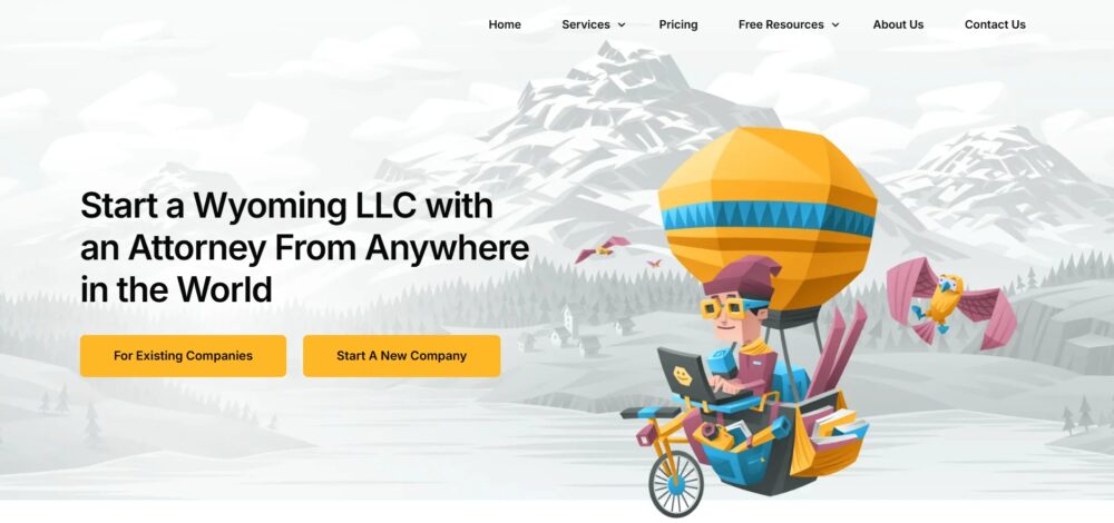
Source: startinwyoming.com
Whitespace That Amplifies Intent Instead of Diluting It
Empty space isn&8217;t a leftover but a deliberate tool that gives your content room to breathe and your CTAs room to command.
Crowded layouts force the eye to work overtime, sorting signal from noise. Generous whitespace does the opposite. It isolates what matters, letting a headline land harder and a button feel more important simply because nothing else competes for the same real estate.
The impulse to fill every pixel is strong. Resist it. When you give elements proper distance from each other, you grant each one permission to be seen fully before the next arrives.
Actionable steps you can take immediately:
- Double the padding around any primary CTA. If your button currently sits with 16 pixels of breathing room, push it to 32. Notice how the visual weight shifts.
- Audit the space between sections. Cramped sections bleed into one another and confuse the user about where one idea ends and another begins. A minimum of 80 pixels between major content blocks establishes clear territory.
- Reduce the number of elements competing above the fold. Three things seen clearly outperform seven things fighting for attention.
EmailOctopus, an email marketing platform built for creators and small businesses who want affordable newsletter delivery, demonstrates this approach throughout their site. Their above-the-fold area pairs a single headline with one button. Nothing else crowds the frame.
The whitespace surrounding the offer signals confidence. The user knows exactly where to look and what to do next without scanning past distractions.
The space around your best work communicates that the work is worth framing. Cramped layouts whisper scarcity. Open layouts project authority.
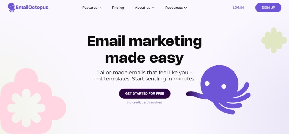
Source: emailoctopus.com
Layouts That Create a Natural Flow Down the Page
A visitor who stops scrolling is a visitor who stopped thinking.
That sounds harsh, but you know the feeling. You land on a page and something feels off. Maybe the sections crash into each other, maybe the rhythm stumbles, or maybe your eye has nowhere to land next. As a result, you leave.
Layout isn&8217;t decoration. It&8217;s a sequence of visual invitations. When spacing, alignment, and content grouping work together, the page becomes a gentle conveyor belt. The user moves downward without ever consciously deciding to do so.
Actionable steps you can take immediately:
- Analyze your vertical rhythm. Pick a consistent spacing unit (say 80 pixels between major sections and 40 between internal elements) and stick to it. Inconsistent gaps create visual static that tires the eye.
- Use alignment to build invisible rails. Left-aligned headlines that sit flush with left-aligned body copy create a clean edge that the eye can track downward without resistance.
- Group related information visually. A headline, two sentences of context, and a button should read as one unified block, not three disconnected pieces floating in space.
Engain, a marketing platform that helps brands establish presence and generate leads through Reddit conversations, structures its homepage with this exact discipline.
The page opens by establishing why Reddit matters right now, then moves into the practical problem of managing it manually, then presents Engain as the solution &8211; in that exact order. Each section earns the next.
The spacing between content blocks is deliberate, giving each idea room before the next one lands. Features are grouped by function, not volume, so the page never feels like a list dump. By the time users reach pricing, they&8217;ve already been walked through the full rationale.
Thoughtful spacing, structured grouping, and logical order help visitors absorb each piece of information without friction.
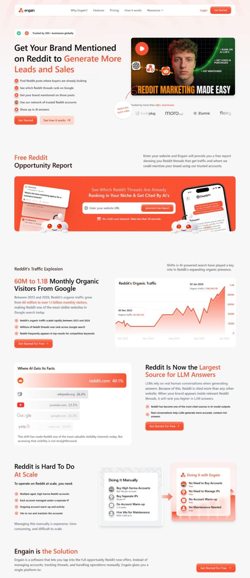
Source: engain.io
Typography That Signals Confidence and Reduces Friction
Type carries tone before it carries meaning. A visitor reads the weight of your font choices before they process a single word.
Thin, elegant letterforms on a contact page can whisper hesitation. Bold, clear anchors on the same page project certainty. When the path to action feels legible and assured, users move forward without second-guessing.
Typography isn&8217;t just the container for your message. It represents the handshake, the eye contact, and the nod that says &8220;You&8217;re in the right place&8221;.
Actionable steps you can take immediately:
- Examine your button text weight and case. Uppercase labels in a medium or bold weight tend to read as definitive commands. Sentence case in a light weight reads as a suggestion. Choose the option that matches the feeling you want your invitation to convey.
- Maintain consistent typographic hierarchy across every actionable element. If &8220;Get Started&8221; appears in 16-pixel semi-bold on one section, don&8217;t let it shrink to 14-pixel regular two scrolls later. Inconsistency breeds mistrust at a subconscious level.
- Evaluate the legibility of your smallest interaction text. Form labels, checkbox descriptions, and error messages should never dip below functional clarity. When users squint, they bounce.
Wave, a financial platform offering small business banking and bookkeeping tools including invoicing and expense tracking, executes this with quiet precision.
Their interface uses type weights to distinguish between primary actions, secondary navigation, and supporting information without visual chaos. Buttons wear a confident semi-bold treatment. Explanatory text stays readable without competing.
The result feels competent rather than flashy, and competence reduces the friction that kills conversions.
The type you choose for the final click should feel like a door handle, not a polite suggestion. Make the next step feel inevitable through weight alone.
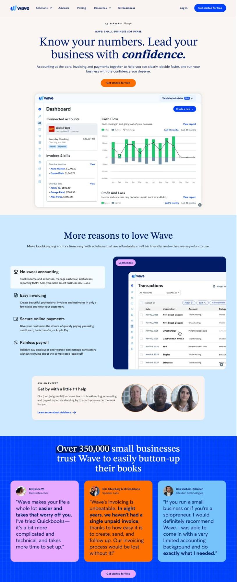
Source: waveapps.com
Visual Hierarchy That Guides Attention to Key Actions
A page without hierarchy is just a wall of noise. The eye wanders. The mind checks out. But when you deliberately control what someone notices first, second, and third, you stop asking for attention and start directing it.
Optimized visual flow can guide users where to look. Size, placement, weight, and contrast become tools of guidance rather than mere style choices. Used well, they eliminate the cognitive friction of &8220;what now?&8221; and replace it with a quiet certainty about what comes next.
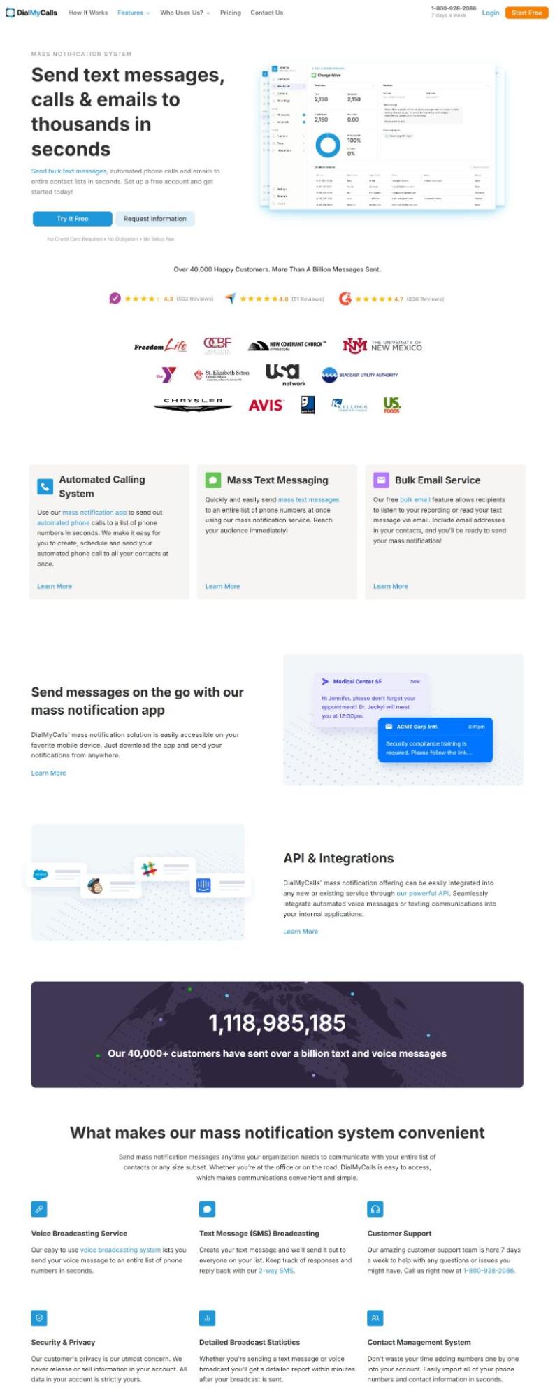
DialMyCalls, a platform that lets organizations send bulk text messages, uses its homepage to make the hierarchy immediately readable. The headline dominates the top of the page in large, high-contrast type, anchoring the value proposition before anything else registers.
The primary CTA, &8220;Try It Free&8221;, appears in the header and stays visible as users scroll, so the path to action never disappears.
Supporting content like features and social proof sits further down, at a smaller scale and lower visual weight, which signals that it&8217;s supplementary. The page has one clear job, and the hierarchy enforces it. Nothing fights the headline for dominance.
For graphic designers and typographers, this translates directly to how you structure any landing page.
Actionable steps you can take immediately:
- Give the page one dominant element. Everything else should rank below it in size, contrast, or placement.
- Use your CTA color exclusively for primary actions. The moment that color appears on a badge or decorative element, it loses its signal value.
- Test your hierarchy with a quick blur check. Step back and squint at the layout. What&8217;s still visible? That&8217;s what users notice first.
- Keep type at no more than three levels of scale. More than that, and the ranking breaks down.
Source: dialmycalls.com
Color That Creates Clear Focal Points for Interaction
Color is the loudest voice in your layout, even when it whispers. A single accent hue in a sea of neutrals pulls the eye with almost gravitational force. Yet many designers treat color as mood-setting alone. That&8217;s a missed opportunity.
Strategic color application creates instant wayfinding. When a button, a headline, or a key statistic wears a hue that appears nowhere else on the page, the brain registers it as important before conscious thought kicks in.
Actionable steps you can take immediately:
- Start with restraint. Choose one dominant accent color and use it sparingly. That color should appear only on elements you want to be touched, read, or acted upon. Everything else stays monochromatic or neutral.
- Test your contrast ratios not just for accessibility compliance but for visual dominance. A CTA button that blends with its surrounding background is a button that goes unseen.
- Audit your page by viewing it in grayscale. The elements you intended as focal points should still read as the darkest or lightest areas on the screen. If they vanish into midtone fog, your color strategy needs recalibration.
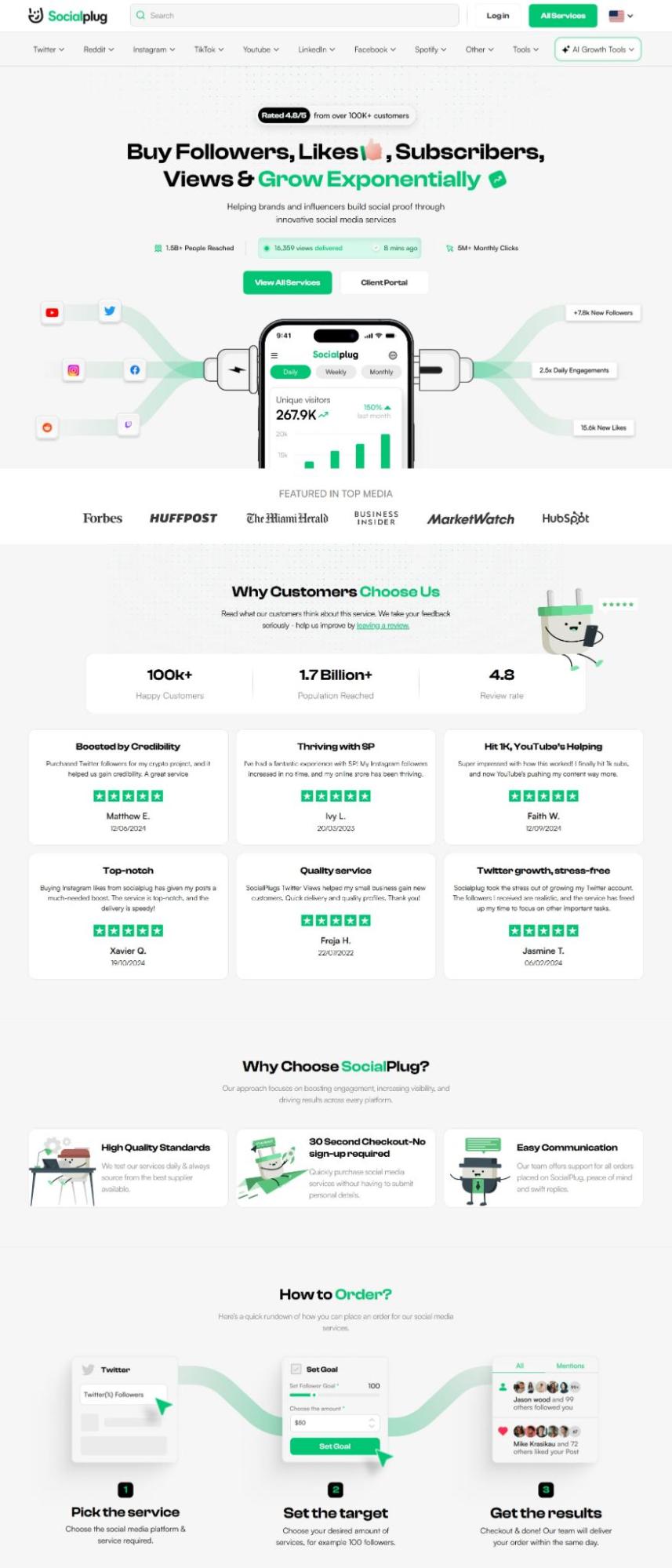
Socialplug, a marketplace where users can purchase social media engagement (followers, likes, views, and comments) across major platforms, uses color as a deliberate navigational tool.
Their homepage runs on a white background with a high-contrast CTA in their accent color that pulls the eye immediately without competition from surrounding elements. Headlines carry visual weight through size and color emphasis, making the value proposition register before the user has consciously decided to read it.
The contrast between the bright base and the accent tones creates a clear separation between content and action. Users don&8217;t have to hunt for what to click next. Socialplug&8217;s color does the directing.
That reduced hesitation is measurable. When users can identify the primary action instantly, the friction between interest and click drops.
Source: socialplug.io
Final Thoughts
Design that drives action rarely relies on a single visual trick. It comes from many small decisions working together.
- Clear above-the-fold messaging sets direction.
- Whitespace gives the decision room to breathe.
- Thoughtful layouts guide the eye down the page.
- Type carries the confidence needed to click.
- Visual hierarchy highlights what deserves attention.
- Color creates focal points for interaction.
For graphic designers, artists, and typographers, this approach turns visual craft into a structured user journey. Each design choice carries a purpose: the layout guides attention, the typography clarifies meaning, and the visuals reinforce the message and next step.
When these elements align, users move through a page with little friction. They understand what the brand offers and how to proceed. That clarity transforms curiosity into engagement and engagement into action.