In this article:
- Understanding X-Height in Typography
- Examples of Different Fonts' X-Heights
- How X-Height Makes Fonts Readable
- When to Consider a Font's X-Height
- The Importance of Legible Typography
- How X-Height Defines Your Brand
- Common Mistakes to Avoid
- Evaluating Your Future Font Choices
The difference between good typography and great typography often comes down to a single measurement. I’ve learned this lesson the hard way. X-height is the quiet force behind readability, brand identity and user engagement.
Understanding X-Height in Typography
Both beginner and expert designers often overlook X-height when selecting fonts. They focus on aesthetic appeal or brand personality without questioning how the typography will perform in real-world applications. However, X-height is a functional decision that affects multiple aspects of your design.
It affects legibility at small sizes, the white space between lines and visitors’ reading speed. Understanding it gives you control over one of the most fundamental aspects of visual communication.
Examples of Different Fonts’ X-Heights
Since proper X-height size depends on the application, there’s no universal “best” option. Your choice depends entirely on your context, audience and medium. While this means font selection is more time-consuming, it’s nice to know your creative freedom isn’t restricted.
The difference between a low X-height and a high X-height font.
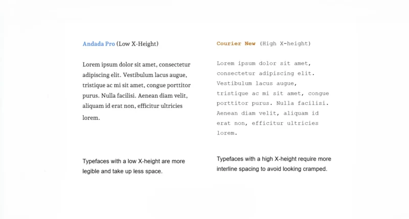
Andada Pro has a low X-height, making it more legible at larger sizes. Moreover, it takes up less vertical space, which is ideal for headlines or designs with busy layouts. The shorter lowercase letters create a modern, refined appearance that works beautifully for display type and branding.
Courier New has a high X-height. Typefaces like this require more interline space to avoid looking cramped. However, they look great at smaller sizes, making them perfect for viewing on mobile devices and desktops.
The taller lowercase letters make individual characters more distinguishable, which is why monospace fonts with high X-heights dominate coding environments and technical documentation.

Get 300+ Fonts for FREE
Enter your email to download our 100% free "Font Lover's Bundle". For commercial & personal use. No royalties. No fees. No attribution. 100% free to use anywhere.
Georgia represents a midrange X-height, the sweet spot for most body copy applications. It balances the elegance of low X-height fonts with the clarity of high X-height typefaces. This moderate approach makes it versatile across print and digital contexts, which is why it remains a favorite for long-form content on the web.
How X-Height Makes Fonts Readable
When lowercase letters occupy more vertical space, the human eye can more easily distinguish individual characters. This is especially true at smaller point sizes or on low-resolution screens. This improved character recognition directly increases letter recognition speed and overall reading comprehension.
One study confirmed that a font’s X-height has a greater impact on letter recognition than the length of its ascenders and descenders. Increasing ascender and descender length only improved legibility for half of the letters in the alphabet, while increasing a font’s X-height improved recognition for all letters.
Readers process the middle zone of text faster than the upper and lower zones. This finding challenges the traditional assumption that ascenders and descenders are the primary drivers of legibility. Typographers can enhance readability and processing speed by simply adjusting the X-height fraction.
You should prioritize X-height when readability is nonnegotiable, such as in body copy, user interface text or any application where readers need to process information quickly. I’ve seen clients struggle with engagement metrics only to discover the solution was as simple as selecting a typeface with a slightly larger X-height.
When to Consider a Font’s X-Height
While X-height is always a factor, certain scenarios make it critical. Getting it wrong can undermine your entire design system.
Improving Accessibility for All Readers
Sans-serif fonts with midrange X-heights balance clean lines with adequate line spacing, improving readability for diverse audiences. All-caps text is generally not considered accessible, especially for long passages, because it eliminates the shape variation that helps readers recognize words quickly.
This includes older adults, who make up a growing portion of the population. In the United States alone, the demographic of people aged 65 years and older will surpass 20% by 2030, making the U.S. a super-aged society. As vision naturally declines with age, this demographic shift makes typographic choices like X-height increasingly critical.
Fonts with generous X-heights improve character distinction for readers experiencing age-related vision changes, making them essential for inclusive design that serves a broader audience. I always think about my own parents when I’m designing for broader audiences. If they can’t read it quickly and comfortably, I haven’t done my job.
Creating Visual Harmony in Font Pairings
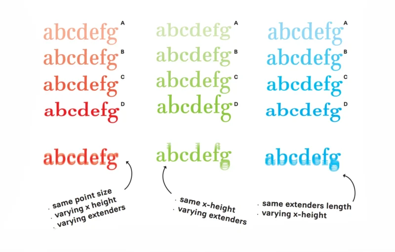
These fonts have identical point sizes but differing X-heights.
Even at identical point sizes, X-height makes fonts look different. Pairing fonts with drastically different X-heights creates visual dissonance that can distract readers and weaken your design’s visual hierarchy.
Fonts with different X-heights make for awkward pairings, even if they are the same style and size. This happens because one overshadows the other. The solution is to match X-heights closely or to vary them in ways that reinforce your hierarchy rather than confuse it.
Optimizing Legibility for Small Screens
For mobile UI and app design, a larger X-height is important because it makes letters easier to distinguish at smaller sizes. When users are reading on a 6-inch screen in varying light conditions, every pixel counts.
I’ve watched usability tests where participants struggled with beautifully designed interfaces simply because the typography didn’t account for X-height at reduced scales. As a practical guideline, fonts with larger X-heights perform better on mobile.
For critical UI elements such as navigation labels or form fields, consider typefaces where the X-height occupies a significant portion of the cap height. This helps ensure legibility across devices and lighting conditions.
Balancing Density in Long-Form Content
While very high X-heights are legible at small sizes, they can appear dense and cramped in long paragraphs. This is especially true where readers need sustained focus over extended reading sessions.
Pair fonts with large X-heights with larger line-height ratios for comfortable reading. Those with smaller X-heights can use tighter spacing without feeling cramped. This creates visual breathing room. Get this right, and readers will move through your content effortlessly.
The Importance of Legible Typography
Legibility is fundamental to graphic design. People can only engage with your work if they can comprehend it. Better engagement means stronger brand awareness and more successful business outcomes.
For web design, legibility impacts bounce rate, reader comprehension, traffic and conversion rates. A poorly chosen typeface with an inappropriate X-height for the context can send users away before they’ve absorbed your message. Typography that prioritizes legibility will keep them on the page.
Good typography respects the reader’s time and attention, which directly impacts the user experience. When clients ask me why typography matters, I point them to their analytics. The numbers tell the story every time.
How X-Height Defines Your Brand
X-height plays a huge role in branding because it contributes to line weight, white space and style.
Subtle Changes Make a Big Difference
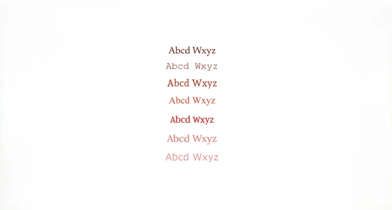
A seemingly small choice like X-height communicates brand values before viewers read a single word. If you’re aiming for playful and accessible, an all-lowercase or uppercase logo is a great option. For a more serious, premium design, differentiate uppercase and lowercase letters.
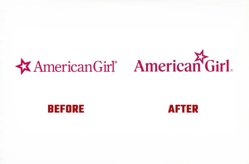
When American Girl rebranded, it changed its typeface from Feature Display to Pleasant Serif, which has a higher X-height. This change makes the brand feel more approachable and contemporary, aligning with its positioning for a new generation of customers.
The shift reflects a broader understanding that typography must evolve with audience expectations. What felt premium and exclusive in previous decades can subconsciously read as cold or inaccessible to younger consumers.
Trading Legibility for a Unique Style
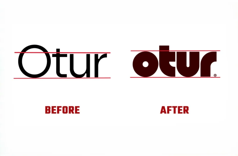
Belgian lighting brand Otur adopted a new logo and brand identity in 2025. The new logo uses a shorter X-height. The letters are thicker, rounder and more compact, with shapes that mirror the weight and structure of its lamps’ handcrafted wooden bases.
This rebrand demonstrates the importance of balance between legibility and style. The shorter, more stylized font creates a unique brand identity that mirrors the company’s aesthetic, deliberately sacrificing some legibility for a stronger brand personality.
Common Mistakes to Avoid
Small mistakes can have outsized consequences for your projects. One common pitfall is failing to test your typography in actual use. A font that looks perfect on your desktop monitor at 16px might become illegible on mobile at the same size.
I’ve found that, for most applications, a midrange X-height is generally superior to a very low or high X-height. This is because they lack sufficient ascenders and descenders, making it difficult to distinguish between characters. The letters start to blur together, defeating the purpose of choosing a “legible” font in the first place.
When designing logos, you should always consider readability. However, it’s OK to lean into stylistic choices that prioritize brand personality over pure legibility, just like Otur’s case. The key is making that choice consciously and understanding the trade-offs you’re accepting.
Evaluating Your Future Font Choices
Pay attention to the X-height the next time you choose a typeface. What viewing distance will your audience experience? Will they be reading on small screens, in print or from across a room? Consider their accessibility needs, reading context and how quickly they need to process the information.
I’ve made X-height evaluation a standard part of my design process. You’ll find that once you start noticing it, you can’t unsee it, and that’s a good thing. Start by comparing X-heights across your favorite typefaces. Examine how much vertical space the lowercase letters occupy relative to ascenders and descenders. Test them at the sizes you’ll actually use and observe how they perform in real-world conditions, not just in your design files.