
In this article:
- Navigation Structures That Keep Users Engaged
- Above-the-Fold Design That Earns Credibility
- Consistent Branding Choices That Strengthen Confidence
- Personalized Experiences That Increase Loyalty
- Layout Choices That Feel More Polished
- Mobile-Friendly Design That Improves User Experience
- Social Proof Design That Builds Reassurance
- Final Thoughts
You know the value of a well-crafted composition. Every pixel, typeface, and color choice on your site functions like an element in a poster or a magazine spread. It either guides the viewer’s eye or sends them elsewhere.
For creatives visiting your portfolio, your web design choices showcase your taste and signal whether you’re a dependable collaborator who respects detail and their time. So, while building your homepage, you’re also shaping a first impression that either invites trust or seeds doubt within seconds.
This post will cut through vague theory and give you actionable, specific decisions you can make right now to strengthen that connection. We’ll cover how consistent branding, practical layouts, and honest interactions directly improve user engagement and make strangers confident enough to hire you.
Let’s make every element you design work as hard as you do.
Navigation Structures That Keep Users Engaged
Your site’s navigation works like a studio’s filing system. If a visitor can’t find your best work or contact details in seconds, you’ve already lost their trust.
Freelancers often treat navigation as an afterthought, burying clients under clever labels and experimental layouts. Yet clear, predictable paths keep people exploring instead of leaving in frustration.
To excel in this area:
Get 300+ Fonts for FREE
Enter your email to download our 100% free "Font Lover's Bundle". For commercial & personal use. No royalties. No fees. No attribution. 100% free to use anywhere.
- Map your top three visitor goals. Most creatives need a primary menu with just four or five items: Work, About, Services, and Contact.
- Drop the clever-but-confusing category names. “Editorial” means more to art directors than “Visual Narratives.”
- Group subpages under these clear headings and keep your navigation identical across every page.
- Add a visible search function if your portfolio exceeds twenty projects.
- Finally, test your structure with someone outside your field. If they hesitate, simplify further.
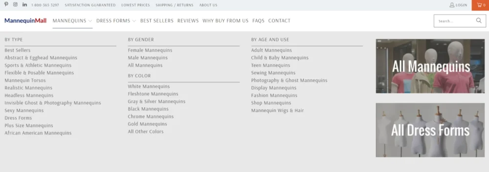
We’ll take a look at how this is done by a successful ecommerce brand. Mannequin Mallis a fashion mannequin retailer that demonstrates how disciplined navigation handles scale without sacrificing clarity.
Their catalog spans hundreds of products across different styles, poses, and materials. Instead of overwhelming shoppers with every option at once, they use straightforward category labels like “Realistic Mannequins,” “Dress Forms,” and “Child & Baby Mannequins.” Filters refine results by type, gender, color, age, and use, without cluttering the main menu. Breadcrumb trails show exactly where you are within their inventory.
This predictable structure respects the shopper’s time and reduces the mental effort required to browse. It allows Mannequin Mall to keep visitors engaged deeper inside their catalog, proving that navigation discipline directly supports business goals, whether you’re selling mannequins or creative services.
Source: mannequinmall.com
Above-the-Fold Design That Earns Credibility
Visitors begin forming an opinion about your website in as little as 0.05 seconds . That’s faster than a single blink.
For creative professionals, this means your above-the-fold area carries an enormous burden. It must simultaneously demonstrate your aesthetic sensibility and convince someone you’re legitimate before they scroll.
A beautiful hero image alone won’t accomplish this. You need intentionalcontent hierarchy that says who you are, what you do, and why someone should trust you.
To excel in this area:
- Audit your current above-the-fold space with fresh eyes.
- Remove any vague welcome messages or self-indulgent animations that delay comprehension.
- Place your strongest credibility marker front and center. This could be a concise headline naming your specialty, a recognizable client logo array, or a specific outcome you deliver.
- Ensure your headline uses plain language that potential clients actually search for, not internal jargon.
- Pair it with a single, obvious CTA.
- Compress your image files so the hero section loads instantly on mobile connections.
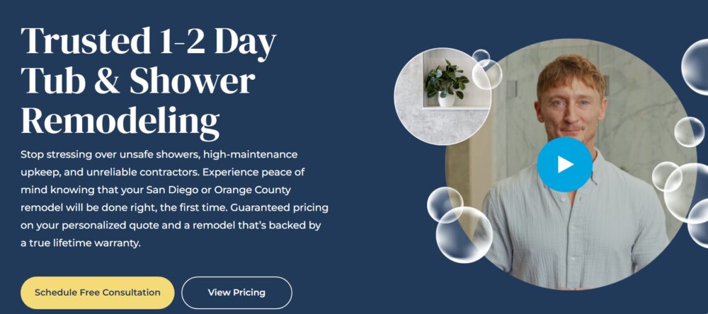
Shugarman’s Bath, a shower and tub remodeling service, masters this principle immediately. Their homepage headline reads “Trusted 1-2 Day Tub & Shower Remodeling.” That single line accomplishes heavy lifting. It promises speed, a top priority during disruptive home renovations, and confronts skepticism directly with the word “trusted.”
The supporting copy addresses specific homeowner anxieties about unsafe showers and unreliable contractors. They reinforce their position with a guaranteed price and a true lifetime warranty.
For a creative’s website, the lesson translates clearly. Identify the precise fear or hesitation your clients carry and address it above the fold with the same directness Shugarman’s Bath applies to remodeling concerns.
Source: shugarmansbath.com
Consistent Branding Choices That Strengthen Confidence
A single off-brand color or mismatched typeface can unsettle a visitor the way a wrong note disrupts a melody.
For artists, designers, and typographers, this sensitivity runs deeper than for most audiences. Your peers and clients notice when your portfolio uses one grid system, your invoice template another, and your social graphics something else entirely. That inconsistency whispers disorganization, even if your individual pieces shine.
On the other hand, cohesive branding across every touchpoint signals professionalism and attention to detail.
To excel in this area:
- Build a simple brand guide even if you work solo.
- Define your exact color hex codes, choose two typefaces with clear usage rules, and settle on a consistent logo placement.
- Apply these decisions everywhere – on your website, email signatures, proposal documents, and social media templates.
- Audit your online presence quarterly. Look for outdated profile images, stray fonts creeping into client presentations, or color variations that stray away from your palette.
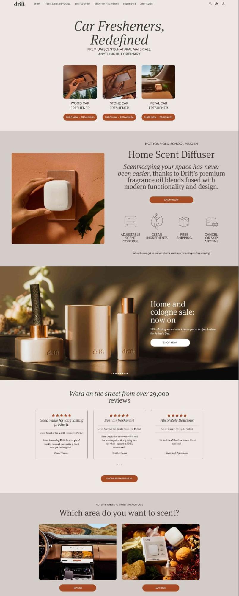
Drift, a home and auto air freshener company , demonstrates how disciplined branding elevates everyday products into something people trust and remember. As you navigate their website, you’ll encounter minimalist layouts, deliberately restrained color palettes, and product photography that maintains consistent lighting and composition across every item.
The brand’s visual consistency reinforces its positioning as a premium choice in a category often dominated by loud packaging and disposable aesthetics.
For creative professionals, Drift’s approach offers a clear parallel. Whether you’re selling air fresheners or design services, the consistency of your visual language directly shapes how seriously people take your work. Every touchpoint either strengthens confidence in your brand or quietly erodes it.
Source: drift.co
Personalized Experiences That Increase Loyalty
Visitors remember interactions that acknowledge their specific needs. Generic, one-size-fits-all portfolios ask potential clients to do all the work of connecting your skills to their problems.
Interactive content doubles engagement rates compared to static formats, yet most creative websites still present identical experiences to every visitor.
A photographer who shoots both weddings and commercial editorials serves two distinct audiences. Showing both bodies of work simultaneously forces each client type to filter irrelevant material. That small friction costs you attention and trust.
To excel in this area:
- Add one lightweight personalization element to your website this month. A simple project recommendation works well.
- Ask visitors to select their industry or project type, then guide them to a curated gallery subset.
- For solo creatives, a brief self-selection prompt like “I need branding photography” versus “I need event coverage” immediately tailors the browsing path.
- Keep the interaction minimal. Two or three clicks should deliver relevant work samples.
- If you run a service-based studio, consider a concise quiz that directs clients toward the right package or collaboration model.
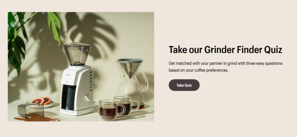
Baratza, a precision coffee grinding equipment company, executes this principle effectively on their homepage. They feature a straightforward quiz prompt inviting visitors to answer three quick questions and discover which grinder suits them best.
This low-commitment entry point immediately signals customer focus without demanding extensive time or personal information. Baratza lets individual brewing habits and preferences guide the recommendation instead of steering everyone toward their most expensive model.
For freelancers, the lesson applies directly. A thoughtful recommendation tool shows that you prioritize solving their particular challenge over making a quick impression.
Source: baratza.com
Layout Choices That Feel More Polished
Cluttered layouts signal amateur work faster than a poorly kerned headline. As graphic designers, artists, and typographers, your layout itself functions as a portfolio piece.
Visitors judge compositional skill before they read a single word. Polished spacing, deliberate grouping, and restrained content density communicate confidence in your work.
When you cram too many elements into a page, you broadcast anxiety that your individual pieces aren’t strong enough to stand with breathing room.
To excel in this area:
- Define consistent padding values between sections and stick to them everywhere.
- Examine each page with a simple test. Can a visitor identify the single most important element within one second? If nothing dominates, you’re asking too much attention from too many objects simultaneously.
- Cut secondary content or move it deeper into your site.
- Limit paragraph widths to roughly 65 characters for comfortable reading.
- Remove any decorative elements that don’t serve a functional purpose. Ornamentation without intent reads as insecurity.
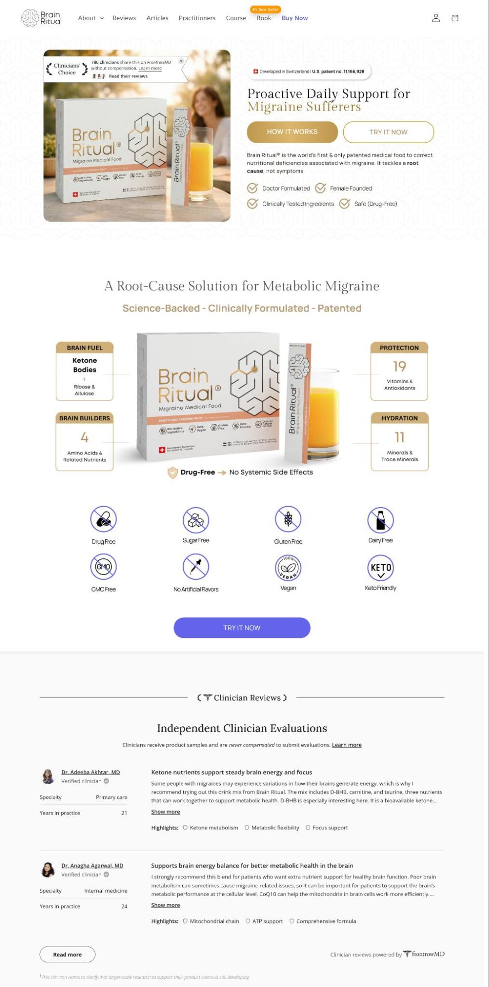
Brain Ritual, a brand creating science-backed supplements for brain health and migraine support , demonstrates how restrained layout choices elevate perceived quality. Their pages employ generous spacing, clean content blocks, and carefully balanced visual composition.
Copy stays concise rather than crowding every available inch with claims. The uncluttered design creates a calm browsing experience that feels intentional and modern.
This approach reinforces a core principle for creative professionals: a layout that respects visual silence signals the same sophistication as a well-composed poster. Whether you’re presenting supplements or design services, letting your content breathe makes your brand feel more premium and worthy of a visitor’s confidence.
Source: brainritual.com
Mobile-Friendly Design That Improves User Experience
Art directors and potential clients browse your portfolio while multitasking. If your site requires pinching, zooming, or squinting on a phone, you’ve already communicated disregard for their convenience.
Today, mobile responsiveness is a baseline courtesy your audience expects from anyone claiming design competence.
A site that performs beautifully on desktop but crumbles on smaller screens suggests you prioritize your own viewing experience over your users’ real-world habits.
To excel in this area:
- Test your site on an actual phone, not just a browser’s responsive preview.
- Check that tap targets for buttons and links measure at least 44 by 44 pixels. Anything smaller frustrates thumbs and signals inattention to interaction design.
- Simplify your navigation for mobile screens. A hamburger menu works, but ensure its contents prioritize the pages visitors need most urgently.
- Compress all images properly so pages load in under three seconds on cellular connections.
- For portfolio-heavy sites, implement lazy loading so images appear as users scroll rather than choking the initial load.
- Test your contact form with one hand. If completing it feels tedious, shorten your fields.
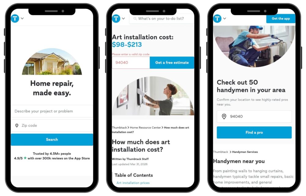
Thumbtack, a marketplace connecting users with local home service professionals, tackles mobile complexity through minimalism and progressive disclosure.
Rather than overwhelming visitors with an exhaustive category list, their interface guides users through specific multiple-choice questions about their project. This step-by-step approach prevents decision fatigue on small screens.
This method offers a direct takeaway for freelancers. Present the most confidence-building information first and defer secondary details behind clear, tappable paths.
Respecting the constraints of mobile screens while still delivering substance proves you understand how busy, discerning clients actually evaluate creative talent.
Thumbtack Mobile – 1
Source: thumbtack.com
Social Proof Design That Builds Reassurance
A potential client lands on your portfolio after hearing your name from a colleague, then immediately searches for validation. They scan for recognizable logos, client quotes, or testimonial snippets before they ever contact you.
Research now shows the trust equivalence between peer reviews and personal recommendations has reached 88% , fundamentally altering how credibility is built online.
Your website must be designed around this reality rather than treating social proof as decoration, tucked away on a buried page.
To excel in this area:
- Pull testimonials out of isolation and weave them into the pages where decisions happen.
- Place a specific client quote next to relevant project images instead of corralling all praise onto one generic testimonials page.
- Feature recognizable client logos on your homepage, but curate them. Five respected names build more confidence than twenty unknown ones.
- If clients allow it, include project outcomes in their own words, not sanitized marketing language.
- For service-based pros, add a concise “What Clients Say” strip near your contact form or booking area.
- Refresh these elements regularly. Stale testimonials from five years ago suggest you haven’t done meaningful work recently.
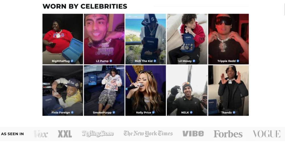
Icecartel, a moissanite jewelry company , embeds social proof throughout their entire shopping experience rather than isolating it on a single review page.
Customer reviews, user-generated imagery, press mentions, and highly visual product photography work together to make luxury purchases feel safer and more validated. These trust signals appear naturally alongside product discovery.
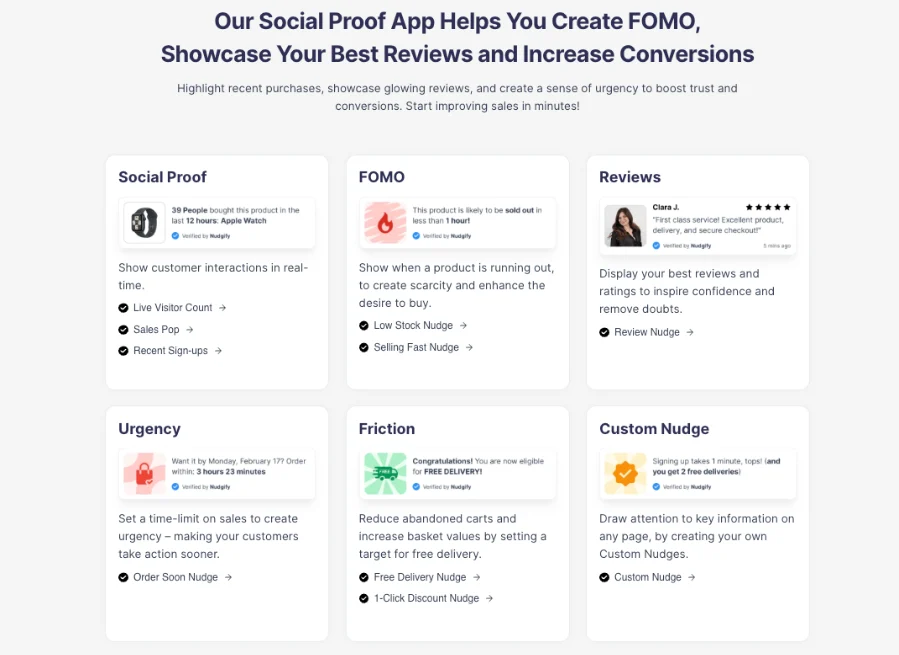
Another effective way to reinforce social proof is through real-time trust signals. Tools like Nudgify display recent purchases, signups, reviews, and customer activity directly on a website. When implemented thoughtfully, these notifications provide visitors with immediate evidence that others are engaging with a business, helping reduce uncertainty and encouraging action. Combined with testimonials and client logos, real-time social proof can strengthen credibility at key decision-making moments.
This integration offers a clear model for creative professionals. Weave client logos into project case studies, place pull quotes beside portfolio images, and position your strongest testimonial where contact decisions happen.
When reassurance arrives at the moment of doubt rather than requiring a separate search, you remove friction between interest and action.
Source: icecartel.com
Final Thoughts
Strong user engagement and trust come from deliberate design choices that support clarity, consistency, and ease of interaction.
Those choices simply remove the friction between a visitor’s skepticism and their decision to hire you.
Pick one section from this article and implement it this week. Small, deliberate adjustments compound into a site that displays your talent and actively convinces people to bet on it.