In this article:
- Where Print Files Break Down
- Printables as a Product Line
- The Proofing Cost Designers Underestimate
- Match the Hardware to the Work
- Specify Paper Like It's Part of the Design
- A Niche Worth Knowing: Educational Printables
- Build a Repeatable Print Workflow
Most designers come up through the screen. The portfolio is digital, the clients review on monitors, the deliverables are files. So when a project crosses into print, a client deliverable, a physical proof, or a line of digital printables sold to customers, a lot of otherwise strong designers discover that print has its own rules and its own economics that screen work never taught them. A layout that’s flawless in the design app can come back from the printer with shifted color, lost detail, or trimmed-off elements, and the cost of feeding a printer through rounds of proofing can quietly eat into a project’s margin. Handling the print side well is part craft and part cost control. Here’s how working designers do both.
Where Print Files Break Down
Designers who live in RGB and assume the printer will sort out the rest are the ones who get surprised. Color is the usual culprit, the vivid blues and greens that glow on a calibrated monitor sit outside the CMYK gamut and come back from print dull or shifted. Building print files in the right color space from the start, soft-proofing against the output profile, and not trusting the screen’s rendition of saturated color are the habits that separate clean print deliverables from disappointing ones.
The other recurring failures are technical and entirely preventable. Images placed at screen resolution that pixelate at 300 dpi. Missing bleed on full-bleed layouts, leaving white slivers after trim. Text or logos sitting outside the safe zone and getting clipped. None of these are design problems, they’re file-prep problems, but the client experiences them as the designer’s failure. Getting resolution, bleed, and safe margins right is non-negotiable baseline work for anyone handing off print files.
Printables as a Product Line
For designers building a digital-product business, printables are an appealing line, design once, sell repeatedly, no inventory. But selling a printable is different from delivering a client file, because the customer is printing it themselves on an unknown printer with unknown paper. The design has to survive that uncertainty. A product that looks gorgeous on your proof but prints muddy on a customer’s home inkjet generates refunds and bad reviews.
That pushes the design toward robustness: high contrast that holds up across printers, layouts that read correctly in grayscale for customers without color, ink-conscious backgrounds that don’t demand a full cartridge per page, and clear instructions so buyers get a good result. The designer’s job expands from making it beautiful to making it reliably reproducible in conditions you can’t control. The most successful printable shops obsess over this, because their reviews live or die on how the product performs in a stranger’s printer.
The Proofing Cost Designers Underestimate
Here’s the part that erodes margin quietly: proofing. Any print project worth doing right goes through multiple physical proofs, and for designers running their own in-house printing, ink and toner are a real recurring cost that rarely makes it into a project quote. Run enough proofs across enough projects and the cartridge spend becomes a line item you should have been accounting for all along.
Sourcing supplies deliberately rather than grabbing overpriced cartridges at the nearest store changes the economics. Selltoner.com is worth comparing on cartridge pricing across the major printer brands, and pricing out your real cost-per-proof through a supplier like selltoner.com often exposes how much a “cheap” office printer actually costs to run once you’re proofing regularly. The designers who track this build it into their rates; the ones who don’t absorb it silently out of their own margin, project after project.

Get 300+ Fonts for FREE
Enter your email to download our 100% free "Font Lover's Bundle". For commercial & personal use. No royalties. No fees. No attribution. 100% free to use anywhere.
Match the Hardware to the Work
The printer on your desk shapes both your proofing quality and your cost per page, and the right machine depends on what you proof most. Inkjets render color and photographic work beautifully and are the better proofing tool for image-heavy or color-critical design, but they cost more per page and can smudge. Laser units are faster, far cheaper per page at volume, and produce razor-sharp text, which suits designers proofing type-driven layouts and document work.
Choosing wrong is an expensive mistake hiding in plain sight. A color-critical designer trying to proof on a basic laser misjudges their color all day; a designer running high volumes of layout proofs on a photo inkjet pays a fortune in ink for output a laser would have done cheaper and crisper. The smart move is to match the proofing hardware to the kind of work you actually produce, not to the most impressive spec sheet.
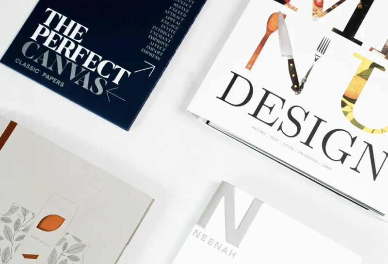
Specify Paper Like It’s Part of the Design
Designers will agonize over a layout and then proof it on whatever stock is loaded in the tray, and then wonder why the proof feels off. Paper is a design decision. Weight, finish, and brightness change how color reads, how the piece feels in hand, and whether the final output matches the intent. Specifying stock for client print runs, and proofing on something close to the final paper, keeps the proof honest and the client’s expectations aligned with reality.
This also feeds directly into client communication. A designer who can speak to paper weight, coated versus uncoated, and how finish affects ink coverage looks like a professional who owns the whole print process, not just the file. It’s a small area of expertise that pays off in client trust and in fewer surprises when the real run comes back from the commercial printer.
A Niche Worth Knowing: Educational Printables
One printable niche worth a designer’s attention is educational materials, because it’s a large, steady market with specific design demands. Resources like these 5th grade english worksheets are a useful reference point for what works in the category, clear hierarchy, generous writing space, grayscale-friendly layouts, and instructions that hold up when a teacher prints a class set on a basic machine. For a designer studying the space, they demonstrate exactly how usability constraints shape educational design.
Designing in this niche means subordinating aesthetics to function in a way some designers find unfamiliar. The page has to be writable, printable in volume, legible to a child, and clear to a teacher scanning it quickly. Studying well-made examples in the category teaches a designer the genre conventions, and the discipline of designing for heavy real-world use, that this kind of work rewards.
Build a Repeatable Print Workflow
The designers who handle print smoothly aren’t reinventing it each time; they’ve built a workflow. Templates with correct color space, bleed, and margins baked in. A proofing routine that catches problems before the client ever sees them. Documented printer settings and paper choices that produce reliable results. A clear sense of their true cost-per-page so print work gets quoted accurately instead of bleeding margin.
Standardizing all of this turns print from the unpredictable part of the job into just another controlled process. Proof under realistic conditions, keep notes on what produced good output, account honestly for the recurring cost of supplies, and the print side stops being where projects go sideways. For a designer, mastering it is what makes the difference between dreading print deliverables and adding them confidently to what you offer, making printables that genuinely work on paper, and spending as little as possible to keep producing them.