
In this article:
- The Real Difference Between Serif and Sans Serif Fonts
- What Each Style Says About Your Brand
- Questions to Ask Before Choosing Serif or Sans Serif for Your Logo
- 7 Serif Fonts with Personality and Charm
- 7 Sans Serif Fonts That Carry a Brand
- Using Both: Can a Brand Use Serif and Sans Serif Fonts Together?
- Frequently Asked Questions
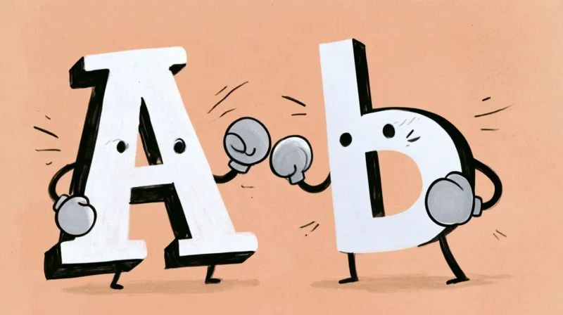
Ask ten designers whether a brand should run serif or sans serif, and you’ll get eleven opinions — plus at least one impassioned tangent about kerning. Here’s the short version: neither typeface family is “better.” They’re not even competing for the same job. Serif fonts tend to signal heritage, craftsmanship, and authority earned over time, while sans serifs signal clarity, modern confidence, and easy approachability. The right choice isn’t about winning some abstract typography contest — it’s about which story your brand is actually trying to tell, and where people will be reading it.
The Real Difference Between Serif and Sans Serif Fonts
A serif is the small stroke or “foot” that finishes off the end of a letter — think of the little flags at the top and bottom of a capital T in Times New Roman. Sans serif fonts (literally “without serif”) strip those details away, leaving clean, uniform strokes with nothing extra hanging off the ends. Serif letterforms trace back to Roman stonecutters chiseling inscriptions into monuments, which is part of why they still carry an air of permanence thousands of years later. Sans serifs are comparatively young, gaining traction in the 19th and 20th centuries alongside industrial design and, later, digital screens. As for readability: serif vs sans serif used to be a real fight, with serifs winning in print and sans serifs winning on low-resolution screens. Modern displays have mostly closed that gap. At normal reading sizes, a well-built font from either family is perfectly legible — context, size, and spacing matter far more than which camp it belongs to.
What Each Style Says About Your Brand
This is where brand personality typography actually gets decided — not in a readability chart, but in the personality your brand wants to project the moment someone sees it.
Serif territory covers heritage, craftsmanship, editorial authority, and luxury — the kind of trust that comes from having been around long enough to earn it. Law firms, universities, publishers, heritage fashion houses, and premium food and beverage brands tend to live here, because a serif quietly implies “we’ve done this before, and we’ve done it well.”
Sans serif territory covers clarity, innovation, friendliness, and digital-first confidence. Tech startups, healthcare apps, direct-to-consumer brands, and anything that needs to feel immediate and unpretentious tends to reach for a sans serif, because clean letterforms read as modern without trying too hard.
None of this is a formula, though. Plenty of luxury brands run confidently on sans serifs, and plenty of tech companies have adopted serif logotypes specifically to stand out from a sea of geometric sameness. The honest truth is that this is a positioning decision, not a rule. Your job here is simply to decide what you want to signal, then pick the typeface family that backs it up.
Questions to Ask Before Choosing Serif or Sans Serif for Your Logo
Before you decide whether to go serif or sans serif for your logo, work through a few practical questions:
Get 300+ Fonts for FREE
Enter your email to download our 100% free "Font Lover's Bundle". For commercial & personal use. No royalties. No fees. No attribution. 100% free to use anywhere.
- Where will your brand live most? A logo destined for packaging and print can carry more serif detail than one that needs to render crisply as a tiny app icon or favicon.
- What do your competitors use? Matching the dominant style in your category blends in and signals “I belong here.” Contrasting against it makes you the one people notice.
- How much long-form text will your brand produce? Blogs, whitepapers, and product manuals benefit from a workhorse font built for paragraphs, not just a punchy headline.
- Does your name already set an expectation? A brand called “Heritage Trust” fighting against a bubbly, ultra-modern sans serif is working against itself.
- Will one typeface carry everything, or will you pair a serif with a sans serif for different roles? There’s no rule that says you have to pick just one — more on that below.
7 Serif Fonts with Personality and Charm
Knowing when to use serif fonts starts with knowing what serif fonts say about a brand: heritage, credibility, and a story that predates the current news cycle. Browse Envato’s serif catalog for the full range, or start with these seven picks — each one strong enough to lead a brand identity on its own, not just dress up a headline.
Wanderlust – Soft Vintage Typeface
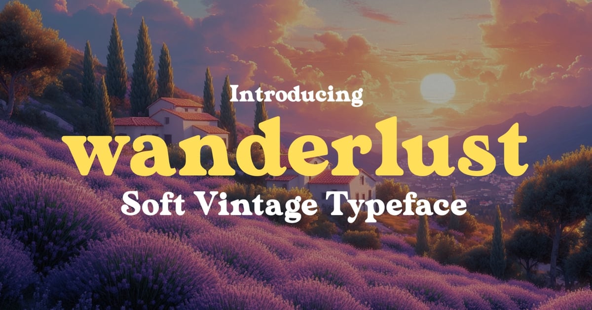
Wanderlust is a warm, nostalgic serif font that captures the charm of hand-painted signage from decades past. Its softened edges and vintage letterforms bring authenticity to branding projects, packaging design, and editorial layouts that need a touch of retro character. The typeface balances classic proportions with gentle imperfections that feel organic and approachable. It works beautifully for travel journals, artisan product labels, and heritage-inspired identities. The collection includes uppercase and lowercase alphabets, numbers, punctuation, and multilingual characters, delivered in both OTF and TTF formats for flexible use across digital and print applications.
Trendy Voyage – Modern Retro Serif
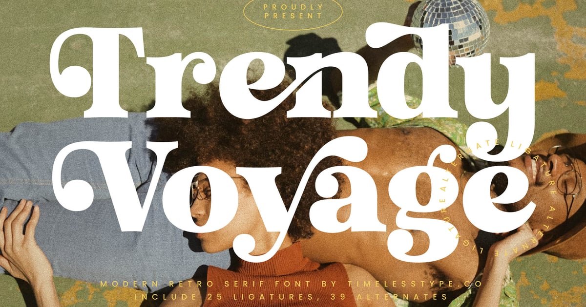
Trendy Voyage blends nostalgic typographic charm with contemporary refinement, creating a distinctive serif font that recalls mid-century design sensibilities. Its bold weight and clean letterforms make it particularly effective for headlines, packaging, and brand identity work that demands both personality and legibility. The typeface supports multilingual characters and includes a full complement of uppercase and lowercase glyphs, numbers, and punctuation. Available in standard font formats, it brings vintage-inspired sophistication to editorial layouts, poster designs, and visual identities seeking that perfect balance between retro appeal and modern polish.
Nomadic Dreams
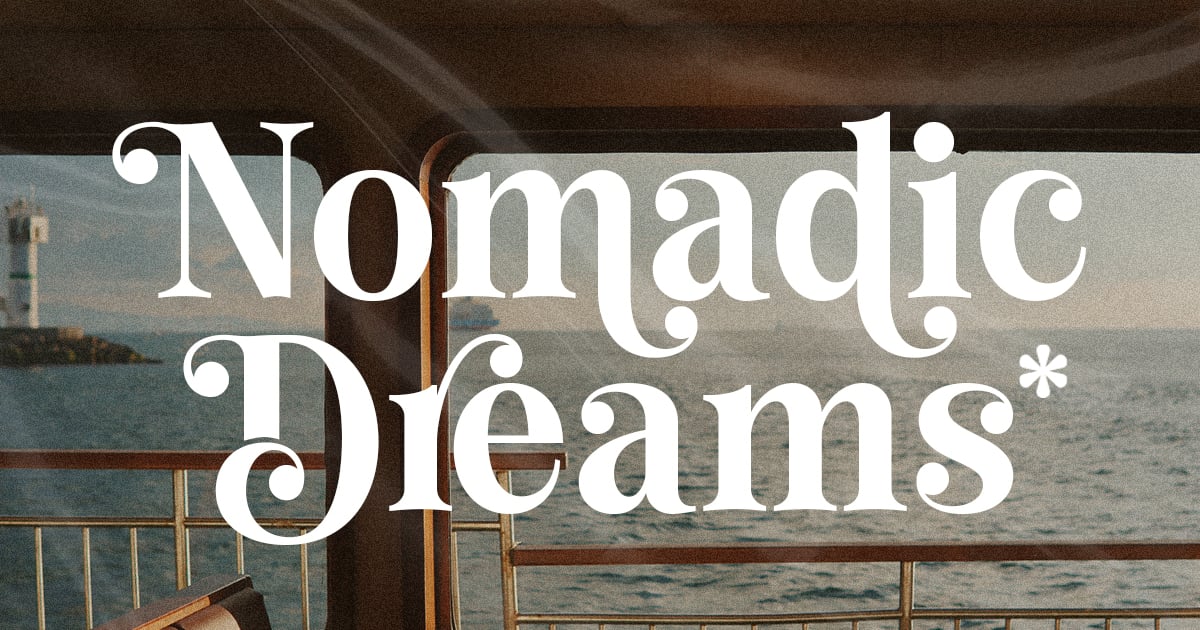
Nomadic Dreams captures the spirit of adventure with its distinctive letterforms that blend vintage travel aesthetics and contemporary elegance. This serif font balances refined sophistication with an exploratory edge, making it well-suited for luxury branding, editorial headlines, and packaging design. The typeface features both uppercase and lowercase letters with carefully crafted details that evoke wanderlust and timeless style. It includes full multilingual support to accommodate international projects, along with numerals and punctuation. Files are provided in TTF and OTF formats for seamless integration across digital and print applications.
Wildest – Classical Serif
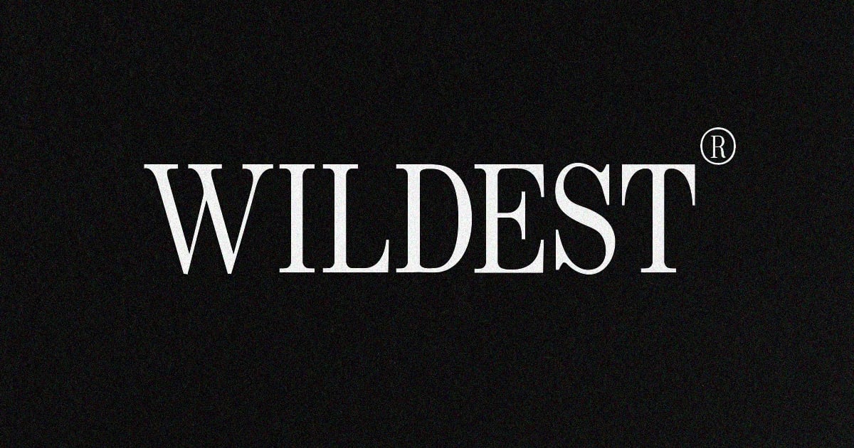
Wildest is a classical serif font that brings timeless elegance to contemporary design projects. Its traditional letterforms feature refined details and balanced proportions that evoke vintage typography while remaining highly readable. The typeface works beautifully for editorial layouts, luxury branding, book covers, and formal invitations where sophistication is essential. With its nostalgic charm and structured composition, Wildest offers designers a versatile tool for projects requiring both authority and grace. The font supports standard character sets and comes ready to use in common font formats.
Serif font with Italics
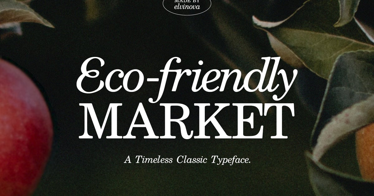
This refined serif font brings traditional elegance together with expressive italic variants, offering designers a versatile toolkit for sophisticated projects. The typeface balances classical proportions with contemporary clarity, making it well-suited for editorial layouts, book design, branding materials, and formal invitations. Its italic styles add graceful emphasis and rhythmic flow to body text. As a serif font rooted in timeless typographic principles, it delivers both authority and readability across print and digital applications. The package provides standard character sets with uppercase, lowercase, numerals, and punctuation marks.
Avenue – Nostalgic Serif
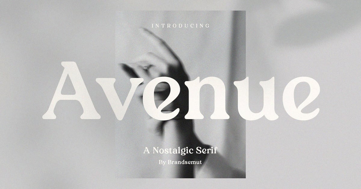
Avenue is a nostalgic serif font that channels vintage elegance with contemporary refinement. Its classic letterforms feature graceful serifs and balanced proportions that evoke mid-century typography while remaining perfectly suited for modern design work. The typeface excels in editorial layouts, luxury branding, wedding stationery, and packaging where a touch of timeless sophistication is desired. Avenue includes uppercase and lowercase characters, numerals, and punctuation. Files are provided in both OTF and TTF formats for seamless integration across design platforms.
Mildora Modern Bold Serif Font
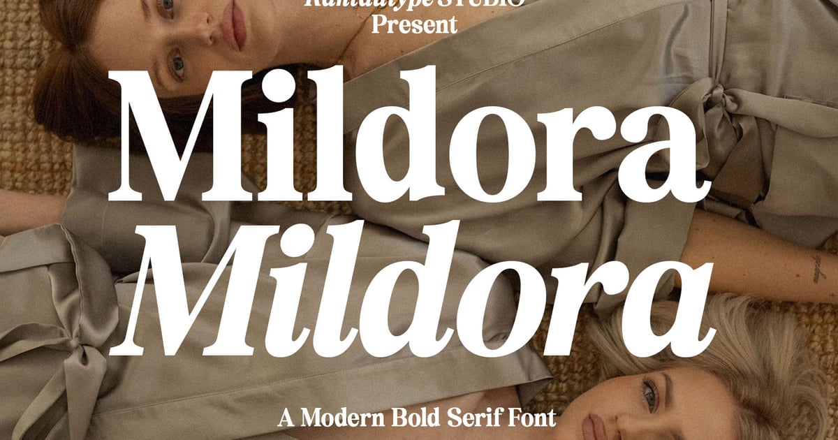
Mildora Modern Bold Serif Font brings a confident, retro-inspired aesthetic with strong letterforms that command attention. Its heavy weight and vintage character make it particularly effective for headlines, editorial layouts, poster designs, and branding projects that need visual impact. The typeface captures the spirit of 1970s typography while maintaining contemporary refinement. This serif font balances boldness with elegance, making it suitable for fashion magazines, album covers, and packaging that requires a distinctive voice. The design works especially well when paired with minimalist layouts that let its personality shine through.
7 Sans Serif Fonts That Carry a Brand
Knowing when to use sans serif fonts comes down to one question: does your brand need to feel instantly clear, modern, and easy to trust at a glance? If so, Envato’s sans serif catalog is worth a deep browse. Here are seven fonts with enough personality to be the brand, not just the label.
Mallo Bold – Chunky Display Typeface
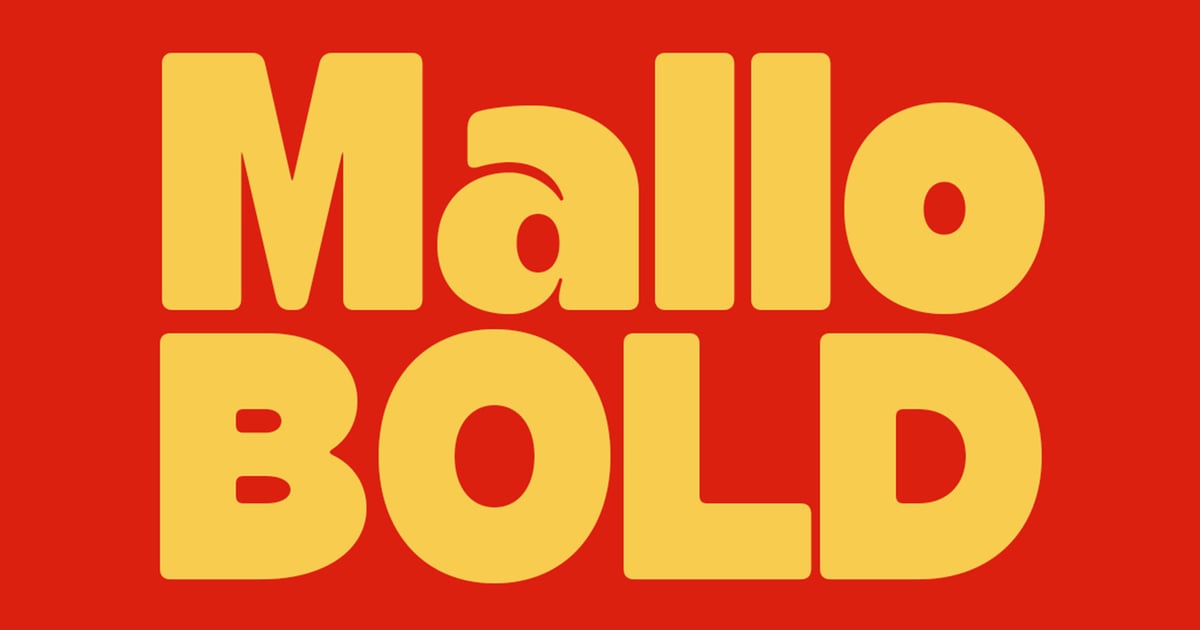
Mallo Bold is a playful sans serif font that brings personality and warmth to display typography. Its chunky letterforms feature soft, rounded corners that create an approachable and friendly aesthetic, perfect for children’s books, packaging design, poster headlines, and casual branding projects. The typeface’s bold weight ensures excellent visibility and impact across both print and digital applications. With its distinctive character and inviting presence, Mallo Bold works particularly well when you need typography that feels both contemporary and welcoming, making it an ideal choice for projects targeting younger audiences or brands seeking a cheerful, informal voice.
Ragnor Bold
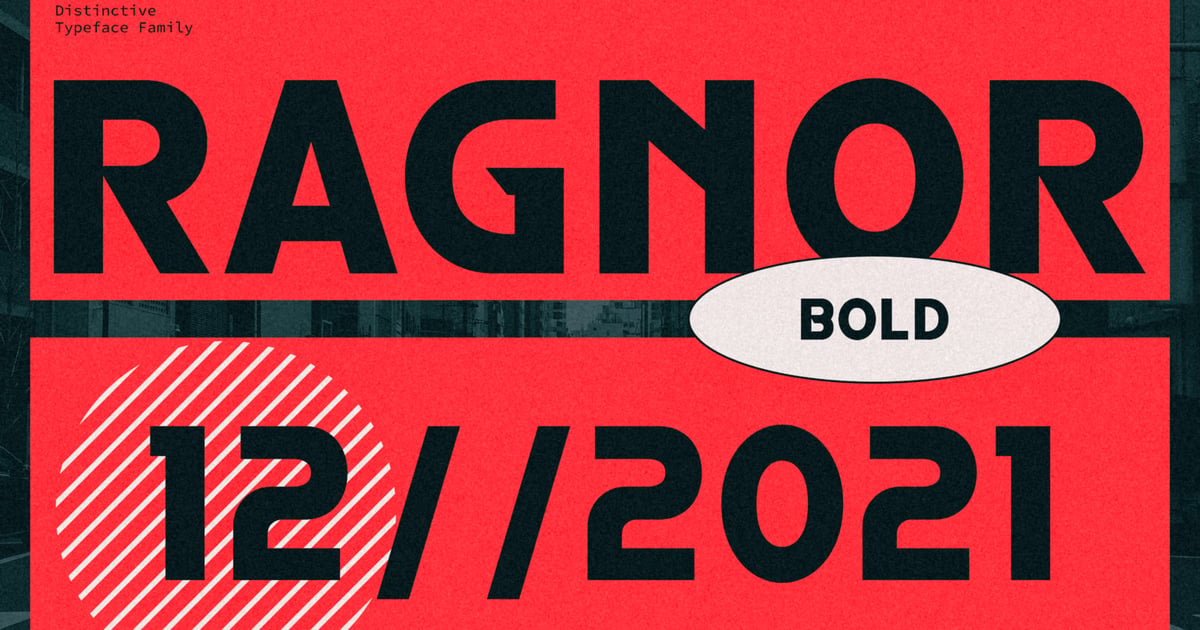
Ragnor Bold brings a striking, forward-thinking aesthetic to display typography with its commanding presence and geometric precision. This sans serif font works exceptionally well for poster designs, tech branding, gaming interfaces, and editorial headlines where impact matters. Its bold weight delivers maximum visibility while maintaining clean, contemporary letterforms that feel both industrial and refined. The typeface supports standard punctuation and numerals, making it suitable for headline-focused projects that demand attention. Perfect for designers seeking a powerful, modern voice in their visual communications.
Confine – A Modern Sans Serif Font
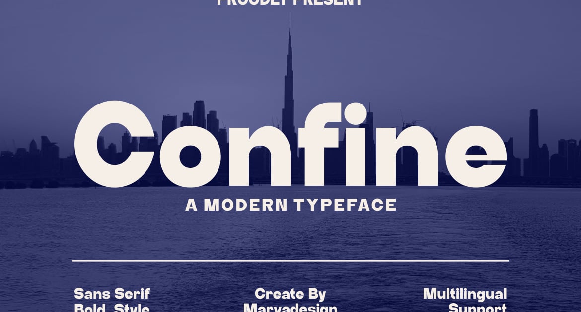
Confine is a sleek sans serif font built for contemporary design projects that demand clarity and sophistication. Its geometric letterforms strike a balance between minimalist restraint and approachable warmth, making it equally suited for editorial headlines, branding systems, and digital interfaces. The typeface features clean lines and generous spacing that enhance readability across print and screen applications. With its refined proportions and modern aesthetic, Confine works particularly well for tech startups, creative portfolios, and lifestyle brands seeking a polished yet accessible visual voice.
Moue – Bold Rounded Display Font
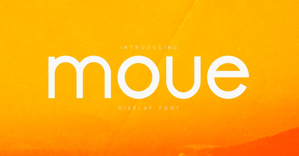
Moue is a confident, playful sans serif font defined by its chunky rounded terminals and bold personality. The soft geometric curves give it an approachable, contemporary feel that works beautifully for headlines, packaging, children’s content, and eye-catching branding projects. Its substantial weight commands attention while maintaining a friendly warmth that resonates across digital and print applications. The typeface supports multiple languages and includes a complete set of uppercase and lowercase letters, numbers, and essential punctuation. Files are provided in both OTF and TTF formats for flexible use across design platforms.
Serifora – Modern Minimal Sans Serif
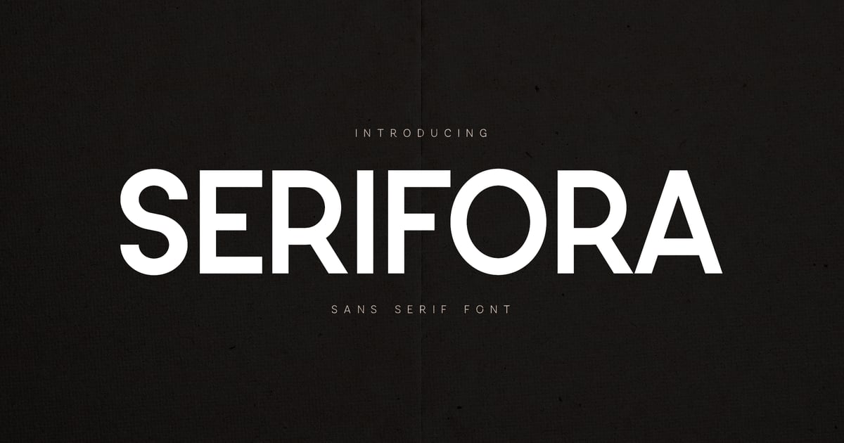
Serifora brings a contemporary, pared-back aesthetic to typography with its clean lines and geometric precision. This sans serif font excels in editorial layouts, brand identities, and digital interfaces where clarity and sophistication matter most. Its minimal approach emphasizes legibility while maintaining visual interest through carefully balanced proportions. The typeface includes full multilingual support along with uppercase and lowercase characters, numerals, and punctuation marks. Available in both TTF and OTF formats, Serifora adapts seamlessly across print and screen applications where modern simplicity is essential.
Pageto – Typeface Sans Serif Font
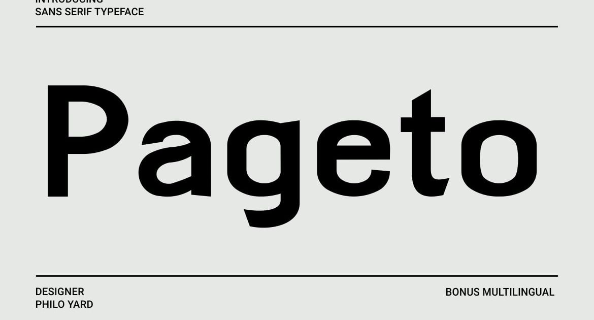
Pageto is a contemporary sans serif font that balances geometric precision with approachable warmth. Its clean letterforms feature subtle rounded terminals and consistent stroke weights, creating a harmonious rhythm across text settings. The family includes both variable and bold weights, offering flexibility for hierarchical typography in branding, editorial layouts, and digital interfaces. With its professional yet friendly demeanor, Pageto works equally well for headlines and body copy, making it a versatile choice for modern design projects that require clarity without sterility.
Behavior – Modern Sans Serif
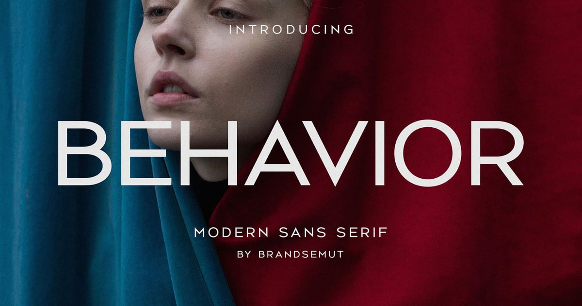
Behavior is a clean, contemporary sans serif font built for clarity and impact across modern design projects. Its geometric letterforms and balanced proportions make it equally suited for headlines, branding systems, and editorial layouts where legibility matters. The typeface includes both standard character sets and logotype variations, giving designers flexibility for wordmarks and custom lettering solutions. With its refined structure and neutral aesthetic, this sans serif font adapts seamlessly to minimalist interfaces, corporate identities, and digital applications. Files are provided in standard font formats for desktop and web use.
Using Both: Can a Brand Use Serif and Sans Serif Fonts Together?
Here’s the escape hatch from the false binary: most mature brands don’t pick a side at all. They pair a serif and a sans serif and give each one a job. A common split is a serif for headlines and a sans serif for body copy and UI — or the reverse, if you want warmth in the small details and clarity in the big statements. One typeface should lead and set the tone, and the other should support it quietly, without competing for attention.
Frequently Asked Questions
Is serif or sans serif better for a logo?
Neither is universally better — it depends on where your logo will be seen and what you want it to say. Serif logos tend to feel established and trustworthy, which works well in print, packaging, and any context with room for detail. Sans serif logos scale cleanly down to tiny sizes like favicons and app icons, making them a safer default for digital-first brands.
What does a serif font say about a brand?
A serif font signals heritage, craftsmanship, and authority earned over time. It suggests permanence and tradition, which is why law firms, universities, publishers, and luxury brands frequently choose serif typefaces. The small strokes at the end of each letter echo historic engraving and printing, lending a sense of trust that’s harder to fake with a cleaner, more modern typeface.
Are sans serif fonts easier to read?
On modern screens, the readability gap between serif and sans serif has mostly closed. Sans serifs historically had an edge in small digital text because of low screen resolution, but today’s high-resolution displays render both styles clearly. At normal reading sizes, legibility comes down more to spacing, weight, and font quality than to whether the letters have serifs at all.
Can a brand use both serif and sans serif fonts?
Yes, and many established brands do exactly that. The typical approach pairs one font for headlines and another for body text or UI elements, giving the brand both personality and practical readability. The key is assigning each font a clear role rather than letting them compete for the same job on the page.