
In this article:
- How We Chose These Fonts
- The Best Modern Serif Fonts for Contemporary Branding
- Classic Serif Typefaces That Never Go Out of Style
- Elegant Serifs with a Premium Feel
- Readable Serifs for Body Text and Long-Form Content
- Bold Display Serifs for Headlines
- What Makes a Serif Font Worth Using?
- Strong, Considered Proportions
- Contrast That Matches Its Purpose
- A Family with Range
- Character Without Eccentricity
- When to Choose a Serif Over a Sans Serif
- How to Choose the Right Serif Font for Your Project
- Start with Where It Will Actually Live
- Check the Full Weight Range Before You Commit
- Match the Contrast Level to the Brief
- Test It at Scale and at Size
- Consider the Licensing
- Alternatives to Consider When Serifs Aren't Quite Right
- Slab Serifs
- Humanist Sans Serifs
- Transitional Display Faces
- Frequently Asked Questions
- What is the most popular serif font right now?
- What serif fonts are best for branding?
- What's the difference between old style, transitional, and modern serifs?
- Are serif fonts hard to read on screens?
- The Case for Caring About Your Serifs
If you asked me to defend the serif font to a skeptic, I’d start with three names: a modern workhorse that holds up across branding and editorial, a timeless transitional that’s been quietly powering books and magazines for decades, and a high-contrast stunner built for headlines that stop you mid-scroll. I’ll get to the full list in a moment, but those three represent the spectrum this roundup covers — breadth of personality, not just polish.
This article pulls together the best serif fonts available right now, across five clear categories: modern serifs for contemporary branding, classic typefaces that resist trend cycles, elegant premium picks, readable body-text workhorses, and bold display faces for headlines and packaging. If you want to browse the wider universe before diving in, Envato’s serif catalog is a solid starting point.
How We Chose These Fonts
Readability at text sizes was non-negotiable — a beautiful font that turns to mush at 10pt didn’t make the cut. Weight and style range mattered too, because a typeface that only works in one weight is a typeface that will eventually box you in. Every font here earns its place by performing across both print and digital contexts, not just looking good in a mockup. And each one has genuine, distinguishing character — something that makes it recognizably itself, not just another generic serif filling a slot.
The Best Modern Serif Fonts for Contemporary Branding
Modern serif fonts walk a precise line: they carry the authority and warmth that serifs are known for, without looking like they belong on a Victorian-era apothecary label. These picks bring that balance to life across brand identities, editorial design, and everything in between.
Luxury Elegance – Modern Serif
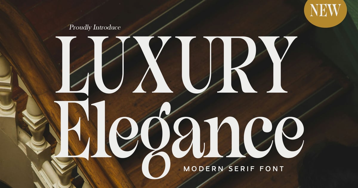
Luxury Elegance brings sophistication to contemporary design with refined letterforms that balance traditional typographic principles and sleek, minimalist details. This modern serif font features clean lines and graceful proportions that work beautifully for high-end branding projects, wedding stationery, and editorial layouts. The typeface includes uppercase and lowercase characters, numbers, and punctuation marks to support a wide range of creative applications. Its polished aesthetic makes it particularly effective for luxury brands, elegant invitations, and premium packaging designs. Available in standard font formats for seamless integration into any design workflow.
Qurio Modern Serif Display
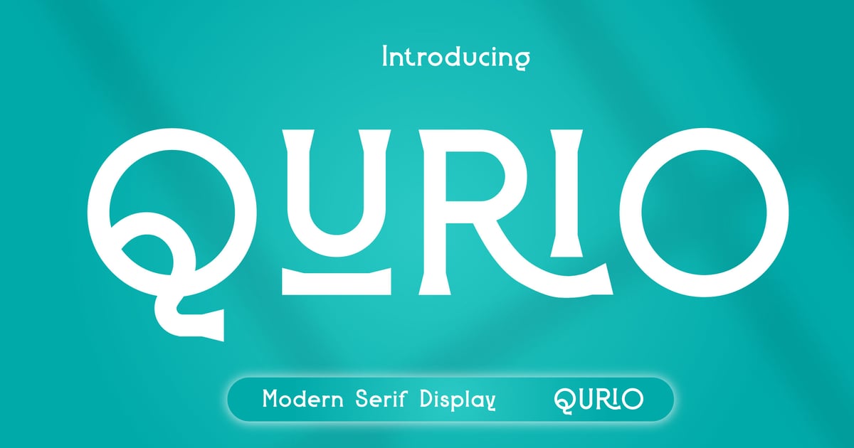
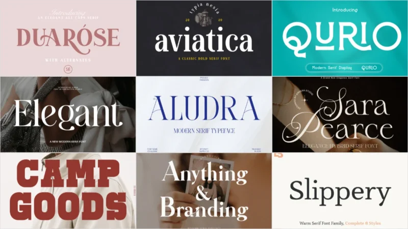
Qurio Modern Serif Display brings contemporary refinement to traditional letterforms with its clean lines and distinctive character shapes. This modern serif font balances sophistication with approachability, making it well-suited for editorial headlines, upscale branding, and luxury packaging designs. The typeface works particularly well at larger sizes where its carefully crafted details can shine. Perfect for projects requiring both elegance and readability, Qurio includes uppercase and lowercase alphabets, numerals, and essential punctuation. The font is delivered in standard desktop formats for easy integration into your design workflow.
Magode – Collection Modern Serif

Magode is a distinctive modern serif font collection that emphasizes dramatic contrast between thick and thin strokes. Its refined letterforms bring sophistication to editorial layouts, luxury branding, and elegant packaging designs. The high-contrast aesthetic gives headlines and display text a bold, contemporary presence while maintaining classical proportions. This typeface works beautifully for fashion magazines, upscale product labels, and refined digital content where visual impact matters. The collection supports multilingual typography and includes a complete character set with uppercase and lowercase letters, numerals, and punctuation marks in both OTF and TTF formats.
Get 300+ Fonts for FREE
Enter your email to download our 100% free "Font Lover's Bundle". For commercial & personal use. No royalties. No fees. No attribution. 100% free to use anywhere.
Aludra – Modern Serif Font
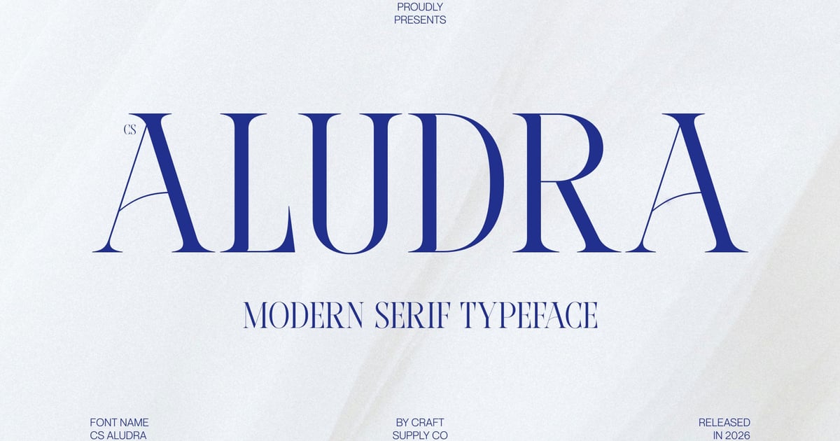
Aludra is a refined modern serif font that balances classical typography with contemporary elegance. Its letterforms feature clean lines and graceful proportions that work beautifully across both print and digital applications. The typeface shines in editorial layouts, luxury branding, wedding stationery, and sophisticated packaging design. With its polished aesthetic, Aludra brings a sense of timeless refinement to headlines and display text while maintaining excellent readability. The font supports standard character sets and comes in accessible formats, making it a versatile choice for designers seeking understated sophistication in their projects.
Louries – Modern Elegant Serif
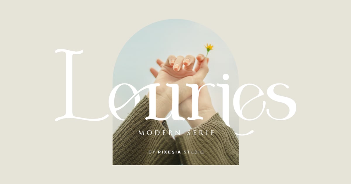
Louries brings sophistication and refinement to editorial design with its carefully balanced letterforms and graceful proportions. This modern serif font features clean lines paired with distinctive details that evoke both classic typography and contemporary aesthetics. The typeface works beautifully for luxury branding, magazine headlines, wedding stationery, and upscale packaging where elegance matters. With multilingual capabilities, uppercase and lowercase alphabets, numerals, and essential punctuation marks included, Louries delivers versatility across print and digital projects. Available in standard font formats for seamless integration into any design workflow.
Milcora Modern Ligature Serif
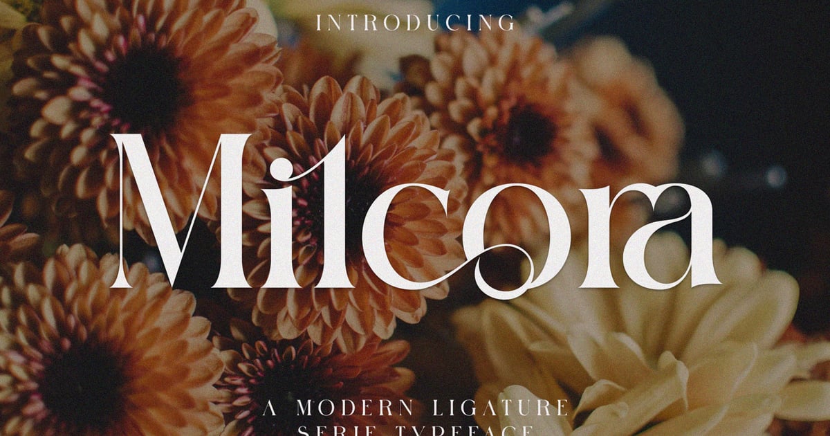
Milcora Modern Ligature Serif brings sophisticated elegance to editorial and branding projects through its refined letterforms and thoughtfully crafted ligatures. This modern serif font balances traditional typographic principles with contemporary styling, making it particularly effective for luxury packaging, magazine headlines, and upscale identity work. The design features graceful proportions and distinctive character details that elevate any layout. With comprehensive language support and professional-grade OpenType features, Milcora delivers versatility across print and digital applications. Files are provided in both TTF and OTF formats for seamless integration into any creative workflow.
Modern Serif Display Font – Birchmore
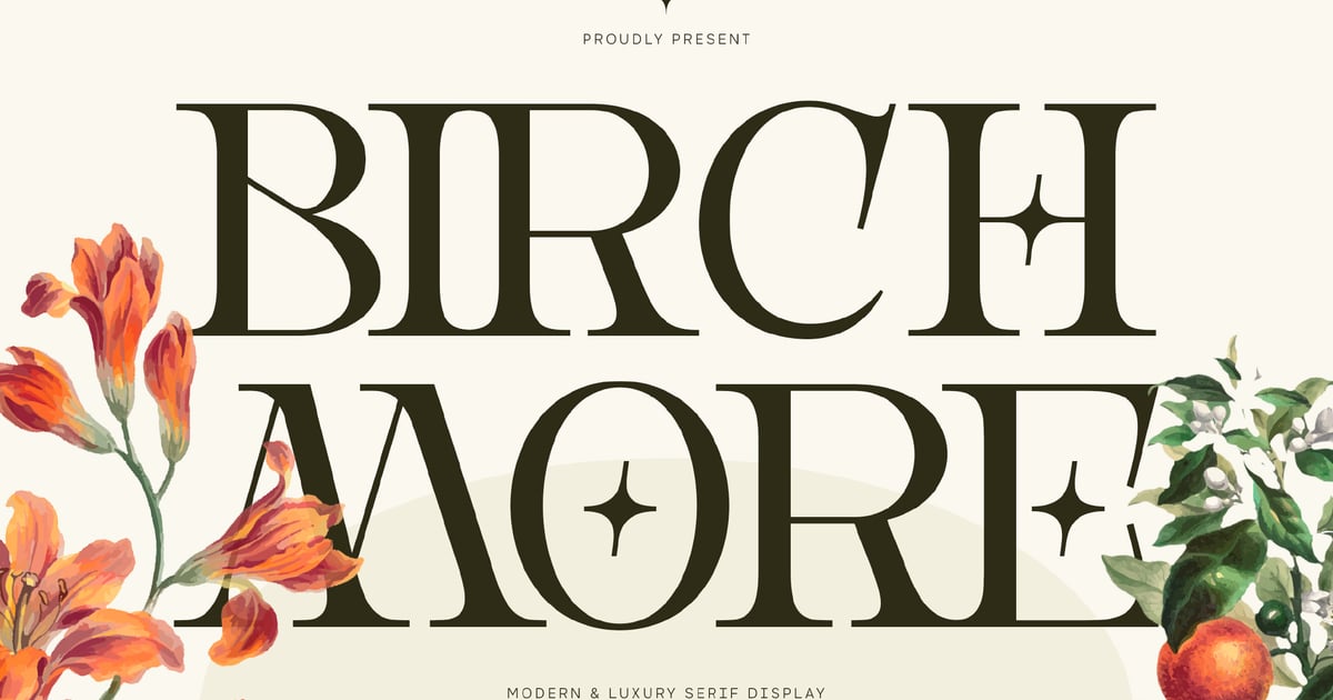
Birchmore combines classic typographic elegance with contemporary refinement, making it ideal for editorial headlines, luxury branding, and sophisticated poster designs. This modern serif font features carefully balanced letterforms that command attention while maintaining readability across display applications. The typeface works beautifully for fashion magazines, upscale packaging, and cultural event materials where a distinguished presence matters. With support for extended Latin characters and essential punctuation marks, Birchmore delivers both versatility and visual impact for designers seeking timeless sophistication with a current edge.
Classic Serif Typefaces That Never Go Out of Style
There’s a reason certain serif typefaces have been in continuous use for decades. They’re not popular by default or nostalgia — they’re built on proportions and details that simply work. These classic serif typefaces have earned their reputations honestly.
Jevale – Classic Serif
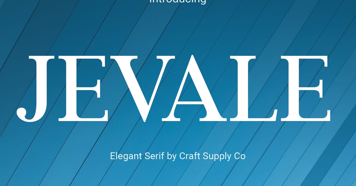
Jevale brings timeless sophistication to editorial and branding projects with its refined letterforms and traditional proportions. This classic serif font balances elegance with readability, making it well-suited for book design, luxury packaging, and upscale visual identities. The typeface captures the essence of heritage typography while maintaining clarity across different sizes and applications. Its carefully crafted details and balanced stroke weights create a distinguished presence that works equally well in headlines and body text, offering designers a versatile tool for projects requiring polish and enduring style.
Aviatica Classic Serif
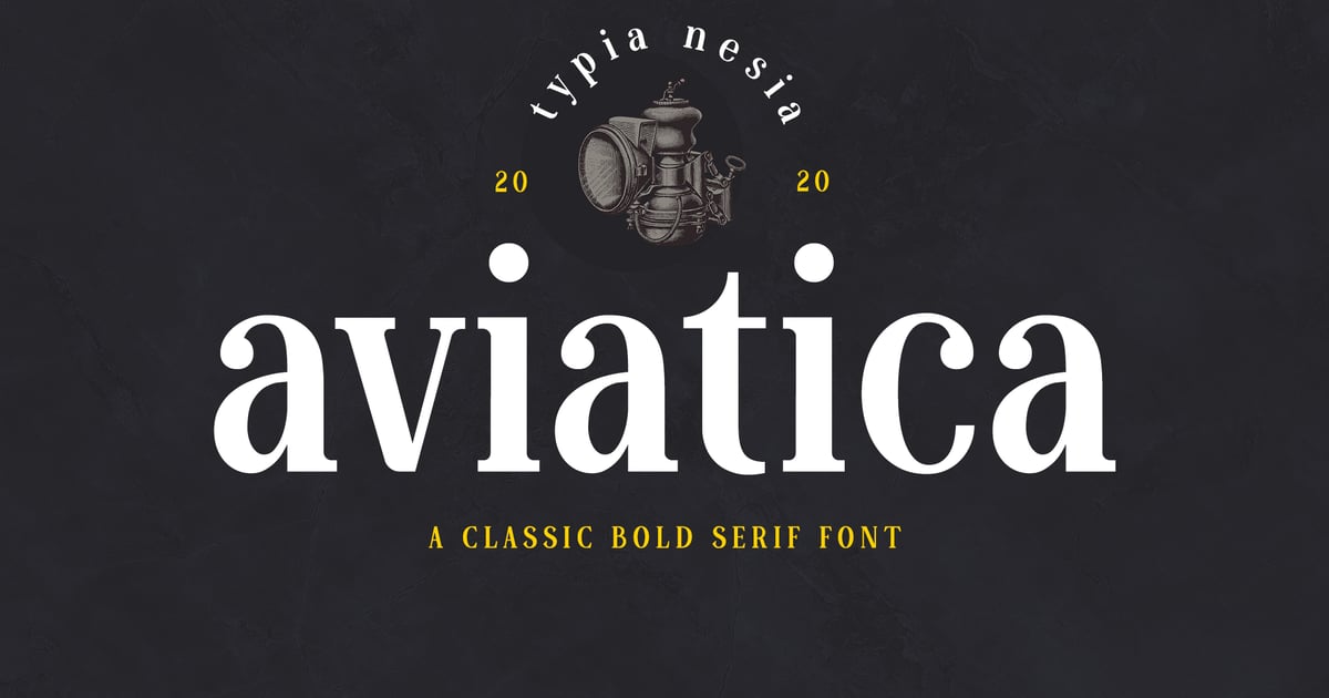
Aviatica Classic Serif brings traditional elegance to contemporary design projects with its refined letterforms and timeless proportions. The typeface balances sophistication with readability, making it well-suited for editorial layouts, luxury branding, and prestigious corporate identities. As a classic serif font, it carries an air of authority while remaining approachable enough for modern applications. The family supports multilingual character sets and includes both uppercase and lowercase letters, numerals, and punctuation. Files are provided in TTF and OTF formats for seamless integration across digital and print workflows.
Graceful – Classic Elegance Serif Font
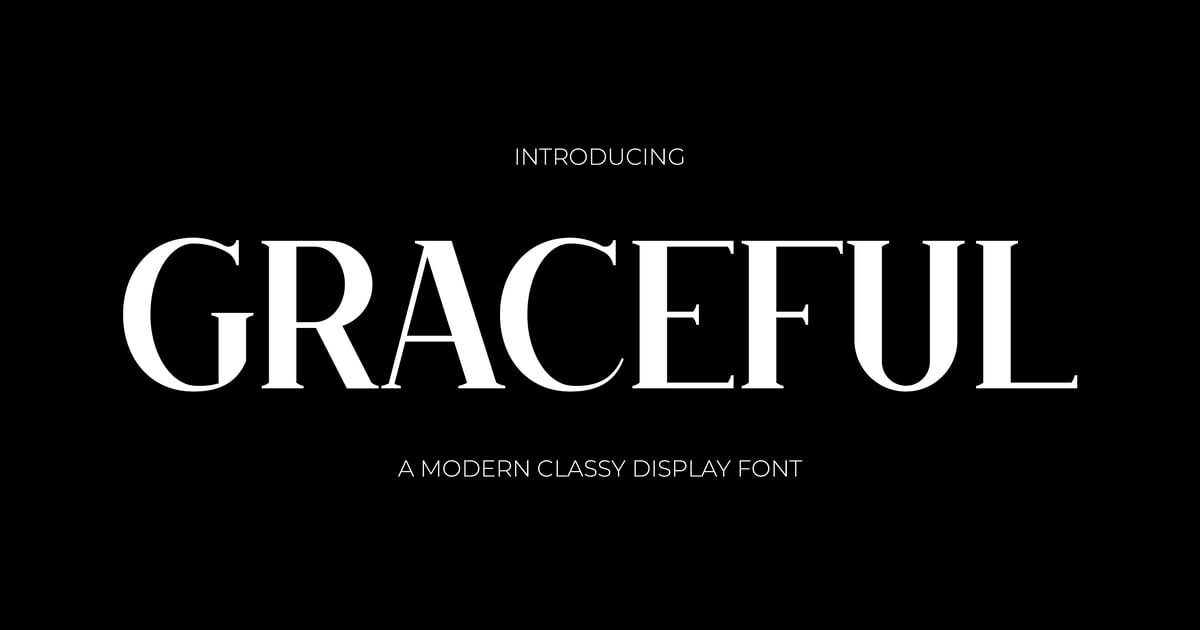
Graceful lives up to its name with refined letterforms that balance traditional typography with timeless sophistication. This classic serif font features elegant proportions and carefully crafted details that work beautifully for editorial layouts, luxury branding, wedding stationery, and upscale packaging. The design maintains readability while projecting an air of refined taste. With both serif and roman variants included, it offers versatility for headlines and body text alike, making it suitable for projects that demand a polished, distinguished aesthetic rooted in typographic heritage.
Leipzer – A Simple Serif Typeface
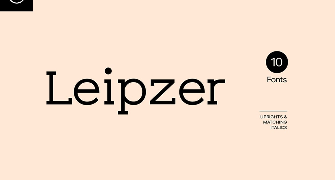
Leipzer is a classic serif font that brings understated elegance to editorial and branding projects. Its clean, traditional letterforms balance timeless sophistication with contemporary restraint, making it well-suited for book design, magazine layouts, and identity work that calls for refined simplicity. The typeface offers a complete character set with multilingual support, allowing designers to work across multiple languages while maintaining typographic consistency. Available in standard font formats, Leipzer provides the versatility needed for both print and digital applications where clarity and classic proportions take center stage.
Jazmond – Classic Serif Font
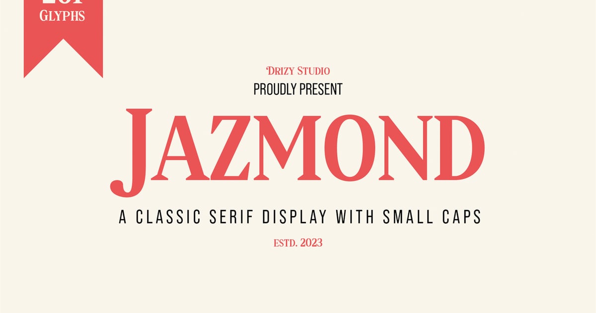
Jazmond brings traditional elegance to contemporary design projects with refined letterforms and balanced proportions. This classic serif font works beautifully for editorial layouts, luxury branding, wedding stationery, and sophisticated packaging where timeless appeal matters. The typeface features a complete character set with uppercase and lowercase letters, numerals, and punctuation marks to handle diverse typographic needs. Its versatile nature makes it equally at home in both display settings and longer text passages where readability remains essential.
Alland – Classic Serif Font
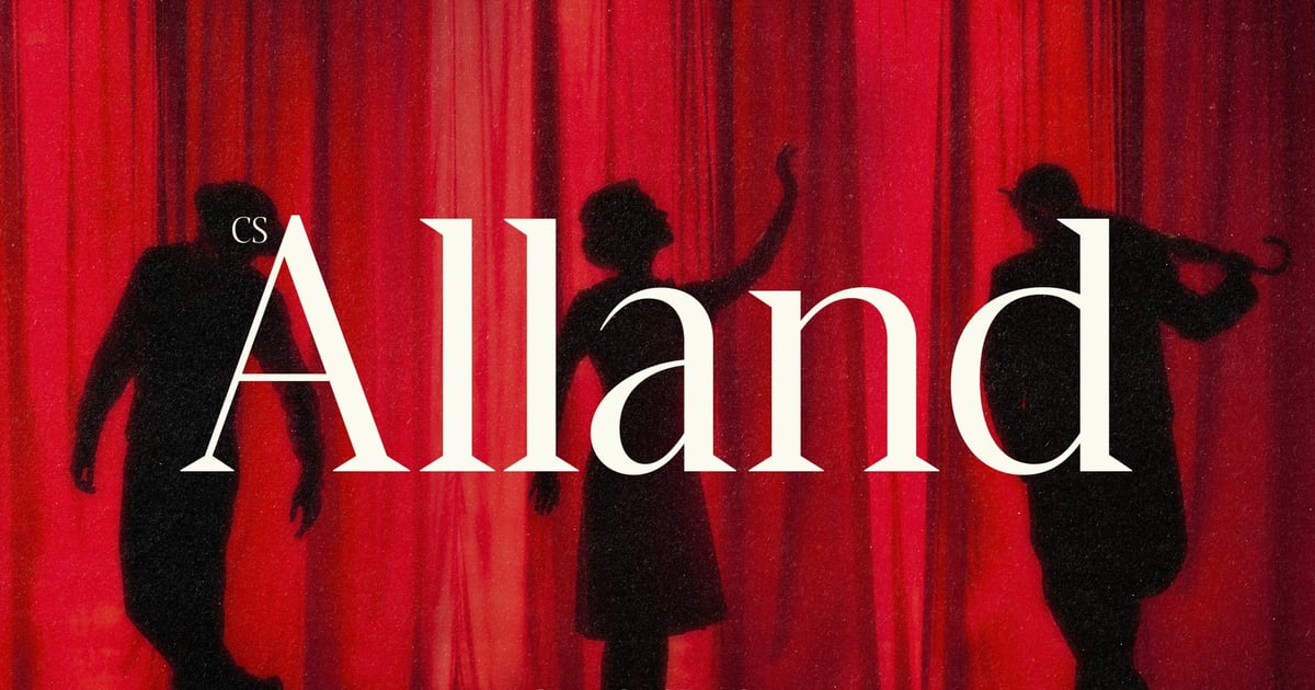
Alland brings timeless sophistication to editorial and branding projects with its refined letterforms and elegant proportions. This classic serif font balances traditional craftsmanship with contemporary polish, making it well-suited for luxury packaging, magazine mastheads, wedding stationery, and upscale identity work. The typeface features a complete character set with multilingual support, allowing designers to work across languages while maintaining its distinguished aesthetic. Available in standard font formats, Alland delivers versatility without sacrificing its aristocratic presence.
Elegant Serifs with a Premium Feel
Elegant serif fonts tend to share a few common threads: high contrast between thick and thin strokes, refined spacing, and a quiet confidence that reads as luxury without shouting about it. These are the fonts you reach for when the brief says “premium,” “heritage,” or “editorial.”
Elegant Serif Font – Classic Stylish Typeface
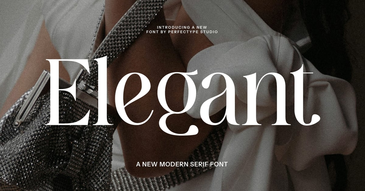
This elegant serif font combines traditional typographic refinement with contemporary sophistication, making it ideal for editorial layouts, luxury branding, and wedding stationery. The letterforms feature balanced proportions and graceful details that convey timeless appeal without feeling dated. Its classic styling works beautifully for book covers, fashion magazines, and premium packaging where distinction matters. The typeface includes uppercase and lowercase characters, numerals, and essential punctuation marks. Multiple file formats ensure compatibility across design software, while the clean construction maintains legibility at both display and text sizes for versatile application.
Fezeline – Elegant Serif
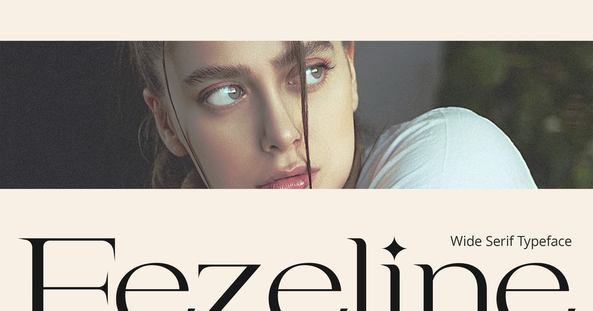
Fezeline brings sophisticated refinement to contemporary design projects with its carefully crafted letterforms and timeless proportions. This elegant serif font balances classical typography traditions with modern sensibilities, making it ideal for high-end branding, editorial layouts, wedding stationery, and luxury packaging. The typeface features clean lines and graceful details that communicate prestige and taste. It includes both uppercase and lowercase characters, numerals, and punctuation marks to handle a wide range of design applications. The font files are provided in standard formats for seamless integration into professional workflows.
Duarose – An Elegant Serif
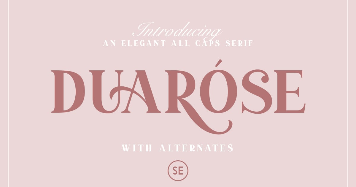
Duarose brings sophisticated typography to projects seeking refinement and grace. This elegant serif font balances classical letterforms with contemporary sensibility, making it well-suited for luxury branding, editorial layouts, wedding stationery, and upscale packaging. The design features clean lines and tasteful proportions that convey both authority and beauty. With its versatile character set supporting multiple languages, Duarose adapts seamlessly across print and digital applications. The font delivers professional results for designers working on premium projects where typographic distinction matters.
Jassime – Elegant Serif
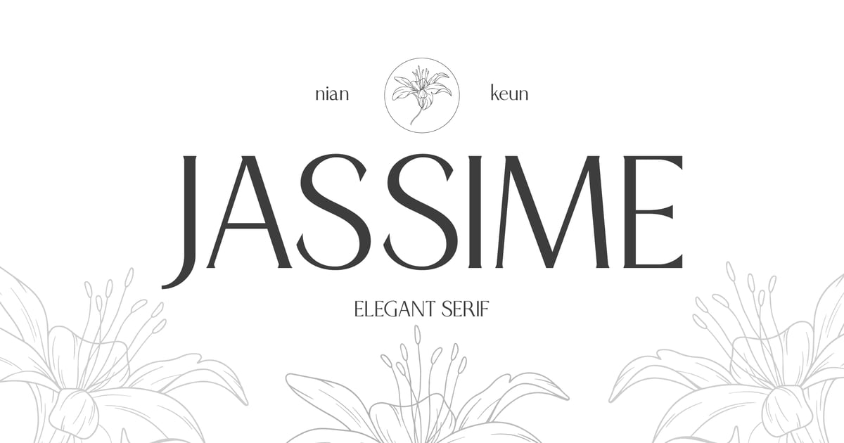
Jassime brings refined sophistication to display typography with its graceful letterforms and timeless proportions. This elegant serif font features delicate hairlines balanced against sturdy stems, creating a luxurious aesthetic perfect for wedding stationery, high-end branding, and editorial headlines. The design strikes a balance between classic refinement and contemporary sensibility, making it equally at home on champagne labels or boutique logos. Supporting multilingual characters along with complete uppercase, lowercase, numerals, and punctuation, Jassime delivers versatility in both TTF and OTF formats for professional design projects.
Morona – Elegant Serif
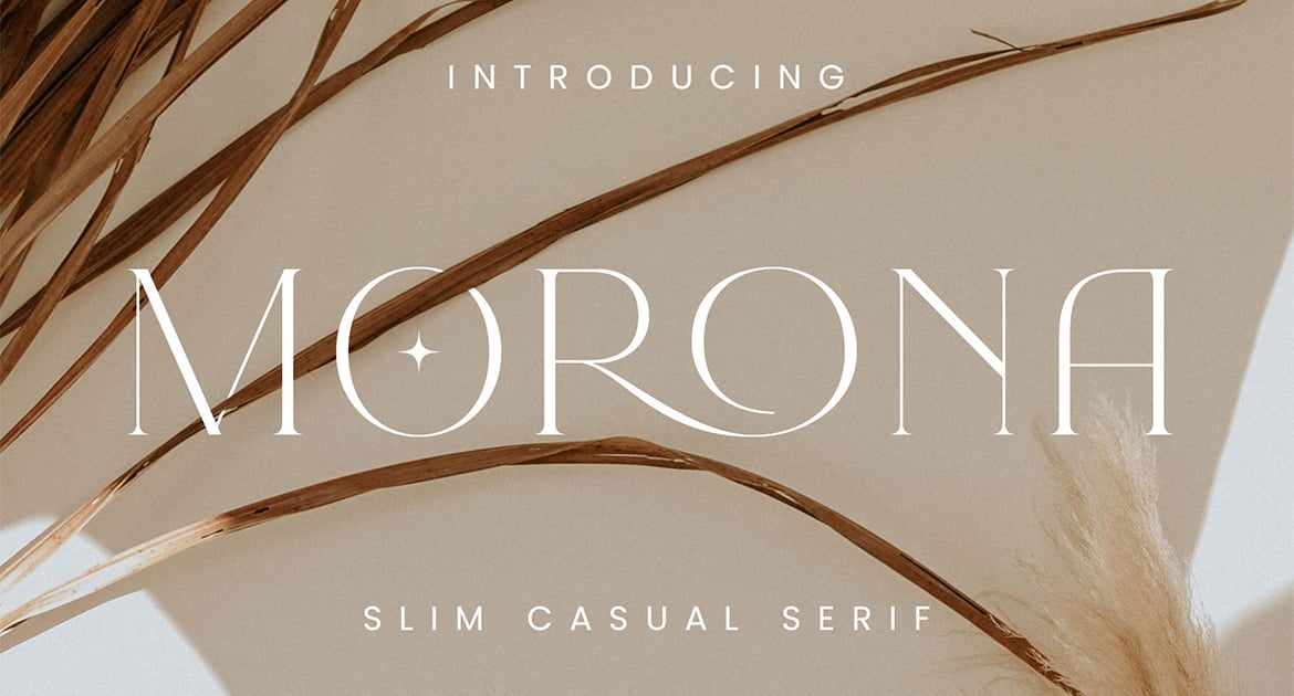
Morona brings refined sophistication to contemporary design projects with its carefully balanced letterforms and graceful proportions. This elegant serif font features clean lines and subtle contrast that work beautifully for editorial layouts, luxury branding, wedding materials, and upscale packaging. The typeface includes uppercase and lowercase characters, numerals, and punctuation to handle diverse typographic needs. Its timeless aesthetic bridges classical typography with modern sensibilities, making it equally effective for both print and digital applications. Available in standard font formats for easy installation across design software.
Serenity Moment – Elegant Modern Serif
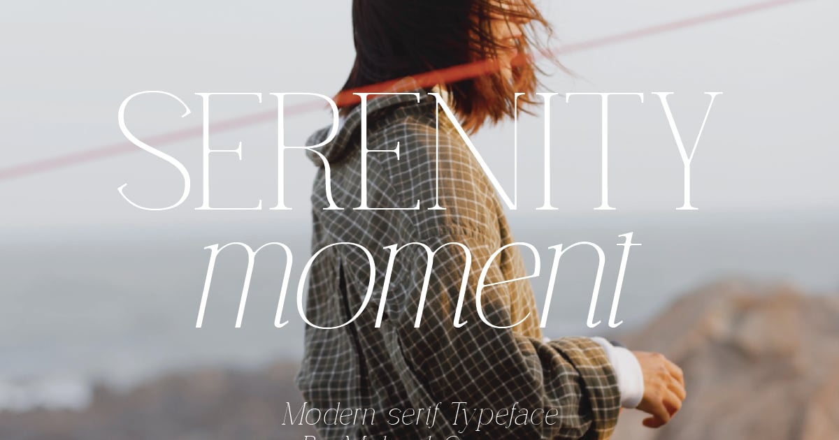
Serenity Moment brings refined sophistication to contemporary typography with its clean lines and graceful letterforms. This elegant serif font balances traditional typographic principles with modern sensibilities, making it ideal for luxury branding, editorial layouts, wedding stationery, and upscale packaging design. The typeface features both serif and display variants, offering designers flexibility across different applications. With multilingual character support and comprehensive punctuation, it adapts seamlessly to international projects while maintaining its polished, timeless aesthetic. Available in standard font formats for immediate use.
Elegant Hybrid Serif Branding – Sara Pierce
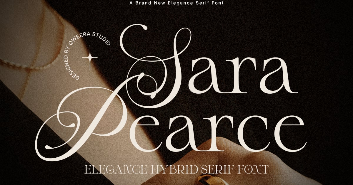
Sara Pierce blends classical serif elegance with contemporary hybrid letterforms, creating a sophisticated typeface that bridges traditional and modern design sensibilities. The font’s refined proportions and balanced strokes make it ideal for upscale branding projects, editorial headlines, and luxury packaging where distinction matters. As an elegant serif font with versatile character, it adapts beautifully across both print and digital applications. The family provides complete multilingual support alongside uppercase, lowercase, numerals, and punctuation marks, delivered in standard font formats for professional use.
Readable Serifs for Body Text and Long-Form Content
A font that looks gorgeous at 60pt and falls apart at 10pt isn’t a typeface — it’s a decoration. The readable serif fonts in this section are optimized for the long game: sustained reading, tight columns, small screens, and print layouts where your reader’s eyes need to travel comfortably across hundreds of words.
Camfort – Modern Headline Serif Font
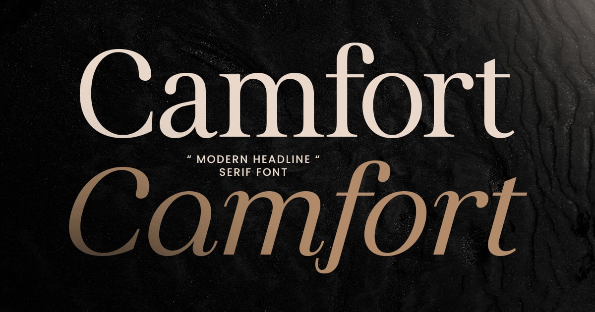
Camfort brings bold sophistication to headlines with its sharp serifs and contemporary proportions. This legible serif font balances traditional elegance with modern clean lines, making it ideal for editorial layouts, brand identities, and poster designs that demand attention. The typeface works beautifully at large sizes where its refined details and strong character shapes can shine. Perfect for fashion magazines, luxury packaging, and website headers, Camfort delivers impact while maintaining readability. The family includes uppercase and lowercase letters, numbers, punctuation, and multilingual support, available in TTF and OTF formats.
Scholar Serif
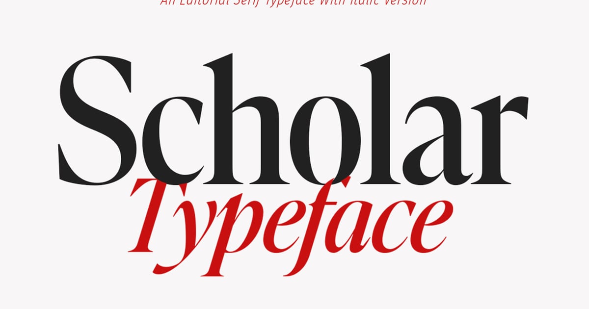
Scholar Serif brings refined academic elegance to contemporary design work. This legible serif font balances traditional typographic principles with modern proportions, making it well-suited for editorial layouts, book design, and professional branding that requires both authority and approachability. Its clean letterforms maintain excellent readability across body text and display sizes. The typeface works particularly well for publishing projects, cultural institutions, and thoughtful corporate communications where sophistication matters. Scholar Serif delivers a polished, intellectual aesthetic that feels timeless rather than trendy.
Starlight Branch – Elegant Editorial Serif Font
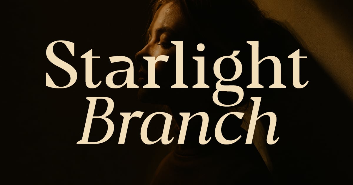
Starlight Branch combines refined elegance with editorial sophistication, making it ideal for luxury branding, fashion magazines, and upscale packaging. This legible serif font features graceful letterforms with delicate contrast and polished details that convey refinement without sacrificing readability. The design works beautifully in both headlines and body text where a distinguished, high-end aesthetic is desired. Perfect for cosmetics brands, editorial layouts, wedding stationery, and premium product labels, it brings a sense of timeless grace to any project requiring sophisticated typography.
Slippery
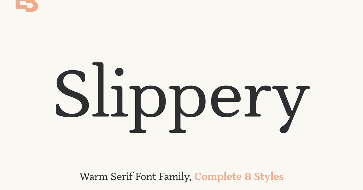
Slippery brings a playful energy to typographic design with its distinctive blend of classic structure and whimsical personality. This legible serif font features charming details that add character without sacrificing readability, making it ideal for branding projects, editorial headlines, and packaging that needs to stand out. The design strikes an appealing balance between approachable and sophisticated, working beautifully for creative studios, lifestyle brands, and artisanal products. With its complete character set and versatile nature, Slippery offers designers a refreshing alternative to conventional serif typefaces while maintaining professional polish across various applications.
Welcome to Lettering
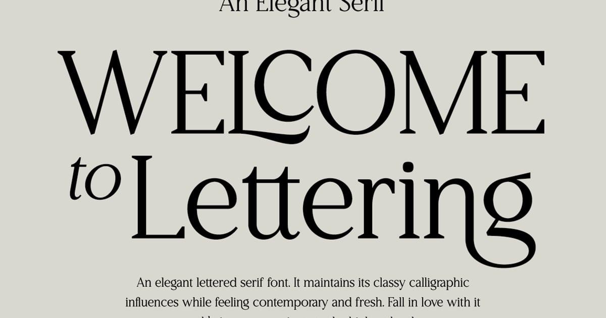
Welcome to Lettering brings refined elegance to typographic projects with its classic proportions and contemporary sensibility. This legible serif font pairs beautifully with delicate watermark elements, making it ideal for editorial layouts, sophisticated branding, and wedding stationery. The typeface balances traditional letterforms with just enough personality to feel distinctive without sacrificing readability. Perfect for projects requiring both substance and style, it works equally well in headlines and extended text settings where clarity matters.
Anything Branding Serif Font
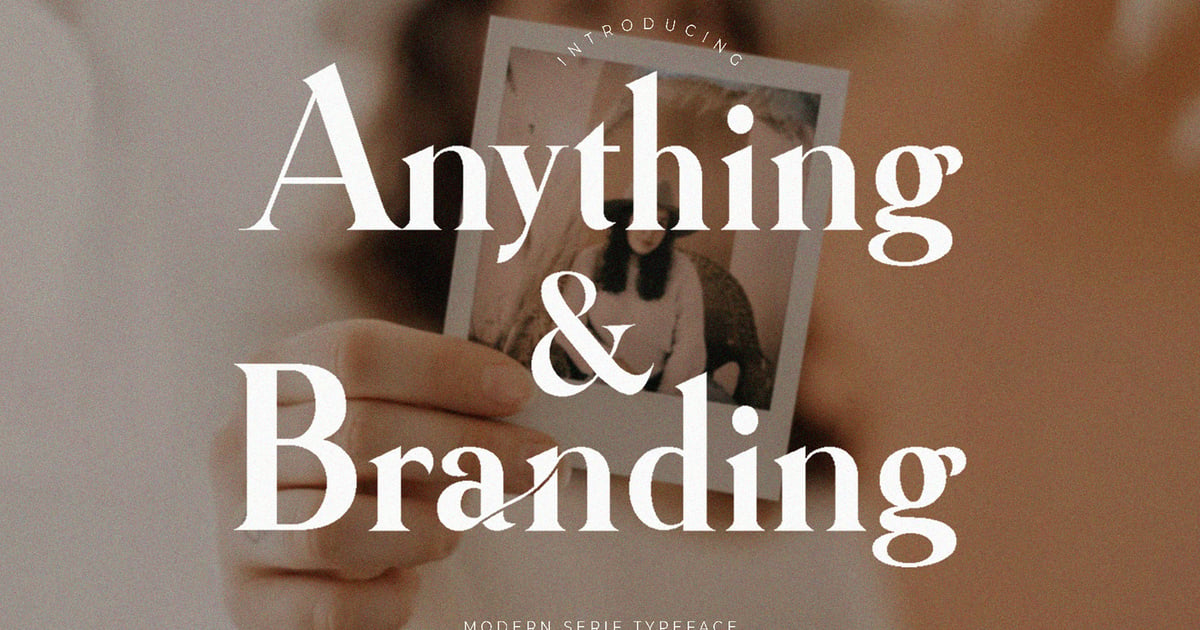
Anything Branding Serif Font brings contemporary sophistication to editorial and identity work with its refined letterforms and balanced proportions. This legible serif font works beautifully for logos, packaging, magazine layouts, and upscale web projects where clarity meets distinction. The typeface features uppercase and lowercase characters, numerals, punctuation, and multilingual support to accommodate international design needs. Its modern styling maintains traditional serif elegance while offering enough personality to stand out in branding applications. Files are provided in both TTF and OTF formats for broad compatibility across design platforms.
Bold Display Serifs for Headlines
Display serifs exist to do one thing: make people stop. These fonts have the weight, personality, or sheer presence to anchor a magazine cover, a campaign headline, or a brand mark. Most of them are too assertive for body text, and that’s exactly the point.
Bold Serif Font Bold Serif
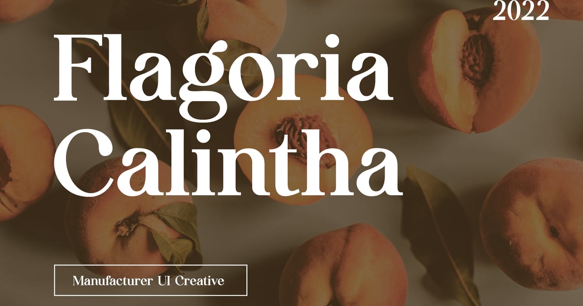
Bold Serif Font Bold Serif brings a commanding presence to editorial and branding projects with its robust letterforms and confident character. The strong vertical stress and pronounced serifs create exceptional impact in headlines, magazine layouts, and luxury packaging. This bold serif font delivers multilingual support alongside a complete set of uppercase and lowercase letters, numerals, and punctuation marks. Files arrive in both TTF and OTF formats, making it suitable for print and digital applications where distinctive, authoritative typography is essential.
Koffeet Bold Serif Vintage
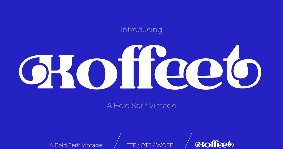
Koffeet Bold Serif Vintage channels the timeless appeal of classic typography with decorative details that evoke old-world craftsmanship. This bold serif font brings substantial weight and nostalgic character to headlines, packaging designs, and brand identities that need a heritage aesthetic. Its vintage styling works particularly well for coffee shops, breweries, and artisan businesses seeking an established, trustworthy presence. The typeface includes uppercase and lowercase letters, numbers, and punctuation, with support for multiple languages. Files are provided in both TTF and OTF formats for broad compatibility.
Hibrida Bold Serif Font
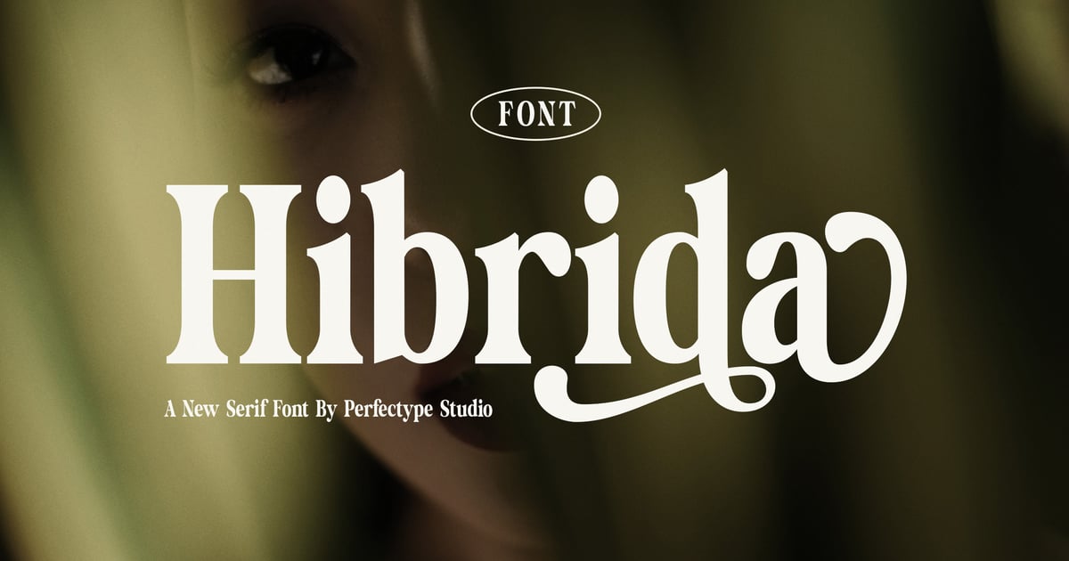
Hibrida combines contemporary boldness with vintage-inspired character, creating a distinctive typeface that bridges eras with confidence. Its robust letterforms carry retro sensibilities while maintaining clean, modern readability. This bold serif font excels in branding projects, editorial headlines, and poster designs where impact matters. The strong serifs and generous weight make it particularly effective for projects needing both authority and personality. Perfect for packaging, album covers, and identity work that demands attention, Hibrida delivers versatility alongside its commanding presence. The family includes comprehensive character support and comes in standard font formats.
Harond – Bold Serif
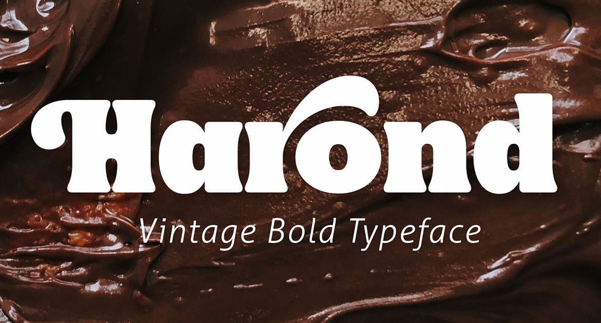
Harond brings a commanding presence to any design project with its robust letterforms and refined proportions. This bold serif font balances strength with sophistication, making it particularly well-suited for editorial headlines, luxury branding, and poster work where impact matters. Its vintage-inspired details add character without sacrificing legibility, while the substantial stroke weight ensures excellent readability across both print and digital applications. The typeface works beautifully for book covers, packaging design, and identity systems that need to convey authority and timeless appeal.
Camp Goods – Modern Bold Branding Slab Serif
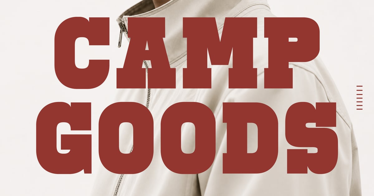
Camp Goods is a contemporary slab serif typeface designed for making strong visual statements in branding projects. Its sturdy letterforms balance vintage charm with modern refinement, featuring thick serifs and commanding proportions that ensure excellent visibility across applications. This bold serif font excels in headlines, packaging designs, and identity work where presence matters. The family supports multilingual typesetting and includes uppercase and lowercase characters, numerals, and essential punctuation marks. Files are provided in both OTF and TTF formats for broad compatibility across design software and platforms.
The Mount Saint – Bold Luxury Serif Font
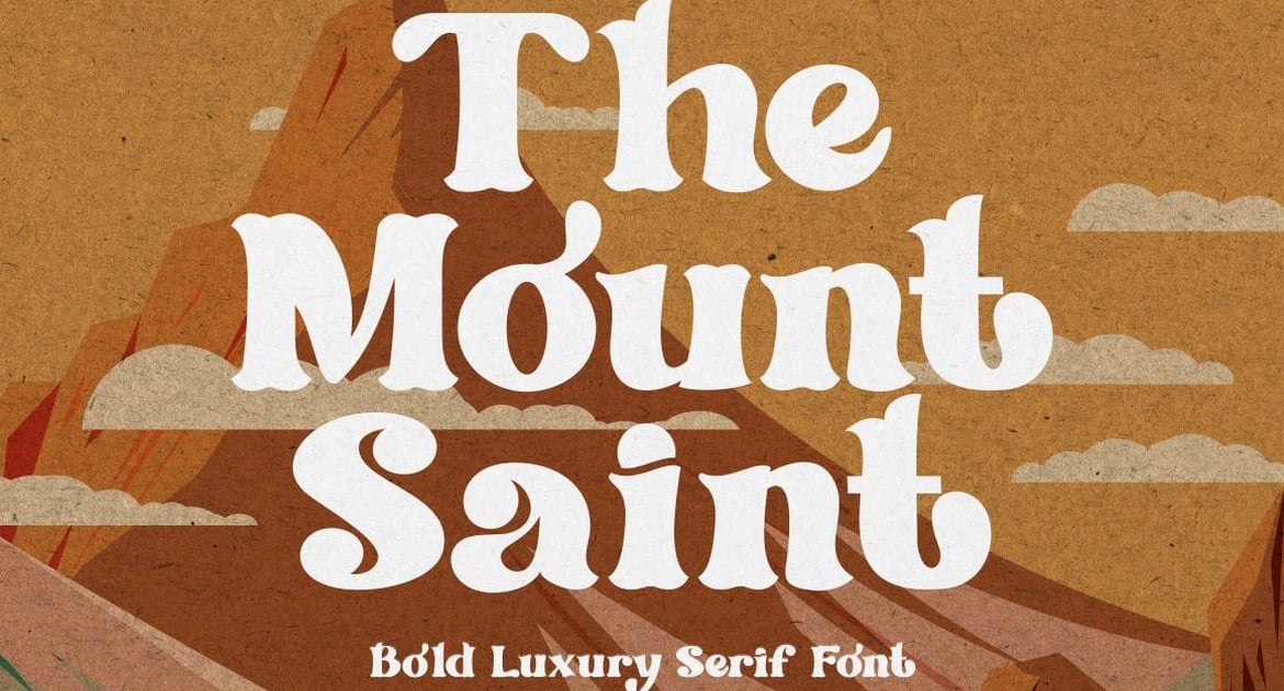
The Mount Saint is a bold serif font that radiates sophistication and upscale elegance. Its robust letterforms combine classical proportions with contemporary refinement, making it particularly well-suited for luxury branding, editorial headlines, and premium packaging. The strong serifs and confident stroke weight create instant visual impact while maintaining readability across applications. This typeface excels in contexts requiring both authority and grace, from high-end cosmetics to boutique hotels. The design balances timeless serif traditions with modern sensibilities, offering designers a versatile tool for projects demanding a polished, distinguished aesthetic.
Bekley Serif – Modern Bold Serif
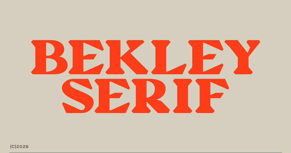
Bekley Serif is a contemporary typeface that combines traditional serif elegance with commanding weight and presence. Its sturdy letterforms feature crisp details and balanced proportions, making it ideal for editorial headlines, luxury branding, and poster designs that demand attention. This bold serif font works beautifully across both digital and print applications, from magazine mastheads to packaging projects. The family provides comprehensive character coverage including uppercase and lowercase letters, numerals, and punctuation. Available in standard font formats, Bekley Serif delivers the sophisticated impact modern design projects require.
Belfrage – Slab Serif Font
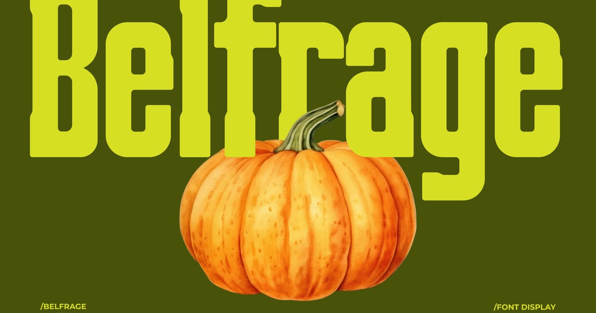
Belfrage is a contemporary slab serif typeface that brings substantial weight and presence to editorial and branding projects. Its sturdy letterforms feature the characteristic block serifs that define the style, while maintaining clean lines and excellent readability across sizes. This bold serif font works particularly well for magazine headlines, poster designs, and logo treatments where impact matters. The family supports multiple languages and includes both uppercase and lowercase characters along with numerals and essential punctuation marks. Files are provided in TTF and OTF formats for seamless integration into any design workflow.
What Makes a Serif Font Worth Using?
Not all serifs are created equal, and “it has little feet on the letters” is not a design strategy. Here’s what actually separates a great serif from a merely adequate one.
Strong, Considered Proportions
The best serif fonts are built on letterform proportions that feel natural and balanced — counters that breathe, ascenders and descenders that don’t crowd the line above and below. When proportions are off, you feel it even if you can’t name it. The text feels tight, restless, or strangely hard to read.
Contrast That Matches Its Purpose
Stroke contrast — the variation between the thick and thin parts of each letter — is one of the most important decisions a type designer makes. High contrast looks stunning at large sizes and gets eaten alive at small ones. Low contrast holds up at 9pt but can feel dull at display scale. A versatile serif tends to live somewhere in the middle, or it ships with optical size variants that handle both ends of the range.
A Family with Range
A single-weight serif is a liability. A good serif type family gives you regular, italic, at least a bold, and ideally a few weights in between. That range is what lets a typeface carry an entire brand system — body, caption, headline, pull quote — without importing a second font to fill the gaps.
Character Without Eccentricity
The best serifs have a personality that’s recognizable but never distracting. You notice the design when you look for it, but it doesn’t interrupt reading. The moment a quirky serif character pulls the reader’s eye out of the text and into the letterform itself, the font has overstayed its welcome as a text face — though it may still be spectacular as a display face.
When to Choose a Serif Over a Sans Serif
Serifs aren’t automatically more elegant, and sans serifs aren’t automatically more modern — that’s a cliché the best contemporary branding has been actively dismantling for years. But there are contexts where a serif is genuinely the stronger call.
If your brand needs to communicate authority, tradition, or intellectual credibility — think publishing, law, finance, heritage luxury — a serif carries those associations more naturally than most sans serifs can. If you’re setting long bodies of text for print, a well-spaced serif improves reading comfort over sustained use. And if you want your brand to feel warm and human rather than clean and minimal, serifs bring that quality in ways that geometric sans serifs rarely do.
The honest answer is that the best choice depends on the system, not the category. A beautifully set geometric sans can feel warmer than a stiff, over-compressed serif. Start with what the brand needs to communicate, then let the typeface serve that goal.
How to Choose the Right Serif Font for Your Project
The list above gives you strong starting points, but the right font for your project isn’t just the one that looks best in isolation. Here’s how to narrow it down.
Start with Where It Will Actually Live
A serif that’s destined for a printed annual report has different requirements than one heading a social media campaign or a mobile app interface. Before you fall in love with a typeface, check its performance at the sizes and contexts that actually matter for your project. Some elegant, high-contrast serifs that look spectacular in a print mock-up turn into a blurry mess on a 375px screen.
Check the Full Weight Range Before You Commit
Pull up the full type specimen, not just the default weight. If the italic is an afterthought, that’s going to matter. If there are only two weights and you need five, you’ll be fighting the typeface for the entire project. A font that looks exactly right in one weight but has weak supporting styles will create problems the moment the design gets complex.
Match the Contrast Level to the Brief
If the word “premium” or “luxury” is in the brief, a higher-contrast serif will likely serve you better — that contrast is part of what communicates refinement. If the brief calls for “approachable,” “editorial,” or “trustworthy,” a more moderate contrast with sturdy serifs will feel friendlier and less formal. If “bold” or “impactful” is the goal, look at the display serifs section and think about whether the font needs to carry body text at all, or just own the headline.
Test It at Scale and at Size
Set three lines of body copy at 10pt. Set a headline at 60pt. If either of those makes you wince, keep looking. A font that only works in one size range is going to limit you constantly throughout the project. The best serif fonts hold their quality and character across the full range of sizes you’ll actually use.
Consider the Licensing
This is the unsexy part that becomes very sexy when a client asks if they can use the font in a mobile app, on merchandise, or in broadcast video. Read the license before you fall in love. Many otherwise-excellent fonts have licensing terms that make them impractical for commercial branding work, or they charge extra for web or app use. Know what you’re buying before you build a brand system around it.
Alternatives to Consider When Serifs Aren’t Quite Right
Sometimes you want the warmth and structure of a serif but a different kind of texture or tone. A few adjacent categories are worth knowing about.
Slab Serifs
Slab serifs swap the tapered, often delicate serifs of traditional typefaces for chunky, rectangular ones. They’re bold, grounded, and excellent for branding that needs to feel sturdy and direct — outdoor signage, product packaging, sports and fitness brands. They share the visual weight of a serif family without the formal elegance, which is exactly what some projects need.
Humanist Sans Serifs
If you like what a good serif does for readability and warmth but the specific context (a tech product, a minimal brand system) is pushing you toward sans, a humanist sans serif is the closest you can get without making the full serif commitment. Humanist sans fonts are drawn with the same hand-influenced proportions that make serifs feel natural, just without the terminal strokes.
Transitional Display Faces
A number of typefaces sit deliberately between categories — they have serif details but bold, expressive proportions that read more like display faces than traditional text serifs. These can be unexpected and interesting alternatives when you want something that doesn’t quite fit either bin, and they’re worth exploring when the brief feels like it’s resisting a clean category answer.
Frequently Asked Questions
What is the most popular serif font right now?
There’s no single answer, but a handful of serif typefaces consistently appear across brand identities, editorial design, and digital products. Classic transitional and old-style serif families dominate professional work because they’re versatile and have long track records. Among newer releases, contemporary serifs with high contrast and refined proportions are trending heavily, especially in luxury branding and editorial contexts.
What serif fonts are best for branding?
The best serif fonts for branding have a strong, distinctive personality, a solid range of weights to build a full visual system, and good performance in both print and digital applications. Modern serifs with moderate contrast tend to be the most flexible. For luxury or heritage brands, a high-contrast elegant serif with fine detailing will carry more weight. Avoid fonts with very limited weight ranges — they’ll constrain the brand system quickly.
What’s the difference between old style, transitional, and modern serifs?
Old style serifs, like those designed in the 15th and 16th centuries, have low contrast between thick and thin strokes, angled stress, and humanist proportions — they feel warm and literary. Transitional serifs from the 18th century have higher contrast and more upright stress — more refined and formal. Modern serifs (Didone style) take that contrast to an extreme with hairline thins against very thick strokes, giving them that high-fashion, luxury quality.
Are serif fonts hard to read on screens?
That was a real concern ten years ago when screen resolution was too low to render fine serif details cleanly. On modern displays, well-designed serif fonts are completely legible and often excellent for on-screen reading. The key is choosing serifs designed or optimized for screen use — fonts with generous x-heights, open counters, and moderate contrast. Avoid ultra-high-contrast serifs with hairline strokes for small body text on screen.
The Case for Caring About Your Serifs
Serif fonts are one of those areas of typography where the differences between good and great are subtle until they’re not. A mediocre serif choice produces work that feels slightly off in a way clients can’t name but designers absolutely can. A great one makes the whole layout feel inevitable — like the type was always going to be exactly that.
The fonts in this list aren’t here because they’re famous or safe. They’re here because they’re genuinely excellent: built with care, designed with range, and worth the time it takes to learn how to use them well. The breadth of the list reflects the breadth of what “best” actually means — a font that’s perfect for a fashion editorial might be entirely wrong for a long-form academic journal, and both of those are legitimate design problems worth solving with the right tool.
If you’ve found a serif that’s become your go-to, or you’re working with one that surprised you, I’d love to hear about it — drop it in the comments below. The best type recommendations always come from designers who’ve actually put them through their paces.