
In this article:
- How We Chose These Fonts
- Professional Sans Serifs for Clean, Modern Slides
- Serif Fonts That Add Authority to Business Presentations
- Bold Display Fonts for Title Slides and Section Breaks
- Readable Fonts for Data-Heavy Slides and Reports
- How to Pair Fonts in a Presentation
- Serif or Sans Serif for Presentations?
- Frequently Asked Questions
The back row of every conference room holds one person your slides are really for. They’re sitting behind a pillar, looking past someone’s laptop at a projector bulb that’s been slowly dimming for years. If they can read your deck, everyone can. So having a professional font for presentations really matters.
How We Chose These Fonts
I pulled every pick from Envato’s font catalog and put each one through the same four checks:
- A presentation font has to stay legible at a distance, on a cheap projector as well as a sharp monitor.
- A good slide font gives you clear hierarchy, with headline and body weights that look obviously different.
- A professional font should look polished without looking stiff.
- A font for slides has to render the same way in PowerPoint, Keynote, and Google Slides.
If a font looked great at poster size and fell apart at 24pt, it didn’t make the list.
Professional Sans Serifs for Clean, Modern Slides
When you want a modern, professional look, start with a sans serif. These are the workhorses of good PowerPoint fonts: open letterforms, even spacing, and enough weights to handle a title, a subhead, and a bullet on the same slide. None of them draw attention to themselves, and on a slide that’s usually what you want. The audience should notice your idea before they notice the font.
Pros – Minimal Modern Sans Serif
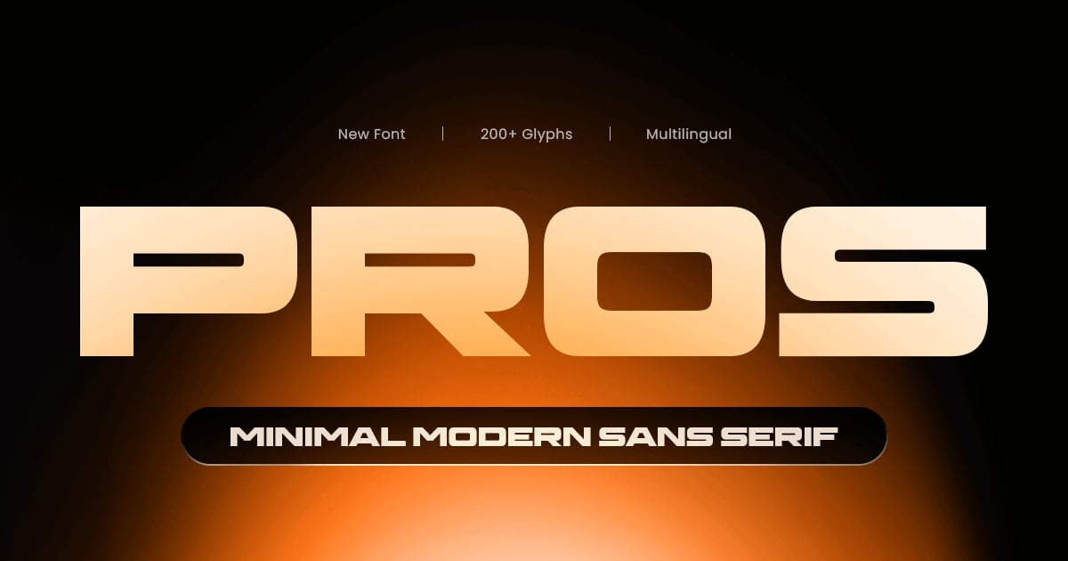
Pros brings refined minimalism to contemporary typography with its clean, geometric forms and balanced proportions. This professional sans-serif font excels in branding projects, editorial layouts, and digital interfaces where clarity meets sophistication. Its streamlined letterforms maintain excellent readability across sizes while projecting a distinctly modern aesthetic. The typeface supports multiple languages and includes uppercase and lowercase characters, numbers, and essential punctuation marks. Available in standard font formats, Pros offers designers a versatile solution for projects demanding understated elegance and visual precision without unnecessary embellishment.
Collegan – A Modern Sans Serif Font
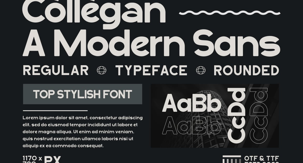
Collegan brings crisp, contemporary lines to the world of typography with its clean geometric construction and balanced proportions. This professional sans-serif font works beautifully across branding projects, editorial layouts, and digital interfaces where clarity and modern sophistication matter most. Its streamlined letterforms maintain excellent readability at any size, making it equally suitable for headlines and body text. The design strikes a versatile middle ground between minimalist restraint and approachable warmth, lending itself to corporate identities, tech startups, and lifestyle brands alike. Perfect for designers seeking a dependable, polished typeface for professional applications.
Clarity Sans – Sophisticated Sans Serif Font
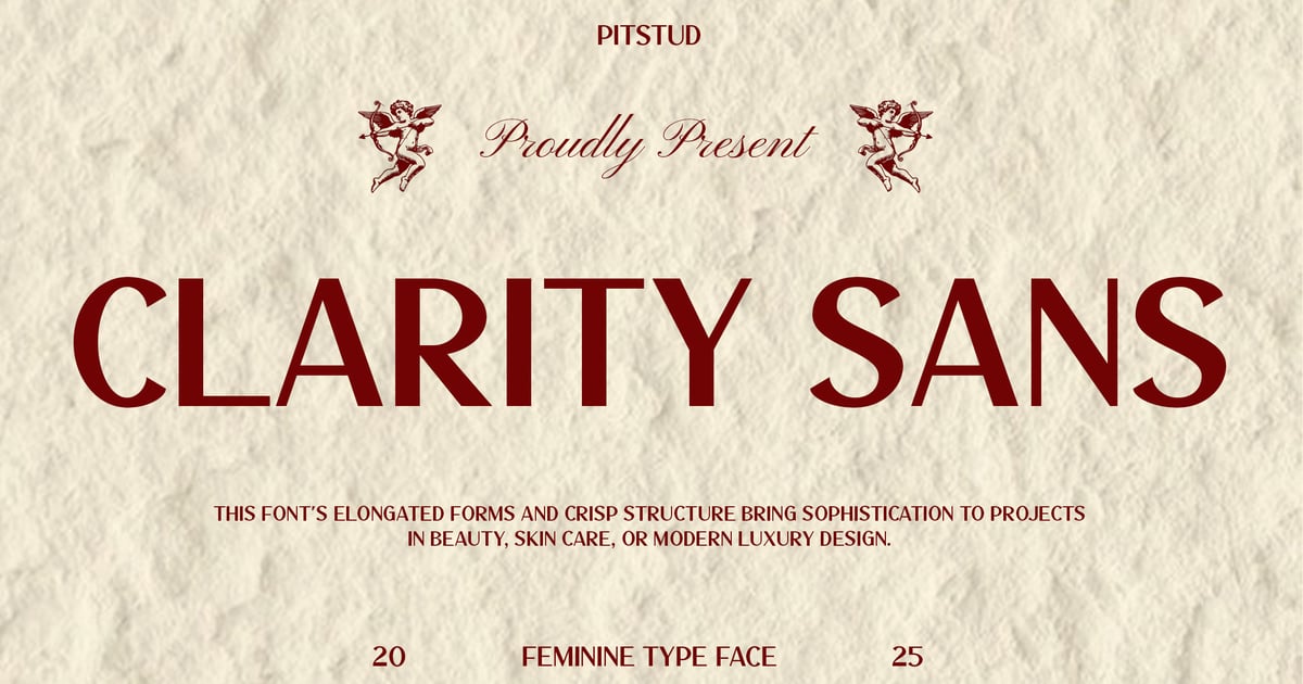
Clarity Sans brings a refined, contemporary edge to typographic design with its clean lines and balanced proportions. This professional sans-serif font works beautifully across beauty and skincare branding, where elegance and readability are essential. Its sophisticated letterforms maintain clarity at any size, making it ideal for packaging, editorial layouts, and digital interfaces. The typeface strikes a perfect balance between modern minimalism and approachable warmth, suitable for projects requiring both visual polish and functional versatility. Whether used for headlines or body text, Clarity Sans delivers a polished aesthetic that elevates brand identity with understated confidence.
Get 300+ Fonts for FREE
Enter your email to download our 100% free "Font Lover's Bundle". For commercial & personal use. No royalties. No fees. No attribution. 100% free to use anywhere.
Moninger Geometric Sans Serif
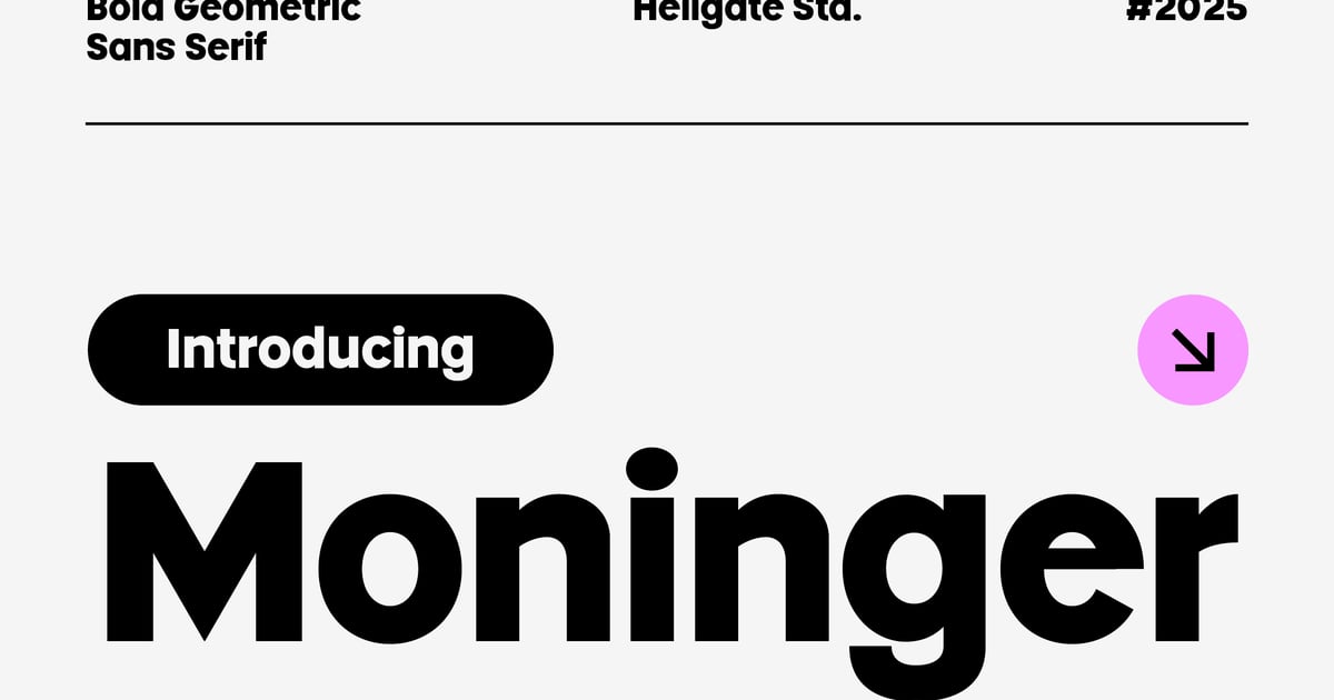
Moninger is a clean, geometry-driven typeface built on precise shapes and consistent proportions. Its structured letterforms balance mathematical clarity with contemporary style, making it well-suited for modern branding, editorial layouts, and digital interfaces. This professional sans-serif font works equally well in headlines and body text, offering versatility across various design contexts. The family supports multilingual projects with extended character coverage, and includes uppercase and lowercase letters, numerals, and essential punctuation. Files are provided in both TTF and OTF formats for broad compatibility across design applications.
SANGUARD – A Modern Sans Serif Font
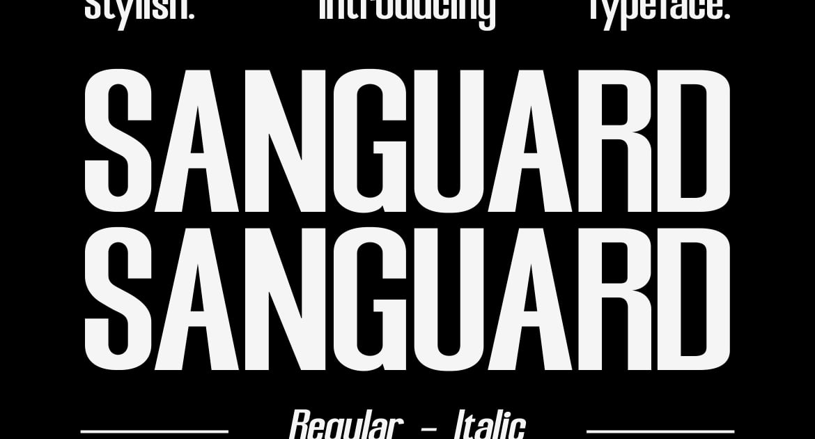
SANGUARD is a clean, contemporary typeface built for clarity and impact across digital and print applications. Its geometric letterforms strike a balance between technical precision and approachable warmth, making it suitable for corporate identity systems, editorial headlines, and web interfaces. This professional sans-serif font works particularly well in business contexts where legibility and modern sophistication are priorities. The family includes uppercase and lowercase characters, numerals, and essential punctuation. Files are provided in both OTF and TTF formats for flexible integration into any design workflow.
Working – Modern Minimalist Sans Serif Font
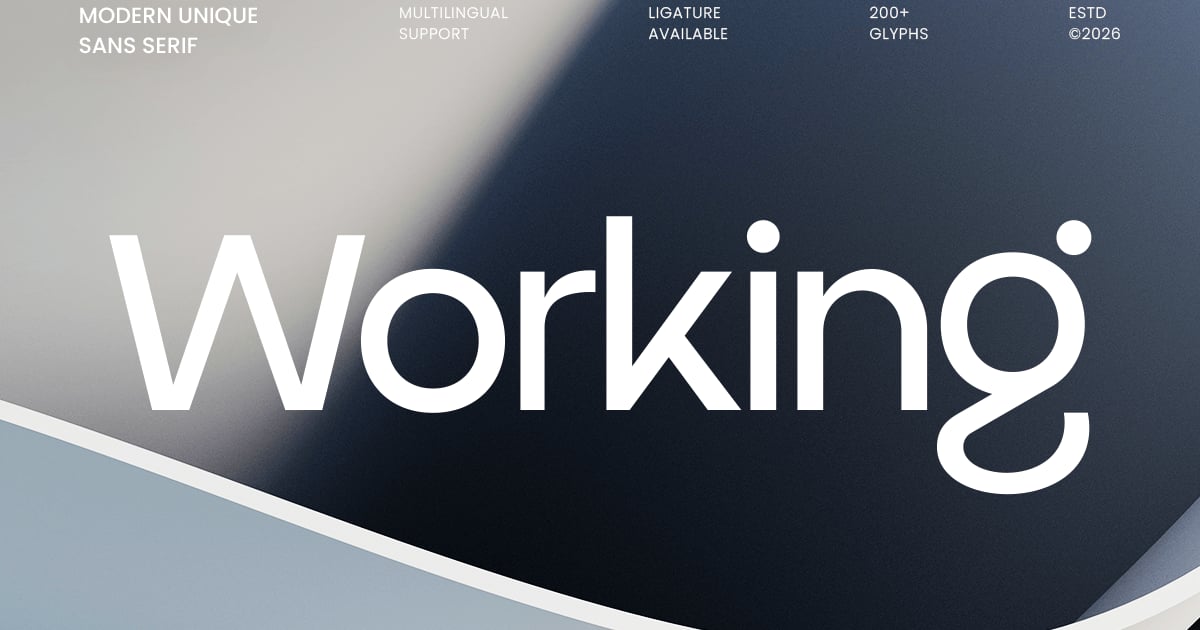
Working brings clean geometric forms and refined simplicity to contemporary typography. This professional sans-serif font strips away ornamentation to reveal precise letterforms that feel both technical and approachable. Its balanced proportions and consistent stroke weights make it especially well-suited for branding systems, editorial layouts, web interfaces, and corporate communications where clarity matters. The minimalist aesthetic adapts seamlessly across digital and print applications, from app design to packaging. Files are provided in standard font formats with full uppercase and lowercase alphabets, numbers, and punctuation marks.
Algoria – A Functional Sans Serif
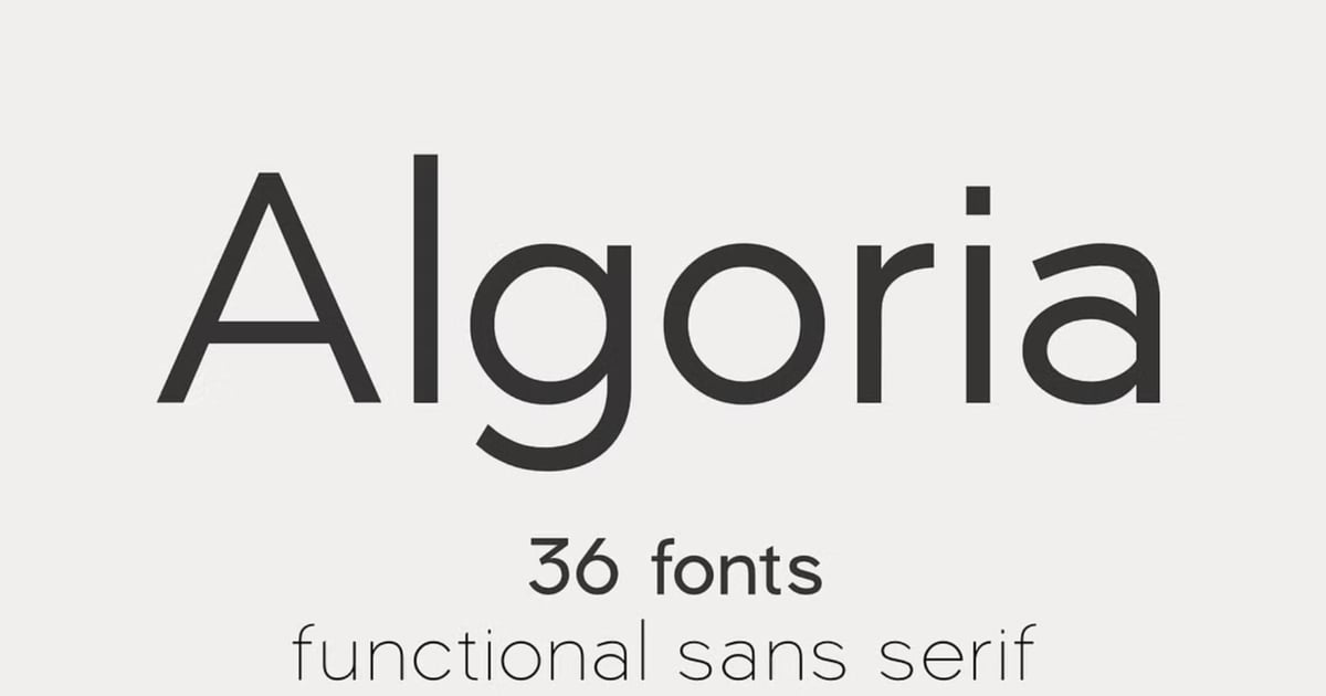
Algoria is a professional sans-serif font built for clarity and practical application across diverse design projects. Its clean geometric forms and balanced letterforms make it ideal for corporate identities, editorial layouts, web interfaces, and signage systems where legibility is paramount. The typeface strikes a confident tone without unnecessary embellishment, allowing content to communicate directly. With its straightforward approach to contemporary sans-serif design, Algoria works equally well in headlines and body text. The font supports multiple languages and delivers the essential characters needed for professional typographic work in standard formats.
Serif Fonts That Add Authority to Business Presentations
Some professional fonts for business presentations need a bit more weight behind them. Think board updates, investor meetings, legal and financial briefings, or any deck where credibility matters as much as clarity. A well-chosen serif adds that authority. The trick is picking one with sturdy strokes and generous x-heights, so the elegance survives the trip from your laptop to a projector across the room.
Pros Vogen Luxury Modern Serif
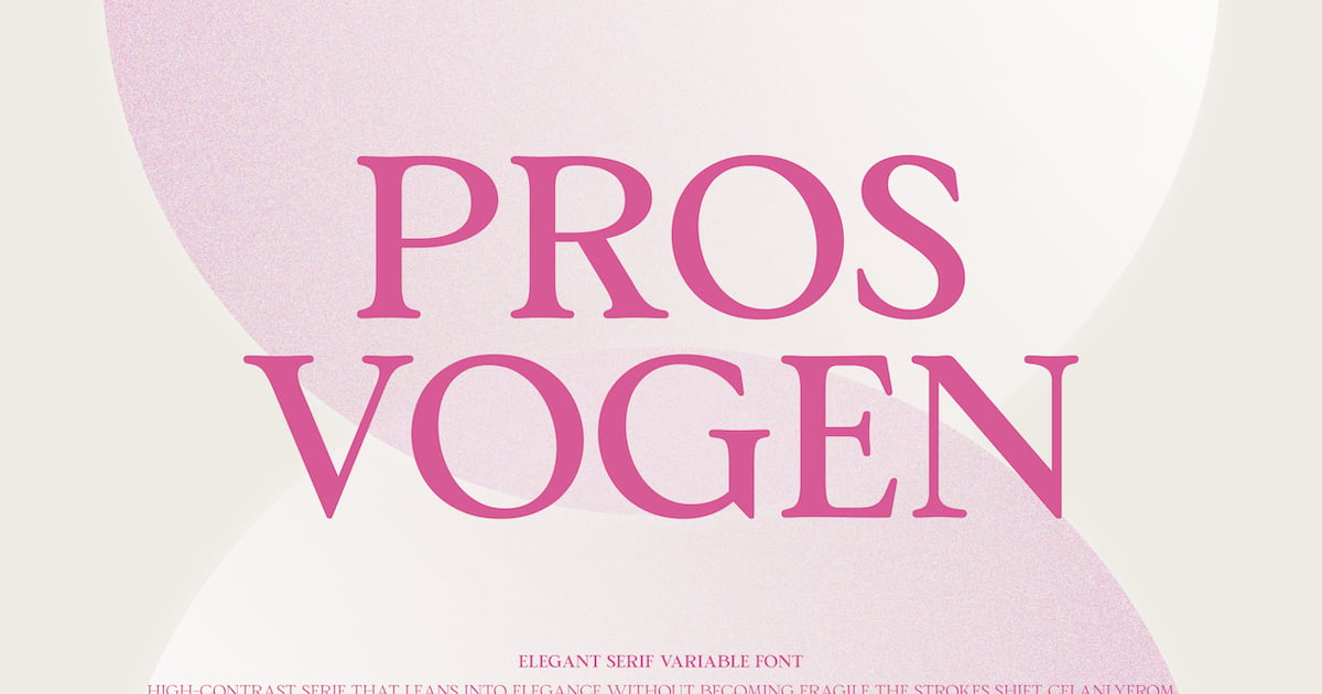
Pros Vogen Luxury Modern Serif brings contemporary sophistication to traditional letterforms with refined elegance and distinctive detailing. This professional serif font balances classic proportions with modern sensibilities, making it well-suited for high-end branding, editorial layouts, luxury packaging, and upscale web design. The typeface includes both standard serif and modern serif variations, offering designers flexibility for headlines and body text alike. With comprehensive character coverage and multiple file formats, it delivers polished results across print and digital applications where refined typography makes a lasting impression.
Troja Pro – Classic Retro Serif
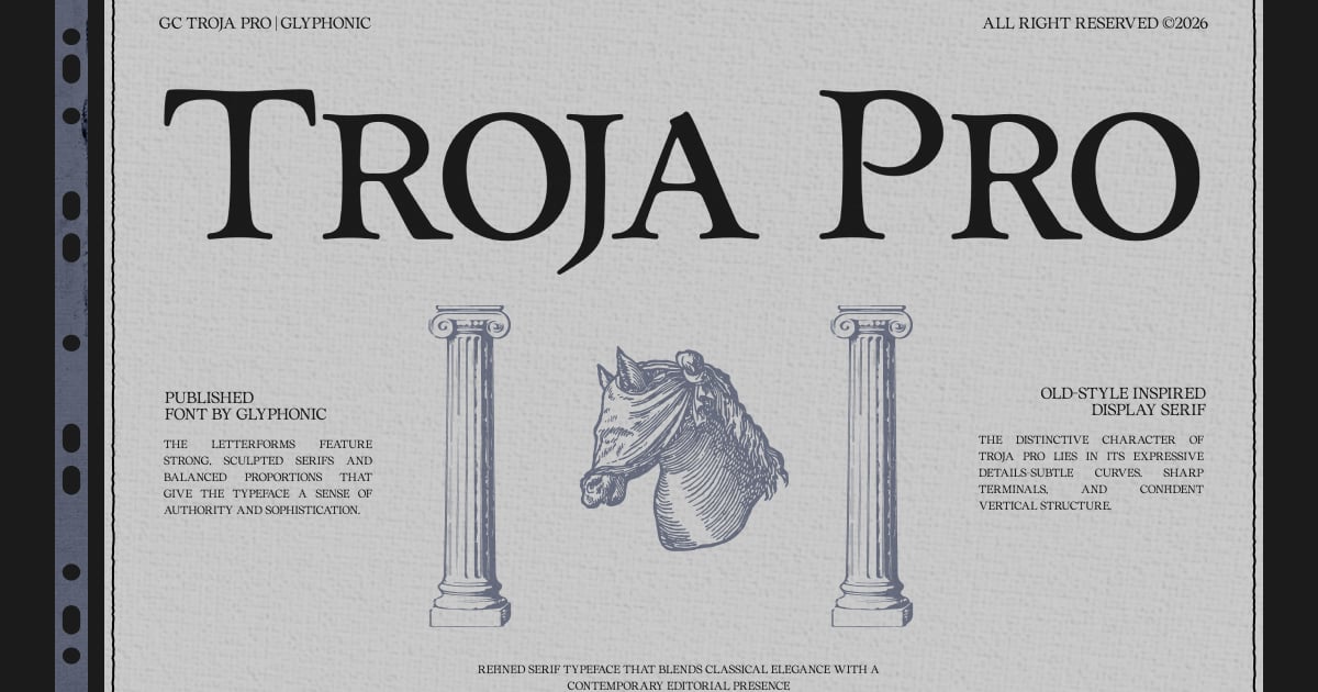
Troja Pro brings the distinctive aesthetic of mid-century typography to contemporary design projects. This professional serif font captures the bold, geometric spirit of vintage advertising and editorial design while maintaining excellent readability across modern applications. Its strong serifs and balanced letterforms make it ideal for headlines, posters, packaging, and branding work that calls for nostalgic sophistication. The typeface works particularly well in retro-inspired campaigns, luxury product design, and editorial layouts seeking timeless appeal. With comprehensive language support and both desktop font formats included, Troja Pro delivers classic elegance for designers working across print and digital media.
Prime Serif – Elegant Modern Serif Family
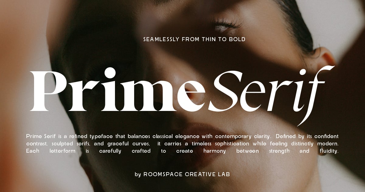
Prime Serif combines classical typographic elegance with contemporary refinement, making it ideal for editorial design, luxury branding, and sophisticated print projects. This professional serif font family features carefully balanced letterforms with delicate contrast and refined details that bring polish to magazines, book layouts, and upscale identity systems. The typeface includes full uppercase and lowercase alphabets, numerals, punctuation, and multilingual characters to support international projects. Available in multiple weights, it adapts seamlessly from body text to headlines while maintaining its distinctive character throughout.
Kelvingi Rodrige Serif Font
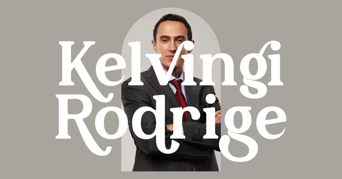
Kelvingi Rodrige brings refined sophistication to editorial and branding projects with its graceful letterforms and timeless aesthetic. This professional serif font balances classical proportions with contemporary elegance, making it particularly well-suited for luxury packaging, magazine headlines, and upscale identity work. The design features delicate serifs and carefully considered spacing that ensure excellent readability across both print and digital applications. With full multilingual capabilities, uppercase and lowercase characters, numerals, and comprehensive punctuation, it arrives ready for international projects in convenient TTF and OTF formats.
Thomas Craft A Modern Serif Typeface
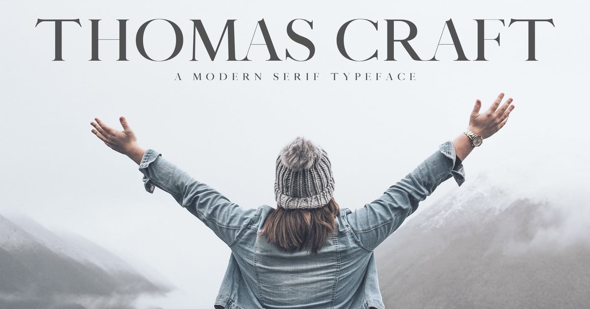
Thomas Craft is a professional serif font that balances contemporary sharpness with refined traditional letterforms. Its clean lines and carefully weighted strokes make it ideal for editorial design, luxury branding, book covers, and sophisticated web projects. The typeface brings an air of understated confidence to headlines and body text alike, working beautifully across both print and digital applications. With its versatile character set and polished aesthetic, Thomas Craft offers designers a dependable choice for projects requiring timeless elegance with a modern sensibility.
Mouris – Modern Serif Typeface
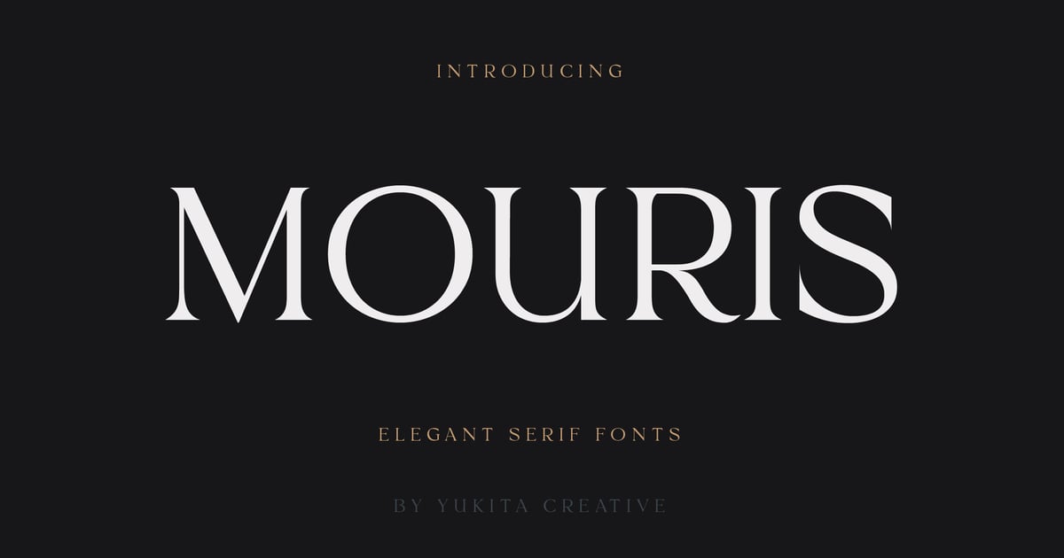
Mouris is a contemporary serif typeface that balances classical proportions with refined, modern details. Its elegant letterforms feature crisp serifs and sophisticated contrast, making it well-suited for editorial layouts, luxury branding, and upscale packaging design. This professional serif font brings polish to headlines and body text alike, offering designers a versatile solution for projects requiring both authority and style. The family includes uppercase and lowercase characters, numbers, and punctuation marks, with support for extended Latin scripts. Files are provided in standard desktop formats for immediate use across print and digital applications.
Cronisse – Modern Display Serif
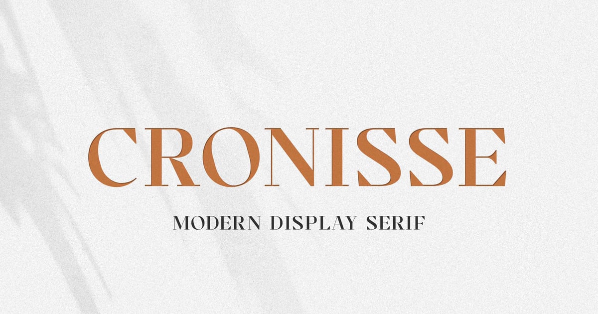
Cronisse brings contemporary sophistication to the serif category with distinctive display characteristics that balance traditional elegance and modern sensibilities. Its refined letterforms feature carefully considered proportions and contrast, making it ideal for editorial headlines, luxury branding, and upscale packaging projects. This professional serif font works particularly well when you need to convey authority and style simultaneously. The typeface includes uppercase and lowercase characters, numerals, punctuation, and multilingual support to accommodate diverse design needs. Files are provided in both OTF and TTF formats for seamless integration across design applications.
Perfect Dream | Beautifully Serif Family
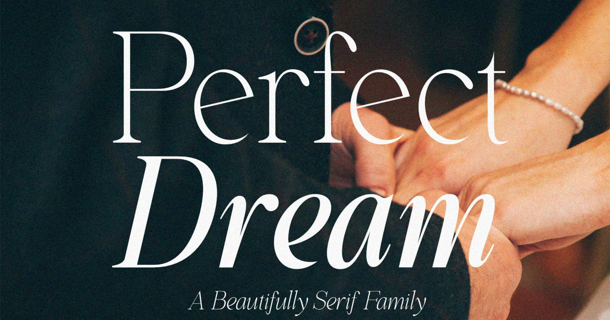
Perfect Dream is a professional serif font family that balances classical elegance with contemporary refinement. Its beautifully crafted letterforms feature graceful curves and refined details that work equally well for editorial layouts, luxury branding, and sophisticated wedding materials. The family offers versatile weights suitable for both headlines and body text. With comprehensive multilingual support and a full complement of uppercase and lowercase characters, numerals, and punctuation marks, it delivers polish across print and digital projects. Files are provided in TTF and OTF formats for broad compatibility.
Bold Display Fonts for Title Slides and Section Breaks
The best fonts for pitch decks usually have a split personality: calm and readable in the body, loud on the title slide. These display faces handle the loud part. Use them for your opening slide, section dividers, and that one big number you want investors to remember. Keep them away from bullet points, though. A display font that looks great at 72pt gets tiring fast at 20pt.
Orenza Bold – Company Modern Logo Font
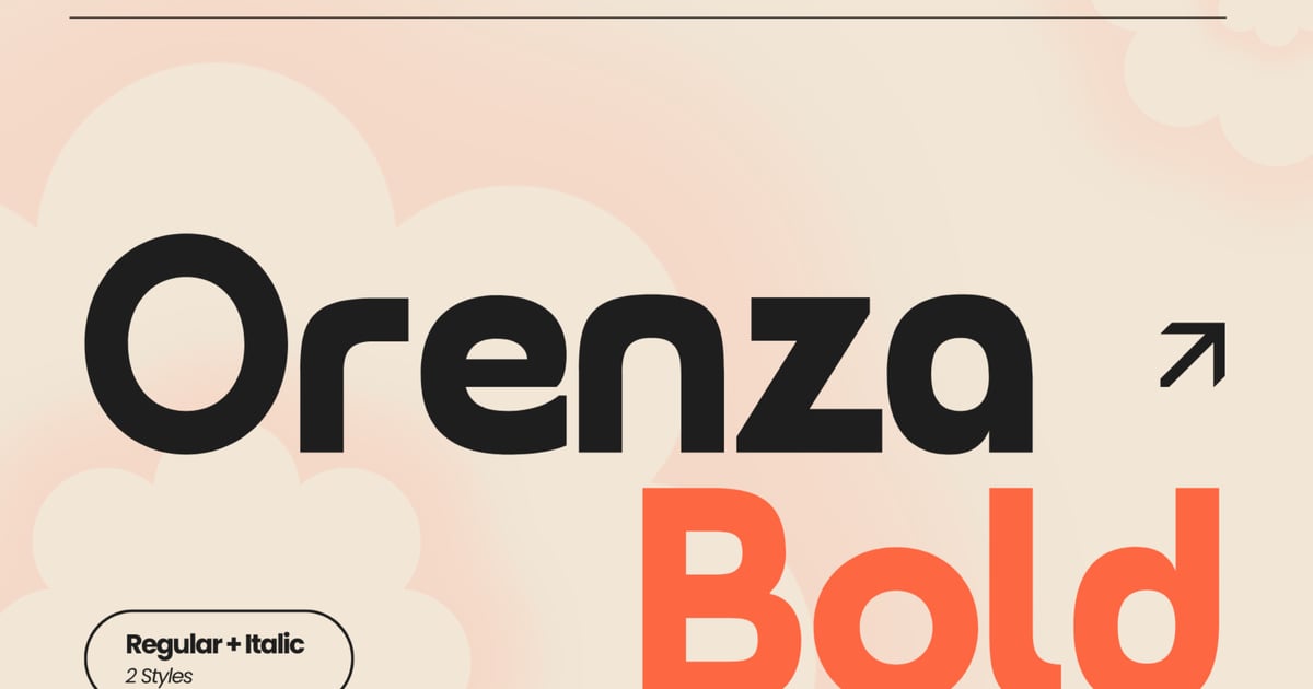
Orenza Bold delivers sharp, contemporary letterforms built for corporate identity and branding work. Its clean geometric construction and confident weight make it ideal for logos, headlines, and packaging that demand clarity and impact. This professional bold font maintains excellent legibility across scales while projecting authority and modern sophistication. The character set covers essential typographic needs with uppercase and lowercase letters, numerals, and punctuation. Perfect for tech startups, financial services, or any enterprise seeking a polished, no-nonsense visual voice, it arrives ready to use in standard font formats.
Laveda – Bold Sans Serif
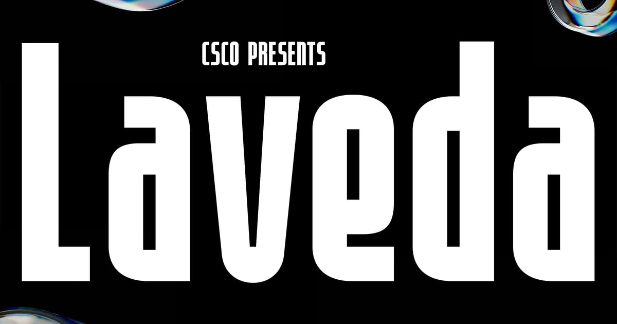
Laveda is a commanding sans serif typeface built for impact and clarity. Its heavy, confident letterforms deliver strong visual presence while maintaining excellent readability across headlines, branding, and editorial layouts. This professional bold font works particularly well for corporate identities, poster designs, and digital interfaces that demand attention without sacrificing sophistication. The family includes uppercase and lowercase characters, numerals, and punctuation to handle diverse typographic needs. Whether anchoring a minimalist logo or powering through dense information hierarchies, Laveda brings structural integrity and contemporary polish to any project requiring authoritative typography.
Pro Bold – Sans Serif Bold Font
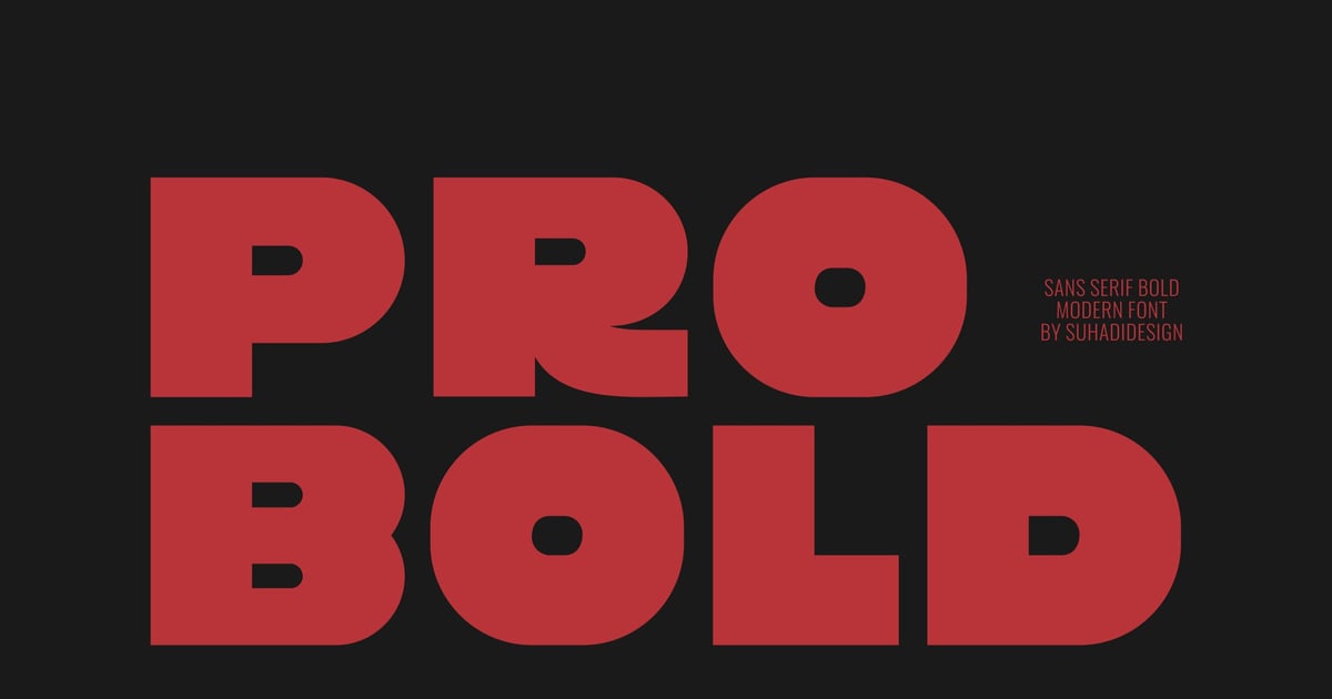
Pro Bold is a confident sans serif typeface designed for maximum impact and clarity. Its thick, sturdy letterforms command attention while maintaining excellent readability across print and digital applications. This professional bold font excels in headlines, posters, branding materials, and editorial layouts where strength and presence matter. The straightforward geometric construction ensures versatility across industries, from tech startups to fitness brands. Clean terminals and balanced proportions make it suitable for both large display settings and shorter text blocks that need extra weight and emphasis.
Segant Bold Branding Sans Font
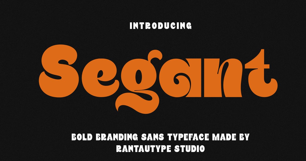
Segant Bold is a contemporary sans-serif typeface built for high-impact visual identity work. Its hefty letterforms command attention while maintaining clean, geometric proportions that feel modern and approachable. This professional bold font excels in logo design, packaging, headlines, and marketing materials where presence matters. The design balances strength with refinement, making it equally suited for tech startups and lifestyle brands. Segant Bold supports multilingual projects and includes uppercase and lowercase characters, numerals, and essential punctuation. Files are provided in standard font formats for seamless integration into any design workflow.
Fearless – Modern Condensed Sans Serif Font
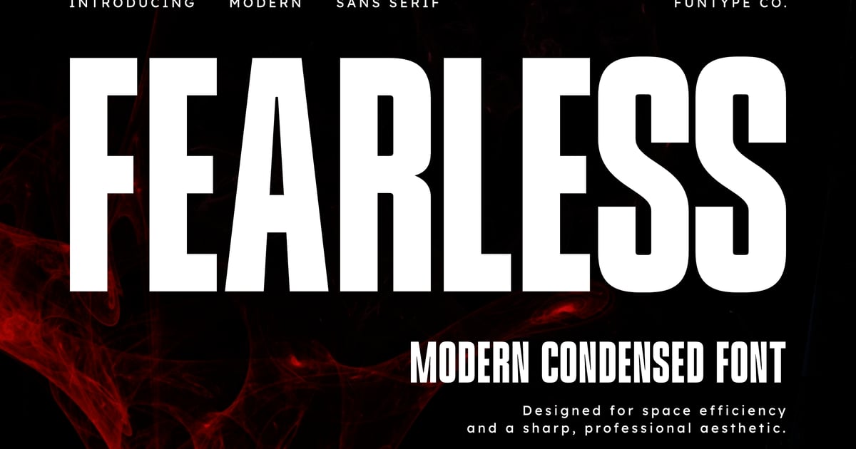
Fearless is a sleek condensed sans serif with a confident, athletic sensibility that works beautifully for branding, headlines, and poster designs. Its tall, narrow letterforms deliver maximum impact in tight spaces while maintaining excellent readability. The typeface shines in sports-related projects, fitness branding, and contemporary editorial layouts where a professional bold font presence is essential. With its geometric construction and modern proportions, Fearless adapts equally well to digital interfaces and print applications. The family supports multiple languages and includes uppercase and lowercase characters, numerals, and punctuation in accessible font formats.
Bloom – Modern Bold Condensed Sans Serif Font
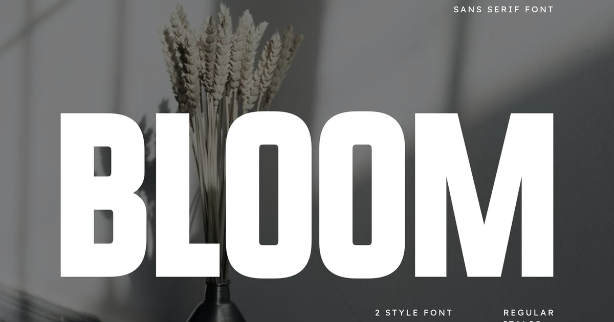
Bloom is a professional bold font that commands attention with its condensed proportions and contemporary geometric structure. The sans-serif design delivers maximum impact in tight spaces, making it ideal for headlines, posters, magazine covers, and athletic branding where strength and clarity matter. Its streamlined letterforms balance modern sophistication with readable functionality, working equally well for tech startups and fashion editorials. The typeface supports essential punctuation and numerals, while its bold weight ensures legibility across print and digital applications. Files are provided in standard desktop formats for immediate use.
Ragick – Bold Logo Corporate Font
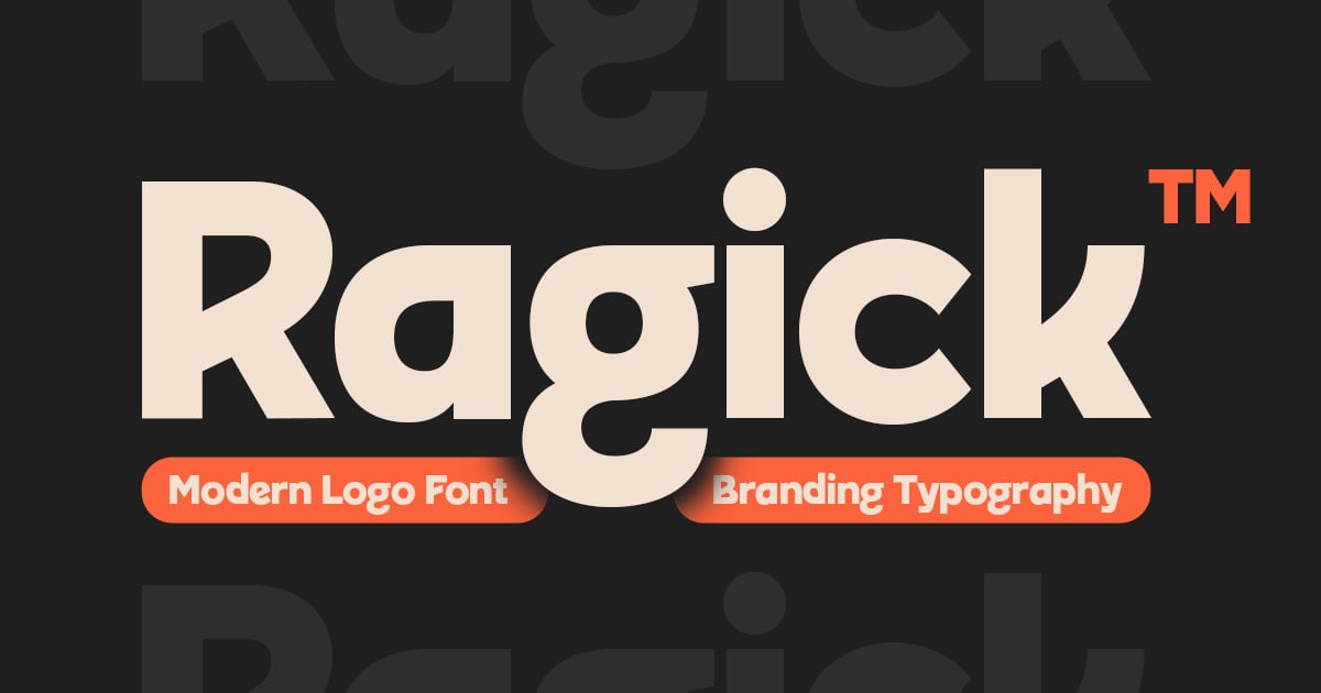
Ragick is a commanding sans-serif typeface built for impact in corporate and branding contexts. Its sturdy letterforms and confident weight make it ideal for logos, headlines, and identity systems that demand presence. This professional bold font delivers clarity at any size, from business cards to billboards. The design balances geometric precision with just enough warmth to feel approachable rather than cold. Perfect for tech startups, finance brands, or any venture seeking authoritative visual voice. The package includes uppercase and lowercase characters, numerals, punctuation, and multilingual support in both TTF and OTF formats.
Gafyn – Modern Bold Display Font
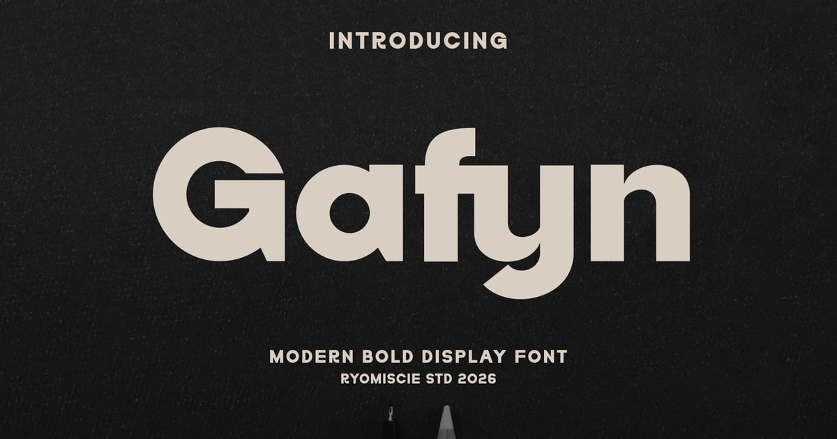
Gafyn is a professional bold font designed for maximum impact in contemporary design projects. Its strong, geometric letterforms deliver confidence and clarity, making it well-suited for headlines, posters, branding materials, and editorial layouts that demand attention. The typeface combines clean, modern proportions with substantial weight, ensuring excellent readability at display sizes. Gafyn includes both uppercase and lowercase characters, numerals, and essential punctuation. Files are provided in TTF and OTF formats for broad compatibility across design applications.
Vank – Strong Bold Condensed
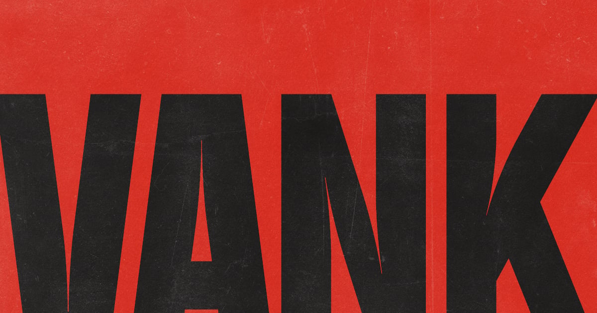
Vank is a space-efficient condensed typeface built for maximum impact in tight layouts. Its sturdy letterforms pack visual punch while maintaining excellent readability, making it ideal for headlines, posters, and athletic branding. This professional bold font excels in modern corporate applications where strength and efficiency matter equally. The family supports multilingual typesetting and includes uppercase and lowercase characters, numerals, and essential punctuation. Files are provided in both OTF and TTF formats for broad compatibility across design software and platforms.
Readable Fonts for Data-Heavy Slides and Reports
Charts, tables, and dense quarterly numbers put more pressure on a typeface than anything else in a deck. These readable fonts for slides stay legible from the back of the room even when the text is small and the figures are packed together. Most of them also double as strong fonts for reports and marketing materials, so your leave-behind PDF matches the deck you just presented. I looked for fonts with a wide range of weights, along with tabular figures that keep columns of numbers lined up.
Briselle
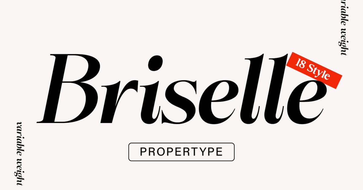
Briselle brings together the distinctive personality of wedge serifs with exceptional legibility for both display and text applications. Its sturdy letterforms strike a balance between traditional serif elegance and contemporary clarity, making it well-suited for editorial headlines, branding projects, and packaging designs. As a readable bold font with confident strokes and refined details, it commands attention while maintaining excellent functionality across various sizes. The family supports multiple languages and includes uppercase and lowercase characters, numerals, and punctuation. Files are provided in TTF and OTF formats for broad compatibility.
Algoria – A Functional Sans Serif
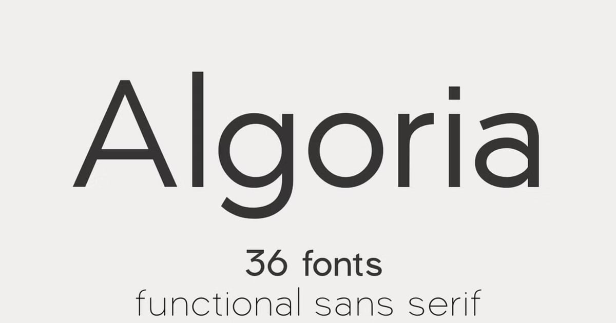
Algoria is a crisp, utilitarian sans serif built for clarity and contemporary applications. Its clean geometric forms and balanced proportions make it equally effective in digital interfaces, editorial layouts, and corporate branding systems. The typeface maintains excellent legibility across sizes while offering enough personality to stand out in crowded visual environments. As a readable bold font with functional sensibilities, Algoria handles everything from website headlines to presentation decks with professional polish. The family supports multiple languages and delivers files in standard web and desktop formats for seamless integration into any design workflow.
RNS Sanz
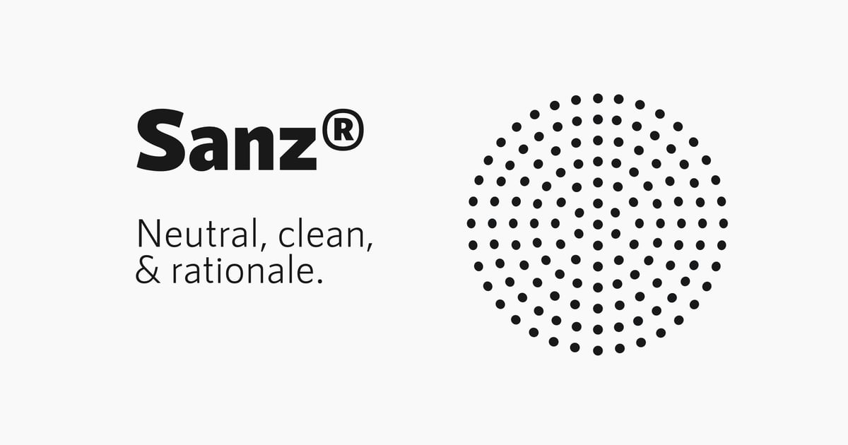
RNS Sanz is a contemporary sans-serif typeface that balances clean geometry with practical functionality. Its rational construction and web-optimized design make it ideal for digital interfaces, corporate branding, and editorial layouts where clarity matters most. As a readable bold font with understated confidence, it works equally well in headlines and body text. The family supports multiple languages and includes a full character set with uppercase and lowercase letters, numerals, and punctuation marks, providing designers with a dependable workhorse for modern communication projects.
Meridiana Pro
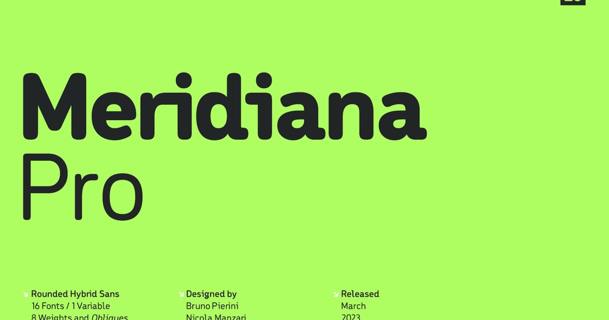
Meridiana Pro is a contemporary sans-serif typeface that balances clean geometric forms with approachable warmth. Its letterforms feature crisp terminals and consistent proportions, making it well-suited for editorial layouts, branding systems, and digital interfaces where clarity matters. As a readable bold font with variable capabilities, it adapts seamlessly across different weights and contexts. The family supports multilingual character sets and comes equipped with numerals, punctuation, and special glyphs. Files are provided in multiple formats for flexible implementation across print and screen applications.
Kineks Text | Neo-Grotesque Text
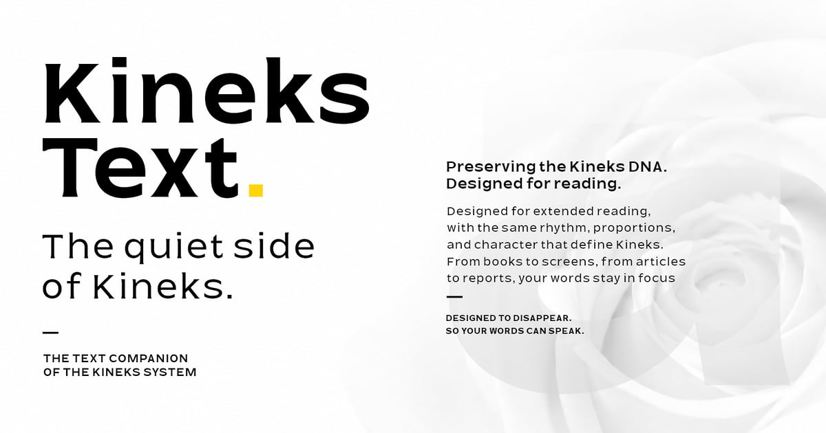
Kineks Text is a contemporary neo-grotesque typeface built for clarity and versatility in editorial and digital contexts. Its clean, rational letterforms balance neutrality with subtle personality, making it well-suited for body copy, UI design, and corporate communications. The family offers multilingual coverage and a comprehensive character set including uppercase, lowercase, numerals, and punctuation. As a readable bold font with crisp geometry and generous proportions, it performs reliably across various applications from publication layouts to brand systems. Files are provided in standard font formats for immediate use.
Lazario – Modern Font
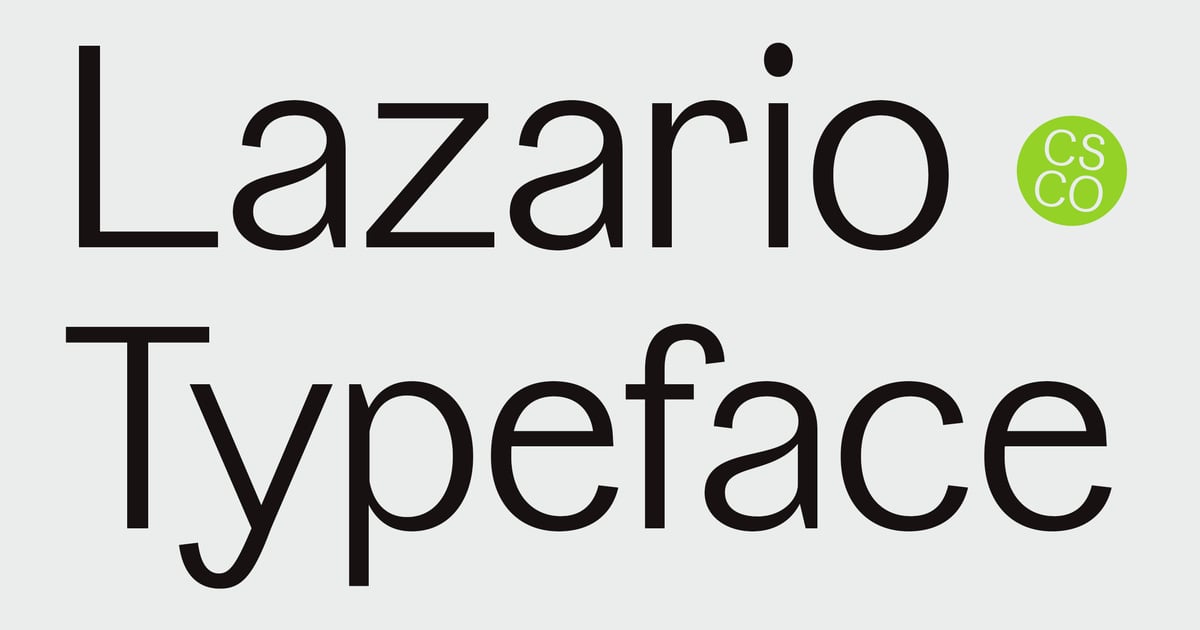
Lazario is a contemporary sans-serif typeface that balances clean geometry with approachable warmth. Its strong letterforms and generous spacing make it a readable bold font suitable for headlines, branding projects, and editorial layouts where impact matters. The design features consistent stroke weights and refined terminals that work across both digital and print applications. Ideal for modern websites, packaging, and promotional materials, Lazario brings clarity without sacrificing personality. The family includes uppercase and lowercase characters, numerals, punctuation, and multilingual support, delivered in standard font formats for broad compatibility.
Alice Mono – Monospaced Font
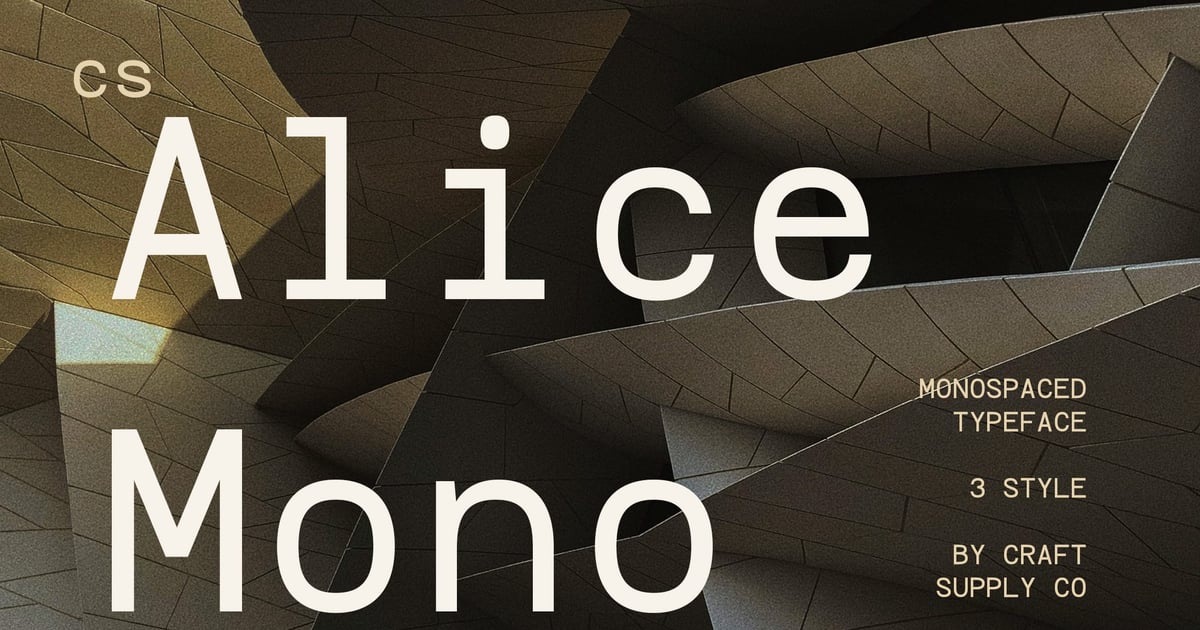
Alice Mono is a clean, utilitarian monospaced typeface built for clarity in technical and editorial contexts. Its even character widths make it ideal for coding environments, data tables, and modern interface design where alignment matters. The typeface balances functionality with personality, offering a readable bold font option that maintains excellent legibility at various sizes. Alice Mono includes uppercase and lowercase letters, numerals, and essential punctuation. It’s particularly well-suited for developer portfolios, tech documentation, and contemporary branding projects that need a structured, no-nonsense aesthetic with typographic precision.
How to Pair Fonts in a Presentation
A great font list only gets you halfway. How you combine the fonts is what makes a deck look designed instead of assembled. Here’s the approach I use:
- One headline font, one body font. Use a display face or serif for titles and a clean sans serif for everything else.
- Two typefaces max per deck. A third one almost always looks like a mistake. If you need more variety, use a different weight of a font you already have.
- Keep data labels in the body font. Chart labels, axis values, and table text should match your body copy so the numbers read as part of the story.
- Contrast on purpose. Pair fonts that are clearly different, like a heavy serif with a light sans. Two fonts that are only slightly different just look off.
If you’d rather not build a layout from scratch, start with one of these presentation templates and swap in your chosen pairing. Fonts and templates work best together.
Serif or Sans Serif for Presentations?
Here’s the short answer: use sans serifs for screens and projection, and serifs for printed leave-behinds and moments that need authority. Sans serifs have simpler shapes that stay crisp at low resolution and at a distance. Serifs look great in print and add weight to a title slide or a key quote. Most of the best decks use both, with a serif for headlines and a sans serif for everything else.
Frequently Asked Questions
What is the most professional font for a presentation?
No single font wins every time, but a clean sans serif with several weights is the safest professional choice. It reads well on projectors and laptops, keeps text hierarchy clear, and suits almost any industry. For formal or finance-focused decks, pair it with a sturdy serif for headlines to add authority.
What font size should I use for presentation slides?
Use 36 to 44pt for slide titles and 24 to 28pt for body text. Don’t go below 18pt, even for chart labels and footnotes. If text doesn’t fit at those sizes, the slide has too much on it. Split it into two slides instead of shrinking the type.
Should I use a serif or sans serif font for PowerPoint?
For most PowerPoint decks, use a sans serif for body text. It stays sharper when projected and at smaller sizes. Serifs work well for headlines, quotes, and title slides where you want some polish or authority. Pairing a serif headline with a sans serif body gives you both.
What fonts work in both PowerPoint and Google Slides?
System fonts like Arial, Georgia, Verdana, and Times New Roman work in both. Google Fonts such as Roboto, Lato, Open Sans, and Montserrat are built into Google Slides and can be installed for PowerPoint. For licensed fonts, embed them in your PowerPoint file or export a PDF so they display correctly everywhere.
Your fonts won’t close the deal for you, but a bad font can make a good idea look weaker. Choose one of these, pair it carefully, and make sure it works for the person in the back row.