In this article:
- Understanding the Basics of Typography
- Principles of Font Pairing
- Techniques for Pairing Fonts
- Common Font Pairing Mistakes
- Showcasing Successful Font Pairing Examples
- Conclusion
Have you ever wondered why some designs instantly grab your attention while others fall flat? A crucial element lies in the art of font pairing. For graphic designers, mastering how to pair fonts can transform a simple project into a compelling visual story.
Font combinations aren’t just about aesthetics; they’re vital for effective branding and communication.
When fonts blend seamlessly, they convey the right tone and message, elevating a brand’s identity. This post will show you practical tips to pair fonts like a pro, ensuring your designs not only look great but also communicate powerfully.
Understanding the Basics of Typography
Typography is more than just choosing a font that looks appealing. It’s an art and science combined, guiding the reader’s eye and enhancing the message. Whether you’re designing a book cover or a website, understanding the basics of typography can elevate your design skills. Let’s break it down.
Font Anatomy
Typography is like the anatomy of a human body, each part having its unique function and importance. Here are some key terms you’ll want to know:
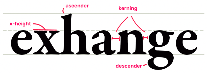
- Ascenders: These are the tall parts of letters that extend above the x-height, like the stem on the letter “b” or “d.” They give fonts a feeling of elegance and can affect readability.
- Descenders: Opposite to ascenders, descenders are the parts that drop below the baseline, seen in letters like “p” or “q.” They add depth and balance to a typeface.
- X-height: This measures the height of the lowercase letters, typically the body of the letter “x.” It influences how large the text feels and its legibility at smaller sizes.
Font Classification
Fonts are like personalities on a page. Choosing the right one sets the tone for your text. Here’s a snapshot of the main font categories:

Get 300+ Fonts for FREE
Enter your email to download our 100% free "Font Lover's Bundle". For commercial & personal use. No royalties. No fees. No attribution. 100% free to use anywhere.
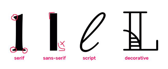
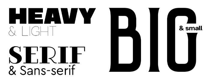
- Serif: These fonts have small lines or strokes at the end of each letter. They’re seen as traditional and formal, making them a staple in books and newspapers.
- Sans-serif: As the name suggests, these fonts lack the extra strokes. They offer a clean and modern look, perfect for digital content.
- Script: Mimicking cursive handwriting, script fonts are often used for elegant or creative designs. They can add a personal touch but should be used sparingly for readability.
- Display: Designed to catch attention, these fonts are bold and unique. Ideal for headlines or logos but not recommended for body text due to their decorative nature.
Hierarchy and Scale
Hierarchy in typography gives order to your design, guiding which information should grab the reader’s attention first. It’s like having a map for the reader’s journey.
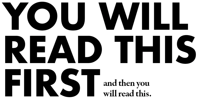
- Size: Larger text naturally attracts the eye first. Use size to emphasize headlines or important points.
- Weight: Boldness can highlight key elements. A heavier weight stands out, signaling importance or urgency.
To combine these effectively, imagine reading a road sign. The largest and boldest text tells you what to focus on first, just like your headlines should. In design, creating a clear hierarchy will ensure your message is seen and understood.
Learning typography is like learning a language, where every term, classification, and technique has its role in communication. Keep these basics in mind, and you’ll be on your way to designing with confidence and effectiveness.
Principles of Font Pairing
When diving into the world of graphic design, pairing fonts might seem like an art form reserved for the talented few. However, with the right knowledge and understanding, anyone can master it. Let’s explore the principles you can follow to create visually appealing font combinations.
Contrast
Contrast in font pairing is like creating a perfect balance between light and dark in a painting. By using contrasting fonts, you draw attention to the different elements on the page. Have you noticed how a bold headline next to a light script typeface immediately catches your eye? This is the power of contrast at work.
Consider these aspects when looking for contrast in fonts:
- Weight: Pair a heavy font with a lighter one.
- Style: Mix a serif with a sans-serif for clear differentiation.
- Size: Use varying sizes to show hierarchy and importance.
Contrast helps guide the reader’s eye and makes your design more interesting. It’s like adding a spice to a dish; the right amount makes all the difference.
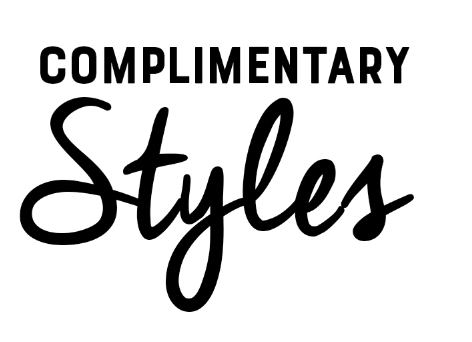
Complementary Styles
When choosing fonts that complement each other without clashing, think of it like matching your outfit. You want pieces that look good together but aren’t too similar. Complementary fonts play off each other’s strengths and create harmony in your design.
Ask yourself these questions:
- Do the fonts share similar moods or themes?
- Do they look balanced when placed side by side?
- Do they serve the intended purpose without one overpowering the other?
For instance, a clean sans-serif paired with a casual script font can work well in creating a friendly yet professional feel. It’s about finding fonts that speak the same language but have different dialects.
Consistency
Consistency in font pairing is like the glue that holds your entire project together. It might seem tempting to use multiple fonts to show creativity, but too many styles can confuse the audience. Consistency ensures that your design communicates clearly and looks cohesive.
Here’s how to maintain consistency:
- Use Hierarchy: Create a hierarchy by using one font for headings and another for body text.
- Stick to a Theme: Ensure all fonts align with the overall theme of your project.
Consistency doesn’t mean being boring. Think of it as creating a melody where each note falls perfectly in place, leaving your audience with a lasting impression.
Techniques for Pairing Fonts
Pairing fonts is a crucial skill for graphic designers looking to create visually appealing and effective designs. It’s like cooking—you need the right mix of ingredients to make a dish memorable. The same goes for fonts; getting them right can bring your design to life. Here’s a breakdown of some practical techniques to master this art.
Using Font Pairing Tools
Feeling stuck on which fonts to mix? The internet is your toolbox. There are many font pairing tools available that can do the heavy lifting for you. These resources can spark inspiration and guide your choices:
- Google Fonts: Offers a library of free, easy-to-mix fonts.
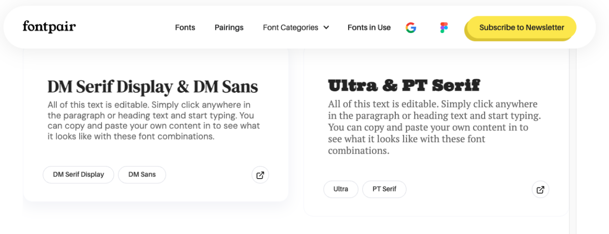
- Fontpair: Specializes in pairing Google Fonts, making it beginner-friendly.
- Typekit (Adobe Fonts): Provides curated font sets that work together seamlessly.
- Canva Font Combinations: Shows you how different fonts pair with selected styles.
These tools can save time and help you find combinations you might not have considered. They act like a chef’s taste test, ensuring the flavors complement rather than clash.
Designing with Scale and Weight
Think of fonts as characters in a play—they each have a role. Scale and weight are vital in making these characters stand out or blend in as needed.

The size of a font (scale) and the thickness (weight) can drastically change how a design is perceived:
- Varying Scale: Use larger headlines with smaller body text to guide the reader’s eye.
- Mixing Weights: Pair a bold font with a lighter one to create visual contrast.
Using scale and weight thoughtfully helps structure your design, making it easy for viewers to follow the narrative. It’s like the stage lighting—highlighting the right parts at the right time.
Experimentation and Testing
Like any creative field, designing involves experimentation. Don’t be afraid to play around with different font combinations until something clicks. Here’s how you can test your pairings:
- Create Mockups: Try your font pairings on real designs to see how they work.
- Seek Feedback: Ask colleagues or mentors for their thoughts.
- Reflect: Consider how the fonts change the tone of your message.
Testing allows you to see your fonts in action, much like a dress rehearsal. It gives you the chance to refine and perfect your pairings before they go live.
By understanding these techniques and using the right tools, you’ll be well on your way to mastering font pairing, crafting designs that not only catch the eye but also communicate your message effectively. So, what fonts will you experiment with next?
Common Font Pairing Mistakes
Pairing fonts as a graphic designer is a bit like finding the perfect outfit. You want to mix and match pieces that complement each other and create a pleasing look. However, just like in fashion, it’s easy to make mistakes that can throw everything off balance. Let’s explore some common font pairing mistakes and how you can avoid them.
Overmatching Styles
Imagine wearing a suit with a tie and shoes that match so perfectly, it looks like they’re from a uniform. That’s what happens when you pair fonts that are too similar. When fonts resemble each other too closely, the design can seem dull and flat.
Instead, aim for contrast to keep things interesting. Pairing a bold serif with a clean sans-serif, for instance, can create visual tension that holds attention. Consider these contrasting pairs:
- Old Style Serif with Humanist Sans-Serif for a classic yet contemporary look.
- Slab Serif with Modern Sans-Serif for a striking yet balanced contrast.
Remember, diversity in choice can make your designs pop and grab the viewer’s attention.
Ignoring Readability
Have you ever tried to read text that’s in a font so fancy, you end up squinting? Readability is crucial when it comes to font pairing. If your audience can’t read the message, the design fails, no matter how good it looks.
When choosing fonts, prioritize clarity. Here’s how to keep readability in check:
- Avoid overly intricate scripts for body text. Save them for headings or decorative elements.
- Test the font size. Ensure that your fonts maintain clarity at all sizes.
- Check for line spacing. Proper spacing helps make text easier to read.
Think of readability as the GPS guiding your audience through your design. If they get lost trying to figure out the words, they might miss the destination altogether.
Neglecting Context
Choosing fonts without considering the context is like wearing flip-flops to a snowstorm. The right font should feel at home in its setting. A playful font might work for a children’s book but fall flat in a legal document.
Consider the tone and purpose of your design:
- Who is your audience? Younger audiences might prefer modern or quirky fonts, while a more formal audience will appreciate traditional ones.
- What is the message? A handwritten script might convey warmth and personal touch, perfect for invitations or personal notes.
- Where will it be used? Digital screens require different considerations than print media, such as screen legibility.
Context is your guiding light. By understanding where and how your fonts will function, you ensure they communicate your intended message effectively.
Keep these pointers in mind to avoid common pitfalls, and you’ll be well on your way to mastering the art of font pairing.
Showcasing Successful Font Pairing Examples
Pairing fonts can feel a bit like finding the perfect dance partner. Some fonts twirl together seamlessly, while others might stumble over each other’s feet. In this section, we’ll explore examples of successful font pairings and current trends that guide designers in making those perfect matches.
Case Studies: Analyze Successful Designs and the Font Pairings Used
Successful font pairings can transform simple text into visual art. Let’s dive into a few examples:
- Apple’s Branding: Apple famously uses the combination of San Francisco for its operating systems, paired with Helvetica Neue. This pairing offers a sleek, modern look that perfectly aligns with the brand’s minimalist aesthetic.
- New York Times Newspaper: For a classic and authoritative vibe, the New York Times wisely pairs Cheltenham for headlines and Franklin Gothic for body text. This combination ensures readability while maintaining a traditional newspaper feel.
- Spotify Campaigns: Spotify often uses Circular for its headings and combines it with Gotham for supporting text. Together, these fonts appeal to younger audiences, exuding a sense of freshness and modernity.
Each of these pairings reflects a deeper understanding of brand identity and audience connection. Think of it as selecting the right key to unlock the mood you wish to convey with your design.
Industry Trends: Discuss Current Trends in Typography and How They Influence Font Pairing
Typography trends often mirror societal shifts and technological advancements. In recent years, some clear trends have emerged in font pairing:
- Minimalism and Simplicity: Many brands are moving towards cleaner and more straightforward font combinations. Simple sans-serif fonts, like Lato and Open Sans, are often paired to create an uncluttered look that flows smoothly across devices.
- Mixing Fonts with Personality: Contrary to the minimalist trend, there’s a growing popularity of adding a fun, quirky font to standard pairings. Think about pairing something classic like Times New Roman with a fun, display font such as Amatic SC. This combo can inject personality and make designs more engaging.
- Variable Fonts: Designers are embracing variable fonts, which allow for multiple weights and styles in one family. This flexibility in font design can lead to seamless transitions between headings and body text without jarring visual shifts.
Why not experiment with these trends in your next project? By considering trends and successful examples, you can ensure your designs are not only current but also memorable. How do you go about finding your perfect pairing? Think of it as crafting a playlist for a party—each track should be distinct, yet part of a harmonious whole.
Conclusion
Understanding font pairing elevates your design game, turning ordinary projects into visually engaging masterpieces. Remember these key points for effective pairing: ensure contrast while maintaining harmony, use hierarchy to guide the viewer, and consider the mood you wish to convey. Trust your instincts and explore combinations that complement your design’s purpose.
Practice regularly. Experimenting with different pairings will sharpen your skills and boost your confidence. So, take that bold step—try new font pairings today and see how they transform your work.
What font pairings have made a memorable impression on you? Share your insights in the comments and inspire fellow designers. Thank you for visiting, and keep an eye out for our future posts on advanced design techniques!