In this article:
So much of the information we see today comes through text, thanks to our reliance on websites. We also see much of that text on our phones. Consequently, mobile typography has a huge impact on what we read and how it comes across.
Every good designer knows they need to cater to mobile users today. However, the unique opportunities and challenges of mobile font design may be less clear. Here is a closer look at this field to help overcome that gap.
What Makes Mobile Typography Different?
The biggest difference between mobile typography and other contexts is screen size. Phone displays are larger than they used to be but still far smaller than laptops, desktop monitors and TVs. They also vary widely between models, which presents an interesting challenge in font design.
Text that is too small increases visual strain and slows reading, but too-large letters disrupt reading’s natural flow. Striking the right balance is harder when you are dealing with a smaller screen and varying sizes and aspect ratios.
Mobile devices also have less processing power than larger gadgets. This drop in computing performance means loading times are a more prominent concern. Some typography choices may work well in a desktop setting but require too much bandwidth to justify for apps or mobile websites.
The way people interact with their phones matters, too. We use our phones outside in varying lighting conditions, we scroll by touching the screen and we tap links with our fingers. Those may seem like minute details, but they all carry typography implications. You may not need to think about them in a different context, but they make a big difference on a mobile device.
10 Mobile Typography Tips and Guidelines
Given these unique concerns, mobile typography requires a specific approach. Follow these 10 tips and guidelines when designing or implementing your next mobile font.

Get 300+ Fonts for FREE
Enter your email to download our 100% free "Font Lover's Bundle". For commercial & personal use. No royalties. No fees. No attribution. 100% free to use anywhere.
1. Choose a Readable Font
Source: https://www.visionaustralia.org/business-consulting/digital-access/blog/typography-in-inclusive-design-part-1
Above all else, mobile fonts must be readable. You can find remarkable diversity among the 6.38 billion people who use smartphones every day, but they also have one thing in common — they want to understand what’s on their phones.
The need for readability may not be unique to mobile typography, but it does carry more weight. You already face an uphill battle here when dealing with less space and variable external lighting conditions. Screens will be small, and users may contend with more glare than they would with another format, so readability requires a larger emphasis.
Many mobile designers opt for sans-serif fonts, but serifs can improve readability as long as the ornamentation is not too complex. Wider letter thickness may also help. Color and contrast demand attention, too, as more contrast between text and background fights glare.
2. Avoid Imposters
As you pursue readability, remember to watch out for imposter letters. Imposters are characters that look nearly identical to others, leading to misreading and confusion. A common culprit is the uppercase “I,” which looks like a lowercase “l” in many sans-serif fonts.
Many accessibility experts recommend avoiding imposter letters, even if regulations like the Americans with Disabilities Act do not technically require it. Accessibility and regulations aside, removing these confusing characters keeps your font easier to read. Similarities are all the more apparent in smaller text sizes, so this is crucial for mobile design.
You may need to compare fonts manually and see how they look on various screen sizes to determine if imposters are a big issue. Small ornamentations and height differences are easy fixes to avoid such confusion.
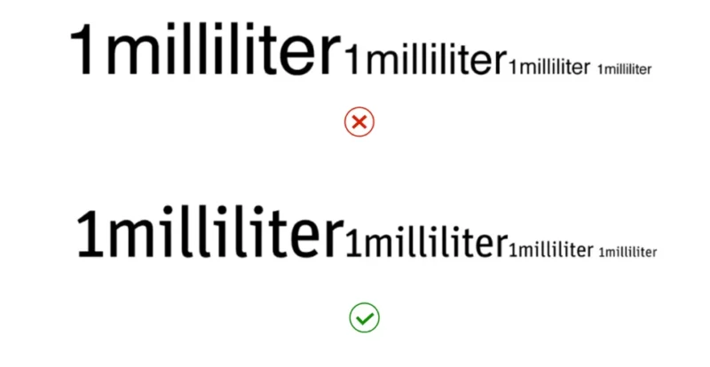
3. Use Relative Units for Kerning
Another important mobile typography readability tip is to keep your kerning adjustable. The spacing between your letters heavily affects font legibility, but the optimal value may vary between phones.
Just 66% of iPhone users use their device’s default text size. Roughly 22% make iOS fonts bigger, and 12% make them smaller. Mobile users may also pinch to zoom on some sites, and phone screen sizes may impact how large letters appear.
All of this variation means that fixed kerning may lead to mixed results in readability. Instead of using a set value, use relative units like em and rem in your site’s CSS. Using a ratio instead of a specific number will mean all audiences get the same experience from your typography.
4. Manage Line Length
Line spacing is a similar issue. Small text is easier to read when there’s enough white space around it to create contrast. At the same time, too big of a gap between elements could hinder the user experience, especially when scrolling through a longer piece.
Your body copy should have a line height of between 1.5 and 1.6 times the font size. Much less than that may make things difficult to read, and larger spacing may leave too few words on the screen at a given time. Heading spacing should be slightly smaller, as the difference in font sizes will already create contrast to aid reading.
Consider your margins, too. You want some white space at the edges of the display, but these should be relatively thin. Given how narrow phone screens are, wide margins will limit your words per line and stretch paragraphs out too long.
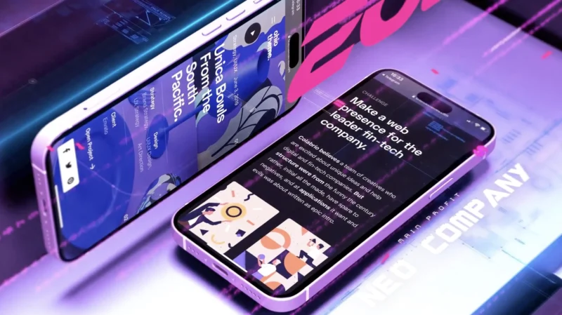
5. Be Careful About Font Pairings

Source: https://unsplash.com/photos/person-holding-space-gray-iphone-LUgHXvLe_kM
Font diversity is another complex part of mobile typography. While pairing different typefaces is a great way to add visual interest and contrast, going too far can introduce unwanted complications when dealing with mobile devices.
Consider your fonts’ file sizes. Pairing two custom or particularly complex typefaces may increase your page weight, slowing things down. The difference may not be noticeable on a desktop computer, but it takes less to make a difference on a less powerful phone or tablet.
Decreasing your load time through careful font combinations improves your search engine optimization on top of making a better user experience. Beyond file size, consider font pairings that offer contrast through letter size, thickness and possibly serifs, but avoid anything with enough complexity to make a small display busy.
6. Create Hierarchy
Mobile typography must also have a clear hierarchy. Differences in text sizes and styles keep things organized and make it easier for users to understand what they are seeing, which is particularly important when there is not as much room.
Hierarchy is not as straightforward as merely using smaller headings to separate sections under larger ones. The World Wide Web Consortium (W3C) warns against skipping heading ranks, highlighting how going from an H2 to an H4 is confusing. Similarly, using too many subheading ranks can overcomplicate the page and add too much bold text to be readable.
You can create hierarchy through more than just differently sized fonts. Consider changing the character weight, spacing or case to see how these differences look. Whatever you choose, you must keep spacing between ranks consistent and ensure it all remains readable on a small screen.
7. Implement Responsive Typography
Remember — while all mobile displays are smaller than computer monitors and TVs, some phones are far bigger than others. The 2022 iPhone SE screen is just 4.7 inches, compared to a 6.1-inch screen on Apple’s flagship smartphone. A fixed font size and spacing will look dramatically different between them, so you need responsive typography.
Responsive typography automatically adjusts font size and line height depending on a user’s display dimensions. The key to enabling it is basing these values on pixel ratios rather than specific, fixed numbers.
Some typefaces are more conducive to responsive typography than others. Fonts with strong strokes, neutral appearances and clear lines are generally more scalable, but you may need to test and compare a few choices.
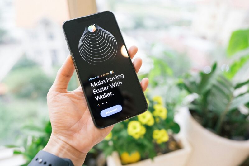
8. Keep Things Tappable
Source: https://unsplash.com/photos/person-holding-black-iphone-4-3xFwO_wTrkg
Clickability is another easily miss-able factor to consider. Many web builders automatically change the appearance of clickable links, but considering how 67.81% of U.S. users visit sites on mobile devices, you must focus on tappability, which is slightly different.
Fingers are not as precise as a cursor. Consequently, a tappable link needs to be more forgiving. You can lean into this by ensuring your body text or menu options use a slightly larger font than you would normally choose. Keep at least eight pixels between links to help people avoid tapping the wrong thing.
Bold text may make a link stand out, but it could also mess with spacing, leading to tap interference. Opt for color variations and underlining instead to highlight what users can interact with.
9. Capitalize on Contrast
Contrast between tappable content and non-interactive elements is not the only difference mobile typography needs. All text should stand out against its background, even more so than in another setting, because mobile users face more visibility hurdles.
Limited display space aside, we use our phones everywhere. On average, Americans look at their phones 144 times a day, which means staring at a screen in multiple rooms and environments. As a result, mobile content must be readable in all lighting conditions.
Avoid going beyond whites, blacks and grays for most text and backgrounds. Mix dark and light colors to keep things legible, even when light sources may produce significant glare.
10. Provide Accessibility Options
Mobile typography should be accessible. Accessibility is a key issue for all web design contexts, but the limits of handheld devices may mean some users want adjustable options they may not otherwise use.
Font size selectors, high-contrast modes and dark modes are three of the most important accessibility options to include for mobile text. Not everyone will use these functions, but they give people the ability to adjust their displays to their preferences, which is important when dealing with the mobile field’s variety.
All accessibility options should also be easy to find. Otherwise, they will not be useful to your audience. Consider placing them at the top of the page or in a tappable accessibility menu that remains in the corner as users scroll.
Master Mobile Typography to Reach a Modern Audience
You need to cater to a smartphone-using audience if you want your sites to be successful today. Consequently, mobile typography is an unignorable part of modern design. Optimizing typefaces and spacing for phone screens may be complex at times, but once you understand what users need, you can create readable, engaging text for any audience.
