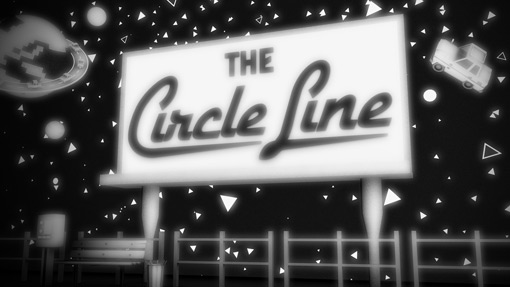
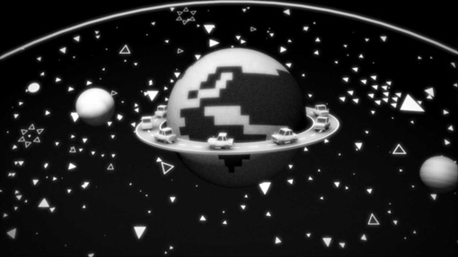
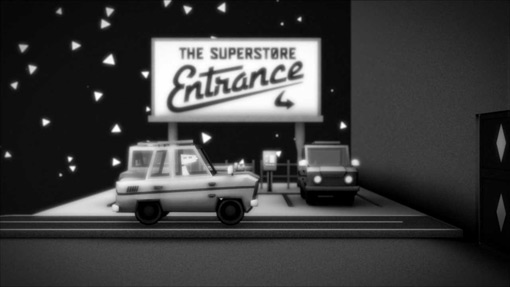
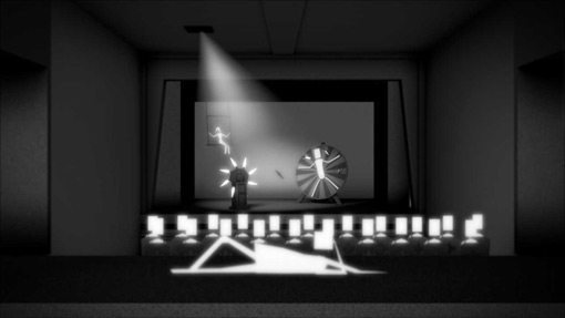
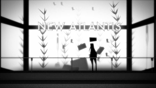
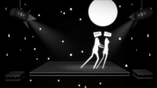
I don’t post a lot of animation work around here, but every so often one really catches my eye. And Adam Wells‘s beautiful black and white piece, The Circle Line, did just that. The animation was born from a larger festival piece created earlier this year, Risehigh, and utilizes really interesting animation techniques. Be sure to scroll down for some screen grabs if you can’t watch the video right away.

Get 300+ Fonts for FREE
Enter your email to download our 100% free "Font Lover's Bundle". For commercial & personal use. No royalties. No fees. No attribution. 100% free to use anywhere.
I’ll let Adam tell you more:
…I wanted something I could put out on the internet right away. It was made over a 3 month, with the objective of making something very chaotic and in your face. I wanted make the world as much a character as those that the camera follows, with lots of mini unfinished narratives in the background; like the ones we pass in the city all the time.
I have also have been using a different technique from standard CG animation (which is more like puppetry). Where I illustrate with polygon modelling tools. I then animate these frame by frame from a side view, much like a more 2d animator. That then allows me to use more traditional animation techniques such as squash and stretch, which I have ramped up to the extreme for this piece.
I was also put out a call on twitter for typographers who might want to help. Amazingly Joseph Alessio responded. And he build some wonderful type to use in the piece. Which was a lovely experience.
