


In this article:
- From Responsive Layout to Truly Adaptive UI Components
- Designing for Foldables: Postures, Folds, and App Continuity
- Desktop vs Mobile vs Foldable: Shared Tokens, Divergent Behaviors
- Input Methods: Mouse, Touch, Pen, and Keyboard Navigation
- State Preservation and App Continuity Across Form Factors
- How SoftDoes Approaches Systemic Adaptive Design
Product teams today ship to a growing roster of form factors in the same release train. A customer might begin a workflow on a phone, unfold the same device into a tablet, then resume on a desktop. Responsive design adapts layouts to different screen sizes, but width breakpoints alone no longer cover the complexity these teams face.
From Responsive Layout to Truly Adaptive UI Components
A classic responsive layout uses a single fluid layout that responds to width breakpoints. Fluid grids allow elements to resize based on screen width, media queries detect device dimensions for layout adjustments, and fluid images scale to fit their container. This approach improves SEO by ensuring mobile friendliness and delivers a baseline experience across different screen sizes. But it treats all screens as variations of one continuous surface.
Adaptive design goes further. It recognizes that a foldable device is not simply a wide phone or a narrow tablet. Foldables transition dynamically between compact and expanded states. The same device can present a single column layout when folded, master detail split layouts when unfolded, or stacked panes in tabletop mode. Adaptive layouts optimize user experience for different screen sizes by accounting for viewport segments, fold position, occlusion area, aspect ratio extremes, input modality, and keyboard focus requirements.
Consider an email application. On a phone in portrait, the app shows a message list in a single column layout. Adopt master detail layouts for email applications on foldables: when the user unfolds the device into book posture or works on a desktop, a reading pane appears beside the list. In tabletop mode, panes stack so the fold does not bisect related content. These are not just width changes. They are meaningful behavioral shifts that create a seamless experience for the user.
The key dimensions that turn a basic responsive layout into adaptive UI components include available viewport segments, fold position, input modality (mouse, touch, pen), and keyboard focus requirements. Tokens like spacing, typography scale, and color can stay unified, while layout templates and interaction patterns often need platform specific variants.
Teams that invest in software development services with this distinction in mind avoid rebuilding screens every time a new device category arrives. As one engineering director put it, “The gap between responsive and adaptive is the gap between resizing a page and rethinking the experience.”
Designing for Foldables: Postures, Folds, and App Continuity
Designing for foldable screens requires fluid adaptive UI components that respond to posture, not just width. Apps should automatically adjust when partially folded. Best layout patterns for foldables depend on device state and posture. Foldable devices require layouts for both folded and unfolded states. Use responsive application interfaces layout techniques rather than fixed dimensions to handle these transitions gracefully.

Get 300+ Fonts for FREE
Enter your email to download our 100% free "Font Lover's Bundle". For commercial & personal use. No royalties. No fees. No attribution. 100% free to use anywhere.
App continuity is the mechanism that preserves a user’s current state when the device changes posture. Hinge positions create visual separations in foldable devices, so designers should use separate content regions for different foldable postures. Avoid placing critical interactive elements across the device hinge. Instead, split panels so the fold falls between logical content areas.
A concrete example: on a trading dashboard, the cover screen shows a price chart and recent trades. When the user unfolds the device, the app expands to show an order book, watchlist, and trade ticket without losing the selected instrument or scroll position. This continuity ensures users see the same content across screens and do not restart their workflow with each posture change. As Bloomberg reported on enterprise mobility trends, the expectation among professional users is that tools follow them across contexts without friction.
Desktop vs Mobile vs Foldable: Shared Tokens, Divergent Behaviors
Design tokens form the stable core of a multi device design system. A unified theme ensures consistent visual identity cross platform design system. The tokens safe to share across desktop, mobile, and foldable variants include palette and semantic color roles, font families, typographic hierarchy, base spacing grid, and iconography set. Use vector graphics to ensure scalability on high density displays across all these contexts.
What must diverge by platform or form factor includes density scale (compact on desktop, comfortable on touch devices), motion curves for larger transitions, corner radii, and elevation behavior on web versus native rendering. Avoid stretching components unnecessarily across larger screens. Instead, define context specific density and layout rules.
Design systems require structured ownership across all roles involved. Over twenty five percent of public design systems will support multiple platforms by next year, which signals that this is no longer an edge case. Maintain visual consistency across different screen configurations by structuring tokens into tiers: primitive values, semantic mappings, and component level overrides. A primary button, for example, can reuse color and typography tokens everywhere but expose behavioral variants: hover and focus rings on desktop, pressed states and larger touch targets on mobile and foldables, and keyboard focus outlines for accessibility.
Input Methods: Mouse, Touch, Pen, and Keyboard Navigation
For touch first use on foldables and phones, provide targets about six to eight millimeters wide and add padding around icon buttons. Desktop controls can be smaller, but must remain legible and offer visible focus indicators and arrow key navigation in complex widgets.
A data grid can adapt its behavior by context:
- Desktop: support row hover, resizable columns, and keyboard shortcuts.
- Foldable in portrait: show columns as cards with swipe and tap interactions.
- Foldable or tablet with an external keyboard: enable focus indicators and keyboard shortcuts.
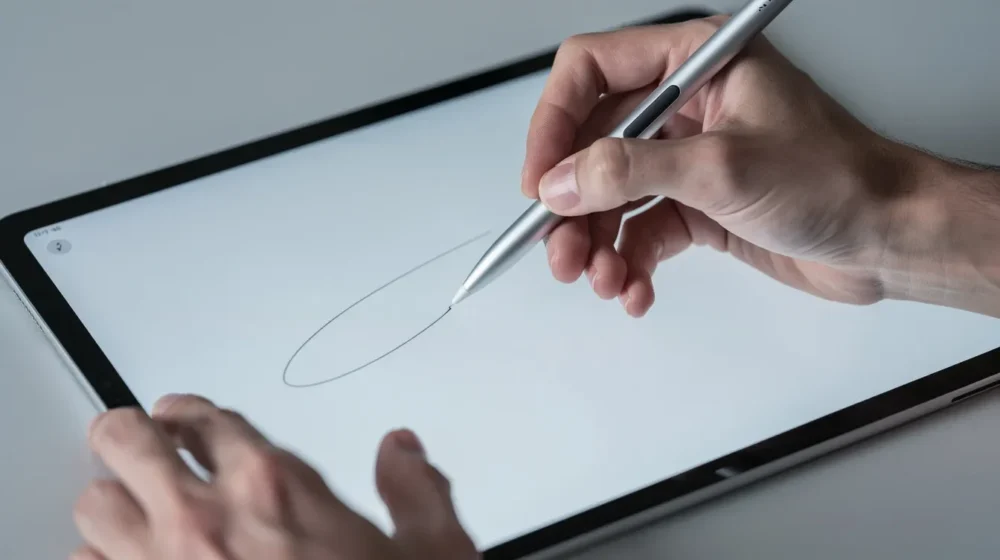
Pen input affects components such as drawing canvases and annotation tools on foldables. Larger gesture zones around the fold help accommodate resting hands, and controls should avoid edges where certain users rest their palms. According to research covered by Harvard Business Review on digital workplace tools, organizations that optimize for mixed input modalities see measurably higher adoption of mobile productivity apps.

State Preservation and App Continuity Across Form Factors
Apps must preserve state during screen transitions. When users move between a phone, foldable screen, and desktop app, retain navigation, scroll position, selections, and unfinished forms. Dynamic UI updates should happen seamlessly when users fold or rotate a device or resize a window.
Persist the state that supports the task, including the current route or filter, open panels, and form progress. A layout change should not interrupt checkout, clinical documentation, or a compliance workflow. For example, a portfolio manager should be able to resume a desktop review on a foldable with the same instrument and risk filters selected.
How SoftDoes Approaches Systemic Adaptive Design
SoftDoes helps teams in finance, healthcare, education, and other industries adapt shared UI components across devices. The process includes mapping user journeys, auditing tokens and components, and assessing fold postures and input methods. Teams then build a shared library with reusable foundations and distinct layouts for phones, unfolded foldables, tabletop use, and desktop.
A verification matrix guides development and regression testing, then evolves as device usage changes. This approach reduces one off designs, simplifies maintenance, and gives teams a clear path for updates across platforms.