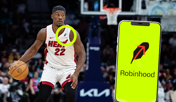
The other day, I was watching basketball with my son when something caught my eye: the Robinhood logo on one of the players’ jerseys. Now, I’ve been using Robinhood since around 2018, checking my account every few days like most of us do. But seeing that logo out of context—away from my regular routine of opening the app to check my positions—made me notice something I’d somehow missed for years.
There’s an arrow hidden in the feather. And not just any arrow—it points up and to the right, exactly how we all want our stocks to go.
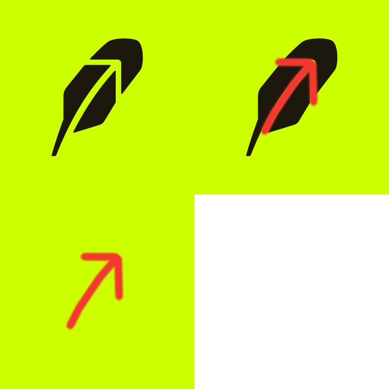
I know what you’re thinking: “Preston, this is like that FedEx arrow thing, right?” And yeah, it actually is. Just like how FedEx cleverly hid an arrow between the ‘E’ and the ‘x’ in their logo, Robinhood’s designers pulled off something similarly subtle but meaningful. The feather, which obviously ties back to the Robin Hood legend, doubles as a visual metaphor for market growth.
This observation feels particularly relevant right now, as Robinhood just rolled out a complete visual rebrand. In October 2024, they unveiled a new look that’s been, well, let’s say “polarizing” among users. The company swapped out their iconic mint green for what they’re calling “Robin Neon”—a bright yellow-green that’s gotten some colorful descriptions from the Reddit crowd, ranging from “radioactive” to “hyper urine.” (Stay classy, Reddit.)
But here’s the thing: while the color scheme might be dividing users, the simplified logo actually makes that hidden arrow even more prominent. The new design strips away unnecessary elements, leaving us with a cleaner, more purposeful mark. And when you’re trying to communicate something as fundamental as “stocks go up,” sometimes less really is more.
Now, I get it. Change is hard, especially when you’re messing with something that worked. The original mint green had become Robinhood’s signature, to the point where people specifically chose that color for their debit cards. One Redditor pointed out that changing an established brand color is like “if McDonald’s suddenly changed their logo to maroon and pale yellow.” It’s jarring.

Get 300+ Fonts for FREE
Enter your email to download our 100% free "Font Lover's Bundle". For commercial & personal use. No royalties. No fees. No attribution. 100% free to use anywhere.
But while the color change might take some getting used to, I’d argue that strengthening the visibility of that upward-pointing arrow is actually a smart move. It’s not just about aesthetics—it’s about reinforcing what Robinhood is supposed to help us achieve: growth.
The timing is interesting too. Robinhood’s pushing to position itself as a more serious platform for investors. They’re expanding into retirement accounts, offering competitive margin rates, and now they’ve got NBA jersey partnerships with the Memphis Grizzlies and Miami Heat. That hidden arrow isn’t just a cute design trick—it’s a subtle reminder of their core promise to users.
For what it’s worth, some users are having legitimate issues with the new color scheme. Several colorblind users have reported difficulty distinguishing between the new red and green indicators, which is obviously problematic for a trading platform. That’s something Robinhood needs to address, and quickly.
But looking past the color controversy, I think there’s something to be said for a logo that actually means something. In a world where many tech companies opt for generic, interchangeable symbols, Robinhood’s hidden arrow feels intentional. It tells a story. It communicates a promise. And most importantly, it makes you smile a little when you finally notice it.
Will this make everyone forget about the “hyper urine” green? Probably not. But maybe next time you open the app, you’ll notice that subtle upward arrow and remember why you started investing in the first place. Sometimes the best design elements are the ones hiding in plain sight.
Just don’t expect me to tell my son about this during our next basketball game. I’m pretty sure he’s already tired of me pointing out hidden arrows in logos.

