In this article:
- The 35 Most Commanding Army Fonts of 2026
- What Makes Army Fonts So Distinctive?
- Where to Use Army Fonts Effectively
- When to Avoid Army Fonts
- Pairing Army Fonts with Other Typefaces
- The Evolution of Military Typography
- Common Questions About Army Fonts
- Conclusion: Standing at Attention
Army-inspired typography isn’t just for the military anymore. These powerful fonts have marched their way into mainstream design, appearing in everything from fashion brands to video games to corporate identities seeking to convey reliability and toughness.
The 35 Most Commanding Army Fonts of 2026
After extensive research and testing, I’ve compiled this definitive list of the most impressive army fonts available today. From authentic military stencils to modern interpretations, these fonts will add authority and precision to any design project.
Station Army Font
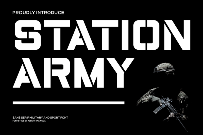
Station Army Font is a bold, sans-serif typeface that exudes military precision and strength. Its clean lines and sharp edges make it perfect for headlines and logos, particularly in projects with a military or industrial theme.
Cold Army – A Stencil Font
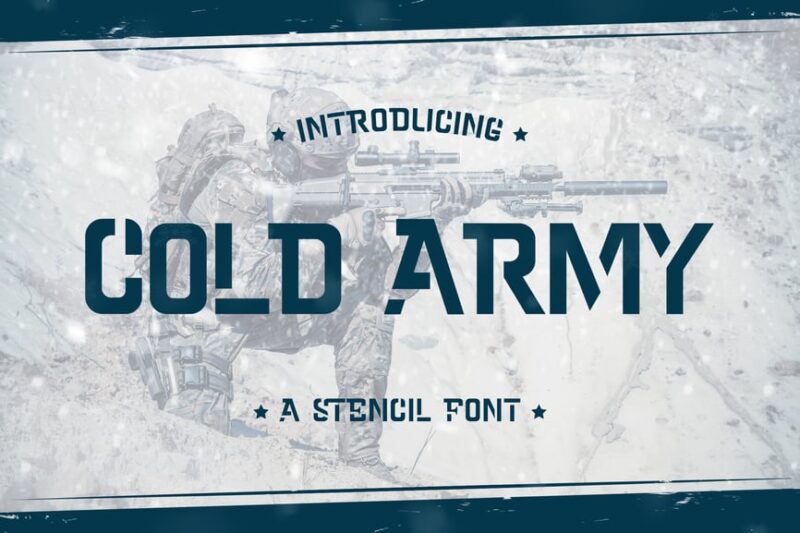
Cold Army is a striking stencil font that captures the essence of military aesthetics. Its rugged, cut-out design lends an authentic feel to designs, making it ideal for army-themed projects or to add a tough, utilitarian look to any graphic work.
Stencil Army
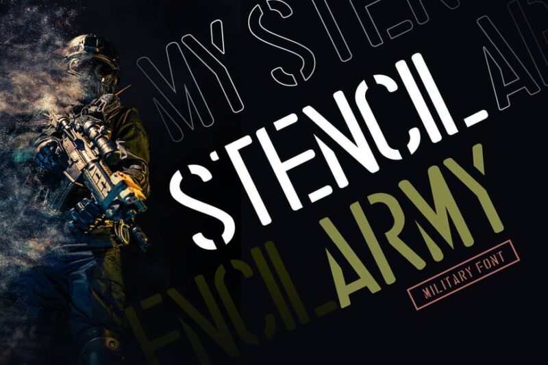
Stencil Army is a versatile sans-serif font with a retro military flair. Its stenciled letters evoke a sense of nostalgia while maintaining readability, making it suitable for both vintage-inspired designs and modern projects requiring a touch of ruggedness.
Stencil Army Font – SGT. John O
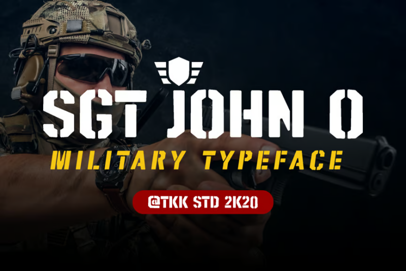
SGT. John O is a bold, military font that commands attention. Its strong, geometric shapes and clean cuts make it highly legible even at small sizes, perfect for creating impactful headlines or branding materials with a militant edge.
Warband Stencil Font
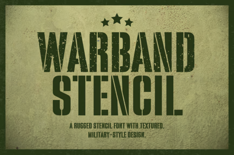
Warband Stencil Font combines military precision with modern typography. Its clean, stenciled characters offer excellent readability while maintaining an authoritative presence, making it suitable for a wide range of design projects from posters to packaging.

Get 300+ Fonts for FREE
Enter your email to download our 100% free "Font Lover's Bundle". For commercial & personal use. No royalties. No fees. No attribution. 100% free to use anywhere.
Headcorps – Military Serif Font
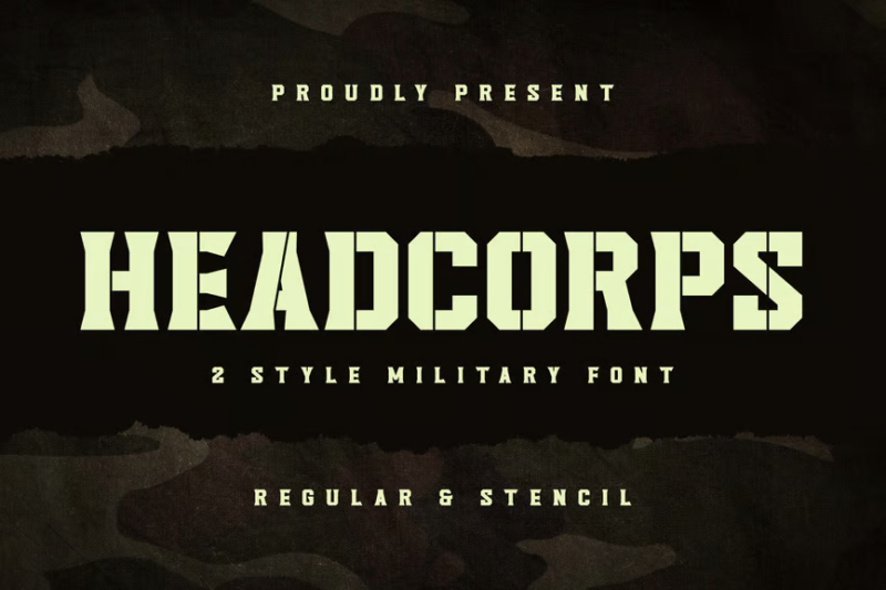
Headcorps is a distinctive military serif font that blends vintage charm with modern design sensibilities. Its bold serifs and strong character shapes create a powerful presence, ideal for headlines or branding in projects that require a mix of authority and nostalgia.
Peligro Stencil
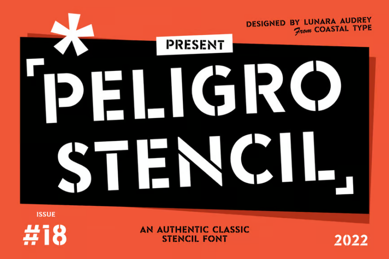
Peligro Stencil is a bold, sans-serif font with a military-inspired stencil design. Its sharp edges and cut-out details create a sense of urgency and danger, making it perfect for warning signs, action-oriented designs, or any project requiring a strong, militant aesthetic.
Thunderbolt

Thunderbolt is a dynamic, futuristic sans-serif font that crackles with energy. Its sleek, angular forms and sharp terminals make it ideal for headlines and display text in projects that require a modern, high-tech, or sci-fi feel.
Legacy – Vintage Style Font
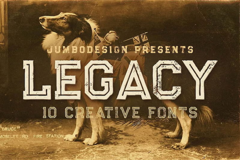
Legacy is a charming vintage-style font that combines sans-serif simplicity with decorative flair. Its nostalgic character shapes and subtle imperfections give designs an authentic retro feel, perfect for projects that aim to evoke a sense of history or tradition.
Brave Brigade – Tactical Display Font
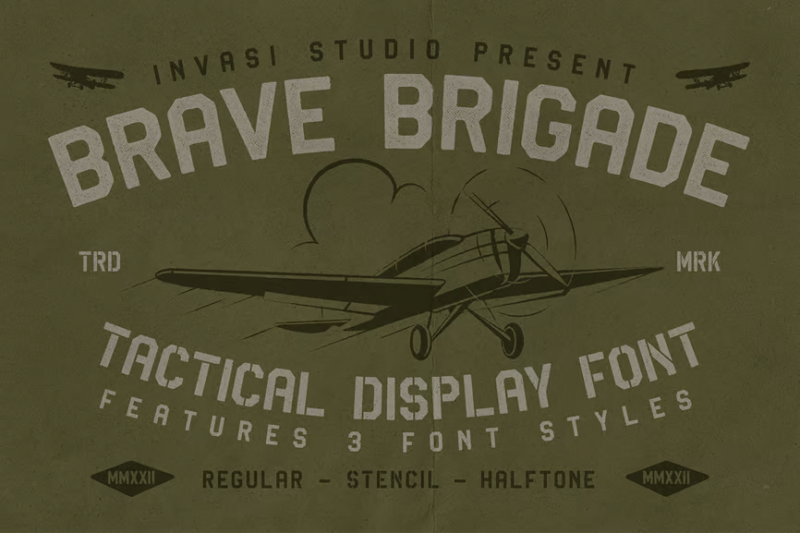
Brave Brigade is a bold, stencil-style display font with a tactical edge. Its retro-inspired design and sharp angles create a strong military aesthetic, making it ideal for game titles, movie posters, or any design project requiring a robust, action-packed feel.
United Mech – Stencil Sans Font

United Mech is a powerful stencil sans font that combines military precision with mechanical aesthetics. Its clean lines and geometric shapes make it highly readable, while its stenciled design adds a rugged, industrial feel perfect for tech-oriented or military-themed projects.
Boomer Town – Retro Military
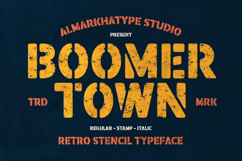
Boomer Town is a nostalgic, retro-military font that captures the essence of mid-20th century army aesthetics. Its bold, slightly condensed characters and subtle roughness make it ideal for vintage-inspired designs, particularly those related to military history or classic Americana.
Bandex – Stencil Typeface
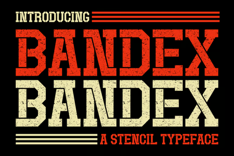
Bandex is a robust serif stencil typeface that combines military precision with classic typography. Its bold serifs and stenciled design create a strong, authoritative presence, making it perfect for headers, logos, and displays in projects requiring a tough, no-nonsense aesthetic.
Reloaded – Military Serif Font
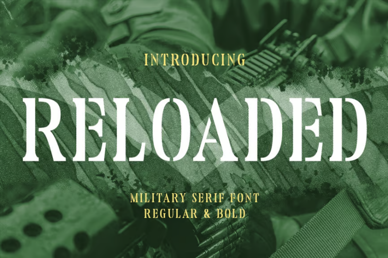
Reloaded is a distinctive military serif font that blends vintage charm with modern design elements. Its bold serifs and strong character shapes create a powerful presence, ideal for headlines or branding in projects that require a mix of authority and nostalgia.
Montenegro – Decorative Slab Serif
Montenegro is a versatile decorative slab serif font with a military-inspired twist. Its bold, square serifs and unique character shapes make it stand out in both digital and print designs, particularly suited for game titles, posters, or branding projects with a strong, assertive tone.
Union Force – Stencil Display
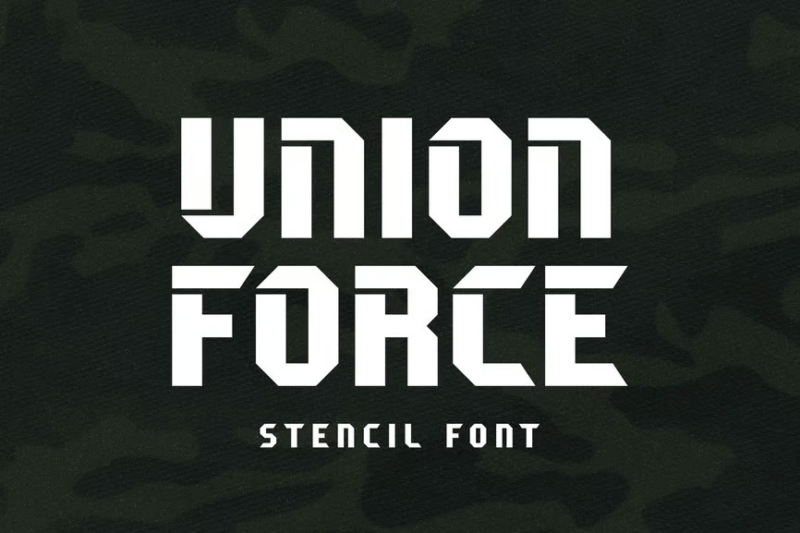
Union Force is a powerful stencil display font that combines military aesthetics with vintage appeal. Its bold, cut-out design creates a strong visual impact, making it ideal for headlines, logos, or any design project that requires a tough, authoritative presence with a touch of nostalgia.
Lordcorps – Military Sans Font
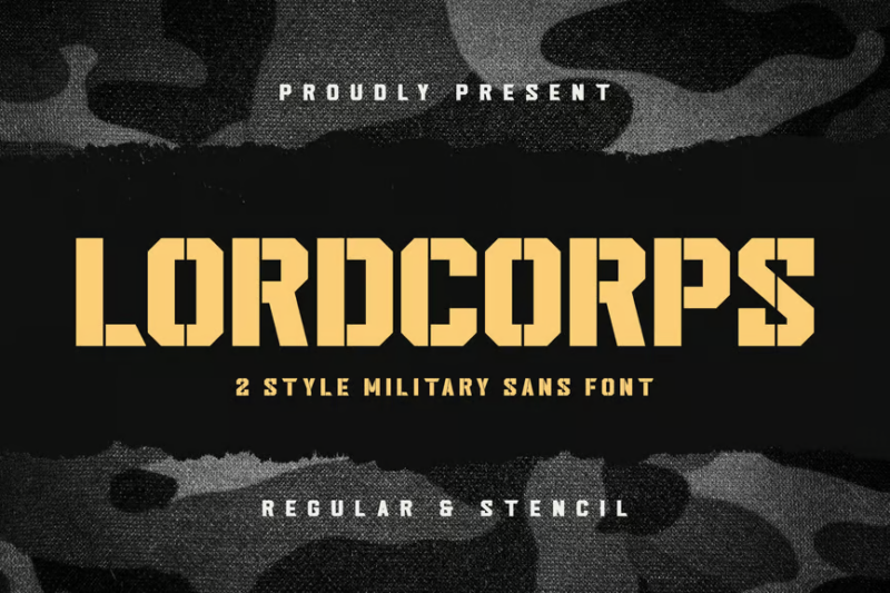
Lordcorps is a commanding military sans font with a vintage twist. Its bold, slightly condensed characters and subtle detailing evoke a sense of authority and tradition, making it perfect for projects that require a strong, official look with a touch of historical flair.
Gin Military Base
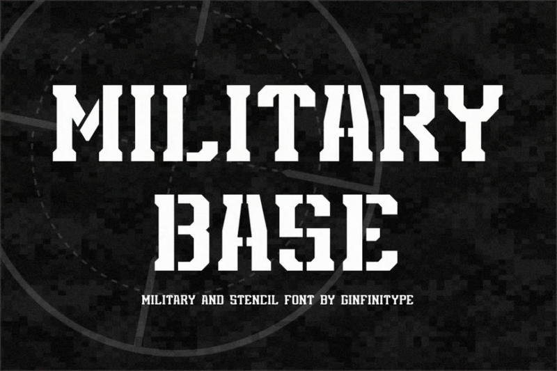
Gin Military Base is a bold, retro-inspired serif font that exudes strength and authority. Its thick, squared-off serifs and strong vertical strokes create a powerful presence, ideal for headlines, logos, or any design requiring a robust, militaristic feel with a vintage touch.
Delta – Textured Stencil Font
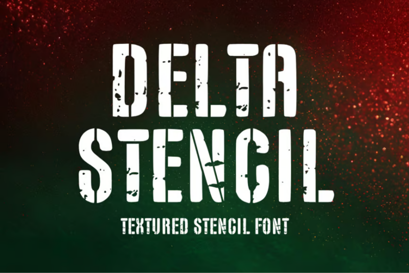
Delta is a gritty, textured stencil font that adds an authentic, worn look to designs. Its rough edges and imperfections create a sense of ruggedness and use, making it perfect for projects that require a distressed, military-inspired aesthetic or a touch of urban grunge.
Sparated – Modern Stencil Typeface
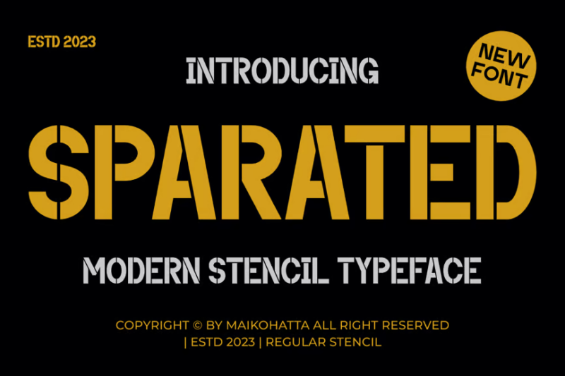
Sparated is a clean, modern take on the classic stencil typeface. Its precise cuts and geometric shapes offer a contemporary military feel, making it ideal for tech-oriented designs, sports branding, or any project requiring a sleek, tactical aesthetic.
Destro – Stencil Display Font
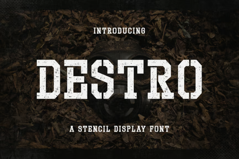
Destro is a bold, attention-grabbing stencil display font with a military edge. Its sharp angles and strong geometric shapes create a powerful visual impact, perfect for headlines, posters, or any design project that needs to convey strength and authority.
Vinstamp – Military Game Stencil Font
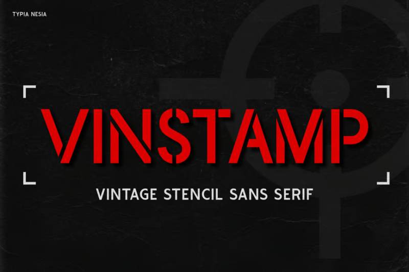
Vinstamp is a dynamic military game stencil font that combines tactical aesthetics with playful energy. Its bold, cut-out design and slight irregularities give it a hand-stamped feel, making it ideal for game titles, esports branding, or any project requiring a militaristic yet engaging look.
What Makes Army Fonts So Distinctive?
Army fonts aren’t just about looking tough – they’re designed with specific characteristics that make them immediately recognizable and functionally effective. Here’s what gives military typography its commanding presence:
Stencil Breaks
The most iconic feature of military typography is the stencil break – those small gaps in the letterforms that allow paint to be applied through a physical stencil. These breaks aren’t just decorative; they’re functional design elements that originate from the practical needs of marking equipment and supplies quickly in the field.
These strategic breaks create a distinctive look that’s instantly associated with military precision and authority. Even when digital designs don’t require actual stenciling, these breaks communicate that unmistakable military aesthetic.
Bold, Geometric Shapes
Military fonts typically feature strong, geometric letterforms with minimal decoration. This isn’t just about style – it’s about legibility under adverse conditions. Sans-serif designs with even stroke weights ensure that military markings can be read quickly and clearly, whether they’re on a dusty vehicle or a moving aircraft.
The geometric simplicity also means these fonts can be scaled down without losing readability – crucial for small equipment markings where space is at a premium but legibility can’t be compromised.
Condensed Proportions
Many military fonts feature slightly condensed letterforms, allowing more information to fit into limited space. This condensed design isn’t extreme enough to harm readability, but efficiently uses available space – reflecting the military’s emphasis on efficiency and practicality.
This condensed quality also gives many army fonts a sense of vertical strength and stability, enhancing their authoritative appearance.
Utilitarian Aesthetics
Army fonts embrace a utilitarian design philosophy where form follows function. Flourishes and decorative elements are stripped away, leaving only what’s necessary for clear communication. This no-nonsense approach reflects military values of efficiency, practicality, and directness.
The result is a powerful design language that communicates strength not through ornate decoration, but through purposeful simplicity and functional integrity.
Where to Use Army Fonts Effectively
Army fonts command attention, but they’re not right for every situation. Here’s where military typography truly shines:
Branding & Logos
Brands looking to convey strength, reliability, and precision can benefit tremendously from military-inspired typography. Outdoor gear companies, tactical equipment manufacturers, and fitness brands often leverage these fonts to communicate durability and toughness.
Even companies outside the “tactical” space can use military fonts to suggest reliability and precision – think construction companies, security firms, or transportation services where dependability is paramount.
Entertainment & Media
Military fonts are staples in action movies, video games, and graphic novels. They instantly set the tone for high-stakes, adrenaline-pumping content. From game UI elements to movie posters, these fonts create immediate visual shorthand for combat, adventure, and heroism.
The gaming industry particularly embraces military typography for first-person shooters, strategy games, and any title wanting to evoke that tactical combat feel.
Event Promotions
Obstacle races, bootcamp-style fitness challenges, and adventure competitions often use military fonts to convey the intensity and challenge of their events. These fonts tell participants to expect something tough, demanding, and ultimately rewarding.
The authoritative nature of these fonts also works well for security-related events, conferences focused on defense or cybersecurity, and any gathering where precision and expertise are highlighted.
Instructional Materials
When content needs to be taken seriously and followed precisely, military typography can reinforce the importance of instructions. This could be anything from safety protocols to assembly instructions for complex equipment.
The clear, no-nonsense quality of these fonts emphasizes the importance of following directions exactly as specified – a perfect match for content where precision matters.
When to Avoid Army Fonts
As powerful as army fonts can be, they’re not suitable for every context. Here are situations where you might want to stand down from military typography:
Luxury Brands
The utilitarian, functional nature of military fonts generally clashes with the elegant, refined aesthetic of luxury brands. If you’re selling premium experiences or high-end products, the rugged practicality of army fonts might undermine your sophisticated brand positioning.
Sensitive Services
Contexts requiring a gentle, comforting touch – like healthcare, counseling services, or childcare – may find military fonts too harsh or authoritarian. The commanding presence that makes these fonts work for tactical gear might feel inappropriate for services focused on care and emotional support.
Formal Documents
Legal documents, academic papers, and formal business communications generally call for more traditional serif or professional sans-serif typefaces. The distinctive stencil breaks and military associations of army fonts can distract from serious content in these contexts.
Readability-Critical Applications
While many army fonts are reasonably legible, some of the more stylized or heavily distressed options can compromise readability, especially at smaller sizes or in body text. For content where easy reading is crucial, standard text fonts are usually a better choice.
Pairing Army Fonts with Other Typefaces
The key to successful typography is creating harmonious relationships between different fonts. Here’s how to effectively pair army fonts with other typefaces:
Create Contrast with Serif Fonts
The geometric simplicity of army fonts creates a striking contrast with traditional serif typefaces. Try pairing a bold military headline font with a classic serif for body text – the juxtaposition of utilitarian and traditional creates a dynamic, interesting visual hierarchy.
Serifs like Georgia or Garamond can add a touch of sophistication that balances the rugged directness of military typography.
Build Harmony with Sans-Serif Companions
For a more cohesive look, pair army fonts with clean, professional sans-serif typefaces. Since military fonts are often based on sans-serif forms, this creates a harmonious relationship while still maintaining clear distinction between headline and body text.
Try combining a stencil military font for headers with a workhorse sans like Helvetica, Open Sans, or Roboto for body text.
Add Personality with Script Accents
For an unexpected twist, try juxtaposing the rigid, geometric structure of military fonts with small doses of script typography. This contrast can create interesting visual tension – just use script fonts sparingly as accents rather than primary content.
This pairing works especially well for designs that need to balance toughness with a human touch, like veteran-focused organizations or military heritage brands.
The Evolution of Military Typography
Military fonts have a rich history that’s worth understanding if you want to use them authentically. Let’s march through the evolution of these powerful typefaces:
Early Military Markings
The earliest military stencil fonts were purely functional, developed for quickly marking equipment, supplies, and shipping containers. These weren’t designed for aesthetic appeal, but for clarity and efficiency in field conditions.
The U.S. military standardized many of these early stencil designs during World War I and II, creating the foundational look that we now associate with military typography.
Mid-Century Standardization
By the mid-20th century, military fonts became more standardized across different branches and applications. The Military Standard 130 (MIL-STD-130) established specific guidelines for marking military property, further codifying the appearance of these typefaces.
This period saw the widespread adoption of the classic stencil fonts that many designers still reference today.
Pop Culture Adoption
As military aesthetics entered mainstream culture through war films, action movies, and later video games, army fonts transcended their utilitarian origins to become powerful design elements with strong cultural associations.
This transition from purely functional to culturally significant marks the point where military typography became a deliberate design choice rather than just a practical necessity.
Modern Digital Interpretations
Today’s digital army fonts range from historically accurate reproductions to creative interpretations that capture the essence of military typography while adding contemporary design sensibilities.
Many modern designers are finding ways to maintain the authoritative presence of military fonts while improving readability and versatility for digital applications.
Common Questions About Army Fonts
What font does the U.S. Army use?
The U.S. Army uses several typefaces for different purposes, but their official branding typically features a modified version of Franklin Gothic and Univers. For stencil applications on equipment, they use standardized military stencil fonts that conform to MIL-STD-130 specifications.
Are military stencil fonts still used in actual military operations?
Yes, stencil fonts are still used for marking military equipment, supplies, and shipping containers. While digital printing has supplemented traditional stenciling in many applications, the stencil aesthetic remains standard for certain military markings.
What’s the difference between army fonts and regular stencil fonts?
Military stencil fonts are typically more utilitarian and standardized than decorative stencil fonts. They feature strategic breaks that would allow the physical stencil to remain structurally sound, whereas decorative stencil fonts often place breaks for aesthetic rather than functional reasons.
Can I use army fonts commercially?
Most army fonts available through commercial font foundries can be used for commercial projects with proper licensing. However, some fonts may have restrictions, particularly those that directly reproduce official military designs. Always check the licensing terms before using any font commercially.
What are the best free army fonts?
Several quality military-inspired fonts are available for free personal use, including Army Stencil, Military, and Stardos Stencil. For commercial projects, you may need to purchase proper licensing or look for open-source alternatives like Black Ops One from Google Fonts.
Conclusion: Standing at Attention
Army fonts march into design projects with a commanding presence that few other typography styles can match. From their functional origins on military equipment to their current status as powerful design elements, these fonts carry associations of strength, precision, and authority that make them valuable tools in any designer’s arsenal.
Whether you’re creating branding for an outdoor adventure company, designing UI elements for a tactical video game, or just looking to add some rugged character to a personal project, the right military font can transform your design from civilian to commanding officer in an instant.
As with any powerful design element, the key is knowing when (and when not) to deploy these fonts. Used thoughtfully, army typography can elevate your designs with authority and impact. Used indiscriminately, they might send the wrong message or create an inappropriate tone.
I hope this exploration of army fonts has given you some fresh ammunition for your next design project. Remember that even the most utilitarian typefaces can be used creatively when paired with complementary elements and deployed with strategic intent.
So which military font caught your attention? Are you a fan of the authentic stencil classics, or do you prefer the modern interpretations with their enhanced readability? Drop a comment below and let me know how you’re using army fonts in your own designs!
Until next time, keep your typography standing tall and your designs ship-shape. Dismissed!