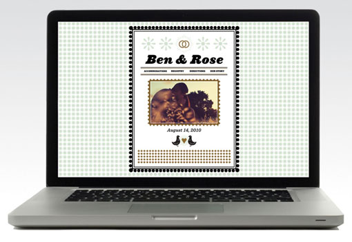
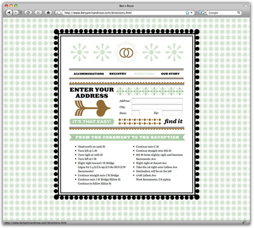
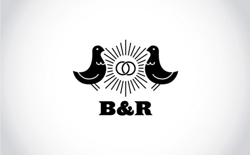
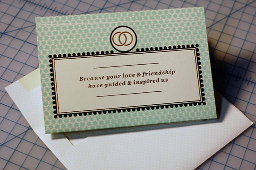
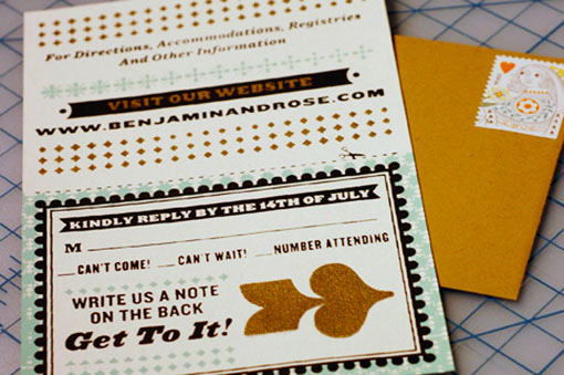
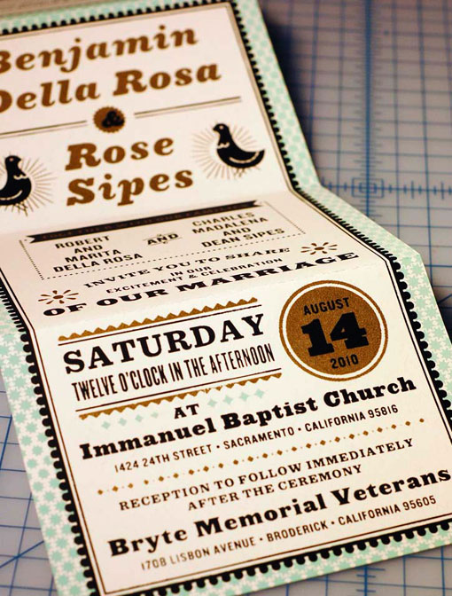
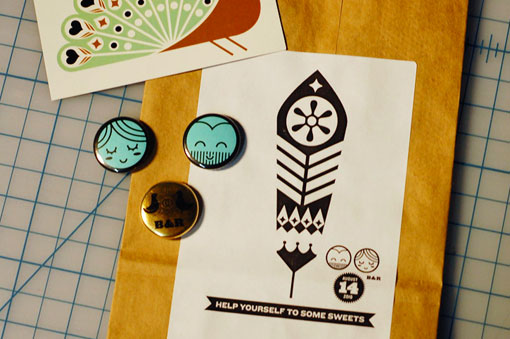
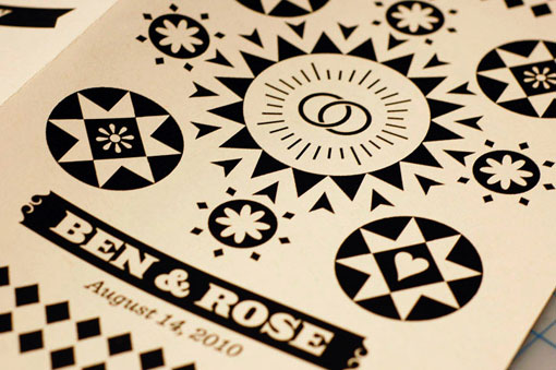
When I am designing for a wedding, I approach it as I would any other branding project, and attempt to capture the essence of the couple through messaging and graphics. So I loved receiving this great example—created for his own wedding—of a similar approach from Benjamin Della Rosa. I love the visual language he’s developed and carried through each piece in different, but complementary ways. Check out some more details right here.

Get 300+ Fonts for FREE
Enter your email to download our 100% free "Font Lover's Bundle". For commercial & personal use. No royalties. No fees. No attribution. 100% free to use anywhere.
