In this article:
- The 9 Grooviest 70s Color Palettes
- Why 70s Color Palettes Still Rock Today
- How to Use 70s Color Palettes in Modern Design
- Why Were These Colors So Popular in the 70s?
- Incorporating 70s Color Palettes in Different Design Fields
- Conclusion: Embracing the Bold and Groovy
As a designer, I’m constantly drawn to the bold, expressive colors of the 1970s. There’s something about those vibrant hues and earthy tones that just screams creativity and individuality. If you’re looking to add some groovy vibes to your next project, you’ve come to the right place. I’ve put together a list of the 10 best 70s color palettes that are sure to inspire you and transport you back to this iconic era of design.
The 9 Grooviest 70s Color Palettes
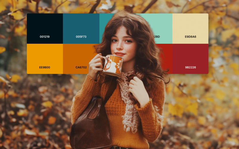
1. Earthy Autumn
- Harvest Gold: #DA9100
- Avocado Green: #568203
- Rust Orange: #B7410E
- Chocolate Brown: #7B3F00
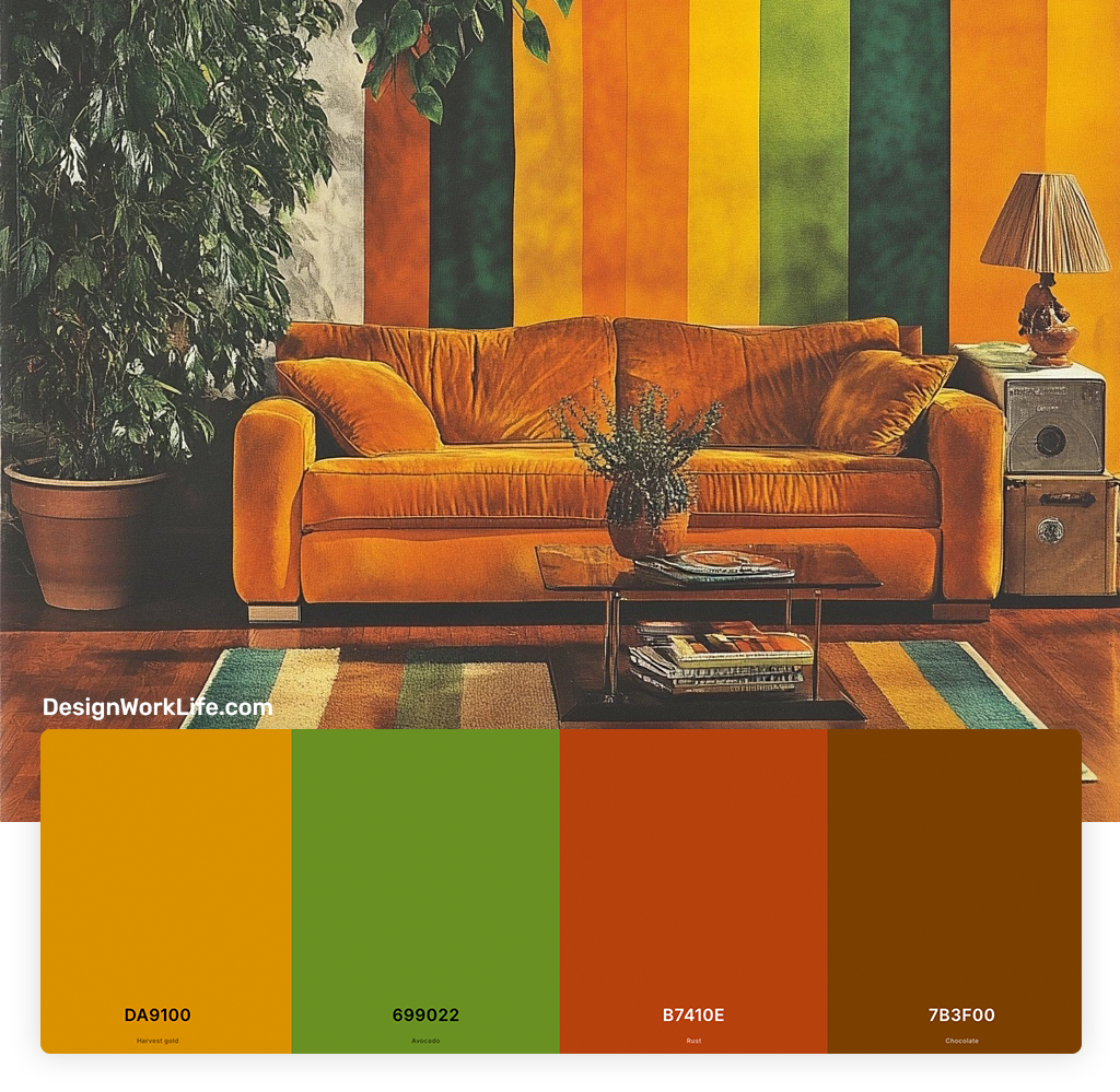
This palette captures the essence of the early 70s, with its warm, natural tones inspired by the great outdoors. I love using these colors for cozy, inviting spaces or for brands that want to evoke a sense of authenticity and connection to nature.
2. Sunny Citrus
- Tangerine Orange: #F28500
- Lemon Yellow: #FFF44F
- Lime Green: #32CD32
- Creamy White: #F5F5DC
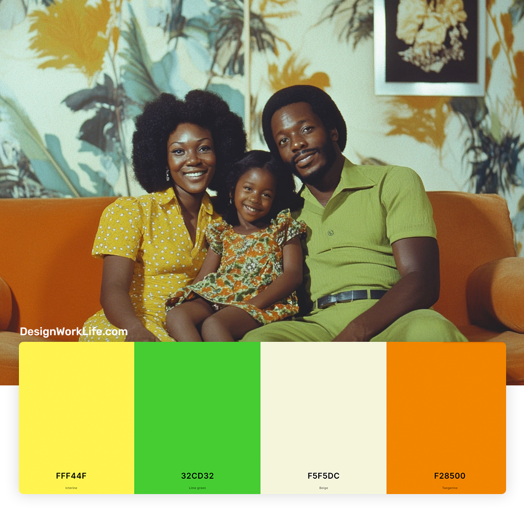
Nothing says 70s quite like these bright, cheerful citrus hues. This palette is perfect for adding a pop of energy to any design. I often use it for summer-themed projects or to create a fun, youthful vibe.
3. Disco Nights
- Electric Blue: #0073CF
- Hot Pink: #FF69B4
- Purple: #800080
- Silver: #C0C0C0
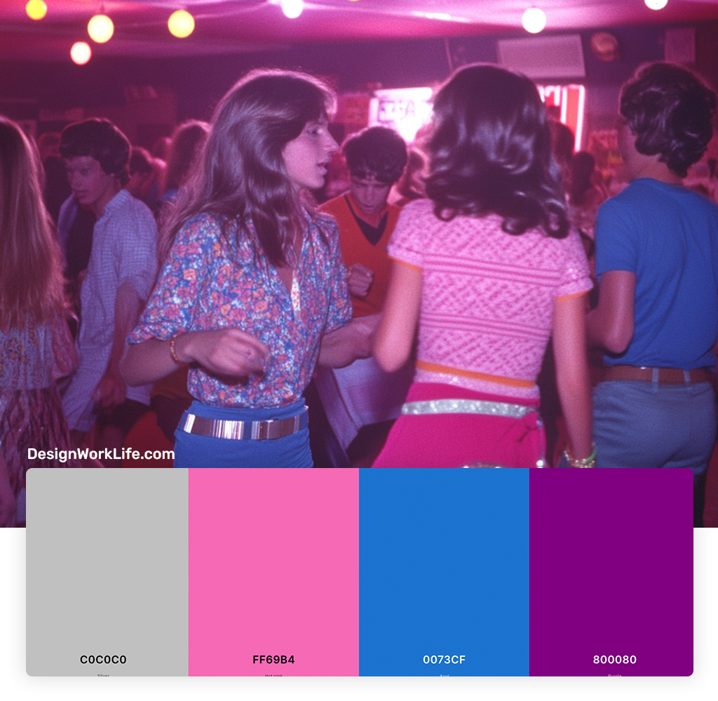
When I think of the late 70s disco era, these are the colors that come to mind. Bold, vibrant, and a little bit glam, this palette is great for creating designs with a sense of excitement and movement.

Get 300+ Fonts for FREE
Enter your email to download our 100% free "Font Lover's Bundle". For commercial & personal use. No royalties. No fees. No attribution. 100% free to use anywhere.
4. Retro Pastels
- Dusty Rose: #DCAE96
- Powder Blue: #B0E0E6
- Mint Green: #98FF98
- Pale Yellow: #FFFF99
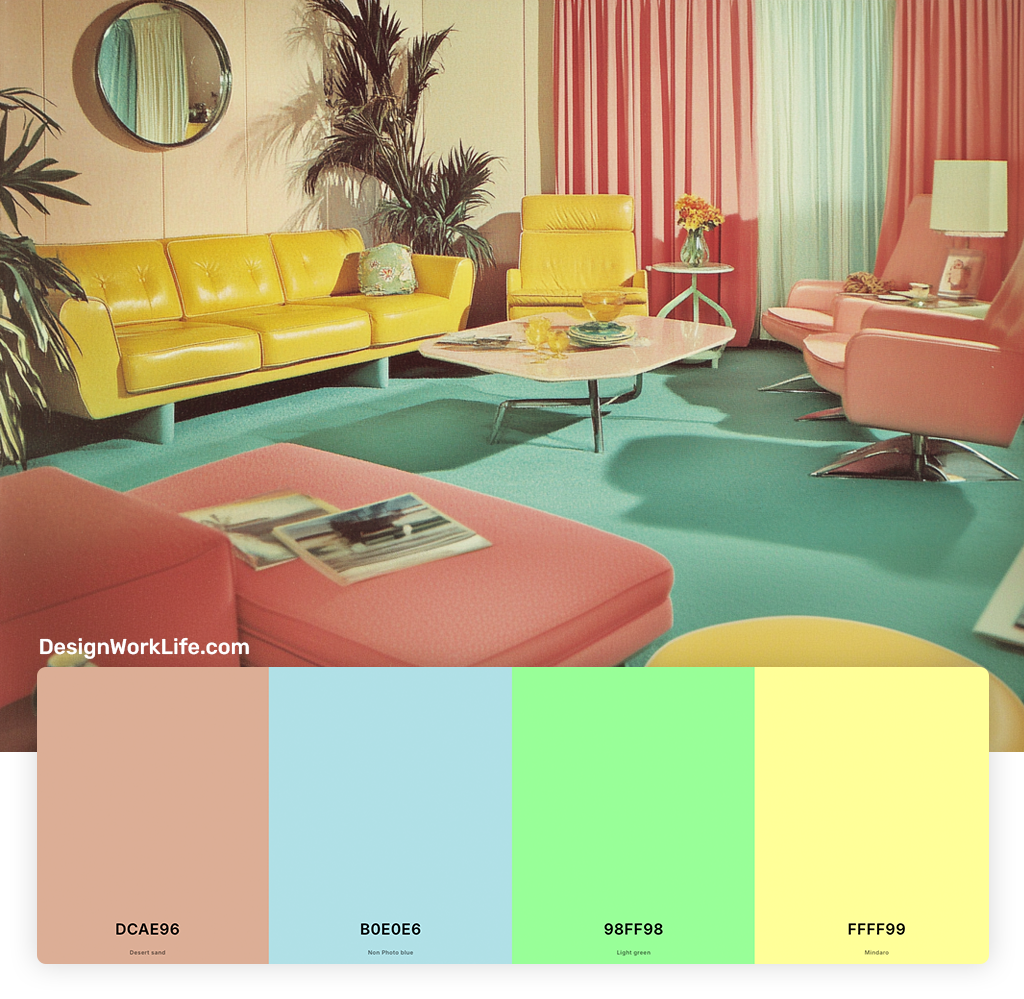
Not all 70s colors were bold and bright. This softer palette shows the more subdued side of the decade. I find these colors work well for creating a vintage feel without overwhelming the senses. Sort of like our Pastel Color Rainbow Palette.
5. Bohemian Dream
- Sienna: #85331E
- Cocoa Brown: #C8733A
- Sage Green: #84A69D
- Viridian: #498B74
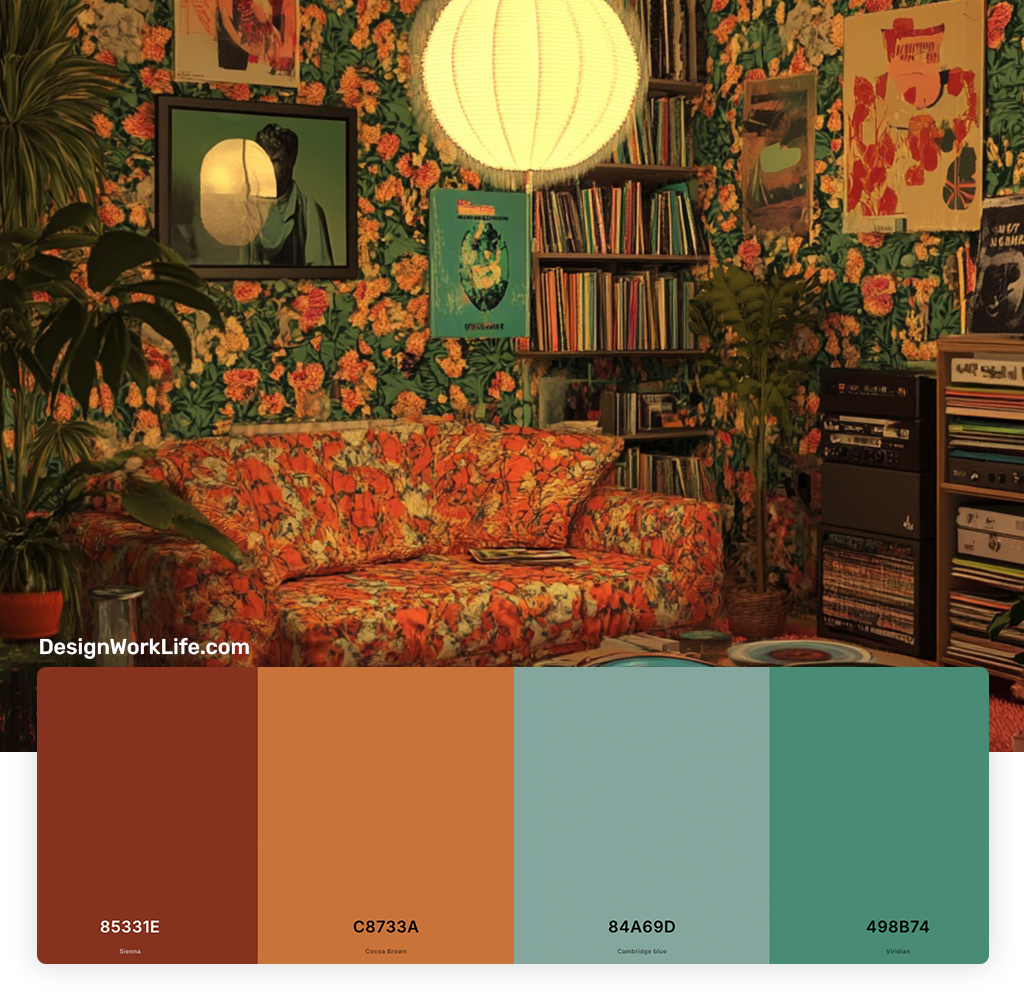
This palette captures the free-spirited, bohemian side of the 70s. I love using these colors for projects that need a touch of earthy sophistication and global influence.
6. Space Age Silver
- Metallic Silver: #BCC6CC
- Charcoal Gray: #36454F
- White: #FFFFFF
- Bright Red: #FF0000
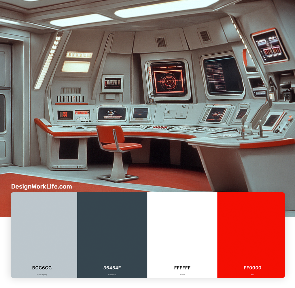
Inspired by the era’s fascination with space and technology, this palette combines sleek neutrals with a pop of red. It’s perfect for creating a futuristic, yet retro look.
7. Sunbaked Desert
- Adobe Red: #D94A38
- Sand Beige: #F4A460
- Cactus Green: #53824B
- Sky Blue: #87CEEB
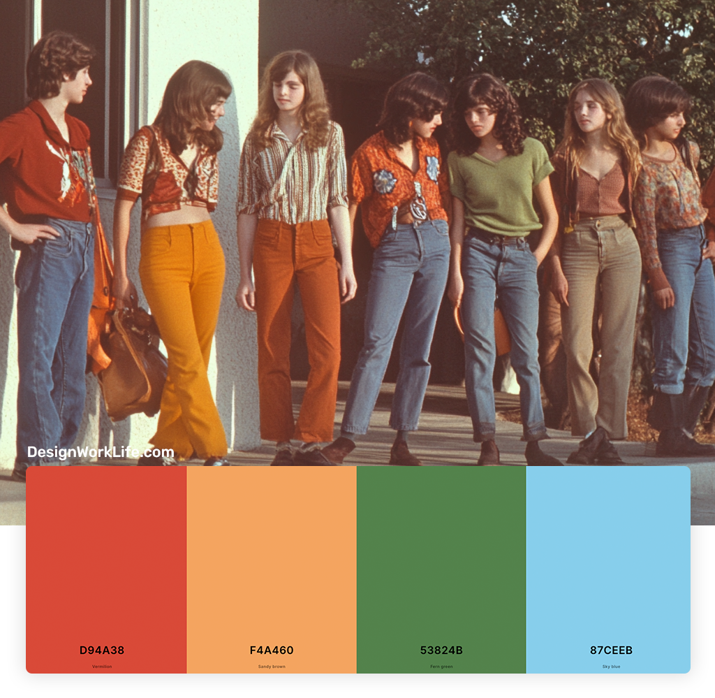
This palette evokes the sun-drenched landscapes of the American Southwest, a major inspiration in 70s design. I find it works beautifully for projects that need a warm, natural feel with a touch of adventure.
8. Psychedelic Dream
- Magenta: #FF00FF
- Sunshine Yellow: #FFD700
- Turquoise: #40E0D0
- Grass Green: #7CFC00
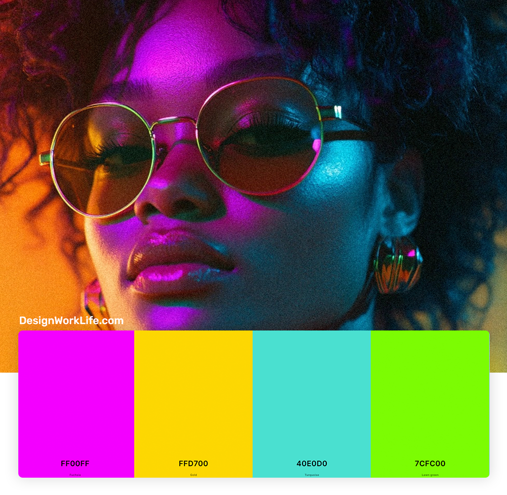
When you want to go full-on 70s psychedelia, this is the palette to choose. These vibrant, almost neon hues are great for creating eye-catching designs that really pop.
9. Coffee Shop Cool
- Coffee Brown: #6F4E37
Cream: #FFFDD0
Burnt Orange: #CC5500
Olive Green: #556B2F
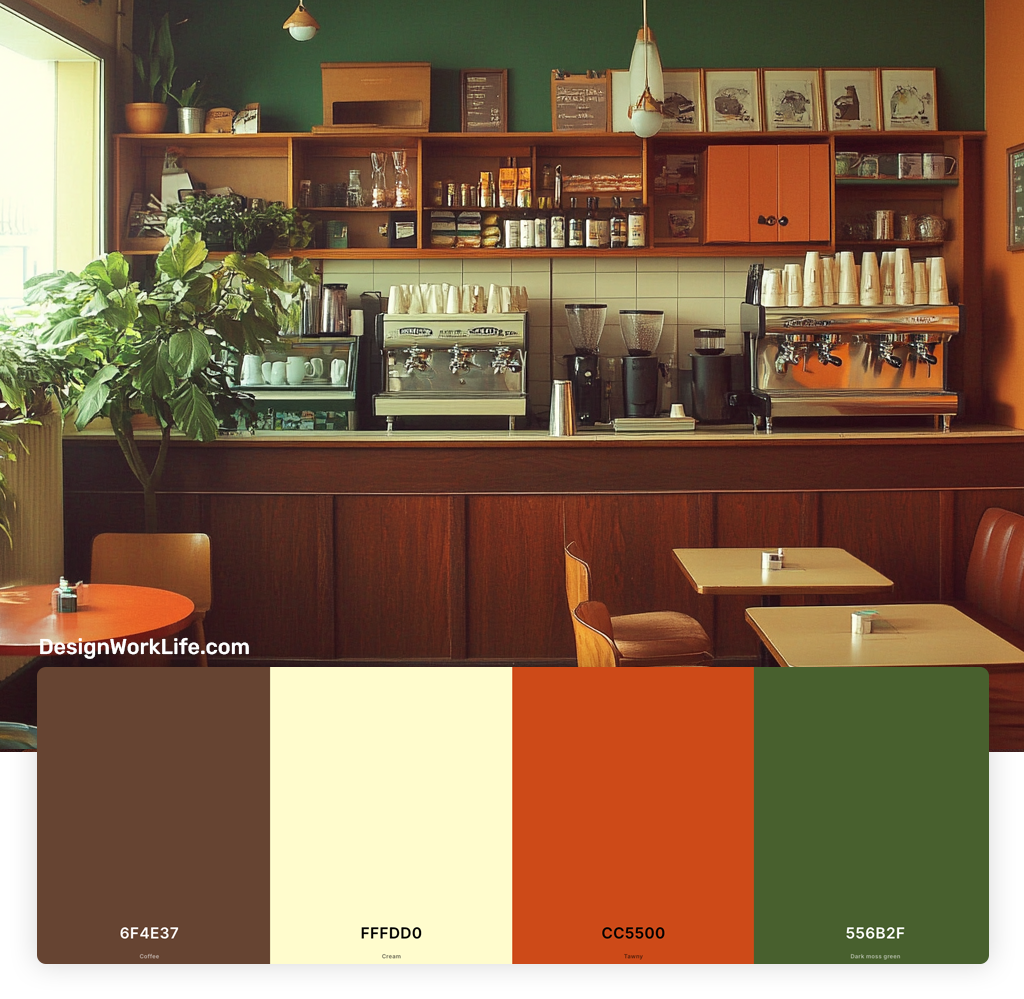
Inspired by the cozy coffee shops of the era, this palette combines warm neutrals with muted versions of classic 70s hues. I love using it for projects that need a comfortable, slightly nostalgic vibe.
10. Retro Rainbow
- Red
- Orange
- Yellow
- Green
- Blue
- Purple
Last but not least, this classic rainbow palette embodies the colorful spirit of the 70s. While it might be too much for some projects, I find it’s perfect for creating bold, playful designs that capture the joy and optimism of the era.
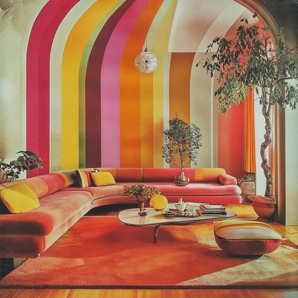
Why 70s Color Palettes Still Rock Today
Before we dive into the specific palettes, let’s talk about why 70s colors are still so relevant and inspiring today. The 1970s were a time of cultural revolution, and this spirit of liberation and self-expression was reflected in the daring color choices of the era. From the earthy tones of the early 70s to the electrifying hues of the disco era, this decade was a kaleidoscope of color that challenged conventional norms and embraced individuality.
As a designer, I find that incorporating 70s-inspired colors into modern projects can add depth, warmth, and a touch of nostalgia that resonates with many people. Whether you’re working on a branding project, interior design, or even a retro-inspired fashion line, these palettes can help you create a look that’s both fresh and timeless.
How to Use 70s Color Palettes in Modern Design
Now that we’ve explored some fantastic 70s color palettes, you might be wondering how to incorporate them into your modern design projects without looking dated. Here are some tips I’ve learned over the years:
1. Use them as Accent Colors
If you’re hesitant about going full-on 70s, try using these colors as accents against a more neutral background. A pop of avocado green or tangerine orange can add interest to an otherwise subdued design.
2. Pair with Modern Typography
Combining 70s colors with contemporary, clean typography can create a fresh look that nods to the past without being stuck there. I love the contrast of sleek sans-serif fonts with groovy 70s hues. Of course, any kind of 70s fonts will also work really well in these colors.
3. Balance with Neutrals
Many 70s palettes can be quite bold. Balancing them with neutrals like white, black, or gray can help make them more versatile and less overwhelming.
4. Use in Patterns and Textures
Incorporating 70s colors into patterns or textures can be a subtle way to reference the era without going overboard. Think about using these hues in geometric patterns or textured materials.
5. Consider Color Blocking
The 70s were all about bold statements, and color blocking was a big trend. Try using large blocks of color in your designs for a retro-inspired look that still feels modern.
Why Were These Colors So Popular in the 70s?
As a design enthusiast, I’ve always been fascinated by the cultural and historical factors that influence color trends.
The popularity of these vibrant and earthy tones in the 70s can be attributed to several factors:
- Reaction to the 60s: The psychedelic brights of the 60s evolved into more natural, earthy tones in the early 70s, reflecting a growing environmental consciousness.
- Cultural Shifts: The bold, expressive colors mirrored the social movements of the time, including the push for individual freedom and self-expression.
- Technological Advancements: New synthetic dyes made it possible to create brighter, more saturated colors than ever before.
- Economic Factors: The oil crisis of the 70s led to a renewed interest in nature and earth tones, as people sought comfort in natural elements.
- Pop Culture Influence: TV shows, movies, and music of the era popularized certain color combinations, spreading them throughout popular culture.
Understanding these factors can help us appreciate why these colors resonated so strongly then, and why they continue to captivate us today.
Incorporating 70s Color Palettes in Different Design Fields
One of the things I love about 70s color palettes is their versatility. They can be adapted to various design fields, each with its own unique approach:
Interior Design
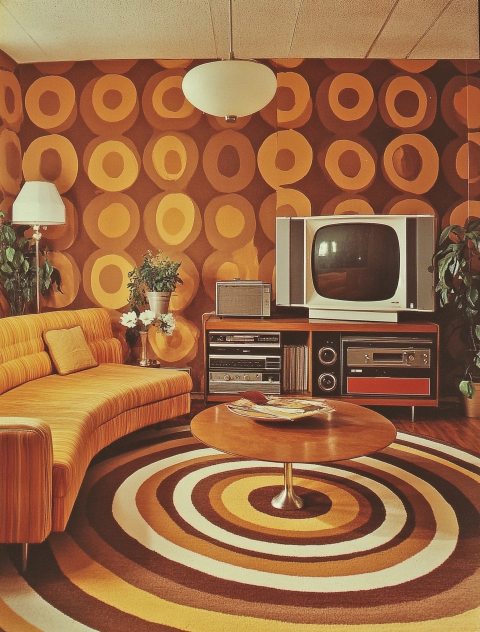
In interior design, 70s colors can create warm, inviting spaces with a touch of retro charm. I’ve found that using earthy tones like avocado green or harvest gold on an accent wall can instantly transform a room. Pairing these with modern furniture and plenty of plants can create a fresh, bohemian look that’s very on-trend right now.
Graphic Design
For graphic designers, 70s color palettes offer a wealth of possibilities. I often use these vibrant hues in logo design, particularly for brands that want to evoke a sense of nostalgia or playfulness.
Including these projects in a digital portfolio is a great way to showcase how retro elements can be made fresh. The key is to balance the bold colors with plenty of white space and clean, modern typography to keep the design from feeling dated.
The key is to balance the bold colors with plenty of white space and clean, modern typography to keep the design from feeling dated.
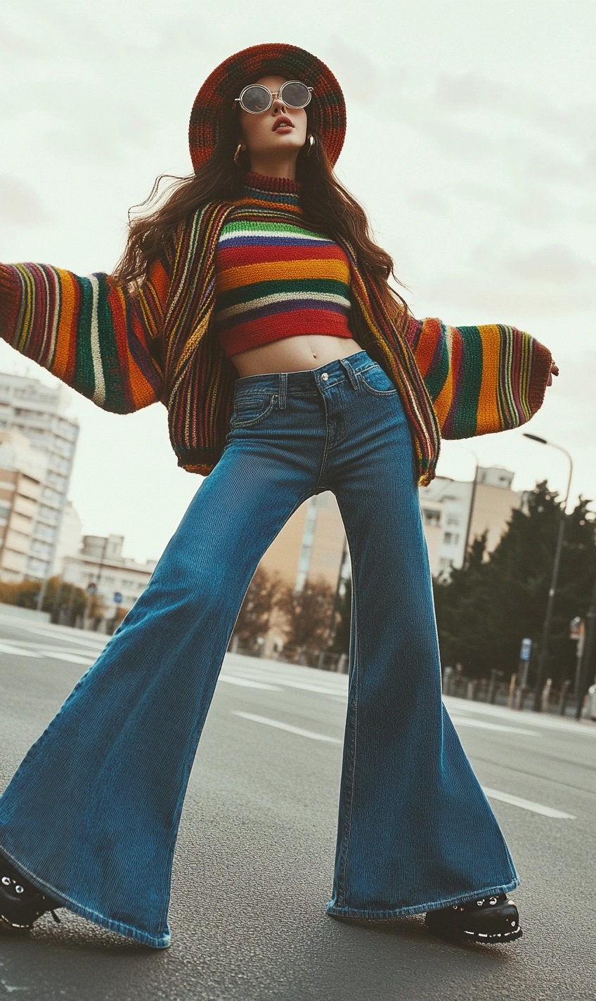
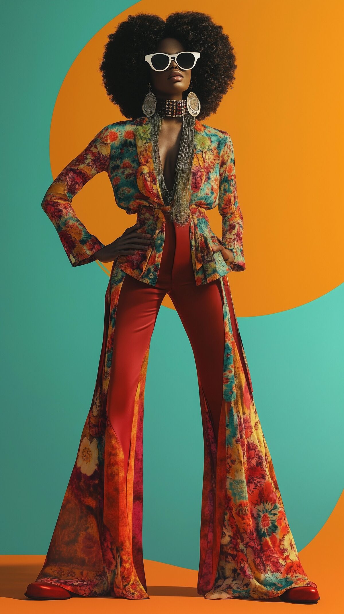
Fashion
The fashion world has seen a major revival of 70s-inspired looks in recent years. As a designer, I love incorporating these colors into retro-inspired prints or color-blocked outfits. The earthy tones work particularly well for fall collections, while the brighter hues are perfect for summer.
Web Design
While it might seem challenging to use such bold colors in web design, I’ve found that 70s-inspired palettes can create truly unique and memorable websites. Using these colors for call-to-action buttons or hover effects can add a fun, interactive element to your site.
Conclusion: Embracing the Bold and Groovy
As we’ve explored these 10 fantastic 70s color palettes, I hope you’ve gained a new appreciation for the bold, expressive hues of this iconic decade. Whether you’re designing a retro-inspired logo, giving your living room a groovy makeover, or just looking to add a pop of vintage charm to your next project, these palettes offer endless possibilities.
Remember, the key to successfully using 70s color palettes in modern design is balance. Don’t be afraid to experiment, but also consider how these bold hues interact with other elements of your design. And most importantly, have fun with it! After all, the 70s were all about expression and individuality, so let your creativity shine through.
So go ahead, embrace the bold and the groovy. Whether you’re a seasoned designer or just starting out, these 70s color palettes are sure to inspire you and add a touch of retro magic to your work. Happy designing!