In this article:
- The Very Best Feminine Fonts for Designers
- Understanding Feminine Fonts
- Choosing the Right Feminine Font
- Feminine Fonts in Action
- DIY: Creating Custom Feminine Typography
- Conclusion
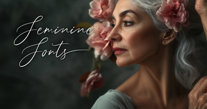
Feminine fonts have the power to transform a design, infusing it with grace, elegance, and a distinct personality. These typefaces, characterized by their flowing curves, delicate serifs, or playful flourishes, can evoke a range of emotions from whimsical charm to sophisticated allure.
In the world of graphic design and typography, feminine fonts offer a versatile toolkit for creating visually appealing content that resonates with audiences seeking a softer, more refined aesthetic. Whether you’re designing a wedding invitation, crafting a logo for a boutique, or laying out a lifestyle magazine, understanding the nuances of feminine typography can elevate your project to new heights.
In this article, I’ll explore some of the most charming feminine fonts that can make a lasting impression—without saying a word!
The Very Best Feminine Fonts for Designers
Southwide Feminine Script Font (Paid)
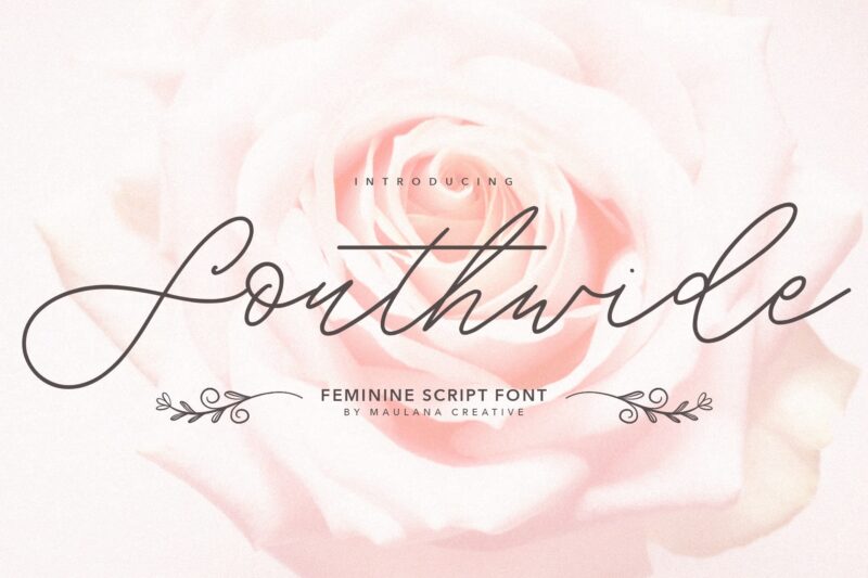
If you’re aiming for a handcrafted feel, Southwide is a fantastic choice. I love its charming ligatures and varied strokes, which add unique character to stationery and quotes. Just remember, it shines best in short texts!
Girly Font (Paid)
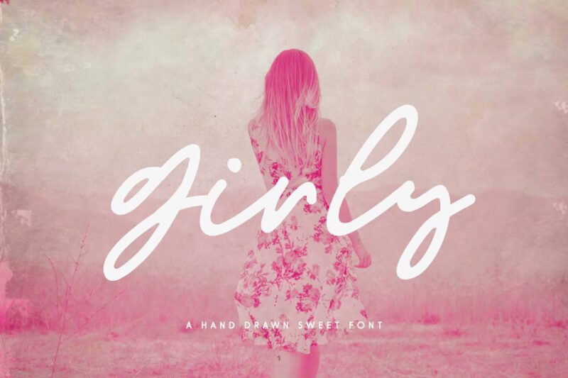
You can’t go wrong with this font! It has such a charming vibe, perfect for quotes and greeting cards. Watching the design come together was a pleasant surprise, like finding the last puzzle piece.

Get 300+ Fonts for FREE
Enter your email to download our 100% free "Font Lover's Bundle". For commercial & personal use. No royalties. No fees. No attribution. 100% free to use anywhere.
Anathelya Feminine Script Font (Paid)
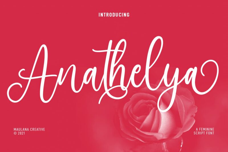
Anathelya is a fantastic cursive script with character. Its fun ligatures and alternate letters offer flexibility. I love using Anathelya for social media captions, and the feedback is always positive!
Feminine Curvy Script Font (Paid)
This font adds a sweet touch to my projects. You can use it for social media or gifts. I tried it on a birthday card, and it created a buzz!
Bromello Font (Free for Personal Use)
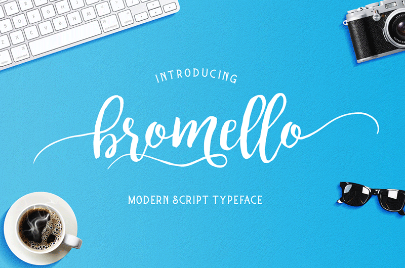
Bromello adds warmth to designs and is perfect for personal messages and friendly branding. Just check licensing for business use and ensure its casual vibe fits your project’s tone!
Great Vibes Font (Free)
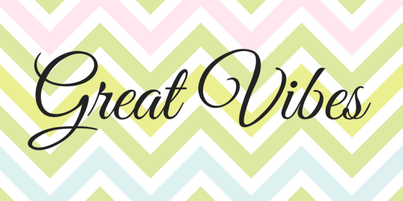
Great Vibes is stunning! Its flowing script and elegant loops elevate my designs. It’s ideal for invitations and headers, but I find it shines best in titles and quotes to keep its beauty intact.
Seillamikha Font (Paid)
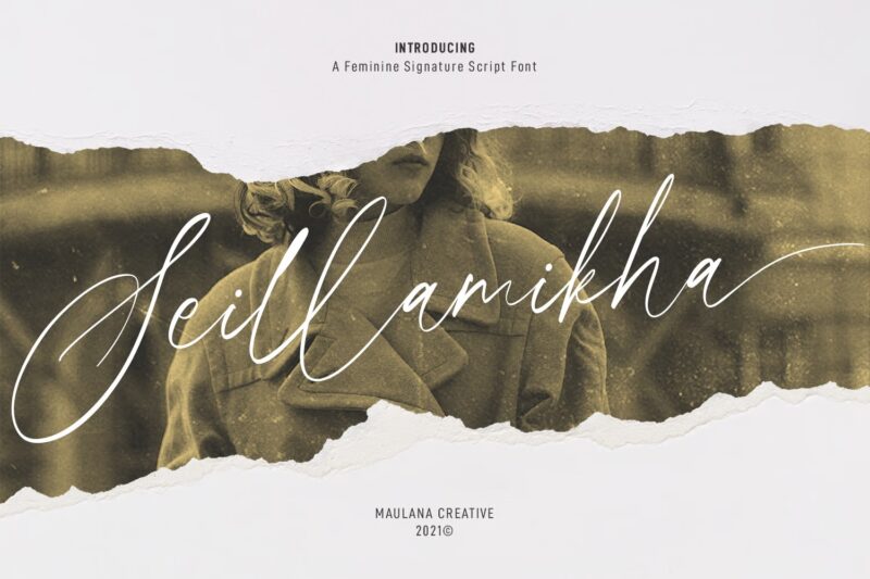
Seillamikha is a stunning modern script font that adds elegance to my projects. You can use it for branding or social media posts, and it makes logos and special invitations pop!
Dear-lovers Font (Paid)
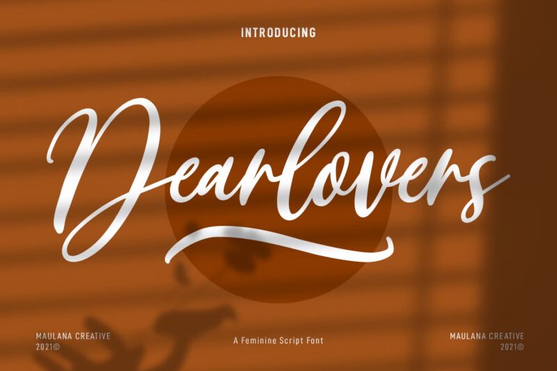
Dear Lovers has a fresh, modern vibe that’s classy yet approachable. You can use it for social media graphics or book covers. Pair it with a sans-serif font for a polished look!
Dancing Script Font (Free)
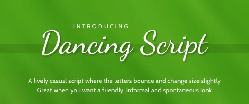
Dancing Script is where fun meets functionality! This font has a casual vibe that flows beautifully. However, while it looks great in headers, it’s not the best for lengthy text. Stick to titles or short quotes for the best effect, and you’ll see how it can elevate your design.
Reghina (Paid)
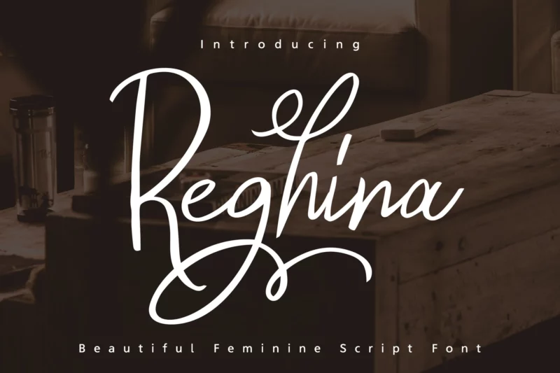
This font is perfect for invitations and branding. You can access its OpenType features in Adobe programs, and with PUA Unicode, all alternate characters are available for your creative projects!
Anthemia Feminine Serif Font (Paid)
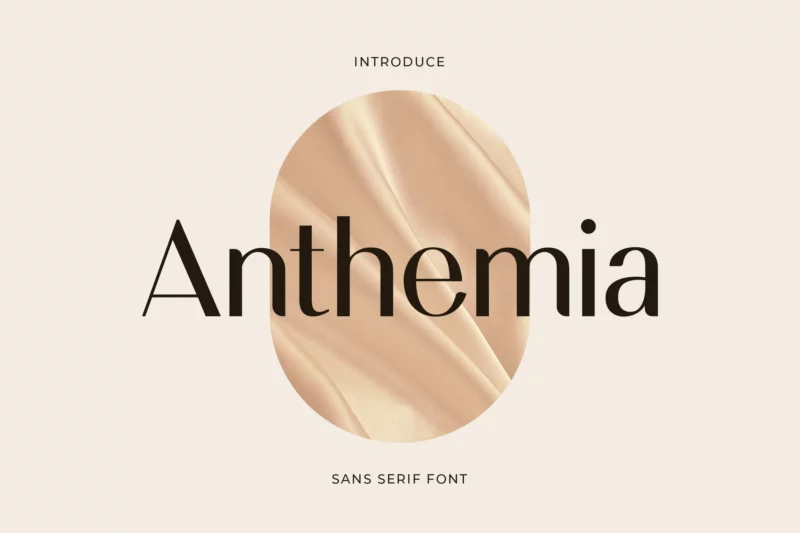
If you’re looking for a classy, elegant font, I think you’ll love Anthemia. It’s perfect for your logo, branding, or even a wedding invite. Plus, its versatility works for so many projects!
Ballein Feminine Serif Font (Paid)
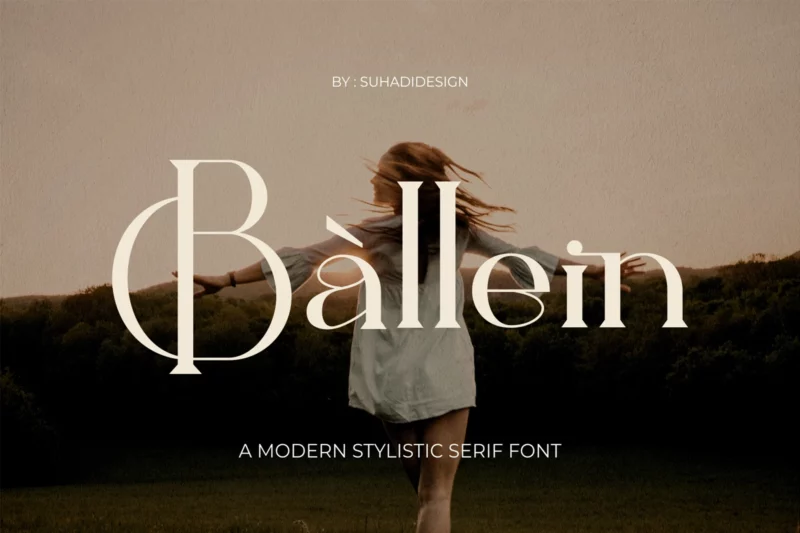
Ballein offers a modern, approachable touch, ideal for beauty magazines and wedding invitations. You can effortlessly elevate your designs, and the alternate characters add a special flair you’ll love!
Alviona Modern Serif Font (Paid)
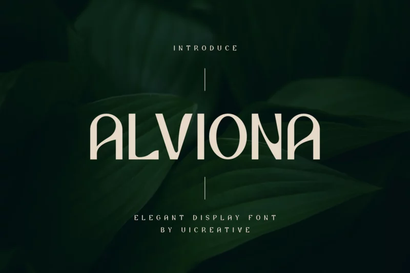
This font blends elegance with a modern flair, perfect for logos and book covers. You can use it for stationery designs, and it will make your work pop!
Sorinok Gows Font (Paid)
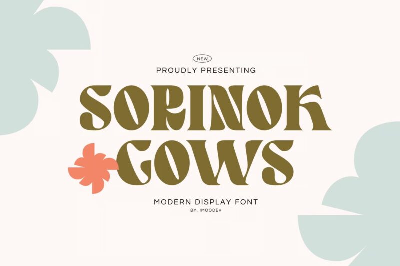
Sorinok features soft curves that draw you in, and it’s adaptable for various designs, from invitations to branding. You can appreciate a font that balances readability and style, and this one truly nails it!
Quincy Serif (Paid)
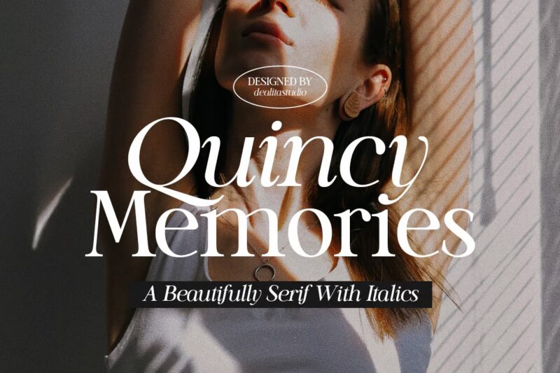
Quincy Serif features elegant curves, making it perfect for formal invites and chic branding. With regular and italic styles, you can elevate your designs while enjoying its multilingual support. Consider Quincy Serif for your next project!
Bridge Font (Paid)
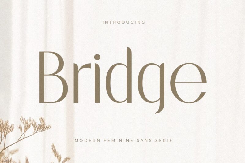
Bridge is a true gem! Its classy look enhances any branding project. I struggled at first with its ligatures, but once I figured it out, it turned out beautifully. If you’re in a design pinch, this font can save the day!
Gold and Queen Font (Paid)
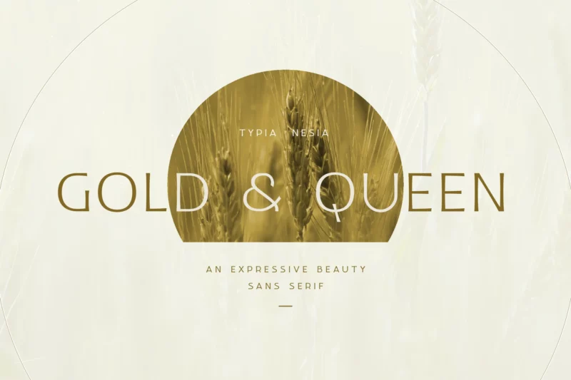
Gold and Queen Font blends elegance and versatility, ideal for upscale branding. Use it for chic stationery, and you’ll see the transformation. Its fresh look impresses clients and showcases thoughtful typography!
Chaviera Pro Font (Paid)
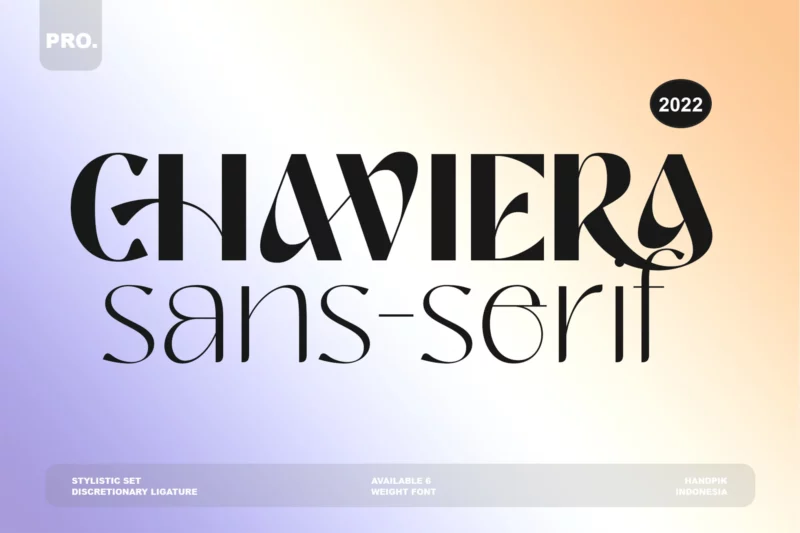
Chaviera Pro Font offers a modern, feminine charm perfect for wedding invitations and social media posts. It adds an elegant touch to designs. If you’re feeling stuck, this font can unlock new creative possibilities and help you communicate your ideas more effectively!
Lumina Font (Paid)
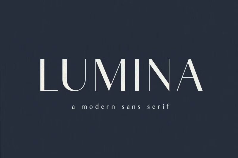
And then there’s Lumina. This font is a breath of fresh air! It pairs beautifully with modern sans-serifs or scripts. You can use it for headings in your editorial designs, and it always shines.
San Miguel Font (Paid)
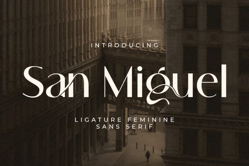
I love how San Miguel Font adds a sophisticated flair to my designs. You can use its unique ligatures and alternate characters to turn even simple projects into something dynamic, adding a layer of depth you didn’t expect.
Pacifico Font (Free)
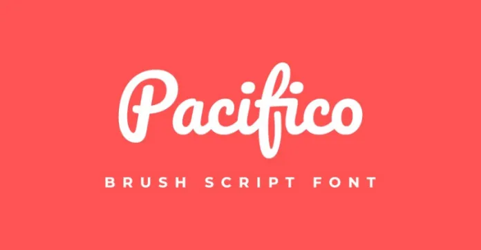
Pacifico adds a carefree, beachy vibe to designs. You can use it for summer party invites to create a playful touch, but I’d be careful—overusing it might push your design into “vacation mode.”
Alex Brush (Free)
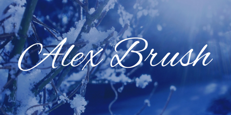
If you want elegance without sacrificing readability, I suggest Alex Brush. You can use it for wedding programs or upscale events, as it flows beautifully while remaining easy to read.
Lemonade (Free)
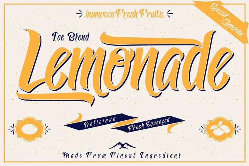
Lemonade Font is fun and versatile, ideal for retro-themed projects. You can use it for packaging or branding—think homemade lemonade! Its old-school charm feels familiar yet fresh every time.
Me Amanda Feminine Font (Paid)
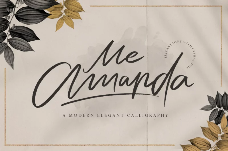
Me-Amanda fuses modern calligraphy with a personal touch. You can use it for logos, wedding invites, and more. I found it ideal for a bridal shower invite, as its hand-drawn look offered a custom feel, while the elegant flourishes added just the right touch.
Gaby Font (Paid)
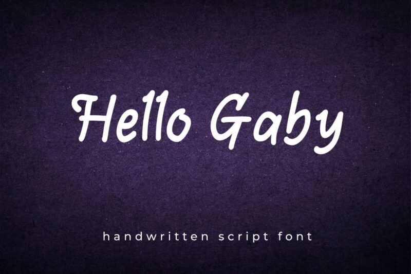
Gaby Font has a friendly, handwritten vibe that’s perfect for casual branding or social media. It adds warmth while remaining professional. If you’re seeking something approachable, I think you’ll find Gaby to be your new go-to!
Flóra (Paid)
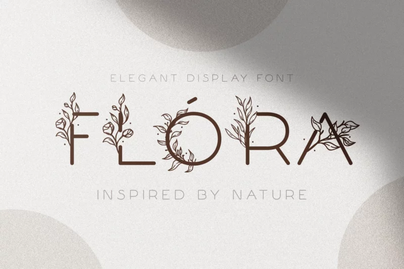
I’d recommend Flóra when you’re aiming for a soft, natural touch. It works beautifully for things like wedding invites or elegant headlines. Just be careful—it can lose its charm if overused in long text.
Gizela (Paid)
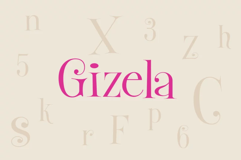
Gizela’s got that playful, almost child-like vibe. I suggest using it for projects like birthday invitations or anything lighthearted. You’ll want to use it sparingly, though; too much can be overwhelming.
Quinstary (Paid)
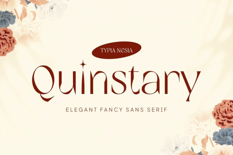
Quinstary blends that modern and classic feel. I usually pair it with a simple sans-serif to keep things balanced. It shines best when you keep the look clean and not too busy.
Harfesto Font (Paid)
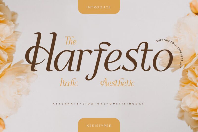
For a touch of elegance, I’d go with Harfesto. It’s perfect for social media graphics or stylish logos. Let it stand out on its own because it doesn’t like sharing the spotlight.
Catwalk (Paid)
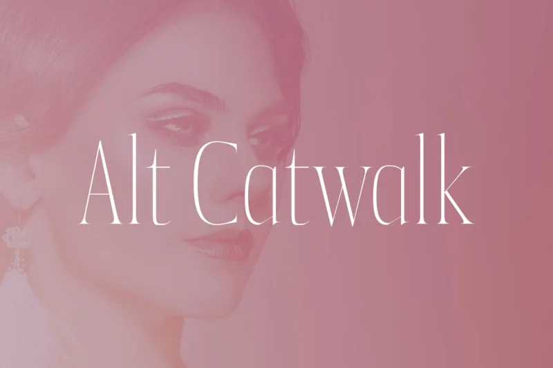
Catwalk is bold and attention-grabbing. I’d use it mainly for logos or striking titles. It’s best to pair it with something simpler to avoid clashing.
Understanding Feminine Fonts
A. Characteristics of Feminine Typography
When I think of feminine typography, a few characteristics jump out at me:
- Thin lines: They’re elegant and light. I remember using a thin font for a project, and it felt like the entire design just floated.
- Curvy shapes: Fonts with a bit of a curve can feel playful. I once picked a rounded font for a baby shower invite, and it just felt perfect!
- Bubbly designs: A touch of decoration can add warmth and personality to designs, but caution is key! Using a bubbly font for a serious announcement may not have the desired effect.
B. The Psychology Behind Feminine Fonts
Now, let’s talk about the psychology behind these fonts. They evoke feelings of warmth and elegance. Designing a wedding invitation with a delicate script font can create an immediate connection to the event, making guests feel engaged from the very beginning.
C. Evolution of Feminine Fonts in Design
Feminine fonts have come a long way. Gone are the days of traditional, stuffy designs! Now, fresh options blend soft curves with geometric shapes. W
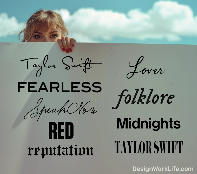
We’ve even seen the rise of celebrity-inspired typography, like Taylor Swift fonts, which have become popular for fan-made content and merchandise. Pairing a feminine script with a bold sans-serif can make a design pop. I recently tried this combo and felt like I unlocked a design superpower!
Choosing the Right Feminine Font
A. Considerations for Different Projects
When picking a feminine font, consider your project. For logos, focus on the message and your audience: elegant scripts work for bridal shops, while playful fonts attract younger beauty product buyers. Don’t be afraid to explore fun fonts for projects aimed at children or for casual, lighthearted designs – they can add a whimsical touch that resonates with certain audiences.
- Logos: Match your font to your brand’s vibe.
- Packaging: Balance aesthetics with practicality.
- Web Design: Always think of readability—no one likes squinting!
Packaging can be tricky. A label font may not work online. Pair a feminine font with a simple sans-serif for an elegant, readable design.
B. Pairing Feminine Fonts with Other Typefaces
Font pairing creates magic! Mixing a delicate serif with a bold sans-serif offers a striking contrast. Consider combining a flowing script with a clean, modern typeface for a playful yet readable design.
- Experiment: Don’t hesitate to mix things up!
- Contrast: Pair delicate serifs with bold sans-serifs for a beautiful effect.
- Simplicity: Stick to two or three fonts to maintain a clean look.
Keep it simple! Use two or three fonts to avoid a messy design. Too many choices can be overwhelming—like picking an ice cream flavor!
C. Common Mistakes to Avoid
Let’s talk about mistakes. A common one is using too many font styles. It’s tempting to showcase every font you love, but it can create chaos.
- Limit Styles: No more than three fonts, please!
- Outdated Fonts: Stay away from Comic Sans or Papyrus—yikes!
- Tone Check: Ensure your font matches the design tone.
Also, avoid outdated fonts like Comic Sans and Papyrus—they belong in the past! Opt for fresh alternatives that connect with your audience.
Feminine Fonts in Action
A. Case Studies of Successful Use in Branding
So, Sarah Lee started a skincare line called skincare company Glow Recipe. At first, she picked a bold font, but it just felt off. After switching to a lighter, more elegant script, her sales jumped by 25%! Isn’t that wild? It shows how a font can make a difference.
Then there’s Lush Cosmetics. Their quirky, handwritten fonts connect perfectly with their brand. You can feel the fun and creativity in their messaging!
B. Examples Across Various Industries
Feminine fonts pop up all over the place. Here are some that I think are doing it right:
- Beauty Brands: Sephora uses elegant serif fonts that feel classy yet inviting.
- Fashion: Kate Spade nails playful fonts that reflect their vibrant style.
- Lifestyle: I adore how Anthropologie uses soft, flowing fonts that create a cozy vibe.
C. Tips for Implementing Feminine Fonts Effectively
If you’re considering feminine fonts, here are some tips I’ve picked up:
- Know Your Audience: Younger crowds like fun styles; older folks prefer classics.
- Pair Fonts Wisely: Mixing cursive with clean sans-serif can elevate your design.
- Consider Context: Ensure the font matches the message—bubbly fonts are for light topics!
- Experiment: Trying new things can lead to discovering your favorite font combos.
- Mind Your Colors: Soft pinks offer delicacy; bold colors bring energy.
Finding feminine fonts has been a journey! Trust your instincts and keep experimenting—you might find the perfect one!
DIY: Creating Custom Feminine Typography
A. Tools and resources for customizing fonts
Creating custom typography can feel daunting, but it’s easier than it looks! My favorite tool is FontStruct; it lets you design fonts like you’re playing with Legos—just click and drag. Glyphr Studio is also user-friendly and perfect for beginners.
If you’re an Adobe fan, definitely check out Fontself; it transforms your sketches into fonts, making the process feel almost magical. And don’t overlook Calligraphr—it turns your own writing into an authentic handwriting font, which is super fun! You can also explore Envato Elements for a wide range of font templates and design resources that can elevate your typography game.
B. Tips for Adding Feminine Touches to Existing Fonts
Tweaking existing fonts can be just as rewarding!
- Adjust Weight: Use the width tool in Adobe Illustrator to make letters lighter.
- Play with Color: Pastels like light pink and mint green can add a feminine vibe.
- Add Patterns: I once made a font inspired by my garden, and it was such a joy!
C. Trends in Feminine Typography to Watch
Keep an eye on these trends:
- Handwritten Scripts: These fonts give a personal touch that many brands love.
- Mixing Fonts: Pairing serif with sans-serif creates a stylish contrast.
- Geometric Shapes: Incorporating geometric elements can refresh your designs.
Typography is all about self-expression, so have fun experimenting!
Conclusion
In summary, feminine fonts bring elegance, charm, and personality to designs. From graceful scripts like Anathelya to refined serifs like Quincy, these fonts elevate projects with warmth and sophistication. Each font adds its unique flair, perfect for social media, invitations, or branding.
As you explore feminine typography, consider your design’s context and purpose. Thoughtful font pairing and balancing readability with style can make a significant impact. Whether aiming for a playful or timeless look, there’s a perfect font to realize your vision.
Now, I’d love to hear from you! Have you tried any of these fonts in your projects? What’s your favorite go-to font for feminine designs? Share your tips in the comments below!