

In this article:
- Font choice must fit in slide design
- The fonts that actually work
- Pairing logic
- What to avoid
- Font personality and presentation context
- A note on system fonts vs. custom fonts
- Conclusion
Font choice is one of those decisions that most presenters make in about 30 seconds, then never revisit. That’s a mistake. The typeface running through your slides affects how the audience reads your content, how professional the deck looks, and whether the visual hierarchy actually guides attention where you want it to go.
This guide covers the fonts that consistently work in presentation contexts, how to pair them, and what to avoid.
Font choice must fit in slide design
Typography is a design discipline in its own right, and the best font for presentation slides involve more than aesthetics. Legibility at distance, hierarchy between heading and body text, and brand consistency all depend on the typeface system you choose.
Most people build their slides the slow way: layout decisions first, then adjusting fonts and design manually for hours. Teams that want to move faster often start by generating a structured draft with an AI slideshow maker. Once you have a content outline ready, you can create AI presentations with Slideonic that already apply clean typographic defaults, so the design foundation is in place before you start customizing. The generated output is fully editable, which means font adjustments happen on a structured deck rather than a blank canvas. Font selection still matters after generation. Knowing which typefaces work and why – makes every customization decision faster and more deliberate.
The fonts that actually work
Good fonts for presentations listed below share a few properties: they render clearly at both large and small sizes, they have sufficient weight variation to create hierarchy, and they don’t call attention to themselves. The best typeface in a presentation is usually the one the audience doesn’t consciously notice.
Sans-Serif workhorses
Calibriis the PowerPoint default for a reason. It’s clean, slightly rounded, and reads well at any size. The problem is overexposure – it’s everywhere, which can make a deck feel generic. It’s a safe choice, not an inspired one.
Helvetica / Arialare the most widely used best font for powerpoint options in corporate environments. Arial is the Windows system equivalent of Helvetica. Both are neutral, highly legible, and work across every industry. Pair with a slightly heavier weight for headings.

Get 300+ Fonts for FREE
Enter your email to download our 100% free "Font Lover's Bundle". For commercial & personal use. No royalties. No fees. No attribution. 100% free to use anywhere.
Inter, widely used for business cards and has become the go-to for tech and product companies. Designed specifically for screen readability, it handles both large display text and small body copy well. Available free through Google Fonts.
Proxima Novais one of the most popular professional font for powerpoint choices in marketing and startup decks. It has a modern, geometric quality without feeling cold. Proxima nova font pairing with a serif like Freight Text or Garamond creates a strong contrast between headline and body.
Montserratsuits bold, visually driven presentations. The uppercase characters are particularly strong for slide titles. Works best at larger sizes; gets harder to read at small body text sizes.
Serif options for authority
Serifs carry weight and authority in ways that sans-serif fonts don’t. They work well in finance, legal, academic, and any context where the brand positioning leans traditional or established.
Georgiawas designed for screen readability and holds up well in presentations. It’s a safer serif choice than Times New Roman, which reads as dated in most modern contexts.
Playfair Displayis a high-contrast serif with editorial character. Strong for heading use in culture decks, brand presentations, and anything where the brand aesthetic leans premium. Too stylized for body text.
Garamondis a classic for a reason. Elegant, refined, and authoritative – it communicates credibility in a way few other typefaces do. Works particularly well when paired with a neutral sans-serif for body copy.
Pairing logic
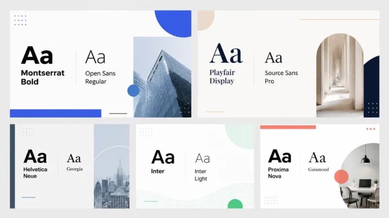
The most common pairing system uses a sans-serif for headings and a complementary font for body text, or vice versa. The key is contrast without conflict.
| Heading font | Body font | Works well for |
| Montserrat Bold | Open Sans Regular | Modern, energetic decks |
| Playfair Display | Source Sans Pro | Premium brand or editorial |
| Helvetica Neue | Georgia | Corporate with warmth |
| Inter | Inter Light | Minimal, tech-focused |
| Proxima Nova | Garamond | Marketing or startup pitches |
A single-font system also works well when that font has enough weight variation. Inter, for example, runs from Thin through Black, which gives you enough range to create clear hierarchy with one typeface.
What to avoid
Several fonts are worth leaving out entirely, regardless of context.
Comic Sansis an obvious example – it signals informality in a context where credibility matters. But there are subtler mistakes that happen more often.
Impactproduces bold, heavy headlines that feel more like a meme template than a slide. Fonts similar to impact that work better in presentations include Bebas Neue or Anton, both of which have similar weight but more design intentionality.
Decorative or script fonts – anything that requires extra cognitive effort to read – slow the audience down. A moment of hesitation reading a headline breaks attention at exactly the wrong time.
How to add a font to PowerPoint
How to add a font to powerpoint is a common question when a brand requires a typeface that isn’t installed by default. The process:
- Download the font file (.ttf or .otf format) from the font source
- Right-click the file and select “Install” (Windows) or double-click and click “Install Font” (Mac)
- Restart PowerPoint
- The font should appear in the font menu
Font not showing up in powerpoint after installation is usually a sign that PowerPoint was open during installation. A full restart of the application – and sometimes the computer – resolves it in most cases.
Font personality and presentation context
Typography carries meaning beyond legibility. The concept of font personality test thinking – matching typeface character to presentation purpose – is worth taking seriously.
A rounded sans-serif like Nunito communicates approachability. A geometric sans-serif like Futura reads as forward-looking and precise. A high-contrast serif like Didot signals luxury font slide and editorial taste. None of these is universally correct – the right choice depends on what the presentation needs to communicate before the audience reads a single word.
Good fonts for slideshows in educational contexts tend to lean readable and neutral – Inter, Open Sans, or Lato. Sales presentations benefit from type with more personality, provided it doesn’t sacrifice legibility. Brand decks can push further into expressive territory.
A note on system fonts vs. custom fonts
Most presentations get shared across devices and operating systems. Custom fonts that aren’t installed on the PC will substitute, often breaking the visual hierarchy. There are two ways around this: embed fonts when saving the PowerPoint file (File > Save As > Tools > Save Options > Embed fonts), or stick to system-safe choices like Arial, Georgia, or Calibri.
The best font ever for presentations is probably the one that renders correctly on every device, suits the brand, and never distracts the audience from the content. That’s not an exciting answer, but it’s the practical one.
Conclusion
“What is the best font for powerpoint slideshow?” – this question doesn’t have a universal answer, but it has a clear framework: choose for legibility first, hierarchy second, and personality third. Pair fonts with intention, use weight variation to create structure, and test how the deck reads from a distance before presenting.
The specific font matters less than the consistency with which it’s applied across every slide.