It may seem like we’re crazy about apps, but we like the web too. The question is, what’s the future of the web? Is it dying? Are apps taking over? Or are websites coming back in vogue as social media sites don’t give the organic reach they once offered brands? When apps continue to crush mobile web usage by a factor of 10-1, what’s a website to do?
Here’s three new websites making a valiant stand against the “appization” of just about everything offering up useful features to their users.
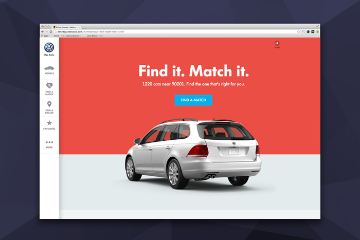
VW
For the new launch of VW.com, the automaker and its digital agency Deutsch LA turned car buying into a Tinder-like dating experience. The utility of transforming the traditional car brochure site into something useful, where people can actually find a car that meets their criteria, seems comically obvious given it is 2014. But it’s a fast-loading, smartly built website, akin to looking at places to stay on Airbnb—simple to use, inspiring to browse, and deadly in its ability to suck time and space away from you.
There are a lot of parallels between online dating and car shopping,” chief digital officer of Deutsch LA Winston Binch told Digiday. “Picking your perfect mate and car are both stressful, rational and ultimately, emotional decisions. … We knew we needed to get people to fall in love with our cars quickly and painlessly.
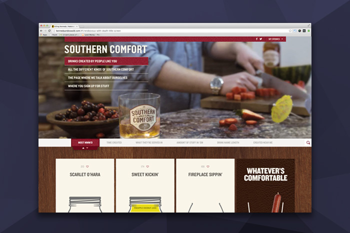
Southern Comfort

For the brand that runs Jack Daniels and Southern Comfort, the organic reach of Facebook meant rethinking their websites. For Jason Loehr, director of global media and digital marketing at Southern Comfort’s parent company Brown-Forman that meant rethinking the fishing where the fish are strategy of social media. “It’s putting a discipline against us and a rigor. Ultimately, what Facebook has done is say, remember your Internet websites, how important are those,” he said.

Get 300+ Fonts for FREE
Enter your email to download our 100% free "Font Lover's Bundle". For commercial & personal use. No royalties. No fees. No attribution. 100% free to use anywhere.
The new site features a pretty in depth and slick crowdsourced drink listing menu. Let’s be honest, it’s a drinking website (and no judging from our whiskey sipping peanut gallery). The website lets you create your own drink, pick your glass, the garnish (bacon and beef stick are both delicious sounding options) and type of ice. Then you share it. Pretty simple way for these handcrafted recipes to then be shared on social, and work around the organic reach issue.
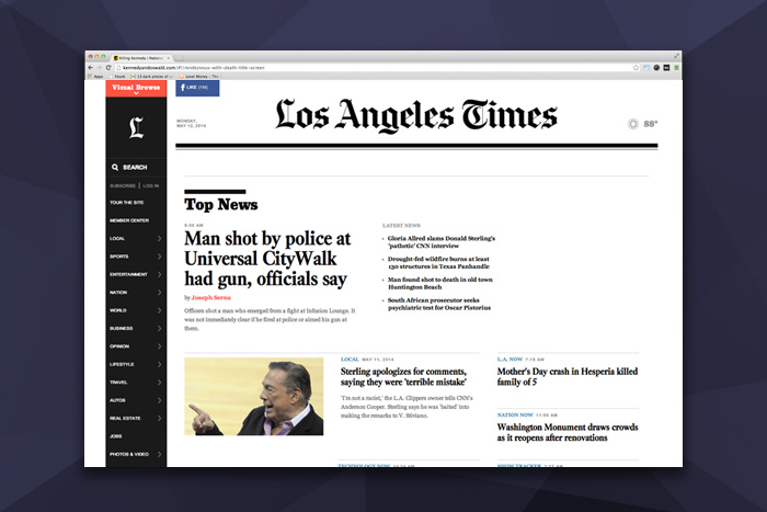
The Los Angeles Times

For the Los Angeles Times’ new website experience the newspaper focused its efforts on using mapping data to help serve up relevant local stories for each of the city’s 88 neighborhoods. That focus on all stories as local ones is as important as the local farmers market resurgence.
“So this is a natural fit for us and a great way for us to coalesce and aggregate some our great local coverage and information—news, crime and demographic information, restaurant and food reviews— in one place,” said Ron Parsons in Gizmodo, vice president of digital products.
The site, by Code and Theory is smartly built around different ways to consume the content. As it’s both optimized and set up for snacking on small bits of content as it is deep reading and jumping into the conversation through comments. What is interesting is that both the VW site and this one feature persistent left hand navigation that follows the user down. There is also a visual browse feature that transforms the content into an Instagramization of news.
Now, who says innovation on the web is dead?

