In this article:
- Our Favorite Pirate Fonts in all the Seven Seas:
- What Makes a Font Feel "Piratey"?
- Perfect Places for Pirate Fonts
- When to Avoid Pirate Fonts
- Choosing the Perfect Pirate Font
- Pairing Pirate Fonts Like a Pro
- Alternative Approaches to Pirate Typography
- Technical Tips for Working with Pirate Fonts
- Avoiding Common Mistakes
- Conclusion
Whether you’re designing for ‘Talk Like a Pirate’ Day, creating a themed restaurant menu, or just want to add some swashbuckling flair to your next project, choosing the right pirate font can make or break your design.
But you don’t need a treasure map to find the best pirate fonts on the internet. We’ve compiled all the best ones below. So let’s dive into our list and everything you need to know about these treasure-worthy typefaces.
Our Favorite Pirate Fonts in all the Seven Seas:
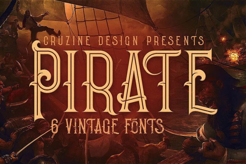
Pirate
A vintage-style serif font with decorative elements. Designed for display purposes with a classic feel.
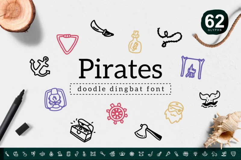
Pirates Dingbat
A specialized symbol font featuring pirate-themed dingbats and icons.
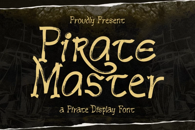
Pirate Master

Get 300+ Fonts for FREE
Enter your email to download our 100% free "Font Lover's Bundle". For commercial & personal use. No royalties. No fees. No attribution. 100% free to use anywhere.
A swashbuckling display font designed for adventure-themed projects. Perfect for pirate-themed designs and titles.
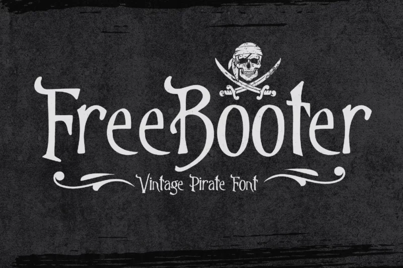
Freebooter
A pirate-themed display font with nautical elements. Features ship-inspired decorative elements. You might also like our collection of Nautical Fonts.
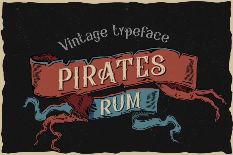
Pirates Rum
A vintage typeface with decorative elements perfect for logo design. Inspired by traditional rum labels and pirate aesthetics.
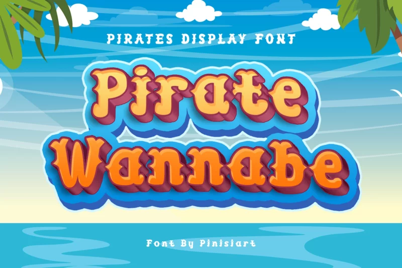
Pirate Wannabe
A bold display font with action-oriented design elements. Features strong serif characteristics.
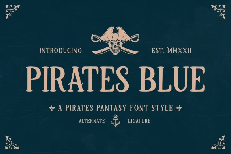
Pirates Blue
A fantasy-inspired display font designed for adventure branding. Features decorative elements with a nautical theme.
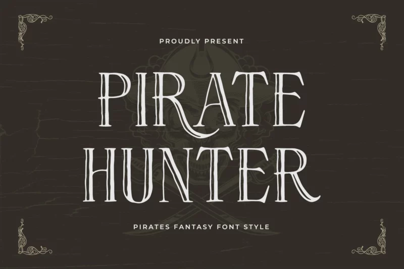
Pirate Hunter
A fantasy font style with strong pirate and ship motifs. Perfect for maritime-themed designs.
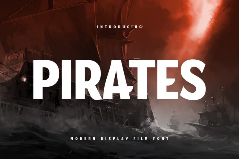
PIRATES
A modern display film font with sans-serif styling. Designed for contemporary logo applications.
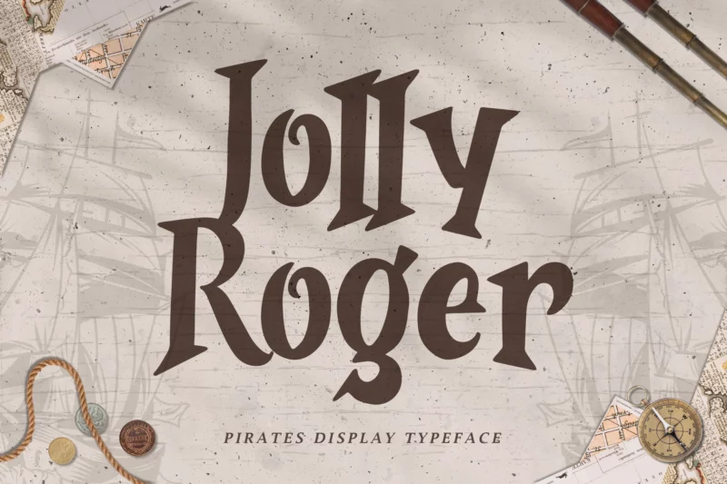
Jolly Roger
A pirates display typeface focused on adventure and branding. Features decorative elements inspired by pirate lore.
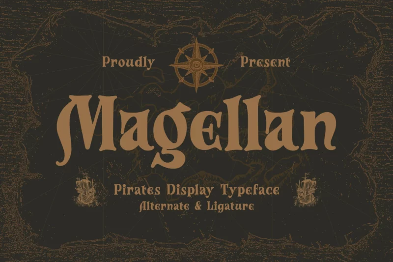
Magellan
A swashbuckling display typeface with decorative elements. Inspired by maritime exploration and adventure.
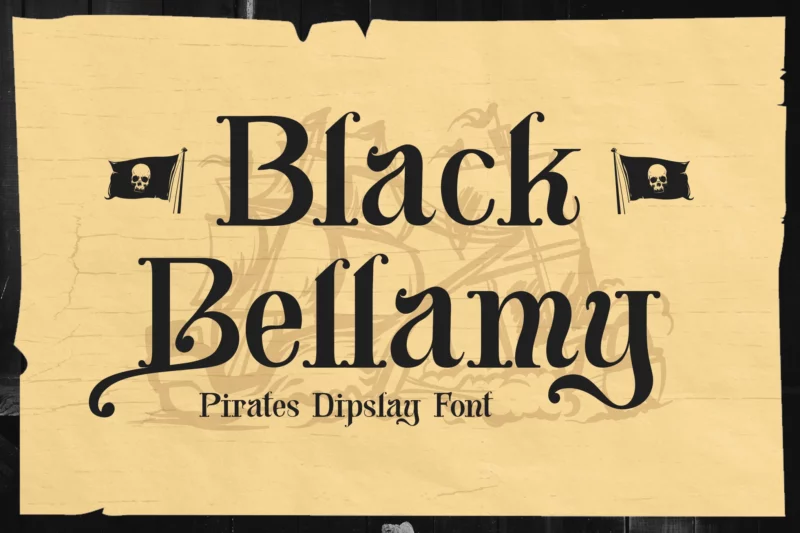
Black Bellamy
A pirates display font designed for adventure-themed projects and books. Features bold, decorative elements.
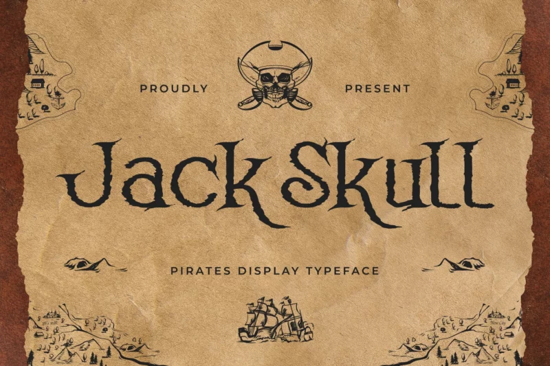
Jack Skull
A pirates display typeface featuring skull motifs and decorative elements. Perfect for themed designs.
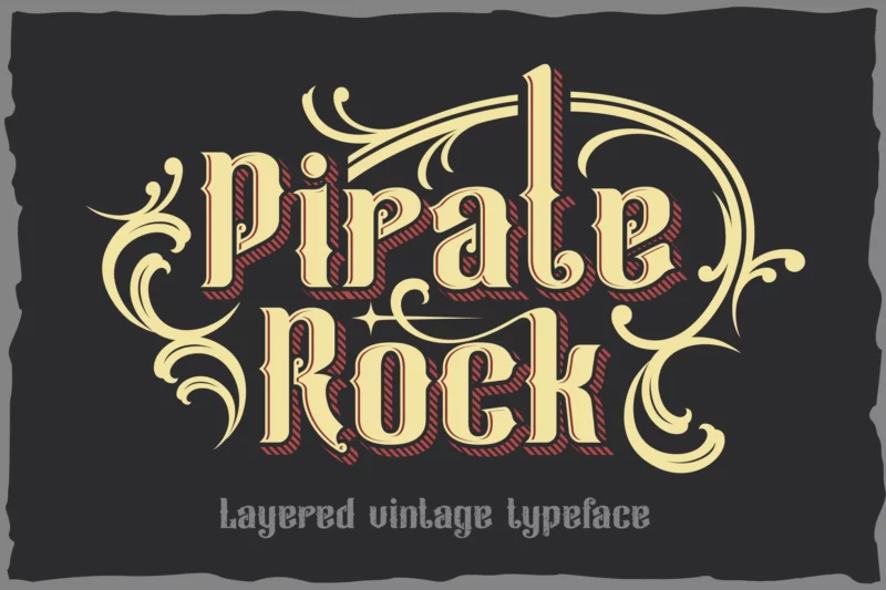
Pirate Rock
A vintage layered font designed for music and metal applications. Features multiple layers for depth effects.
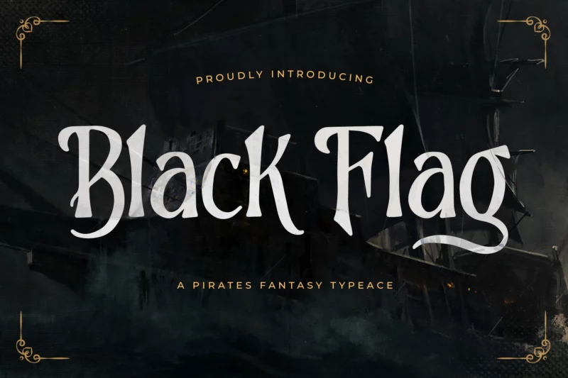
Black Flag
A pirates fantasy typeface for creative and greeting applications. Features decorative elements inspired by pirate flags.
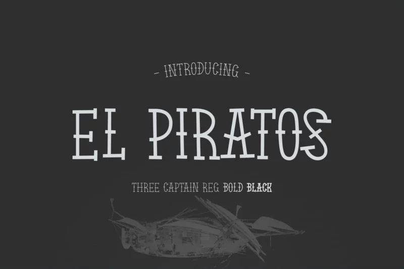
EL PIRATOS
A sailor tattoo-inspired serif font with vintage styling. Perfect for maritime and nautical designs.
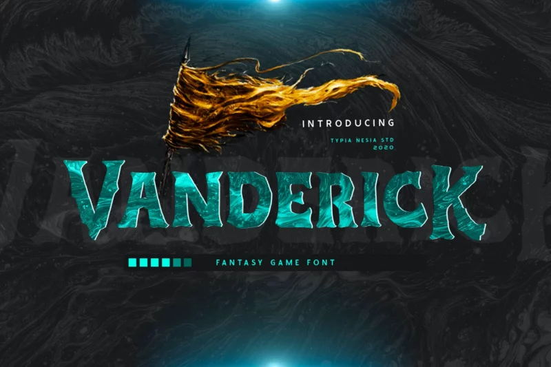
Vanderick
A fantasy game font with pirate and wild elements. Features decorative symbols and serif styling.
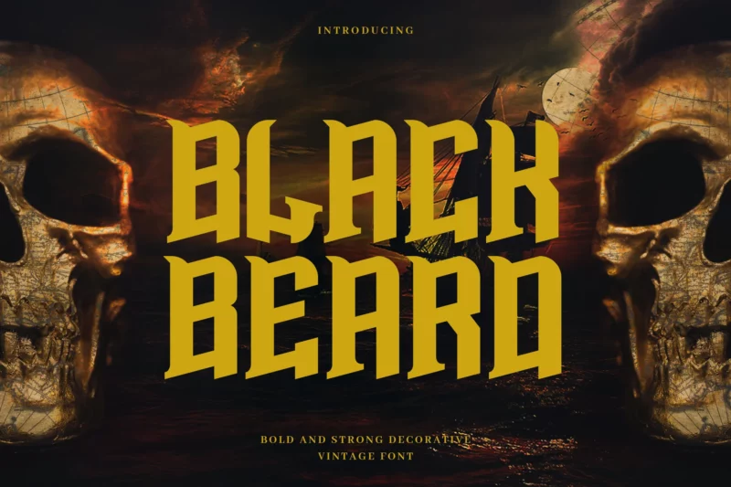
Blackbeard
A vintage bold display typeface with sans-serif elements. Inspired by pirate tales and maritime history.
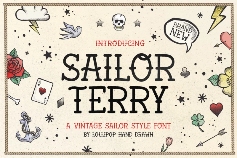
Sailor Terry
A script font designed for tattoo and navy-themed projects. Features handwritten styling with nautical elements.
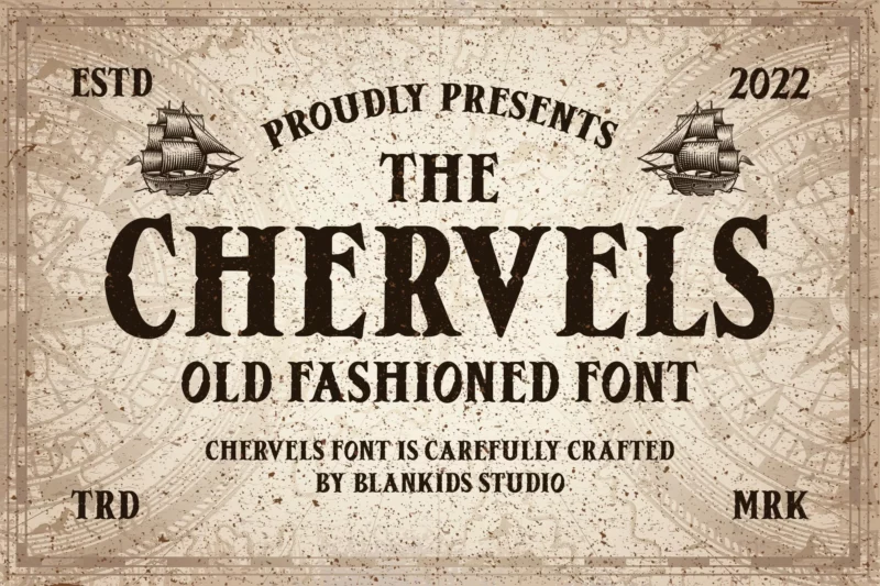
Chervels
An old-fashioned serif font with retro styling. Perfect for vintage-inspired designs.
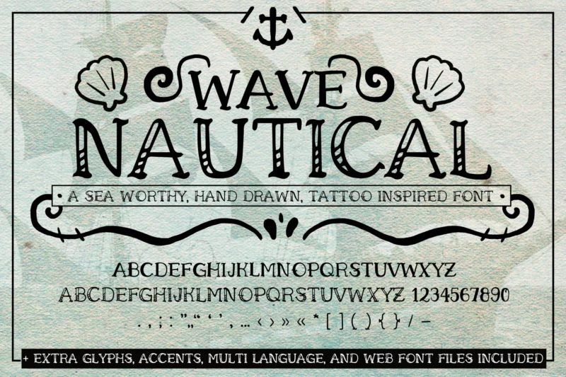
Wave Nautical Font
A handwritten tattoo web font with nautical themes. Combines serif and script styles with decorative elements.
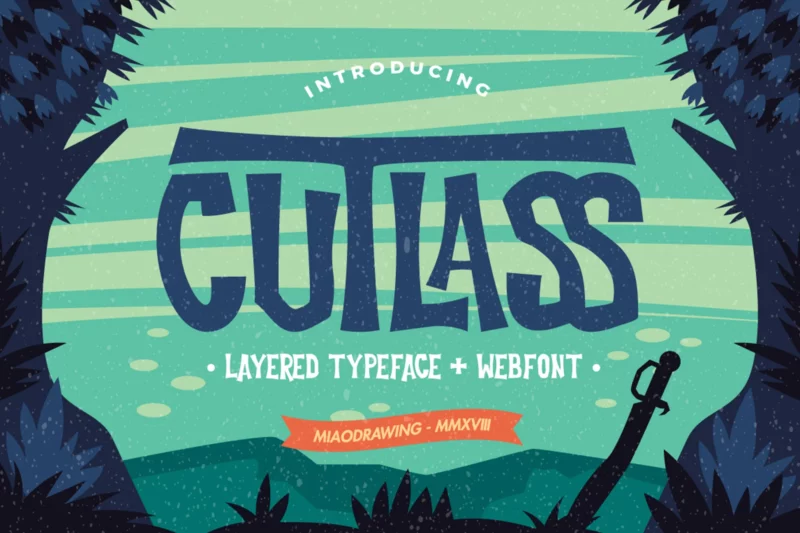
Cutlass Typeface – Lite
A sans-serif typeface with decorative symbols. Features miaodrawing-inspired elements.
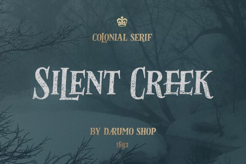
Silent Creek
A vintage serif font suitable for classic and holiday designs. Features traditional styling.
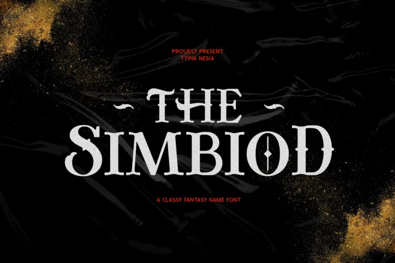
The Simbiod
A classic adventure fantasy game font with serif styling. Perfect for gaming and fantasy projects.
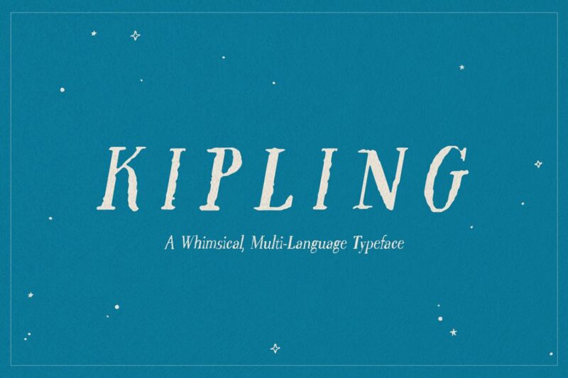
Kipling
A whimsical font combining serif, script, and decorative elements. Designed for children’s content.
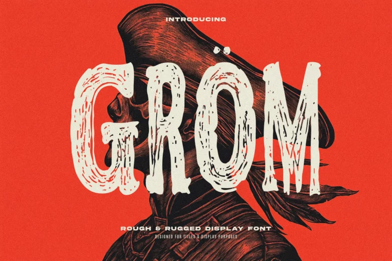
Gröm
A tall grunge display font with rustic texturing. Perfect for creating weathered, vintage effects.
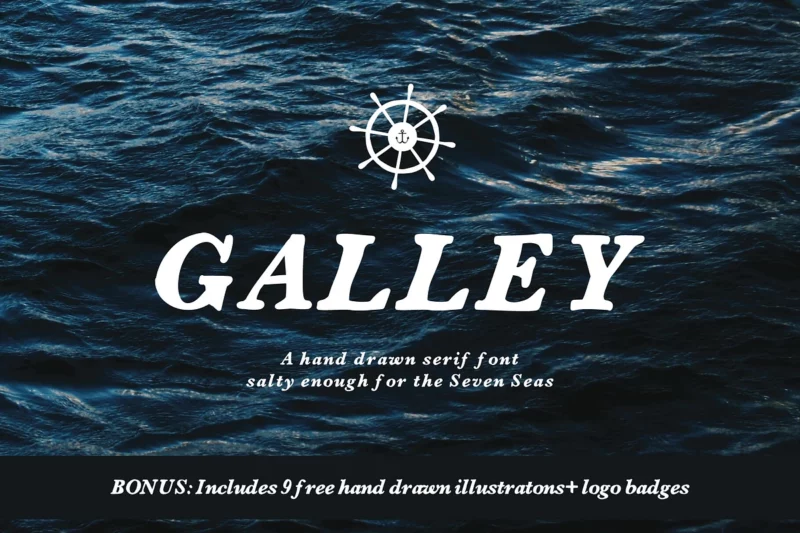
Galley Font
A serif font with complementary logo badges. Designed for maritime-themed branding.
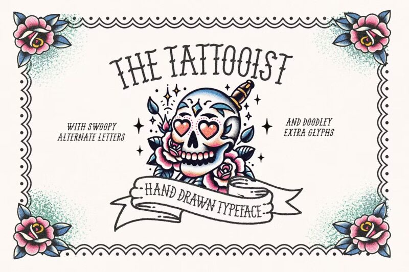
The Tattooist
A typeface designed for tattoo-style typography. Features vintage-inspired elements.
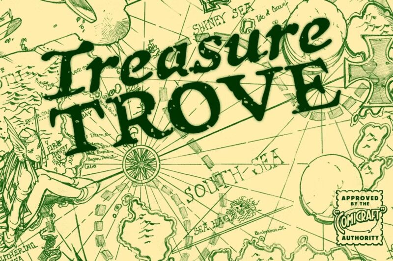
Treasure Trove
An ancient map-inspired handwritten font. Perfect for creating historical and adventure designs.
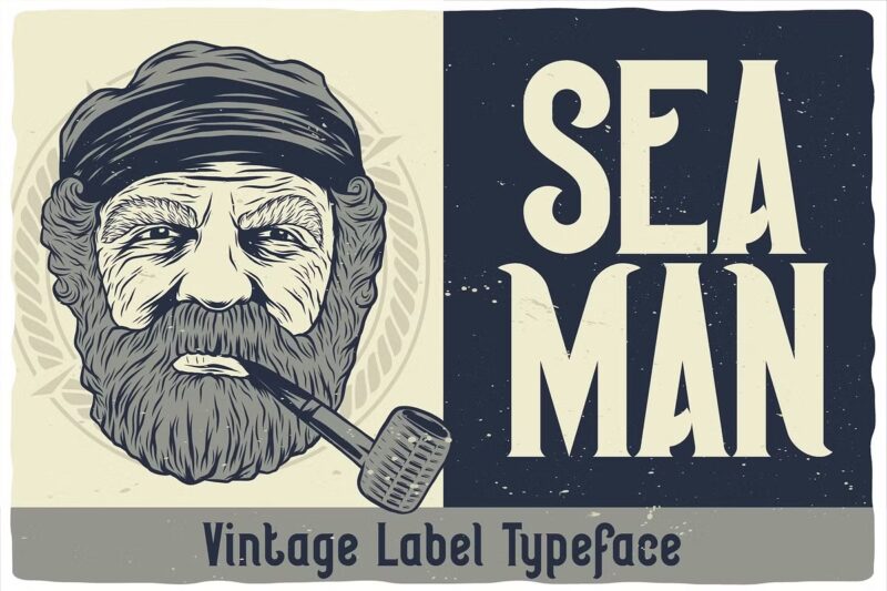
Seaman Label
A font designed for nautical and maritime labeling. Features traditional seaman-style typography.
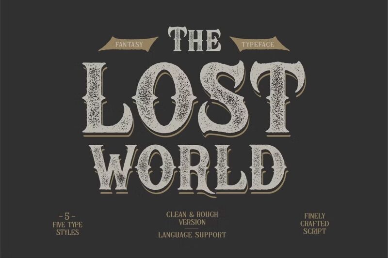
The Lost World
A fantasy font designed for adventure themes. Perfect for mysterious and exploration-based projects.
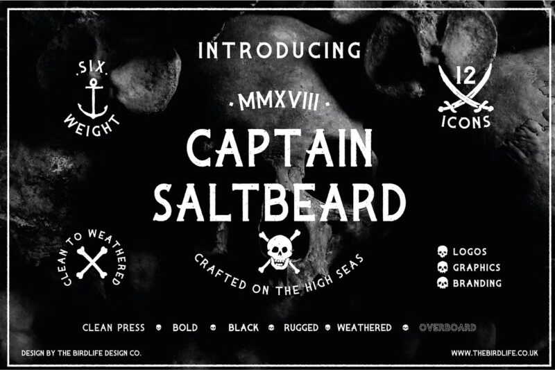
CAPTAIN SALTBEARD
A serif font with maritime character. Designed for nautical and pirate-themed projects.
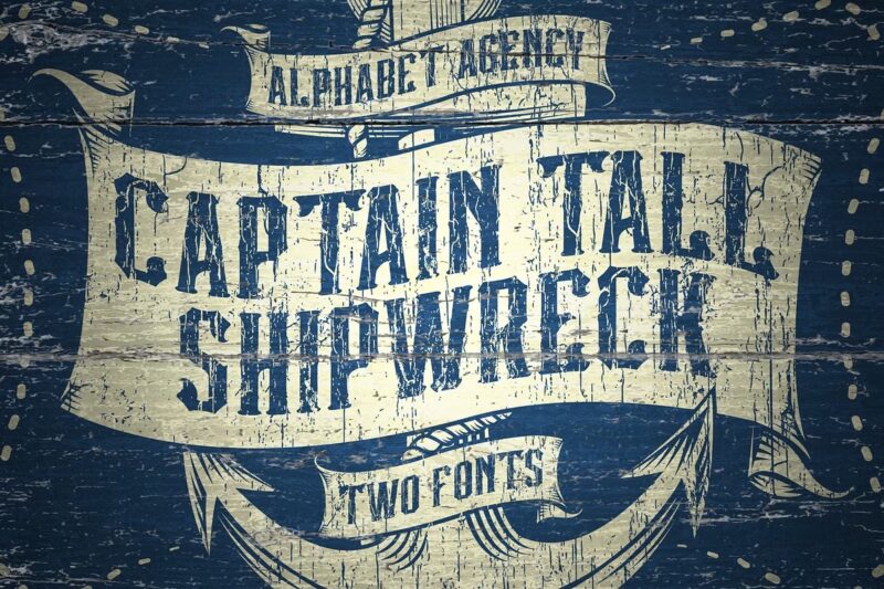
Captain Tall Shipwreck
A font duo featuring shipwreck-inspired design elements. Perfect for maritime branding.
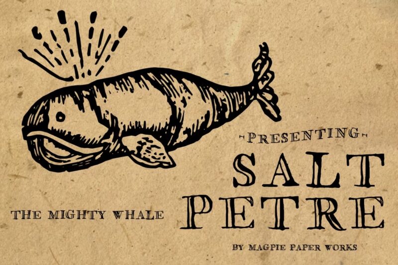
Saltpetre
A font with vintage maritime characteristics. Designed for historical and nautical applications.
What Makes a Font Feel “Piratey”?
I’ve spent countless hours analyzing what makes certain fonts feel more authentic to the golden age of piracy. The most effective pirate fonts combine historical elements with modern design sensibilities to create that perfect seafaring feel.
The historical authenticity comes from blackletter influences of 17th-18th century typography, often featuring weathered or distressed appearances that mirror aged parchment. The best pirate fonts incorporate decorative swashes that reflect the ornate writing style of ship’s logs, while slightly uneven baselines simulate the experience of writing on rough seas.
But it’s not just about historical accuracy. Modern pirate aesthetics play a huge role too. The most popular pirate fonts today feature rum-soaked irregularities in their letter shapes, sword-like serifs and sharp terminals, and treasure map-inspired decorative elements. Some even incorporate subtle “wooden” textures that recall ship planks and maritime materials.
Perfect Places for Pirate Fonts
In my years of design work, I’ve found that pirate fonts truly shine in specific contexts. Theme parks are an obvious winner – from restaurant menus to ride entrances, these fonts help create an immersive experience that transports visitors to a different time and place.
Entertainment design is another perfect playground for pirate typography. Board games, book covers for maritime adventures, and movie promotional materials all benefit from the right pirate font. I’ve even seen some brilliant uses in gaming UI elements where the font adds to the storytelling without sacrificing usability.
Event design offers endless opportunities too. Whether it’s birthday party invitations, Halloween promotions, or maritime festival branding, pirate fonts can set the perfect tone for your celebration.
When to Avoid Pirate Fonts
As much as I love a good pirate typeface, there are times when you should keep these fonts locked in the treasure chest. Here’s where pirate fonts typically sink rather than swim:
- Professional Business Communications
- Legal Documents
- Medical Information
- Safety Signage
- Mobile App Body Text
- Academic Papers
Choosing the Perfect Pirate Font
After years of working with specialty fonts, I’ve developed a reliable framework for selecting the right pirate typeface. It all starts with understanding your audience. For children’s designs, you’ll want to lean toward friendlier, more playful pirate fonts. Historical recreations call for authentic blackletter-inspired options. Modern interpretations? Look for fonts that cleverly blend historical elements with contemporary design sensibilities.
One mistake I see designers make constantly is sacrificing readability for style. Here’s my rule of thumb: save the most decorative pirate fonts for headlines where they can make a big impact. Use semi-decorative options for subheaders, and stick to pirate-inspired serif fonts for body text. This creates a perfect balance between style and functionality.
Pairing Pirate Fonts Like a Pro
After two decades of design work, I’ve learned that even the best pirate font needs a strong supporting cast. The key to successful font pairing is understanding the role each typeface plays in your design hierarchy.
Your pirate font should typically take the lead role – think headlines and key display text. For secondary elements, I often reach for simplified historical typefaces that complement without competing. The body text needs to be highly readable, so I typically opt for a clean modern font that won’t tire the reader’s eyes.
Alternative Approaches to Pirate Typography
Sometimes a full pirate font isn’t the right choice, but you still want that seafaring feel. I’ve had great success with modified traditional fonts – adding distressed effects to serif fonts, incorporating nautical ornaments, or using weathered textures with standard typefaces.
You can also create a pirate vibe through typography-only solutions. Strategic use of swashes, maritime-inspired layouts, and even naval signal flag influences can all contribute to that seafaring feel without requiring a specialized font.
Technical Tips for Working with Pirate Fonts
Over the years, I’ve learned some crucial technical considerations when working with these specialty fonts. Pay special attention to OpenType features – many pirate fonts come with extra swashes and alternates that can add variety to your designs. For web projects, always check compatibility and file sizes; these decorative fonts can get heavy quickly.
When implementing pirate fonts in your designs, remember to create outlines for print work, adjust tracking for optimal readability, and carefully manage file sizes for web use. I’ve found that taking these steps early in the process saves countless headaches later.
Avoiding Common Mistakes
Let me save you from some mistakes I’ve made over the years. First, resist the urge to go overboard with decorative elements. One strong pirate font can make a bigger impact than three competing ones. Second, never sacrifice readability for style – test your designs at various sizes and check contrast levels carefully. Finally, always consider the context of your design. Make sure your font choices match both the historical period you’re referencing and your client’s brand guidelines.
Conclusion
Pirate fonts can add that perfect touch of adventure to your designs when used thoughtfully. Whether you’re creating something for Talk Like a Pirate Day or designing a themed restaurant menu, the key is balancing authenticity with usability.
Remember: like any specialty font, pirate typefaces are tools in your design arsenal. Use them wisely, and they’ll help you create designs that truly transport your audience to the high seas of adventure.
Have you worked with pirate fonts in your designs? I’d love to hear about your experiences in the comments below. And don’t forget to check out our other font guides here on Design Work Life!

