In this article:
- 1. Times New Roman
- 2. Arial
- 3. Calibri
- 4. Helvetica
- 5. Garamond
- 6. Georgia
- 7. Cambria
- 8. Verdana
- 9. Book Antiqua
- 10. Arial Narrow
- Font Size & Formatting Guidelines
- Common Font Mistakes to Avoid
- Final Thoughts
Remember when you thought picking a font for your resumé was just about making it look “nice”?
Those days are gone.
In 2025, your resumé font choice can make the difference between landing an interview and getting lost in the stack. With AI screening tools and hiring managers spending mere seconds scanning applications, every detail matters.
Even that tiny font choice.
According to research from job search platform ZipJob, recruiters spend an average of just 7.4 seconds looking at each resumé. That’s not much time to make an impression.
Your font choice speaks volumes before they read a single word.
Let’s dive into exactly which fonts will help you land more interviews in 2025.

Get 300+ Fonts for FREE
Enter your email to download our 100% free "Font Lover's Bundle". For commercial & personal use. No royalties. No fees. No attribution. 100% free to use anywhere.
1. Times New Roman
Let’s address the elephant in the room: Times New Roman is the safest choice you can make.
It’s been the go-to resumé font for decades, and there’s a good reason why: it works.
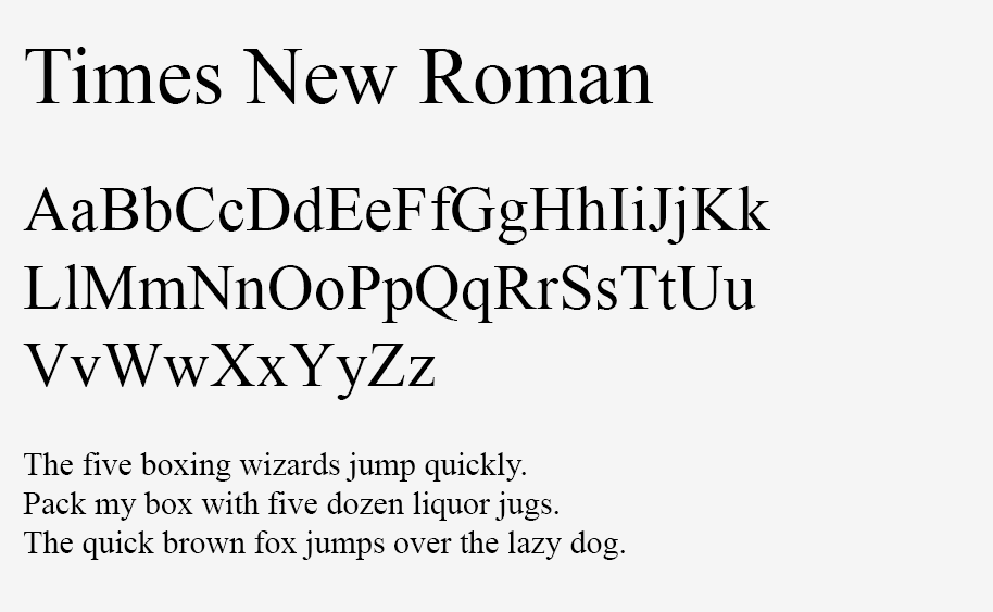
Times New Roman strikes the perfect balance between professionalism and readability. It’s especially strong if you’re applying to traditional industries like law, banking, or academia.
The downside? It might come across as a bit too safe or traditional for creative fields or tech startups.
2. Arial
Arial is the Switzerland of fonts: neutral, reliable, and universally accepted.
This sans-serif font brings a clean, modern look to your resumé without trying too hard to stand out.
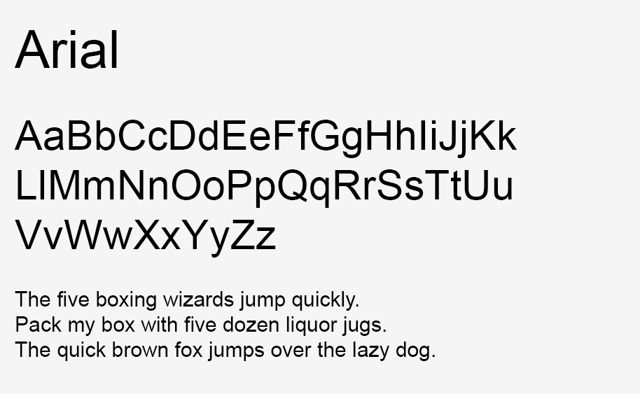
It’s particularly effective for digital submissions because it renders perfectly on virtually every screen and system.
If Times New Roman feels too stuffy but you still want to play it safe, Arial is your best bet.
3. Calibri
Since 2007, Calibri has been Microsoft Word’s default font – and that’s actually a good thing.
It’s modern, clean, and incredibly easy to read both on screen and in print.
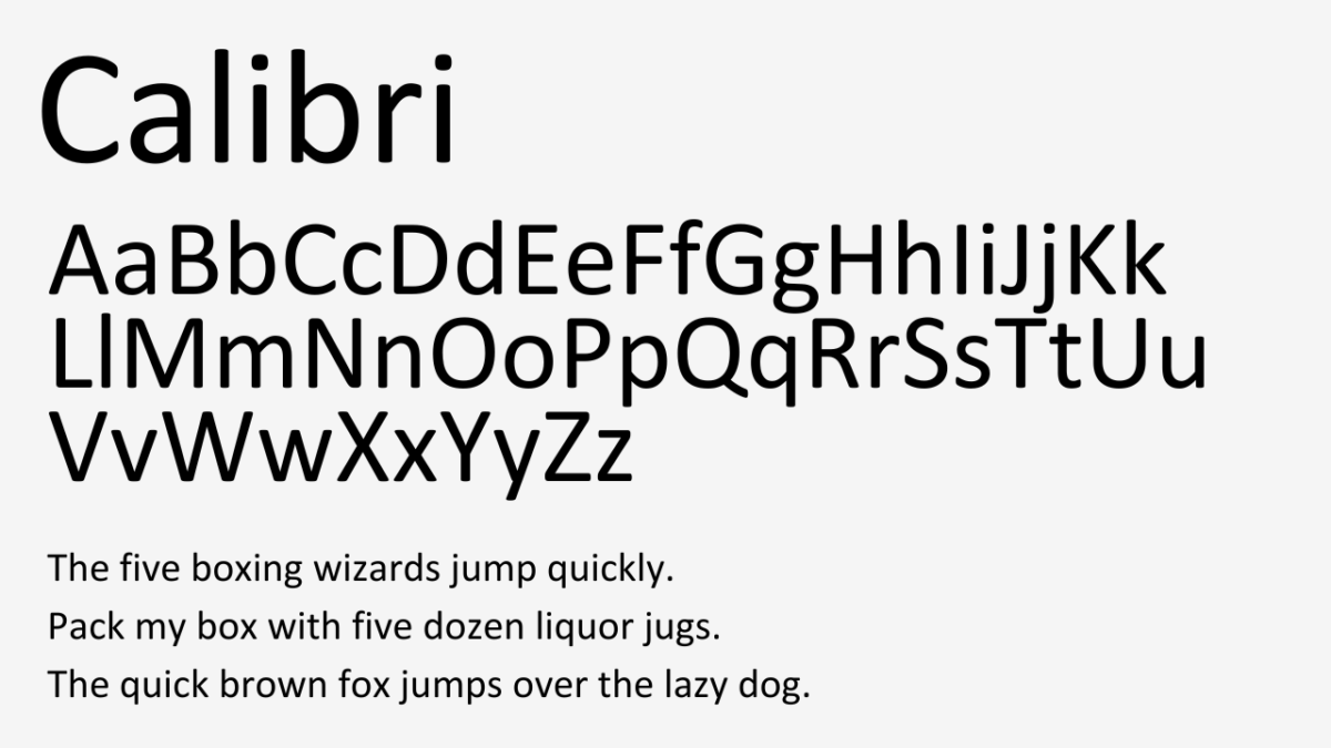
Calibri manages to look professional while taking up less space than most fonts, which means you can comfortably fit more content on your resumé without making it look cramped.
This font is particularly strong for business and tech industry applications.
4. Helvetica
Helvetica is the designer’s choice – sleek, professional, and timelessly modern.
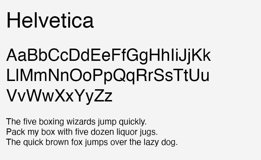
The only catch? It doesn’t come pre-installed on most Windows computers, which means you’ll need to purchase it or have access to a Mac where it comes standard.
But if you have access to Helvetica, it’s worth considering. Its clean lines and perfect proportions make any resumé look intentionally designed.
5. Garamond
Garamond is like Times New Roman’s cooler cousin.
It’s a classic serif font that brings a touch of sophistication without feeling outdated.
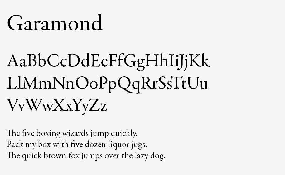
The best part? Garamond uses less space than most fonts in its class, which means you can fit more content on your resumé while maintaining a clean, uncluttered look.
6. Georgia
Georgia was specifically designed to be readable on computer screens, and it excels at that job.
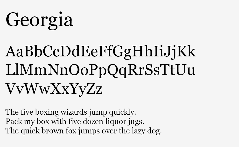
It’s slightly wider and rounder than Times New Roman, which makes it easier on the eyes – especially for digital resumés.
If you’re applying for remote positions where your resumé will likely only be viewed digitally, Georgia might be your secret weapon.
7. Cambria
Cambria bridges the gap between old-school serif fonts and modern design.
Microsoft created it as an alternative to Times New Roman, focusing on making it more readable on computer screens.
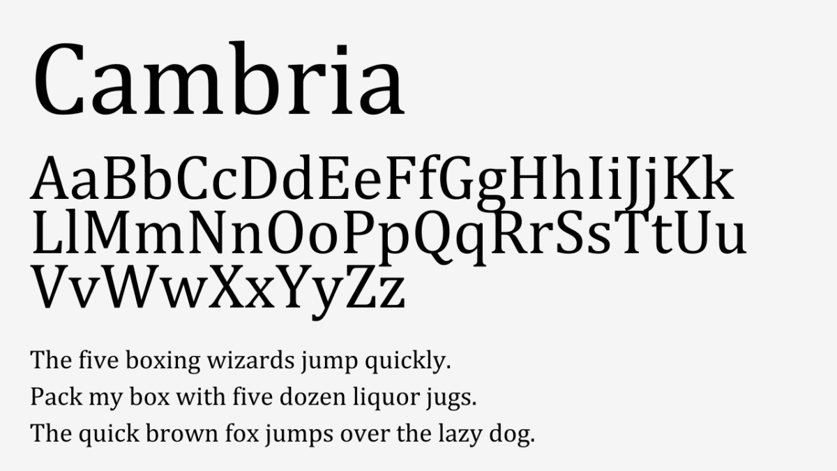
It’s professional without being boring, and it works particularly well if you’re planning to send your resumé both digitally and in print.
8. Verdana
Verdana was built for screens, and it shows.
It’s slightly wider than Arial, with more space between letters, making it incredibly easy to read even at small sizes.
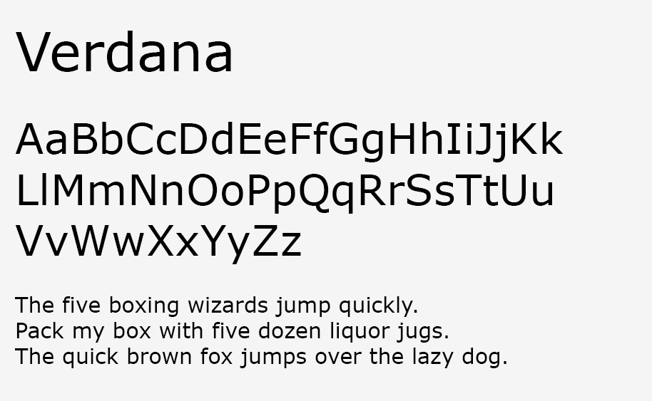
The downside? That extra width means you might fit less text on your resumé. But if readability is your top priority, Verdana won’t let you down.
9. Book Antiqua
Book Antiqua brings a touch of elegance to your resumé without going overboard.
It’s similar to Palatino, another classic font, but with a slightly more modern feel.
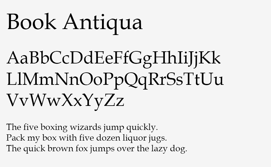
This font works especially well for senior-level positions where you want to convey experience and sophistication.
10. Arial Narrow
Sometimes you need to fit more content on your resumé without reducing font size. That’s where Arial Narrow comes in.
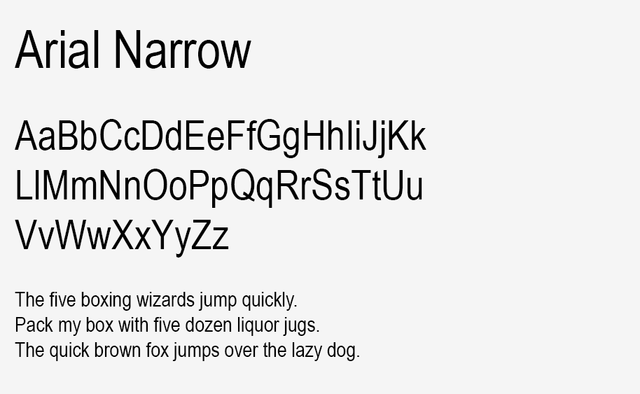
It’s just as readable as regular Arial but takes up less space horizontally.
Just be careful not to use it at too small a size – anything below 10 point can become difficult to read.
Font Size & Formatting Guidelines
Let’s talk about size – because when it comes to resumé fonts, it definitely matters.
Your name at the top should be the largest element on the page. Think 14-16 points.
Section headers look best at 12-14 points. They need to stand out from your body text without shouting.
For the main content of your resumé, stick to 10-12 points. Any smaller and you risk straining the reader’s eyes.
Here’s a pro tip: if you’re over 40, use 11 or 12 point font. Studies show it’s actually perceived as more senior and confident than tiny text.
Common Font Mistakes to Avoid
The fastest way to sink your chances? Using multiple fonts on your resumé.
Pick one font and stick with it. Different sizes for different sections? Yes. Different fonts? Probably not.
Never use script fonts or decorative fonts. Not even for your name at the top. It doesn’t look creative – it looks unprofessional.
Avoid light or thin font variants. They might look elegant on your screen, but they often become hard to read when printed.
And please, don’t shrink your font down to microscopic sizes just to fit everything on one page. If you need smaller text, you need better editing.
Final Thoughts
Your resumé font choice might seem like a small detail, but it’s one of those details that really matter.
Choose a font from this list, stick to the size guidelines, and keep it consistent throughout your document.
Remember: the best font is one that no one notices. It should make your experience and skills shine – not draw attention to itself.
Now go ahead and update your resumé. With the right font choice, you’re already one step closer to landing that interview.

