In this article:
- My Favorite Tee Shirt Fonts Right Now
- Why Typography Matters in T-Shirt Design
- Understanding the Basics: Font Fundamentals for T-Shirt Design
- The Five Essential Font Categories for T-Shirts
- Expert Font Pairing Techniques
- Industry-Specific Applications
- Technical Implementation
- Print Production: Making Your Fonts Look Perfect in the Real World
- Quality Control: Ensuring Perfect Typography Every Time
- Legal Considerations in Font Usage
- Essential Resources and Tools for T-Shirt Typography
- Final Thoughts: Creating Typography That Lasts
Let’s face it – picking the perfect font for your t-shirt design can feel overwhelming. With thousands of options out there, how do you choose the one that’ll make your design pop? Whether you’re creating merch for your brand, designing custom tees for an event, or launching your own clothing line, the right font can make or break your design.
In this comprehensive guide, we’ll dive deep into everything you need to know about t-shirt fonts in 2026. We’ll explore what makes certain fonts work better than others, how to choose the perfect typeface for your project, and share expert tips to elevate your designs from good to absolutely incredible.
My Favorite Tee Shirt Fonts Right Now
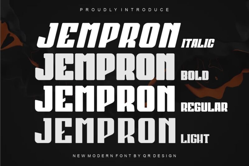
Jempron Font
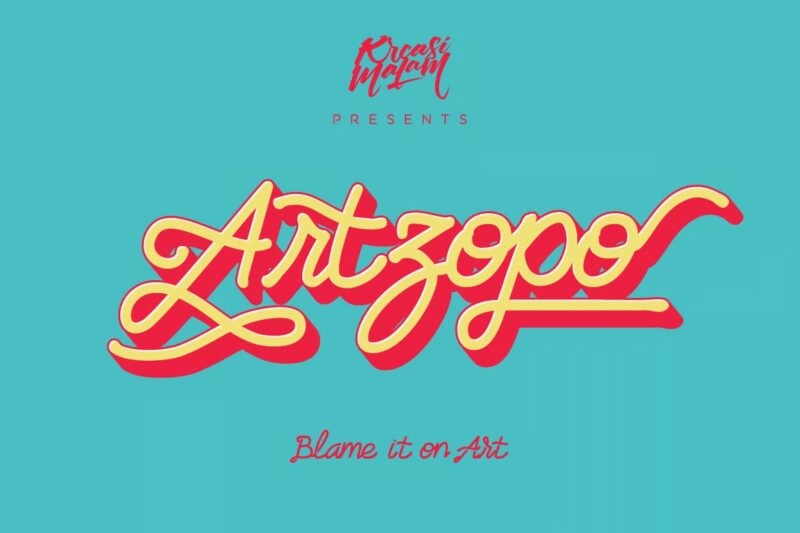
Artzopo Font
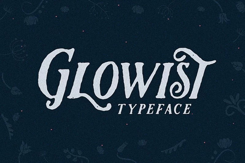
Glowist
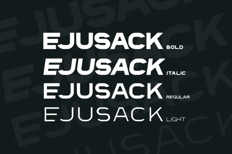
Ejusack Font
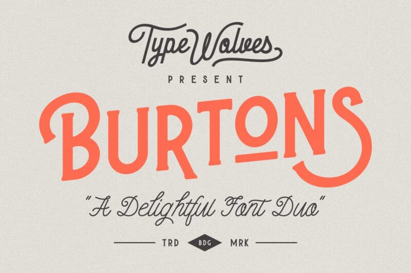
Burtons

Get 300+ Fonts for FREE
Enter your email to download our 100% free "Font Lover's Bundle". For commercial & personal use. No royalties. No fees. No attribution. 100% free to use anywhere.
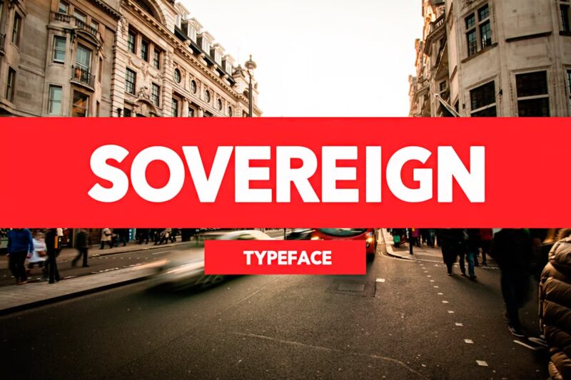
Sovereign Typeface
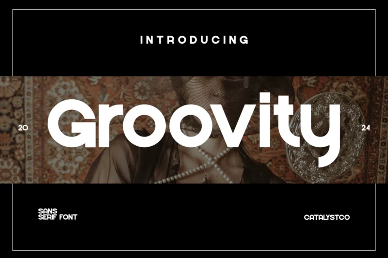
Groovity Sans
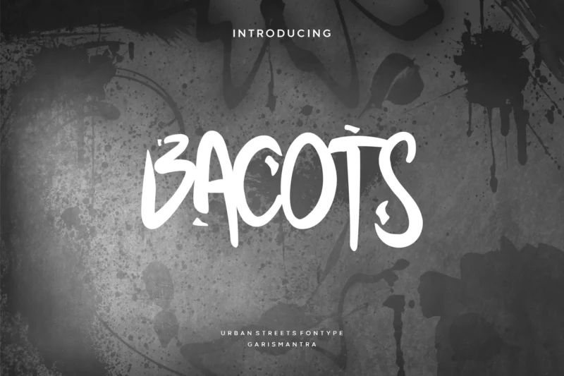
Bacots
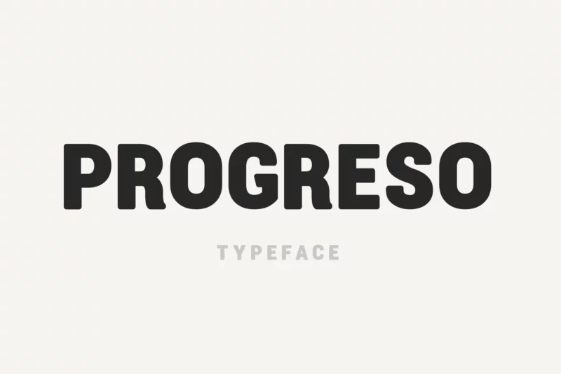
Progreso
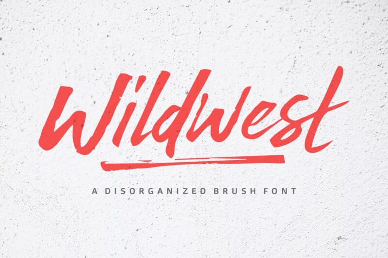
Wildwest Font
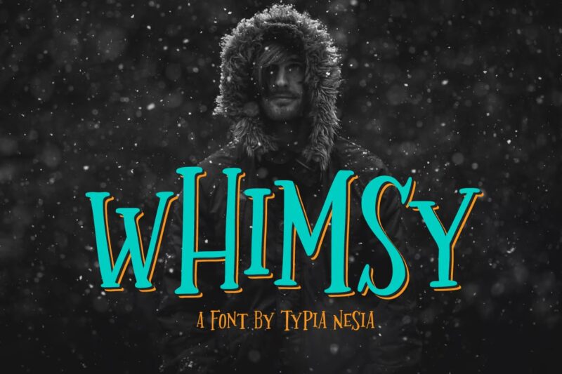
Whimsy
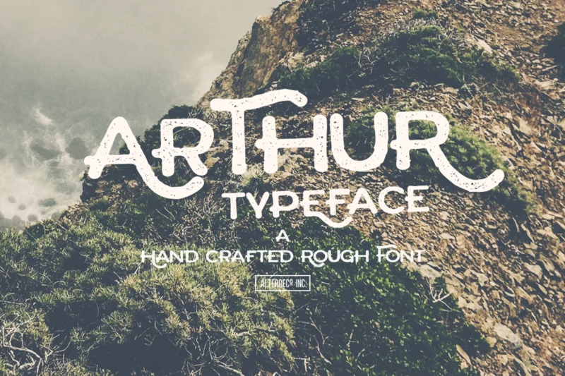
Arthur Typeface
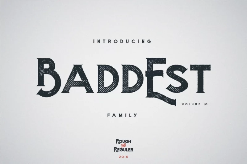
Baddest typeface
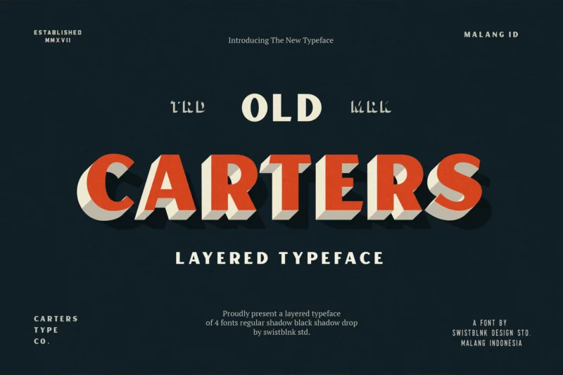
Carter Layered
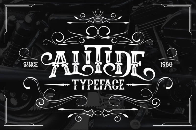
ALITIDE Typeface
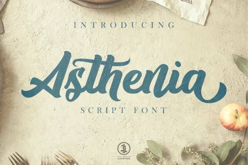
Asthenia
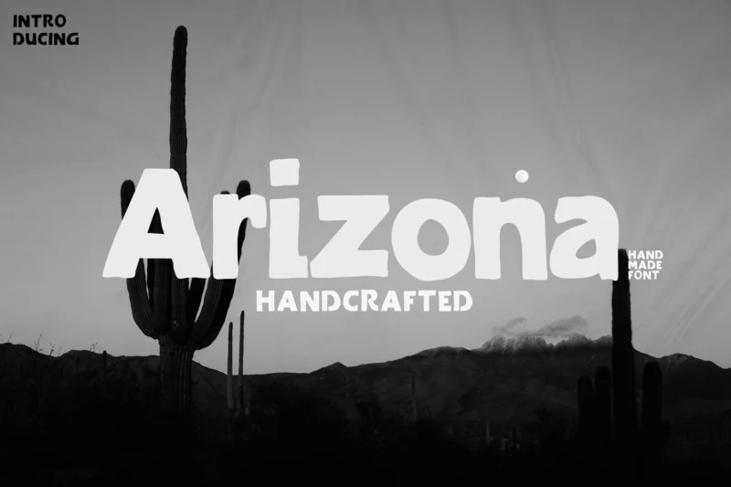
Arizona Family Font
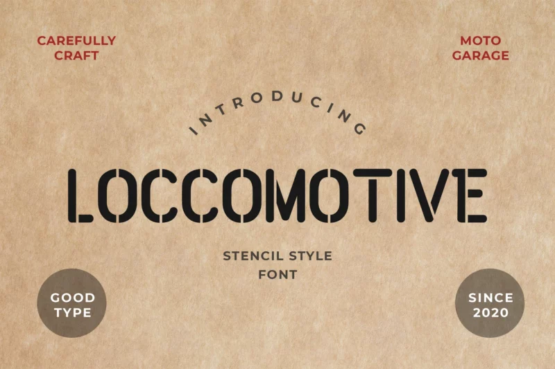
Loccomotive Stencil Font
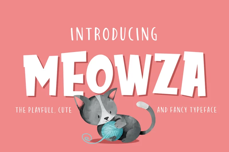
Meowza
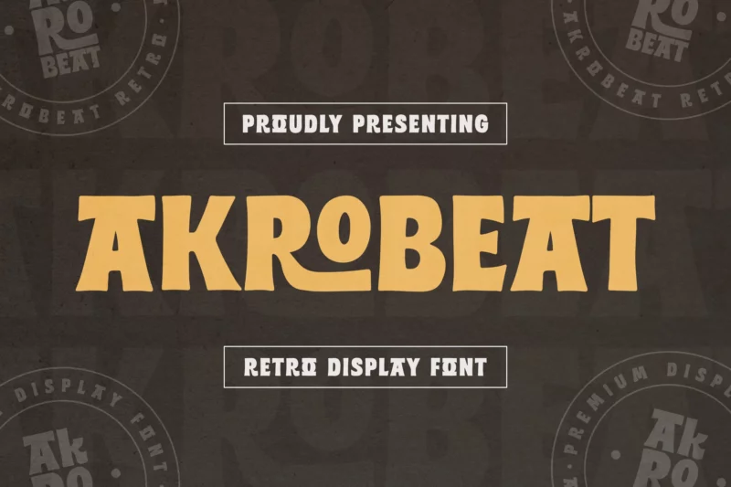
Akrobeat Font
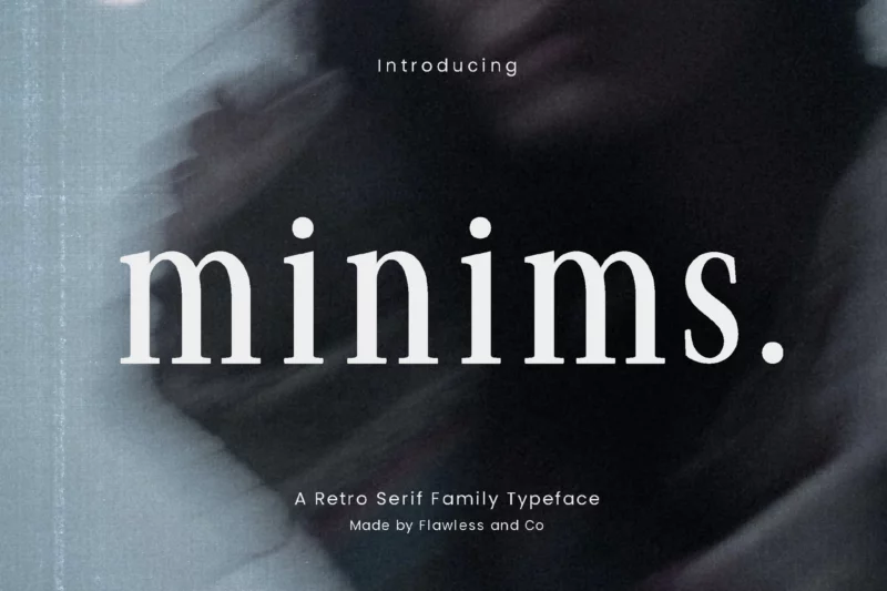
Minims Retro Serif Font Family
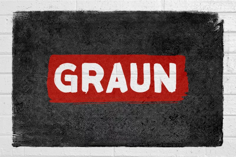
Graun
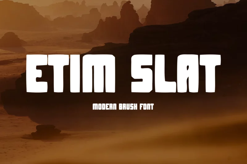
EtimSlat
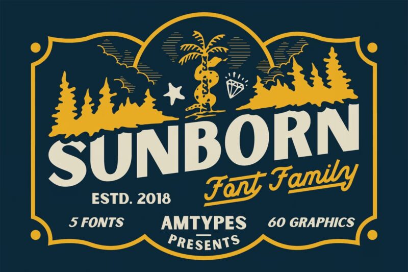
Sunborn Font Family
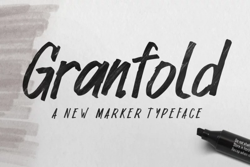
Granfold
Luxe Font
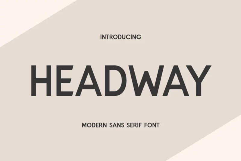
Headway Display Sans Serif Font
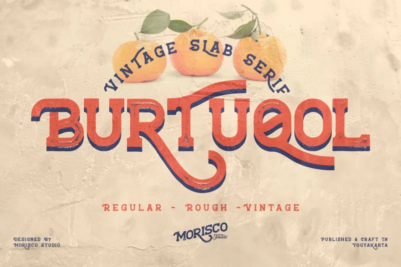
Burtuqol
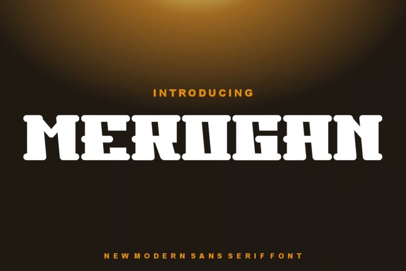
Merogan Font
Salaka
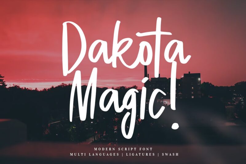
Dakota Magic
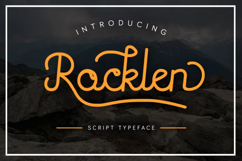
Rocklen
Why Typography Matters in T-Shirt Design
Here’s the thing about t-shirt design – it’s not just about picking a cool font and calling it a day. Your typography choice sends powerful messages about your brand, creates emotional connections with your audience, and can be the difference between a shirt that flies off the shelves and one that collects dust.
Think about it: when someone sees your shirt from across the room, what catches their eye first? Usually, it’s the text. That’s why getting your font choice right is absolutely crucial.
Understanding the Basics: Font Fundamentals for T-Shirt Design
Before we dive into specific font recommendations, let’s break down some essential typography concepts that’ll help you make better design decisions.
Key Typography Terms You Need to Know
Font vs. Typeface: While often used interchangeably, these terms actually mean different things. A typeface is the overall design of the lettering (think “Helvetica”), while a font is a specific size, weight, and style of that typeface (like “Helvetica Bold 12pt”).
Kerning: This refers to the space between individual letters. Good kerning can make the difference between professional-looking text and something that looks off. When designing for t-shirts, proper kerning becomes even more crucial because your text will be visible from various distances.
Tracking: Unlike kerning, tracking adjusts the spacing uniformly across a range of characters. For t-shirt designs, you might want to increase tracking to improve readability, especially for bold or decorative fonts.
Leading: This is the vertical space between lines of text. In t-shirt design, generous leading can help text breathe and make multi-line designs more readable.
Special Considerations for T-Shirt Typography
Designing for fabric is different from designing for screens or paper. Several factors come into play when choosing your font. The printing method will significantly impact how your typography appears on the final product. Screen printing works best with simpler, bold fonts, while DTG printing can handle more intricate typefaces. Vinyl cutting requires fonts that won’t lose detail when cut.
Different fabrics will affect how your font appears – cotton blends might cause slight distortion, and stretchy materials can warp typography. Your fonts need to work at various sizes, and text should be readable from at least 6-8 feet away. Always consider how the design will look on different shirt sizes.
The Five Essential Font Categories for T-Shirts
Serif Fonts: Classic and Timeless
Serif fonts are like the well-tailored suits of the typography world – they never really go out of style. These fonts have little feet or decorative strokes (called serifs) at the ends of their letters. They’re perfect for corporate event t-shirts, university and academic designs, vintage or retro-inspired looks, and premium brand merchandise. Popular choices include Merriweather for clean, professional designs, Playfair Display for bold, sophisticated statements, and Libre Baskerville for vintage-inspired looks.
Sans Serif Fonts: Modern and Clean
If serif fonts are suits, sans serif fonts are like your favorite pair of designer sneakers – modern, versatile, and always ready to make a statement. These fonts don’t have the decorative strokes, giving them a cleaner, more contemporary look. They’re ideal for tech company merch, minimalist designs, sports and fitness wear, and modern brand collections. Montserrat offers clean and highly readable text, while Roboto provides versatility and modern appeal. Open Sans remains perfect for minimalist designs.
Script and Handwritten Fonts: Adding That Personal Touch
Want to make your t-shirt design feel more authentic and personal? Script and handwritten fonts can transform a simple design into something that feels custom-made and special. They work beautifully for band merchandise, inspirational quotes, boutique branding, and personal celebration tees. Popular choices include Brushwell for that authentic hand-painted look, Sacramento for elegant flowing text, and Caveat for casual but readable everyday designs.
Remember the golden rule with script fonts: readability trumps style. Even the most beautiful script font isn’t worth using if people can’t read your message from a few feet away.
Display and Decorative Fonts: Making a Bold Statement
Think of display fonts as the life of the party – they’re bold, they’re attention-grabbing, and they’re definitely not shy. These fonts are designed to be used at larger sizes and can add serious personality to your designs. They’re perfect for festival merchandise, sports team gear, youth-oriented designs, and holiday-themed shirts. Ultra works wonderfully for retro-inspired designs, Bungee suits urban and street style, and Titan One delivers bold, playful statements.
Use display fonts sparingly – they work best as headlines or for single words rather than lengthy phrases.
Expert Font Pairing Techniques
The art of combining fonts is like being a DJ – it’s all about finding the perfect mix that gets people excited. The key to successful font pairing is creating contrast while maintaining harmony.
The Classic Combo pairs a bold sans serif header with a clean serif for details, perfect for professional event shirts. For a Modern Mix, combine a display font with a minimal sans serif, great for street wear and urban designs. The Personality Pair matches a script font with a simple sans serif, ideal for boutique and lifestyle brands.
Avoid common pairing mistakes like using fonts that are too similar, pairing two script fonts, or combining two heavily decorative fonts.
Industry-Specific Applications
Different industries have different typography needs. The fashion world loves pushing boundaries with typography. In 2024, we’re seeing deconstructed letterforms, mixed-size typography, experimental layouts, and minimal sans serifs with maximum impact.
Corporate merch requires maintaining professionalism while still creating something people actually want to wear. Stick to clean, professional fonts and ensure perfect readability while maintaining brand guidelines.
Sports typography needs to be bold, dynamic, and easily readable from the stands. Current trends favor angular, aggressive fonts with strong, bold weights and high-contrast combinations.
Technical Implementation
Now for the practical aspects of making your font choices work in the real world. Whether you’re using Adobe Illustrator, Photoshop, or other design tools, always convert fonts to outlines before sending to print, but keep a copy with live text for future edits. Use proper color spaces and create appropriate bleeds for edge-to-edge designs.
Consider minimum text sizes – typically 14pt for most fonts – and test readability at actual print size. Account for fabric stretch in your design and consider how designs will scale across shirt sizes.
Print Production: Making Your Fonts Look Perfect in the Real World
Screen printing remains one of the most popular methods for t-shirt production, requiring fonts with clean, definitive edges. Thin lines and delicate serifs can be challenging, often filling in or breaking apart during the printing process.
DTG printing allows for much more detail in your font choices, making it perfect for intricate scripts or fonts with fine details. However, contrast remains crucial – ensure there’s enough contrast between your text and the shirt color for optimal readability.
Vinyl cutting presents unique challenges, requiring fonts with strong, clean lines while avoiding extremely complex decorative elements. Modified block letters and bold sans serifs often work wonderfully, maintaining readability and professional appearance.
Quality Control: Ensuring Perfect Typography Every Time
Before sending any design to production, test your typography thoroughly. Print your design at actual size and view it from various distances. Create prototypes whenever possible – many print shops will provide test prints, invaluable for catching potential issues before a full production run.
Watch for common issues like fonts that look crisp on screen but become muddy in print, or the “floating letter” problem where certain characters seem to sit at different heights than the rest of the text. Manual kerning adjustments often solve these issues.
Legal Considerations in Font Usage
Understanding font licensing is crucial for running a legitimate business. When creating t-shirts for sale, you need commercial licenses for your fonts. Many designers don’t realize that fonts that came with their computer or were downloaded for free might not include commercial rights.
Keep detailed records of your font licenses and usage rights. Save copies of license agreements and track where and how you’re using different fonts. This documentation can be invaluable if questions ever arise about your right to use certain typography.
Essential Resources and Tools for T-Shirt Typography
Adobe Fonts, MyFonts, and Monotype offer extensive libraries of high-quality fonts with commercial licensing. Font foundries like Hoefler&Co and House Industries specialize in creating distinctive, high-quality typefaces that can set your designs apart.
For free options, Google Fonts and Font Squirrel provide well-designed fonts with clear licensing terms. Tools like WhatTheFont, Fontspring Matcherator, and TypeScale can enhance your typography workflow.
Final Thoughts: Creating Typography That Lasts
Great t-shirt typography isn’t just about following trends or rules – it’s about creating designs that resonate with your audience and stand the test of time. The most successful t-shirt designs combine technical excellence with creative innovation, pushing boundaries while remaining wearable and readable.
Take time to experiment with different fonts and combinations. Don’t be afraid to break rules once you understand why they exist. Keep building your typography skills through practice and observation. Pay attention to successful t-shirt brands and analyze how they use typography effectively.
The perfect font for your next t-shirt design is out there – armed with this knowledge, you’re now better equipped to find it and use it effectively. Remember that great typography isn’t just about making words look good – it’s about creating experiences that people want to wear and share.
Now get out there and start creating! The world needs more thoughtfully designed t-shirts, and you’ve got the typography knowledge to make them happen.

