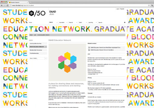
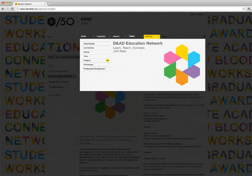
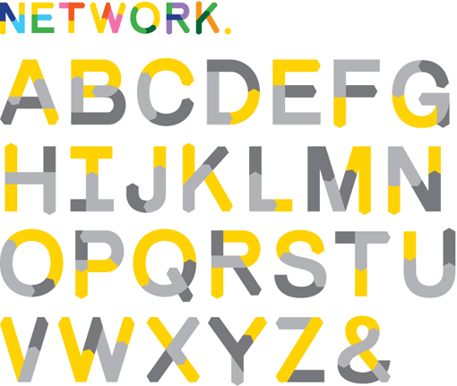
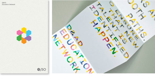
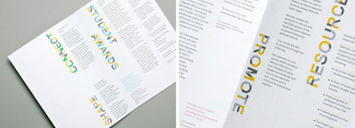
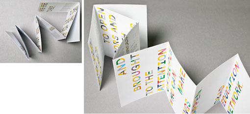
Bibliothèque Design developed this subbrand for the D&AD to “unify the education strands of the organization.” The project incorporated separate campaigns for each of the three education strands, a bespoke typeface, print and interactive materials:
The identity links the well-established D&AD logo with the D&AD Student Awards, New blood, Connect and Graduate Academy programmes. The solution remixes the hexagonal shape of the D&AD iconic yellow pencil – it is multiplied and extruded to reflecting the sub-brand’s status as a multifaceted network with diverse converging disciplines.


Get 300+ Fonts for FREE
Enter your email to download our 100% free "Font Lover's Bundle". For commercial & personal use. No royalties. No fees. No attribution. 100% free to use anywhere.
