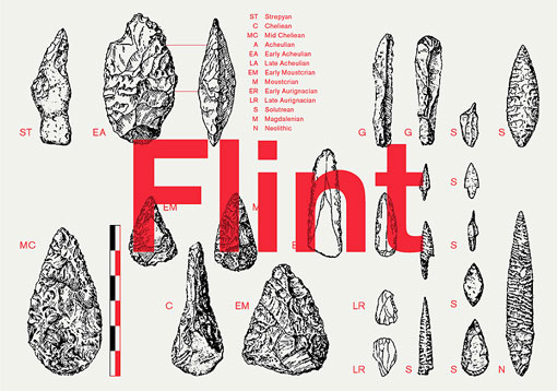
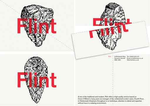
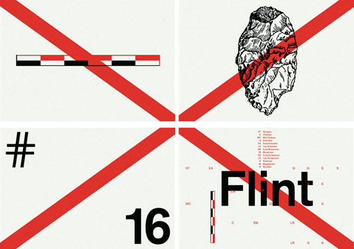
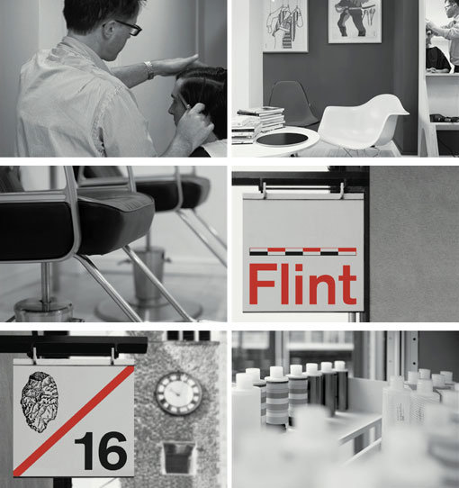
I’m not sure what it is about vintage-looking diagrams, but I cannot resist them. So, of course, I was immediately drawn to this identity designed by Bibliothèque for Flint, a hair salon with a focus on craftsmanship and modernity. I certainly had no idea this design was for a hair salon at first glance, but after reading more about the background, I think the concept is pretty ingenious. View more and learn more about the thoughts behind the design right here.


Get 300+ Fonts for FREE
Enter your email to download our 100% free "Font Lover's Bundle". For commercial & personal use. No royalties. No fees. No attribution. 100% free to use anywhere.
