In this article:
- The Most Shattered Broken Fonts of 2026
- What Gives Broken Fonts Their Disruptive Edge?
- How to Pick the Perfect Broken Font
- Fantastic Broken Font Alternatives
- Common Broken Font Questions
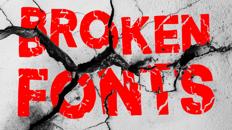
Broken fonts lean into imperfection by design. They’re the typefaces that look cracked, glitched, or pulled apart—intentionally disrupting the clean, polished feel we usually expect from typography. The result is something bold and unconventional, with a modern edge that instantly stands out.
In this guide, I’ll walk through some of the most compelling broken fonts to experiment with in 2026 and what makes them effective. We’ll cover how to pick the right style for your project, what creates that signature fragmented look, and where these fonts work best (plus a few places they don’t). I’ll also point you to a handful of solid alternatives and tackle a few common questions as we go.
The Most Shattered Broken Fonts of 2026
Not all broken fonts hit the same way. Some introduce just a hint of digital distortion, while others feel completely torn apart—like the letterforms have been pushed to their breaking point. That range is part of what makes this style so interesting, but it also means some options are far more usable than others.
To help narrow things down, I’ve pulled together a selection of my favorite “shattered” broken fonts right now—the ones that strike the best balance between style and usability. Here are a few worth checking out:
Groovy Volcano
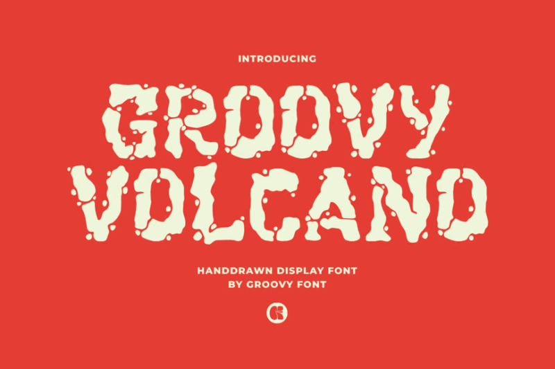
Groovy Volcano is a decorative display font with a hand-drawn, organic feel. Its playful, energetic and wavy design makes it perfect for creating lively headlines, posters, or branding materials, especially for projects that aim to convey a sense of fun and creativity.
Stone Breaker
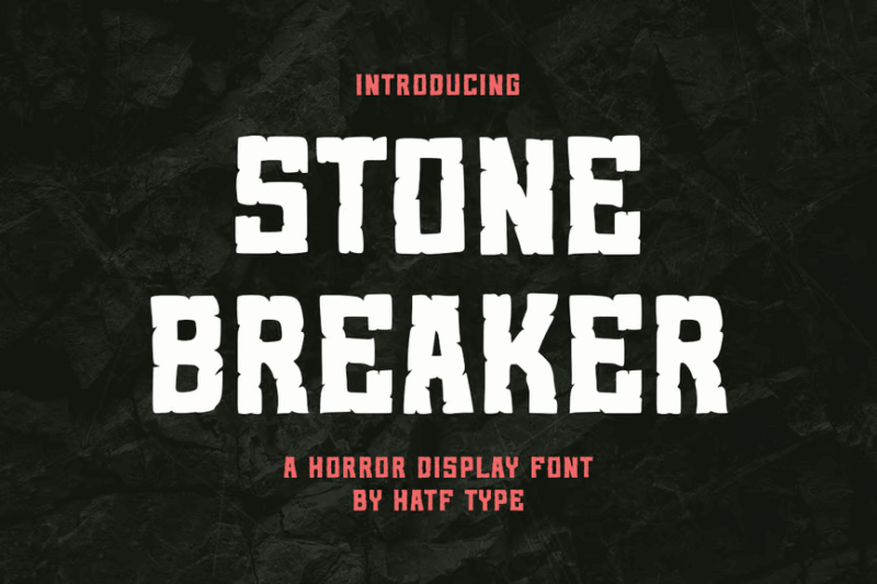
Stone Breaker is a decorative font that mimics the appearance of carved or broken stone. Its rugged texture and bold design make it perfect for creating impactful headlines, logos, or branding materials, especially for projects related to construction, archaeology, or nature.
Asphalt Crack – Distressed Cartoon Typeface
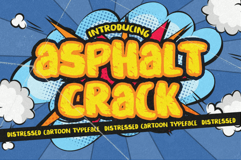
Asphalt Crack is a distressed, superhero-style font that combines sans-serif simplicity with decorative elements. Its unique texture makes it perfect for branding and advertising projects that require a balance of playfulness and urban grit.

Get 300+ Fonts for FREE
Enter your email to download our 100% free "Font Lover's Bundle". For commercial & personal use. No royalties. No fees. No attribution. 100% free to use anywhere.
Brick Stones – SVG Color Font
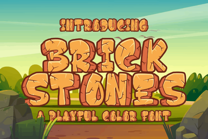
Brick Stones is a decorative SVG color font that mimics the appearance of cartoon-style bricks. Its playful design and color options make it perfect for creating eye-catching typography in children’s books, animated projects, or any design that requires a fun, buildable aesthetic.
Fractura Font
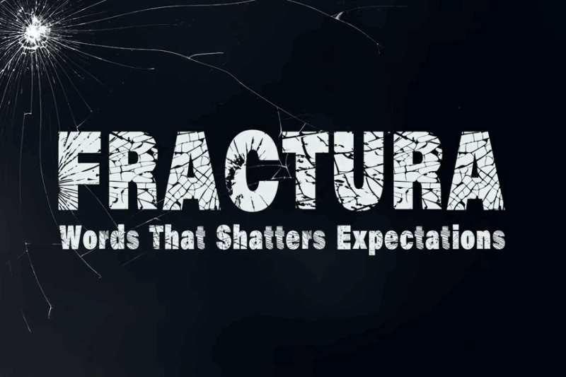
Fractura is a decorative font featuring bold, cracked letterforms. Its dramatic appearance makes it perfect for creating attention-grabbing headlines, posters, or logos, especially in designs that aim to convey strength, impact, or a sense of breaking through.
Broken Wings
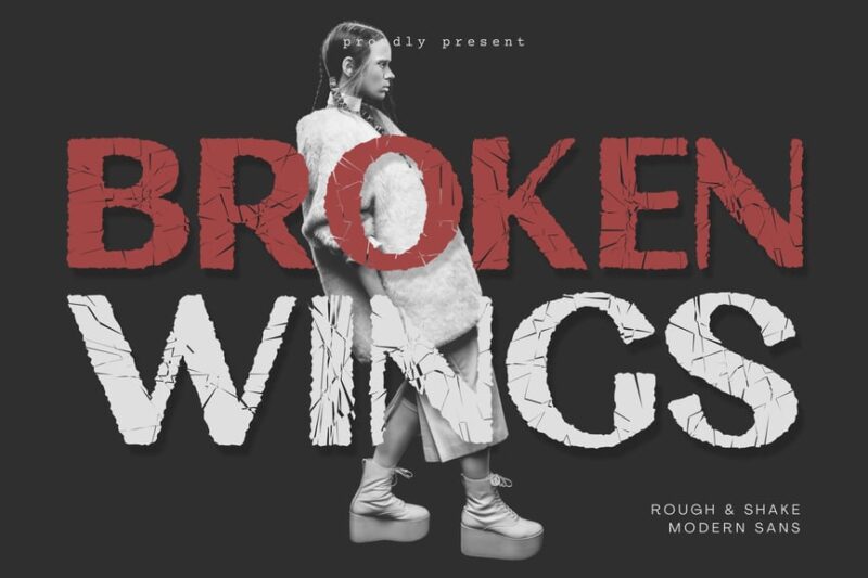
Broken Wings is a sans-serif font that brings a distinctive edge to typography. Its broken aesthetic adds visual interest while maintaining readability, making it ideal for headlines, logos, or any design that needs to convey a sense of edginess or unconventionality.
Petrified Section Graffiti Horror Display Font
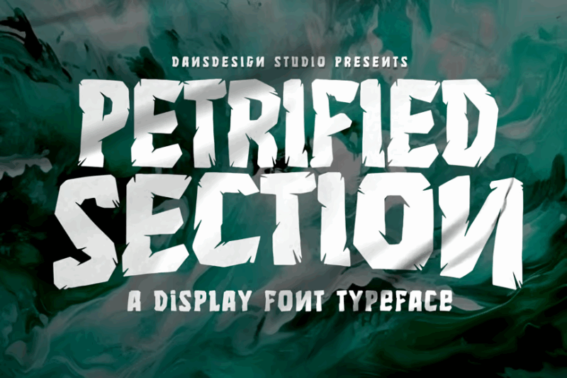
Petrified Section is a decorative font that combines blackletter style with graffiti and horror elements. Its intricate, scary design makes it perfect for creating chilling visuals for horror-themed projects, album covers, or Halloween designs.
Groovy Knock
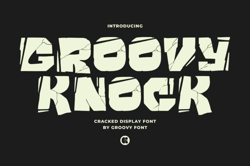
Groovy Knock is a decorative display font with an edgy, retro-inspired design. Its unique character makes it ideal for creating eye-catching headlines, posters, or branding materials that aim to capture a funky, vintage vibe with a modern twist.
Cursed Stone
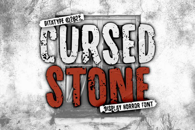
Cursed Stone is a textured font with stone-like vibes. Its eerie design makes it ideal for creating chilling visuals for horror movies, book covers, or Halloween-themed projects that aim to evoke a sense of ancient curses or supernatural dread.
Cracking Sans – Another Cartoon Font
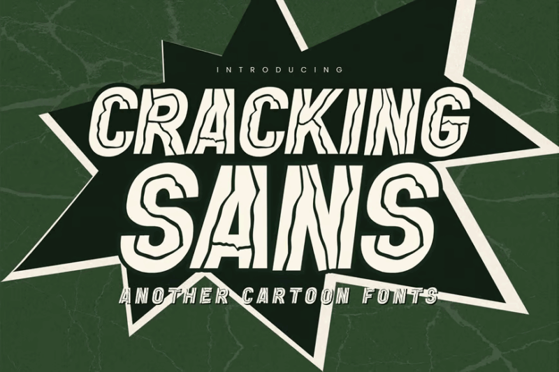
Cracking Sans is a unique sans-serif font with a cartoon-inspired, textured appearance. Its playful design and cracked texture make it ideal for children’s books, animated projects, or any design that requires a fun, lighthearted feel with a touch of quirkiness.
Urban Plaza Display Font
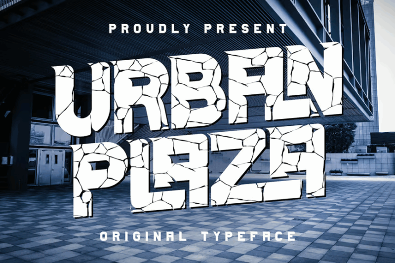
Urban Plaza is a unique sans-serif display font with a rough, textured appearance. Its urban-inspired design makes it ideal for creating bold headlines, logos, or branding materials that need to convey a sense of grit and authenticity.
Break Jumps Font
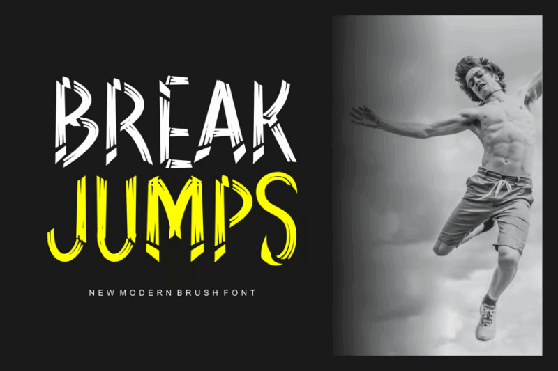
Break Jumps is a decorative font with a unique, fragmented appearance. Its distinctive design makes it ideal for creating eye-catching typography in posters, logos, or branding materials, especially for projects that aim to convey a sense of dynamism or disruption.
Broken Silence
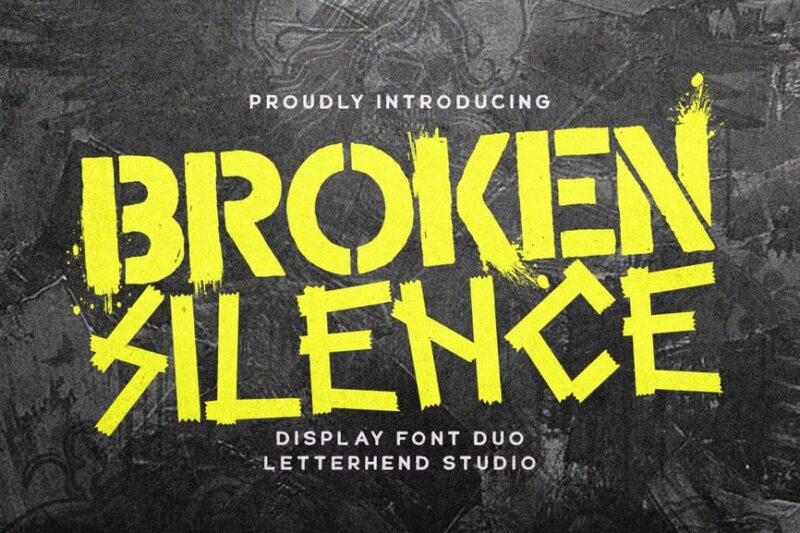
Broken Silence is a stencil font featuring a stencil-like design with an urban flair. Its fractured appearance and bold lines make it perfect for creating impactful designs in street art, posters, or any project requiring a raw, urban aesthetic.
Stoner Hexago – Stone & Typeface Font
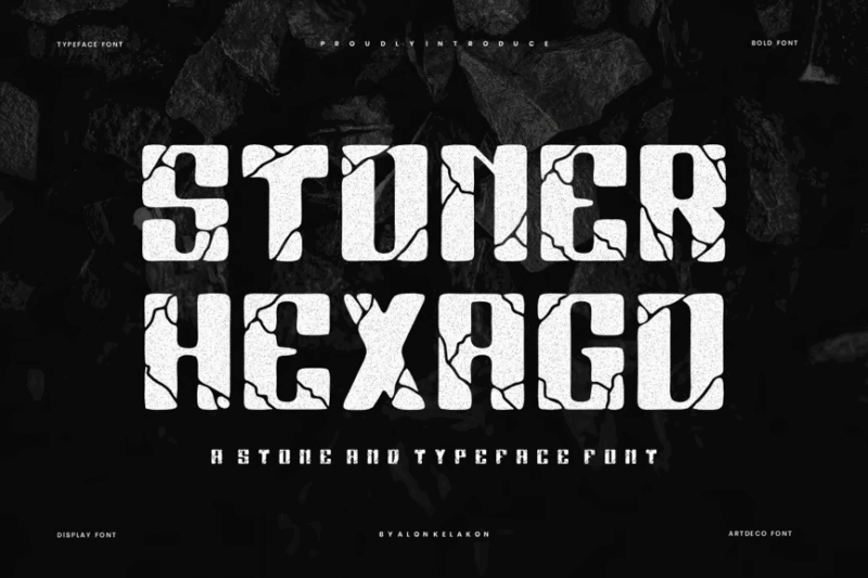
Stoner Hexago is a decorative font that combines a stone-like texture with geometric elements. Its unique design, reminiscent of both grotesk and marker styles, makes it ideal for creating distinctive typography in posters, logos, or branding materials with a modern edge.
The Stack Stone – Display Font
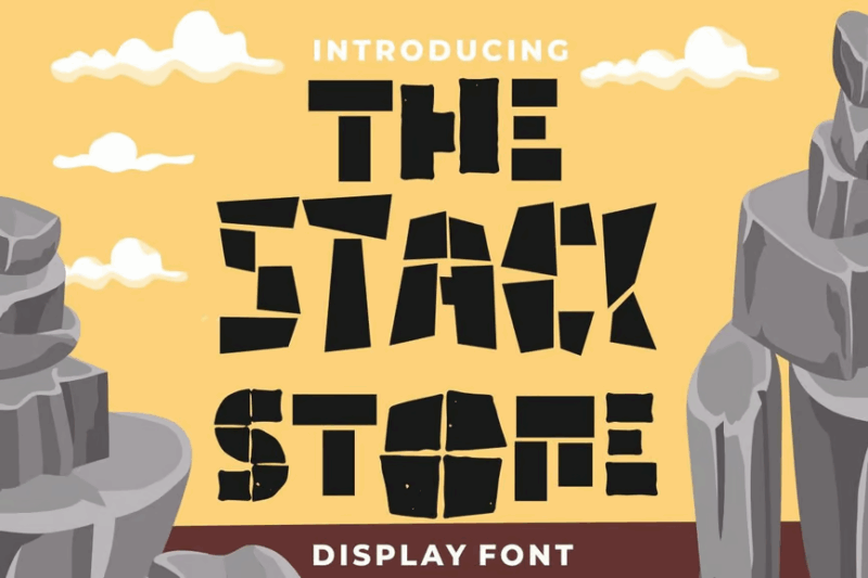
The Stack Stone is a decorative display font that mimics stacked or piled stones. Its unique design makes it perfect for creating eye-catching typography in posters, logos, or branding materials, especially for projects related to construction, landscaping, or natural themes.
Fracture Dreams Crack Graffiti Horror Display Font
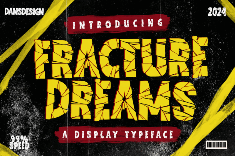
Fracture Dreams is a bold, decorative font that combines cracked textures with a bold style like the popular Impact font. Its horror-themed design makes it perfect for creating eerie, unsettling visuals for movie posters, book covers, or Halloween-themed projects.
Breaking The Comic -Bold Playful Comic Font
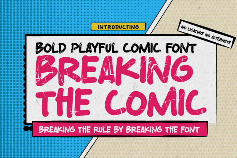
Breaking The Comic is a bold, playful font that combines sans-serif and decorative elements. Its lively design makes it perfect for children’s books, animated projects, or any design that requires a fun, energetic feel with high readability.
Stone Skin Horror Grunge Font
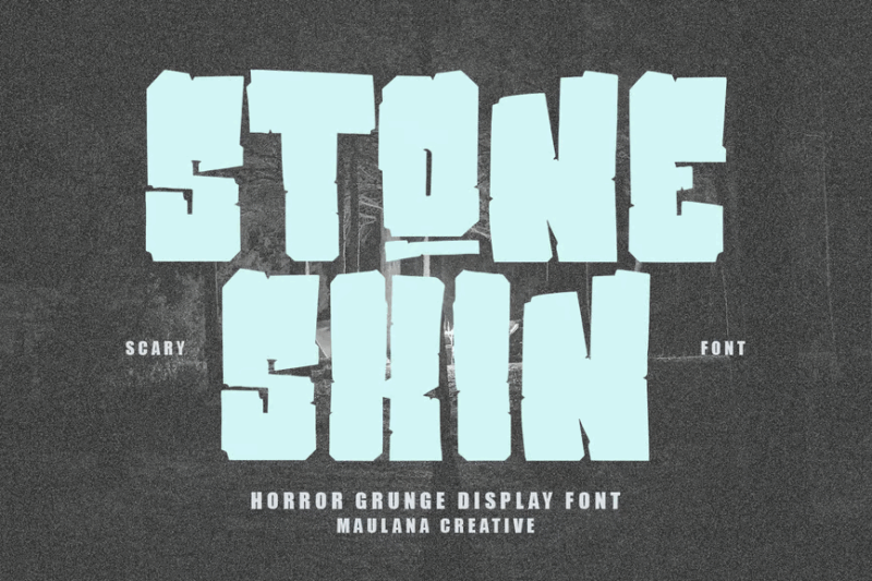
Stone Skin is a decorative font with a horror-inspired, grungy texture resembling rough stone. Its unsettling design makes it ideal for creating eerie visuals for horror movies, book covers, or Halloween-themed projects that require a raw, unsettling aesthetic.
Cave Stone – prehistoric cartoon font
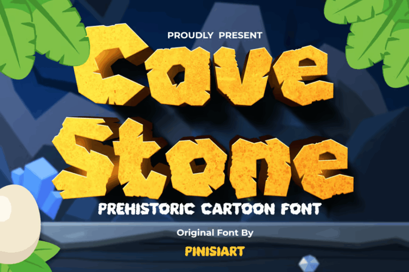
Cave Stone is a sans-serif font with a prehistoric, cartoon-inspired design. Its playful, stone-like texture makes it perfect for children’s books, educational materials about prehistory, or any project that requires a fun, primitive aesthetic.
The Quakeer – Display Font
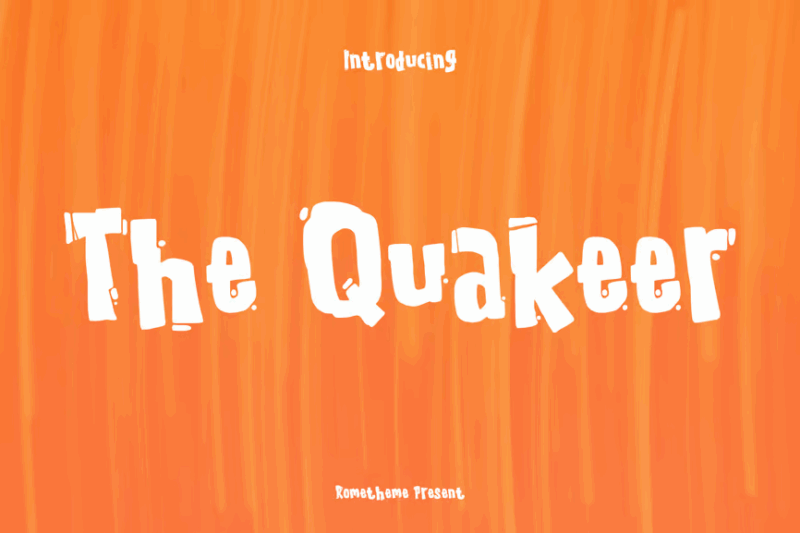
The Quakeer is a script and handwritten display font with a horror-movie inspired design. Its eerie, shaky appearance makes it perfect for creating unsettling visuals for horror films, book covers, or Halloween-themed projects that aim to evoke a sense of unease.
Broken Wood Font
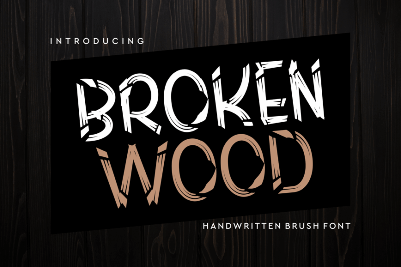
Broken Wood Font is a decorative typeface that mimics the appearance of splintered or cracked wood. Its unique texture and organic feel make it an excellent choice for rustic, nature-inspired designs or projects that require a rugged, weathered look.
Thelor Cevlok – A Display Font
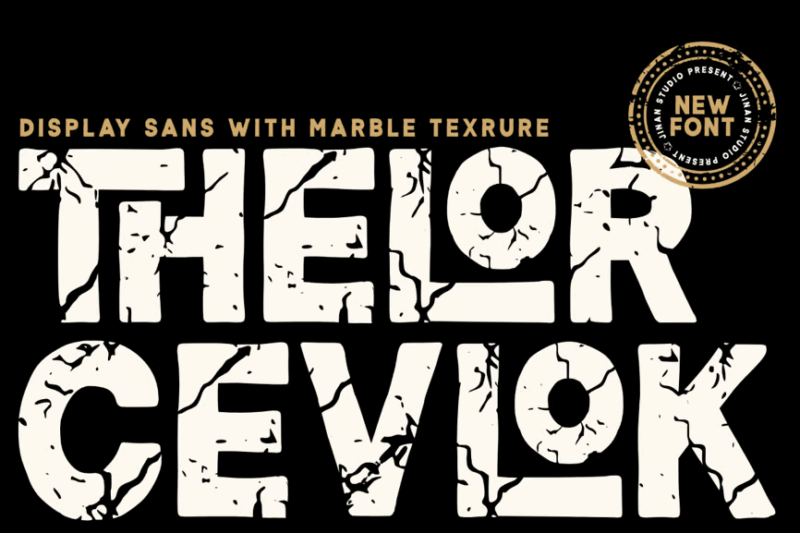
Thelor Cevlok is a sans-serif display font with a unique textured appearance. Its distinctive character makes it suitable for creating eye-catching headlines, logos, or branding materials that require a balance of modernity and visual interest.
Brown Stones a Cartoon SVG Color Font
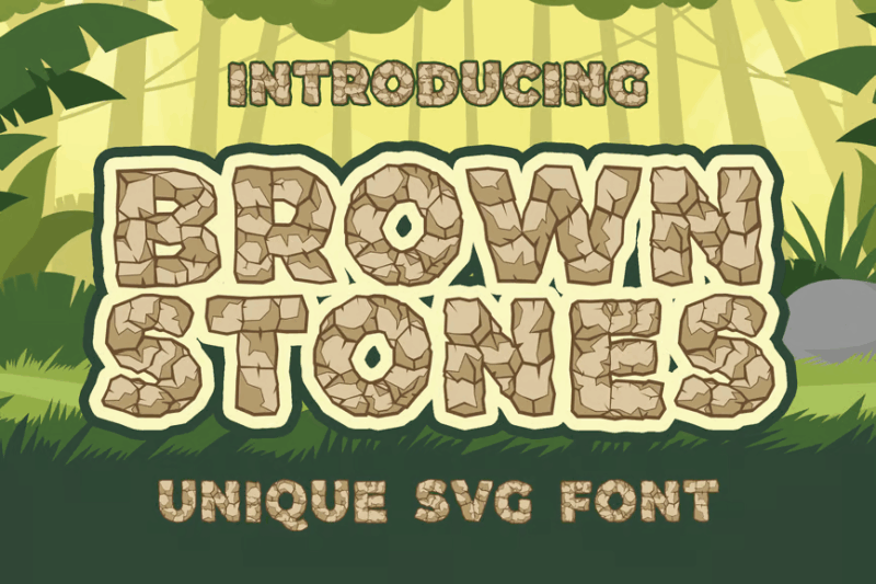
Brown Stones is a playful SVG color font that combines sans-serif simplicity with decorative, cartoon-like stone textures. Its versatile design makes it suitable for creating fun typography in children’s books, comics, or any project that requires a balance of readability and whimsical charm.
Grounded Cracked Font Family
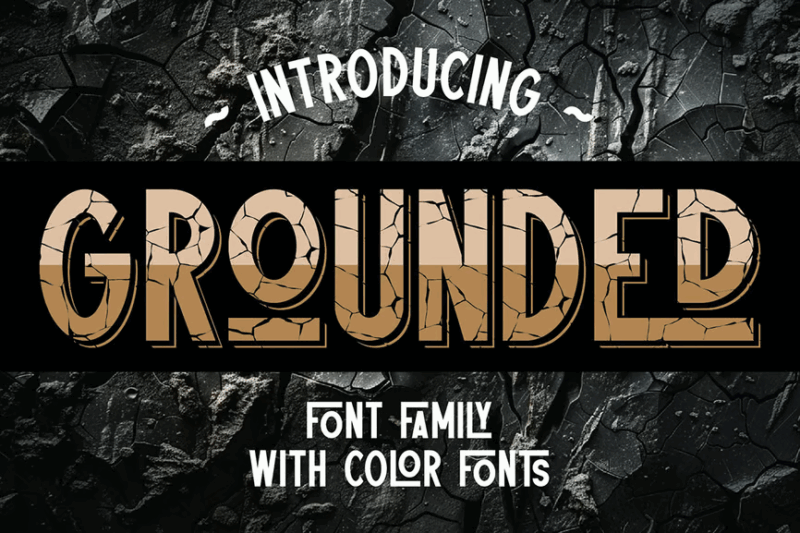
Grounded Cracked is a unique sans-serif font family featuring a cracked texture. This versatile set offers various weights and styles, making it suitable for a range of design applications that require a balance of legibility and visual interest.
Broken Font
Broken Font is a versatile typeface that combines script, handwritten, decorative, and sans-serif styles. It offers a unique blend of simplicity and vintage charm, making it suitable for a wide range of design projects that require a touch of nostalgia or character.
Burgystone – Bold Graffiti Font
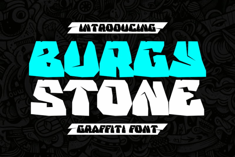
Burgystone is a bold, decorative font inspired by graffiti art. Its strong, urban-inspired design makes it perfect for creating impactful headlines, logos, or branding materials, especially for projects related to street culture, music, or youth-oriented brands.
Bigger Cracks Sans Serif Decotive Font
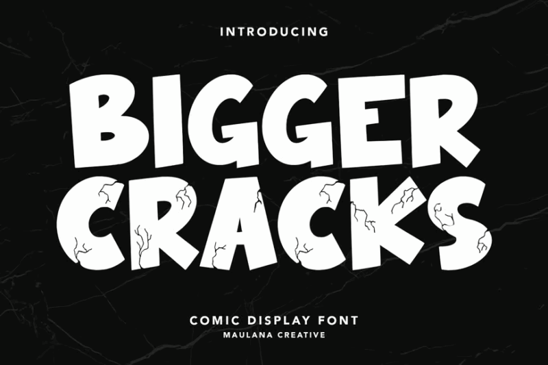
This font combines sans-serif simplicity with decorative cracks, offering a striking visual impact. It’s perfect for designs that need to balance readability with a touch of grunge or distress, ideal for posters, headlines, or branding that aims to stand out.
Stone Man – Rock Texture Font
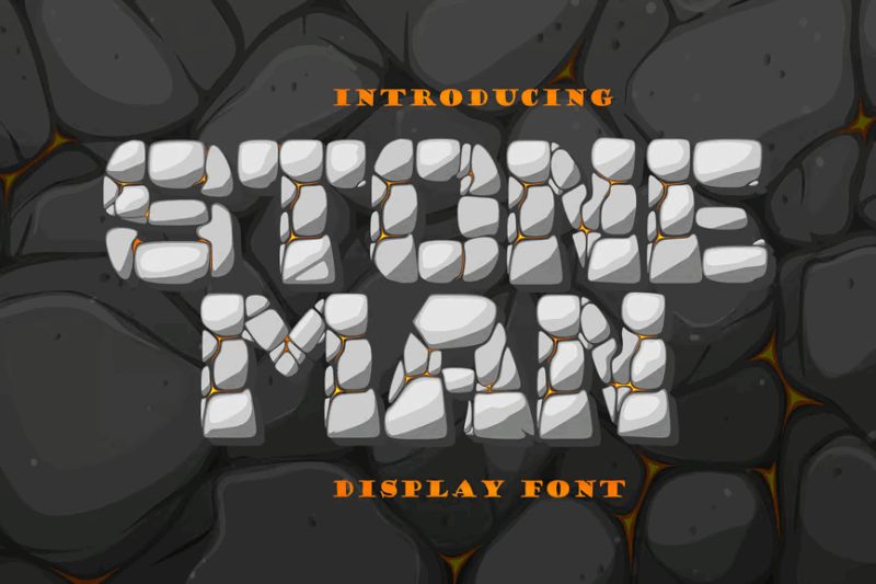
Stone Man is a decorative display font with a realistic rock texture. Its rugged, three-dimensional appearance makes it ideal for creating impactful headlines, logos, or branding materials, especially for projects related to nature, outdoor activities, or geology.
What Gives Broken Fonts Their Disruptive Edge?
Broken fonts feel so striking because they deliberately break away from the rules that make most typography feel stable and predictable. Instead of clean, consistent letterforms, they introduce tension, movement, and a sense that something is slightly “off”—in a way that’s completely intentional.
One of the biggest factors is fragmentation. Letters in broken fonts often look like they’ve been cracked, sliced, or pulled apart, with jagged edges and missing pieces. Even though they appear damaged, the design is still controlled. That balance—between something feeling incomplete yet purposeful—is what makes them so visually compelling. Your eye naturally wants to resolve the gaps, which keeps you engaged.
There’s also a strong influence from digital distortion. Many broken fonts borrow from the visual language of glitches—things like pixelation, scan lines, or subtle misalignment. These details mimic the look of corrupted files or screen errors, giving the type a modern, tech-driven feel. Sometimes even the spacing or rhythm of the letters feels slightly “off,” like it’s stuttering or lagging, which reinforces that effect.
Finally, there’s an element of controlled chaos. The breaks and distortions aren’t always consistent, and that unpredictability adds energy. You’re seeing two opposing forces at once: structure (the recognizable letterforms) and disruption (the damage applied to them). That push and pull is what ultimately gives broken fonts their edgy, attention-grabbing personality.
How to Pick the Perfect Broken Font
To choose an excellent broken font matching your needs, first reflect on:
Degree of Breakage
Consider how “broken” you want your text to appear. Subtle fractures maintain better readability while still adding edge. Heavily broken fonts create more visual impact but sacrifice some legibility. Match the level of disruption to your communication goals.
A lightly fragmented font might work for a headline that needs to be immediately understood, while a heavily glitched font could work for a single word or short phrase meant to create visual drama.
Breakage Style
Analyze what type of “broken” aesthetic best fits your concept. Pixelated glitches? Shattered glass effect? Corrupted data appearance? Acid deterioration? Each style of breakage communicates different associations and emotions.
Tech-inspired digital glitches feel contemporary and related to software, while shattered or cracked effects may suggest physical impact and analog damage. Choose breakage type that reinforces your concept.
Base Font Style
Look at the underlying font style before the breakage effects. Is it serif? Sans-serif? Script? The base typography still influences the overall impression even after being “broken.”
A broken serif might retain some traditional qualities while a broken script creates interesting tension between elegance and disruption. Consider what base characteristics will shine through the fragmentation.
Context and Scale
Factor in where and how your broken font will be displayed. Large applications allow for more intricate fracturing details, while smaller uses may require simpler breaks to remain effective.
Test broken fonts at your intended display size to ensure the fragmentation effects remain visible and impactful without becoming muddy or illegible.
With these factors in mind, matching an appropriate broken font to your specific project becomes much more intuitive!
Fantastic Broken Font Alternatives
While broken fonts themselves inject disruptive energy into designs, alternatives can provide that edgy, experimental allure too.
Some top options include:
Distressed Fonts
Distressed fonts with worn, eroded, or weathered appearances create a different type of “broken” aesthetic focusing on age and deterioration rather than fragmentation. These worn letterforms still communicate disruption of perfect typography.
Experimental Display Fonts
Highly experimental display fonts with unusual construction, extreme proportions, or unconventional letter building principles can create visual interest without actual “breakage.” These boundary-pushing designs challenge typographic norms in different ways.
Layered Font Systems
Layered font systems allowing multiple color combinations and overlapping elements can create the appearance of fractured or complex typography. By stacking different layers with slight offsets, you can simulate certain types of digital distortion or print errors.
So creating that broken, experimental aesthetic is possible with these alternatives that offer different approaches to typographic disruption!
Common Broken Font Questions
Let’s wrap up by answering some common broken font questions:
What are glitch fonts called?
Glitch fonts specifically mimic digital errors and electronic malfunctions in their appearance. While “glitch fonts” is the umbrella term, you might see them labeled as “corrupted fonts,” “distorted fonts,” or “digital interference typefaces” as well.
When were broken fonts first created?
The intentional “breaking” of typography gained popularity in the 1990s with the rise of digital design and experimental typography. However, the true explosion of broken font styles coincided with the glitch art movement of the 2010s, and they continue evolving today with increasingly sophisticated digital techniques.
Can I use broken fonts for my logo?
Absolutely! Broken fonts can make memorable, distinctive logos particularly for brands wanting to appear innovative, disruptive, or cutting-edge. However, ensure the fragmentation doesn’t compromise recognition or scalability. Test your broken font logo at multiple sizes and in black and white to confirm it maintains impact and legibility in all applications.
Are broken fonts accessible?
By their nature, broken fonts prioritize visual style over maximum readability, potentially creating accessibility challenges. If accessibility is a priority, consider using broken fonts only for decorative elements or headlines while keeping body text in highly legible standard typefaces. For digital applications, always provide appropriate alt text describing content written in broken fonts.
Broken fonts breathe rebellious energy and contemporary edge into designs meant to challenge viewers and stand out from the crowd. Their fragmented appearance ensures your typography breaks through the noise of conventional design.
So try out some of these sensational broken fonts in your own projects. Used thoughtfully, they build memorable designs certain to disrupt expectations and demand attention.
Have favorite broken fonts not mentioned? Please share below!
