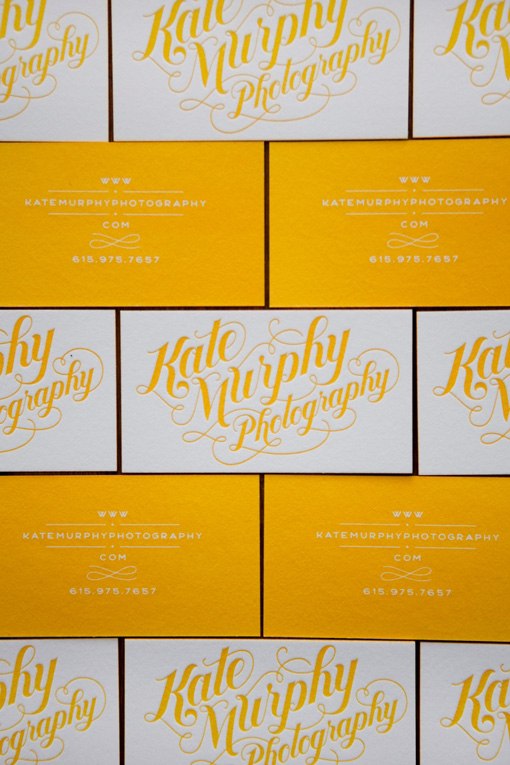
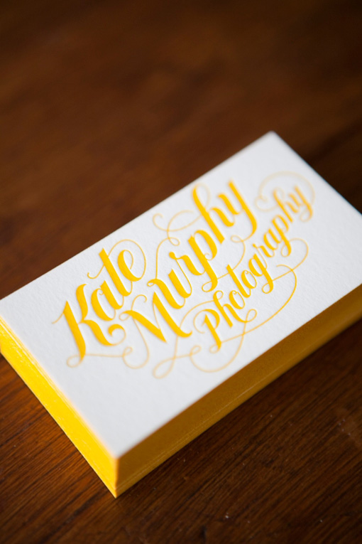
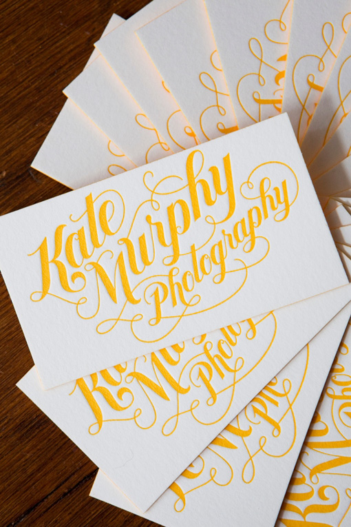
When I spotted Kate Murphy’s new business cards on her photography blog recently, I knew I had to feature them. Between the saturated yellow ink and gorgeous hand-lettering they are absolute perfection. The logo and cards were designed by Jessica Hische and the the cards were letterpress printed by a friend of Kate’s. If I were her I know I’d have a hard time letting these go.
gorgeous. i love these.
fantastic yellow!
Oh wow I *love* these. The yellow is perfect.
ooooooo pretty
I love the color and the hand lettering is gorgeous. thank you for sharing.
the yellow edging is a nice touch.
oh my gosh I love this SO MUCH! beautiful!
These are beautiful + totally memorable.
Stunning and unforgettable.
Beautiful!! Such a fan of Jessica’s work :)
class. very chic.
[…] (via designworklife ยป) […]
[…] Another example of Jessica Hische’s distinctive lettering for Kate Murphy Photography. […]
Fantastic lettering, Jessica the master
Beyond – Jessica Hische is a master of the magnificent!
Is the solid yellow on the one side letterpressed or is the paper that gorgeous yellow?
[…] via https://designworklife.com/?p=15567 […]
It’s definately my style and really so good design !!
[…] via https://designworklife.com/?p=15567 […]
[…] via https://designworklife.com/?p=15567 […]
[…] via https://designworklife.com/?p=15567 […]
one word… WOW. Beautiful.
[…] Completely droolworthy letterpress business cards for photographer Kate Murphy, designed by Jessica Hische. Hello, lovely hand lettering and vivid yellow! – via Design Work Life […]