National Currency is a new font from Decade Typefoundry, which was inspired by lettering found on 19th century stock certificates. In addition to the ...
Quan is a new release from new-to-me foundry, Typesketchbook, which is based in Thailand. The family features bold and rounded styles—plus obliques fo...
Brooklyn and Brooklyn Stencil are two new releases from Village. The pair was originally developed by Chester Jenkins as part of the massive Atlantic ...
Letters from Sweden recently introduced Kumla, a display face inspired by lettering on the facade of Kumla Skofabrik, a shoe factory in Sweden. This t...
Brandon Grotesque is one of my favorite san serif typefaces, so I’m pretty excited about Brandon Text, the latest release from HVD Fonts. Brandon Text...
Ollie is a new casual script by Schizotype, with a huge variety of special features. It was designed to make the most of OpenType technology, and incl...
Yesterday Hoefler & Frere-Jones added another awesome family to their library: Landmark. The architectural typeface was originally commissioned by Mic...
Lolita is one of Latinotype’s latest releases, which they call a “sans family with a touch of mojo.” The typeface features ten weights, and includes a...
Bellissima Pro is the latest fancy script release from Sudtipos....
Realistic-looking hand lettering typefaces are hard to come by, so I was plesantly surprised to stumble upon Insolente, a family of two fonts—the prim...
Prisma Pro is an energetic display face by RMU Typedesign. This version is actually a revival and expansion of Prisma, a typeface that was designed by...
According to MyFonts: Marat Sans is a clean and lively sans serif typeface designed by Ludwig Übele. It is characterized by excellent legibility and s...
Vulpa is a quirky little serif typeface by Schizotype Fonts....
I’ve got my eye on Australis Pro from Latinotype....
Roman Extended Lightface is a new release from the Hamilton Wood Type Foundry. This new digitization features a full Western and Eastern European char...
Earlier this week Jessica Hische launched her latest font, Minot, a beautiful ornamental display face. Minot includes three styles—Outline, Fill and B...
The layered type trend has certainly taken off in the last year or so. (See Detroit, Valuco, Frontage.) Now Latinotype has contributed their version t...
Before I took a look back, I thought I might have a hard time finding ten really great typefaces from 2012 to feature. But once I actually explored th...
This morning I’m loving Quarzo, an elegant, traditional script by Corradine Fonts....
Carat is a “contemporary interpretation of a classic serif” by German foundry Hoftype....
Unio is a friendly slab serif with rounded edges by Wilton Foundry....
Shelton Slab is a distressed letterpress style font featuring letterforms that appear to be from many different alphabets. Pick up this new release by...
Olio is a bold, geometric display face by Max Little. Available in Bold and Inline, you can currently pick up the set for 50% off at MyFonts....
Ramsey is a new display sans from the folks at Associated Typographics, aptly described as having a “strong structure and a warm personality.” Look cl...
Suitcase Type Foundry recently released two new typefaces to complement the popular serif Tabac: Tabac Slab and Tabac Mono. The entire Tabac family is...
Lost Type Co-op’s latest release is a “reverse contrast cowboy font” by Dan Gneiding, aptly named Dude. The font includes twelve awesome styles, each ...
I’m currently loving Feather Script, an elegant vintage design from Lettering Inc. Pick it up at My Fonts....
Harriet is an elegant serif typeface developed by Okay Type. It features two styles, display and text; six weights, from thin to black, and a wide arr...
Trithart is a playful, hand-drawn, Open Type font by illustrator Emma Trithart. You can pick it up right here at You Work for Them. ...
Worthe Numberals is a set of fun set of decorative numerals from House Industries. The set of two fonts includes both the standard and drop shadow ver...
Yesterday HF&J launched the new and improved Tungsten family, which now boasts 32 styles. Improvements include four new lighter weights, the addition ...
Lupa Sans is a fun new typeface designed by Melle Diete. Lupa includes a range of weights, from Extra Light to Black, and an incredible extended chara...
I’m loving Signalist, a lively brush script by Mike Melvas....

Modular is a six layer stacking display typeface by Letterwerk that allows for unlimited possibilities. Two versions, a slab serif and a sans serif, a...
The companion Salvo Sans and Salvo Serif was originally designed by Cyrus Highsmith for use in various AARP publications. Both typefaces are available...
Aria is a graceful, elegant display serif by Fountain Type, that was released back in 2011. Get a closer look on MyFonts....
Swagg is a friendly sans serif—love the lowercase “g”—that was released by Miller Type Foundry back in 2011. You can pick up all five weights individu...
Originally released in the late 1960s, Filmotype Manchester has recently been reissued with new refinements and expansions. Along with Miner and Marle...
You may remember that I already posted about Alda in 2010, back when it was still a work-in-progress. Well, I just happened to stumble upon it again r...
HWT American Chromatic is the first release from the Hamilton Wood Type Foundry, a new collaboration between P22 and the Hamilton Wood Type & Printing...
Susa, by Hubert Jocham Type, is currently one of my favorite casual scripts. Pick it up at MyFonts....
Lexia is another Dalton Maag typeface originally created in 2007. The friendly slab serif features six weights plus italics. Pick it up right here....
I’m loving the playful softness of Foco, a typeface published by Dalton Maag from 2007....
I’m currently loving Gigalypse, a new chunky square sans serif from Dunwich Type Founders....
I’ve had my eye on Steinweiss Script for awhile, a typeface that was originally developed as cover lettering for a Taschen edition on the work of Alex...
Luella is a whimsical, vintage-inspired, hand-drawn font by Cultivated Mind. Pick it up at You Work for Them....
Type Together makes so many great workhorse typefaces, both serif and sans serif, that can work for an incredibly wide range of applications. I would ...
Nat Grotesk, a family of 14 styles and 4 weights by Paratype, has a sort of vintage feel that I’ve been drawn to lately. Pick it up at You Work For Th...
Proxima Nova Soft is a rounded version of Mark Simonson’s popular Proxima Nova. Fun fact: this Soft cut was originally designed for use as a web headl...
For the month of August, a series of guests will be filling in on DWL with daily posts. Today’s posts come to you from Jason Johnson who fights the go...
Sixta is a new sans serif typeface from Hoftype, which comes in six weights. Get a closer look at MyFonts....
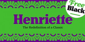
Henriette is a new, historically-influenced serif typeface by Typejockeys. Here’s a bit of info about its origin: In the 1920s the Viennese government...
I’ve been anxiously awaiting the release of Valuco since Aesthetic Apparatus announced its development with a Kickstarter project earlier this year. T...
Glenlake is a new addition to Filmotype’s extensive library of vintage fonts. This one in particular was originally designed and released in 1955, and...
Village is one of my favorite type shops. I’d love to own their entire library, but right now I especially have my eye on some of their 2012 releases,...
Memoire is a gorgeous linear, hairline contemporary sans by Reserves. Pick it up at MyFonts....
Latinotype has recently added Italic styles to their original Andes family. Check it out on MyFonts—it’s on super sale for a limited time. ...
Ninfa Serif, designed by Brazilian foundry dootype, was built from the “genetic inheritance” of their earlier semi-serif design, Ninfa....
On the heels of Idlewild’s release comes Halogen, another extended typeface but with more quirky details. Designed by Positype, Halogen features seven...
A little while back I mentioned that Adelle Sans, the sans serif companion typeface to TypeTogether’s popular Adelle, was being designed. Well lucky f...