I’m really loving the incredibly sophisticated color palette of this oversized Map of the Future infographic. If you’re interested in the background of this project, be sure to check out this in depth article by Density Design. And you can also get a closer look at the detail by checking out the larger version on Flickr.
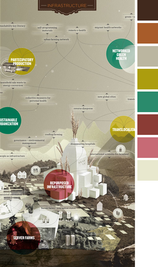
Color Happy 69
Courtney
<p>Courtney is the founder of Design Work Life and <a href="http://seamlesscreative.com" target="_blank" rel="noopener">Seamless Creative</a>, a small design studio she runs with her husband Brian. She now splits her time between developing brand identities for small businesses and soaking up (and passing along) as much inspiration as she possibly can.
Art Deco vs Art Nouveau: 3 Important Differences
There are 3 big differences between Art Deco and Art Nouveau: inspiration, aesthetics, and timing. Art Deco is influenced by...
Ultimate Neon Colors Guide for Designers September 2024
Neon colors have become a popular design trend in recent years, reviving that classic look from the 90s. But how...
Rebecca Green Illustration
For the month of August, a series of guest posters will be filling in on DWL with daily posts. Today’s...