In this article:
- Nimbus
- Anti-Font #3
- Cobya
- Clay
- Astoria
- Rhythmic Regal
- Canvas Inline
- Hatton
- Rokurou
- Better Hobby
- …But How Do I Choose Just One Font?
If you’re anything like me, you already have over a thousand fonts installed on your machine. But every time you start browsing your collection, all the options somehow seem too boring.
And so, here you are, looking for fresh, cool fonts to spice things up. I get it. That’s why I’ve recently gone down the rabbit hole myself (thanks to essay writing help, I had the time!). I needed some fresh ideas, so I set out to find fonts that are unlike anything I’ve seen so far.
Here are the 10 cool fonts I’ve unearthed during my search!
Nimbus
Where to find: Creative Market
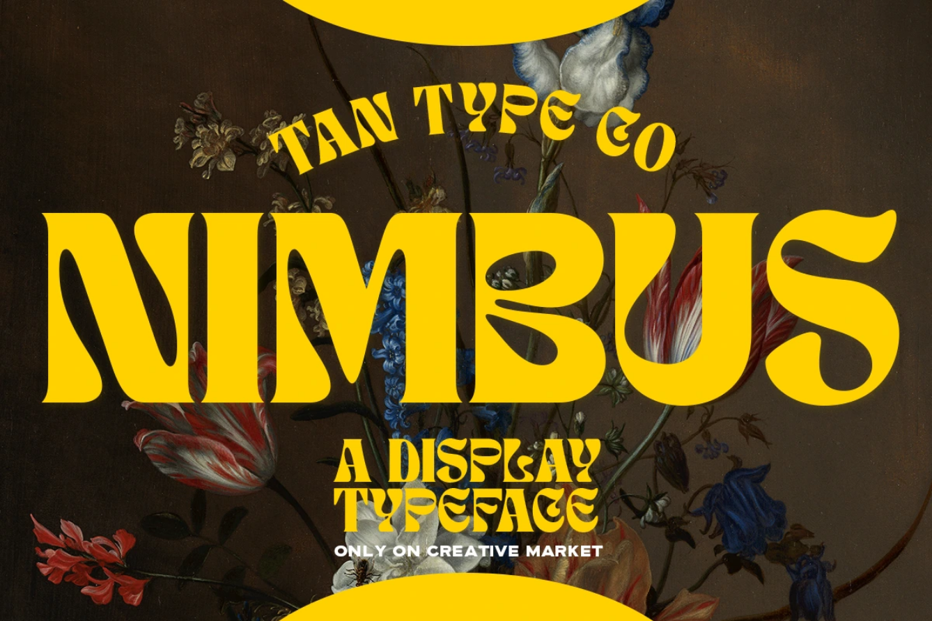
If you’re looking for that psychedelic 70s vibe, – or just cool fonts to draw, – Nimbus is a display typeface for you. It’s perfect for making a bold statement, adding a bit of playfulness to your design, or setting the mood to retro.
Nimbus isn’t just a cool typeface for all of us English speakers: it supports multiple languages that use the Latin alphabet. Its creators at TanType added glyphs for letters with accents, circumflexes, and more.

Get 300+ Fonts for FREE
Enter your email to download our 100% free "Font Lover's Bundle". For commercial & personal use. No royalties. No fees. No attribution. 100% free to use anywhere.
Anti-Font #3
Where to find: Creative Market
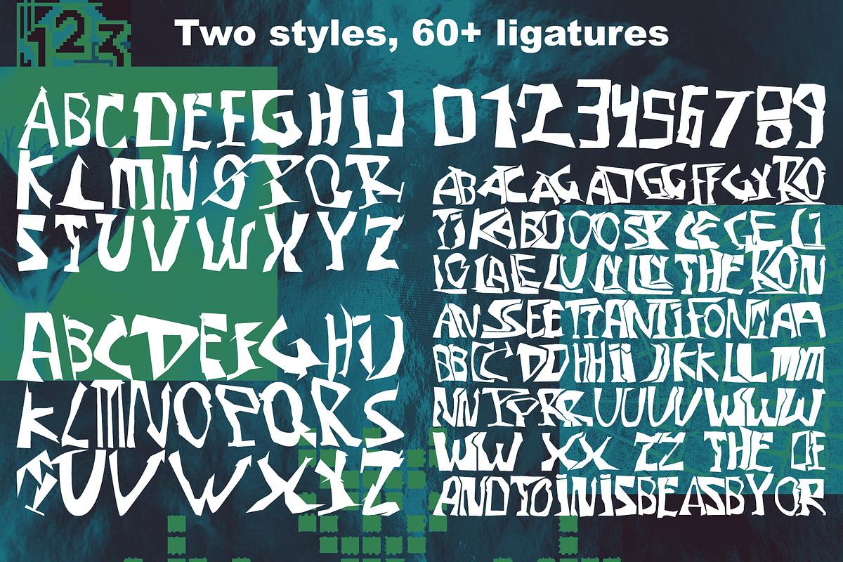
Looking for a font that seems to break the rules of typography with its mere existence? Then, the Anti-Font #3, designed by folks at the Bbymedia store, is worth your attention. It has this punk feel to it, all thanks to the jagged lines that look like they came straight out of the 90s posters.
This typeface comes in two styles, with all 26 letters of the English alphabet and numbers from 0 to 9. Although it doesn’t have multi-language support, Anti-Font #3 is so strange and rule-breaking that it deserves to be on this list.
Cobya
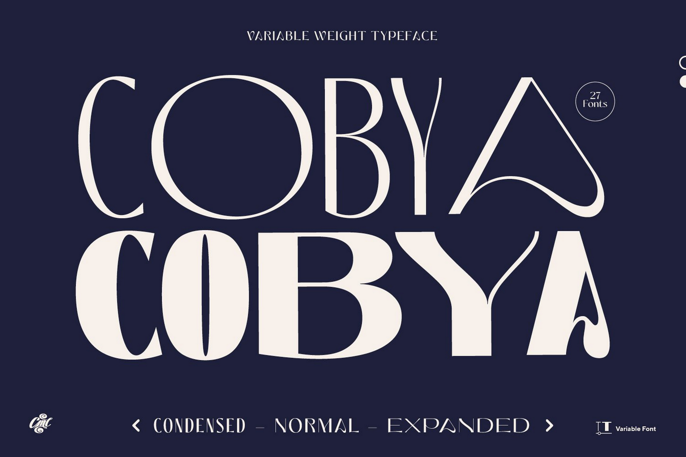
Where to find: Envato
Some fonts are fresh today but have the potential to become a timeless signature of elegance in typography. Cobya is one of such fonts. Its flowing lines allow for a modern and fashionable look that won’t go out of style for years to come.
Cobya comes in three font variations: Condensed, Normal, and Expanded. It also supports a variety of weight values, from 100 all the way to 900. The only thing is, Cobya is an all-capital font, which makes it more suitable for headlines and logos.
Clay
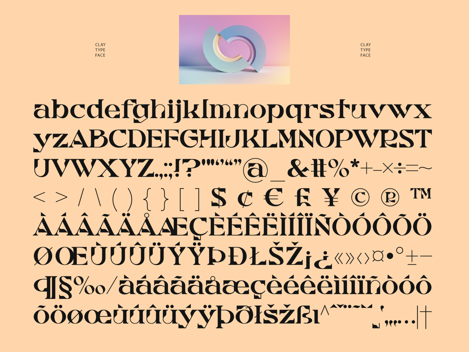
Where to find: Barrett Reid-Maroney Type Design Studio
If you’re looking for a font that plays with geometrical shapes, Clay is something to look at. Inspired by the 19th-century typography tenets, this font somehow doesn’t look old-fashioned. Instead, it’s a bold slab serif that befits any modern design.
Although it comes in a single weight, Clay quickly became one of my favorites because of its subtly unusual look. I’d also deem it one of the cool number fonts that you should pay attention to!
Astoria
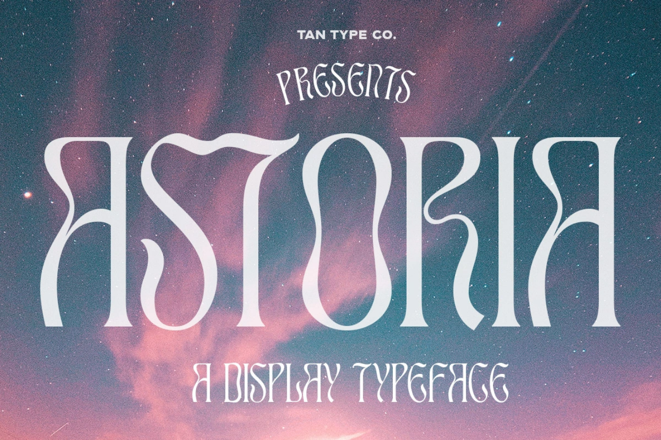
Where to find: Creative Market
Is there a font that resembles the waves more than Astoria? I’ve yet to find one. (Yes, technically, Cobya’s creators said the ocean was their inspiration, but look at Astoria!)
Created by the same studio as Nimbus, Astoria is one of those cool letter fonts that have an ethereal vibe to them. While Astoria also evokes a psychedelic feeling, it’s much less pronounced. This makes Astoria suitable for a wider range of designs that don’t necessarily need a font that screams retro.
Rhythmic Regal
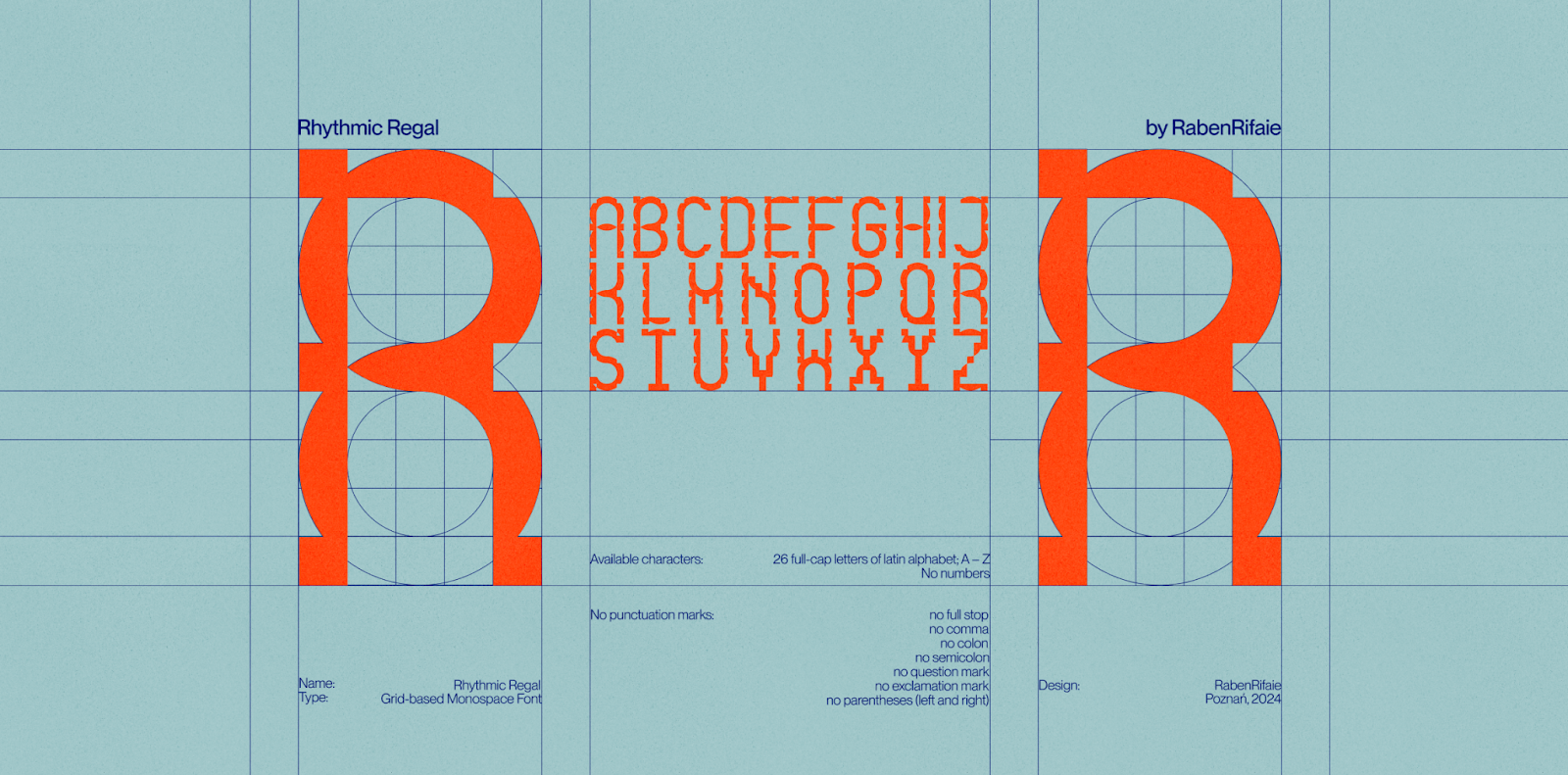
Where to find: Raben Rifaie
Rhythmic Regal is a complex grid-based monospace font that demonstrates perfectly why no cool fonts generator can rival human creativity. Its geometric look took painstaking work to put together, and its intricacy is something rarely seen in the typography world.
The ornaments of Rhythmic Regal letters make it perfect for adding personality to any headline. The only limitation of this font is that it supports only the 26 full-cap Latin letters (no numbers or punctuation marks).
Canvas Inline
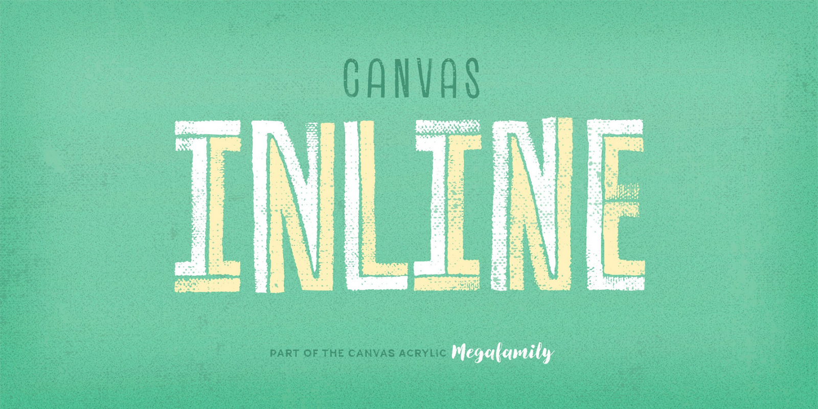
Where to find: Adobe Fonts
Grunge may not be all the rage right now, but a good grainy font will always find its use in graphic design. Canvas Inline is just that kind of font, and it absolutely belongs in designs destined for the younger demographic.
Canvas Inline comes in two variations: Reg and Heavy. So, you can easily mix and match it in headings and subheadings. Plus, you can easily add it to your project if you’re using the Adobe products.
Hatton
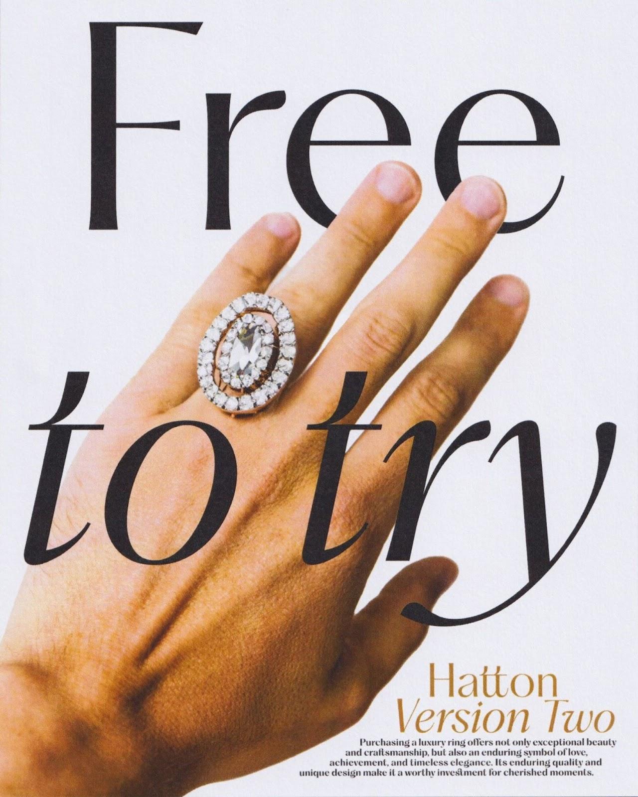
Where to find: Pangram Pangram
If you’re looking for cool text fonts that can work for both attention-grabbing elements and good-old paragraph text, consider Hatton. At first glance, it may look like your regular sans-serif. But once you take a closer look, you’ll notice its unusual approach to details, like the dots over the ‘i’s.
Hatton is also a great font if the variable weight is important to you. This font family comes with variations from Thin and Ultralight all the way to Ultrabold and Black.
Rokurou
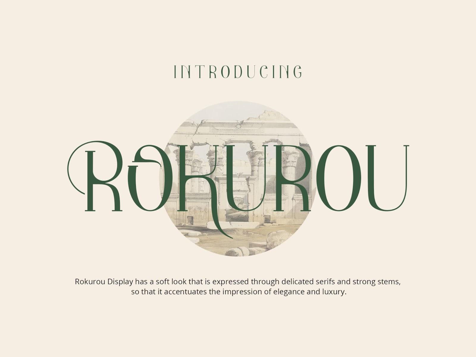
Where to find: Pixelbuddha
Another font that adds a modern twist to the timeless classics, Rokurou is a display font with a soft look and delicate serifs that hint at its antique origins. Its creator took inspiration from classic Roman proportions and enhanced them with elegant, flowing lines.
I’d choose Rokurou for any design that has to have that elegant, timeless feel to it without feeling too archaic. Plus, Rokurou works for multiple languages that use the Latin alphabet thanks to its many glyphs.
Better Hobby
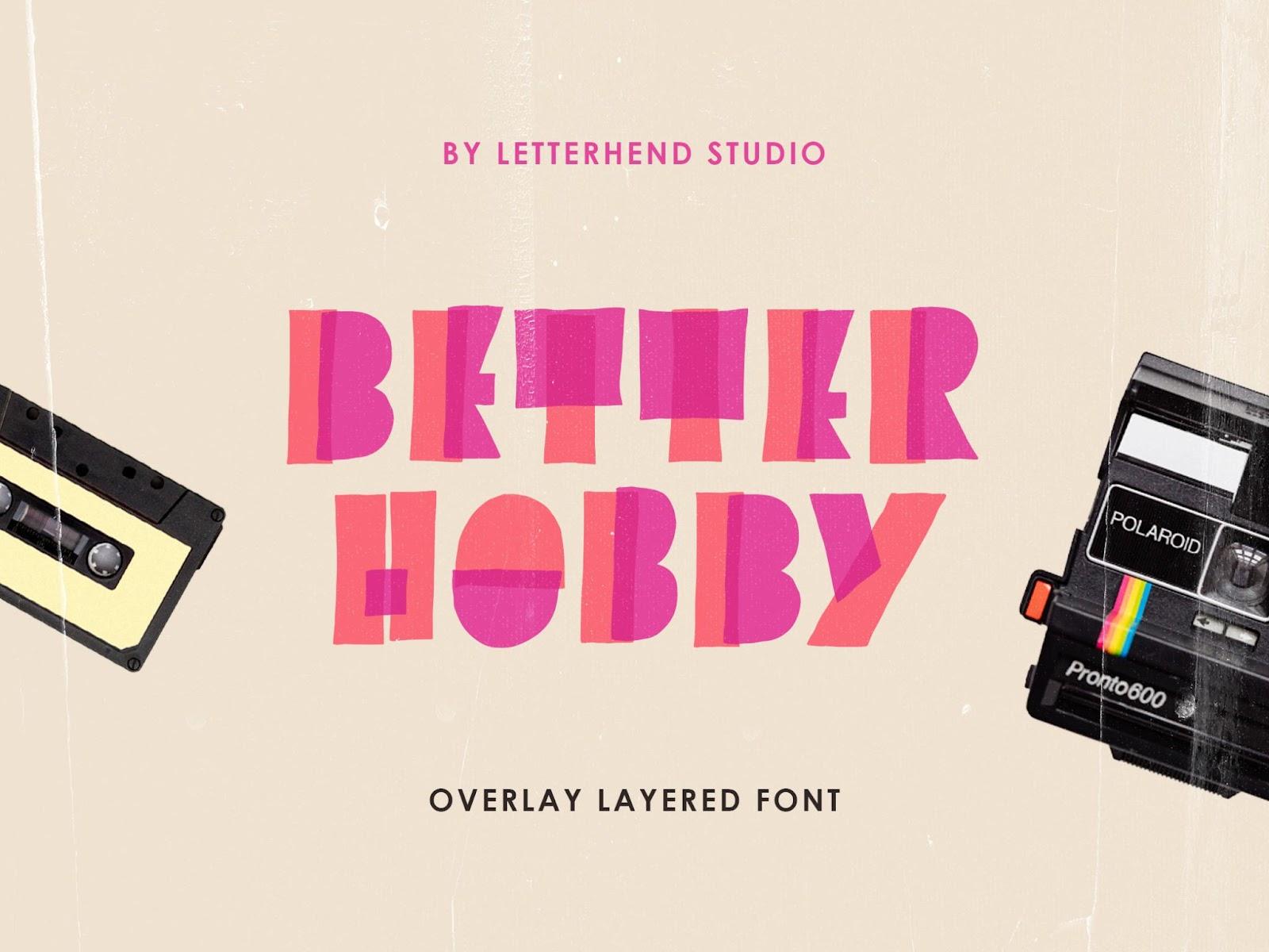
Where to find: Pixelbuddha
Miss the highlighter marker typography of the 80s and 90s? Better Hobby will take you back to that era. Its overlaying multi-color strokes make Better Hobby one of those cool writing fonts that are hard to resist using when you have a chance to incorporate them.
As a plus, Better Hobby is also free to use, even under a commercial license – so go ahead and grab it! And yes, the font comes with punctuation marks and numbers.
…But How Do I Choose Just One Font?
I’ve been there, too – you have so many options on the table that choosing just one can seem like an impossible task. I’d advise you, first and foremost, to try several fonts. That’s the best way to see if the typeface matches the vibe of your project.
But if you’ve tried several fonts and don’t know how to decide which one is the one, I’ve been there, too. Here are the five things I ask myself in such cases:
- Which font is the easiest to read?
- Which one matches the client’s brand and context better?
- Which one the intended audience will probably like more?
- Which one matches the other fonts in the project or the ones used by the client the best?
- Would the client prefer a trendy font or a timeless one?
Still stuck? Don’t hesitate to send out several versions to the client and let them choose!

