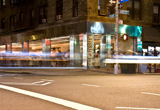
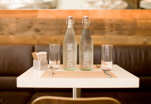
Restaurant branding is an area of design that I’m particularly interested in, so I was excited when I came across this project by Marque Creative. Delicatessen is a New York City-based restaurant serving international comfort food with a twist. Everything, from the logo to the packaging to the coffee cups, is beautifully designed with a custom typeface inspired by neon signage. And the whole package is simple, elegant, and fun—I can’t wait to check it out for myself.